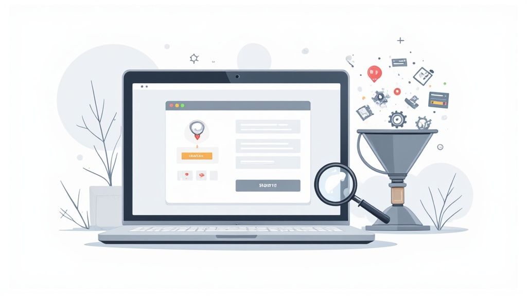
Checkout optimization is all about fine-tuning the final, critical steps of an online purchase to make it faster, easier, and more intuitive for your customers. This isn't just about minor tweaks; it’s about systematically plugging a huge revenue leak by eliminating checkout friction and guiding motivated buyers smoothly across the finish line.
Why Your Checkout Is Leaking Revenue
The checkout page is the single most critical point in your sales funnel, yet it's often the most neglected part of the entire website. Think of it as the final handshake in a deal. A firm, confident handshake seals it, while a clumsy one creates last-minute doubt. Your checkout works the same way.
Every unnecessary field, every moment of confusion, and every surprise fee adds a layer of friction. While one minor issue might seem harmless, these problems compound. They create a frustrating experience that can drive away even the most determined buyers.
Industry data consistently shows that nearly 70% of all shopping carts are abandoned. A huge portion of that drop-off happens right at the checkout stage. This isn't just a lost sale; it's a leaky bucket draining your marketing budget and potential profits.
The Real-World Cost of Checkout Friction
The consequences of a clunky checkout aren't just theoretical. They hit your bottom line directly and measurably. When customers encounter friction, they don't just get frustrated—they leave. These seemingly small roadblocks collectively snowball into significant financial losses.
Think about these common friction points that silently kill conversions every day:
- Forced Account Creation: Making someone create an account just to pay is a notorious conversion killer. It’s an immediate wall for many shoppers.
- Confusing Form Fields: Poorly labeled fields or a lack of clear instructions cause users to second-guess their entries and lose momentum.
- Unexpected Shipping Costs: "Sticker shock" from high shipping fees that only appear at the final step is a leading cause of abandonment.
- Lack of Trust Signals: An absence of security badges or a clear privacy policy can make shoppers feel unsafe sharing their payment information.
Each of these issues erodes the customer's confidence, pushing them closer and closer to abandoning their purchase.
A complicated or confusing checkout process is a direct tax on your conversion rate. The goal of ecommerce checkout optimization is to eliminate that tax, making the path to purchase as smooth and reassuring as possible.
The Proven ROI of Optimization
The good news? Strategic adjustments deliver massive returns. This isn't just about making things look nicer; it's about driving tangible business growth. By focusing on a streamlined, transparent, and trustworthy process, you can see significant lifts in your most important KPIs.
The impact is well-documented. For example, the UK retailer White Stuff transformed its three-page checkout into a sleek single-page design. This one change led to a 100% speed boost on mobile, a 37% increase in conversion rates, and a 26% jump in average order value.
Similarly, Wreaths Across America implemented a custom checkout that allowed for in-cart edits. The result was a staggering 63% increase in revenue. These examples prove that investing in checkout optimization isn't an expense—it's one of the highest-leverage investments you can make in your business.
The core principles behind these successes are universal and can be applied to any online store. For a deeper dive into foundational strategies, check out our complete guide on ecommerce checkout best practices. By addressing friction, you not only boost conversions but also increase average order value and foster the kind of long-term customer loyalty that builds brands.
Finding the Friction in Your Current Checkout Process
Before you can even think about redesigning your checkout, you have to put on your detective hat. The best ecommerce checkout optimization strategies don't come from gut feelings or copying competitors; they're dug out of your own data. Your mission is to get past your assumptions and figure out precisely where your customers are hitting a wall.
This is where you'll find your low-hanging fruit and biggest wins. By zeroing in on the exact moments people get confused, frustrated, or just plain give up, you can focus your energy where it will actually make a difference to your bottom line. It's all about finding the "why" behind those abandoned carts.
Combining Quantitative and Qualitative Data
A rock-solid audit isn't just about one type of data. It’s a blend of two crucial perspectives.
First, you've got your quantitative data—the cold, hard numbers. This is your foundation, telling you what is happening at scale. It gives you the big picture of user behavior.
Then, there’s the qualitative data, which explains why it’s happening. This is the human story behind the numbers, giving you the context and empathy needed to truly understand the user's struggle. When you bring these two together, you get a complete, actionable view of your checkout's performance.
Let's break down the tools for each.
Start with Your Analytics
Your first stop for quantitative data should always be your analytics platform, which for most people is Google Analytics. You absolutely need to have a conversion funnel set up that maps out every single step of your checkout, from "add to cart" all the way to the final "thank you" page.
This funnel is your treasure map. It will immediately show you the drop-off rate between each step. See a massive exodus between the shipping and payment pages? That’s a giant red flag telling you something’s wrong right there.
The numbers don't lie. A checkout funnel analysis is your first and most important step. It tells you where to point your magnifying glass.
Keep a close eye on these key metrics:
- Checkout Abandonment Rate: The percentage of users who start the checkout process but don’t complete a purchase.
- Time to Completion: How long does it take the average person to get through your checkout? Longer times often signal unnecessary complexity or confusion.
- Conversion Rate by Device: Is your mobile conversion rate tanking compared to desktop? That's a clear sign of mobile-specific friction.
Diving Deeper with Behavioral Tools
Once your analytics tell you where the bodies are buried, behavioral tools help you figure out how they got there. These tools provide the qualitative "why" that numbers alone can never reveal.
Session recordings are pure gold. You're literally watching a video replay of a user's screen as they try to navigate your checkout. You can see their mouse hover in confusion, watch them rage-click on a broken button, or see them backtrack when a form field doesn't make sense.
Heatmaps are another game-changer. They pull together all user clicks, mouse movements, and scrolls into a visual map of where people are focusing their attention. Are they clicking on an image that they think is a button? Are they completely ignoring your main call-to-action? Heatmaps will show you in seconds.
Pinpointing Specific Friction Points
This powerful combination of data lets you diagnose specific problems with confidence. Let's face it, cart and checkout abandonment is a massive hurdle, with a jaw-dropping 70% of shopping carts abandoned globally. The data shows 22% of users bail because of a long or complicated checkout, and another 26% leave when they're forced to create an account. These aren't just numbers; they're lost sales. You can find more tips on how to tackle these common issues over on lateshipment.com.
As you dig through your data, watch for these usual suspects:
- High Error Rates on Specific Fields: If tons of users are getting an error on the "State/Province" field, the design is probably confusing or clunky.
- Sudden Drop-offs After Shipping Calculation: A classic sign of "sticker shock." You're hitting them with unexpected shipping costs too late in the game.
- Repeated Attempts to Enter a Coupon Code: A broken or confusing promo code box is a surefire way to frustrate a customer right at the finish line.
By identifying these exact failure points, you build a data-driven roadmap for your ecommerce checkout optimization efforts. This ensures you’re not just making random changes, but solving the real problems that are actively costing you money.
Alright, you've crunched the numbers and pinpointed exactly where your checkout is letting you down. Now for the fun part: turning those insights into a design that actually converts.
A great checkout isn't just about looking pretty. It's about psychology. It's about creating a path of least resistance from the customer's cart to that sweet, sweet "Thank You" page. Your mission is to make the entire process feel so intuitive and smooth that shoppers barely even notice they're filling out a form.
This is where your ecommerce checkout optimization audit becomes real. Every layout choice, every form field, and every button needs to work together to guide the user forward.
Single-Page vs. Multi-Page Checkout
One of the first big forks in the road is deciding on your checkout's layout. Do you put everything on one comprehensive page, or do you break it up into a few digestible steps? Honestly, there's no single right answer—it all comes down to your products and, more importantly, your customers.
A single-page checkout lays everything out at once: shipping, billing, and payment all live on the same page. For shoppers, this can feel faster and more transparent since they can see the entire scope of what's needed from the get-go. This approach tends to work wonders for stores with lots of repeat buyers or those selling simpler, low-consideration items.
On the flip side, a multi-page checkout breaks the process into logical chunks, usually over three or four steps (like Information > Shipping > Payment). This can feel much less intimidating for first-time buyers or for purchases that require a bit more thought, like customized goods. By breaking it down, you lower the initial cognitive load and ease the customer into the process.
To help you weigh the options, here’s a quick comparison of the two approaches:
Single-Page vs. Multi-Page Checkout Comparison
Ultimately, the best way to know what works is to test it.
The real question isn't which layout is universally "better," but which one is better for your customers. Start with the layout that your audit suggests is the best fit, and then A/B test it against the alternative. The data will tell you the truth.
Create a Focused and Distraction-Free Environment
Once a customer hits "Checkout," your one and only job is to guide them across the finish line with zero detours. This is not the time to dangle your latest blog post or a flashy banner for next month's sale. You need to build a "checkout tunnel."
Here are a few ways to create that laser-focused experience:
- Ditch the main navigation menu. A simple store logo that links back to the homepage is all you need.
- Kill the promotional pop-ups. Any unnecessary sidebars or alerts can pull their attention away from the prize.
- Limit cross-sells and upsells. If you must include them, make sure they are hyper-relevant and don't interrupt the flow.
Think minimalist. You've worked hard to get them this far—don't give them an easy off-ramp now.
The data below hammers home just how crucial it is to remove early friction points, especially something as common as forcing customers to create an account.
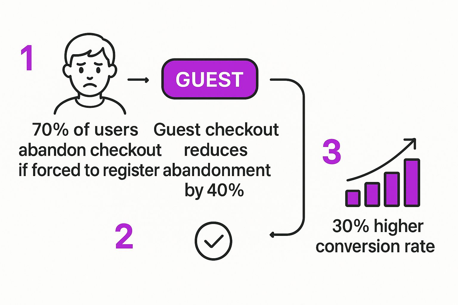
As you can see, offering a guest checkout isn't just a nice-to-have; it's one of the most powerful changes you can make to reduce cart abandonment.
Design User-Friendly Forms
Let's be honest: the forms are where most checkouts fall apart. Every single field is a potential roadblock. Your design needs to be all about speed, clarity, and offering a helping hand when needed.
Visual Progress Indicator: A simple progress bar showing the steps (e.g., "Shipping > Payment > Review") is a game-changer for user anxiety. It immediately answers the question, "How much longer is this going to take?" and provides a sense of control and momentum.
Mobile-First Design: A massive chunk of your shoppers are on their phones, so your checkout needs to be designed for thumbs, not a mouse. That means big, tappable buttons, fields that bring up the right keyboard (like the number pad for a phone number), and a clean, single-column layout that's a breeze to scroll through.
Smart Form Features: Put technology to work to make your customer's life easier.
- Address Autofill: Use tools like the Google Places API to instantly complete shipping addresses as the user starts typing. This is a huge time-saver.
- Inline Validation: Give feedback in real-time. If someone types an invalid email, a gentle error message should pop up right away—not after they’ve hit "Submit" and have to re-do the whole page.
- Clear Field Labels: This is a classic mistake. Always place labels above the input field, not as placeholder text inside it. As soon as the user clicks to type, that placeholder text vanishes, forcing them to rely on short-term memory. It’s a small detail that causes a surprising amount of frustration.
Building Unshakeable Trust and Security
When a customer gets to your checkout, they’re at the most critical point of their entire journey. They have their wallet out, ready to punch in their personal information and credit card details. At this moment, trust isn't just a nice feature—it's everything.
Your job is to make them feel completely safe and secure. This goes way beyond just having a secure website; you need to actively project trustworthiness with visual cues, reassuring language, and transparent policies. The real goal of ecommerce checkout optimization here is to head off any last-second doubts before they even have a chance to take root.
The Non-Negotiable Trust Signals
Think of trust signals as the digital version of a clean, well-lit store with friendly staff ready to help. They are the instant, visual proof that your business is legit and that your customer's data is locked down. Without them, you’re basically asking shoppers to hand over their credit card in a dark alley. It’s not going to happen.
These are the absolute baseline signals every single checkout must have:
- SSL Certificate: That little padlock icon and the "https" in your URL are completely non-negotiable. Modern browsers will literally scream at users when a site isn't secure, which is an immediate conversion killer.
- Security Badges: You have to prominently display logos from trusted security providers like Norton, McAfee, or your PCI compliance badge. Put them right next to your payment forms and main call-to-action buttons—exactly where people feel the most anxiety.
- Payment Logos: Show the logos for Visa, Mastercard, PayPal, Apple Pay, and whatever else you accept. This simple visual cue reinforces your legitimacy and quietly tells shoppers that you work with established, trusted financial companies.
If you don't have these basics covered, any other optimization efforts you make will be a waste of time. They are the price of entry for earning a customer's trust online.
Going Beyond Badges with Psychological Reassurance
Visual badges are a great start, but true confidence comes from a deeper sense of security. This is where you can lean into the psychology of trust. A few well-placed words and some transparent information can proactively answer a customer's unspoken questions and calm their nerves.
Smart checkout optimization also means focusing on usability and clarity. Things like progress bars, offering real-time support, and enabling form autofill keep shoppers moving forward and cut down on friction. When you pair these features with plenty of payment options—like mobile wallets or "buy now, pay later"—you're catering to how people actually shop today. If you're curious how these elements play out in different global markets, you can explore detailed findings on checkout optimization from Ping Identity.
A secure checkout isn't just about preventing data breaches. It's about preventing the fear of a data breach. Your design and copy must work together to make the customer feel protected and in control.
Here’s how you can implement these subtle but powerful reassurances:
- Reassuring Microcopy: Use small bits of text near sensitive fields. Right next to the credit card input, a simple message like, "Your payment is 100% secure and encrypted," can make a huge difference.
- Clear Return Policies: Don't make people dig for your return policy. A quick summary or a direct link right in the checkout ("Easy 30-day returns on all orders") takes the risk out of their decision to buy.
- Accessible Customer Support: Just seeing a phone number, email address, or a link to live chat in the checkout footer provides a powerful safety net. It tells customers that if something goes wrong, a real person is there to help them.
These details show you care about the customer's experience beyond just taking their money. They prove you're a trustworthy partner, not some faceless online store. By blending visible security with psychological reassurance, you build a checkout that doesn’t just process transactions—it builds lasting confidence.
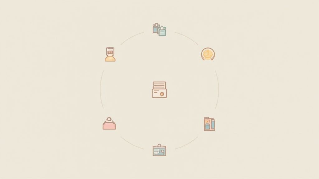
Optimizing Payments and the Post-Purchase Experience
Thinking the customer journey ends once the payment goes through? Think again. That moment is actually the start of a whole new—and incredibly important—phase. The final steps of the transaction and what happens immediately after are where you solidify trust and turn a first-time buyer into a repeat customer.
It's easy to breathe a sigh of relief when the payment is approved, but the best brands know this is where the real work of customer retention kicks off. A seamless payment process followed by a reassuring and engaging post-purchase experience is your best defense against buyer's remorse.
Offer the Right Payment Mix
One of the fastest ways to lose a sale at the very last second is by failing to offer the customer's preferred payment method. Today's shoppers expect options, and forcing them to use a method they don't trust or have on hand is a surefire way to see them abandon their cart.
But this isn't about overwhelming them with every option under the sun. That can lead to choice paralysis. The key is to offer a strategic mix that covers the most popular methods for your audience. For most stores, this means:
- Credit and Debit Cards: This is the baseline. You absolutely must accept major cards.
- Digital Wallets: Think Apple Pay, Google Pay, and PayPal. These are non-negotiable, especially for mobile shoppers who hate typing in card details on a tiny screen. The one-click convenience is a huge conversion driver.
- Buy Now, Pay Later (BNPL): Services like Klarna, Afterpay, or Affirm have exploded in popularity. They let customers split the cost into smaller, often interest-free payments. This can be a game-changer for increasing conversions and average order value, especially on higher-ticket items.
If you're selling internationally, this gets even more complex and critical. To really cater to a global audience, you should look into setting up a dedicated business account for international payments. This makes handling different currencies and local payment preferences so much easier.
Transform Your Thank You Page
The order confirmation page, or "Thank You" page, is probably the most wasted piece of real estate in all of ecommerce. Most brands treat it like a digital receipt—a dead end. But you have the full, undivided attention of a happy customer who just gave you their money. Don't waste it!
Instead of a generic "Thanks for your order," you need to turn this page into a strategic touchpoint. It's your first, best chance to start building a long-term relationship.
Don't let your Thank You page be a dead end. It’s the first page of your next sale. Use it to engage, reassure, and guide your customer on what to do next.
Here are a few things you can do to put that page to work:
- Reassure them immediately: Show a clear order summary, a prominent order number, and an estimated delivery date. This simple act calms any post-purchase jitters.
- Encourage social sharing: Add simple "share" buttons so customers can show off their new purchase. Sweeten the deal by offering a small discount on their next order if they do.
- Gather quick feedback: Pop in a simple one-question survey, like "How was your shopping experience today?" You'll get honest feedback while it's still fresh in their mind.
- Drive the next sale: Offer a time-sensitive coupon code for their next purchase. This creates a powerful incentive to come back soon.
Master Post-Purchase Communication
As soon as the order is placed, the customer's focus shifts to one question: "Where's my stuff?" Radio silence from your end is a recipe for anxiety, frustration, and a wave of customer service tickets. Clear, proactive communication is everything.
Your order confirmation email needs to hit their inbox instantly. Make it clean, mobile-friendly, and packed with all the essentials: order number, items purchased, total cost, and the shipping address. This is their official receipt and a critical piece of reassurance.
After that, proactive shipping notifications are a must. Don't make the customer hunt for a tracking number. Send automated updates for key milestones:
- When the order has shipped (with the tracking link front and center).
- When it's out for delivery.
- When it has been successfully delivered.
This level of transparency builds immense trust. It shows you're on top of things and that you care about keeping them in the loop. This simple communication flow dramatically cuts down on "Where is my order?" (WISMO) questions, freeing up your support team and creating happier, more confident customers who will be far more likely to buy from you again.
Common Checkout Optimization Questions
When you start digging into checkout optimization, you'll quickly find that a few key questions come up over and over again. I've seen countless store owners wrestle with the same hurdles when trying to tighten up their checkout flow.
Let's cut through the noise. Here are the most frequent questions I get, along with practical answers based on years of experience optimizing stores just like yours.
Should I Force Users to Create an Account?
The short answer? Almost never.
Forcing someone to create an account before they can give you their money is one of the most infamous conversion killers in ecommerce. It's like putting a locked door between a customer and the cash register. It’s an immediate, frustrating, and totally unnecessary barrier.
You should always lead with a prominent, easy-to-find guest checkout option. This shows respect for your customer's time and their desire to just get the transaction done.
If you still want to encourage account creation, the perfect time is after the purchase is complete. On the "Thank You" page, you can offer a simple, one-click option to save their details for next time by creating a password. This frames it as a helpful convenience, not a roadblock.
A mandatory account wall feels like a pop quiz before a purchase. A guest checkout is an express lane. Always offer the express lane.
How Should I Display Shipping Costs?
Transparency is everything here. The single biggest mistake you can make is surprising a customer with unexpected shipping costs on the final review page. This "sticker shock" is a massive driver of cart abandonment.
The key is to be upfront about costs as early as you possibly can.
- Add a Shipping Calculator: Put a shipping cost estimator right on the cart page. This lets users see their all-in price before they even start the checkout process. No surprises.
- Shout About Free Shipping: If you offer free shipping (even with a minimum order), this needs to be one of the most visible messages on your entire site. Use a top banner, display it on product pages, and repeat it in the cart.
- Show Delivery Timelines: Don't just show the cost; provide estimated delivery dates. This manages expectations and builds another layer of trust with the shopper.
Getting this right is critical. In fact, most guides on how to reduce cart abandonment point directly to surprise costs as the primary reason people leave.
What Should I A/B Test First?
With so many variables in a checkout flow, it’s easy to feel overwhelmed. The trick is to focus on the areas with the biggest potential for friction and the biggest impact on your bottom line. Use your analytics and session recordings to form a hypothesis about where people are struggling.
A few great places to start your A/B testing include:
- Layout: Test your current single-page checkout against a multi-page accordion style (or vice versa). This is a major structural change that can have a huge effect on how users move through the process.
- Call-to-Action (CTA): Experiment with the text, color, and placement of your main "Complete Purchase" button. You’d be surprised how much a small tweak can lift conversions.
- Form Fields: Try removing non-essential fields. Do you really need a phone number? Does asking for a "Company Name" cause a drop-off? Test a simplified version of your form and measure the result.
For a deeper dive into more testing ideas and other essential strategies, this comprehensive ecommerce checkout optimization guide is a fantastic resource that offers some additional perspectives.
How Many Payment Options Are Too Many?
Your goal should be to provide relevant, trusted choices, not a dizzying list that causes choice paralysis. For most stores, it's about quality over quantity.
A solid, effective payment mix usually includes:
- Major Credit Cards: Visa, Mastercard, and American Express are non-negotiable.
- Digital Wallets: PayPal, Apple Pay, and Google Pay are table stakes, especially for mobile shoppers who value convenience.
- Buy Now, Pay Later (BNPL): Services like Klarna or Afterpay can dramatically increase conversions and average order value, particularly for higher-priced products.
This combination covers the vast majority of customer preferences without cluttering the interface. Dig into your own customer data to see which methods are most popular for your audience and make sure those are front and center.
Ready to stop losing sales to a clunky checkout? The team at ECORN specializes in Shopify development and conversion rate optimization. We build seamless checkout experiences that turn browsers into loyal customers. Book a call with us today and let's optimize your most critical revenue funnel.


Shopify Visual Merchandising: A Playbook for Higher Sales

Shopify Landing Page Design: Master Conversion in 2026
10 Best AI SEO Optimization Tools for Shopify in 2026

Agentic AI for Ecommerce: Boost Your Sales in 2026
Mastering Email Marketing Data for eCommerce Growth
Conversion Rate Optimisation Australia: Boost Your Sales
Conversion Rate Optimization AI: Your Shopify Store Guide

10 Product Bundling Strategies for Shopify in 2026
How to Increase Customer Lifetime Value: A Shopify Playbook
AI Customer Service Automation: Shopify Guide 2026
Clean Website Design: A Shopify Conversion Playbook

Omnichannel Retail Strategy: A Shopify Playbook
Product Data Enrichment: A Guide for Shopify Brands
Instagram Shopping Features a Guide for Shopify Stores

What Is Revenue Optimization: A Holistic RevOps Guide
Benefits of Conversion Rate Optimization: Boost Your
WordPress to Shopify Migration: Your 2026 Seamless Switch
Boost Sales: Ecommerce Payment Processing Guide 2026
Unified Commerce Platform: Benefits, KPIs & Shopify Guide

How to Reduce Bounce Rate eCommerce: Your 2026 Guide

Shopify API Integration: A Practical End-to-End Guide

How to Implement Data Governance: A 2026 Guide

Shopify Store Development Cost: A 2026 Breakdown
What Is Server Side Tracking: The Shopify Guide 2026

Marketing Automation Workflows: A Shopify Guide for 2026

Shopify: How to Reduce Technical Debt

Shopify UX Design Change: A Playbook for Growth

User Generated Content Strategy: Shopify Playbook

Shopify Pause and Build Plan Cost: A Complete 2026 Guide

Compare at Price on Shopify: A Complete Guide for 2026

Where Can I Sell My Prints? 10 Best Platforms for 2026

Shopify Order Management System: The Ultimate Guide 2026

What Is Marketing Attribution? an eCommerce Guide for 2026

10 Best Black Friday Sales Sheets for 2026

Discover the Top Social Media Marketing Agencies For

Consumer Confidence Definition for eCommerce in 2026

What Is Social Commerce? Your 2026 Guide to Boosting Sales

A Social Ad Campaign Playbook for eCommerce Growth

7 Best FAQ Page Examples for SaaS & eCommerce

Market Research in Fashion Industry: A Guide for Shopify

Shopify Migration Services: Expert Guide for 2026

Mastering FB Retargeting Ads for Shopify in 2026

What Is Omnichannel Ecommerce

Master Your Shopify Plus Migration: The 2026 Guide

Shopify Integration Services: A Merchant's 2026 Guide

Shopify Collection Description: A Guide to SEO & Sales

Shopify Plus Contact: Reach Sales & Support Effectively

Top Luxury Shopify Stores: Design & UX Strategies

How to Improve Customer Experience: A Shopify Roadmap

Creative Facebook Ads: 10 Examples for Shopify Brands

Remarketing with Facebook Ads: A Shopify Guide for 2026

SEO Linking Strategies for Shopify Stores

Top 7 Statistics YouTube Channels for eCommerce in 2026

Hiring Shopify Plus Designers: A Founder's Guide

Shopify Product Variation: Master Your Variants for 2026

Leverage Ai Solutions Brands: Your 2026 Shopify Growth Guide

Filters in Shopify: A Guide for Growing Brands

Shopify Plus Developer: A Guide for Growing Brands

When Does Black Friday Online Start? A 2026 Guide

Black Friday Email Marketing: Shopify & Klaviyo Guide

Polaris Design System: The Complete Shopify Guide

How to Hire a Consultant Email Marketing Expert

What Is Q4? A Shopify Merchant's Guide to Peak Season

Marketing Organization Structure for eCommerce Growth

Top Account-Based Marketing Agency Guide for 2026

7 Remarketing Ad Examples for Your 2026 Campaigns

AI Retail Solutions: Boost Your Shopify Store

Migrate to Shopify: The Definitive 2026 Guide

Shopify Authentication App: A Guide for Secure Stores

Why Strategic Marketing Is Important for Growth in 2026

How to Create a Size Chart in Shopify: 2026 Guide

Shopify Themes for Jewelry: The Definitive 2026 Guide

Minimal Shopify Templates: Faster, Higher-Converting Stores

Maximize Profit: Shopify CC Fees 2026 Guide

Best Shopify Apps for Beginners in 2026

How to Improve Online Shopping Experience in 2026

Shopify Design and Development Services: A 2026 Guide

Small Business Social Media Marketing Agency: A Hiring Guide

Bulk Edit Shopify: A Guide to Save Hours on Store Updates

2026 Trends in Food and Beverage Industry

Post Purchase Survey Guide for Shopify Stores

How to Build an Ecommerce Brand in 2026

Conversion Rate Optimization for Ecommerce: Maximize Profit

How to Use Customer Data to Increase Sales: A Guide

Shopify for Enterprise: The 2026 Deep Dive Guide

Email Marketing Agencies: The Guide for Shopify Brands

Boost Sales With The Right Shipping Shopify App

Your Guide to the Shopify Site Map

7 Headless Commerce Examples for 2026

Mastering Trends in Cosmetic Industry for 2026

Transfer Shopify to BigCommerce The Complete 2026 Playbook

What Is Shopify Collective? Your 2026 Guide to Success

Unlock Shopify Growth with Site Link SEO

Integrating Shopify and WordPress A Complete Guide for 2026

Naming a Clothing Store: A Shopify Founder's Playbook

Guide to buying shopify store in 2026

Buying shopify store: Buying a Shopify Store: Invest Wisely

Food & Beverage Marketing: A Complete Guide for 2026

Facebook Ads Agency: A Shopify Brand's Hiring Guide

Shopify Apparel Stores: A 2026 Launch & Scale Guide


newsletter in your inbox