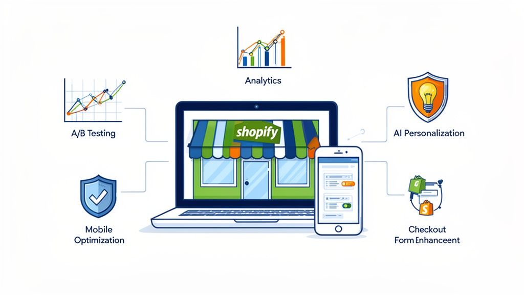
Optimizing your conversion funnel is really about smoothing out the bumps in the road your customers travel from their first "hello" to the final "buy now." It's a hands-on process of finding and fixing all those little (and big) friction points that cause people to leave, so you can turn more curious visitors into happy, loyal customers.
What a Healthy Conversion Funnel Looks Like

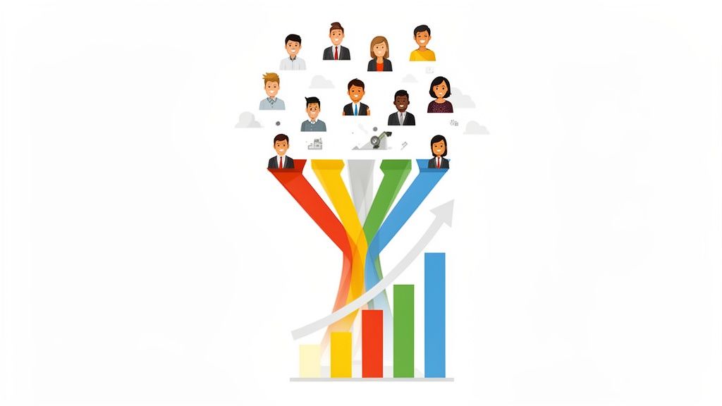
You’ve probably seen diagrams like the classic AIDA model (Awareness, Interest, Desire, Action) above. It's a decent starting point for visualizing the journey, but in the real world, a high-performing funnel is much more than a simple, clean graphic. It’s a seamless, almost invisible path that guides a user from their first look to the final sale.
Frankly, it's less of a rigid structure and more of a fluid journey that adapts to how your customers actually think and behave. This path is going to be different for every business, whether you're selling handmade jewelry or enterprise-level software.
The real trick is to map your specific customer journey to find those make-or-break moments where users either move forward with confidence or get frustrated and leave. A healthy funnel is almost always built on a solid foundation of the best online marketing strategies, which ensures you're getting a steady stream of the right kind of traffic. It all starts with seeing your store through your customer’s eyes—a crucial first step before you even think about changing a button or tweaking a headline.
The Anatomy of a High-Performing Funnel
A truly healthy funnel isn't just about nailing the final sale. It’s about making every single interaction count. This means each stage has a clear job to do and a specific set of metrics you can watch to see how well it's performing. Let's break down what this looks like in practice.
The Awareness Stage (Top of Funnel): This is your first impression. It's where potential customers first stumble upon your brand. Success here means your landing pages are compelling, your ads hit the mark, and your content genuinely solves a problem or answers a question. You'll want to keep an eye on traffic sources, new user sessions, and bounce rate.
The Consideration Stage (Middle of Funnel): Okay, you've got their attention. Now they're evaluating your products and sizing you up against the competition. A strong middle-funnel experience has detailed product pages, persuasive reviews or case studies, and social proof that’s easy to find. Here, we're tracking metrics like time on page, email sign-ups, and the add-to-cart rate.
The Conversion Stage (Bottom of Funnel): This is the moment of truth. They're ready to pull the trigger. A healthy conversion stage has a dead-simple, frictionless checkout process with transparent pricing, plenty of payment options, and trust signals like security badges. The number one metric here is, without a doubt, the checkout completion rate.
Pinpointing Your Funnel's Vital Signs
To get a real handle on your funnel's performance, you need a clear dashboard of metrics. I've seen the difference between a struggling store and a wildly successful one come down to how closely they monitor these numbers.
A healthy funnel provides a clear, logical path for users, making the next step feel intuitive and easy. It anticipates user questions and removes obstacles before they become reasons for a visitor to leave.
The data tells the story. The reason we obsess over conversion funnel optimization is because the gap between average and great is enormous. Average website conversion rates can hover around 2.35%, while better sites can hit 5.31% or more. The top performers? They're often clearing 11%. That massive spread represents a huge opportunity, where even small, targeted improvements can lead to a significant boost in revenue.
To help you get started, here's a quick reference table that breaks down the funnel into its core components. Think of this as your cheat sheet for diagnostics.
Key Conversion Funnel Stages and Metrics
By keeping a close watch on these specific KPIs for each stage, you can quickly identify where your funnel is leaking and focus your optimization efforts for the biggest impact.
Finding and Fixing Your Funnel's Leaks
Let's be honest: every single conversion funnel leaks. That’s just a fact of life in eCommerce. The real difference between a struggling store and a thriving one is the ability to find and plug those leaks, turning lost revenue into predictable growth. This means you have to become a bit of a data detective, figuring out exactly where customers are dropping off and, more importantly, why.
To do this right, we need to look past surface-level stats like bounce rate. The real answers come from blending quantitative data (the "what") with qualitative insights (the "why"). This two-pronged approach is the heart and soul of effective conversion funnel optimization.
Becoming a Data Detective
Your investigation starts with a bird's-eye view of user behavior. This is where a tool like Google Analytics is your best friend. Don't just glance at traffic numbers; you need to dig into the reports that show how people actually move through your site.
The User Flow report is a fantastic place to begin. It draws a visual map of the paths visitors take from the moment they land. You’re hunting for unexpected drop-offs or frustrating loops where people seem stuck, clicking back and forth between pages without ever moving forward.
Here’s a look at a Goal Flow report in Google Analytics, which maps out the specific journey toward a conversion.
This kind of report makes it painfully obvious where users are abandoning the process. It helps you zero in on the most critical steps that are crying out for attention.
Another powerful quantitative method is a dedicated funnel analysis. When you set up a custom funnel for a crucial process, like your checkout flow, you can see the precise completion rate for each step. If you see a massive drop-off between someone adding an item to their cart and reaching the payment page, for instance, you've just found a major red flag. For a more detailed walkthrough, our complete guide to conversion funnel analysis breaks down exactly how to set these up.
Uncovering the 'Why' Behind the Numbers
Analytics tells you what is happening, but it rarely tells you why. For that, you need to get closer to the actual user experience with tools like heatmaps and session recordings.
- Heatmaps give you a visual aggregate of where users click, how they move their mouse, and how far down the page they scroll. You might discover that dozens of people are trying to click on an image that isn't actually a link, or that they’re completely scrolling past your main call-to-action button.
- Session recordings are like watching over a user's shoulder. Spending an hour watching recordings of users who abandon their carts can be one of the most eye-opening things you do. You might see them wrestle with a confusing form field or get visibly frustrated when an unexpected shipping cost pops up at the last second.
The goal isn't just to spot where users leave; it's to understand their frustration. When you can almost feel their pain point through the screen, you’re on the right track to finding a real solution.
To effectively pinpoint and solve these issues, you have to think about the entire customer experience from start to finish. A great guide on customer journey optimization offers proven strategies for turning that user confusion into conversion by improving every single touchpoint.
Directly Asking Your Users for Clues
Sometimes, the easiest way to find a leak is just to ask. Never underestimate the power of getting direct feedback from the people who matter most.
- On-site surveys: On a page with a high exit rate, try a small, unobtrusive pop-up survey. A simple question like, "Was there anything you were looking for today that you couldn't find?" can yield gold.
- Exit-intent pop-ups: When a user’s cursor moves to leave the checkout page, you can trigger a pop-up. Offer a small discount in exchange for answering one simple question: "What's stopping you from completing your purchase today?"
- Post-purchase surveys: Your new customers are an incredible resource. Ask them what almost stopped them from buying. Their memory of any friction in the buying process is still fresh and can provide invaluable insights.
By weaving these methods together—using analytics to find the problem spots, behavior tools to see the struggle, and direct feedback to finally hear the "why"—you'll build a clear, data-backed list of your funnel's biggest weaknesses. These aren't just hunches; they're your roadmap to meaningful optimization.
Optimizing the Top of Your Funnel

The top of your funnel (ToFu) is your one shot at a first impression. This is that make-or-break moment where a casual browser either gets hooked or bounces, gone forever. Effective conversion funnel optimization all starts here, by making this initial touchpoint as compelling as possible.
Your main job is to answer a visitor’s unspoken question—"Am I in the right place?"—in under five seconds. That means your value proposition has to be razor-sharp, your headlines have to grab them, and your design needs to feel clean and intuitive. This isn't just about looking good; it's about building instant trust.
Crafting a Magnetic First Impression
Think of your landing pages as the front door to your store. If they're cluttered, slow, or confusing, you’ve essentially jammed the lock. A great landing page tells a visitor exactly who you are, what you offer, and why they should stick around—immediately.
I've found that a minimalist design often wins. It helps guide the eye to what truly matters: a strong, benefit-focused headline and an unmissable call-to-action (CTA). Instead of a bland "High-Quality Leather Bags," try something that hits an emotional chord, like "The Last Bag You'll Ever Need to Buy." See the difference? One sells a product, the other sells a solution.
You have to obsess over the user experience. Is the navigation straightforward? Can people easily find and click your buttons? These seemingly small details have a massive impact on bounce rates. Trust me, a frustrating website is the fastest way to lose a potential customer before their journey even starts.
The Power of Personalization and Clarity
One of the best ways to nail the top of your funnel is with simple personalization. You don’t need a super-complex system to get started. Just creating different landing pages for different ad campaigns can work wonders. This ensures the message a user sees in your ad is perfectly mirrored on the page they land on.
For example, if you're running a Facebook ad for new parents about "spill-proof baby clothes," your landing page headline better shout that exact promise. This consistency creates a seamless experience, reassures visitors, and builds confidence in your brand right away.
Here are a few quick wins for your ToFu experience:
- Refine Your CTAs: Get specific. Ditch the generic "Submit" and try something like "Get Your Free Style Guide" or "Start My 30-Day Trial." It tells the user exactly what they're getting.
- Prioritize Page Speed: A one-second delay in page load time can slash conversions by a staggering 7%. Use a tool like Google's PageSpeed Insights to find and fix what's slowing you down.
- Ensure Mobile Responsiveness: With more than half of all web traffic on mobile, this is non-negotiable. Your site has to look and work flawlessly on a small screen, which means big, tappable buttons and text that’s easy to read.
Turning Visitors into Engaged Prospects
Let's be realistic. Not everyone who lands on your site is ready to buy on the spot. A huge chunk of your traffic is just browsing. This is where a smart conversion funnel strategy shines, because it acknowledges that the customer journey has multiple steps.
The hard truth is that only about 3% of website visitors convert on their first visit. This makes it absolutely critical to have a plan for re-engaging the other 97%. But with 68% of businesses not having a clearly defined funnel, most of this potential just walks out the door.
This is why capturing an email address with a valuable offer—like a discount or a genuinely helpful guide—is such a massive win at this stage. It lets you take the conversation to a more personal channel where you can nurture that relationship. The goal is to turn a casual browser into an engaged prospect who actually wants to hear from you again. For a deeper look, check out our complete guide on how to increase your eCommerce conversion rate with proven strategies. It's the foundation for turning fleeting interest into real, long-term revenue.
Driving Action in the Middle and Bottom of the Funnel
Alright, so you've managed to grab a visitor's attention. That's half the battle, but now the real work begins. The focus shifts from getting them in the door to guiding them toward a decision. This is the heart of the middle and bottom of your funnel, where casual browsing needs to transform into confident buying.
Your job is to build unshakable trust and make the path to purchase as smooth as possible. We're moving beyond "Hmm, that's interesting" and aiming for "Okay, I absolutely need this." Getting this transition right is the key to conversion funnel optimization in these later stages.
Building Unbreakable Trust with Social Proof
Let's be honest, people are skeptical. You can't just tell them your product is great; you have to prove it. This is where social proof becomes your secret weapon. When potential customers are on the fence, they're actively hunting for signals that they're making a smart choice.
But not all social proof is created equal. A generic, one-line testimonial just doesn't cut it anymore. You need authentic, compelling stories that your ideal customer can see themselves in.
Authentic Customer Reviews: Don't just show star ratings. Feature detailed reviews that tell a story. Look for the ones that describe the customer's initial problem and explain exactly how your product provided the solution. Make sure these are front and center on your product pages.
Powerful Video Testimonials: There's something uniquely persuasive about video. A short, genuine clip of a happy customer sharing their excitement can dissolve doubt in a way that no amount of written copy ever could.
Detailed Case Studies: If you sell more complex or expensive products, case studies are non-negotiable. They offer a clear "before-and-after" narrative, backing up your claims with hard data and tangible results.
The ultimate goal is to make your buyer feel like they're joining a club of smart, satisfied people. When they see that others just like them have already won by choosing your product, their fear of making a mistake evaporates.
By strategically weaving these elements into your site, you’re proactively answering that quiet, internal voice of doubt and replacing it with confidence.
Crafting Product Pages That Actually Convert
Think of your product pages as the main event. This is the moment of truth where a visitor decides if what you're offering is truly for them. A great product page isn't just a picture and a price; it's a comprehensive sales pitch that anticipates and resolves every question a buyer might have.
It all starts with your visuals. Use high-resolution photos from every conceivable angle. Show the product in use. Add a 360-degree view if you can. Let people zoom in and inspect every last detail. The more clearly they can visualize themselves owning and using it, the closer they are to clicking "Add to Cart."
Your product descriptions have to work just as hard. Ditch the jargon and focus on benefits, not just features. Instead of saying "water-resistant fabric," try "keeps your gear bone-dry, even in a downpour." You're selling the outcome, not the spec sheet.
Streamlining the Final Hurdle: The Checkout
You've done all this work to get a customer to the checkout. This is the one-yard line—don't fumble the ball now. The checkout is notoriously leaky, and it's almost always because of a clunky, confusing, or surprising process.
Your mission is simple: eliminate friction. Every extra form field, every unexpected shipping fee, every moment of hesitation is a potential exit point.
Take a look at this data from the Baymard Institute on why people abandon their carts.
It’s staggering how often seemingly small hurdles, like forcing someone to create an account, directly kill a sale.
To fix this, make your checkout an absolute breeze. Offer guest checkout. Show all costs—including shipping—right from the start. Integrate one-click payment options like PayPal or Apple Pay. And don't forget to display security badges prominently to reassure customers that their data is safe.
Using Strategic Offers to Close the Deal
For some customers, even a perfect experience isn't enough to get them over the line if the price feels too high. A well-timed, strategic offer can be the final nudge they need. This is where you can get creative with pricing and payment structures.
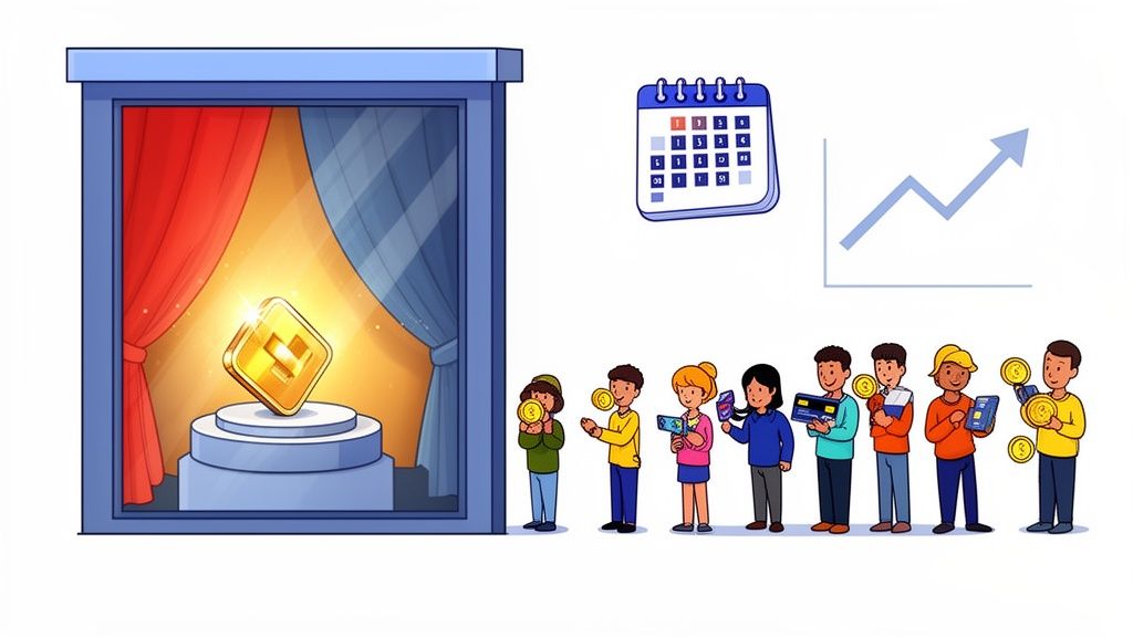
A "tripwire" offer, for example, is a fantastic strategy. It’s a low-cost, low-risk initial product designed to convert a prospect into a first-time customer. Once someone has made that small purchase, they are exponentially more likely to buy your main, higher-priced product down the road.
One well-documented case study saw a business use a $5.60 tripwire product to funnel customers toward a $297 core offer. This single strategy became the engine driving the majority of their income. You can find more breakdowns of these tactics, like in this summary of tiered funnel strategies from a past summit.
The lesson here is that by directly addressing price concerns with smart, flexible offers, you can capture hesitant buyers and dramatically increase the overall value of your funnel.
Building Your System for Continuous Improvement
Thinking you can fix your conversion funnel with a one-off project is a common mistake. True optimization is a mindset, a core business process you never stop refining. Once you’ve used data to pinpoint the leaks, it's time to shift from just finding problems to systematically fixing them. This means building a reliable system for A/B testing and experimentation.
Simply changing button colors or rewriting headlines on a whim is like throwing darts in the dark. You might get lucky, but it's not a strategy. Instead, you need to form powerful hypotheses based on the data you’ve already collected.
A strong hypothesis isn't a guess; it's an educated statement. For example: "We believe that adding customer testimonials directly below the 'Add to Cart' button will reduce hesitation and increase conversions by 15%. Our user feedback showed a clear lack of trust at this specific stage." This approach turns every change into a measurable experiment, ensuring you’re always learning and moving forward.
Prioritizing Your Tests for Maximum Impact
Once you have a list of data-backed hypotheses, you'll immediately face a new challenge: what to test first? Trying to fix everything at once is a recipe for chaos and muddy, inconclusive results. You need a simple but effective framework to prioritize your efforts.
One of the most practical methods I've used over the years is the PIE framework. It stands for Potential, Importance, and Ease. For every test idea, you score each of these three factors on a scale of 1 to 10.
- Potential: How much room for improvement is there on this page? A page with a staggering 90% drop-off rate has far more potential than one with a 5% leak.
- Importance: How valuable is the traffic to this page? Your checkout page might get less traffic than your homepage, but it's infinitely more important because every visitor has high purchase intent.
- Ease: How difficult will this test be to implement? A simple headline change is a low-effort task you can knock out in an afternoon. A complete checkout redesign, on the other hand, is a major project.
Just add up the scores. This gives you a clear, data-informed priority list. It's a lifesaver for ensuring you’re focusing your limited time and resources on the changes that promise the biggest wins for the least amount of effort.
Running Clean and Effective A/B Tests
With your prioritized list ready, it's time to actually start testing. The goal here is to run clean experiments that give you results you can trust. This process is absolutely fundamental to building a smarter, more profitable funnel.
At its core, A/B testing is pretty straightforward: you split your traffic, showing one version of your page to one group (the control) and a modified version to another (the variation).

By comparing how many people convert on each version, you can see definitively if your change had a positive, negative, or neutral impact. Tools like VWO are fantastic for this, allowing you to set up and manage these experiments without needing a developer for every little change. You can see how each variation is performing in real-time and know exactly when you've found a winner.
A critical mistake I see all the time is stopping a test too early. You have to run it long enough to reach statistical significance. This means you have enough data to be confident the result isn't just a random fluke. Most testing tools will tell you when you've hit this point, which is typically at a 95% confidence level.
This systematic approach creates a powerful feedback loop. Every test—whether it wins or loses—gives you a valuable insight that deepens your understanding of your customers. For more strategies to keep the momentum going, check out these excellent conversion funnel optimization tips. It’s this ongoing cycle of testing and learning that turns good funnels into truly great ones.
Frequently Asked Questions About Funnel Optimization

Even with the best guides, some common questions always pop up when you start digging into funnel optimization. I hear these all the time, so let's clear them up and get you moving in the right direction.
Where Should I Start Optimizing My Funnel?
Everyone's first instinct is to go straight to the top of the funnel (ToFu) to pour more traffic in. It makes sense on the surface, but it's usually the wrong move.
My advice? Start at the very bottom, with your checkout process.
Think about it: the people who reach checkout have already jumped through every other hoop. They want to buy. A 10% improvement in your checkout conversion rate is pure profit, a far more immediate win than a 10% boost in top-of-funnel traffic, which you still have to convert.
It's like fixing the biggest leak in your bucket before you turn on the faucet. Once you've solidified that final step, every drop of new traffic you add to the top has a much better chance of making it all the way through.
After your checkout is running smoothly, then you can work your way back up the funnel with confidence.
How Long Does It Take to See Results?
This is the classic "it depends" question, but the answer really boils down to one thing: your website traffic.
- High-Traffic Stores: If you're seeing thousands of visitors every day, you could get statistically significant results from an A/B test in just a few days or a couple of weeks.
- Low-Traffic Stores: For smaller sites, gathering enough data to make a confident call might take a month or even longer. Patience is key here.
Simple changes, like rewriting a headline or tweaking a button color, can show an impact pretty quickly. On the other hand, bigger projects like a full checkout redesign will take longer to test but often deliver the most significant, lasting gains. Just remember, conversion funnel optimization is a marathon, not a sprint—it's about continuous improvement.
What Are the Essential Tools for Funnel Optimization?
You don't need a massive, expensive tech stack to make a real difference. You can get incredibly far with just a few core tools, many of which have free versions.
Here’s the starter kit I recommend:
- Web Analytics: This is non-negotiable. You need something like Google Analytics to track user behavior, see where people are dropping off, and understand your traffic sources.
- User Behavior Tools: To understand why users are dropping off, you need to see how they interact with your site. Tools like Hotjar or Microsoft Clarity offer heatmaps and session recordings, and their free plans are surprisingly powerful.
- A/B Testing Platforms: To prove your ideas work, you need to run experiments. While Google Optimize has been sunset, other platforms like VWO or Optimizely are industry standards for running sophisticated tests.
Start with analytics to find the "what," then layer in behavior tools to uncover the "why."
Can I Really Optimize My Funnel on a Small Budget?
Absolutely. Some of the most effective optimization work is done with completely free resources.
You can get all the quantitative data you need from Google Analytics. You can watch real users interact with your site using Hotjar's free plan. Need customer feedback? Skip the pricey survey software and use Google Forms to ask your customers what they think.
Your most important asset isn't a huge budget; it's a disciplined, data-informed process. Spend your time digging into the data you already have, forming smart hypotheses, and testing simple changes that have the potential for a big impact.
At ECORN, we live and breathe this stuff. We specialize in transforming these optimization principles into real, measurable growth for Shopify stores. Our team uses a data-first approach to find opportunities and run tests that directly boost your bottom line. Check out how we can help optimize your conversion funnel.


