The final step in any online purchase, the checkout, is often the most overlooked part of the customer journey. It is the digital equivalent of the final handshake, the moment where a potential sale becomes a confirmed order. However, according to research from the Baymard Institute, nearly 70% of online shopping carts are abandoned before the purchase is complete. This staggering number highlights a critical revenue leak for countless businesses. The primary culprit is often a clunky, confusing, or untrustworthy checkout process.
This article moves beyond generic advice to deliver a comprehensive guide to the most essential ecommerce checkout best practices. We will break down eight specific, actionable strategies that you can implement immediately to streamline your customer's path to purchase. From offering guest checkout and displaying trust signals to optimizing for mobile and providing transparent pricing, you will learn how to build a seamless experience. By focusing on these crucial optimizations, you can transform your checkout from a conversion killer into a powerful and reliable conversion driver, securing sales that would otherwise be lost. We will explore how to recapture that lost revenue by refining this final, critical stage.
1. Simplify the Checkout Process with Minimal Steps
The single most impactful ecommerce checkout best practice is to reduce friction by minimizing the steps a customer must take to complete a purchase. According to research from the Baymard Institute, a complicated or long checkout process is a top reason for cart abandonment. By condensing information collection into fewer pages, or even a single page, you make the journey feel faster and more intuitive, directly boosting your conversion rate.
A streamlined flow doesn’t just mean fewer clicks; it means a smarter, more efficient user experience. This approach respects the customer's time and reduces the cognitive load required to make a purchase.

How to Implement a Simplified Checkout
Implementing a simplified checkout requires a strategic approach to information architecture. The goal is to collect necessary data without overwhelming the user.
- Single-Page vs. Multi-Step: While a single-page checkout displays all required fields at once, a well-designed multi-step process with clear progress indicators can also be highly effective. The key is to test which format resonates best with your audience.
- Progressive Disclosure: Use techniques like accordion-style sections (as seen in many Shopify checkouts) where users only see the fields for one section at a time, such as "Shipping" or "Payment," keeping the interface clean and focused.
- Remove Optional Fields: Scrutinize every form field. Does asking for a second address line or a company name truly add value? If a field isn't essential for order fulfillment or critical marketing data, remove it.
A prime example is Warby Parker, which guides users through a clean, logical flow, or Apple, whose purchase process feels almost effortless. The ultimate benchmark remains Amazon's patented one-click checkout, which eliminates nearly all steps for returning customers.
To further optimize, use smart defaults for shipping options and leverage browser auto-fill capabilities for addresses and payment information. This simple step can dramatically speed up the process and reduce user frustration.
2. Offer Guest Checkout Options
Forcing users to create an account before they can buy is one of the most notorious conversion killers in ecommerce. Offering a guest checkout option removes this significant barrier, directly addressing a primary reason for cart abandonment. This practice respects the customer's desire for a quick, low-commitment transaction, particularly crucial for first-time buyers who are not yet loyal to your brand.
By providing a path to purchase without the friction of registration, you cater to user convenience and signal that you value their time. This simple yet powerful ecommerce checkout best practice can immediately improve your conversion rates and reduce user frustration.

How to Implement Guest Checkout Effectively
A successful guest checkout implementation is about making the non-account path as seamless as possible while still encouraging account creation at the right moment.
- Make Guest Checkout the Primary Path: Position the guest checkout option as the most prominent or default choice. Use clear, simple language like "Continue as Guest" versus "Sign In" or "Create Account," guiding impatient shoppers directly toward completion.
- Offer Post-Purchase Account Creation: Once the transaction is complete, prompt the user to create an account using the information they've already provided. Frame it as a benefit, for example, "Save your details for next time" or "Track your order easily," turning a past point of friction into a present-day convenience.
- Collect Minimal Information: The spirit of guest checkout is speed. Only ask for the absolute essentials needed to process and ship the order: name, email (for receipts and tracking), shipping address, and payment details. Every additional field increases the risk of abandonment.
Retail giants like Target and Best Buy showcase this principle perfectly by presenting guest checkout as an equally valid, if not preferred, option. Similarly, ASOS makes the guest journey effortless, only offering the option to save details after the payment is confirmed, capturing both the immediate sale and the potential for a future registered customer. This approach strikes the ideal balance between business needs and a superior customer experience.
3. Display Trust Signals and Security Badges
One of the most effective ecommerce checkout best practices is to alleviate customer anxiety by prominently displaying trust signals. When users are asked to share sensitive credit card and personal information, their primary concern is security. By visually reassuring them that their data is safe, you build the confidence needed to overcome hesitation and complete the purchase.
These signals act as a digital handshake, communicating legitimacy and reliability at the most critical point in the customer journey. Failure to establish this trust is a direct path to an abandoned cart, especially for new customers unfamiliar with your brand.

How to Implement Trust Signals in Your Checkout
Strategically placing visual cues of security and reliability involves more than just adding a logo. It’s about integrating them seamlessly into the checkout flow where user doubt is highest.
- Place Badges Strategically: Position recognizable security badges like Norton Secured, McAfee SECURE, or your SSL certificate logo directly beside the payment information fields. Also, display logos of accepted payment methods (Visa, Mastercard, PayPal) to reinforce legitimacy.
- Showcase Guarantees: Clearly display money-back guarantees, satisfaction promises, or hassle-free return policies near the final "Complete Order" button. This reduces the perceived risk of the purchase.
- Provide Clear Contact Information: Including a visible customer service phone number, email, or live chat link on the checkout page signals that a real team is available to help, which greatly enhances trust.
- Leverage Third-Party Endorsements: If you have accreditations from organizations like the Better Business Bureau (BBB) or high ratings on platforms like Trustpilot, feature these badges to provide unbiased social proof.
A great example is seeing the PayPal or Stripe security emblems on a small business site; it borrows trust from these globally recognized payment giants. Similarly, major e-commerce platforms like Shopify automatically include security language and badges in their checkout templates because they understand their powerful impact on conversion rates. By making security a visible priority, you address a core user fear and remove a significant barrier to purchase.
4. Optimize for Mobile Devices
With mobile commerce accounting for the majority of online sales, optimizing your checkout for mobile devices is no longer optional; it's an essential ecommerce checkout best practice. A desktop checkout simply shrunk down to a smaller screen creates a frustrating user experience, leading to high abandonment rates. A true mobile-first approach considers the unique constraints and behaviors of mobile users, such as smaller screens, touch-based interaction, and on-the-go purchasing.
Designing specifically for mobile ensures the process is seamless and intuitive, catering to how customers actually shop today. This focus on mobile UX directly addresses a massive segment of your audience, preventing lost sales from a clunky, difficult-to-navigate interface.

How to Implement a Mobile-Optimized Checkout
Effective mobile optimization goes beyond simple responsive design. It requires a thoughtful redesign of the entire checkout flow with the mobile user at the center.
- Design for Touch: Ensure all buttons, links, and form fields are large enough to be easily tapped with a thumb. Avoid placing interactive elements too close together to prevent accidental clicks.
- Simplify Form Fields: Keep forms as lean as possible. Use single-column layouts, and ensure mobile keyboards automatically display the correct format (e.g., a number pad for phone numbers or credit card fields). Leverage address auto-complete and auto-fill features to minimize typing.
- Integrate Mobile Wallets: The most significant mobile optimization is offering one-tap payment options. Integrating Apple Pay, Google Pay, and Shop Pay allows users to bypass manual entry of shipping and payment details, drastically reducing friction and checkout time.
Excellent examples of this in action include Nike's responsive checkout, which provides a clean and tappable interface, and Sephora's mobile app, which streamlines the purchase flow for its loyal customers. Both prioritize speed and ease of use, recognizing that mobile shoppers value efficiency above all. Testing your checkout process on various devices and screen sizes is critical to identifying and fixing any usability issues before they impact your customers.
5. Provide Multiple Payment Options
Failing to offer a customer's preferred payment method is one of the quickest ways to lose a sale at the final hurdle. An ecommerce checkout best practice that directly addresses this is providing a diverse range of payment options. Not every shopper wants to use a credit card, and catering to preferences for digital wallets, buy-now-pay-later (BNPL), and other methods builds trust and removes a major point of friction.
By accommodating various payment habits, you make your checkout more inclusive and convenient. This simple act of flexibility can significantly boost conversions, especially when selling to different demographics or international markets where payment preferences vary widely.
How to Implement Multiple Payment Options
Integrating diverse payment methods requires a strategic selection based on your target audience and a secure technical setup. The goal is to make every customer feel comfortable and confident when paying.
- Analyze Your Audience: Research the preferred payment methods of your target demographic. Are they younger shoppers who favor BNPL services like Klarna or Afterpay? Or are they international customers who rely on regional payment systems? Use this data to prioritize your integrations.
- Visually Display Options: Don't hide your payment methods. Display logos of accepted cards, digital wallets (like PayPal, Apple Pay, Google Pay), and BNPL services prominently on product pages and early in the checkout flow. This assures customers from the start that their preferred method is available.
- Prioritize Security and Compliance: Ensure every payment option is fully PCI compliant to protect customer data. A secure process is non-negotiable for building customer trust. For a deeper dive into this technical aspect, you can review this payment gateway integration guide on ecorn.agency.
Excellent examples include major platforms like Amazon, which offers a vast array of choices, and modern payment processors like Stripe and Square, which make it easy for businesses to accept everything from standard credit cards to bank transfers. Shopify Payments also simplifies this by integrating multiple options directly into the native checkout experience.
To maximize effectiveness, regularly test the payment flow for each option to catch any bugs or user experience issues. The most popular methods in your primary market should be presented first, with others available for those who need them. This balanced approach ensures a smooth transaction for the majority while still capturing sales from a wider audience.
6. Implement Clear Error Handling and Validation
Nothing derails a smooth checkout experience faster than a cryptic error message. One of the most critical ecommerce checkout best practices is to implement clear, helpful, and immediate feedback when a customer makes an input mistake. Good error handling transforms a moment of frustration into a guided correction, preventing cart abandonment and ensuring users can successfully complete their purchase.
When a customer enters an invalid credit card number or forgets a required field, your system's response determines their next action. Vague messages like "Invalid Input" create friction and confusion, while specific guidance like "Please enter a valid 16-digit card number" empowers the user to fix the issue and move forward.
How to Implement Clear Error Handling
Effective error handling is proactive, not reactive. The goal is to anticipate user mistakes and provide instant, user-friendly solutions that prevent them from getting stuck.
- Use Inline Validation: Instead of waiting for a user to submit the entire form, provide real-time feedback as they type. Stripe’s credit card input field is a masterclass in this, instantly showing a green checkmark for valid entries or highlighting a mistake the moment it’s made.
- Provide Specific, Actionable Messages: Avoid generic alerts. If an email is mistyped, don't just say "Invalid Email." Offer a helpful suggestion, like Gmail does: "Did you mean example@gmail.com?". Similarly, for addresses, Shopify's validation system can suggest corrections to ensure deliverability.
- Highlight Problematic Fields Clearly: Use visual cues like a red border, an icon, and a descriptive text message placed directly next to the field that needs attention. This immediately draws the user's eye to the exact spot that requires a fix, eliminating guesswork.
A great example is Airbnb's booking form, which uses a combination of color-coding and precise text to guide users. If you select dates that are unavailable, the system doesn't just block you; it explains why and keeps the calendar open so you can easily select a different range.
By designing error messages with empathy and clarity, you build trust and reinforce a positive user experience. This simple but powerful practice keeps customers on the path to conversion, even when they make a small mistake.
7. Show Transparent Pricing and Shipping Costs
One of the most jarring experiences for an online shopper is reaching the final payment step only to be hit with unexpected fees. According to the Baymard Institute, extra costs like shipping, taxes, and fees are the number one reason for cart abandonment. This makes transparent pricing one of the most critical ecommerce checkout best practices for building trust and maintaining conversion momentum.
Displaying all costs upfront eliminates unpleasant surprises and respects the customer's budget. When a shopper sees the total price early on, they can make an informed decision, which significantly reduces the likelihood they will abandon their cart out of frustration or a feeling of being misled.
How to Implement Transparent Pricing
Implementing pricing transparency means integrating cost calculations early and clearly into the user journey. The goal is to set accurate expectations from the very beginning, not just at the final payment screen.
- Calculate Costs Early: Don't wait until the final step to reveal shipping and tax costs. Use a zip code estimator in the cart or on product pages to provide an accurate, real-time calculation as early as possible. This simple feature can dramatically improve the customer experience.
- Clearly Display Free Shipping Thresholds: If you offer free shipping after a certain order value, make this prominent throughout the site. Use dynamic banners that update as customers add items, such as "You're only $15 away from free shipping!" This encourages larger order sizes while being transparent.
- Itemize All Charges: Provide a clear, itemized breakdown of the total cost in the checkout summary. List the subtotal, shipping fees, taxes, and any discounts applied. This reassures customers that there are no hidden charges and builds confidence in your brand.
Excellent examples include Amazon, which shows an estimated total before the customer even begins the formal checkout, and Patagonia, which provides a clear cost breakdown. This approach transforms pricing from a potential point of friction into a tool for building customer trust and loyalty.
To further enhance transparency, consider offering a shipping calculator directly on product pages. For international customers, using a service that calculates duties and taxes upfront (landed cost) is a powerful way to prevent post-purchase issues and improve satisfaction.
8. Enable Cart Recovery and Save for Later
Recognizing that not all customers are ready to buy immediately is a crucial ecommerce checkout best practice. Implementing features that allow shoppers to save their carts or receive automated abandoned cart reminders caters to this reality. This strategy acknowledges that purchasing is often a multi-session process, turning a potential lost sale into a future conversion.
By giving users a low-effort way to pause their purchase, you respect their decision-making process and keep your brand top-of-mind. This approach directly addresses cart abandonment, which often happens due to distraction or the need for further consideration, not a lack of interest.
How to Implement Cart Recovery Features
Effective cart recovery combines on-site functionality with strategic off-site communication. The goal is to make returning to the purchase journey as seamless as possible.
- "Save for Later" Option: Directly within the cart, provide a clear button that moves an item to a "saved for later" list instead of deleting it. This keeps the product visible without cluttering the active cart, a feature Amazon has perfected.
- Automated Email Sequences: Use email marketing platforms to trigger a series of recovery emails. The first email should be a simple reminder, while subsequent emails can introduce a sense of urgency or offer a small incentive like free shipping.
- Personalize the Reminder: Address the customer by name and display images of the exact items left in their cart. This personalization significantly increases the email's relevance and effectiveness.
Many platforms like Shopify and Klaviyo offer powerful, built-in cart recovery automation. For inspiration on crafting compelling messages, you can find a variety of excellent examples. Find out more about abandoned cart email examples on ecorn.agency.
To maximize impact, make sure your recovery emails are mobile-friendly and test different sending times. A common best practice is to send the first reminder within 1-3 hours of abandonment, as this is when the purchase intent is still highest.
8-Key Ecommerce Checkout Best Practices Comparison
Turning Your Checkout into a Conversion Engine
Navigating the competitive landscape of online retail requires more than just a great product; it demands an exceptional customer experience, especially at the most critical moment of the purchase journey. The checkout page is where potential buyers become loyal customers or, all too often, where sales are lost. The ecommerce checkout best practices detailed throughout this article are not just isolated tips; they are interconnected components of a single, powerful system designed to eliminate friction and build unwavering customer confidence.
From the foundational simplicity of a minimal-step process and the accessibility of guest checkout to the psychological reassurance provided by trust signals and transparent pricing, each element plays a vital role. By embracing these principles, you directly combat the primary drivers of cart abandonment, such as unexpected costs, a complicated process, or security concerns. A well-designed checkout reassures customers that their time, money, and personal information are in safe hands.
From Insights to Actionable Strategy
The true power of these insights lies in their implementation. Merely understanding the importance of mobile optimization or multiple payment options is not enough. The goal is to move from passive knowledge to active, data-driven optimization. A successful strategy involves a continuous cycle of testing, measuring, and refining.
Here are your actionable next steps:
- Audit Your Current Checkout: Perform a thorough walkthrough of your own checkout process on both desktop and mobile devices. Identify immediate friction points, confusing steps, or missing information based on the eight practices we've covered.
- Prioritize Your Efforts: You don't need to implement everything at once. Start with the "low-hanging fruit." Are your shipping costs hidden until the final step? Add transparency. Is guest checkout missing? Implement it. These initial changes can deliver significant returns.
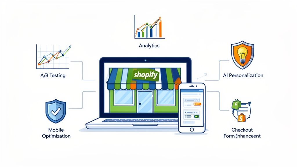
- A/B Test and Measure: For every change you make, establish a baseline and test its impact. Use analytics to track conversion rates, cart abandonment rates, and time-to-completion. Data, not assumptions, should guide your decisions.
Ultimately, applying these best practices is crucial for implementing effective strategies to increase your ecommerce conversion rate and maximize sales. Each optimization, no matter how small, contributes to a more streamlined, trustworthy, and profitable customer journey. By treating your checkout not as a static final page but as a dynamic conversion engine, you build a powerful competitive advantage that secures revenue and fosters long-term brand loyalty.
Ready to transform your checkout from a point of friction into your most powerful conversion tool? The team at ECORN specializes in custom Shopify development and conversion rate optimization, helping ambitious brands build seamless, high-performing checkout experiences. Contact ECORN today to discover how we can help you implement these best practices and unlock your store's true potential.


