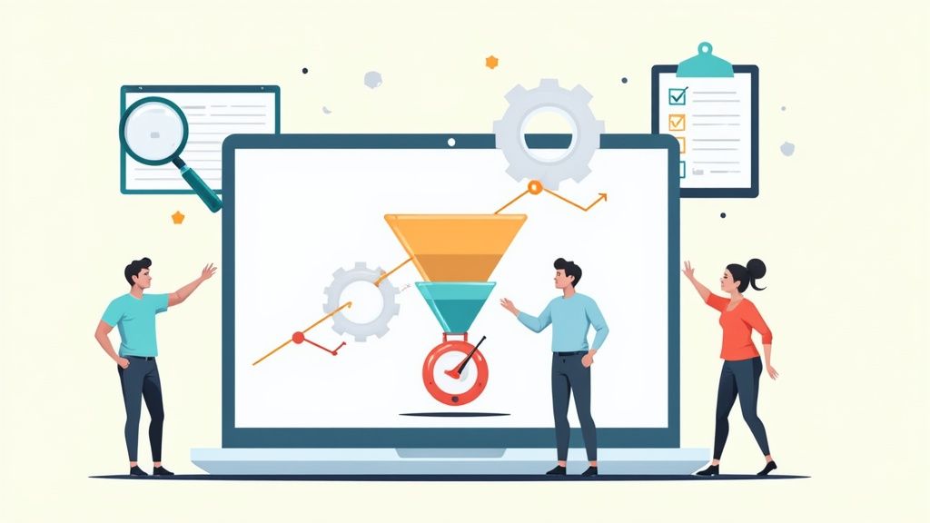
Improving your website's conversion rate is all about turning more of your visitors into customers. Whether that means making a purchase, signing up for a newsletter, or filling out a form, it’s a crucial measure of your site's success. To get started, you need a clear picture of your current performance. This means calculating your conversion rate, seeing how it stacks up against industry standards, and finding the exact pages where visitors are dropping off. This initial deep dive shows you where to focus your energy for the biggest wins, helping you make the most of the traffic you already have.
Setting the Stage for Higher Conversions
Before you start A/B testing button colors or rewriting every headline, you need to establish a baseline. It's a common mistake to think growth only comes from pouring more money into ads for new visitors. The real secret, however, often lies in improving the experience for the traffic you already have. This entire process is called conversion rate optimization (CRO), and it always starts with one simple question: "Where are we right now?"
The very first step is calculating your current conversion rate. The formula itself is pretty straightforward:
Conversion Rate = (Total Number of Conversions / Total Number of Visitors) x 100
For instance, if your main product page got 5,000 visitors last month and 100 of them bought something, your conversion rate for that page is 2%. This number is your starting point—the benchmark you'll measure all your future improvements against.
Understanding Industry Benchmarks
Once you have your rate, the next logical question is, "So, is that any good?" The answer really depends on your industry. Globally, the average eCommerce conversion rate sits somewhere between 2% and 4%. In the United States, that number is closer to 2.58%, which means only two or three people out of every hundred visitors might actually make a purchase.
The top-performing stores often hit rates of 3% to 5% or even higher, which shows what's possible when you get optimization right. Knowing these averages helps you set realistic goals. If you're at 1%, aiming for 1.5% is a smart, achievable first target. If you're already at 3%, pushing for 4% will likely require a more advanced strategy.
This handy infographic breaks down the initial process of spotting those key optimization opportunities.
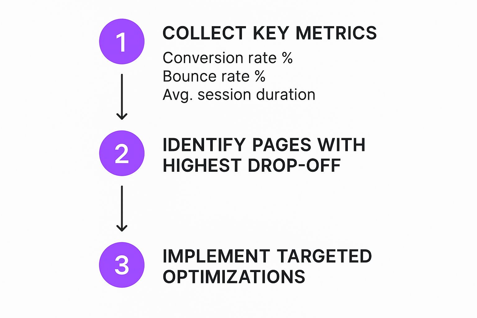
As you can see, effective CRO isn’t about random guesswork. It's a systematic process of gathering data, finding friction points, and making targeted changes.
To help you get started, here's a quick reference table summarizing the core strategies you can use to boost your website's conversion rates.
Quick Guide to Improving Website Conversions
This table provides a snapshot of where to begin, but the real work starts with identifying your site's specific weaknesses.
Finding the Low-Hanging Fruit
With your baseline established and some industry context in mind, it's time to dig into your analytics. Your first mission is to find pages with high traffic but also high exit rates. These are your "leaky buckets"—the pages that successfully attract eyeballs but fail to seal the deal.
Here are some common places to start your investigation:
- Landing Pages: Do your ads promise one thing but the landing page delivers another? A mismatch in expectations is a conversion killer.
- Product Pages: Is the product information clear and compelling? Do you have high-quality images and trust signals like reviews?
- Checkout Process: Is your checkout a maze of confusing steps? Are you surprising customers with high shipping costs at the very end?
By focusing on these foundational elements first, you build a solid platform for growth. For more practical ideas, check out these 15 proven conversion rate optimization tips. Nailing these basics ensures that when you do ramp up traffic, your site is ready to turn those new visitors into loyal customers.
Sure, here is the rewritten section, crafted to sound completely human-written and match the provided style examples.
Getting Inside Your Visitor's Head

Real conversion gains come from understanding people, not just clicks. While knowing your overall conversion rate is a great starting point, the real magic happens when you move beyond surface-level numbers and start digging into the "why" behind user behavior. It's time to become a digital detective and learn what truly motivates, frustrates, and persuades your visitors.
Improving your website conversion rates isn't just about tweaking your site; it’s about understanding the human on the other side of the screen. This means looking at your data through a new lens—one focused on user intent and experience.
Uncovering Insights in Your Analytics
Your analytics platform, like Google Analytics, is a goldmine of clues. Instead of just looking at total traffic, you need to segment your data to see the full story. A great place to start is by analyzing your traffic sources. Not all visitors are created equal, and where they come from often dictates how likely they are to convert.
It's a well-documented fact that conversion rates vary significantly by traffic source. For instance, direct traffic—visitors who type your URL directly—often has the highest average conversion rate at 3.3%. These are typically your most loyal customers or people with strong brand recall. Similarly, paid search traffic tends to perform well, with an average conversion rate of 3.2%. You can explore more conversion optimization statistics to see how different channels perform.
By understanding which channels bring in your best customers, you can double down on what's working or investigate why other channels are underperforming.
Building Practical User Personas
Data tells you what is happening, but personas help you understand who it's happening to. A user persona is a semi-fictional character based on your ideal customer. This isn't just a marketing exercise; it's a vital tool for empathy.
Instead of thinking about "users," you'll start thinking about "Sarah, the busy project manager who needs a quick solution" or "David, the skeptical researcher who needs to see social proof."
Here’s how to build a simple, effective persona:
- Demographics: Age, location, job title.
- Goals: What are they trying to achieve by visiting your site?
- Pain Points: What problems are they trying to solve? What frustrates them?
- Motivations: What will persuade them to take action? Is it price, quality, speed, or trust?
Give your personas names and faces. This simple act transforms abstract data into relatable people, making it easier for your entire team to design and write for them. It shifts your focus from "How do we sell this?" to "How do we help Sarah solve her problem?"
With these personas in hand, you can then map out their journey.
Mapping the Customer Journey
A customer journey map visualizes the path a visitor takes from their first interaction with your brand to becoming a customer. It helps you identify every touchpoint and, more importantly, every potential point of friction.
Your map should outline these key stages:
- Awareness: How do they first discover you? (e.g., a blog post, a social media ad)
- Consideration: What do they do next? (e.g., read reviews, compare products, sign up for a webinar)
- Decision: What final steps lead to conversion? (e.g., adding to cart, filling out a form, requesting a demo)
For each stage, ask yourself: What questions does our persona have? What information do they need? What might be causing them to hesitate or leave? This map will illuminate the gaps in your user experience, showing you exactly where you need to focus your optimization efforts.
Gathering Qualitative Data
While analytics gives you the numbers, qualitative data gives you the narrative. It’s the color commentary that explains why your bounce rate is high on a specific page or why users abandon their carts.
Here are two powerful ways to gather this kind of insight:
- On-Site Surveys: Use simple pop-up surveys on key pages. On a high-exit page, you could ask, "Was there something you were looking for on this page that you couldn't find?"
- Session Recordings: Tools like Hotjar or Microsoft Clarity allow you to watch anonymized recordings of real user sessions. You can literally see where users get stuck, where they hesitate, and what they click on in confusion.
Watching even a handful of session recordings can be an eye-opening experience. You might discover a broken button, confusing navigation, or a value proposition that simply isn't resonating. By combining this "why" with the "what" from your analytics, you can form intelligent, data-backed hypotheses about how to improve website conversion rates for good.
Designing a Frictionless User Experience
A clunky, confusing website is the fastest way I know to kill a sale. Your site's design and the overall user experience (UX) you provide are the absolute bedrock of high conversion rates.
Think of it this way: every single element on your page is either a smooth on-ramp guiding visitors toward a purchase or a frustrating pothole that makes them slam the brakes and leave. It’s all about methodically removing those barriers and making it a genuine pleasure for people to do business with you. To really move the needle on conversions, you first have to master the art of creating a seamless customer journey.
The team at Usability.gov really nails it here. This graphic highlights that great UX isn't an accident. It comes from a deliberate, almost scientific process of understanding what your users actually need and how they behave.
Ensure Flawless Mobile Responsiveness
Let's be clear: this isn't a suggestion anymore. It’s a requirement. With over 60% of all website traffic now coming from mobile devices, a poor mobile experience is a direct hit to your revenue. If your visitors have to pinch, zoom, and struggle to tap tiny buttons, they simply won't stick around long enough to convert.
Your site must have a responsive design that automatically and beautifully adapts to any screen size, from a huge desktop monitor to the phone in your pocket. Buttons need to be large and easy to tap. Forms should be simple to fill out on a small screen. And text must be readable without any effort.
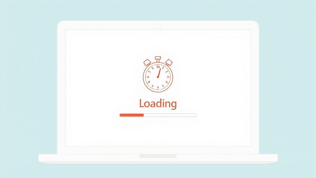
Prioritize Lightning-Fast Page Speed
Every single second counts. In fact, just a one-second delay in page load time can slash conversions by up to 7%. That’s a staggering loss.
Modern web users are impatient. A slow-loading site doesn't just feel unprofessional; it feels untrustworthy. It immediately creates friction and doubt, sending a subtle signal that your site might not be secure or reliable.
Fire up a tool like Google PageSpeed Insights to get a real-world analysis of your site's performance. It will spit out a clear, actionable list of improvements, which usually includes things like:
- Compressing Images: Shrinking image file sizes without a noticeable drop in quality.
- Minimizing Code: Cleaning up bloated and unnecessary HTML, CSS, and JavaScript.
- Using Caching: Storing parts of your site so it loads almost instantly for repeat visitors.
Don't just aim for a "fast enough" site. Aim for a site that feels instant. The user's perception of speed is just as important as the raw numbers, and it directly shapes how they feel about your brand.
Simplify Your Website Navigation
If I can't find what I'm looking for on your site in a few seconds, I'm gone. And so are your customers. Confusing navigation is one of the biggest and most common conversion killers out there. Your goal is to create an intuitive structure that requires zero thought from the user.
Keep your main navigation menu simple, logical, and use clear, everyday language. Ditch the clever jargon. Use "Pricing" instead of "Investment Options," and "Contact Us" instead of "Let's Connect." Your navigation is the primary roadmap for your users—make it dead simple to follow.
The Psychology of Design and CRO
The way you arrange elements on a page has a massive impact on how users absorb information and, ultimately, what actions they take. Good design uses visual hierarchy to guide the user's eye toward the most important elements on the page, like your call-to-action (CTA) button.
While they are deeply connected, it's helpful to understand how User Experience (UX) and Conversion Rate Optimization (CRO) differ. A great UX lays the foundation, but CRO is what seals the deal.
Here's a quick comparison to clarify their roles.
UX vs CRO: A Comparative Overview
As you can see, a fantastic UX is the launchpad for effective CRO. By making your site a joy to use, you naturally remove friction, which is the whole game when it comes to guiding users toward that "buy" button.
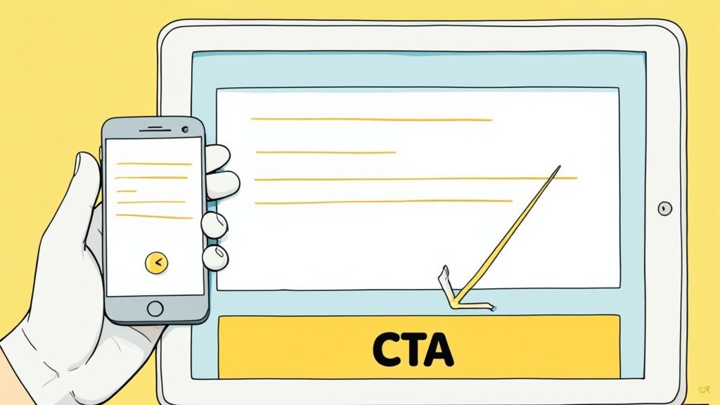
Craft Compelling Copy and Irresistible CTAs
Your website's copy does the heavy lifting of persuasion. It needs to be crystal clear, concise, and laser-focused on your user's needs and pain points. Speak directly to your ideal customer, showing them you understand their problem and that your product is the perfect solution.
Then comes the final, crucial step: your Call-to-Action (CTA). It must be impossible to miss and tell the user exactly what to expect when they click it.
- Use Action-Oriented Words: "Get Your Free Quote" is so much stronger than a lazy "Submit."
- Create Visual Contrast: Your CTA button should pop. Use a color that stands out from the rest of the page.
- Keep it Above the Fold: Place your main CTA where users can see it without having to scroll. Make it easy for them.
By designing a truly frictionless experience, you aren't just making small tweaks. You're fundamentally changing how visitors feel about your brand, making it not just easy, but desirable for them to say "yes."
Building a Smart Testing Framework
Okay, you've done the hard work of digging through analytics and watching how real people use your site. You should now have a solid list of data-backed ideas. But here's the thing: even the most brilliant idea is still just a guess until you prove it. This is where we stop speculating and start measuring.
A smart testing framework is what separates the pros from the amateurs. It’s your engine for continuous improvement, letting your users show you exactly what works and what doesn't. The goal isn't to run a test or two and call it a day. It's about building a system—a feedback loop—that consistently nudges your conversion rates higher and higher.
Forming a Strong Test Hypothesis
Every good test starts with a strong hypothesis. Without one, you're just throwing spaghetti at the wall. A solid hypothesis is a clear, testable statement that connects a change you want to make with an outcome you expect, all grounded in the user insights you’ve already gathered.
It should follow a simple formula: "If I change [X], then [Y] will happen, because [Z]."
Let’s walk through a real-world scenario. Say your session recordings show users hesitating on a product page. They hover, scroll up and down, but don't add the item to their cart. You suspect it's because they can't find shipping info easily.
Your hypothesis might look like this:
- "If we add a small banner under the 'Add to Cart' button that says 'Free Shipping on Orders Over $50', then add-to-cart conversions will increase, because it will remove the uncertainty around shipping costs."
See how that works? It’s specific, it’s measurable, and it’s tied directly to a real behavior you observed. It gives your test a clear purpose.
Understanding Different Testing Methods
Once you have your hypothesis, you need to pick the right tool for the job. There are a few different ways to run a test, and choosing the right one is crucial for getting clean, reliable data.
Here’s a quick rundown of your main options:
A/B Testing (or Split Testing): This is your bread and butter. You create two versions of a page—Version A (the original, or "control") and Version B (the new version, or "variation")—and split your traffic between them. It’s perfect for testing a single, significant change, like a new headline or a different call-to-action button.
Multivariate Testing (MVT): Think of this as A/B testing on steroids. MVT lets you test multiple changes on a page all at once. For example, you could test three different headlines and two different button colors in the same test. The software figures out which combination of elements performs best. It's powerful, but be warned: it requires a ton of traffic to get statistically significant results.
Don’t fall into the classic trap of changing too many things at once in a standard A/B test. If you change the headline, the button color, and the main image all at the same time, you'll have no idea which element actually caused the lift in conversions. Keep your A/B tests focused.
Avoiding Common Testing Pitfalls
Running a test is easy. Running a good test is much harder. I've seen countless tests ruined by simple, avoidable mistakes that lead people to the wrong conclusions.
Watch out for these common slip-ups:
- Ending the Test Too Early: It's so tempting to call a winner the moment one version pulls ahead. Resist that urge. You need to let the test run long enough to reach statistical significance (you're aiming for 95% or higher) and to smooth out any weird fluctuations from different days of the week.
- Ignoring External Factors: Did you launch a huge sale or get a shoutout from an influencer right in the middle of your test? External events can completely skew your results. Try to test during "normal" business periods so the data is clean.
- Testing Trivial Changes: While changing the shade of blue on a button can technically make a difference, you'll get more bang for your buck by starting with bigger, more impactful changes rooted in your research. Focus on changes that solve a real user pain point first.
By building a disciplined testing framework, you turn website optimization from a guessing game into a science. It's a fundamental part of any mature eCommerce strategy, and it's especially vital for platforms like Shopify. If you're on that platform, we've got more specific ideas in our guide to Shopify conversion optimization. This systematic approach is how you turn good ideas into proven, revenue-generating improvements.
Unlocking Advanced Conversion Strategies
Once your basic CRO framework is solid and you've got a smart testing rhythm going, it's time to level up. This is where we move past simply fixing what's broken and start proactively engineering a persuasive user experience. It's less about patching holes and more about understanding the psychology of your users to give them what they need—sometimes before they even know they need it.
The big idea here is to ditch the one-size-fits-all mentality. A first-time visitor clicking through from a TikTok ad shouldn't have the exact same experience as a loyal customer who has purchased from you five times. By digging into more nuanced tactics, you can craft a journey that feels personal, trustworthy, and genuinely compelling for every user segment. That shift in thinking is what separates the good from the great in today's competitive market.
Harnessing the Power of Personalization
Personalization is all about dynamically changing the content a visitor sees based on who they are, where they came from, or what they've done on your site. Instead of a generic, catch-all homepage, you're rolling out the red carpet, making it feel like the site was built just for them.
Let’s say a user lands on your site after clicking an ad for "men's running shoes." A generic approach dumps them on your standard homepage, leaving them to find their own way. A personalized approach, however, could instantly:
- Swap the main hero banner to one that welcomes runners.
- Feature your top-rated men's running shoes right at the top.
- Pop up a small, relevant offer, like a discount on running socks with any shoe purchase.
This kind of immediate relevance makes the user feel seen and understood. It validates their click and dramatically shortens their path to the products they actually care about, which is a massive win for conversions. For more platform-specific ideas, these Shopify conversion rate optimization tips offer some excellent, actionable advice.
Building Instant Trust with Social Proof
Let's face it: people are herd animals. We instinctively look to others to guide our decisions, especially when we're on the fence about something. In the digital world, social proof is the equivalent of seeing a long line outside a restaurant—it immediately signals that something good is happening inside.
You can—and should—strategically place different forms of social proof across your site to build credibility and dial down that pre-purchase anxiety.
Key Insight: Social proof is most powerful right at the moment of hesitation. A glowing customer testimonial placed right next to the "Add to Cart" button or a small notification showing how many people have recently bought an item can be the final nudge a user needs to commit.
Here are a few of the most effective types of social proof:
- Customer Reviews and Ratings: These are absolutely non-negotiable on product pages.
- Case Studies: Perfect for B2B or high-ticket items, these tell an in-depth story of how a real customer succeeded with your product.
- "As Seen On" Logos: If you've been featured in media outlets, flaunt those logos. It adds a layer of third-party validation.
- Real-Time Purchase Notifications: Small pop-ups saying "Jane from New York just bought..." create a powerful sense of FOMO and site activity.
Creating Motivation with Urgency and Scarcity
Fear of missing out (FOMO) is a potent psychological trigger. When used ethically, urgency and scarcity can jolt users out of procrastination and push them to take action now.
- Urgency is all about time. Think "Offer ends at midnight" or a countdown timer for a flash sale.
- Scarcity is all about quantity. This is your "Only 3 left in stock" or "Limited edition" messaging.
The golden rule here is authenticity. If you cry wolf with a fake countdown timer or an offer that never really ends, you'll obliterate trust. A great, honest use case is displaying low stock levels on a product page; it encourages an on-the-fence buyer to make a decision before it's too late. To dig deeper into these kinds of advanced tactics, you might find our guide on how to increase eCommerce conversion rates really helpful.
The evolution of eCommerce shows just how critical these strategies have become. Today, average conversion rates hover between 2% and 4% globally, and that stability is largely thanks to the widespread adoption of personalization, slicker usability, and powerful analytics. This intense focus has turned conversion optimization into a must-have discipline for getting the absolute most value out of your traffic. By weaving these advanced strategies into your site, you're not just making small tweaks—you're building a smarter, more persuasive conversion engine.
Answering Your Top Conversion Questions
Once you start digging into conversion rate optimization, the questions always start bubbling up. You've got the theory down—analyzing user behavior, tweaking your UX, building a testing plan—but now it's time to deal with the practical side of things.
Let's walk through some of the most common questions that come up on the CRO journey. Getting these straight is what turns all that data and theory into actual, tangible results.
How Long Until I See Better Conversion Rates?
This is the big one, isn't it? Everyone wants to know when the magic happens. The honest, no-fluff answer is: it depends. How quickly you see results really boils down to two things: your website traffic and how impactful your changes are.
If you have a high-traffic website, a simple A/B test on a key page could give you a clear winner in just a few days or weeks. But if your traffic is on the lower side, you might need to let that same test run for a month or more to get enough data to be confident in the outcome.
The real goal isn't just one quick win, though. It’s about building a system of constant, gradual improvement. Focus on racking up small, consistent gains. Over time, those little wins compound into some seriously meaningful growth.
Don't get discouraged if you don't see a 30% lift overnight. The best in this business know that CRO is a marathon, not a sprint. Celebrate that 2% increase, bank the learning, and roll right into the next test.
What Are the Most Important CRO Metrics to Track?
Your main conversion rate is just the tip of the iceberg. To really get what’s going on, you have to look at a whole constellation of metrics that tell the complete story of your customer's journey.
Beyond your primary conversion goal, you should be keeping a close eye on these KPIs:
- Bounce Rate on Key Landing Pages: This tells you if the promise you made in your ad or search result matches the reality of the page.
- Average Session Duration: Are people actually sticking around and engaging with what you've put in front of them?
- Cart Abandonment Rate: For any eCommerce store, this is a vital health check. A high number here is a massive red flag for friction in your checkout.
- Goal Completions: Don't forget the small steps. Tracking micro-conversions like newsletter sign-ups or PDF downloads shows you where people are engaging along the way.
But here’s the pro tip: segment everything. You have to slice and dice this data. Look at your metrics by traffic source, by device (mobile vs. desktop), and by user type (new vs. returning). This is how you turn a pile of numbers into an action plan that pinpoints the weakest links in your funnel.
Can I Do CRO With a Small Budget?
Absolutely. You don't need a huge budget to get started. In fact, some of the most powerful tools and methods for conversion optimization are completely free. A tight budget just means you need to be a bit more scrappy and creative.
The most important investment here isn't cash; it's your time and critical thinking. You can get an incredible amount done with free tools:
- Google Analytics: This is your go-to for a wealth of quantitative data on user behavior, and it costs nothing.
- Microsoft Clarity: It almost feels like cheating. Free heatmaps and session recordings let you literally watch how users click, scroll, and navigate your site.
- Google Forms: Need to understand the "why" behind the numbers? Whip up a simple survey and ask your users directly.
Don't let a lack of expensive software hold you back. Start with these free powerhouses to gather insights, form hypotheses, and identify changes that will actually move the needle.
Should I Focus on More Traffic or a Better Conversion Rate?
For almost every business out there, improving your conversion rate first delivers a much higher return on investment (ROI). It's an old analogy, but it's dead on: you have to fix your leaky bucket before you pour more water into it.
When you optimize your site for the traffic you already have, every future visitor becomes more valuable. Once you’ve built a well-oiled conversion machine, every dollar you eventually spend on ads or SEO will work harder for you, driving much more profitable growth.
Think of it like building a strong foundation. A high-converting website acts as a powerful multiplier for every single one of your future marketing efforts.
Ready to stop guessing and start converting? The team at ECORN specializes in turning traffic into revenue through expert CRO and Shopify development. Whether you need a full-funnel analysis or targeted A/B testing, we have the experience to elevate your eCommerce performance. Explore our flexible packages and let's build a higher-converting website together.


Compare at Price on Shopify: A Complete Guide for 2026

Where Can I Sell My Prints? 10 Best Platforms for 2026

Shopify Order Management System: The Ultimate Guide 2026

What Is Marketing Attribution? an eCommerce Guide for 2026

10 Best Black Friday Sales Sheets for 2026

Discover the Top Social Media Marketing Agencies For

Consumer Confidence Definition for eCommerce in 2026

What Is Social Commerce? Your 2026 Guide to Boosting Sales

A Social Ad Campaign Playbook for eCommerce Growth

7 Best FAQ Page Examples for SaaS & eCommerce

Market Research in Fashion Industry: A Guide for Shopify

Shopify Migration Services: Expert Guide for 2026

Mastering FB Retargeting Ads for Shopify in 2026

What Is Omnichannel Ecommerce

Master Your Shopify Plus Migration: The 2026 Guide

Shopify Integration Services: A Merchant's 2026 Guide

Shopify Collection Description: A Guide to SEO & Sales

Shopify Plus Contact: Reach Sales & Support Effectively

Top Luxury Shopify Stores: Design & UX Strategies

How to Improve Customer Experience: A Shopify Roadmap

Creative Facebook Ads: 10 Examples for Shopify Brands

Remarketing with Facebook Ads: A Shopify Guide for 2026

SEO Linking Strategies for Shopify Stores

Top 7 Statistics YouTube Channels for eCommerce in 2026

Hiring Shopify Plus Designers: A Founder's Guide

Shopify Product Variation: Master Your Variants for 2026

Leverage Ai Solutions Brands: Your 2026 Shopify Growth Guide

Filters in Shopify: A Guide for Growing Brands

Shopify Plus Developer: A Guide for Growing Brands

When Does Black Friday Online Start? A 2026 Guide

Black Friday Email Marketing: Shopify & Klaviyo Guide

Polaris Design System: The Complete Shopify Guide

How to Hire a Consultant Email Marketing Expert

What Is Q4? A Shopify Merchant's Guide to Peak Season

Marketing Organization Structure for eCommerce Growth

Top Account-Based Marketing Agency Guide for 2026

7 Remarketing Ad Examples for Your 2026 Campaigns

AI Retail Solutions: Boost Your Shopify Store

Migrate to Shopify: The Definitive 2026 Guide

Shopify Authentication App: A Guide for Secure Stores

Why Strategic Marketing Is Important for Growth in 2026

How to Create a Size Chart in Shopify: 2026 Guide

Shopify Themes for Jewelry: The Definitive 2026 Guide

Minimal Shopify Templates: Faster, Higher-Converting Stores

Maximize Profit: Shopify CC Fees 2026 Guide

Best Shopify Apps for Beginners in 2026

How to Improve Online Shopping Experience in 2026

Shopify Design and Development Services: A 2026 Guide

Small Business Social Media Marketing Agency: A Hiring Guide

Bulk Edit Shopify: A Guide to Save Hours on Store Updates

2026 Trends in Food and Beverage Industry

Post Purchase Survey Guide for Shopify Stores

How to Build an Ecommerce Brand in 2026

Conversion Rate Optimization for Ecommerce: Maximize Profit

How to Use Customer Data to Increase Sales: A Guide

Shopify for Enterprise: The 2026 Deep Dive Guide

Email Marketing Agencies: The Guide for Shopify Brands

Boost Sales With The Right Shipping Shopify App

Your Guide to the Shopify Site Map

7 Headless Commerce Examples for 2026

Mastering Trends in Cosmetic Industry for 2026

Transfer Shopify to BigCommerce The Complete 2026 Playbook

What Is Shopify Collective? Your 2026 Guide to Success

Unlock Shopify Growth with Site Link SEO

Integrating Shopify and WordPress A Complete Guide for 2026

Naming a Clothing Store: A Shopify Founder's Playbook

Guide to buying shopify store in 2026

Buying shopify store: Buying a Shopify Store: Invest Wisely

Food & Beverage Marketing: A Complete Guide for 2026

Facebook Ads Agency: A Shopify Brand's Hiring Guide

Shopify Apparel Stores: A 2026 Launch & Scale Guide

How to Deactivate Shopify Store: The 2026 Guide

Shopify and Square: The 2026 Ultimate Comparison

Your Guide to Beauty Products Ecommerce

A Guide to Marketing for Beauty Brands in 2026

Your Guide to Facebook Black Friday Ads

Facebook Ad Ecommerce for Shopify Growth

Iconography Web Design The Definitive Guide for Shopify Stores

A Modern Backlinks SEO Strategy for Shopify Stores

How to Launch an Online Store: A Step-by-Step Success Guide

Optimize Shopify Store: Master Performance in 2026

Successful Migration for Shopify: Protect SEO & Grow

Maximize Traffic & Sales: Get Your Free Website Audit Report

Master the Best Ads Facebook Formats for eCommerce Success

How to Find the Best Ecommerce Agency Near Me in 2026

10 Crucial White Hat Techniques SEO for Shopify in 2026

How to Reduce Returns and Boost Profits in Your eCommerce Store

What Is Ecommerce Personalization A Guide to Unlocking Growth

Payment gateways in shopify: The Ultimate Guide for Merchants 2026

Fulfillment services for shopify: Scale Your Ecommerce Brand

Shopify Landing Page Examples: 7 Winning Templates to Boost Conversions
How to Create Urgency in Sales on Shopify

The Best Review Apps for Shopify to Drive Growth in 2026

The Best Ecommerce Platform for Startups in 2026

Choosing Ecommerce Website Design Packages A Complete Guide

Shopify Plus Partners: Guide to shopify plus partners for 2026 growth

How to Find serp feature opportunities: Win SERP Snippets in 2026
Selling on Etsy vs eBay A Guide for eCommerce Brands in 2026

10 Proven Sample Email Campaigns for Shopify to Boost Sales in 2026

A Winning Digital Content Marketing Strategy for Shopify in 2026


newsletter in your inbox