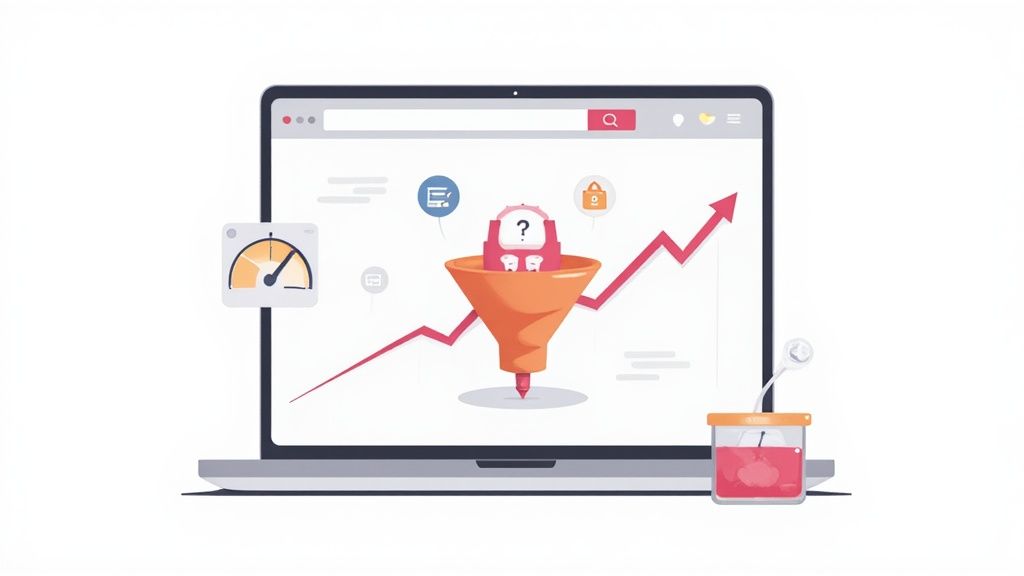
Before you can boost your Shopify conversion rate, you have to answer a crucial question: What does "good" even look like? It’s tempting to chase a universal magic number, but that's a mistake. The real goal is to benchmark against your specific industry and, most importantly, establish a baseline from your own store's data.
This approach lets you set goals that are actually achievable and helps you find the real friction points holding your sales back.
What Is a Good Shopify Conversion Rate?
Let’s get one thing straight: a “good” conversion rate isn’t a single, static number. It’s a moving target, heavily influenced by your niche, average order value, where your traffic comes from, and even the time of year.
The truth is, performance varies wildly across the board. The average Shopify store typically sees a conversion rate somewhere between 1% and 3%. However, the stores that are really dialing things in often push past 3.5%, with some of the best in the business hitting 4-5%. For a deeper dive, check out this insightful breakdown of Shopify benchmarks.
Setting a Realistic Baseline
It's completely pointless to compare your handmade jewelry store to a massive electronics retailer. Context is everything. To give you a better idea, here’s how things generally stack up by industry:
- Fashion and Apparel: These stores tend to average around 2.5%.
- Beauty and Skincare: This niche often converts a bit higher, landing closer to 3%.
- Electronics: With higher price points and more research involved, these rates are usually lower, around 1.5%.
- Health and Wellness: This sector can see strong performance, sometimes reaching as high as 4%.
Your first mission should be to outperform your industry's average. Once you’ve done that, you can start aiming for the top percentile. Forget the generic 2% rule and start with your own numbers.
This chart really puts the journey into perspective, showing the leap from an average performance to a solid, achievable target.
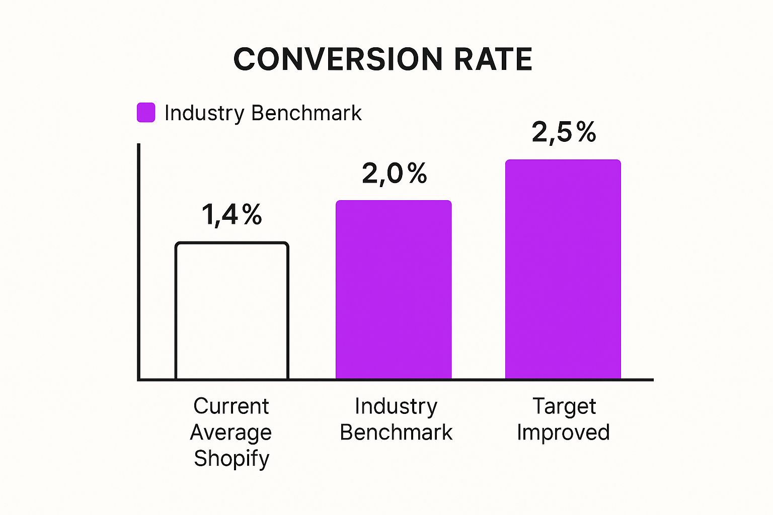
As you can see, moving from the current average of 1.4% to a strong target of 2.5% is a significant jump, but it’s absolutely within reach.
To see how your store stacks up, check out this table of industry benchmarks. This is a great starting point for setting your own realistic goals.
Shopify Conversion Rate Benchmarks by Industry
Compare your store's performance against industry standards with this breakdown of average conversion rates for different ecommerce niches on Shopify.
Use these figures not as rigid rules, but as guideposts. Your specific products, price points, and audience will always be the most important factors.
How to Diagnose Your Store's Performance
To get a real handle on your conversion health, you have to look beyond the final sale. Your overall conversion rate is just the final score of the game; to win, you have to analyze the individual plays. This is where your analytics tools—like your built-in Shopify Analytics and Google Analytics—become your most trusted coaches.
Start by digging into these key "micro-conversions." They’re the leading indicators of your sales funnel’s health:
- Add to Cart Rate: What percentage of your visitors add an item to their cart? A low rate here often points to problems on your product pages, confusing pricing, or weak calls-to-action.
- Reached Checkout Rate: Of the people who added items to their cart, how many actually started the checkout process? If you see a big drop-off here, there's likely friction in the cart experience itself.
- Checkout Completion Rate: Out of everyone who starts the checkout, how many finish the purchase? High abandonment at this final hurdle usually screams of surprise shipping costs, a clunky form, or not enough trust signals.
Pro Tip: Don't just stare at the numbers. Use a session recording tool like Hotjar or Lucky Orange to watch how real people are actually navigating your site. You'll be blown away by the "aha!" moments you get from seeing your store through a customer's eyes.
By dissecting your funnel this way, you shift from guessing to knowing. Instead of a vague goal to “improve conversions,” you can set specific, data-driven targets like, “Cut checkout abandonment by 15%” or “Boost the add-to-cart rate on mobile by 10%.” This focused approach is the key to making meaningful changes that actually grow your revenue.
Refining Your Store's User Experience and Navigation
Think of your Shopify store's user experience (UX) and navigation like the layout of a physical store. If someone walks in and the aisles are a mess or the price tags are missing, they’re not sticking around to buy anything. It's the exact same principle online, but the stakes are much higher—a competitor is just one click away.
A confusing website is a surefire way to lose sales. Your job is to smooth out every single bump in the road, making it so ridiculously easy for shoppers to find what they want that buying from you feels like the most natural thing to do. This isn't about flashy graphics; it's about pure, simple, intuitive clarity.
Create an Intuitive Menu and Site Structure
Your navigation menu is your customer's roadmap. It needs to be logical, clean, and completely predictable. When someone lands on your site, they shouldn't have to play detective to figure out where to go next.
A classic mistake I see all the time is cramming the main menu with way too many options. This just causes decision paralysis. Instead, focus on clear, top-level categories that a first-time visitor can understand in a heartbeat.
- Logical Grouping: Group similar products under broad, easy-to-understand categories. A clothing store, for example, should use "Tops," "Bottoms," and "Accessories"—not internal jargon nobody outside your company understands.
- Mega Menus for Large Inventories: If your catalog is huge, a well-organized mega menu can show off subcategories without overwhelming people. Use small images or bold text as visual cues to guide their eyes.
- Keep It Simple: Stick to 5-7 top-level items in your main navigation. Anything more is just clutter. You can tuck important but less-critical links like "About Us" or "Contact" into the footer.
A well-structured menu is like a silent salesperson, effortlessly guiding visitors toward products they're likely to buy. The goal is to reduce their cognitive load so they can focus on your amazing products, not on figuring out your website.
Since its launch, Shopify has become an absolute giant, processing an eye-watering $886 billion in sales by making e-commerce accessible. This user-first approach is baked into the platform's DNA. While the average Shopify store converts around 1.4%, the top 10% of stores are hitting rates above 4.7%. This jump is a clear sign that a refined user experience—especially when 79% of traffic is mobile—is what separates the good from the great. You can dig into more of Shopify's impressive performance statistics to get the full picture.
Implement Smart Search with Powerful Filtering
Let's be real: a lot of your customers land on your store already knowing what they want. If your search bar is hidden or useless, they're gone. A prominent, high-performing search bar isn't a "nice-to-have"; it's a non-negotiable for any serious e-commerce store.
But a basic search box won't cut it anymore. You need to level it up with smart features that help people zero in on exactly what they're looking for.
Just look at Shopify's own interface—it's a masterclass in clean, user-friendly design.
Shopify practices what it preaches with an organized, intuitive layout. This is the model you should be aiming for with your own storefront's navigation and design.
To turn your search bar into a sales machine, make sure it has these features:
- Autocomplete and Suggestions: As someone types, your search should dynamically suggest popular terms and even specific products. This not only speeds things up but also helps avoid typos that lead to zero results.
- Robust Filtering: Let users slice and dice the search results by attributes that actually matter—size, color, price range, brand, customer ratings, you name it. The more specific they can get, the faster they'll find their perfect match.
- Handle "No Results" Gracefully: A "no results found" page is a dead end. Don't do that. Use that page as an opportunity to suggest related products, point them to popular categories, or offer a link to customer support. Never leave a potential buyer hanging.
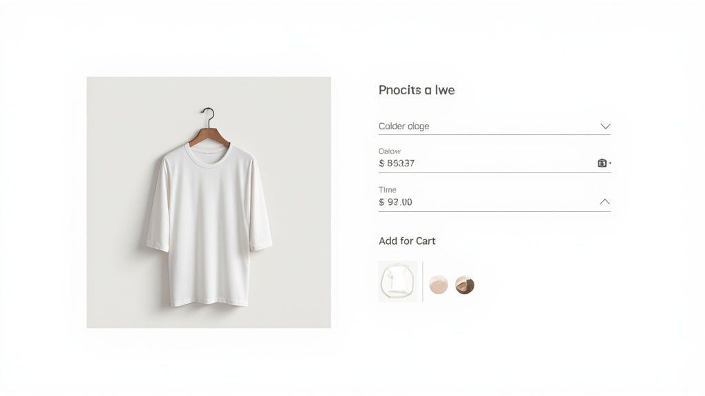
Turning Product Pages into Conversion Engines
If your homepage is the front door, your product page is where the sale is made or lost. It’s the final pitch. This is where a browser's casual interest has to turn into a decisive "I need this." It’s arguably the most critical junction in your entire sales funnel, yet I see so many Shopify stores treat it like a simple inventory listing.
To truly improve your Shopify conversion rate, you need to engineer these pages for persuasion, clarity, and trust. A product page fails when it leaves questions unanswered. You have to get inside the customer’s head and give them the answers before they even think to ask. This means getting way beyond generic feature lists and focusing on the experience your product delivers.
Write Descriptions That Sell the Outcome
Your product descriptions must do more than just describe; they need to sell. The single biggest mistake I see is leading with specs and technical jargon. Yes, that information matters, but it doesn't forge an emotional connection. Instead, lead with the benefits and the outcome.
How does your product make the customer's life better, easier, or more interesting? Paint that picture. For instance, instead of just saying a backpack has "water-resistant nylon," try something like, "Caught in a sudden downpour? Your laptop and books stay bone dry, so you can commute with total peace of mind." The first is a feature; the second is a solution.
Structure your descriptions to work for both scanners and deep-readers:
- Benefit-Driven Opening: Kick things off with a punchy paragraph that sells the experience.
- Key Features as Bullets: Use a bulleted list for the must-know specs like dimensions, materials, or ingredients. It's clean and easy to scan.
- Storytelling: Weave in a short narrative about the product in action. Help the customer visualize it in their own life.
Use High-Quality Imagery and Video
Customers can't touch or hold your product online, so your visuals have to do all the heavy lifting. Grainy, poorly lit, or generic stock photos are absolute conversion killers. They scream unprofessionalism and can make even a premium product feel cheap.
Invest in professional, high-quality photography that shows your product from every important angle. Make sure to include lifestyle shots of the product being used—this helps customers connect on a personal level. And don't stop at static images. A short video that demonstrates features, shows scale, or explains how it works can be incredibly convincing. In fact, adding video to product pages can increase purchases by as much as 144%.
Your product photography isn't just about showing what something looks like; it's about creating desire. Every image should be a miniature ad, making the viewer feel like they need to have what they see.
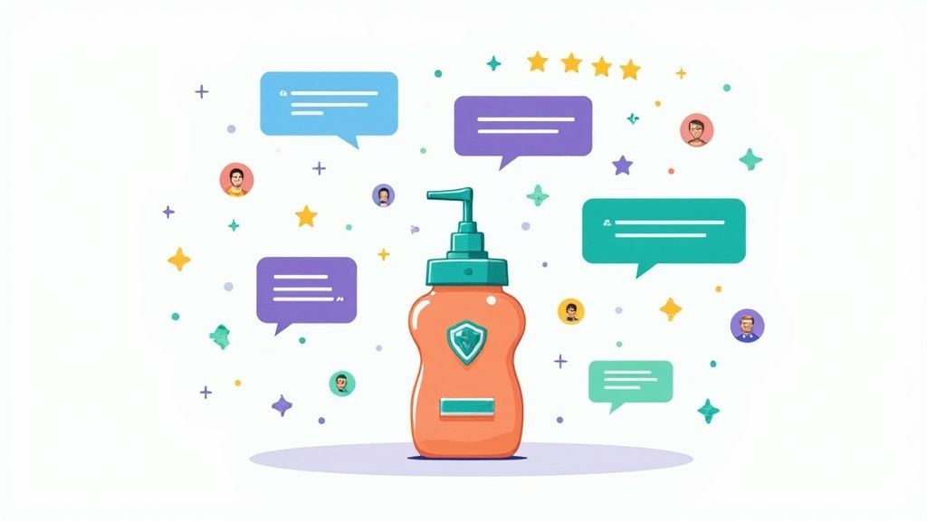
Leverage Social Proof and Pricing Psychology
Nothing builds trust faster than seeing that other people have already bought—and loved—your product. Placing customer reviews strategically is non-negotiable. Don't bury them on a separate page. Integrate them right on the product page, ideally with a star-rating summary just below the product title. Reviews that include customer-submitted photos or videos are pure gold.
The way you present your price also has a huge psychological impact. Instead of just listing a number, try these tactics:
Finally, your "Add to Cart" button has to be impossible to miss. Use a bold, contrasting color that pops off the page. The text should be clear and action-oriented. Adding small trust signals right below the CTA—like "Fast, Free Shipping" or "30-Day Money-Back Guarantee"—can give a hesitant shopper that final nudge they need to commit.
Combining these elements creates a powerful case for purchase, which is the heart of any successful CRO strategy. For more advanced techniques, check out our detailed guide on Shopify conversion rate optimization strategies for sustainable growth.
Streamlining Checkout to Reduce Cart Abandonment
Getting a customer all the way to the checkout page is a huge win, but it's not the finish line. This is the final, most crucial step where even the tiniest bit of friction can convince a shopper to leave their cart behind. It's a high-stakes moment where countless stores leak revenue, often without realizing just how easy the fixes can be.
The checkout is where a customer’s excitement can easily curdle into frustration. Think about it: they've done the hard work of browsing, comparing, and deciding. Now, they're ready to hand over their money. Your only job is to make that process as smooth, transparent, and fast as possible. Any unnecessary fields, surprise costs, or confusing steps can shatter their confidence and send them clicking away for good.
Eliminate Friction with a Simplified Checkout Flow
A long, complicated checkout process is one of the top reasons shoppers bail. In fact, studies show that requiring too much information or having too many steps can cause 18% of users to abandon their carts. The goal here is to make completing the purchase feel like a natural, easy conclusion to their shopping journey.
Here are a few high-impact ways I’ve seen work wonders for simplifying the flow:
- Offer Guest Checkout: Forcing a new customer to create an account before they can buy is a classic conversion killer. Always provide a prominent guest checkout option. You can always prompt them to create an account after the purchase is complete, framing it as a way to easily track their order.
- Enable One-Page or Express Checkouts: Tools like Shop Pay, PayPal, or Google Pay let returning customers check out in seconds. For new buyers, a clean, one-page checkout where all fields are visible on a single screen drastically reduces the psychological burden.
- Use a Progress Bar: If you must have a multi-step checkout, a visual progress bar is non-negotiable. It lets customers know exactly where they are in the process and how much is left. This simple addition manages expectations and gets rid of that feeling of being trapped in an endless series of forms.
By trimming the fat from your checkout, you respect the customer's time and make it incredibly easy for them to give you their business. If you're looking for more tactics to optimize this critical stage, our team has put together a detailed guide on how to reduce cart abandonment.
Master Transparency and Reclaim Lost Sales
The second major conversion killer at checkout is surprises. Nothing sends a customer running faster than sticker shock from unexpected shipping fees, taxes, or other hidden charges. They need to see the full, all-in cost before they're asked for their credit card details.
Transparency isn't just a best practice; it's a fundamental trust signal. When a customer sees all the costs upfront, it validates their decision to buy from you. Hidden fees do the opposite—they create instant distrust.
Be upfront with shipping costs, either on the product pages themselves or in a prominent site-wide banner. Even better, offer a free shipping threshold (e.g., "Free shipping on orders over $75"). This not only builds transparency but can also nudge your average order value higher.
Even with a perfect checkout, some customers will still get distracted or have second thoughts. That’s where proactive recovery tactics come in. Setting up an exit-intent popup that triggers when a user’s cursor moves to leave the checkout page can be a powerful final play. Offering a small, last-minute discount or a free shipping code can be the nudge they need to finish the purchase.
Globally, the average Shopify conversion rate hovers around 1.4%, but the top-performing stores are hitting 4.7% or more. A huge piece of that puzzle is checkout efficiency. Top stores see checkout completion rates of 66% or higher, while the average is just 45.2%—clear proof that a streamlined process has a massive impact on revenue.
Building Unshakable Trust with Your Audience
In the faceless world of ecommerce, trust is the ultimate currency. It’s what transforms a skeptical browser into a loyal customer. Before anyone even thinks about clicking "Add to Cart," they have to feel confident that your store is legit, your products are quality, and their personal information is locked down tight.
You can't just slap a badge on your site and call it a day. Building real credibility is about weaving multiple trust signals throughout the entire customer journey. Each one chips away at purchase anxiety, making the decision to buy from you feel like a no-brainer.
Laying the Foundation with Non-Negotiable Trust Signals
Let's start with the absolute must-haves. Honestly, if you don't have these basics covered, you're just making it harder to improve your Shopify conversion rate. Shoppers expect these things, and their absence is a massive red flag.
First up, your return policy needs to be dead simple to find and understand. Don't hide it in a footer link and hope for the best. A clear, generous policy shows you stand behind what you sell and takes the risk out of the purchase.
Next, make it incredibly easy for people to reach you. Display multiple contact methods—like an email, a phone number, and a live chat widget—right where people can see them. Knowing a real human is just a click or a call away provides huge peace of mind.
Finally, security badges are non-negotiable, especially on the checkout page. Logos from payment providers like Visa, Mastercard, and Shop Pay, along with SSL certificates, instantly tell shoppers their financial details are safe and secure.
Advanced Tactics for Building Deeper Credibility
With the fundamentals in place, it’s time to level up. These are the strategies that don't just make you look trustworthy—they help you build a reputable brand that stands out.
Showcasing user-generated content (UGC) is easily one of the most powerful forms of social proof. Go beyond simple text reviews and encourage customers to share photos or videos of your products in action. Nothing sells a product better than seeing real, happy customers using it in their own lives.
Trust is built in drops and lost in buckets. Every element on your site, from your 'About Us' page to your return policy, either adds a drop to the trust bucket or pokes a hole in it.
Featuring press mentions or awards is another great way to add a layer of authority. If you’ve been featured in a blog, magazine, or local news spot, create an "As Seen In" section on your homepage. This third-party validation tells new visitors that you're a recognized name in your space.
Transparency is also huge. Your "About Us" page shouldn't be an afterthought; it's your chance to tell a story. Who are you? Why did you start this business? People connect with people, not faceless corporations, and a compelling brand story creates a powerful emotional link.
Beyond these specific on-site tweaks, building lasting brand awareness is crucial. A strong, recognizable brand identity reinforces credibility and contributes significantly to customer trust and loyalty. By thoughtfully layering these trust signals, you’re giving shoppers every possible reason to say "yes."
Using Data and A/B Testing for Continuous Growth
Look, conversion optimization isn't a project you just finish and check off a list. The most successful Shopify stores I’ve worked with treat it as a constant process of figuring out what makes their customers tick. They don’t rely on guesswork. Instead, they operate on a simple but powerful loop: test, measure, learn, and repeat. This is where your data and a solid A/B testing strategy become your biggest allies for real, sustainable growth.
Making changes based on a gut feeling is like trying to find your way in the dark. You might get lucky, but you're far more likely to get lost. The only reliable path to improving your Shopify conversion rate is by letting your customers' actions—the real data—guide your decisions. It all starts with a clear hypothesis and a controlled way to test it.
From Hypothesis to Actionable Insight
A good A/B test always starts with a question that comes directly from your analytics. For instance, maybe you’ve noticed a huge drop-off rate on your product pages, but only for mobile users. That's your starting point.
From that observation, you can form a hypothesis: "I believe that replacing our text-heavy product descriptions with a short, benefit-focused video will increase mobile 'add to cart' clicks. Why? Because it’s way more engaging and easier to digest on a small screen."
See? That's not some vague idea. It’s a specific, testable statement. You can then use an A/B testing app like Intelligems or VWO to show 50% of your mobile visitors the original page (the control) and the other 50% the new page with the video (the variation).
The point of A/B testing isn't just to find a "winner." It's to understand the why behind customer behavior. A failed test that tells you what your audience doesn't want is just as valuable as a successful one.
Once a test concludes with a statistically significant result, you roll out the winning version to everyone. This data-first approach ensures every change you make is a calculated step forward, not just a random shot in the dark.
What to Test for Maximum Impact
While you can technically test almost anything, your time and traffic are precious. You need to focus your first tests on the high-impact areas that are most likely to actually move the needle on your revenue.
Here are some of the most effective elements to experiment with first:
- Headlines & Value Propositions: How are you communicating your core benefits? Test different angles.
- Call-to-Action (CTA) Buttons: Play with the text ("Add to Cart" vs. "Buy It Now"), color, size, and even the placement of your main buttons.
- Product Imagery: Try professional studio shots against lifestyle photos. Even better, test the impact of adding a product video or user-generated photos.
- Page Layouts: For critical pages like your homepage or product pages, test different arrangements of your content to see what flow converts best.
- Offers & Promotions: Compare a percentage discount (e.g., 20% off) versus a dollar amount off (e.g., $15 off). Or test a "Buy One, Get One" offer against a free shipping threshold.
When you adopt this cycle of continuous experimentation, you turn your Shopify store into a living laboratory. Every test, win or lose, gives you another piece of the puzzle, helping you understand your audience on a much deeper level. That’s how you turn small, incremental wins into massive, long-term growth.
Your Top Questions, Answered
When you start digging into conversion optimization, a lot of questions pop up. That's a good thing—it means you're on the right track. Let's tackle some of the most common ones we hear from Shopify store owners.
"How Long Until I Actually See a Difference?"
This is the big one, right? The honest answer: it depends.
Small, focused tweaks—like changing your "Add to Cart" button color or testing a new homepage headline—can show a real, statistically significant impact in just a few days or weeks. These are your quick wins.
But for bigger strategic moves, like a full user experience redesign or completely rethinking your site navigation, you'll need more patience. It can take several weeks, sometimes a couple of months, to truly measure the ripple effects. The goal isn't one magic fix; it's about building momentum through consistent, iterative testing. Every test, win or lose, gives you priceless data for the long haul.
A word of advice from the trenches: let your tests run their course. It’s tempting to pull the plug the moment you see a spike, but don't. Wait for the data to reach statistical significance before you make a call. That's how you build a business on facts, not feelings.
"Okay, So What Should I Optimize First?"
For the biggest bang for your buck, go straight to the biggest leaks in your sales funnel.
Dive into your analytics and find pages that get tons of traffic but also have a massive drop-off rate. More often than not, this will point you straight to your product pages or the very first step of your checkout. These are your red-flag areas.
Start there. On product pages, that could mean adding higher-quality images, making customer reviews impossible to miss, or clarifying your shipping info. At checkout, it might be as simple as adding a guest checkout option. Fix the most painful problem first.
"Do I Really Need to Shell Out for Expensive Tools?"
Absolutely not. While the premium CRO platforms are powerful, you can get incredible results with tools that are probably already at your fingertips.
Start with the basics: your built-in Shopify Analytics and Google Analytics. Use them to get a clear picture of your customer journey and pinpoint those problem spots we just talked about.
Once you know where to look, a whole ecosystem of free and low-cost Shopify apps can help you with heatmaps, customer surveys, popups, and A/B testing. You don't need a massive budget to start making data-backed decisions that will genuinely improve your Shopify conversion rate.
Ready to stop guessing and start growing? The expert team at ECORN specializes in Shopify design, development, and conversion rate optimization to turn more of your visitors into customers. Get your custom eCommerce solution today.


Unified Commerce Platform: Benefits, KPIs & Shopify Guide

How to Reduce Bounce Rate eCommerce: Your 2026 Guide

Shopify API Integration: A Practical End-to-End Guide

How to Implement Data Governance: A 2026 Guide

Shopify Store Development Cost: A 2026 Breakdown
What Is Server Side Tracking: The Shopify Guide 2026

Marketing Automation Workflows: A Shopify Guide for 2026

Shopify: How to Reduce Technical Debt

Shopify UX Design Change: A Playbook for Growth

User Generated Content Strategy: Shopify Playbook

Shopify Pause and Build Plan Cost: A Complete 2026 Guide

Compare at Price on Shopify: A Complete Guide for 2026

Where Can I Sell My Prints? 10 Best Platforms for 2026

Shopify Order Management System: The Ultimate Guide 2026

What Is Marketing Attribution? an eCommerce Guide for 2026

10 Best Black Friday Sales Sheets for 2026

Discover the Top Social Media Marketing Agencies For

Consumer Confidence Definition for eCommerce in 2026

What Is Social Commerce? Your 2026 Guide to Boosting Sales

A Social Ad Campaign Playbook for eCommerce Growth

7 Best FAQ Page Examples for SaaS & eCommerce

Market Research in Fashion Industry: A Guide for Shopify

Shopify Migration Services: Expert Guide for 2026

Mastering FB Retargeting Ads for Shopify in 2026

What Is Omnichannel Ecommerce

Master Your Shopify Plus Migration: The 2026 Guide

Shopify Integration Services: A Merchant's 2026 Guide

Shopify Collection Description: A Guide to SEO & Sales

Shopify Plus Contact: Reach Sales & Support Effectively

Top Luxury Shopify Stores: Design & UX Strategies

How to Improve Customer Experience: A Shopify Roadmap

Creative Facebook Ads: 10 Examples for Shopify Brands

Remarketing with Facebook Ads: A Shopify Guide for 2026

SEO Linking Strategies for Shopify Stores

Top 7 Statistics YouTube Channels for eCommerce in 2026

Hiring Shopify Plus Designers: A Founder's Guide

Shopify Product Variation: Master Your Variants for 2026

Leverage Ai Solutions Brands: Your 2026 Shopify Growth Guide

Filters in Shopify: A Guide for Growing Brands

Shopify Plus Developer: A Guide for Growing Brands

When Does Black Friday Online Start? A 2026 Guide

Black Friday Email Marketing: Shopify & Klaviyo Guide

Polaris Design System: The Complete Shopify Guide

How to Hire a Consultant Email Marketing Expert

What Is Q4? A Shopify Merchant's Guide to Peak Season

Marketing Organization Structure for eCommerce Growth

Top Account-Based Marketing Agency Guide for 2026

7 Remarketing Ad Examples for Your 2026 Campaigns

AI Retail Solutions: Boost Your Shopify Store

Migrate to Shopify: The Definitive 2026 Guide

Shopify Authentication App: A Guide for Secure Stores

Why Strategic Marketing Is Important for Growth in 2026

How to Create a Size Chart in Shopify: 2026 Guide

Shopify Themes for Jewelry: The Definitive 2026 Guide

Minimal Shopify Templates: Faster, Higher-Converting Stores

Maximize Profit: Shopify CC Fees 2026 Guide

Best Shopify Apps for Beginners in 2026

How to Improve Online Shopping Experience in 2026

Shopify Design and Development Services: A 2026 Guide

Small Business Social Media Marketing Agency: A Hiring Guide

Bulk Edit Shopify: A Guide to Save Hours on Store Updates

2026 Trends in Food and Beverage Industry

Post Purchase Survey Guide for Shopify Stores

How to Build an Ecommerce Brand in 2026

Conversion Rate Optimization for Ecommerce: Maximize Profit

How to Use Customer Data to Increase Sales: A Guide

Shopify for Enterprise: The 2026 Deep Dive Guide

Email Marketing Agencies: The Guide for Shopify Brands

Boost Sales With The Right Shipping Shopify App

Your Guide to the Shopify Site Map

7 Headless Commerce Examples for 2026

Mastering Trends in Cosmetic Industry for 2026

Transfer Shopify to BigCommerce The Complete 2026 Playbook

What Is Shopify Collective? Your 2026 Guide to Success

Unlock Shopify Growth with Site Link SEO

Integrating Shopify and WordPress A Complete Guide for 2026

Naming a Clothing Store: A Shopify Founder's Playbook

Guide to buying shopify store in 2026

Buying shopify store: Buying a Shopify Store: Invest Wisely

Food & Beverage Marketing: A Complete Guide for 2026

Facebook Ads Agency: A Shopify Brand's Hiring Guide

Shopify Apparel Stores: A 2026 Launch & Scale Guide

How to Deactivate Shopify Store: The 2026 Guide

Shopify and Square: The 2026 Ultimate Comparison

Your Guide to Beauty Products Ecommerce

A Guide to Marketing for Beauty Brands in 2026

Your Guide to Facebook Black Friday Ads

Facebook Ad Ecommerce for Shopify Growth

Iconography Web Design The Definitive Guide for Shopify Stores

A Modern Backlinks SEO Strategy for Shopify Stores

How to Launch an Online Store: A Step-by-Step Success Guide

Optimize Shopify Store: Master Performance in 2026

Successful Migration for Shopify: Protect SEO & Grow

Maximize Traffic & Sales: Get Your Free Website Audit Report

Master the Best Ads Facebook Formats for eCommerce Success

How to Find the Best Ecommerce Agency Near Me in 2026

10 Crucial White Hat Techniques SEO for Shopify in 2026

How to Reduce Returns and Boost Profits in Your eCommerce Store

What Is Ecommerce Personalization A Guide to Unlocking Growth

Payment gateways in shopify: The Ultimate Guide for Merchants 2026


newsletter in your inbox