User-centered design principles are the core beliefs that put the end user right at the heart of the entire design and development process. It's a philosophy that ensures the products we build aren't just functional, but genuinely intuitive and even enjoyable for the people who actually use them.
Why Putting Your Customer First Changes Everything

This whole "user-first" idea feels very modern, but it’s a way of thinking with surprisingly deep roots, stretching back long before online stores and smartphone apps. It marks a fundamental shift: instead of building things based on what a system can do, we create solutions based on what a person needs.
Think of it like this: you have two chefs. One cooks only the complex dishes they've perfected. The other talks to their diners, learns what they love, and crafts a menu around those preferences. The first chef might create technically impressive food, but the second one builds a loyal following. That’s the essence of user-centered design principles.
The Historical Roots of a Modern Idea
This isn't some trend born out of the internet age. Its core concepts were shaped decades ago by pioneers in fields that had nothing to do with code. Back in the 1950s, long before "UX" was even a term, American industrial designer Henry Dreyfuss was already championing these ideas. He obsessed over how people interacted with everyday objects—from telephones to tractors—to make them safer, more comfortable, and easier to use.
A few years later, another visionary applied the same kind of thinking to a completely different world.
Walt Disney didn't just build an amusement park; he engineered an entire experience. He was obsessed with empathy, storytelling, and meticulously managing what every guest saw and felt. He was applying user-centered concepts on a massive scale to create a place that felt truly magical and effortless.
These early pioneers laid the foundation for the digital world. They proved that when you design for people first, the results are more engaging, more satisfying, and ultimately, more successful. The principles they established—reducing friction, enhancing emotional connection—are timeless, as you can see in this deeper dive into the history of UX design.
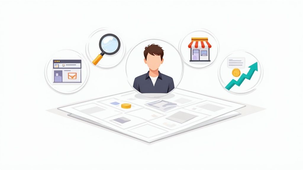
Why This Mindset Matters for eCommerce
For any online store, adopting user-centered design principles isn't about making your site look pretty. It's about making it feel right to the customer. This mindset directly impacts your bottom line by focusing on the user's journey, from their very first click all the way to the final "thank you" page.
When someone lands on your Shopify store, they shouldn't have to think. They should just do. A user-centered approach makes sure that happens.
- Effortless Navigation: Products are a breeze to find. Categories just make sense.
- Clear Communication: Product details, pricing, and shipping info are transparent and easy to digest. No surprises.
- Reduced Friction: The checkout is smooth and simple, without all the annoying steps or confusing forms that lead to abandoned carts.
- Increased Trust: The whole experience feels professional, secure, and respectful of the customer's time.
By building your eCommerce site around your customer's needs, you transform a simple transaction into a positive, memorable interaction. This doesn't just nudge them toward a purchase; it builds loyalty, turning one-time buyers into repeat customers who feel understood. In a crowded market, that's how you win.
Understanding The Core UCD Framework
Think of user-centered design less like a rigid instruction manual and more like a conversation. It's an iterative process, a flexible framework for building better experiences for your customers. I like to compare it to a custom home builder working closely with a client. There’s a logical flow, but the goal is always to ensure the final product—your eCommerce store—is a perfect fit for the person who will actually live in it: your customer.
This isn't some new-age fad, either. The core ideas have been refined over decades. The term was officially coined by Don Norman way back in 1986 to pull the focus away from what a system could do and onto the user's actual needs and limitations. Norman, who later became Apple's first "User Experience Architect," was instrumental in baking these concepts into the design practices we rely on today.
The Four Iterative Phases of UCD
The UCD process isn’t a straight line from A to B; it's a cycle. You're constantly learning, creating, testing, and refining. Each phase feeds directly into the next, which is what keeps the user squarely at the center of your project from the initial sketch to the final launch.
The whole thing breaks down into four key stages:
- Understand the Context of Use: This is your detective phase. You dig in to figure out who your users are, what they’re trying to accomplish on your site, and the environment they're in when they do it.
- Specify the Requirements: With your insights in hand, you start drawing up the blueprint. This is where you clearly define what the user needs and what the business needs, making sure both are perfectly aligned.
- Produce Design Solutions: Now for the fun part—the creative stage. You start actually building things, moving from rough sketches and wireframes to interactive prototypes that bring your solutions to life.
- Evaluate the Design: Finally, you get your designs in front of real users. You collect feedback, watch what works and what falls flat, and use those crucial insights to circle right back to the beginning and make things even better.
The real power of this framework is that it’s built on iteration. You don’t just launch a feature and cross your fingers. You build a little, test it, learn from what happens, and improve it. This continuous feedback loop is what separates a good design from a truly great, user-focused experience.
To really get a handle on what your users are experiencing, tools like Customer Journey Mapping are invaluable. Mapping out every touchpoint gives you a bird's-eye view of their entire interaction with your brand, making it much easier to spot friction points and opportunities.
The infographic below really drives home how these foundational principles fuel the entire UCD framework.
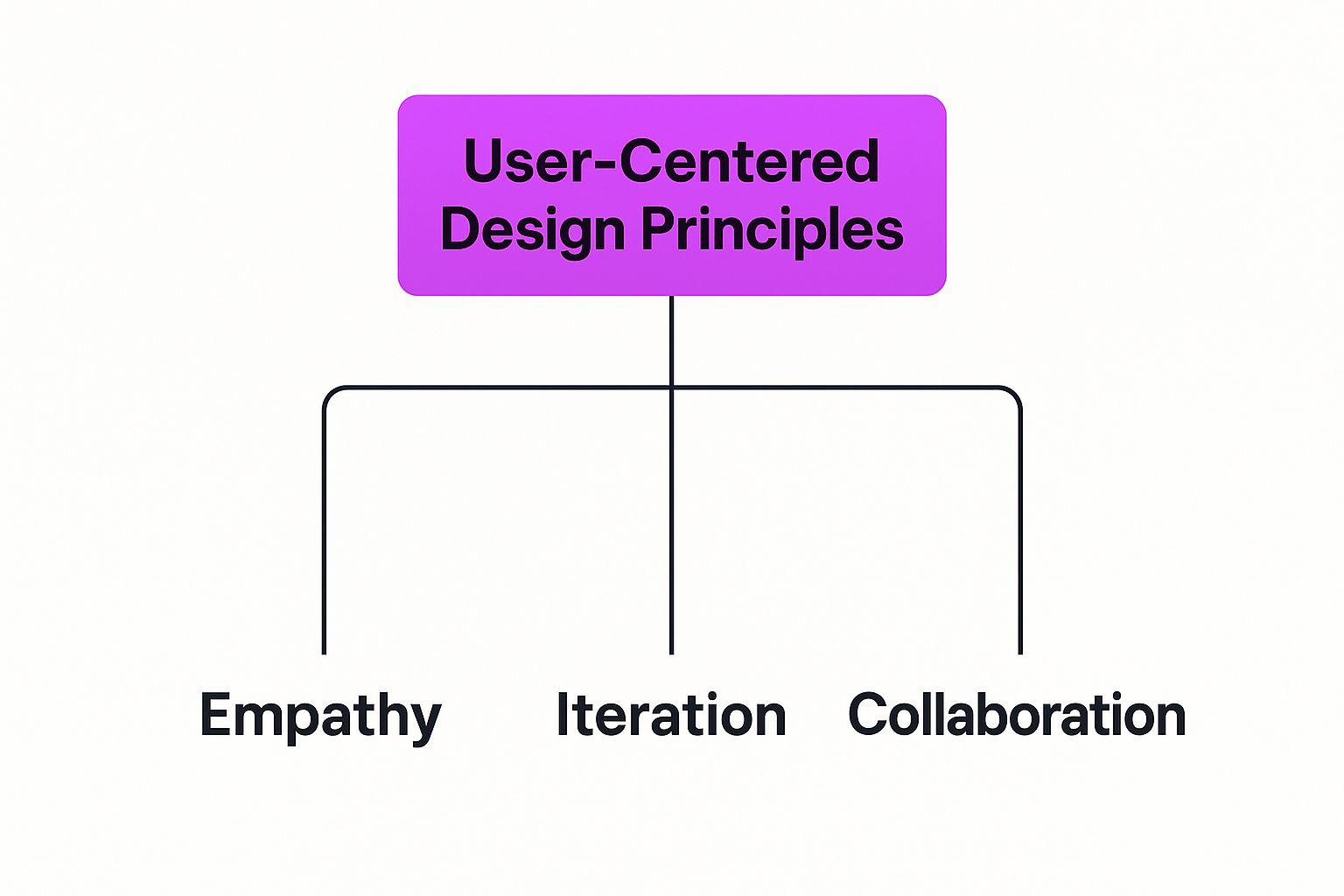
It all comes back to a foundation of empathy, constant iteration, and genuine collaboration.
A Practical Look at the UCD Phases
So, how does this all translate to a real-world eCommerce store? The goal is to move from fuzzy ideas to concrete actions that genuinely improve the shopping experience and, ultimately, your bottom line.
To give you a clearer picture, here’s a quick breakdown of the UCD process in an eCommerce context.
The Four Phases of the UCD Process
This table summarizes the core iterative phases of user-centered design, highlighting their goals and showing what they look like in practice for an online store.
By moving through these phases systematically, you take the guesswork out of the design process. Every decision you make is grounded in real user insights, leading to a much more intuitive, effective, and successful online store.
How Great UX Drives Real Business Growth

Let's get one thing straight: applying user-centered design principles isn't just about making your store look pretty or ensuring the checkout process is smooth. It's one of the most powerful levers you can pull for real, tangible business growth. This is where a happy customer directly translates into a healthier bottom line, turning your investment in their experience into a serious competitive advantage.
Too many store owners see design as a line item on the budget—a cost to be trimmed. But the data tells a much different story. A customer-first approach is a strategic investment with a measurable, and often massive, return. It's the engine that powers higher conversion rates, forges unbreakable customer loyalty, and tackles the expensive problem of abandoned carts head-on.
The Financial Impact of a User-First Strategy
The link between a killer user experience (UX) and financial success isn't just a hunch; it's a proven business reality. When customers find your store intuitive, trustworthy, and genuinely easy to use, they are far more likely to click "buy." Even better, they're more likely to come back. This sparks a sustainable growth loop fueled entirely by positive interactions.
The numbers don't lie. Studies show that a smart investment in UX can boost conversion rates by as much as 400%. And for every single dollar invested in creating a better user experience, the average return is a staggering $100. That's an ROI of 9,900%—a figure that screams "great design pays for itself."
This impact boils down to a simple human truth: people hate frustration. After just one bad experience, a whopping 88% of online shoppers are less likely to ever return to that website. This makes it painfully clear that poor UX doesn’t just lose you a sale; it can lose you a customer for life.
From Good Experience to Business Moat
In today's crowded marketplace, your user experience is one of the few things your competitors can’t just copy and paste. It becomes a protective "moat" around your business, fostering a kind of loyalty that's incredibly difficult for others to penetrate.
A superior user experience builds trust and an emotional connection. Customers who feel understood and valued become less sensitive to price and more likely to turn into brand advocates, driving the kind of powerful word-of-mouth marketing that money simply can't buy.
This creates a virtuous cycle of benefits that compound over time:
- Higher Customer Lifetime Value (CLV): Satisfied customers buy more products, more often.
- Lower Customer Acquisition Cost (CAC): Happy customers refer their friends, reducing your marketing spend.
- Stronger Brand Reputation: A seamless experience builds a name for quality and reliability.
By prioritizing user-centered design principles, you're not just tweaking your website. You're building a more resilient, profitable, and defensible business. For a deeper dive into putting this into practice, check out our guide on eCommerce user experience best practices. Think of it as an investment in your customers that pays dividends across every corner of your operation.
Putting UCD Principles into Practice on Your Store
Knowing the theory is one thing, but actually putting user-centered design principles to work on your eCommerce store is where the magic happens. This isn't about some massive, budget-draining overhaul. It’s about making smart, targeted improvements that iron out the wrinkles in your customer's journey.
The goal is to step into your customer's shoes and look at your store through their eyes. By figuring out where they might get confused, frustrated, or hesitant—whether it's on a product page or during checkout—you can make simple changes that have a huge impact on their experience and, ultimately, your sales.
Simplifying Your Site Navigation
Think of your store’s navigation as a friendly concierge in a big hotel. Their job is to point guests exactly where they need to go, no fuss. If that concierge is confusing or sends people in circles, guests get annoyed and leave. It’s the exact same story with your website.
A classic mistake is organizing categories based on internal company jargon instead of how real customers actually think and shop.
The heart of user-centered navigation is predictability. A shopper shouldn't have to play detective to find a product. The layout should feel so natural that they don't even notice it.
To get there, start by watching how people actually use your menu. Heatmaps will show you what’s getting clicked, and session recordings will reveal where they hesitate or get stuck. From there, you can start simplifying things.
- Use Clear and Familiar Labels: Ditch the clever, branded terms for your categories. Stick to simple language everyone gets, like "Men's T-Shirts" instead of "The Forge Collection."
- Limit Top-Level Menu Items: Too many options cause decision fatigue. Try to keep your main menu to 5-7 categories to keep things clean and focused.
- Implement a Robust Search Function: For shoppers who know exactly what they want, a powerful search bar is a lifesaver. Features like autocomplete and smart filters act as a safety net for anyone who can't immediately find their way through the main navigation.
These small tweaks can make a world of difference, guiding users right to the products they're looking for with zero friction.
Optimizing Your Product Detail Pages
Your product page is your digital salesperson. Its one and only job is to give shoppers all the information and confidence they need to hit that "Add to Cart" button. A user-centered product page answers a customer's questions before they even think to ask them.
It's tempting to throw every last detail onto the page at once, but that just creates a cluttered mess. Instead, focus on a clear visual and informational hierarchy.
Start by placing the most critical elements "above the fold" so they're visible without scrolling. This includes:
- High-quality product images and video
- The product title and price
- Key options like size and color
- A big, bold "Add to Cart" button
As the user scrolls down, you can then unpack the finer details—full descriptions, specs, customer reviews, and shipping info. Breaking this content into scannable chunks with clear headings, bullet points, and icons makes it far easier to digest. A great way to enhance the page is by showing related items. You can learn more about how to set up effective eCommerce product recommendations to boost cross-sells and improve the shopping journey.
Streamlining Your Checkout Process
The checkout is the final hurdle. It’s also the place where an estimated 70% of shoppers abandon their carts. Any little bit of friction here—an unexpected shipping cost, forcing someone to create an account, a confusing form—can kill a sale in an instant. Applying user-centered design principles to your checkout is probably one of the most profitable things you can do.
The name of the game is making the process as smooth and transparent as possible. To see how this works in practice, let's compare some common approaches with their user-centered counterparts.
UCD Implementation Checklist for eCommerce
This table breaks down how to apply a user-centered mindset to key parts of your store, transforming a standard feature into one that truly serves the customer.
By systematically knocking down these small roadblocks, you create a checkout experience that feels safe, simple, and fast. This builds the trust needed to turn browsers into buyers, ensuring more of your hard-won traffic converts into actual revenue.
Learning from Brands That Mastered UCD

Theory and frameworks are one thing, but seeing user centered design principles out in the wild is where their power really clicks. The best way to learn is to look at how the top eCommerce brands use these principles not just to stay afloat, but to completely own their markets.
These companies don’t just happen to have a good user experience; it's a core part of their product. They're selling more than just physical goods—they're selling confidence, convenience, and the feeling of being understood. By breaking down what makes them so successful, we can put together a playbook of tactics for any store.
Amazon: The Master of Low-Friction Buying
It’s impossible to have a conversation about user-centered eCommerce without bringing up Amazon. Their design might not be winning any beauty contests, but its raw effectiveness is undeniable. Amazon’s entire system is built to eliminate every single roadblock between a person’s desire for a product and the final purchase.
Their famous "1-Click" ordering is the perfect example. It cuts right to the chase, understanding that the user's ultimate goal is to get their stuff with as little fuss as possible. By stripping away every non-essential step, that single feature becomes a masterclass in reducing mental effort and respecting the customer’s time.
But it doesn't stop there. Their use of social proof and user-generated content is just as powerful.
- Customer Reviews and Q&As: These features build trust by letting real buyers do the talking. A shopper can quickly find out if a shirt runs small or if a gadget works with their other devices, all without ever leaving the product page.
- "Frequently Bought Together": This is much more than a simple upsell. It's a genuinely helpful feature that anticipates a customer's needs, helping them find complementary items they might have forgotten. It makes their original purchase more complete and useful.
Amazon's dominance is a direct result of an obsessive focus on what the user wants: speed, confidence, and convenience.
Warby Parker: Turning a High-Stakes Purchase into a Fun Experience
Not long ago, buying prescription glasses online seemed like a crazy idea. It’s a major purchase that traditionally required an expert fitting in a physical store. Warby Parker flipped the script by tackling the customer's biggest fears head-on with a brilliant user-centered solution.
Their "Home Try-On" program is the star of the show. It directly answers the core user problem: "How will these frames actually look and feel on my face?" Instead of relying on tech alone, they created a physical, risk-free experience that brings the best part of in-store shopping right to your living room.
By tackling the biggest point of friction head-on, Warby Parker transformed a stressful decision into an enjoyable and shareable activity. They didn't just build a website; they built a new, user-friendly way to buy glasses.
Their virtual try-on tool is another fantastic layer. Using a phone’s camera, it gives a surprisingly accurate preview of how different frames will look. This feature directly supports the user’s need for visual confirmation and confidence before they commit, perfectly demonstrating a core user centered design principle in action.
Chewy: Serving Pet Owners with Empathy
The online pet supply giant, Chewy, has built a tribe of fiercely loyal customers by weaving empathy into every single interaction. They get it: for their customers, pets aren't just animals, they're family. This simple insight drives their entire user experience.
One of their most impactful features is the Autoship subscription. It solves a classic pet owner problem—the dreaded moment you realize you're out of food. Chewy's system lets users "set it and forget it," giving them the peace of mind that they'll never run out of essentials again.
But what truly makes Chewy special is how they handle the human side of pet ownership. The company is famous for sending hand-painted pet portraits, sympathy flowers when a beloved pet passes away, and even birthday cards. These aren't typical eCommerce tactics. They show a profound understanding of the user's emotional world, forging a bond that goes way beyond transactions. By placing empathy at its core, Chewy has created a brand that people don't just buy from—they genuinely love.
Common Questions About User-Centered Design
As more and more businesses connect the dots between happy customers and healthy revenue, it's only natural to get curious about a more structured approach. But diving into user-centered design principles can feel like a lot at once, and it usually brings up a few very practical questions.
Let’s clear the air and tackle some of the most common things people ask. The goal here is to give you straightforward answers so you can start making changes with confidence.
How Is UCD Different From UX or UI?
This is easily the question I hear most often, and for good reason—these terms get thrown around together all the time. The simplest way I've found to explain it is with a set of nesting dolls.
- User Interface (UI): This is the smallest doll, the surface you see and touch. UI is all about the visual stuff a user interacts with—the buttons, the fonts, the colors, the layout. It's the look and feel of your store.
- User Experience (UX): This is the next doll, and it holds the UI inside it. UX is the entire feeling a person gets while using your site. Was it easy? Was it frustrating? Did it help them do what they came to do? It’s the whole journey.
- User-Centered Design (UCD): This is the biggest doll, the one that contains both UX and UI. UCD isn't the final product itself, but the process you follow to create a fantastic user experience. It's the philosophy of putting your customer at the heart of every single decision.
So, in short, you use the UCD process to build a great UX, which is brought to life through a beautiful and effective UI.
How Can I Apply UCD With a Small Budget?
There's a persistent myth that user-centered design requires a massive research budget and a dedicated team of scientists in lab coats. While more resources are always nice, the real core of UCD is a mindset, not a price tag. You can start making a huge difference with some simple, low-cost activities.
The most expensive mistake is building something nobody wants. Even a little bit of user research upfront can save you thousands in development costs by making sure you're building the right thing from the start.
Here are a few budget-friendly ways to get going:
- Just Talk to Your Customers: You don't need a fancy lab. Hop on a 15-minute call with a handful of recent customers and just ask them about their shopping experience. You'll be amazed at what you learn.
- Use Free Tools: Amazing tools like Hotjar or Microsoft Clarity have free plans that let you watch real session recordings and see heatmaps of where people are actually clicking.
- Run 5-Second Tests: Seriously. Show a screenshot of your homepage to someone for just five seconds, then hide it and ask what they remember. It’s a lightning-fast way to check if your main value proposition is hitting home.
What Are the Best Metrics to Track UCD Success?
To know if all this effort is actually working, you have to measure it. But don't get lost in a sea of analytics. Just focus on a few key metrics that are a direct reflection of the user experience.
The trick is to benchmark these numbers before you make changes. Then, as you roll out improvements based on user-centered design principles, you can watch how these metrics move. This data-driven approach not only proves the ROI of your work but also tells you exactly where to focus your energy next.
Ready to transform your Shopify store into a high-converting, customer-focused powerhouse? At ECORN, we specialize in applying these proven design and CRO strategies to help brands like yours grow. See how our Shopify expertise can work for you. Learn more about ECORN's services.


Discover the Top Social Media Marketing Agencies For

Consumer Confidence Definition for eCommerce in 2026

What Is Social Commerce? Your 2026 Guide to Boosting Sales

A Social Ad Campaign Playbook for eCommerce Growth

7 Best FAQ Page Examples for SaaS & eCommerce

Market Research in Fashion Industry: A Guide for Shopify

Shopify Migration Services: Expert Guide for 2026

Mastering FB Retargeting Ads for Shopify in 2026

What Is Omnichannel Ecommerce

Master Your Shopify Plus Migration: The 2026 Guide

Shopify Integration Services: A Merchant's 2026 Guide

Shopify Collection Description: A Guide to SEO & Sales

Shopify Plus Contact: Reach Sales & Support Effectively

Top Luxury Shopify Stores: Design & UX Strategies

How to Improve Customer Experience: A Shopify Roadmap

Creative Facebook Ads: 10 Examples for Shopify Brands

Remarketing with Facebook Ads: A Shopify Guide for 2026

SEO Linking Strategies for Shopify Stores

Top 7 Statistics YouTube Channels for eCommerce in 2026

Hiring Shopify Plus Designers: A Founder's Guide

Shopify Product Variation: Master Your Variants for 2026

Leverage Ai Solutions Brands: Your 2026 Shopify Growth Guide

Filters in Shopify: A Guide for Growing Brands

Shopify Plus Developer: A Guide for Growing Brands

When Does Black Friday Online Start? A 2026 Guide

Black Friday Email Marketing: Shopify & Klaviyo Guide

Polaris Design System: The Complete Shopify Guide

How to Hire a Consultant Email Marketing Expert

What Is Q4? A Shopify Merchant's Guide to Peak Season

Marketing Organization Structure for eCommerce Growth

Top Account-Based Marketing Agency Guide for 2026

7 Remarketing Ad Examples for Your 2026 Campaigns

AI Retail Solutions: Boost Your Shopify Store

Migrate to Shopify: The Definitive 2026 Guide

Shopify Authentication App: A Guide for Secure Stores

Why Strategic Marketing Is Important for Growth in 2026

How to Create a Size Chart in Shopify: 2026 Guide

Shopify Themes for Jewelry: The Definitive 2026 Guide

Minimal Shopify Templates: Faster, Higher-Converting Stores

Maximize Profit: Shopify CC Fees 2026 Guide

Best Shopify Apps for Beginners in 2026

How to Improve Online Shopping Experience in 2026

Shopify Design and Development Services: A 2026 Guide

Small Business Social Media Marketing Agency: A Hiring Guide

Bulk Edit Shopify: A Guide to Save Hours on Store Updates

2026 Trends in Food and Beverage Industry

Post Purchase Survey Guide for Shopify Stores

How to Build an Ecommerce Brand in 2026

Conversion Rate Optimization for Ecommerce: Maximize Profit

How to Use Customer Data to Increase Sales: A Guide

Shopify for Enterprise: The 2026 Deep Dive Guide

Email Marketing Agencies: The Guide for Shopify Brands

Boost Sales With The Right Shipping Shopify App

Your Guide to the Shopify Site Map

7 Headless Commerce Examples for 2026

Mastering Trends in Cosmetic Industry for 2026

Transfer Shopify to BigCommerce The Complete 2026 Playbook

What Is Shopify Collective? Your 2026 Guide to Success

Unlock Shopify Growth with Site Link SEO

Integrating Shopify and WordPress A Complete Guide for 2026

Naming a Clothing Store: A Shopify Founder's Playbook

Guide to buying shopify store in 2026

Buying shopify store: Buying a Shopify Store: Invest Wisely

Food & Beverage Marketing: A Complete Guide for 2026

Facebook Ads Agency: A Shopify Brand's Hiring Guide

Shopify Apparel Stores: A 2026 Launch & Scale Guide

How to Deactivate Shopify Store: The 2026 Guide

Shopify and Square: The 2026 Ultimate Comparison

Your Guide to Beauty Products Ecommerce

A Guide to Marketing for Beauty Brands in 2026

Your Guide to Facebook Black Friday Ads

Facebook Ad Ecommerce for Shopify Growth

Iconography Web Design The Definitive Guide for Shopify Stores

A Modern Backlinks SEO Strategy for Shopify Stores

How to Launch an Online Store: A Step-by-Step Success Guide

Optimize Shopify Store: Master Performance in 2026

Successful Migration for Shopify: Protect SEO & Grow

Maximize Traffic & Sales: Get Your Free Website Audit Report

Master the Best Ads Facebook Formats for eCommerce Success

How to Find the Best Ecommerce Agency Near Me in 2026

10 Crucial White Hat Techniques SEO for Shopify in 2026

How to Reduce Returns and Boost Profits in Your eCommerce Store

What Is Ecommerce Personalization A Guide to Unlocking Growth

Payment gateways in shopify: The Ultimate Guide for Merchants 2026

Fulfillment services for shopify: Scale Your Ecommerce Brand
Shopify Landing Page Examples: 7 Winning Templates to Boost Conversions
How to Create Urgency in Sales on Shopify

The Best Review Apps for Shopify to Drive Growth in 2026

The Best Ecommerce Platform for Startups in 2026
Choosing Ecommerce Website Design Packages A Complete Guide

Shopify Plus Partners: Guide to shopify plus partners for 2026 growth

How to Find serp feature opportunities: Win SERP Snippets in 2026
Selling on Etsy vs eBay A Guide for eCommerce Brands in 2026

10 Proven Sample Email Campaigns for Shopify to Boost Sales in 2026

A Winning Digital Content Marketing Strategy for Shopify in 2026

Top 7 Best Shopify Agencies to Scale Your Business in 2026

Ecommerce Website Development Cost in 2026 A Realistic Guide

10 Advanced Link Building Tips for eCommerce Brands in 2026

10 Game-Changing Social Media Advertising Ideas for Shopify Brands in 2026

Google Ads for Ecommerce Your Ultimate Guide for 2026


newsletter in your inbox