To lower your bounce rate, you first have to get inside your visitors' heads and figure out why they’re leaving. It almost always boils down to a simple mismatch between what they expected and what they actually experienced on your site. Maybe the page loaded too slowly, the navigation was a mess, or the content just didn't answer their question.
Fixing these core issues is the only real way to keep people engaged and clicking around.
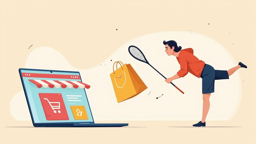
Understanding Why Shoppers Bounce
Before you can fix a high bounce rate, you have to stop thinking of it as just a number in Google Analytics. It’s direct, unfiltered feedback. A bounce is a clear signal that something on your page fell flat.
Think of it this way: a potential customer walks into your brick-and-mortar store, takes one look around, and immediately walks right back out. You’d want to know why, right? The same goes for your website. Digging into the "why" is the most important first step.
Common Reasons for a High Bounce Rate
Visitors bounce for a lot of different reasons, and your job is to play detective and figure out which ones are plaguing your site. A classic culprit is a disconnect between your marketing and your website. For example, if you run an ad promising a 50% off sale, but the landing page makes no mention of it or buries the offer, people will feel misled and leave instantly.
Other major factors that send shoppers running include:
- Slow Page Load Speed: In eCommerce, every second counts. If a product page takes more than a couple of seconds to load, impatient shoppers are gone.
- Poor Mobile Experience: A site that’s clunky or hard to use on a smartphone is a guaranteed way to lose on-the-go shoppers.
- Confusing Navigation: Can users easily find product categories, the search bar, or their cart? If not, they'll get frustrated and give up.
- Unclear Value Proposition: From the moment they land, visitors need to understand what you sell and why they should buy it from you.
A high bounce rate isn’t a traffic problem—it's a user experience problem. It tells you that you did the hard part of getting someone to your site, but then failed to give them a compelling reason to stick around.
Looking at the bigger picture, bounce rates vary wildly depending on the type of website. YouTube, for instance, has a relatively low bounce rate of around 34.29% because its entire model is built on serving up engaging, personalized video content to keep you watching. On the flip side, a site like Twitter sees a much higher bounce rate of approximately 71.46%, as users often just check one thing and leave.
This massive difference really drives home how much content relevance and user experience dictate whether a visitor stays or goes.
Ultimately, tackling your bounce rate is a fundamental part of good Conversion Rate Optimization (CRO) practices. When you understand why people are leaving, you can make targeted fixes that not only keep them on your site longer but also guide them smoothly toward the checkout. The goal is to perfectly align your site's experience with what the visitor wanted in the first place.
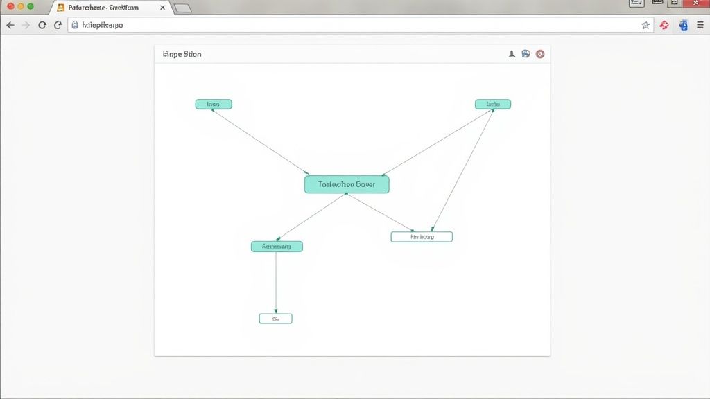
Quick Diagnostic Checklist for High Bounce Rate Pages
Use this checklist to quickly assess your top exit pages and identify potential reasons for visitor drop-off.
This quick-and-dirty checklist isn't exhaustive, but it's a great starting point for identifying the low-hanging fruit and forming a hypothesis about why a specific page is underperforming.
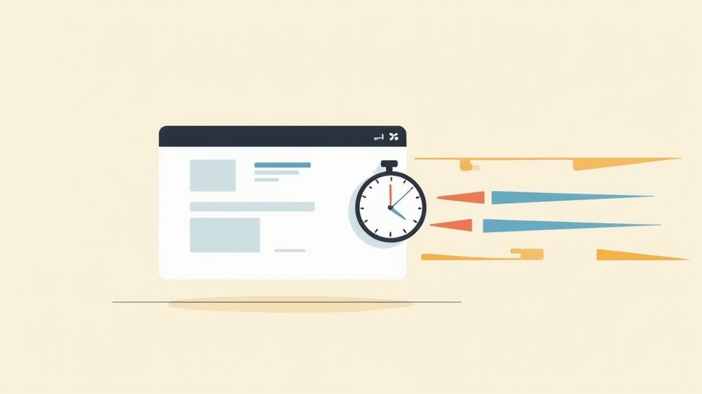
Mastering Site Speed and Mobile Performance
In eCommerce, speed is everything. A customer waiting for a page to load is a customer you're about to lose. Seriously, think about it—just a one-second delay in mobile load times can slash conversion rates by up to 20%. This isn't just a tiny hiccup; it's a direct hit to your sales.
If you want to get your bounce rate under control, you have to become obsessed with how quickly your site responds, especially on phones. Slow performance is one of the biggest reasons shoppers leave a page before it even finishes loading.
Pinpoint Performance Bottlenecks
Your first move is to get a real, objective measure of your site's speed. Don't just judge it based on how fast it loads on your office Wi-Fi. Tools like Google PageSpeed Insights give you an honest performance score and, more importantly, a checklist of exactly what to fix.
You get a clear breakdown for both mobile and desktop, showing you exactly where the friction is.
This report instantly flags issues with things like Largest Contentful Paint (LCP) and Cumulative Layout Shift (CLS), metrics that directly tie into how a visitor experiences your site.
Focus on these areas for the quickest wins:
- Image Optimization: Huge, uncompressed product photos are notorious speed killers. Use tools to shrink image file sizes without making them look grainy. Serving them in modern formats like WebP is a game-changer.
- Code Minification: This just means cleaning up your site's CSS, JavaScript, and HTML files by stripping out unneeded characters and spaces. It makes the files smaller and way faster for browsers to download.
- Browser Caching: Set up caching so return visitors don't have to download your entire site all over again. Their browser holds onto key parts of your site, making their next visit feel almost instant.
For a much deeper dive into getting your store up to speed, our guide on Shopify page speed optimization has a ton of practical steps you can take right now.
Adopt a Mobile-First Mindset
Look, a "responsive" site isn't good enough anymore. Your store needs to feel like it was built for a phone, not just squished to fit on one. A mobile-first approach is absolutely critical because people behave completely differently on their phones. Their patience is much thinner.
The data backs this up. For example, Twitter's desktop bounce rate is roughly 25% lower than its mobile rate. That gap tells a story: a clunky mobile experience sends people running for the exit.
A great mobile experience is more than just readable text. It's about making sure buttons are easy to tap, navigation feels natural with your thumb, and the checkout process doesn't make you want to throw your phone. Every single interaction should feel effortless.
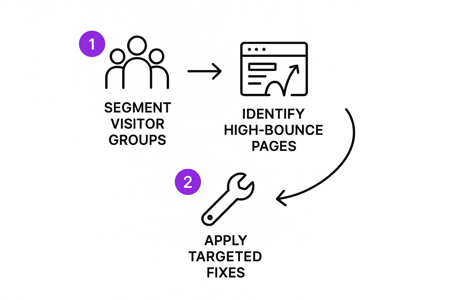
This isn't just about tweaking a few things here and there. It's about a strategic flow: segmenting your audience, finding the problem pages, and then rolling out targeted fixes. This approach is especially powerful for dialing in your mobile experience and keeping those visitors engaged.
Designing an Intuitive Shopping Journey
When someone lands on your site, they need to feel like you’ve rolled out the red carpet for them. A confusing or illogical layout is the digital equivalent of a locked door—it's the fastest way to make them turn around and leave. Getting this intuitive shopping journey right is absolutely fundamental to lowering your bounce rate.
Think about the last time you were in a well-organized store. Signs guide you to different departments, popular items are easy to find, and the path to checkout is crystal clear. Your website has to do the same thing, just digitally.
Create a Clear Visual Hierarchy
Your most important information has to grab a visitor's attention immediately. This is all about having a strong visual hierarchy. Key elements like your value proposition, current promotions, and those all-important "Add to Cart" buttons should pop through smart use of color, size, and placement.
For example, a product page should instantly draw the eye to the product title, high-quality images, the price, and a brightly colored call-to-action button. Don't make people hunt for the critical stuff.
A great user journey feels effortless. Every click should feel logical and move the shopper closer to their goal without them having to think about how to use your website. If they're confused, they're gone.
It's not just a gut feeling, either. One study found that 38.5% of users will ditch a site simply because the design is outdated or poorly structured. That number alone shows just how crucial it is to guide the user's eye and make the path forward obvious.
Streamline Your Site Navigation
I've seen it a hundred times: clunky navigation is a major source of frustration and a surefire way to send your bounce rate through the roof. Your main menu should be simple, logical, and use words your customers actually understand. Avoid trying to be clever with vague category names; stick to clear labels like "Men's T-Shirts" instead of something abstract like "Threads."
To really guide users and reduce friction, it's worth implementing the best ecommerce website design strategies for a smoother shopping experience. A well-organized menu empowers people to explore your store with confidence.
Here are a few quick wins for better navigation:
- Sticky Header: Keep your main navigation and search bar visible at the top as users scroll. It's a small thing that makes a huge difference.
- Logical Categories: Group products in a way that makes sense to a first-time visitor. Use subcategories so the main menu doesn't become an overwhelming wall of text.
- Prominent Search Bar: Make your search bar impossible to miss, especially on mobile. A lot of shoppers know exactly what they want and will go straight for the search.
- Smart Internal Linking: Use descriptive anchor text in product descriptions or blog posts to point shoppers toward related items or categories. This encourages them to stick around and browse.
Use High-Quality Visuals to Answer Questions
High-resolution product photos and videos do more than just show off your items; they answer questions and build trust before a shopper even thinks to ask. Can they see the texture of the fabric? Is there a video showing the product in use?
By providing this rich visual context, you're preemptively handling their concerns, making them feel more confident and far less likely to bounce. It’s a simple step that can dramatically improve engagement and keep visitors on your pages longer. Ultimately, an easy-to-navigate site with clear visual cues is non-negotiable for anyone serious about turning browsers into buyers.
Make Your Content and CTAs Impossible to Ignore
Let's get one thing straight: your product pages have a single, critical job. They must convince a visitor, in a matter of seconds, that your product is the solution they've been searching for. If your content is vague, uninspired, or just plain boring, shoppers have zero reason to stick around. This is where you roll up your sleeves and master persuasive copy and crystal-clear calls to action.
Think of your product descriptions as your best salesperson, working 24/7. They can't just list features; they have to sell the experience. Instead of saying a backpack has "durable nylon straps," you need to paint a picture. Talk about how those straps deliver "all-day comfort on your longest hikes, so you can focus on the view, not your shoulders." See the difference? You're helping the shopper imagine themselves actually benefiting from the product.
Match Your Message to Their Mindset
One of the quickest ways to trigger a bounce is a mismatch between what a visitor expects and what they actually find. It's a classic mistake. Your Google Ad screams "Luxury Silk Pillowcases," but the landing page headline mutters something about "High-Quality Bedding."
That tiny disconnect is enough to create confusion and doubt. The visitor immediately wonders, "Am I in the right place?" More often than not, they'll hit the back button to find a page that directly mirrors their search. Make sure your landing page headline and key messages are a perfect reflection of the ad copy, search result, or social media post that brought them there. It's about creating a seamless, reassuring transition.
Engineer a High-Converting Call to Action
Your call to action (CTA) is arguably the most important element on the entire page. It's the big, shiny button that tells the visitor exactly what to do next. A weak, generic "Submit" button isn't going to inspire anyone. Your CTA has to be compelling, impossible to miss, and maybe even create a little bit of urgency.
When you're designing your CTAs, focus on these game-changers:
- Action-Oriented Language: Use strong, commanding verbs. "Get Your Free Trial" is miles ahead of a passive "Sign Up." For an eCommerce store, stick to direct and effective phrases like "Add to Cart," "Buy Now," or "Shop the Collection."
- Contrasting Colors: Your CTA button needs to pop. If your site’s color palette is mostly blue and white, a bright orange or green button will instantly draw the eye and practically beg to be clicked.
- Smart Placement: Put your main CTA "above the fold" so it’s one of the first things a visitor sees, no scrolling required. For longer product pages, it’s a great strategy to repeat the CTA further down the page so it's always within easy reach.
A sobering study found that users spend an average of just 5.59 seconds looking at a website’s written content. That’s a tiny window. Your message and CTA have to be instantly obvious and incredibly persuasive.
Ultimately, your content and CTAs are a one-two punch. The copy builds desire, and the CTA provides the clear, simple path to get what they want. When you nail both, you give visitors every reason to engage with your site instead of bouncing away. Your goal is to make clicking that "Add to Cart" button feel like the most natural, obvious next step in their journey.
Build Trust So They Stick Around
When a new visitor lands on your site, the clock starts ticking. You have just a few seconds to earn their trust. They don’t know you, and asking for their credit card information before establishing any credibility is a fantastic way to send your bounce rate through the roof.
Building that initial trust isn't just a "nice to have"—it's a requirement for survival. This means you need to prominently display signals that tell shoppers your store is legitimate, secure, and that real people stand behind it. Think of these as digital handshakes that reassure them it’s safe to stick around and browse.
Display Powerful Trust Signals
The best trust signals tackle a visitor's subconscious question head-on: "Is this a real business, and can I trust them?" They provide social proof and security validation at a glance.
Here are the signals I always recommend my clients feature prominently:
- Customer Reviews: Shoppers trust other shoppers more than they'll ever trust you. Placing authentic reviews and star ratings directly on your product pages offers instant proof that your products are real and that people are happy with them. In fact, showing reviews can boost conversion rates by a staggering 270%. Our guide on how to add reviews to Shopify is a great place to start.
- Security Badges: Logos from names like McAfee, Norton, or the Better Business Bureau are visual shortcuts for security. I find placing them near "Add to Cart" buttons or in the site's footer is most effective for reassuring customers that their payment info is safe.
- A Clear Return Policy: No one wants to feel like they're making a risky purchase. An easy-to-find, clearly worded return policy shows you stand behind your products and removes a huge barrier to buying.
Trust is the currency of eCommerce. A visitor who feels secure is far more likely to explore your products, while a visitor who feels uncertain is already halfway out the door.
Use Engagement Hooks to Keep Them Exploring
Once you've established that baseline of trust, the next job is to give visitors a compelling reason to interact with your site. These "engagement hooks" can turn a passive browser into an active participant, slashing your bounce rate in the process.
This is where knowing some industry benchmarks comes in handy. Bounce rates vary wildly—gaming sites often see lower rates (around 46.70%) because the content is naturally interactive, while B2B sites can be anywhere from 25-55%. For eCommerce, we have to create that engagement. You can find some great industry-specific traffic statistics on vwo.com to see where you stack up.
Try implementing these hooks to keep people on your site longer:
- Smart Exit-Intent Popups: When a user’s cursor moves toward the exit, a well-timed popup can be a lifesaver, not an annoyance. Trigger a popup offering a 10% discount on their first order. It's a simple, powerful incentive to get them to reconsider leaving.
- Product-Finder Quizzes: If you've got a large catalog, a quiz like "Find Your Perfect Skincare Routine" is a fantastic way to guide users to the right products. It personalizes the shopping experience and keeps them clicking.
- Responsive Live Chat: An accessible live chat widget signals that you're available to help. Even if a visitor doesn't use it, just seeing it there can boost their confidence and encourage them to continue shopping.
Common Questions About Reducing Bounce Rate
Even after you've rolled out a bunch of fixes, some questions always seem to pop up about what bounce rate really means for your specific store. Getting the nuances right helps you set goals that actually make sense and stop misinterpreting your analytics.
Let's dig into a few of the most common questions we hear from eCommerce owners. Getting these answers straight turns a confusing metric into a genuine tool for growth.
What Is a Good Bounce Rate for an eCommerce Website?
For most online stores, a "good" bounce rate hovers somewhere between 20% and 45%. But honestly, context is everything.
A product page someone landed on from a Google search will almost always have a higher bounce rate than your homepage. That’s not necessarily a bad thing—they might just be quickly comparison shopping before coming back later.
The key is to benchmark against yourself. Instead of getting hung up on some universal "magic number," your real goal should be to see a steady downward trend as you make improvements.
If your site-wide bounce rate is consistently creeping over 55%, that’s a pretty clear signal that you’ve got some major user experience issues to tackle. Don't panic, but do see it as a green light to start digging into the problems we've covered.
How Does a High Bounce Rate Affect My SEO?
This is a big one. While Google has clarified that bounce rate isn't a direct ranking factor, it's a huge clue about user satisfaction—which absolutely impacts SEO.
Think about it from Google's perspective. When someone searches, clicks your link, and then immediately hits the back button to return to the search results (a behavior called 'pogo-sticking'), it sends a powerful message.
It tells search engines that your page didn't deliver what the user was looking for. If this happens enough, Google's algorithm, which is built to reward pages with strong user engagement, will start favoring your competitors' pages that do a better job of keeping visitors engaged.
How Long Until I See Results from My Changes?
Once you've pushed your changes live, you have to play the waiting game. For most stores, you'll want to give it at least two to four weeks to collect enough data to draw any real conclusions. This buffer helps smooth out any weird traffic spikes from weekends, sales, or marketing campaigns.
Want the cleanest possible data? Here's what we do:
- Use an A/B testing tool. This is the gold standard. By showing the new and old versions to different users at the same time, you get a direct, apples-to-apples comparison of which one performs better.
- Change one major thing at a time. It's tempting to overhaul everything at once, but if you redesign your navigation and optimize your product images, you’ll have no idea which change actually moved the needle.
By testing methodically and giving it enough time, you can confidently figure out what your audience responds to and make smarter decisions to get that bounce rate down for good.
Lowering your bounce rate is a continuous process of testing, learning, and refining. For expert help in optimizing your eCommerce store for conversions and user engagement, trust the specialists at ECORN. Explore our Shopify development and CRO services to see how we can help your brand grow.


Unified Commerce Platform: Benefits, KPIs & Shopify Guide

How to Reduce Bounce Rate eCommerce: Your 2026 Guide

Shopify API Integration: A Practical End-to-End Guide

How to Implement Data Governance: A 2026 Guide

Shopify Store Development Cost: A 2026 Breakdown
What Is Server Side Tracking: The Shopify Guide 2026

Marketing Automation Workflows: A Shopify Guide for 2026

Shopify: How to Reduce Technical Debt

Shopify UX Design Change: A Playbook for Growth

User Generated Content Strategy: Shopify Playbook

Shopify Pause and Build Plan Cost: A Complete 2026 Guide

Compare at Price on Shopify: A Complete Guide for 2026

Where Can I Sell My Prints? 10 Best Platforms for 2026

Shopify Order Management System: The Ultimate Guide 2026

What Is Marketing Attribution? an eCommerce Guide for 2026

10 Best Black Friday Sales Sheets for 2026

Discover the Top Social Media Marketing Agencies For

Consumer Confidence Definition for eCommerce in 2026

What Is Social Commerce? Your 2026 Guide to Boosting Sales

A Social Ad Campaign Playbook for eCommerce Growth

7 Best FAQ Page Examples for SaaS & eCommerce

Market Research in Fashion Industry: A Guide for Shopify

Shopify Migration Services: Expert Guide for 2026

Mastering FB Retargeting Ads for Shopify in 2026

What Is Omnichannel Ecommerce

Master Your Shopify Plus Migration: The 2026 Guide

Shopify Integration Services: A Merchant's 2026 Guide

Shopify Collection Description: A Guide to SEO & Sales

Shopify Plus Contact: Reach Sales & Support Effectively

Top Luxury Shopify Stores: Design & UX Strategies

How to Improve Customer Experience: A Shopify Roadmap

Creative Facebook Ads: 10 Examples for Shopify Brands

Remarketing with Facebook Ads: A Shopify Guide for 2026

SEO Linking Strategies for Shopify Stores

Top 7 Statistics YouTube Channels for eCommerce in 2026

Hiring Shopify Plus Designers: A Founder's Guide

Shopify Product Variation: Master Your Variants for 2026

Leverage Ai Solutions Brands: Your 2026 Shopify Growth Guide

Filters in Shopify: A Guide for Growing Brands

Shopify Plus Developer: A Guide for Growing Brands

When Does Black Friday Online Start? A 2026 Guide

Black Friday Email Marketing: Shopify & Klaviyo Guide

Polaris Design System: The Complete Shopify Guide

How to Hire a Consultant Email Marketing Expert

What Is Q4? A Shopify Merchant's Guide to Peak Season

Marketing Organization Structure for eCommerce Growth

Top Account-Based Marketing Agency Guide for 2026

7 Remarketing Ad Examples for Your 2026 Campaigns

AI Retail Solutions: Boost Your Shopify Store

Migrate to Shopify: The Definitive 2026 Guide

Shopify Authentication App: A Guide for Secure Stores

Why Strategic Marketing Is Important for Growth in 2026

How to Create a Size Chart in Shopify: 2026 Guide

Shopify Themes for Jewelry: The Definitive 2026 Guide

Minimal Shopify Templates: Faster, Higher-Converting Stores

Maximize Profit: Shopify CC Fees 2026 Guide

Best Shopify Apps for Beginners in 2026

How to Improve Online Shopping Experience in 2026

Shopify Design and Development Services: A 2026 Guide

Small Business Social Media Marketing Agency: A Hiring Guide

Bulk Edit Shopify: A Guide to Save Hours on Store Updates

2026 Trends in Food and Beverage Industry

Post Purchase Survey Guide for Shopify Stores

How to Build an Ecommerce Brand in 2026

Conversion Rate Optimization for Ecommerce: Maximize Profit

How to Use Customer Data to Increase Sales: A Guide

Shopify for Enterprise: The 2026 Deep Dive Guide

Email Marketing Agencies: The Guide for Shopify Brands

Boost Sales With The Right Shipping Shopify App

Your Guide to the Shopify Site Map

7 Headless Commerce Examples for 2026

Mastering Trends in Cosmetic Industry for 2026

Transfer Shopify to BigCommerce The Complete 2026 Playbook

What Is Shopify Collective? Your 2026 Guide to Success

Unlock Shopify Growth with Site Link SEO

Integrating Shopify and WordPress A Complete Guide for 2026

Naming a Clothing Store: A Shopify Founder's Playbook

Guide to buying shopify store in 2026

Buying shopify store: Buying a Shopify Store: Invest Wisely

Food & Beverage Marketing: A Complete Guide for 2026

Facebook Ads Agency: A Shopify Brand's Hiring Guide

Shopify Apparel Stores: A 2026 Launch & Scale Guide

How to Deactivate Shopify Store: The 2026 Guide

Shopify and Square: The 2026 Ultimate Comparison

Your Guide to Beauty Products Ecommerce

A Guide to Marketing for Beauty Brands in 2026

Your Guide to Facebook Black Friday Ads

Facebook Ad Ecommerce for Shopify Growth

Iconography Web Design The Definitive Guide for Shopify Stores

A Modern Backlinks SEO Strategy for Shopify Stores

How to Launch an Online Store: A Step-by-Step Success Guide

Optimize Shopify Store: Master Performance in 2026

Successful Migration for Shopify: Protect SEO & Grow

Maximize Traffic & Sales: Get Your Free Website Audit Report

Master the Best Ads Facebook Formats for eCommerce Success

How to Find the Best Ecommerce Agency Near Me in 2026

10 Crucial White Hat Techniques SEO for Shopify in 2026

How to Reduce Returns and Boost Profits in Your eCommerce Store

What Is Ecommerce Personalization A Guide to Unlocking Growth

Payment gateways in shopify: The Ultimate Guide for Merchants 2026


newsletter in your inbox