
Ecommerce conversion rate optimization (CRO) is all about turning more of your website visitors into paying customers. It’s a systematic process—not guesswork. It involves digging into your data to understand how people actually use your site and then making smart changes, like speeding up your pages or simplifying the checkout, to boost that purchase percentage.
The goal isn't just to get more traffic; it's to get more value from the traffic you already have.
Building Your CRO Foundation
It’s tempting to jump straight into A/B testing button colors or rewriting headlines. But without a solid foundation, you’re just throwing ideas at a wall to see what sticks. Real, sustainable CRO starts with building a data-driven baseline. This isn't about getting lost in spreadsheets; it's about asking the right questions to figure out why people are leaving and what convinces them to stay.
Before you can improve anything, you have to measure it. The first step is to get a clear, reliable picture of your current performance. This baseline is what you'll use to set realistic goals and know for sure if your changes are actually working. Forget vague goals like "increase sales." A strong foundation lets you zero in on specific metrics that make a real difference.
Define Your Key Goals and KPIs
Effective CRO goes way beyond the final sale. You need to think about the entire customer journey and the smaller steps, or micro-conversions, that lead to a purchase. Setting clear objectives from the start helps you focus your energy where it’ll have the biggest impact.
Here are a few common goals you might focus on:
- Reducing Cart Abandonment: Digging into why shoppers add products to their cart but never finish the checkout.
- Increasing Average Order Value (AOV): Nudging customers to spend a little more through smart upsells, cross-sells, or product bundles.
- Boosting Newsletter Sign-ups: Growing your email list is a classic move for nurturing leads and bringing customers back for more.
- Improving Add-to-Cart Rate: Tweaking product pages to convince more visitors to take that crucial first step.
These goals are tracked with Key Performance Indicators (KPIs). Picking the right KPIs is absolutely critical for diagnosing problems. For example, a high bounce rate on your product pages points to a totally different issue than a high drop-off rate during the final payment step.
Establish a Reliable Performance Baseline
You can't know if your optimizations are successful without a clear starting line. On a global scale, the average ecommerce conversion rate hovers somewhere between 2% and 4%, but this number can swing wildly. Desktop users, for instance, tend to convert at higher rates (around 3.9%) than mobile users (about 1.8%).
Knowing these benchmarks helps, but your own data is what really matters. You need to understand your numbers, inside and out.
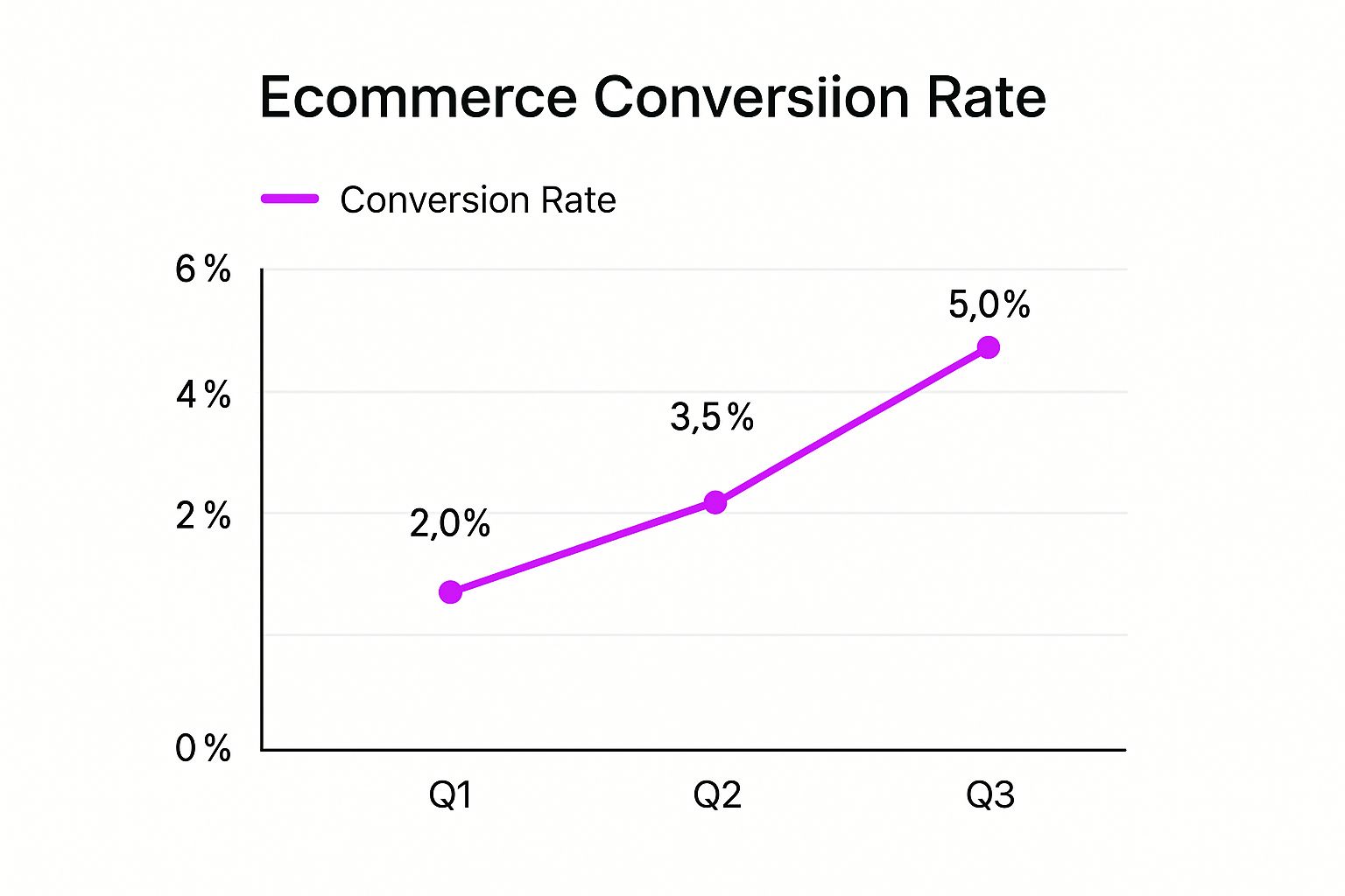
The chart above shows exactly what’s possible with a focused strategy. It illustrates a clear upward trend, moving from a 2.0% conversion rate in Q1 to 5.0% by Q3, proving the power of continuous, data-informed improvements.
To help you get started, here’s a quick rundown of the essential metrics you should be tracking from day one.
Essential Ecommerce CRO Metrics to Track
This table breaks down the critical metrics for an effective CRO program, what they reveal about user behavior, and some general industry benchmarks to aim for.
Tracking these numbers gives you a story about your customers. It tells you where the friction is, where the opportunities are hiding, and exactly where your optimization journey should begin.
Your baseline isn't just a number; it's a story about your customers. It tells you where the friction is, where the opportunities lie, and where your optimisation journey should begin.
To hit the ground running, it’s always a good idea to familiarize yourself with top conversion rate optimization best practices to see what’s working for others. This initial phase of setting up your analytics and defining your goals ensures every test and tweak you make is driven by data, not just a hunch. It turns CRO from a random shot in the dark into a strategic process that delivers real, measurable growth.
Fixing Your Technical and UX Roadblocks
A gorgeous store that loads at a snail's pace is like a beautiful shop with the doors bolted shut. All the time and money you pour into branding and product curation is wasted if people can't even get inside. This is where the non-negotiable technical and user experience (UX) fundamentals come in—they are the absolute backbone of your ecommerce conversion rate optimisation strategy.
Honestly, tackling these foundational issues is where I see clients get the biggest and quickest wins. Before you even think about A/B testing button colors, you have to make sure your site is fast, intuitive, and trustworthy.
This report from Google's PageSpeed Insights isn't just a bunch of numbers; it's a real-world performance audit. It flags critical areas like Largest Contentful Paint (LCP) and Cumulative Layout Shift (CLS). Fixing the issues it finds directly impacts how snappy and smooth your site feels to a user, which is a massive factor in whether they stick around or bounce.
Make Site Speed Your Top Priority
In ecommerce, speed isn't a "nice-to-have." It's everything. A slow site is actively costing you money by pushing away perfectly good customers. According to Google, when a page load time jumps from just one second to five, the probability of a visitor leaving skyrockets by 90%. That's a direct line from poor performance to lost sales.
Every single millisecond counts. Slow load times create friction and frustration, sending shoppers straight into the arms of your faster competitors.
Here are a few things you can do right now to speed things up:
- Compress Your Images: Large, unoptimized images are the number one culprit I find on slow ecommerce sites. Use a tool to compress them without turning them into a pixelated mess.
- Leverage Browser Caching: This tells a visitor's browser to save parts of your site, so it doesn't have to reload every single element on their next visit. It makes a huge difference for repeat customers.
- Choose the Right Hosting: That cheap, shared hosting plan might seem like a good deal, but it will buckle under pressure. A reliable host built for ecommerce traffic can dramatically improve your site's response time.
- Minimize Plugins and Apps: Every app or plugin you add can slow your site down. Do a regular audit and get rid of anything that isn't absolutely essential to your business.
Design for an Intuitive Mobile Experience
It’s no secret that more than half of all online shopping now happens on a phone. This isn't just a trend; it’s the new standard. Having a "mobile-friendly" site isn't good enough anymore. You need a mobile-first experience that feels completely natural on a small screen.
Think about how people actually use their phones. They're usually on the go, multitasking, and using one thumb to navigate. Your mobile design must cater to this reality with big, easy-to-tap buttons, dead-simple navigation, and forms that don't make you want to throw your phone across the room.
A common mistake I see all the time is brands just shrinking their desktop site to fit a mobile screen. A true mobile-first approach means designing the experience from the ground up, specifically for the constraints and behaviors of mobile users.
Your goal is to eliminate all that awkward pinching, zooming, and frustrated tapping. Every single element, from the search bar to the product filters, should be designed for thumbs.
Create a Frictionless and Trustworthy Checkout
The checkout is the final hurdle, and it’s where a shocking number of sales are lost. A confusing, long, or untrustworthy checkout process can undo all the great work you did to get the customer to this point. Your only job here is to make giving you money as easy and reassuring as possible.
Start by mercilessly cutting every unnecessary field and step. Do you really need their phone number? Is forcing them to create an account mission-critical? Every extra click is another opportunity for them to leave.
Building trust is also crucial at this stage. Here’s how:
- Display Security Badges: Show logos from trusted names like Norton, McAfee, and your payment providers. It’s a simple visual cue that you’re legitimate.
- Be Transparent with Costs: Surprise shipping fees are the number one reason people abandon their carts. Show all the costs upfront so there are no nasty shocks.
- Offer Guest Checkout: Forcing users to create an account is a massive conversion killer. Always, always, always provide a guest checkout option.
- Provide Multiple Payment Options: People have their preferences. Accommodate them by offering credit cards, PayPal, Apple Pay, and other popular methods.
By focusing on these technical and UX fundamentals, you're not just making minor tweaks; you're clearing the biggest roadblocks in the customer journey. For a deeper dive into streamlining this critical stage, check out our guide on ecommerce checkout optimization. These foundational fixes create a smooth path from browsing to buying and set the stage for more advanced conversion strategies down the line.
Using Data to Make Smarter Decisions
Optimization without data is just expensive guesswork. Once you’ve sorted out the big technical and user experience roadblocks, it's time to get your hands dirty with analytics to really steer your strategy. This is where you learn to see your store through your customers' eyes—understanding not just what they do, but digging into the why behind their actions.
Making assumptions about user behavior is one of the fastest ways to burn through your budget. Forget guessing what might improve your conversion rate. You need to gather both quantitative and qualitative data to paint a clear picture of the real friction points. This evidence-based approach to ecommerce conversion rate optimisation ensures every single change you make has a purpose.
Seeing Your Site Through Your Customers’ Eyes
The numbers in your analytics platform tell you what happened—how many people visited a page or ditched a cart. But they can’t tell you why they left. For that crucial context, you have to turn to user behavior tools that bring the customer journey to life.
Think of these tools as a one-way mirror on your website, letting you see exactly how people interact with your design and content.
- Heatmaps: These show you where users click, move their mouse, and how far they scroll. A heatmap might reveal that a non-clickable element is getting tons of clicks (a sign of confusing design) or that most visitors never even scroll far enough to see your main call-to-action.
- Session Recordings: These are anonymous video playbacks of individual user sessions. Honestly, watching just a few of these can be an eye-opening experience. You might see someone rage-clicking a broken button or struggling to find their way through a confusing menu—problems you’d never spot by looking at spreadsheets.
These insights are pure gold. For example, a session recording might show a user trying to apply a discount code over and over, only for it to fail. Then, they abandon their cart in frustration. That’s a specific, fixable problem you can tackle right away.
Gathering Direct Customer Feedback
While watching user behavior is powerful, sometimes the easiest way to understand what's wrong is just to ask. Qualitative research, like surveys and feedback forms, gives you direct access to your customers' thoughts and pain points, in their own words.
You don't need a massive research budget for this, either. Simple, well-placed feedback tools can deliver incredible insights.
Pro Tip: Add a simple, one-question survey to your order confirmation page asking, "Was there anything that almost stopped you from buying today?" The answers you'll get are invaluable for finding friction in your checkout.
You could also place a small feedback widget on pages where users often get stuck, like your shipping or returns policy pages. A simple "Was this page helpful?" can quickly flag confusing content that needs a rewrite. This direct line of communication helps you prioritize fixes that solve real customer problems.
Running Effective A/B Tests
Okay, so you've gathered data and have a few ideas about what's causing problems. Now it's time to test your solutions. This is where A/B testing comes in. It’s a methodical way to compare two versions of a page (an 'A' version, the control, and a 'B' version, the variation) to see which one performs better.
A good A/B test always starts with a strong, data-backed hypothesis. "I think a green button will work better" is a weak hypothesis. A strong one sounds more like this: "Changing the CTA button color to high-contrast green will make it more visible, leading to a higher click-through rate, because our heatmap shows the current button blends in with the background."
Crafting a solid hypothesis is just the start. To make sure your tests deliver results you can trust, you need to get the experimental design right. For a deeper dive, you can learn all about A/B testing best practices in our dedicated guide.
When you're testing, stick to changing one element at a time to isolate its impact. Some common things to test include:
- Headlines and Value Propositions
- Call-to-Action (CTA) Button Copy and Design
- Product Images and Videos
- Page Layout and Form Fields
Interpreting the results correctly is just as important as running the test. You have to wait until the test reaches statistical significance, which is a fancy way of saying you have enough data to be confident the results aren't just random chance. Acting on flimsy data is a classic mistake that can send you in the completely wrong direction.
Ultimately, great ecommerce conversion optimization comes from blending these data-driven practices. By using analytics tools like Google Analytics and Hotjar, running disciplined A/B tests, and actively listening to your customers, you can systematically smooth out the user journey and chip away at purchase friction. It’s this structured approach that lifts conversion rates from the average 2-3% range and gets them closer to the 4.8% benchmark you see with top-performing stores.
Advanced Strategies for Building Trust and Persuasion
Once your site’s technical foundation is solid and you've got real data pointing you in the right direction, it's time to dig into the more nuanced art of persuasion. This is where you shift your focus to the psychology behind why people buy, building the kind of deep-seated trust that turns a hesitant visitor into a confident customer.
Effective ecommerce conversion rate optimisation at this stage is less about code and more about connection.
It means you stop talking so much about the what (your products) and start focusing on the why (why a customer should choose you over everyone else). It’s all about dismantling objections before they even fully form in a shopper's mind and creating an experience that feels credible and reassuring from the home page to the final "thank you."
Harness the Power of Social Proof
Let's be honest: people are herd animals. We instinctively look to others to validate our choices, especially when we're about to spend our hard-earned money. This is the simple but powerful principle behind social proof, and it’s one of the most effective tools in your conversion toolkit.
No matter how well you write your own copy, it will never be as convincing as what an actual paying customer has to say.
"A single authentic customer review, complete with a photo of them using your product, can be more persuasive than an entire page of your most polished marketing copy. It’s real, it’s relatable, and it builds instant credibility."
The trick is to make your social proof impossible to miss. Don't just bury reviews on a separate page; strategically sprinkle them throughout the entire customer journey.
- Customer Reviews and Ratings: This is table stakes for any online store. Make sure star ratings are prominently displayed on both category and product pages. Go a step further by allowing users to filter reviews to find the ones most relevant to them—like filtering by size or fit for an apparel store.
- User-Generated Content (UGC): Actively encourage your customers to share photos of themselves with your products on social media. Then, get their permission and feature those images directly on your product pages. Seeing your product in a real-world context is infinitely more powerful than a sterile studio shot.
- Expert Endorsements and Media Mentions: If you've been featured in a well-known industry blog or have an expert who genuinely loves your product, show it off. Those logos and pull-quotes act as a powerful, third-party stamp of approval.
Craft Compelling Product Copy and Value Propositions
Your product descriptions need to do more than just list features. They need to sell a solution to a problem. I’ve seen countless product pages that are just a dry list of specs. Great product copy, on the other hand, anticipates a customer's questions, speaks directly to their anxieties, and clearly explains the benefits of choosing your product.
For example, instead of just saying a backpack is "water-resistant," paint a picture of what that means for the customer: "Keep your laptop and books perfectly dry, even if you get caught in an unexpected downpour on your way to class." You're not just selling a feature; you're selling peace of mind.
This same logic applies to your overall value proposition. Why should someone buy from your store and not the dozen other competitors? Make the answer obvious.
- Clarity Above All: Do you offer free shipping? An unbeatable lifetime warranty? Ethically sourced materials? Whatever your unique selling points are, highlight them clearly on your homepage, product pages, and even in your header or footer.
- Address Objections Head-On: If you know from experience that customers worry about the fit of your clothes, include a ridiculously detailed sizing guide with model measurements and customer photos. If your product is more expensive than others, explain the superior quality or materials that justify the price tag. Don't let them wonder.
Create Urgency and Scarcity—Ethically
Urgency and scarcity are powerful psychological triggers. They tap directly into our innate fear of missing out (FOMO) and can give shoppers the nudge they need to take action. But—and this is a big but—they absolutely must be used honestly.
Fake countdown timers or inflated "only 2 left in stock!" messages will destroy trust faster than a 1-star review. You'll get a few cheap sales and lose customers for life.
Here’s how to do it right:
- Genuine Stock Levels: If an item is truly low in stock, showing the exact number remaining can encourage an immediate purchase. This is particularly effective for popular or limited-edition products.
- Time-Bound Offers: Promotions with a clear, real end date (e.g., "Our 20% off sale ends at midnight tonight") create a legitimate reason for customers to buy now instead of "thinking about it."
- Shipping Deadlines: This is a classic for a reason. Clearly display deadlines for holidays or events, like "Order by December 15th to guarantee delivery by Christmas."
The goal here is to provide a gentle, truthful nudge, not to create a high-pressure, anxiety-inducing experience. When used with integrity, these tactics can significantly shorten the decision-making process and reduce cart abandonment.
Driving Growth with Personalization and Continuous Improvement
Let's be clear: effective eCommerce conversion rate optimization isn't a one-and-done project. It’s a complete shift in mindset. You have to move away from thinking in terms of isolated campaigns and embrace a culture of continuous, data-driven improvement. Once you've got your foundational fixes in place, the real growth comes from layering on personalization and building a system for constant refinement.

This ongoing cycle of testing, learning, and iterating is what keeps your store from going stale. It ensures you don’t just improve today but constantly adapt to changing customer expectations. It's all about making small, consistent gains that compound over time into serious revenue growth.
Use Customer Data to Create Personalized Experiences
The days of a generic, one-size-fits-all shopping experience are long gone. Today’s shoppers expect you to get them—to understand their needs and preferences. The good news is, you're likely already collecting the data you need to unlock powerful personalization that makes your store feel more relevant and engaging.
And I'm not just talking about adding a customer's first name to an email. This is about tailoring the entire shopping journey.
- Dynamic Product Recommendations: Showing a "Products You Might Like" section based on a user's browsing history or past purchases is a classic for a reason. It's a simple tactic that can significantly lift your average order value by showing customers relevant items they might have missed otherwise.
- Targeted On-Site Messaging: Use pop-ups or banners that trigger based on specific user behavior. For example, you could offer a first-time visitor a small discount, or maybe show a "low stock" warning to someone who has viewed the same product three times this week.
- Segmented Email Campaigns: Stop sending the same email to everyone. Segment your audience by purchase history, location, or engagement level to send hyper-relevant offers and content. A classic example is a targeted campaign to win back customers who haven't purchased in six months.
The whole point of personalization is to make each customer feel like you’ve curated the store just for them. It transforms the shopping experience from a generic transaction into a helpful, guided journey, which is a massive driver for both conversions and loyalty.
Build Your Optimization Roadmap
A continuous improvement mindset needs a little structure to be truly effective. This is where an optimization roadmap comes in. It's basically a simple framework for prioritizing your test ideas and ensuring you're always working on the changes that will have the biggest impact. It stops you from getting distracted by minor tweaks and keeps the whole team focused on strategic goals.
This roadmap doesn't need to be some complex, 50-page document. It can be a simple spreadsheet that tracks your ideas, your hypotheses, and your results. The real key is to prioritize tests based on their potential impact and the effort required to implement them.
A simple framework I love for prioritization is the PIE model:
- Potential: How much improvement do you realistically expect from this change? A full checkout redesign has way higher potential than changing the color of a footer link.
- Importance: How valuable is the traffic on the pages you're testing? Optimizing a high-traffic product page is far more important than tweaking a rarely visited "About Us" page.
- Ease: How difficult will this be to implement? A headline change is easy. A full site navigation overhaul is hard.
By scoring each idea against these criteria, you can systematically tackle the low-hanging fruit first while you plan for the larger, more complex projects. This kind of disciplined approach ensures your ecommerce conversion rate optimisation efforts are always focused, efficient, and geared for long-term, sustainable growth.
Common Questions About Ecommerce CRO
After laying out a strategy, it’s totally normal for a few questions to bubble up. Getting into the nitty-gritty of ecommerce conversion rate optimisation always brings up some practical concerns. Let's walk through some of the ones I hear most often from store owners who are just getting started.
The first thing on everyone's mind? Money. People often think CRO means shelling out for expensive tools or hiring a pricey agency. While you can certainly go that route, some of the most powerful changes you can make won't cost you a dime.
Seriously. Fixing broken links, punching up confusing product copy, or just simplifying your main navigation costs you nothing but a bit of time. The real investment here is committing to a methodical, data-driven way of thinking.
What Is a Good Ecommerce Conversion Rate?
This is the million-dollar question, and the honest answer is: it really depends. Industry benchmarks might tell you to aim for somewhere between 2% and 4%, but a "good" rate is completely relative to your industry, how people find your site, and what you're selling.
Think about it—a store selling high-end, custom furniture is going to have a very different conversion rate than a shop selling cheap phone cases. The buying journey is completely different.
Instead of getting hung up on some universal number, get obsessed with your own progress. The only goal that matters is consistently improving your own baseline month after month.
Your best benchmark is your own past performance. Aim for steady, incremental improvements month over month. That's the sign of a healthy, sustainable ecommerce conversion rate optimisation strategy.
How Long Does It Take to See Results?
Look, CRO is a long game, not a quick fix. You have to be in it for the long haul.
Sure, some simple tweaks—like fixing a massive bug in your checkout flow—can give you a lift almost overnight. But the real, meaningful improvements come from a disciplined process of continuous testing and fine-tuning. You should plan on running tests for weeks, not days, to collect enough solid data to make a call.
Patience is everything. Think of it as a marathon, not a sprint. The idea is to build a system of ongoing improvement that compounds on itself over time.
Can I Do CRO on a Low-Traffic Site?
Absolutely, but your playbook has to be different. A/B testing, the gold standard for many, needs a decent amount of traffic to reach statistical significance. If you don't have thousands of visitors coming through each month, trying to A/B test is going to be a slow, frustrating, and unreliable process.
So, what do you do instead? You lean heavily on qualitative data and proven best practices.
- User Testing: This is huge. Pay a handful of people in your target audience to record themselves using your site. Hearing them talk through their thought process as they try to complete a task is pure gold.
- Customer Surveys: Use simple, post-purchase surveys to ask customers one critical question: "What almost stopped you from buying from us today?" You'll be amazed at what you learn.
- Heatmaps and Recordings: Tools like Hotjar or Clarity let you see where the visitors you do have are clicking, scrolling, and getting stuck. It's the fastest way to spot obvious points of friction.
This approach helps you find and squash major usability problems without needing a ton of traffic to validate your changes.
At ECORN, we specialize in turning these insights into scalable growth for Shopify stores. Our team of experts can help you build and execute a CRO strategy that delivers measurable results. See how we can elevate your ecommerce performance at https://www.ecorn.agency/.


What Is Marketing Attribution? an eCommerce Guide for 2026

10 Best Black Friday Sales Sheets for 2026

Discover the Top Social Media Marketing Agencies For

Consumer Confidence Definition for eCommerce in 2026

What Is Social Commerce? Your 2026 Guide to Boosting Sales

A Social Ad Campaign Playbook for eCommerce Growth

7 Best FAQ Page Examples for SaaS & eCommerce

Market Research in Fashion Industry: A Guide for Shopify

Shopify Migration Services: Expert Guide for 2026

Mastering FB Retargeting Ads for Shopify in 2026

What Is Omnichannel Ecommerce

Master Your Shopify Plus Migration: The 2026 Guide

Shopify Integration Services: A Merchant's 2026 Guide

Shopify Collection Description: A Guide to SEO & Sales

Shopify Plus Contact: Reach Sales & Support Effectively

Top Luxury Shopify Stores: Design & UX Strategies

How to Improve Customer Experience: A Shopify Roadmap

Creative Facebook Ads: 10 Examples for Shopify Brands

Remarketing with Facebook Ads: A Shopify Guide for 2026

SEO Linking Strategies for Shopify Stores

Top 7 Statistics YouTube Channels for eCommerce in 2026

Hiring Shopify Plus Designers: A Founder's Guide

Shopify Product Variation: Master Your Variants for 2026

Leverage Ai Solutions Brands: Your 2026 Shopify Growth Guide

Filters in Shopify: A Guide for Growing Brands

Shopify Plus Developer: A Guide for Growing Brands

When Does Black Friday Online Start? A 2026 Guide

Black Friday Email Marketing: Shopify & Klaviyo Guide

Polaris Design System: The Complete Shopify Guide

How to Hire a Consultant Email Marketing Expert

What Is Q4? A Shopify Merchant's Guide to Peak Season

Marketing Organization Structure for eCommerce Growth

Top Account-Based Marketing Agency Guide for 2026

7 Remarketing Ad Examples for Your 2026 Campaigns

AI Retail Solutions: Boost Your Shopify Store

Migrate to Shopify: The Definitive 2026 Guide

Shopify Authentication App: A Guide for Secure Stores

Why Strategic Marketing Is Important for Growth in 2026

How to Create a Size Chart in Shopify: 2026 Guide

Shopify Themes for Jewelry: The Definitive 2026 Guide

Minimal Shopify Templates: Faster, Higher-Converting Stores

Maximize Profit: Shopify CC Fees 2026 Guide

Best Shopify Apps for Beginners in 2026

How to Improve Online Shopping Experience in 2026

Shopify Design and Development Services: A 2026 Guide

Small Business Social Media Marketing Agency: A Hiring Guide

Bulk Edit Shopify: A Guide to Save Hours on Store Updates

2026 Trends in Food and Beverage Industry

Post Purchase Survey Guide for Shopify Stores

How to Build an Ecommerce Brand in 2026

Conversion Rate Optimization for Ecommerce: Maximize Profit

How to Use Customer Data to Increase Sales: A Guide

Shopify for Enterprise: The 2026 Deep Dive Guide

Email Marketing Agencies: The Guide for Shopify Brands

Boost Sales With The Right Shipping Shopify App

Your Guide to the Shopify Site Map

7 Headless Commerce Examples for 2026

Mastering Trends in Cosmetic Industry for 2026

Transfer Shopify to BigCommerce The Complete 2026 Playbook

What Is Shopify Collective? Your 2026 Guide to Success

Unlock Shopify Growth with Site Link SEO

Integrating Shopify and WordPress A Complete Guide for 2026

Naming a Clothing Store: A Shopify Founder's Playbook

Guide to buying shopify store in 2026

Buying shopify store: Buying a Shopify Store: Invest Wisely

Food & Beverage Marketing: A Complete Guide for 2026

Facebook Ads Agency: A Shopify Brand's Hiring Guide

Shopify Apparel Stores: A 2026 Launch & Scale Guide

How to Deactivate Shopify Store: The 2026 Guide

Shopify and Square: The 2026 Ultimate Comparison

Your Guide to Beauty Products Ecommerce

A Guide to Marketing for Beauty Brands in 2026

Your Guide to Facebook Black Friday Ads

Facebook Ad Ecommerce for Shopify Growth

Iconography Web Design The Definitive Guide for Shopify Stores

A Modern Backlinks SEO Strategy for Shopify Stores

How to Launch an Online Store: A Step-by-Step Success Guide

Optimize Shopify Store: Master Performance in 2026

Successful Migration for Shopify: Protect SEO & Grow

Maximize Traffic & Sales: Get Your Free Website Audit Report

Master the Best Ads Facebook Formats for eCommerce Success

How to Find the Best Ecommerce Agency Near Me in 2026

10 Crucial White Hat Techniques SEO for Shopify in 2026

How to Reduce Returns and Boost Profits in Your eCommerce Store

What Is Ecommerce Personalization A Guide to Unlocking Growth

Payment gateways in shopify: The Ultimate Guide for Merchants 2026

Fulfillment services for shopify: Scale Your Ecommerce Brand

Shopify Landing Page Examples: 7 Winning Templates to Boost Conversions
How to Create Urgency in Sales on Shopify

The Best Review Apps for Shopify to Drive Growth in 2026

The Best Ecommerce Platform for Startups in 2026
Choosing Ecommerce Website Design Packages A Complete Guide

Shopify Plus Partners: Guide to shopify plus partners for 2026 growth

How to Find serp feature opportunities: Win SERP Snippets in 2026
Selling on Etsy vs eBay A Guide for eCommerce Brands in 2026

10 Proven Sample Email Campaigns for Shopify to Boost Sales in 2026

A Winning Digital Content Marketing Strategy for Shopify in 2026

Top 7 Best Shopify Agencies to Scale Your Business in 2026

Ecommerce Website Development Cost in 2026 A Realistic Guide

10 Advanced Link Building Tips for eCommerce Brands in 2026


newsletter in your inbox