
Creating your brand guidelines is all about defining your company's soul. It involves nailing down your core mission, locking in your visual identity—logo, colors, fonts—and defining your voice. Then, you bundle it all up into an accessible playbook for your team.
This process ensures every single piece of communication, from a quick social media post to a detailed product page, is instantly recognizable and builds a deep sense of trust with your customers. The result? A consistent brand experience that strengthens loyalty and actually drives growth.
Why Brand Guidelines Are Your E-commerce Secret Weapon
Let's be real, the term 'brand guidelines' sounds stuffy. It probably conjures up images of a restrictive corporate document you just don't have time for. But what if I told you it's the key to unlocking consistent, scalable growth for your store?
Think about this all-too-common scenario: a great online store starts to plateau. Their social media posts feel completely disconnected from their email campaigns, and the website has a totally different vibe from their paid ads. Individually, each piece might look fine, but together, they paint a blurry, confusing picture for the customer. That’s brand fragmentation, and it’s a silent killer of trust and momentum.
This is exactly where the power of brand guidelines comes in. Stop thinking of them as restrictive rules. Instead, see them as your strategic playbook. They become the single source of truth that empowers your team, your freelancers, and any agency partners to craft cohesive experiences across every single customer touchpoint.
From Chaos to Cohesion
Without a clear guide, decisions about design and copy become dangerously subjective. One designer might lean towards a muted color palette, while your social media manager loves bright, poppy visuals. A copywriter might use playful emojis, while another writes formal, product-heavy descriptions. The result is a choppy customer journey that feels accidental, not intentional.
Brand guidelines put an end to this chaos by setting clear, objective standards. They answer the critical questions before anyone even has to ask:
- Logo Usage: How much breathing room does our logo need? What’s the absolute minimum size it can be shown? What are the hard-and-fast rules for not stretching or squashing it?
- Color Palette: What are the exact HEX and RGB codes for our primary and secondary colors? More importantly, when do we use each one?
- Typography: Which font is for headings versus body text? What are the go-to font sizes and weights for the website?
- Voice and Tone: Do we sound witty and informal, or are we more authoritative and educational? Are there specific words we love and others we should always avoid?
By documenting these elements, you're not stamping out creativity—you're building a framework for it to thrive within. It’s like giving a band the same sheet music. Everyone can still improvise and add their own flair, but they’re all playing in the same key, creating a beautiful, unified sound.
Building Trust and Driving Revenue
At the end of the day, this consistency builds an unshakeable foundation of customer trust. When customers see the same colors, fonts, and voice every time they interact with your brand, it creates a powerful sense of reliability and professionalism.
This isn't just about looking good; it's about building brand equity that directly impacts your bottom line. In fact, one study showed that consistent brand presentation across all platforms can boost revenue by up to 23%. Every email, ad, and package that follows your guidelines reinforces your brand's promise, making your business far more memorable and trustworthy in a seriously crowded market.
Building Your Brand’s Foundation
Before you get completely lost in a sea of HEX codes and font pairings, we need to talk about something way more important: the soul of your brand.
It's easy to get excited about the visuals, but a stunning brand identity built on a shaky foundation is just a pretty facade. The real work—the stuff that makes a brand memorable and resilient—starts here. It's about defining who you are, why you even exist, and who you’re talking to.
This isn't about writing some vague, corporate-sounding mission statement that gets buried on an "About Us" page. It’s about digging deep to find the principles that will steer every single decision you make, from the products you develop to the way you write a customer support email.

Nail Down Your Mission, Vision, and Values
Think of your mission, vision, and values as your brand’s internal compass. They're the guardrails that keep you from drifting off course as you grow. Getting these right provides the clarity you need to build a brand with actual substance.
Let’s break them down with some practical questions:
Your Mission (The "Why"): This is your purpose. Why did you start this e-commerce brand, really? Beyond just making money. A solid mission for a sustainable clothing brand might be: "To make sustainable fashion accessible without compromising on style." It's clear, concise, and driven by purpose.
Your Vision (The "Where"): This is the future you're building. If your mission is a massive success, what does the world look like? For that same clothing brand, a vision could be: "A world where every wardrobe is built on ethical choices." It's aspirational. It gives your team—and your customers—something to rally behind.
Your Core Values (The "How"): These are your non-negotiables. They’re the principles that guide your day-to-day actions. I always recommend choosing just 3-5 values that are genuinely central to how you operate. Things like Radical Transparency, Community First, or Unwavering Quality. These values dictate how you treat customers, vet suppliers, and build your team.
These foundational elements aren't just for a slide deck. They're the filter you should run every business decision through. When you're at a crossroads, just ask, "Does this align with our mission and values?" If the answer is no, the path forward becomes a whole lot clearer.
Pinpoint Your Ideal Customer
You can't talk to someone effectively if you don't know who they are. Seriously. So many brands try to appeal to everyone, and they end up resonating with no one. The next crucial step is getting almost uncomfortably specific about who your ideal customer is.
This goes way beyond basic demographics like age and location. You need to dive into their psychographics—their hopes, their fears, their motivations, and what frustrates them on a daily basis.
A great exercise here is to build out a detailed customer persona. This is a semi-fictional character who represents your perfect customer. Give them a name, a job, a story. What podcasts do they listen to on their commute? Which Instagram accounts do they scroll through for inspiration? What's the one nagging problem they have that your product actually solves?
For an e-commerce brand selling high-performance coffee, a persona isn't just "coffee drinkers." It might be "Creative Professional Chloe," a 32-year-old freelance graphic designer who cares about ethically sourced products and needs a morning ritual that sparks her creativity. See the difference? That level of detail changes your marketing from a generic broadcast into a one-on-one conversation. This is absolutely essential when you launch a direct-to-consumer brand, as it shapes your entire go-to-market strategy.
Craft a Compelling Brand Story
Okay, now it's time to weave all these pieces together into a narrative. Humans are wired for stories, not sales pitches. Your brand story is what connects your "why" (your mission) with your customer’s needs, creating an emotional hook that builds real loyalty.
Your brand story should answer a few key questions:
- The Origin: How and why did your brand start? Was it born from a personal frustration? A passion project that got out of hand?
- The Conflict: What's the core problem your customer is dealing with that you exist to solve?
- The Resolution: How does your brand provide the solution and make your customer’s life better?
When you articulate this story, you give your audience something to believe in. They aren't just buying a product; they're buying into a story where they get to be the hero. This foundation is the bedrock you'll build everything else on.
To help you get started, I've put together a simple framework. Use this worksheet to think through and document the core pillars of your brand's identity before moving on to the visual elements.
Brand Identity Foundation Framework
Spending the time to fill this out thoughtfully will make every subsequent step of building your brand guidelines infinitely easier and more effective. Don't skip the hard stuff
Designing Your Visual Identity
Once you’ve nailed down the soul of your brand—your mission, vision, and values—it's time for the fun part. This is where you get to translate all those big ideas into a visual language that people can see and connect with. We're moving from abstract concepts to a real, recognizable look and feel. Your visual identity is so much more than a logo; it’s a whole system of design elements working in concert to make a powerful first impression.
And that impression happens fast. Think about it: 55% of all brand first impressions are visual, and you've got as little as 0.05 seconds to make one. Your visual identity is doing all the heavy lifting in that tiny window. A consistent logo, a memorable color palette, and smart design choices aren't just window dressing for your store—they're how you start building rapport instantly. You can find more stats on the power of visual branding from recent industry studies.
Defining Your Logo Usage
Your logo is the most concentrated shot of your brand's personality. It’s the face of your business, and it absolutely has to show up the same way, every single time. By setting clear rules for its use, you sidestep common mistakes like distortion, weird placement, or inconsistent colors that can seriously weaken your brand's impact.
I like to think of a logo as a celebrity. You wouldn't want it appearing in a grainy, poorly-lit photo, right? Your brand guidelines are its agent, making sure it always looks its best.
Here’s what your guidelines need to lock down:
- Primary and Secondary Logos: You'll have your main logo, of course, but you need alternates. Think about a stacked version for square spaces (like your social media profiles) or a simplified icon that works as a tiny favicon in a browser tab.
- Clear Space (Exclusion Zone): This is non-negotiable. You need to mandate a specific amount of empty space that must always surround the logo. This keeps it from getting crowded by other text or graphics and ensures it pops. A great rule of thumb is to use the height of a key letter in your logo as the unit of measurement for this buffer zone.
- Minimum Size: What's the absolute smallest your logo can be before it turns into an unreadable smudge? Define this in pixels for digital use and in inches or millimeters for print. This one simple rule prevents a lot of blurry, unprofessional-looking mistakes.
- Incorrect Usage: This is just as crucial as showing the right way. Provide clear visual examples of what not to do. Common no-nos include stretching or squashing the logo, slapping on a drop shadow, changing its colors, or placing it on a busy background that makes it hard to see.
Key Takeaway: The point of logo guidelines isn't to kill creativity; it's to protect your most valuable visual asset. Consistent use builds recognition, and a staggering 75% of consumers recognize a brand by its logo alone.
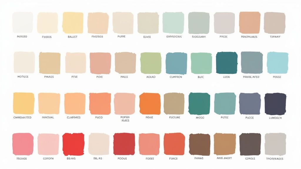
Crafting a Versatile Color Palette
Color is pure psychology. It triggers emotions, sends subtle messages, and is often the first thing a customer will remember about you. In fact, getting your color right can increase brand recognition by up to 80%. Your guidelines need to document a clear, versatile color palette to make sure you're using this powerful tool with intention.
A solid palette isn't just about picking colors you like; it’s about creating a functional system that your team can actually use.
Your Palette Breakdown
- Primary Colors: These are your workhorses, the 1-3 core colors that show up most often. They should feel directly connected to your logo and brand personality.
- Secondary Colors: This is your accent palette, usually 2-4 complementary colors. Use them to create visual interest, highlight key info like calls-to-action, or even differentiate between product categories.
- Neutral Colors: Don't sleep on the basics. Define your specific shades of black, white, and gray. These are essential for things like body text and backgrounds, creating a clean canvas that lets your primary colors shine.
For every single color, you must provide the exact codes. This ensures your brand looks identical whether it's on a screen or on your packaging.
Establishing a Typographic Hierarchy
Typography is the voice of your written content. It's how you make words legible, readable, and visually appealing. For your brand guidelines, this means choosing specific fonts and setting rules for how to use them. A good typographic hierarchy guides the reader's eye, signals what's important, and reinforces your brand's vibe—whether it's sleek and modern or classic and elegant.
Keep it simple. You typically only need two font families: one for headlines and one for body text.
- Headline Font (H1, H2, H3): This is your most expressive font. It needs to grab attention and reflect your brand's personality. Define the specific sizes, weights (like Bold or Semibold), and spacing for each heading level.
- Body Font (Paragraphs): This font’s primary job is to be incredibly easy to read, even in long paragraphs. Define its standard size, weight (usually Regular), and line height to ensure maximum readability.
- Accent Font (Optional): You might want a third font for special use cases like pull quotes or buttons, but use it sparingly. Too many fonts create chaos.
Laying out these rules takes the guesswork out of design and ensures your website, emails, and ads all feel like they came from the same brand. For e-commerce businesses trying to build a killer online presence, professional execution is everything. Getting help from expert e-commerce design services can ensure your visual identity is not just defined, but flawlessly implemented.
Defining Your Imagery and Photographic Style
Finally, your guidelines have to tackle imagery. For any e-commerce brand, product photos and lifestyle shots are your bread and butter. They need to tell a cohesive story and create a consistent aesthetic across your website, social media, and advertising.
Define the mood of your visuals by setting clear direction:
- Lighting: Are you all about bright, airy, natural light? Or is your style more dark, moody, and shot in a studio?
- Composition: Do you prefer clean, minimalist shots with a centered subject, or are your photos busy and full of life, using the rule of thirds?
- Color Treatment: Should photos have a warm or cool tone? Should the colors be vibrant and saturated, or more muted and desaturated?
- Subject Matter: What kinds of models, environments, and props fit your brand? Documenting this helps every photoshoot reinforce the same aspirational vibe you're going for.
By creating these visual guardrails, you ensure that every single element—from your logo down to the filter on an Instagram story—is working together to build a strong, memorable, and trustworthy brand.
Finding Your Brand Voice and Tone
How your e-commerce brand communicates is just as important as how it looks. Your visuals might catch someone's eye, but it's your voice and tone that truly build a lasting relationship. This is where you go beyond the logo and color palette to define the personality behind your words, making sure every email, product description, and Instagram caption sounds consistently and authentically you.
People often use "voice" and "tone" interchangeably, but they are two very different things. Getting this right is crucial.
Here’s the breakdown:
- Brand Voice: This is your brand's core personality. It’s fixed, unchanging, and flows directly from your mission and values. Are you witty, authoritative, warm, or edgy? That’s your voice. It’s your constant.
- Brand Tone: This is the emotional inflection you apply to your voice in different situations. It’s flexible. You wouldn't use the same tone to announce a new product (excited, energetic) as you would to handle a customer complaint (empathetic, reassuring).
Understanding this distinction is the first step. If you're looking to dive deeper into the concept, there are some great resources that explain what is voice in writing and how to carve out a unique style that actually connects with people.
Defining Your Unchanging Brand Voice
Your brand voice should feel like a natural extension of your company's foundation. If your brand is all about adventure and rugged gear, your voice should be bold and direct. If it’s nurturing and calm, like a wellness brand, your voice should be gentle and supportive.
A fantastic way to nail this down is the "We Are / We Are Not" exercise. It's a simple framework that brings instant clarity and helps your entire team quickly grasp the personality you're aiming for.
Let's imagine a clean-ingredient skincare brand:
- We Are: Educational, supportive, transparent, calm.
- We Are Not: Clinical, alarmist, exclusive, trendy.
This simple list immediately tells a writer to explain ingredients clearly (educational) and make customers feel confident (supportive). It also tells them to avoid fear-mongering tactics (alarmist) or jumping on fleeting fads (trendy).
Your brand voice is the promise of a personality. When customers read your content, they should feel like they're hearing from a consistent, recognizable character they can trust.
Mapping Your Tone Across Different Scenarios
Once you've locked in your core voice, it’s time to map out how your tone will adapt. The goal isn't to sound like a completely different brand on each channel, but to show different facets of the same personality. A "Brand Voice and Tone Matrix" is a super practical tool for this.
This matrix helps you map your brand's personality across different communication scenarios to ensure consistency. It's a lifesaver for empowering anyone writing for your brand—from a senior copywriter to a customer service agent—to stay on point.
Brand Voice and Tone Matrix
This simple chart removes the guesswork and ensures your brand sounds like itself, no matter the context.
Look at how even visual elements like typography can dictate tone. This infographic shows how the right font choices can completely change the feel of your message.
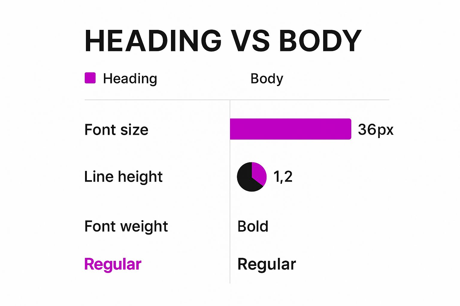
You can see how a bold, larger heading grabs attention and feels authoritative, while the lighter body text with more line height creates a calmer, more readable experience.
Documenting Messaging and Grammar Rules
Okay, now it's time to get granular. To truly lock in your verbal identity, you have to document the small details that make a huge difference. These are the rules that eliminate inconsistencies and give your brand a polished, professional feel every single time.
Think about adding these elements to your brand guidelines:
- Messaging Pillars: What are the 3-5 key messages you want to hammer home? For an e-commerce brand, this could be "Unmatched Quality," "Sustainable Sourcing," and "Exceptional Customer Care."
- Vocabulary List: Create a simple "Use This / Not That" list. For example, maybe you prefer "team members" over "employees" or "invest in" over "buy."
- Grammar and Punctuation: Settle the small debates now. Do you use the Oxford comma? Title case or sentence case for headlines? Are emojis okay, and if so, which ones are on-brand?
These tiny, documented decisions add up. They create a distinct and memorable brand voice that ultimately builds a much stronger connection with your audience.
Putting Your Brand Guidelines Into Action
You’ve done the heavy lifting—defining your mission, designing your visual identity, and nailing down your brand voice. That's a huge accomplishment. But here's the hard truth: a brilliant set of brand guidelines is completely useless if it’s just collecting dust in a forgotten folder. This final phase is all about activation, turning your documented strategy into a living, breathing part of your day-to-day operations.
The goal here is simple: make your guidelines incredibly easy to find, navigate, and use for everyone. This isn't just for your marketing team. It’s for new hires during onboarding, the freelance designer you bring on for a holiday campaign, and the copywriter you just hired for a product launch. When it's easy to access, it's easy to adopt.
Choosing the Right Format for Your Team
How you package your brand guidelines can make or break whether they actually get used. The format should fit your team’s size and the way you work. There’s no single right answer, but a few common approaches work especially well for e-commerce brands.
- The Streamlined PDF: This is perfect for smaller teams or brands just getting off the ground. A well-designed PDF is simple, super shareable, and works great as a static reference. The main drawback? It’s a pain to update. Every little change means creating and redistributing a whole new version.
- The Dynamic Digital Hub: For growing companies, moving to a cloud-based solution is a total game-changer. Using a tool like Notion, Miro, or a dedicated platform like Frontify transforms your guidelines from a static file into an interactive hub. You can embed videos, link directly to asset folders, and update information in real-time for the entire team.
No matter which format you land on, organize it logically. Someone should be able to find the correct HEX code for your primary blue or the rules for logo clear space in under 30 seconds flat. A clear table of contents isn't a nice-to-have; it's essential.
Making Your Guidelines a Living Document
Probably the biggest mistake I see brands make is treating their guidelines like a static rulebook set in stone. Your brand isn't static, so why should its documentation be? You need to build a process for regular review and evolution from day one.
Schedule a formal review at least once a year. It's also a smart move to revisit them whenever your business hits a major milestone, like launching a new product line or expanding into a new market. This keeps the document relevant and ensures it grows right alongside your brand.
Your brand guidelines are a compass, not a cage. They provide direction and consistency, but they should also have enough flexibility to allow for creative and relevant execution as your brand matures.
This commitment to consistency is way more than just an internal exercise; it has a direct, measurable impact on your bottom line. The power of consistency can’t be overstated. Companies that maintain a consistent brand presentation report a 10–20% increase in revenue. Incredibly, a full 33% of these companies see revenue gains of 20% or more from this consistency alone.
Yet, only about 30% of brands have widely enforced guidelines. This creates a massive opportunity for those who get it right.
Once established, your brand guidelines also become a critical tool for implementing proactive brand protection strategies out in the wild. By creating—and actually using—a clear playbook, you empower your team to not only build a memorable brand but also to safeguard it effectively as you scale.
Common Questions About Brand Guidelines
Alright, you've put in the work and documented your brand's identity. But let’s be real—creating the guidelines is one thing, but actually living with them day-to-day is another. Questions are going to pop up.
Think of this section as your quick-reference guide for those practical, "what-if" moments. We'll tackle some of the most common queries I hear from e-commerce brands to make sure your new brand bible doesn't just collect dust on a digital shelf.
How Often Should I Update My Brand Guidelines?
Your brand guide isn't a "set it and forget it" project. It's a living document that should grow with your business. I recommend scheduling a formal review at least once a year. It’s the perfect time to make sure everything still feels fresh and aligns with where your business is headed.
Beyond that, you’ll want to revisit it anytime you make a major business shift. This could be a full brand refresh, launching a huge new product line, or pivoting to a completely different audience. Those are the moments when a deeper dive is non-negotiable.
The goal is simple: keep your guidelines relevant so your team continues to respect and use them.
What Is the Difference Between Brand Guidelines and a Brand Book?
People throw these terms around interchangeably, but there's a subtle yet important difference. Getting this straight helps clarify the purpose of what you've just built.
Brand Guidelines: This is the tactical rulebook. It’s all about the "how-to"—logo spacing, color codes (HEX, RGB, CMYK), and approved fonts. Think of it as the manual for execution.
A Brand Book: This is the bigger picture. It's more philosophical and often includes everything from the guidelines but also tells your brand’s story. It covers your mission, vision, values, and personality—the "why" behind all the rules.
For most e-commerce brands, the best approach is to merge both concepts. You want a single, comprehensive document that’s both inspirational (the brand book part) and incredibly practical (the guidelines part).
Can I Create Brand Guidelines Without a Designer?
Absolutely. You can—and should—define your brand's core foundation on your own. Nailing down your mission, voice, and values is an exercise in strategy and soul-searching, not design chops. Founders and marketing leads are perfectly positioned to lead this charge.
But when it comes to the visual identity and pulling the final document together, hiring a professional designer is a game-changer. It’s a smart investment. They bring deep expertise in color theory, typography, and layout that ensures your brand looks cohesive and professional.
A designer won't just make it look good; they'll create a document that's clear, inspiring, and dead simple for your team to use. This dramatically increases the odds that your guidelines will actually be followed, making that initial investment pay for itself over and over again.
Your brand is your most valuable asset. At ECORN, we specialize in helping e-commerce businesses build powerful, consistent brand experiences that drive growth. From stunning web design to strategic development, our team is ready to bring your brand guidelines to life. Discover how we can help you scale at https://www.ecorn.agency/.


Omnichannel Retail Strategy: A Shopify Playbook
Product Data Enrichment: A Guide for Shopify Brands
Instagram Shopping Features a Guide for Shopify Stores
What Is Revenue Optimization: A Holistic RevOps Guide

Benefits of Conversion Rate Optimization: Boost Your

WordPress to Shopify Migration: Your 2026 Seamless Switch
Boost Sales: Ecommerce Payment Processing Guide 2026

Unified Commerce Platform: Benefits, KPIs & Shopify Guide

How to Reduce Bounce Rate eCommerce: Your 2026 Guide

Shopify API Integration: A Practical End-to-End Guide

How to Implement Data Governance: A 2026 Guide

Shopify Store Development Cost: A 2026 Breakdown
What Is Server Side Tracking: The Shopify Guide 2026

Marketing Automation Workflows: A Shopify Guide for 2026

Shopify: How to Reduce Technical Debt

Shopify UX Design Change: A Playbook for Growth

User Generated Content Strategy: Shopify Playbook

Shopify Pause and Build Plan Cost: A Complete 2026 Guide

Compare at Price on Shopify: A Complete Guide for 2026

Where Can I Sell My Prints? 10 Best Platforms for 2026

Shopify Order Management System: The Ultimate Guide 2026

What Is Marketing Attribution? an eCommerce Guide for 2026

10 Best Black Friday Sales Sheets for 2026

Discover the Top Social Media Marketing Agencies For

Consumer Confidence Definition for eCommerce in 2026

What Is Social Commerce? Your 2026 Guide to Boosting Sales

A Social Ad Campaign Playbook for eCommerce Growth

7 Best FAQ Page Examples for SaaS & eCommerce

Market Research in Fashion Industry: A Guide for Shopify

Shopify Migration Services: Expert Guide for 2026

Mastering FB Retargeting Ads for Shopify in 2026

What Is Omnichannel Ecommerce

Master Your Shopify Plus Migration: The 2026 Guide

Shopify Integration Services: A Merchant's 2026 Guide

Shopify Collection Description: A Guide to SEO & Sales

Shopify Plus Contact: Reach Sales & Support Effectively

Top Luxury Shopify Stores: Design & UX Strategies

How to Improve Customer Experience: A Shopify Roadmap

Creative Facebook Ads: 10 Examples for Shopify Brands

Remarketing with Facebook Ads: A Shopify Guide for 2026

SEO Linking Strategies for Shopify Stores

Top 7 Statistics YouTube Channels for eCommerce in 2026

Hiring Shopify Plus Designers: A Founder's Guide

Shopify Product Variation: Master Your Variants for 2026

Leverage Ai Solutions Brands: Your 2026 Shopify Growth Guide

Filters in Shopify: A Guide for Growing Brands

Shopify Plus Developer: A Guide for Growing Brands

When Does Black Friday Online Start? A 2026 Guide

Black Friday Email Marketing: Shopify & Klaviyo Guide

Polaris Design System: The Complete Shopify Guide

How to Hire a Consultant Email Marketing Expert

What Is Q4? A Shopify Merchant's Guide to Peak Season

Marketing Organization Structure for eCommerce Growth

Top Account-Based Marketing Agency Guide for 2026

7 Remarketing Ad Examples for Your 2026 Campaigns

AI Retail Solutions: Boost Your Shopify Store

Migrate to Shopify: The Definitive 2026 Guide

Shopify Authentication App: A Guide for Secure Stores

Why Strategic Marketing Is Important for Growth in 2026

How to Create a Size Chart in Shopify: 2026 Guide

Shopify Themes for Jewelry: The Definitive 2026 Guide

Minimal Shopify Templates: Faster, Higher-Converting Stores

Maximize Profit: Shopify CC Fees 2026 Guide

Best Shopify Apps for Beginners in 2026

How to Improve Online Shopping Experience in 2026

Shopify Design and Development Services: A 2026 Guide

Small Business Social Media Marketing Agency: A Hiring Guide

Bulk Edit Shopify: A Guide to Save Hours on Store Updates

2026 Trends in Food and Beverage Industry

Post Purchase Survey Guide for Shopify Stores

How to Build an Ecommerce Brand in 2026

Conversion Rate Optimization for Ecommerce: Maximize Profit

How to Use Customer Data to Increase Sales: A Guide

Shopify for Enterprise: The 2026 Deep Dive Guide

Email Marketing Agencies: The Guide for Shopify Brands

Boost Sales With The Right Shipping Shopify App

Your Guide to the Shopify Site Map

7 Headless Commerce Examples for 2026

Mastering Trends in Cosmetic Industry for 2026

Transfer Shopify to BigCommerce The Complete 2026 Playbook

What Is Shopify Collective? Your 2026 Guide to Success

Unlock Shopify Growth with Site Link SEO

Integrating Shopify and WordPress A Complete Guide for 2026

Naming a Clothing Store: A Shopify Founder's Playbook

Guide to buying shopify store in 2026

Buying shopify store: Buying a Shopify Store: Invest Wisely

Food & Beverage Marketing: A Complete Guide for 2026

Facebook Ads Agency: A Shopify Brand's Hiring Guide

Shopify Apparel Stores: A 2026 Launch & Scale Guide

How to Deactivate Shopify Store: The 2026 Guide

Shopify and Square: The 2026 Ultimate Comparison

Your Guide to Beauty Products Ecommerce

A Guide to Marketing for Beauty Brands in 2026

Your Guide to Facebook Black Friday Ads

Facebook Ad Ecommerce for Shopify Growth

Iconography Web Design The Definitive Guide for Shopify Stores

A Modern Backlinks SEO Strategy for Shopify Stores

How to Launch an Online Store: A Step-by-Step Success Guide

Optimize Shopify Store: Master Performance in 2026

Successful Migration for Shopify: Protect SEO & Grow


newsletter in your inbox