
Conducting usability testing is really just about watching real people try to use your product. You get to see firsthand where they get stuck, what confuses them, and what you can do to make things better. The whole process boils down to a few core stages: planning the study, finding the right participants, running the actual test sessions, and then digging through the feedback to make smart, evidence-backed improvements. It’s like a direct line into your customers' minds, showing you exactly how they experience your site or app.
Why Usability Testing Is Your Secret Weapon
Let's kill the idea that usability testing is some luxury item reserved for giant corporations with massive research budgets. It's not. In today's competitive eCommerce world, it’s become a non-negotiable part of building a successful product, no matter your company size. Why? Because it replaces guesswork with cold, hard evidence.
Instead of sitting in a meeting room debating what a button should say or where a menu should go, you can just watch a real user try to figure it out. Their struggles, their "aha!" moments, and their hesitations give you a clear, undeniable path forward.
Before we dive into the how, let's quickly map out the core components of any usability test. This table gives you a bird's-eye view of what we're trying to accomplish at each stage.
Core Components of a Usability Test
With this framework in mind, the value of each step becomes much clearer as we explore them in detail.
From Costly Mistakes to Smart Investments
Without user feedback, development teams often sink weeks or even months into building features based on nothing more than assumptions. When those assumptions are wrong, you're left with wasted time, blown budgets, and engineering effort spent on something that doesn't actually help your customers.
Usability testing completely flips this script. By investing just a little bit of time upfront to test a simple prototype, you can spot critical design flaws before a single line of code is written. This one simple step can save you from expensive post-launch redesigns and ensures your resources are aimed at building things people genuinely want and can actually use.
This shift from reactive fixing to proactive validation is what gives smart companies a massive competitive edge. It's all about making better, data-driven decisions that lead to better products and much happier customers.
The Tangible Business Impact
Understanding your users goes way beyond just creating a pretty interface. The insights you can pull from even a handful of test sessions can have a huge impact on your bottom line. When you remove friction from the customer journey, you see direct improvements in the metrics that matter.
- Increased Conversion Rates: A simpler checkout, clearer product descriptions, or more intuitive navigation directly leads to more completed sales. It's that simple.
- Reduced Development Waste: By validating ideas early, you stop pouring money and time into features that don't add real value or solve a real user problem.
- Enhanced Customer Loyalty: When customers have an easy, enjoyable experience on your site, they're far more likely to come back and recommend your brand to their friends.
The growing recognition of this powerful ROI is fueling major investment in the field. The global market for usability testing tools, valued at USD 1.28 billion, is projected to rocket to USD 6.55 billion as more and more businesses make user experience a top priority.
Ultimately, knowing how to conduct usability testing isn't just a technical skill; it's a strategic advantage. For a deeper dive into the nuts and bolts of the entire process, check out this complete guide on how to conduct usability testing.
Building Your Usability Testing Blueprint
Great user insights don't just happen. They’re the direct result of a smart, well-structured plan. Before you even think about talking to users, you need a solid blueprint that maps out exactly what you want to learn and how you’ll know if you’ve succeeded. Honestly, this planning phase is the single most important part of getting real value from your tests.
Without clear objectives, a session can easily turn into a rambling chat with zero actionable takeaways. You've got to frame the problem you're trying to solve. Are you digging into why 45% of users bail during mobile checkout? Or are you testing a slick new product filter before a single line of code gets written?
Nailing down a sharp, focused goal is your first move. It’s what turns a vague fishing trip into a surgical strike for specific insights.
This visual breaks down the key steps for creating a plan that actually works.
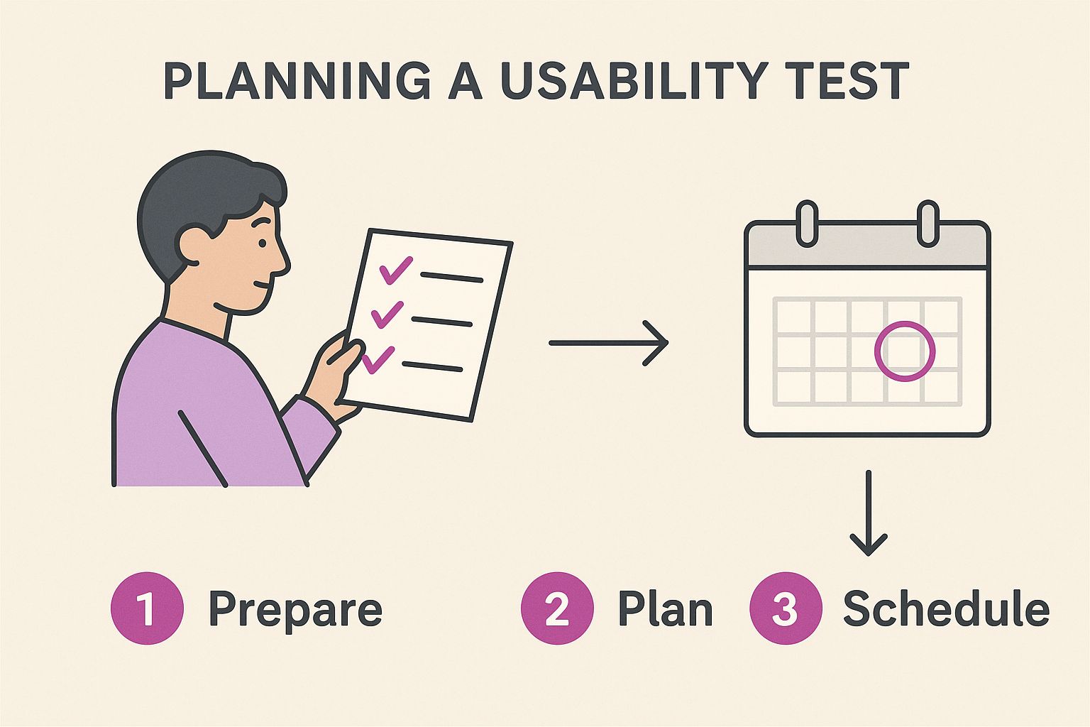
As you can see, it all starts with setting goals and picking the right method, which then flows into the hands-on work of scripting and recruiting.
Choosing Your Testing Method
Once you know your "why," you need to figure out the "how." The best testing method comes down to your goals, your timeline, and your budget. There’s no magical "best" way—it's all about what fits the situation.
The big decision points usually boil down to:
- Moderated vs. Unmoderated: A moderated test is like having a co-pilot. A facilitator guides the participant, asking follow-up questions in real time to understand the why behind their clicks. It’s perfect for digging into complex user flows. Unmoderated tests are more hands-off; participants complete tasks on their own while software records their screen and voice. It’s faster, cheaper, and great for validating simple tasks with a bigger group.
- Remote vs. In-Person: Remote testing lets you get feedback from people all over the world, which is a massive win for efficiency and cost. In-person testing, on the other hand, gives you the benefit of seeing body language and other non-verbal cues. That can be gold for certain types of research.
For an eCommerce store trying to figure out what's causing checkout friction, a remote moderated test is often the sweet spot. You get the deep-dive inquiry without the logistical nightmare of getting everyone in the same room.
Crafting a Test Script That Works
Think of your test script as your most valuable tool during the session. It isn't just a list of questions; it's a carefully designed guide that keeps you focused on your research goals and ensures every participant gets a consistent experience. A bad script can introduce bias and lead users down a certain path, completely tainting your results.
A great script doesn't tell someone what to do. It gives them a realistic scenario to work through.
Bad Scripting: "Click the 'Add to Cart' button for the blue shirt."
Good Scripting: "You're looking for a new shirt for an event this weekend. Use the site to find one you like and start the purchase process."
See the difference? The second one is powerful because it mirrors a real-world goal. It lets you watch their natural behavior. Do they use the search bar or the main navigation? Do they get stuck on the filters? Those are the moments that deliver pure, unadulterated insights.
Your script should always include:
- An introduction to set expectations and make the participant feel comfortable.
- A few warm-up questions about their general online shopping habits.
- A series of scenario-based tasks that tie directly back to your research goals.
- Follow-up and debrief questions to get their final thoughts and overall impressions.
Just remember, your job is to guide, not to lead. You want to see their authentic journey, not the one you wish they’d take. For a deeper dive, our complete guide on website usability testing offers more strategies to get you started. Putting in the work to build a solid blueprint ensures that when you finally sit down with users, every single minute is spent gathering the feedback you need to make your store better.
Finding the Right People for Your Test
Let's be blunt: your usability test results are only as good as the people you test with. Getting this part right is the difference between fuzzy, misleading opinions and game-changing insights that actually move the needle. You’re not just looking for random people; you’re looking for the right people.
The entire process hinges on this. If you’re testing a high-end fashion site with users who only ever shop at discount stores, what kind of feedback do you think you’ll get? It won’t help you serve your actual customers. It's a bit like asking a fish for feedback on climbing a tree.
Where to Find Your Testers
Thankfully, recruiting doesn't have to be some massive, expensive nightmare. You’ve got a few solid options, and the best approach often involves a mix, depending on your budget and how niche your audience is.
- Professional Recruiting Services: Platforms like User Interviews or Respondent were built for exactly this. They have huge panels of people you can filter by demographics, job titles, and even specific shopping habits. It's the fastest, most reliable option, but you'll pay for the convenience.
- Your Own Customer Base: Who knows your site better than the people already using it? You can reach out through email newsletters, social media, or even a small pop-up on your site. This is super cost-effective and guarantees you're talking to a relevant audience, but keep in mind they come with a bit of a bias since they already know your brand.
- Social Media and Online Communities: This is my personal favorite for finding passionate users. Niche communities on Reddit, Facebook Groups, or specialized forums can be absolute goldmines. Selling high-tech hiking gear? A single post in a popular hiking subreddit could connect you with your perfect participants.
No matter where you look, the goal is the same: find people whose real-life habits and needs match the problems you're trying to solve.
Crafting an Effective Screener Survey
Once you have a pool of potential testers, you need to filter them. That’s where a screener survey comes in. It’s a short questionnaire designed to politely weed out anyone who doesn't fit your target user profile.
The key here is to ask questions that reveal behaviors, not just demographics. Instead of asking "Do you shop online?" (who doesn't?), ask "How many times have you purchased clothing online in the last 3 months?" This gets you active, relevant users.
A solid screener should include:
- Demographics: The basics like age and location to make sure you have a reasonably diverse group.
- Behavioral Questions: This is the most important part. Ask about recent, relevant activities (e.g., "Have you researched and purchased a home appliance online in the past 6 months?").
- Tech-Savviness Questions: Ask what devices they use. You need to know they can handle the technical side of the test.
- Open-Ended Questions: A question like, "Describe the last time you bought a gift for someone online," can reveal how articulate and thoughtful someone is. You want feedback from people who can explain why they feel a certain way.
This filtering process ensures the feedback you get is from the exact type of person you're building your site for, making every minute of your test session count.
Determining How Many Users to Test
One of the biggest myths in usability testing is that you need a massive sample size. For qualitative testing—where the goal is to find problems and get rich insights—you need way fewer people than you probably think.
The Nielsen Norman Group, true pioneers in UX research, famously discovered that testing with just 5 users typically uncovers about 85% of the most common usability issues. After that fifth person, you start hearing the same things over and over again, and the return on your time plummets.
Starting with a small, focused group of five to eight participants is almost always the right move. It’s more than enough to spot the critical issues without blowing your budget or timeline. Remember, you're chasing deep insights, not statistical significance.
Your final step? Set up fair compensation. A gift card or cash payment is standard practice. It respects their time and effort and makes sure the whole experience is a positive one for everyone involved.
Running Sessions That Uncover Real Insights
This is where the rubber meets the road. All your planning comes down to this moment: sitting down with a real person and watching them interact with your site. Moderating a usability session is a unique skill—part detective, part talk show host. Your goal is to make someone feel comfortable enough to give you brutally honest feedback while you observe every click, hesitation, and sigh.
Whether you're in a fancy lab or running the session remotely over Zoom, your setup is everything. Nothing kills the vibe faster than technical glitches. Before the participant even joins the call, do a full tech check. Test your screen share, your audio, and your recording software. Trust me, you don’t want to be fumbling around with settings when you should be building rapport.

Setting the Stage for Success
The first five minutes are critical. They set the tone for the entire session. Your participant is probably a little nervous. They might feel like they’re being graded. Your job is to completely dismantle that feeling and make them feel like a valued collaborator.
Kick things off with a warm, friendly introduction. The most important thing you can say is this: "We are testing the website, not you." Seriously, repeat it if you have to. Remind them there are no right or wrong answers. This gives them the green light to be critical and poke holes in your design without feeling bad about it.
Here’s a quick script for your intro:
- Explain the "Why": Keep it simple. "We're trying to see how people shop for gifts on our new site and find out where we can make things easier."
- Get Consent to Record: Always, always ask for permission to record. Explain that it’s just for your team to review later and that their personal info will be kept confidential.
- Encourage Them to Think Aloud: This is the golden rule. Ask them to narrate their thoughts as they complete the tasks. You want to hear the good, the bad, and the ugly.
That "think-aloud" protocol is where the magic happens. It turns invisible thought processes into audible, actionable data. You get a direct line into their expectations, frustrations, and decision-making.
The Art of Moderation
Great moderation is a subtle art. It’s about knowing when to talk and, more importantly, when to embrace the silence. You’re a neutral guide, not a helpful customer service rep. The urge to jump in and "help" when you see someone struggle is powerful, but you have to resist. It’s one of the hardest skills to learn.
When a participant gets stuck, that’s not a failure—that’s a finding! Those moments of friction are exactly what you’re looking for.
Instead of pointing to the solution, use neutral, open-ended questions to probe deeper. These questions encourage them to explain what’s happening in their head without leading them to an answer.
Moderator Pro Tip: When a user goes quiet for a few seconds, a simple, gentle nudge like, "What are you thinking right now?" or "Talk me through what you’re looking at," can get the narration flowing again. It’s an invaluable way to uncover what's causing their hesitation.
Asking Questions That Dig Deeper
The quality of your insights is directly tied to the quality of your questions. Ditch the simple "yes/no" queries and aim for prompts that require a real explanation. While usability testing is about observing behavior, understanding the why behind that behavior often requires a bit of thoughtful questioning, much like learning how to conduct effective user interviews.
Here are some of my go-to follow-up questions:
- "What did you expect would happen when you clicked that?"
- "How is this different from what you're used to seeing on other sites?"
- "You mentioned that was 'confusing.' Can you tell me more about what felt confusing?"
- "Was there anything you were looking for on this page that you couldn't find?"
These questions transform a basic observation ("User didn't click the CTA") into a powerful insight ("User didn't click the CTA because the label 'Proceed' made them think they were about to be charged immediately."). That’s the difference between knowing what happened and understanding why it happened.
Your best tools in any session are sharp observation skills and genuine curiosity. Stay neutral, handle any tech hiccups with a calm demeanor, and let your participant be the star. Their unfiltered experience is the gold you’re here to mine.
Turning Observations into Actionable Fixes
Alright, the last participant has logged off. You're now sitting on a mountain of recordings, notes, and raw observations. This is where the real magic happens. Raw data is just noise; the goal is to sift through it all and turn those moments of user frustration (and delight!) into a prioritized action plan that will actually improve your store.
This part of the process can feel like a huge task, but it doesn't have to be a mess. The trick is to be systematic. You’ll move from scattered notes to clear themes, and finally, to rock-solid recommendations. It’s not about catching every single tiny flaw. It’s about spotting the recurring patterns that have the biggest impact on your customer experience.
From Notes to Patterns with Affinity Mapping
One of the best ways to start making sense of all this qualitative data is a simple technique called affinity mapping. Seriously, think of it as organizing a huge pile of sticky notes. The process is straightforward but incredibly powerful for finding connections you might have missed.
Start by writing every single observation, user quote, or pain point on its own sticky note (virtual or physical). Don't filter yourself here. If a user said it or did it, write it down. Just get it all out there.
Once everything is captured, you and your team can start grouping them.
- Group by Theme: Look for notes that feel related and start clustering them together. You might quickly see a group forming around "confusion over shipping costs," another about "trouble using product filters," and maybe a third about "positive feedback on product photography."
- Name the Clusters: As a group takes shape, give it a clear, descriptive name. This becomes your theme, like "Checkout Friction" or "Navigation Blind Spots."
- Spot the Insights: While you’re building these clusters, the big-picture problems will start to jump out. You’re no longer looking at one person's comment; you're seeing a pattern of behavior shared by several users.
This whole process is fantastic for getting everyone on the same page. It shifts the conversation away from opinions and grounds it firmly in the evidence you’ve gathered from real users. It’s a core part of a user-centered design approach, making sure the customer’s voice is at the heart of every decision. You can learn more about how to embed these user-centered design principles into everything you do.
Prioritizing What to Fix First
After affinity mapping, you'll have a much clearer, more organized list of usability problems. The immediate temptation is to try and fix everything at once—don't. That's a surefire way to get burnt out and spread your resources too thin. A long list of issues is not an action plan. You need to prioritize.
A simple but super effective way to tackle this is to score each issue on two key factors:
- Severity: How badly does this problem break the user journey? A typo on a policy page is a low-severity issue. A bug that stops users from adding an item to their cart? That’s a critical, all-hands-on-deck showstopper.
- Frequency: How many of your participants actually ran into this problem? If only one out of five users struggled with something, it might be less urgent than an issue that tripped up all five.
By mapping each issue based on its severity and frequency, you can instantly see what matters most. The problems that are both high-severity and high-frequency are your top priorities. These are the fires you need to put out first.
This framework gives you a data-backed, defensible way to decide where to focus your team's precious time and energy for the biggest possible impact.
To make this even easier, you can use a simple prioritization framework. This helps categorize issues consistently and makes it clear to stakeholders why you're tackling certain problems before others.
Usability Issue Prioritization Framework
Using a table like this ensures that when you say something is "critical," everyone knows exactly what that means. It takes the guesswork out of planning your next steps.
Crafting a Report That Actually Drives Action
Your final step is to share these findings with the people who can make the changes happen: the designers, developers, and product managers. A dense, 100-page report is the fastest way to get your hard work ignored. Your report needs to be concise, compelling, and above all, actionable.
Your real job here is to tell the story of the user's experience. You need to combine different types of evidence to make your points impossible to overlook.
- Lead with the Big Stuff: Start with an executive summary that highlights the top 3-5 most critical issues you found. Get straight to the point.
- Use Powerful User Quotes: A direct quote like, "I thought clicking 'Continue' would take me to the next step, not charge my card," is way more powerful than a dry description of the problem.
- Show, Don't Just Tell: This is your secret weapon. Include short video clips of users actually struggling. There is nothing more persuasive than watching a real person get frustrated with your website. A two-minute clip of a user sighing in defeat is worth a thousand words.
- Provide Clear Recommendations: For every issue you highlight, propose a clear, specific, and actionable solution. Don't just say, "The checkout is confusing." Instead, suggest, "Change the button label from 'Continue' to 'Review Order' to clarify the next step."
This focus on clear, actionable insights is becoming more vital as businesses pour money into user experience. In North America alone, the usability testing tools market already generates USD 0.48 billion and holds a 32.14% market share. Globally, the market is projected to explode from USD 1.51 billion to USD 10.41 billion by 2034, largely driven by sectors like eCommerce where usability is directly tied to revenue. You can find more details about the usability testing tools market trends on scoop.market.us.
By turning your raw observations into a compelling, evidence-backed story, you ensure your usability testing efforts lead to real improvements that help both your customers and your bottom line.
Common Usability Testing Questions Answered

As teams start to weave user feedback into their workflow, a few practical questions almost always bubble up. Getting clear on these common hurdles is the key to moving from theory to action with confidence.
Think of this as your quick-reference guide for the real-world stuff that comes up the moment you decide to run your first test.
How Many Users Do I Really Need for a Test?
This is the big one, and the answer is almost always "fewer than you think." For the kind of qualitative testing most eCommerce teams need, you're not chasing statistical certainty. You're hunting for recurring problems.
The Nielsen Norman Group famously found that testing with just 5 users will uncover about 85% of the most common usability issues. After that fifth person, you start seeing the same pain points again and again, meaning you hit a point of diminishing returns on your time and money.
Now, if you were doing a big quantitative study—something where you need hard numbers on task completion rates—you'd need a much larger group, often 20 or more. But for most teams just getting their feet wet, five is the magic number.
Moderated vs. Unmoderated Testing: Which Is Better?
There's no single "better" option here; it all boils down to your specific goals, timeline, and budget. Each serves a totally different purpose.
Moderated Testing: This is where a facilitator guides a participant through the test in real-time. It's fantastic for digging into the why behind their actions and asking follow-up questions. If you're looking at a complex checkout flow, this is your go-to.
Unmoderated Testing: Here, participants complete tasks on their own time while a platform records their screen and voice. It's way faster, cheaper, and perfect for getting feedback at scale on more straightforward tasks, like validating a simple navigation change. The trade-off? You can't ask clarifying questions in the moment.
How Do I Convince Stakeholders to Invest?
The trick is to frame it around business impact, not just fuzzy "user experience" benefits. You need to talk about usability testing as an investment that reduces risk and grows revenue.
- Speak in Dollars and Cents: Draw a direct line from usability problems to business metrics. Show them exactly how a confusing checkout process could be costing the company thousands in abandoned carts every month.
- Highlight Saved Resources: Explain that finding and fixing a problem during the design phase is exponentially cheaper than rewriting code after a feature has already been built and shipped.
- Start Small to Prove Value: Don't ask for a huge budget right away. Run a small pilot test and share one powerful video clip of a real user struggling with a key feature. A two-minute video is almost always more persuasive than a 20-slide deck.
What Are the Most Common Mistakes to Avoid?
A few classic blunders can quickly derail your efforts and taint your results. Just being aware of them is half the battle.
- Leading the Witness: Fight the urge to ask questions like, "That was easy, wasn't it?" Stick to neutral prompts, such as, "Tell me about that experience."
- Solving Problems During the Session: Your job is to be a fly on the wall, not a helper. Let participants struggle. Those moments of friction are where the most valuable insights are hiding.
- Skipping the Pilot Test: Always, always run a quick practice session with a colleague. This is your chance to catch awkward phrasing in your script or iron out technical glitches before you're in a live session with a real participant.
At ECORN, we specialize in turning these kinds of user insights into powerful eCommerce growth. If you’re ready to build a Shopify store grounded in what your customers actually need, we can help. https://www.ecorn.agency/


AI Customer Service Automation: Shopify Guide 2026
Clean Website Design: A Shopify Conversion Playbook

Omnichannel Retail Strategy: A Shopify Playbook
Product Data Enrichment: A Guide for Shopify Brands
Instagram Shopping Features a Guide for Shopify Stores
What Is Revenue Optimization: A Holistic RevOps Guide

Benefits of Conversion Rate Optimization: Boost Your

WordPress to Shopify Migration: Your 2026 Seamless Switch
Boost Sales: Ecommerce Payment Processing Guide 2026
Unified Commerce Platform: Benefits, KPIs & Shopify Guide

How to Reduce Bounce Rate eCommerce: Your 2026 Guide

Shopify API Integration: A Practical End-to-End Guide

How to Implement Data Governance: A 2026 Guide

Shopify Store Development Cost: A 2026 Breakdown
What Is Server Side Tracking: The Shopify Guide 2026

Marketing Automation Workflows: A Shopify Guide for 2026

Shopify: How to Reduce Technical Debt

Shopify UX Design Change: A Playbook for Growth

User Generated Content Strategy: Shopify Playbook

Shopify Pause and Build Plan Cost: A Complete 2026 Guide

Compare at Price on Shopify: A Complete Guide for 2026

Where Can I Sell My Prints? 10 Best Platforms for 2026

Shopify Order Management System: The Ultimate Guide 2026

What Is Marketing Attribution? an eCommerce Guide for 2026

10 Best Black Friday Sales Sheets for 2026

Discover the Top Social Media Marketing Agencies For

Consumer Confidence Definition for eCommerce in 2026

What Is Social Commerce? Your 2026 Guide to Boosting Sales

A Social Ad Campaign Playbook for eCommerce Growth

7 Best FAQ Page Examples for SaaS & eCommerce

Market Research in Fashion Industry: A Guide for Shopify

Shopify Migration Services: Expert Guide for 2026

Mastering FB Retargeting Ads for Shopify in 2026

What Is Omnichannel Ecommerce

Master Your Shopify Plus Migration: The 2026 Guide

Shopify Integration Services: A Merchant's 2026 Guide

Shopify Collection Description: A Guide to SEO & Sales

Shopify Plus Contact: Reach Sales & Support Effectively

Top Luxury Shopify Stores: Design & UX Strategies

How to Improve Customer Experience: A Shopify Roadmap

Creative Facebook Ads: 10 Examples for Shopify Brands

Remarketing with Facebook Ads: A Shopify Guide for 2026

SEO Linking Strategies for Shopify Stores

Top 7 Statistics YouTube Channels for eCommerce in 2026

Hiring Shopify Plus Designers: A Founder's Guide

Shopify Product Variation: Master Your Variants for 2026

Leverage Ai Solutions Brands: Your 2026 Shopify Growth Guide

Filters in Shopify: A Guide for Growing Brands

Shopify Plus Developer: A Guide for Growing Brands

When Does Black Friday Online Start? A 2026 Guide

Black Friday Email Marketing: Shopify & Klaviyo Guide

Polaris Design System: The Complete Shopify Guide

How to Hire a Consultant Email Marketing Expert

What Is Q4? A Shopify Merchant's Guide to Peak Season

Marketing Organization Structure for eCommerce Growth

Top Account-Based Marketing Agency Guide for 2026

7 Remarketing Ad Examples for Your 2026 Campaigns

AI Retail Solutions: Boost Your Shopify Store

Migrate to Shopify: The Definitive 2026 Guide

Shopify Authentication App: A Guide for Secure Stores

Why Strategic Marketing Is Important for Growth in 2026

How to Create a Size Chart in Shopify: 2026 Guide

Shopify Themes for Jewelry: The Definitive 2026 Guide

Minimal Shopify Templates: Faster, Higher-Converting Stores

Maximize Profit: Shopify CC Fees 2026 Guide

Best Shopify Apps for Beginners in 2026

How to Improve Online Shopping Experience in 2026

Shopify Design and Development Services: A 2026 Guide

Small Business Social Media Marketing Agency: A Hiring Guide

Bulk Edit Shopify: A Guide to Save Hours on Store Updates

2026 Trends in Food and Beverage Industry

Post Purchase Survey Guide for Shopify Stores

How to Build an Ecommerce Brand in 2026

Conversion Rate Optimization for Ecommerce: Maximize Profit

How to Use Customer Data to Increase Sales: A Guide

Shopify for Enterprise: The 2026 Deep Dive Guide

Email Marketing Agencies: The Guide for Shopify Brands

Boost Sales With The Right Shipping Shopify App

Your Guide to the Shopify Site Map

7 Headless Commerce Examples for 2026

Mastering Trends in Cosmetic Industry for 2026

Transfer Shopify to BigCommerce The Complete 2026 Playbook

What Is Shopify Collective? Your 2026 Guide to Success

Unlock Shopify Growth with Site Link SEO

Integrating Shopify and WordPress A Complete Guide for 2026

Naming a Clothing Store: A Shopify Founder's Playbook

Guide to buying shopify store in 2026

Buying shopify store: Buying a Shopify Store: Invest Wisely

Food & Beverage Marketing: A Complete Guide for 2026

Facebook Ads Agency: A Shopify Brand's Hiring Guide

Shopify Apparel Stores: A 2026 Launch & Scale Guide

How to Deactivate Shopify Store: The 2026 Guide

Shopify and Square: The 2026 Ultimate Comparison

Your Guide to Beauty Products Ecommerce

A Guide to Marketing for Beauty Brands in 2026

Your Guide to Facebook Black Friday Ads

Facebook Ad Ecommerce for Shopify Growth

Iconography Web Design The Definitive Guide for Shopify Stores

A Modern Backlinks SEO Strategy for Shopify Stores

How to Launch an Online Store: A Step-by-Step Success Guide


newsletter in your inbox