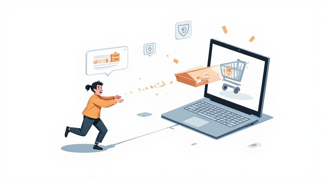
To slash your cart abandonment rate, you have to kill the surprises—we're looking at you, unexpected shipping costs. You also need to make checking out ridiculously easy (hello, guest checkout) and plaster trust badges everywhere. These three moves tackle the biggest reasons people bail right before they buy.
Why Shoppers Abandon Carts and What It Costs You
Think of every abandoned cart as a little story of frustration. It’s not just a lost sale; it’s a bright, flashing sign that somewhere in your store's experience, you created a moment of hesitation. Getting to the "why" is the only way you'll ever reclaim that lost revenue and pave a smoother path to the buy button.
The damage goes way beyond the value of what's left in the cart. Each one of those abandoned carts represents money you've already spent. The ad clicks, the social media campaigns, the content you worked so hard on—it all worked, right up until the final, crucial step. It's a silent leak that's draining your marketing budget and killing your ROI.
The Scope of the Problem
This isn't a small-time issue; it's massive. The global average shopping cart abandonment rate is currently floating around 70.19%. Let that sink in. For every ten shoppers who add an item to their cart, seven of them walk away without paying. It’s a huge, persistent hurdle in turning genuine interest into cold, hard cash. To really get a handle on the scale of this, check out the latest cart abandonment statistics from ContentSquare.
This isn't just a number on a spreadsheet; it's a direct reflection of what customers expect online. When someone adds a product to their cart, they’re practically raising their hand and saying, "I want to buy this!" The fact that they leave moments later is almost always because of a completely preventable problem.
An abandoned cart is not a 'no.' It’s a 'not yet'—or more accurately, a 'not like this.' The customer wanted the product but was deterred by the process. Fixing the process is how you turn that hesitation into a conversion.
Common Culprits Behind Lost Sales
So, what are these deal-breakers that send potential customers running for the hills? The reasons are surprisingly consistent and usually boil down to two things: unexpected costs and a lack of trust.
Before we dig into the solutions, let's get a clear picture of the common friction points. This table breaks down the top reasons customers leave, why it pushes them away, and a quick-fix idea for each.
Top Reasons Your Customers Abandon Their Carts
Seeing it laid out like this makes it pretty clear, doesn't it? Most of these issues aren't about your products; they're about the experience you build around them. Let's start breaking down how to fix each one.
Finding Your Store's Abandonment Hotspots
To really slash your cart abandonment rate, you have to put on your detective hat. That top-level percentage you see in your dashboard is just a headline number. The real gold—the stuff you can actually act on—is buried a layer or two deeper.
You need to pinpoint the exact moments of friction, the "hotspots" where people get frustrated, confused, or hit a wall and decide to leave. This isn't about throwing darts in the dark. It’s about using the data you already have in Shopify and Google Analytics to map out the customer journey and find all the potholes.
Instead of staring at that one big abandonment number, the goal is to break it down. Are more people dropping off on mobile than on desktop? Do shoppers from a specific ad campaign give up more often? Answering these questions turns a massive, overwhelming problem into a series of smaller, much more manageable fixes.
Think of it like this: a customer adds an item, hits some kind of snag, and then they're gone.
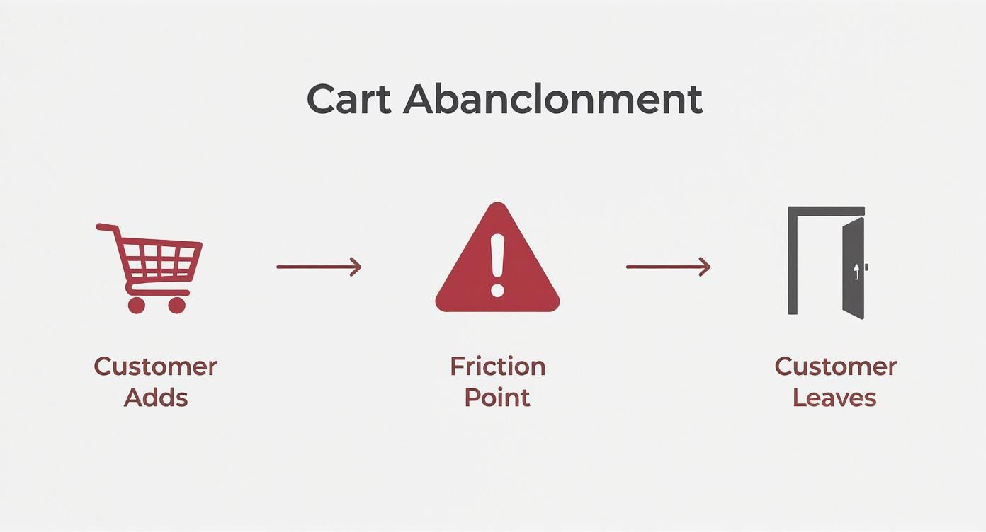
Your analytics tools are designed to show you exactly where that snag is so you can smooth it out.
Using Shopify Analytics for Initial Clues
Your first port of call should always be Shopify's own analytics. It’s straightforward, built right in, and gives you a fantastic high-level view of your sales funnel without any complicated setup. This is where you can spot the most obvious problems quickly.
Head over to your Shopify Admin > Analytics > Reports. You’re looking for reports on your online store conversion. Two areas are particularly revealing:
- Online store conversion rate by device type: This one is huge. If you see that your mobile conversion rate is tanking compared to desktop, you’ve just found your first major hotspot. It's a massive red flag that your mobile checkout experience is clunky, slow, or just plain annoying to use.
- Sessions by traffic source: This report helps you figure out if visitors from certain channels are underperforming. Maybe you'll find that traffic from your Instagram ads has a killer add-to-cart rate but almost no one actually buys. That signals a major disconnect between what your ad promises and what the checkout delivers.
Pro Tip: Don't just look at the numbers; try to see the story behind them. A high abandonment rate for mobile users could mean your payment buttons are too small to tap, the form fields are a pain to fill out on a tiny screen, or the page is just loading too slowly over a 4G connection.
Diving Deeper with Google Analytics 4
While Shopify tells you what is happening, Google Analytics 4 (GA4) helps you uncover the why. With GA4, you can build incredibly detailed funnel exploration reports that visualize every single step a user takes, from adding a product to their cart all the way to seeing that sweet, sweet thank-you page.
This is where you find the exact step that’s causing the most damage.
Setting up a checkout funnel in GA4 is a total game-changer. You can define each specific stage of your checkout process, something like this:
- View Cart: The user lands on their shopping cart page.
- Begin Checkout: They click the "Checkout" button.
- Add Shipping Info: They fill out their shipping address.
- Add Payment Info: They move on to the payment selection step.
- Purchase: The transaction goes through successfully.
Once you have this funnel running, GA4 will show you the percentage of users who move from one step to the next and, crucially, the percentage who bail at each stage.
Imagine you see a massive 40% drop-off between adding shipping info and adding payment info. Boom. You've found a critical hotspot. This is almost always the point where unexpected shipping costs pop up and scare people away. This kind of granular insight is what lets you make targeted fixes that have a real, measurable impact on your revenue.
Smoothing Out Your Shopify Checkout Experience
Once you've figured out where shoppers are dropping off, the next step is to pave over those friction points. Your checkout process needs to be so smooth it’s almost invisible. A clunky, confusing, or demanding checkout is a direct invitation for customers to abandon their cart, even if they absolutely love the product.
The goal here is simple: remove every possible barrier between a customer's decision to buy and that final click. The data doesn't lie—a complicated or lengthy process is a top reason for abandonment. In fact, a whopping 22% of shoppers ditch their carts because the whole thing was just too difficult. We're going to fix that.

This isn’t just about making things look pretty; it's about psychology. A simple, logical flow gives customers confidence and momentum, carrying them straight through to the confirmation page.
Embrace Guest Checkout
If there's one golden rule in checkout optimization, it's this: never force a customer to create an account. I can't stress this enough. A staggering 26% of users will abandon their cart if they're forced to sign up before buying. For a first-time buyer, this step can feel like a huge commitment and a major hassle.
You absolutely must offer a prominent guest checkout option. You can always encourage them to create an account after the sale is complete by highlighting benefits like easy order tracking, but it has to be an option, not a roadblock.
Simplify Your Forms
Every single field you ask a customer to fill out is another tiny piece of friction. You need to scrutinize your checkout forms and be ruthless. Does your shipping partner absolutely require a phone number? If not, make it optional or get rid of it.
Your forms should only ask for the bare essentials needed to get the order processed and shipped. That’s it. This makes the whole process faster and way less intrusive for your customer.
- Shipping Address: Name, Address, City, State, Zip Code.
- Billing Information: Let them use the same as shipping with one click.
- Payment Details: Card number, expiration, CVV.
By simplifying the checkout process, you’re not just making it easier; you’re respecting your customer’s time. A faster, cleaner experience directly translates to a lower abandonment rate and higher revenue.
And in this day and age, tools like address auto-complete are no longer a luxury; they're an expectation. Using the Google Maps API or Shopify's built-in features can seriously speed up form-filling and cut down on frustrating typos that lead to shipping headaches later on.
Build Confidence with Visual Cues
As a customer moves through your checkout, you have to constantly reassure them that this is a safe, professional, and straightforward process. This is where visual cues play a massive role in building trust and managing expectations.
Implement a Progress Bar
A multi-step checkout is often necessary, but it can feel endless if there's no clear guide. A simple progress indicator at the top of the page (e.g., Shipping > Payment > Review) shows customers exactly where they are and how many steps are left. This tiny visual element prevents them from feeling lost and reduces the anxiety of a long checkout.
Display Trust Badges Strategically
Security is a huge concern for online shoppers. You might have trust seals buried in your site's footer, but the checkout page is where they truly matter. You need to display familiar logos prominently right near the payment fields to build confidence at that critical moment of decision.
- Payment Logos: Visa, Mastercard, PayPal, Shop Pay.
- Security Seals: SSL certificates (like "Secure Checkout"), McAfee, or Norton seals.
These little badges act as a final, powerful reassurance that their financial information is safe with you.
Activate Accelerated Checkouts like Shop Pay
For anyone on Shopify, using accelerated checkouts is one of the most powerful moves you can make to slash cart abandonment. Options like Shop Pay, Apple Pay, and Google Pay can completely change the game.
Shop Pay, for instance, saves a customer’s shipping and payment details, letting them fly through future purchases across the entire Shopify network with just a single click. It's an absolute game-changer for returning customers and mobile shoppers, as it kills the tedious task of tapping in information on a tiny screen. The numbers back this up: checkouts going through Shop Pay can convert up to 50% better than a standard guest checkout.
There are tons of ways to tailor this experience for your brand, and our guide on Shopify checkout customization dives much deeper into making these features shine.
Flipping these options on in your Shopify admin is simple, and it gives customers the speed and convenience they now expect everywhere online. It's a clear win for everyone.
Building Trust and Eliminating Surprise Costs
Picture this: you find the perfect pair of sneakers for $100. You're sold. You add them to your cart and head to checkout, ready to buy. Then, right as you pull out your card, the total suddenly jumps to $125.
That sting of "sticker shock" is the single biggest reason people ditch their carts. It feels like a bait-and-switch.
When a customer gets hit with unexpected shipping fees, taxes, or some random handling charge at the very last second, it breaks trust. And it happens a lot. A massive 48% of shoppers walk away specifically because of these last-minute surprises.
The fix is radical transparency. You have to be completely upfront about every single cost, as early as you possibly can. This isn't just about damage control; it's about proactively building the kind of trust that turns a hesitant browser into a confident buyer.
Be Upfront About All Costs
The golden rule here is simple: no surprises. The price a customer sees at the final payment screen should be the one they've been expecting all along. That means getting shipping costs and taxes in front of them long before they're asked for a credit card.
Here are a few practical ways I’ve seen work wonders:
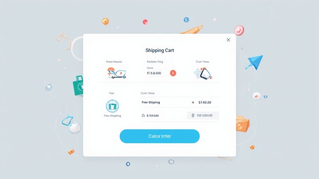
- Add a Shipping Calculator to the Cart: Pop a simple tool on your cart page that lets customers punch in their zip code for an instant shipping estimate. It puts them in control and sets clear expectations right away.
- Use Free Shipping Thresholds: This is a classic for a reason. A banner that screams "Free shipping on orders over $75" does two things at once: it clarifies your shipping cost structure and nudges people to add just one more thing to their cart.
- Leverage Geo-IP Estimates: Use an app to automatically detect a customer's location and show estimated shipping and taxes right on the product or cart pages. It removes a huge piece of friction before it even becomes a question.
The moment a customer adds an item to their cart, your job is to build a bridge of trust to the final purchase. Total cost transparency is the foundation of that bridge. Any surprise cracks it.
Make Your Return Policy Impossible to Miss
Beyond shipping, a clear and fair return policy is one of the biggest trust signals you can have. For someone buying from you for the first time, the fear of getting stuck with something that doesn't fit or isn't right is a huge hurdle. Your return policy is their safety net.
Don't bury this gem in your site's footer. Showcase it proudly. Link to your return policy directly from your product pages, stick it in your site header, and even mention it in the cart summary. A simple line like "Easy 30-day returns" can be the final push someone needs to click "buy."
Bolster Trust with Social Proof and Support
Trust isn't just about money. It's about feeling secure and knowing there's a real human on the other side if something goes wrong. When customers feel confident in your brand and know help is just a click away, they are far more likely to follow through.
This is especially critical in certain niches. For instance, cart abandonment in fashion and luxury can soar as high as 87-88%. Shoppers in these markets browse for inspiration and compare prices like crazy, so building that brand confidence is everything. The complexities of different devices and regional expectations just add to the challenge, making a robust, trust-building checkout non-negotiable. You can discover more insights about these global e-commerce trends to see just how deep this goes.
Here are a few other must-have trust signals:
- Showcase Customer Reviews: Get those star ratings and testimonials right on your product pages. Authentic feedback from real buyers is more persuasive than any marketing copy you could ever write.
- Offer Live Chat Support: A live chat widget during checkout can be a conversion-saver. It lets a nervous shopper get an instant answer about sizing or shipping without ever leaving the page.
- Display Security Badges: Use the logos for trusted payment providers like PayPal and Shop Pay, along with SSL security seals. These little images are powerful visual cues that tell customers their information is safe.
By weaving total cost transparency together with these powerful trust signals, you directly tackle the biggest anxieties that cause people to leave. You create a secure, confident environment where customers actually feel good about giving you their money.
Winning Back Customers with Cart Recovery
Look, even with the slickest checkout process on the planet, people are still going to abandon their carts. It's just a fact of life in ecommerce. Shoppers get distracted by a text message, have a moment of doubt, or are just using your cart as a glorified wishlist. This is where a smart recovery strategy comes in, turning that lost sale into a done deal.
The goal isn't to be pushy. Think of it more like a helpful store assistant noticing someone put an item down and asking, "Were you still interested in this?" A well-timed, gentle nudge can be all it takes to bring a distracted shopper right back, and they're often grateful for the reminder.
Crafting a Winning Email Recovery Sequence
Email is still the undisputed king of cart recovery. It just works. The data is clear: automated cart recovery emails can bring in as much as $5.81 in revenue for every single person who gets one. That's a massive return. But the real key is to think beyond a single, generic "You left something behind!" email.
A strategic three-part sequence is the way to go, with each email building on the last.
- The Gentle Reminder (1-3 Hours Later): This first one should be simple and friendly. Assume they just got sidetracked. A subject line like "Did you forget something?" works perfectly. Just show them a picture of what's in their cart and give them a big, obvious button to get right back to the checkout.
- The Value Nudge (24 Hours Later): By now, they might need a little more convincing. This email is your chance to tackle any hesitation head-on. Remind them about your awesome return policy, shine a spotlight on a key product benefit, or even drop in a glowing customer review for social proof. You're trying to rebuild that initial excitement.
- The Final Incentive (3-5 Days Later): This is your last shot. It's time to introduce a small, time-sensitive incentive like 10% off or free shipping. Frame it as a special, one-time offer to help them make up their mind. A little urgency goes a long way.
A great recovery email isn't really about the discount. It’s about reminding the customer why they wanted that product in the first place. Lead with value, and only use the incentive as that final push to get them over the finish line.
If you really want to nail this, our complete guide to abandoned cart emails for Shopify is packed with advanced strategies and templates to get you going.
Expanding Beyond the Inbox
While email is your workhorse, you can't stop there. A true multi-channel approach meets customers wherever they're hanging out online. If you're only sending emails, you're missing everyone who lives on social media or is glued to their text messages.
By spreading your recovery efforts across a few different channels, you create a much more effective and persistent reminder. You're simply increasing your odds of catching their attention and winning back that sale.
SMS Reminders for Immediate Impact
You want to get someone's attention? Send them a text. SMS messages have an almost unbelievable open rate—often topping 98%. They feel more personal and immediate than an email, which makes them perfect for that first quick follow-up.
Keep it short and sweet. Something like, "Hey [Name]! Looks like you left some great items in your cart at [Store Name]. Here's a link to finish your order: [Link]" is usually all you need. Just make absolutely sure you have their permission to text them—SMS marketing rules are no joke.
Social Media Retargeting Ads
For shoppers who ignore your direct messages, retargeting ads are your secret weapon. Platforms like Facebook and Instagram let you run ads that dynamically show people the exact products they left in their cart.
Imagine them scrolling through their feed and suddenly seeing that perfect pair of shoes they almost bought. It instantly reignites that initial spark of desire. Pair that visual with a compelling offer like, "Still thinking it over? Get 10% off your order today," and you've got a killer formula for bringing them right back to your store.
Answering Your Biggest Cart Abandonment Questions
Even with the best game plan, a few nagging questions always seem to surface when you’re tackling something as crucial as cart abandonment. Let’s clear those up right now.
Think of this as a quick FAQ session, pulling from years of experience helping Shopify stores just like yours plug the leaks in their checkout funnel. These aren't just theories; they're the practical answers you need to make confident, sales-recovering decisions.
How Long Should I Wait to Send a Cart Recovery Email?
Timing is absolutely everything, and the best approach isn't a single email—it's a strategic sequence. While there’s no magic number that works for every single brand, a three-part flow is a proven winner.
Your first email should land in their inbox 1-3 hours after they leave. This is your friendly nudge, the "Hey, did you forget something?" reminder that catches them while the purchase is still fresh. Most of the time, they just got distracted.
Send a second follow-up about 24 hours later. This is where you can get a little more creative. Remind them of the product's benefits, drop in a stellar customer review, or create a little friendly urgency.
The final email, sent 3-5 days later, is your last shot. This is the place to consider a small incentive, like 10% off or a free shipping code. For many on-the-fence shoppers, this last little push is all it takes to bring them back.
Will Offering Discounts in Recovery Emails Kill My Margins?
This is a totally fair question. If you start throwing discounts at every single abandoned cart, you’ll definitely feel the pinch. The trick is to be surgical about it, not to use a sledgehammer.
Instead of a blanket discount for everyone, get smart with segmentation:
- High-Value Carts: If someone was about to drop twice your average order value, offering a small discount to recover that sale is almost always a massive win for your bottom line.
- Low-Value Carts: For smaller orders, a simple reminder might be all you need. Focus on your easy return policy or unique product features instead of cutting into your profit.
- Creative Incentives: Don't underestimate the power of free shipping or a small, free gift. These perks often feel more valuable to a customer than a simple percentage-off discount.
Remember, the goal here is to win back revenue that was otherwise gone forever. Even with a discount, you're coming out ahead. Just be sure to track the ROI of your discount campaigns to make sure they’re pulling their weight.
What's the Single Biggest Change I Can Make to Fix This?
While every store has its own quirks, there's one change that delivers the biggest impact across the board: kill the surprise costs. Hands down, the number one reason people bail at the last second is seeing unexpected shipping fees and taxes pop up right before they hit "pay."
You need to be radically transparent about costs from the get-go. A shipping calculator on the cart page is a great start. Even better? A free shipping threshold.
Putting a banner at the top of your site that says "Free shipping on all orders over $75" does two amazing things at once. It obliterates that final-step sticker shock and actually encourages shoppers to add more to their cart to hit the threshold.
Should I Force Customers to Create an Account?
In one word: absolutely not. Forcing someone to create an account before they can buy is like putting a brick wall in front of your cash register. It’s a massive point of friction that sends people running.
Always, always offer a prominent guest checkout option. Respect your customer's time and their desire for a quick, painless purchase.
You can still encourage sign-ups after the deal is done. On the order confirmation page, invite them to create an account to track their order or for faster checkouts next time. Make it a helpful suggestion, never a roadblock.
Ready to turn these insights into action and drive real results for your Shopify store? The team at ECORN specializes in conversion rate optimization and strategic eCommerce consulting to help brands like yours grow. Explore our flexible packages and see how our experts can help you reduce shopping cart abandonment for good.


Shopify Pause and Build Plan Cost: A Complete 2026 Guide

Compare at Price on Shopify: A Complete Guide for 2026

Where Can I Sell My Prints? 10 Best Platforms for 2026

Shopify Order Management System: The Ultimate Guide 2026

What Is Marketing Attribution? an eCommerce Guide for 2026

10 Best Black Friday Sales Sheets for 2026

Discover the Top Social Media Marketing Agencies For

Consumer Confidence Definition for eCommerce in 2026

What Is Social Commerce? Your 2026 Guide to Boosting Sales

A Social Ad Campaign Playbook for eCommerce Growth

7 Best FAQ Page Examples for SaaS & eCommerce

Market Research in Fashion Industry: A Guide for Shopify

Shopify Migration Services: Expert Guide for 2026

Mastering FB Retargeting Ads for Shopify in 2026

What Is Omnichannel Ecommerce

Master Your Shopify Plus Migration: The 2026 Guide

Shopify Integration Services: A Merchant's 2026 Guide

Shopify Collection Description: A Guide to SEO & Sales

Shopify Plus Contact: Reach Sales & Support Effectively

Top Luxury Shopify Stores: Design & UX Strategies

How to Improve Customer Experience: A Shopify Roadmap

Creative Facebook Ads: 10 Examples for Shopify Brands

Remarketing with Facebook Ads: A Shopify Guide for 2026

SEO Linking Strategies for Shopify Stores

Top 7 Statistics YouTube Channels for eCommerce in 2026

Hiring Shopify Plus Designers: A Founder's Guide

Shopify Product Variation: Master Your Variants for 2026

Leverage Ai Solutions Brands: Your 2026 Shopify Growth Guide

Filters in Shopify: A Guide for Growing Brands

Shopify Plus Developer: A Guide for Growing Brands

When Does Black Friday Online Start? A 2026 Guide

Black Friday Email Marketing: Shopify & Klaviyo Guide

Polaris Design System: The Complete Shopify Guide

How to Hire a Consultant Email Marketing Expert

What Is Q4? A Shopify Merchant's Guide to Peak Season

Marketing Organization Structure for eCommerce Growth

Top Account-Based Marketing Agency Guide for 2026

7 Remarketing Ad Examples for Your 2026 Campaigns

AI Retail Solutions: Boost Your Shopify Store

Migrate to Shopify: The Definitive 2026 Guide

Shopify Authentication App: A Guide for Secure Stores

Why Strategic Marketing Is Important for Growth in 2026

How to Create a Size Chart in Shopify: 2026 Guide

Shopify Themes for Jewelry: The Definitive 2026 Guide

Minimal Shopify Templates: Faster, Higher-Converting Stores

Maximize Profit: Shopify CC Fees 2026 Guide

Best Shopify Apps for Beginners in 2026

How to Improve Online Shopping Experience in 2026

Shopify Design and Development Services: A 2026 Guide

Small Business Social Media Marketing Agency: A Hiring Guide

Bulk Edit Shopify: A Guide to Save Hours on Store Updates

2026 Trends in Food and Beverage Industry

Post Purchase Survey Guide for Shopify Stores

How to Build an Ecommerce Brand in 2026

Conversion Rate Optimization for Ecommerce: Maximize Profit

How to Use Customer Data to Increase Sales: A Guide

Shopify for Enterprise: The 2026 Deep Dive Guide

Email Marketing Agencies: The Guide for Shopify Brands

Boost Sales With The Right Shipping Shopify App

Your Guide to the Shopify Site Map

7 Headless Commerce Examples for 2026

Mastering Trends in Cosmetic Industry for 2026

Transfer Shopify to BigCommerce The Complete 2026 Playbook

What Is Shopify Collective? Your 2026 Guide to Success

Unlock Shopify Growth with Site Link SEO

Integrating Shopify and WordPress A Complete Guide for 2026

Naming a Clothing Store: A Shopify Founder's Playbook

Guide to buying shopify store in 2026

Buying shopify store: Buying a Shopify Store: Invest Wisely

Food & Beverage Marketing: A Complete Guide for 2026

Facebook Ads Agency: A Shopify Brand's Hiring Guide

Shopify Apparel Stores: A 2026 Launch & Scale Guide

How to Deactivate Shopify Store: The 2026 Guide

Shopify and Square: The 2026 Ultimate Comparison

Your Guide to Beauty Products Ecommerce

A Guide to Marketing for Beauty Brands in 2026

Your Guide to Facebook Black Friday Ads

Facebook Ad Ecommerce for Shopify Growth

Iconography Web Design The Definitive Guide for Shopify Stores

A Modern Backlinks SEO Strategy for Shopify Stores

How to Launch an Online Store: A Step-by-Step Success Guide

Optimize Shopify Store: Master Performance in 2026

Successful Migration for Shopify: Protect SEO & Grow

Maximize Traffic & Sales: Get Your Free Website Audit Report

Master the Best Ads Facebook Formats for eCommerce Success

How to Find the Best Ecommerce Agency Near Me in 2026

10 Crucial White Hat Techniques SEO for Shopify in 2026

How to Reduce Returns and Boost Profits in Your eCommerce Store

What Is Ecommerce Personalization A Guide to Unlocking Growth

Payment gateways in shopify: The Ultimate Guide for Merchants 2026
Fulfillment services for shopify: Scale Your Ecommerce Brand

Shopify Landing Page Examples: 7 Winning Templates to Boost Conversions
How to Create Urgency in Sales on Shopify

The Best Review Apps for Shopify to Drive Growth in 2026

The Best Ecommerce Platform for Startups in 2026
Choosing Ecommerce Website Design Packages A Complete Guide

Shopify Plus Partners: Guide to shopify plus partners for 2026 growth

How to Find serp feature opportunities: Win SERP Snippets in 2026
Selling on Etsy vs eBay A Guide for eCommerce Brands in 2026

10 Proven Sample Email Campaigns for Shopify to Boost Sales in 2026


newsletter in your inbox