
At its heart, the mobile-first design philosophy boils down to a single, powerful idea: start designing for the smallest screen first, and then scale your way up.
Think of it like packing for a long trip, but you can only start with a small backpack. You’d be forced to pack only the absolute essentials—your phone, wallet, keys. That’s the core principle here. It forces you to focus laser-sharp on what your users truly need before you start adding nice-to-haves for bigger screens.
What Is Mobile First Design and Why It Matters Now

Mobile-first design is more of a strategy than a technical task. It completely flips the old-school web design process on its head. For years, we designed for a big desktop monitor and then tried to cram and shrink everything to fit on a phone. This old method, often called "graceful degradation," usually led to mobile experiences that were cluttered, painfully slow, and just plain frustrating to use.
The mobile-first approach, on the other hand, champions "progressive enhancement." By starting with the tightest constraints—a smartphone screen—designers have no choice but to prioritize ruthlessly.
- Content Comes First: You’re forced to decide which information and features are absolutely mission-critical. Everything else has to wait.
- Performance is Baked In: Mobile users are impatient and often on spotty connections. This approach demands optimized images and efficient code from the get-go, making speed a priority, not an afterthought.
- Simplicity Wins: With so little space, you need a clean user interface and dead-simple navigation. The happy side effect? This clarity benefits users on every single device.
The Shift to a Mobile-Centric Web
This way of thinking isn't brand new; it's been around for over a decade. But its importance has absolutely exploded recently. The real turning point was in July 2019, when Google officially switched to mobile-first indexing for all new websites. This means Google primarily uses the mobile version of your site to crawl, index, and rank your content. If your mobile site is a mess, your search visibility is going to take a serious hit.
By designing for the smallest screen first, you create a baseline experience that is inherently focused, fast, and user-centric. This foundation ensures that as you scale up to tablets and desktops, you are adding features thoughtfully rather than just filling empty space.
To really get a handle on this, it helps to also understand what is responsive web design, because the two concepts are joined at the hip. Think of mobile-first as a strategy that lives within the larger practice of responsive design. It sets the starting line and the mindset, guaranteeing the final product shines where most of your customers are today: on their phones.
This is especially true in the world of eCommerce. With over 70% of online sales now happening on mobile devices, a clunky mobile experience isn't just an annoyance—it's a direct hit to your bottom line. That tight connection between user experience and revenue is why getting a grip on mobile commerce principles is so vital.
The Three Pillars of a Mobile-First Strategy
Jumping into a mobile-first mindset isn't about ticking off boxes on a long checklist. It's more about building on a solid foundation. Just like a house needs strong pillars to stand, a killer mobile-first design strategy rests on three core principles. Get these right, and you'll build an experience that’s not just functional on a small screen, but lean, intuitive, and ready to grow.
Think of it like designing a tiny house. You wouldn't start by figuring out where to cram a grand piano. You’d begin with the absolute essentials—a place to sleep, eat, and live comfortably. That’s the same logic we're applying here, focusing on Content Prioritization, Scalable Navigation, and Performance Optimization.
Content Prioritization
This is basically "content triage." On a mobile screen, space is a luxury you just don't have. You have to make some tough calls about what information and actions are absolutely mission-critical for your user in that exact moment. Everything else is secondary.
Picture someone looking up a restaurant's website on their phone. They're probably out and about, maybe even a little hangry. What do they need right now?
- The address or a map.
- The phone number to book a table.
- The hours of operation.
A long, detailed history of the chef or a blog post about the restaurant’s philosophy can wait. A mobile-first approach shoves the most critical info right under their nose, so they don't have to waste time hunting for it.
By forcing you to choose only the most important elements, content prioritization naturally declutters the user experience. This leads to a cleaner, more focused design that benefits users on every device, not just mobile.
Scalable Navigation
Okay, so you've figured out your most important content. Now, how do you help people find it? Scalable navigation is all about creating a menu system that works flawlessly in a tight space but can gracefully expand when more screen real estate is available. It’s like having a compact toolkit that unfolds to reveal more options when you need them.
On mobile, this usually means leaning into patterns that users already know and understand.
- Hamburger Menus: That little three-lined icon is the universal sign for "more stuff here." It saves precious screen space by tucking away less-critical navigation links until they’re needed.
- Tab Bars: Often glued to the bottom of the screen, tab bars give users constant, one-tap access to the most important parts of your site, like "Home," "Search," or "Account."
- Vertical Scrolling: Mobile users are practically pros at scrolling. It's second nature. Designing long, scrollable pages is almost always a better experience than making people click through a dozen fragmented pages.
The trick is to start with a navigation system that’s simple and touch-friendly, then build on it for desktop with goodies like mega menus or persistent sidebars.
Performance Optimization
This last pillar is completely non-negotiable: speed. Mobile users are impatient. One study found that 53% of mobile visitors will bounce if a page takes more than three seconds to load. Performance isn’t a nice-to-have; it's a fundamental part of good design.
A mobile-first strategy forces you to think about performance from day one. Since you're starting with the constraints of mobile networks and hardware, you have no choice but to be efficient. This means baking in a few key practices from the start:
- Optimizing Images: Compressing images and using modern formats like WebP means they load lightning-fast without eating up a user's entire data plan.
- Minifying Code: Stripping out all the unnecessary spaces, comments, and characters from your HTML, CSS, and JavaScript files makes them smaller and quicker to download.
- Leveraging Browser Caching: This tells a user's browser to save parts of your site, so it doesn't have to re-download everything every single time they visit.
These three pillars—prioritizing your content, building scalable navigation, and optimizing for performance—are the bedrock of any effective mobile-first design. Master them, and you’ll create an experience that isn't just functional, but one that your users will genuinely love.
How to Implement a Mobile First Workflow
Knowing the principles is one thing, but putting them into practice requires a real shift in how you build. Moving to a mobile-first approach isn't just a tweak to the final design—it's a complete overhaul of your process, from the first brainstorm to the final launch.
Think of it like building a house. You start with a solid, minimalist foundation (mobile) that can easily support more elaborate additions later (desktop), instead of building a mansion and then trying to hack pieces off to make it fit on a smaller plot of land.
This way of thinking was championed by Luke Wroblewski in his book, Mobile First, way back in 2011. He argued that designing for the smallest screen forces you to prioritize what’s truly essential. The limited space becomes a creative constraint that naturally leads to a cleaner, more focused user experience from the get-go.
Mobile First vs Responsive Design Key Differences
It's easy to mix up mobile-first with traditional responsive design, but they are fundamentally different philosophies. One starts small and builds up; the other starts big and scales down. This table breaks down the core distinctions.
At its heart, the mobile-first approach is proactive, forcing you to solve the toughest design problems first. Traditional responsive design is often reactive, trying to fix a complex desktop layout for a mobile context.
Step 1 Start With a Content Inventory
Before you even think about layouts or wireframes, you need to know exactly what you're working with. A content inventory is where you catalog every single piece of information, every button, and every feature your site needs.
Imagine you're packing for a weekend trip with only a small backpack. You can't just throw everything in; you have to choose only the essentials. That's what a content inventory does for your mobile design—it forces ruthless prioritization.
- List Everything: Document it all, from headlines and product descriptions to images, videos, and contact forms.
- Assign Priority: Sort each item into "must-have," "nice-to-have," or "not essential for mobile."
- Focus on User Goals: Ask yourself, "What is the one thing a user absolutely needs to do on this page?" Anything that doesn't support that goal gets cut or moved.
This step ensures your mobile experience is laser-focused on what users actually need, cutting the clutter that so often plagues desktop-to-mobile adaptations.
Step 2 Create Mobile Wireframes First
With your prioritized content list in hand, it’s time to start sketching. In a mobile-first workflow, you begin by creating wireframes—the basic blueprints of your pages—specifically for a smartphone screen.
This is where the constraints of mobile become your biggest advantage. You're not worrying about colors or fonts yet. You’re purely focused on structure, hierarchy, and flow.
A mobile wireframe forces you to solve the toughest usability problems first. If you can create an intuitive experience in such a limited space, scaling it up for larger screens becomes a matter of enhancement, not damage control.
This initial blueprint sets the core structure for your entire user interface, making sure navigation is dead simple and key information is right where users expect it.
This infographic shows how a mobile-first strategy flows, starting with content and building up to a fully optimized experience.
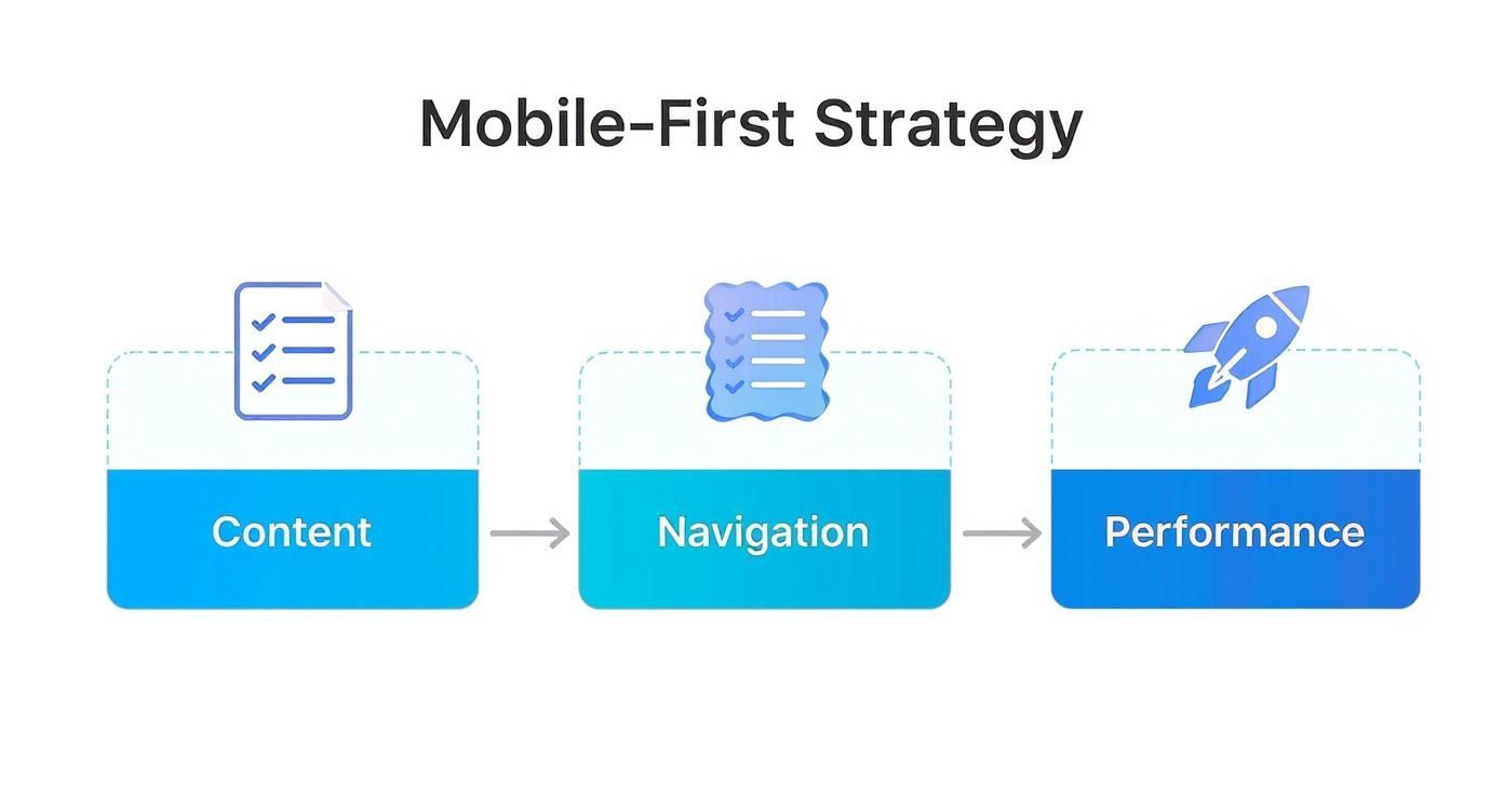
As you can see, everything starts with content. It's the foundation upon which a great mobile experience is built.
Step 3 Design for Touch Interaction
People don't use phones with a precise mouse cursor. They tap, swipe, and pinch with their fingers. Designing for touch isn't a "nice-to-have"—it's a fundamental part of the mobile-first process. A button that’s easy to click on a desktop can be an exercise in pure frustration on a phone.
You absolutely have to consider these factors:
- Tap Target Size: Buttons and links need to be big enough to be tapped easily without zooming. The industry standard is a minimum size of 44x44 pixels.
- Adequate Spacing: Leave enough space between interactive elements to prevent the dreaded "fat-finger" problem, where users accidentally tap the wrong link.
- Thumb-Friendly Zone: Most people hold their phone in one hand and navigate with their thumb. Place your most important actions and navigation elements within this "thumb zone"—the part of the screen they can easily reach without stretching or shifting their grip.
Step 4 Apply Progressive Enhancement
Once your solid mobile foundation is built, it's time to scale up. This is where progressive enhancement comes in. Instead of starting with a big desktop site and stripping features away for mobile (a process called graceful degradation), you do the opposite. You start with the lean mobile version and thoughtfully add features as more screen space becomes available.
For a tablet, this might mean introducing a multi-column layout. For a desktop, you might display secondary information that was hidden on mobile or add cool hover effects that only work with a mouse.
The core experience stays the same across all devices, but it gets richer and more expansive as the screen real estate grows. To learn more about how this philosophy extends to modern app development, read our guide on the differences between a progressive web app vs a native one.
See Mobile-First Design Principles in Action
Theory is one thing, but seeing how the pros put it into practice is where the real lightbulb moments happen. The best companies don't just check the boxes on mobile-first principles; they live and breathe them, crafting mobile experiences that feel like second nature.
Let's break down how giants like Airbnb, Amazon, and Spotify absolutely nail it.
By looking at their design choices, we can connect the dots between the concepts and the results. This gives you a clear blueprint to follow for your own site.
Airbnb: All About the Core User Goal
Pop open Airbnb's mobile site, and you're looking at a masterclass in prioritization. They know exactly why you're there: to find a place to stay, fast. The entire screen funnels your attention to one single, obvious action—the search bar.
It's right there, front and center, asking "Where," "When," and "Who." There are no flashy banners or distracting side quests. This laser focus on the user's main goal cuts out the friction and guides them straight into the booking process. It's brilliant.
- Bare-Bones Header: The top navigation is stripped down to just the essentials, using simple icons for search, favorites, and logging in.
- Pictures First: Search results lead with big, beautiful photos of the properties. After all, that's what people want to see first.
- Made for Thumbs: The filter and map buttons aren't tucked away at the top; they're sitting at the bottom of the screen, right where your thumb can easily tap them.
Amazon: The Kings of Seamless Checkout
For a company that sells literally millions of products, Amazon's mobile experience is shockingly uncluttered. They pull this off with smart navigation and an obsessive focus on making checkout as painless as possible. On mobile, they know speed and simplicity are what drive sales.
The search bar is always there at the top of the screen, a constant reminder that finding what you want is the main event. Below it, clear icons get you to your orders, cart, and account settings without a wall of text.
Amazon's one-click ordering is probably the purest example of mobile-first thinking in the wild. By saving your payment and shipping info, they turn the entire checkout ordeal into a single tap. This is a game-changer for someone on the go who has zero patience for filling out forms.
Getting this flow right is non-negotiable for boosting conversion rates. For shops on other platforms, solid Shopify conversion rate optimization strategies are built on this very same foundation—making it ridiculously easy for mobile users to buy.
Spotify: Designing for Touch and Context
Spotify's app is a perfect example of designing for how people actually use their phones. They know you're probably multitasking—on a run, cooking dinner, or on the train—so the interface has to work with just a glance and a simple tap.
The main navigation lives in a permanent tab bar at the bottom, giving you one-tap access to Home, Search, and Your Library. The buttons are big, spaced out, and right in that "thumb-friendly zone."
But where Spotify really shines is in how it uses context to make things easier.
- The "Now Playing" Bar: A small bar at the bottom gives you instant control over your music from anywhere in the app. No more navigating back and forth just to pause or skip a track.
- Contextual Menus: Instead of cluttering the screen with options, a long press or a tap on the three-dot icon reveals actions like "Add to Playlist" or "Share."
- Clear Visuals: Album art is the star of the show, followed by the song title, and then the controls. This clean hierarchy helps you process what you're seeing in a split second and tap with confidence.
These examples make one thing crystal clear: mobile-first design principles aren't about shrinking a desktop site. It's a total rethink of the user's journey, zeroing in on priorities, simplicity, and speed to create an experience that isn't just usable on a small screen—it's genuinely enjoyable.
Common Mobile-First Design Mistakes to Avoid
Jumping into mobile-first design principles is a fantastic move, but even the sharpest designers can fall into a few common traps. These mistakes might look small on the surface, but they create the kind of frustrating user experience that absolutely destroys conversions and can even ding your SEO.
Think of it like building a world-class engine and then slapping square wheels on the car. All that power is useless because the ride is going to be terrible. Sidestepping these pitfalls is how you make sure your smart design choices lead to a smooth, effective journey for every visitor.
The Shrink and Squeeze Fallacy
This is the big one. The most frequent mistake is not actually designing for mobile, but just shrinking a desktop site to fit a smaller screen. This "shrink and squeeze" approach jams all the content, navigation, and visual bits from a large display onto a tiny one.
The result? A cluttered mess. You get text that’s impossible to read without pinching and zooming, and buttons so small they're impossible to tap accurately. It completely ignores that a mobile visitor is in a totally different mindset. True mobile-first design is about rethinking, not just resizing.
A user on their phone is often on the go, has limited time, and needs to get one thing done—fast. Simply shrinking a desktop design disrespects that context, leading to instant frustration and sky-high bounce rates.
Ignoring the Human Thumb
It's easy to forget when you're designing on a big monitor with a pinpoint-accurate mouse, but your users are navigating with their thumbs. This oversight leads to a critical error: ignoring touch target size and placement.
When buttons, links, or menu items are too tiny or packed together, people run into the dreaded “fat-finger” problem. Hitting the wrong link by accident is infuriating and is a surefire way to get someone to abandon their cart.
- Minimum Target Size: Make sure your interactive elements are at least 44x44 pixels. This gives thumbs a comfortable target to aim for.
- Spacing is Key: Always pad buttons and links with enough white space to prevent accidental taps on neighboring elements.
- Design for the Thumb Zone: Put your most important actions—like "Add to Cart" or the main navigation tabs—in the lower part of the screen. That’s the prime real estate where thumbs can reach them easily.
Forgetting About Performance
A gorgeous design means nothing if it takes forever to load. One of the biggest blunders is forgetting that mobile users are often on slower, less reliable connections. Heavy images, complex scripts, and bloated code are performance killers.
Don't forget that over 53% of mobile visitors will bail if a site takes longer than three seconds to load. Performance isn't just a nice-to-have; it's a core piece of the mobile experience. A mobile-first mindset forces you to think lean from the very beginning, optimizing every single asset.
Hiding Key Content and Actions
In the quest to create a clean, minimalist interface, some designers swing too far the other way. They hide essential information behind confusing icons or bury it deep inside a hamburger menu. While simplifying is the goal, oversimplifying can be just as damaging.
If someone has to go on a treasure hunt to find the search bar, shipping details, or your contact info, they're not going to stick around. The idea is to prioritize and organize, not to hide. Your main calls-to-action and the most critical user journeys should always be in plain sight or just one intuitive tap away.
How Mobile First Design Impacts SEO and Future Trends
Let's be clear: adopting a mobile-first design isn't just a nice-to-have for a better user experience anymore. It's now a core pillar of modern SEO. Search engines like Google have drawn a line in the sand, making your mobile site the definitive version of your brand online.
This all comes down to Google's mobile-first indexing. In simple terms, Google now looks at your mobile site first to understand your content and decide how to rank you. If your mobile site is a stripped-down, clunky afterthought, that's how Google sees your entire brand.
A solid mobile-first strategy also has the welcome side effect of boosting your Core Web Vitals, the performance metrics Google uses to judge the quality of a user's on-page experience.
- Largest Contentful Paint (LCP): When you design for mobile first, you're forced to prioritize the most important content and optimize images from the get-go. This means the main event on your page loads much faster, which is exactly what LCP measures.
- First Input Delay (FID): A lean, mobile-focused build means less code for the browser to wade through. The result? Your site can respond almost instantly when a user taps a button or clicks a link, leading to a much better FID score.
- Cumulative Layout Shift (CLS): Building your layout for a small screen from the ground up naturally leads to a more stable design. You avoid those frustrating jumps and shifts in content that tank your CLS score and drive users crazy.
Preparing for What Comes Next
Looking beyond today's algorithms, the core philosophy of mobile-first—designing for constraints—is what makes it such a durable, future-proof strategy. The principles of prioritizing content, ensuring speed, and focusing on accessibility aren't just for phones; they're essential for the next wave of technology.
Take voice search, for example, which has absolutely exploded in popularity. A mobile-first site, with its clean structure and concise information, is incredibly easy for assistants like Siri and Alexa to understand and serve up as answers.
Adopting a mobile-first mindset is about more than just appeasing current search engine algorithms. It's about building a flexible, efficient, and user-centric foundation that can adapt to the next wave of technology, from foldable phones to voice-activated interfaces.
And as new devices like foldable phones hit the market, the scalable nature of mobile-first design means your site can effortlessly adapt to different screen sizes and orientations. A website built on these principles is inherently flexible. By starting small and scaling up, you're not just building a site for today—you're ensuring your business is ready for whatever tomorrow brings.
Still Have Questions About Mobile-First Design?
Even after getting the hang of the principles and the workflow, a few questions always seem to pop up. Let's tackle those common head-scratchers to make sure you're crystal clear on the whole mobile-first philosophy.
Think of this as the final check-in before you start putting these ideas to work on your own projects.
Is Mobile-First the Same as Responsive Design?
Not quite, but they’re definitely related. The real difference is where you start.
Responsive design is the big-picture term for any site that adjusts to different screen sizes. For years, though, most "responsive" projects started with the desktop version and then tried to shrink everything down for smaller screens. This process is called graceful degradation.
Mobile-first flips that script. It’s a specific strategy that forces you to start with the smallest screen and then scale up, adding more features and complexity for larger devices. This is called progressive enhancement, and it leads to a much cleaner, more focused experience right from the get-go.
Will a Mobile-First Approach Weaken My Desktop Site?
It's a fair question, but the answer is a firm no. In fact, when done right, it makes your desktop experience so much better.
Starting with the tight constraints of a mobile screen forces you to be ruthless with your priorities. You have to ditch the clutter and focus only on what’s absolutely essential for the user. This creates a lean, mean foundation that prevents the feature-creep that so often plagues desktop-first builds.
As you move to bigger screens, you’re not just cramming more stuff in; you're thoughtfully adding back secondary features and more complex layouts. The end result is a more intentional and efficient design on every single device.
A mobile-first approach doesn't lead to a compromised desktop site; it leads to a more disciplined and user-focused one. You build on a solid foundation instead of trying to subtract from a complicated one.
How Does Mobile-First Design Affect My Site's Loading Speed?
This is where mobile-first truly shines. The impact is huge—and positive. Performance isn't an afterthought here; it's baked into the philosophy from day one. When you’re designing for mobile networks that can be spotty and slow, you have no choice but to obsess over speed.
This means you naturally end up doing all the right things:
- Optimized Images: You’re using smaller, compressed images by default, not massive desktop files.
- Minimal Code: Your HTML, CSS, and JavaScript are leaner because you only load what’s necessary for that screen.
- Fewer Resources: You avoid loading heavy scripts or assets that aren't critical to the core mobile experience.
The best part? These performance wins aren't just for your mobile visitors. They carry right over to the tablet and desktop versions, making your website faster for absolutely everyone. That's a massive win for user experience and your SEO rankings.
Ready to build an eCommerce experience that converts? ECORN specializes in crafting high-performance Shopify sites built on solid mobile-first principles. Let our team of experts help you scale your brand with a design that delights customers on every device. Explore our solutions.


Shopify Order Management System: The Ultimate Guide 2026

What Is Marketing Attribution? an eCommerce Guide for 2026

10 Best Black Friday Sales Sheets for 2026

Discover the Top Social Media Marketing Agencies For

Consumer Confidence Definition for eCommerce in 2026

What Is Social Commerce? Your 2026 Guide to Boosting Sales

A Social Ad Campaign Playbook for eCommerce Growth

7 Best FAQ Page Examples for SaaS & eCommerce

Market Research in Fashion Industry: A Guide for Shopify

Shopify Migration Services: Expert Guide for 2026

Mastering FB Retargeting Ads for Shopify in 2026

What Is Omnichannel Ecommerce

Master Your Shopify Plus Migration: The 2026 Guide

Shopify Integration Services: A Merchant's 2026 Guide

Shopify Collection Description: A Guide to SEO & Sales

Shopify Plus Contact: Reach Sales & Support Effectively

Top Luxury Shopify Stores: Design & UX Strategies

How to Improve Customer Experience: A Shopify Roadmap

Creative Facebook Ads: 10 Examples for Shopify Brands

Remarketing with Facebook Ads: A Shopify Guide for 2026

SEO Linking Strategies for Shopify Stores

Top 7 Statistics YouTube Channels for eCommerce in 2026

Hiring Shopify Plus Designers: A Founder's Guide

Shopify Product Variation: Master Your Variants for 2026

Leverage Ai Solutions Brands: Your 2026 Shopify Growth Guide

Filters in Shopify: A Guide for Growing Brands

Shopify Plus Developer: A Guide for Growing Brands

When Does Black Friday Online Start? A 2026 Guide

Black Friday Email Marketing: Shopify & Klaviyo Guide

Polaris Design System: The Complete Shopify Guide

How to Hire a Consultant Email Marketing Expert

What Is Q4? A Shopify Merchant's Guide to Peak Season

Marketing Organization Structure for eCommerce Growth

Top Account-Based Marketing Agency Guide for 2026

7 Remarketing Ad Examples for Your 2026 Campaigns

AI Retail Solutions: Boost Your Shopify Store

Migrate to Shopify: The Definitive 2026 Guide

Shopify Authentication App: A Guide for Secure Stores

Why Strategic Marketing Is Important for Growth in 2026

How to Create a Size Chart in Shopify: 2026 Guide

Shopify Themes for Jewelry: The Definitive 2026 Guide

Minimal Shopify Templates: Faster, Higher-Converting Stores

Maximize Profit: Shopify CC Fees 2026 Guide

Best Shopify Apps for Beginners in 2026

How to Improve Online Shopping Experience in 2026

Shopify Design and Development Services: A 2026 Guide

Small Business Social Media Marketing Agency: A Hiring Guide

Bulk Edit Shopify: A Guide to Save Hours on Store Updates

2026 Trends in Food and Beverage Industry

Post Purchase Survey Guide for Shopify Stores

How to Build an Ecommerce Brand in 2026

Conversion Rate Optimization for Ecommerce: Maximize Profit

How to Use Customer Data to Increase Sales: A Guide

Shopify for Enterprise: The 2026 Deep Dive Guide

Email Marketing Agencies: The Guide for Shopify Brands

Boost Sales With The Right Shipping Shopify App

Your Guide to the Shopify Site Map

7 Headless Commerce Examples for 2026

Mastering Trends in Cosmetic Industry for 2026

Transfer Shopify to BigCommerce The Complete 2026 Playbook

What Is Shopify Collective? Your 2026 Guide to Success

Unlock Shopify Growth with Site Link SEO

Integrating Shopify and WordPress A Complete Guide for 2026

Naming a Clothing Store: A Shopify Founder's Playbook

Guide to buying shopify store in 2026

Buying shopify store: Buying a Shopify Store: Invest Wisely

Food & Beverage Marketing: A Complete Guide for 2026

Facebook Ads Agency: A Shopify Brand's Hiring Guide

Shopify Apparel Stores: A 2026 Launch & Scale Guide

How to Deactivate Shopify Store: The 2026 Guide

Shopify and Square: The 2026 Ultimate Comparison

Your Guide to Beauty Products Ecommerce

A Guide to Marketing for Beauty Brands in 2026

Your Guide to Facebook Black Friday Ads

Facebook Ad Ecommerce for Shopify Growth

Iconography Web Design The Definitive Guide for Shopify Stores

A Modern Backlinks SEO Strategy for Shopify Stores

How to Launch an Online Store: A Step-by-Step Success Guide

Optimize Shopify Store: Master Performance in 2026

Successful Migration for Shopify: Protect SEO & Grow

Maximize Traffic & Sales: Get Your Free Website Audit Report

Master the Best Ads Facebook Formats for eCommerce Success

How to Find the Best Ecommerce Agency Near Me in 2026

10 Crucial White Hat Techniques SEO for Shopify in 2026

How to Reduce Returns and Boost Profits in Your eCommerce Store

What Is Ecommerce Personalization A Guide to Unlocking Growth

Payment gateways in shopify: The Ultimate Guide for Merchants 2026

Fulfillment services for shopify: Scale Your Ecommerce Brand

Shopify Landing Page Examples: 7 Winning Templates to Boost Conversions

How to Create Urgency in Sales on Shopify

The Best Review Apps for Shopify to Drive Growth in 2026

The Best Ecommerce Platform for Startups in 2026

Choosing Ecommerce Website Design Packages A Complete Guide

Shopify Plus Partners: Guide to shopify plus partners for 2026 growth

How to Find serp feature opportunities: Win SERP Snippets in 2026

Selling on Etsy vs eBay A Guide for eCommerce Brands in 2026

10 Proven Sample Email Campaigns for Shopify to Boost Sales in 2026

A Winning Digital Content Marketing Strategy for Shopify in 2026

Top 7 Best Shopify Agencies to Scale Your Business in 2026

Ecommerce Website Development Cost in 2026 A Realistic Guide


newsletter in your inbox