
A web site usability study is pretty straightforward: you watch real people try to use your website.The goal is to find all the little friction points and hidden opportunities that you're too close to see. It’s the single best way to stop guessing why people are leaving and start building a clear, actionable roadmap to sell more stuff.
Why Usability Is Your Conversion Superpower

Let's get practical and talk about actual revenue. For an eCommerce store, your website isn't some digital brochure. It’s your flagship store, your best salesperson, and your biggest brand ambassador, all rolled into one. Every single piece of it—from how clear your navigation is to how fast your product photos load—is either helping or hurting a sale.
A usability study pulls back the curtain on that user experience. You're not asking people if they like your site's color scheme. You're watching them actually try to use it. This is where you find the invisible roadblocks that are quietly costing you money every single day.
The Hidden Costs of a Clunky Website
Think about the last time you ditched a full shopping cart online. Was it a confusing checkout form? Maybe the shipping costs popped up as a nasty surprise, or you couldn't find the return policy. These little moments of frustration seem small, but they add up to a ton of lost revenue.
When a potential customer gets annoyed, they don't file a support ticket; they just leave. Even worse, they probably won't be back. In fact, research shows that around 88% of users are less likely to return to a site after a bad experience. The biggest culprits are slow-loading pages (88.5%) and confusing navigation (61.5%)—exactly the kind of problems a good usability study shines a light on.
A usability study is the ultimate reality check. It replaces your team's assumptions with hard evidence of how real customers see your brand online.
Connecting a Better UX to Your Bottom Line
The real magic of a usability study is its direct link to key business metrics. When you systematically find and fix the things that frustrate your users, you see tangible results that show up in your bank account.
Here’s how investing in usability translates directly to growth:
- Boosted Conversion Rates: When you remove obstacles in the buying journey—like a clunky "add to cart" button or a vague call-to-action—you make it much easier for people to give you their money.
- Higher Average Order Value (AOV): A smooth, intuitive site actually encourages people to browse. When they can easily find related products or understand bundle deals, they’re more likely to add more to their cart.
- Lower Cart Abandonment: By simplifying your checkout and being upfront about things like shipping costs, you can dramatically cut down the number of people who bail at the last second.
- Better Customer Loyalty: A positive, hassle-free experience builds trust and brings people back. It’s how you turn one-time shoppers into loyal fans who tell their friends about you.
To really get why this is so critical, it helps to understand what a conversion rate is in marketing. At the end of the day, a great user experience isn't just about good design; it's a powerful and sustainable way to grow your business.
Laying the Groundwork: How to Plan a Usability Study That Delivers
![]()
Any solid usability study starts with a rock-solid plan. If you jump into testing without clear goals, you’re just gathering opinions. You'll get a ton of feedback, sure, but you won't have a clue if any of it actually helps you solve real business problems. This is where you turn those vague "our checkout feels clunky" complaints into sharp, answerable research questions.
Think of it this way: good planning ensures every minute you spend with a participant is a minute spent getting closer to a genuine solution, not just wandering through a forest of feedback.
Nail Down Your Goals (And Make Them Measurable)
First things first, you need to get specific. Vague goals give you vague, unusable results. You have to tie your study directly to a business problem or a key metric you're trying to move.
A weak goal sounds like, "See if the product page is confusing." It's a start, but it doesn't give you anything to measure against.
A much stronger goal is: "Decrease the bounce rate on product pages by 10% by identifying where users get stuck or miss key information." Now that is a goal. It's specific, measurable, and gives your entire study a clear direction.
Here are a couple more examples to get you thinking:
- Vague: "Improve the checkout process."
- Specific: "Pinpoint the top three friction points in our checkout flow to slash cart abandonment by 15% this quarter."
- Vague: "Make finding products easier."
- Specific: "Measure the time it takes for a user to find a specific item and add it to their cart, with the aim of reducing this time by 20%."
Planning isn't about knowing the answers ahead of time; it's about asking the right questions. A sharp, well-defined goal is the single most important part of a usability study that actually generates ROI.
This kind of precision is what separates a casual chat with a customer from a professional usability study that drives real growth.
To make sure you cover all your bases, we've put together a quick table outlining the key components of a solid usability study plan.
Key Elements of a Usability Study Plan
This table summarizes the essential components to define before you start recruiting. Getting these details down on paper ensures your study stays focused and effective from start to finish.
Defining these elements upfront is non-negotiable. It’s the blueprint that will guide every subsequent step, from writing your script to analyzing the final results.
Know Who You're Talking To: Profiling Participants
Once you know what you want to learn, you have to figure out who you need to learn from. Testing with the wrong audience is worse than not testing at all—it gives you misleading feedback that sends you down the wrong path. Your mission is to recruit people who are a dead ringer for your target customers.
Start by sketching out a simple participant profile. This goes beyond just age and location. Dig into their motivations, their comfort level with technology, and how familiar they are with your brand. For example, are you after feedback from first-time visitors or die-hard fans? The answer completely changes your recruitment strategy.
A solid profile should include:
- Demographics: Age range, gender, location, income level.
- Online Shopping Habits: How often do they shop online? What devices do they prefer?
- Brand Familiarity: Have they bought from you before, or are they seeing your store for the first time?
- Technical Chops: Are they power users who live for advanced filters, or do they need a more straightforward navigation experience?
If you haven't already created user personas, now's a great time. They are an incredibly valuable tool for this process. For a deep dive, check out our guide on how to create buyer personas in our comprehensive article. This ensures the feedback you collect comes directly from people whose opinions can actually impact your bottom line.
Find and Filter Your Testers
With a crystal-clear profile, your next job is to actually find these people. You've got two main routes: recruit from your own audience or use a third-party service.
Your Own Audience (Customers, Email List): This is often the gold standard. You get high-quality, relevant feedback from real people who have a vested interest in your brand. The only catch is the potential for bias. Loyal customers might already know the workarounds for your site's quirks or might be too nice to give truly harsh feedback.
Recruitment Platforms (UserTesting, UserInterviews): These platforms are a lifesaver. They give you access to huge pools of testers that you can filter down to your exact criteria. It’s way faster and saves a ton of administrative headaches, but it costs money, and the participants won’t have that natural connection to your brand.
No matter where you find them, a screener survey is absolutely essential. This is just a short questionnaire to weed out anyone who doesn't fit your profile. The trick is to ask questions that confirm their habits without giving away the "right" answers.
For example, instead of asking, "Do you shop online for athletic wear?" (which prompts a 'yes'), ask, "Which of the following have you purchased online in the last six months?" and include athletic wear as one of several options. This simple step is your best defense for ensuring the quality and relevance of your entire study.
Writing Tasks That Uncover True User Behavior
The quality of your usability study lives and dies by the tasks you give participants. A poorly written task gives you artificial behavior and fuzzy feedback. A great task, though, is like a key that unlocks a genuine glimpse into how a real customer thinks, shops, and solves problems on your site.
The goal here is to get beyond simple instructions and create realistic scenarios that reveal what a user actually does, not just what you tell them to do.
This is where a lot of well-intentioned studies go wrong. Asking someone to "Find a red shirt" is just a command. It tests if they can follow an order, not how they naturally shop. It’s a sterile, clinical request that has almost zero in common with a real-world shopping trip.
From Commands to Scenarios
To get authentic results, you have to frame every task like a story. Give your participant a reason to be on your site and a goal they care about, even if it’s just for the next ten minutes. This simple shift is powerful—it encourages them to think aloud and use the site naturally, revealing their unfiltered thought process.
Let's take that flat command and turn it into a real scenario:
- Instead of: "Find a red shirt."
- Try: "Imagine you have a friend's birthday party this weekend and want to wear something new. You've decided a red shirt would be perfect. Show me how you'd go about finding one on this site that you'd be excited to wear."
See the difference? The second version gives them context and motivation. It invites them to think about style, price, and fit—just like a real shopper would. This is how you learn how they really use your navigation, filters, and search bar when left to their own devices.
The best task scripts make the participant forget they're even in a test. They should feel like they're just shopping online, with the extra step of sharing their thoughts. That's the secret to seeing natural, uncoached behavior.
Crafting Scenarios for Core eCommerce Actions
You’ll want your tasks to cover the most critical parts of the customer journey. You're looking for a complete picture, from how people first discover products to the final click on the purchase button. Here are a few essential areas to test, along with some sample scripts to get you started.
1. Using Site Search and Navigation
The goal here is to see how users find what they're looking for when they have a general idea, but not a specific product, in mind.
- Scenario: "You're redecorating your living room and want a new throw blanket to add a pop of color. You're not exactly sure what you want yet. Could you show me how you'd browse this site to find some options?"
2. Applying Filters and Sorting Products
This puts your category and collection pages to the test. Can users easily narrow down a huge selection of products to find something that meets their specific needs?
- Scenario: "You've decided you want a blue throw blanket, but you're on a budget and don't want to spend more than $50. You also need one that's machine washable. Use the tools on this page to find a blanket that fits the bill."
3. The Full Checkout Process
This is it—the most critical part of your site. The task needs to be designed to observe every single step, from adding an item to the cart all the way to seeing the order confirmation page.
- Scenario: "Okay, you've found the perfect blanket. Now, I'd like you to go through the entire process of buying it. We've provided a test credit card number for you to use, so don't worry, you won't actually be charged. Please just talk me through each step as you go."
This holistic approach means you’re not just testing isolated features, but the entire, end-to-end user flow. It helps you pinpoint exactly where friction happens and where people might be dropping off. This becomes even more critical on mobile, where a seamless experience is non-negotiable. In fact, mobile-optimized websites often see conversion rates 20% higher than their non-optimized counterparts, a number that can jump to 40% higher for sites with truly adaptive design. You can dig deeper into how mobile-friendliness impacts repeat visits and conversions with these valuable UX statistics and trends.
Preparing Your Participants for Success
Before you jump into the first task, it’s vital to set the right tone. A nervous or confused participant isn't going to give you good feedback. Use a quick pre-session script to make them feel comfortable, empowered, and ready to be honest.
Your introduction should hit a few key points:
- Reassurance: "First off, I just want to be clear that we're testing the website, not you. There are absolutely no right or wrong answers here, and you can't do anything wrong."
- Encourage Honesty: "Please be as open and honest as you can. Don't worry about hurting our feelings—your candid feedback is exactly why we're doing this."
- Think Aloud Protocol: "As you go through the tasks, please try to think out loud as much as you can. Just tell me what you're looking at, what you're trying to do, and what's going through your mind. This is the most helpful part for us."
This simple welcome script changes the whole dynamic. It’s no longer an intimidating test; it’s a collaborative conversation. It primes the participant to give you the rich, qualitative insights that a professional web site usability study is designed to capture.
Choosing Your Usability Testing Method
Alright, you’ve got a solid plan and a razor-sharp task script. Now comes the fun part: deciding how you’re actually going to run your website usability study. The method you pick will directly influence the feedback you get, not to mention your budget and timeline.
The biggest decision boils down to one question: Will you be there with the participant, or will they tackle the tasks on their own? This choice splits your options into two main camps: moderated testing, where you're present to guide the session, and unmoderated testing, where they record themselves flying solo. Both are incredibly powerful, but they’re built for different jobs.
Moderated vs. Unmoderated Testing
A moderated study is essentially a live, guided conversation. You're right there with the participant—usually on a video call—watching them interact with your site in real-time. This is gold for digging into the "why" behind their clicks.
When a user hesitates or gives you that confused look, you can jump in with a question like, "What were you hoping to find there?" That kind of interaction delivers rich, qualitative insights you just can't get any other way.
Unmoderated testing, on the other hand, is all about speed and scale. You send instructions to a larger group, and they record their screens and thoughts while completing the tasks on their own schedule. It’s perfect for validating a specific, well-defined flow, like your checkout process or a new feature you just rolled out.
You can quickly see if 10 out of 15 users get tripped up at the same spot, giving you hard quantitative evidence that there’s a problem.
Here’s a simple way to think about it:
- Moderated is for exploration. Use it when you need to understand complex behaviors, dig into user motivations, and ask questions on the fly.
- Unmoderated is for validation. Use it when you have a specific hypothesis to test (e.g., "Is our new product filter confusing?") and need data from more people, quickly and affordably.
The Power of Neutral Moderation
If you go the moderated route, your role as the facilitator is absolutely critical. Your main job is to make the participant feel comfortable enough to think out loud, all while you remain completely neutral. It's surprisingly easy to accidentally lead them with your questions, which can taint your results.
For example, never ask something like, "Was that pop-up annoying?" Instead, use open-ended prompts that let them share their own thoughts. A much better question would be, "Tell me what you were thinking when that pop-up appeared." This neutrality is the secret to getting honest, unbiased feedback.
Your job as a moderator isn't to be a teacher or a guide. It's to be a quiet observer who gently prompts the user to vocalize their internal monologue. The less you talk, the more you'll learn.
This decision tree gives you a great mental model for how to approach feedback during a live session.
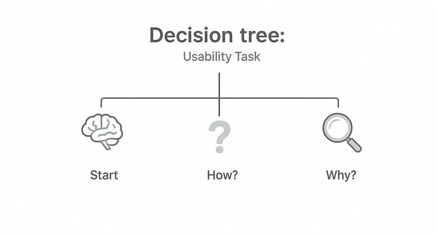
As the graphic shows, observing how a user does something reveals their behavior, but asking why they did it uncovers their real motivations and expectations.
To help you decide which path is right for you, here’s a quick breakdown of the most common methods.
Comparing Usability Study Methods
Deciding between remote moderated, remote unmoderated, and in-person testing can feel overwhelming. This table breaks down the pros and cons of each to help you match the method to your research goals and resources.
Ultimately, the best method depends entirely on what you're trying to learn. For most eCommerce stores, remote options offer the best balance of cost, speed, and quality of insights.
Choosing the Right Tools for the Job
The good news? You don't need a fancy, high-tech lab to run a professional usability test. For most Shopify stores, a few simple remote tools are all you need to get started, and they open up your participant pool to a global audience.
Here are a few great options to get you going:
- Simple Screen Recorders: Tools like Loom or even the built-in screen recorder on macOS can work perfectly for basic unmoderated tests.
- Video Conferencing Software: You’re probably already using Zoom or Google Meet. They are perfect for conducting live, moderated remote sessions with their screen sharing and recording features.
- All-in-One Usability Platforms: Services like UserTesting, Maze, or Lookback offer a full suite of features, from participant recruitment to analysis. They are a fantastic investment if you plan on making usability testing a core part of your process.
There are many different user experience testing methods out there, each with its own strengths. To dive deeper into the nuts and bolts, you can also explore some great advice on how to conduct usability testing. The key is to match the method and the tool to your specific research goals and budget. Nail that decision, and you'll be on your way to capturing the kind of insights that truly move the needle for your store.
Turning Raw Feedback into Actionable Insights
Alright, the tests are wrapped up. You’re now sitting on a pile of session recordings and pages of notes—a jumble of user quotes, your own observations, and direct feedback. This raw data is a goldmine, but right now, it’s just noise. This is where the real work begins: turning that mountain of feedback into a handful of clear, actionable insights that will genuinely move the needle for your store.
Your job isn't to document every single thing that happened. It’s to find the patterns. True analysis means zooming out to spot the recurring themes and pain points that tripped up multiple users. This is how you separate a one-off opinion from a systemic usability flaw that's quietly killing your sales.
Finding Patterns in the Chaos
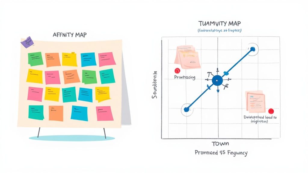
One of the most effective ways to get started is with affinity mapping. Don't let the jargon scare you; it’s basically just a structured way to sort your data. You can go old-school with sticky notes on a wall or use a digital whiteboard tool like Miro or FigJam.
The process is surprisingly simple:
- Get everything out: Go through your notes and recordings. For every distinct observation, user quote, or pain point, write it down on its own virtual (or real) sticky note. Keep it short and sweet.
- Start grouping: Begin clustering the notes that feel related. You'll quickly see themes emerge on their own. For example, a bunch of notes might be about "confusion over shipping costs" or "product filters are a nightmare on mobile."
- Name your themes: Once you have some solid clusters, give each one a descriptive name. These names—like "Checkout Friction" or "Unclear Product Information"—become your core usability themes.
This visual approach makes it impossible to ignore the problems that came up over and over. When four out of five participants couldn't find your return policy, that sticky note cluster is going to be staring you right in the face.
Analysis isn't just about spotting problems; it's about understanding their impact. An insight is an observation connected to a real consequence. "Users couldn't find the size chart" is just an observation. "Users couldn't find the size chart, which led them to abandon their carts out of uncertainty" is a truly actionable insight.
Prioritizing What to Fix First
After affinity mapping, you'll have a much clearer, more organized list of problems. The temptation is to try and fix everything at once, but that's a recipe for burnout and getting nothing done. You need a system for prioritizing, focusing on the changes that will deliver the biggest bang for your buck.
A simple but incredibly powerful framework for this is a severity and frequency matrix. Just create a 2x2 grid and plot each issue based on two factors:
- Frequency: How many of your users ran into this problem? (Low to High)
- Severity: How badly did this problem mess up their ability to complete a task? (Was it a minor annoyance or a complete dead end?)
The issues that land in that "High Frequency, High Severity" box are your top priorities. These are the critical roadblocks that are almost certainly tanking your conversions. Think of a broken "Add to Cart" button—that’s a classic example. A typo on your "About Us" page, on the other hand, is likely low severity and low frequency. It’s worth fixing, but it’s not an emergency.
Another thing to keep an eye on is technical performance. Maybe you noticed tasks that took users forever to complete, not because of confusion, but because of painfully slow page loads. Historical data shows that cutting load time from 8 seconds down to 2 seconds can boost conversion rates by as much as 74%. If you want to dive deeper into how speed impacts the user experience, you can discover more web design statistics.
From Insights to Developer-Ready Tasks
The final, and most critical, step is translating your prioritized findings into concrete, developer-ready recommendations. A vague suggestion like "Fix the checkout" is completely useless. You have to provide crystal-clear instructions that your dev team can pick up and run with.
Break down each insight into a specific, actionable task. Here’s how to turn your findings into clear instructions:
Insight: Users were repeatedly ambushed by the shipping cost at the final step, causing many to abandon their cart.
Recommendation: "Implement a shipping cost estimator on the cart page so users can see potential costs before starting the checkout flow."
Insight: On mobile devices, users lost track of their subtotal as they scrolled down the product page.
Recommendation: "On all mobile product pages, make the 'Add to Cart' button and subtotal a sticky element at the bottom of the screen."
By creating these sharp, well-defined tasks, you build a solid bridge between user research and actual site improvements. This is how you ensure your usability study doesn't just become another report that gathers digital dust—it becomes a practical roadmap for meaningful change and measurable growth.
Common Questions About Usability Studies
Even with a solid plan, jumping into your first website usability study can feel a bit daunting. A lot of questions tend to pop up. Getting those sorted out before you start is the best way to avoid rookie mistakes and make sure the insights you get are actually worth their weight in gold.
Let's break down some of the most common questions I hear all the time.
How Many Participants Do I Really Need?
This is the big one, and the answer usually surprises people. You absolutely do not need a massive sample size to uncover some incredibly powerful findings.
Landmark research from the folks at Nielsen Norman Group famously showed that you can uncover about 85% of the usability problems on a website by testing with just 5 users.
Remember, the goal here isn't to get statistically significant data like you would with a massive survey. What you're really looking for are the recurring patterns—the spots where people consistently get stuck or frustrated.
After about five to seven participants, you'll start hearing the same feedback and seeing the same struggles over and over. That's your point of diminishing returns. For most eCommerce stores, a small, laser-focused group is way more effective (and budget-friendly) than a huge, generic one.
What's the Difference Between Usability Testing and A/B Testing?
This is a super common point of confusion, but getting the distinction right is crucial. Both are tools for improving your site, but they answer completely different questions. I like to think of it as the "Why" versus the "Which."
Usability Testing (Qualitative): This is all about the "Why." You're watching a handful of users interact with your site to understand their thought process, their motivations, and what makes them want to tear their hair out. It’s perfect for discovering problems you didn’t even know you had.
A/B Testing (Quantitative): This gets you to the "Which." You're testing two versions of a page (Version A vs. Version B) against each other with a ton of traffic to see which one performs better on a specific goal, like getting more clicks or sales. It's for validating a potential solution at scale.
The real magic happens when you use them together. Start with usability testing to find the friction and brainstorm solutions. Then, use A/B testing to prove that your fix actually moves the needle.
How Much Should I Pay Participants for a Study?
If you want good, engaged participants, you need to offer a fair incentive that respects their time. While the exact amount can vary, there are some pretty standard benchmarks to go by.
For a typical one-hour remote session with general online shoppers, plan on an incentive between $50 and $100. This signals that you value their input and helps make sure they show up focused and ready to contribute.
Now, if you're trying to recruit people with very specific or professional expertise—think doctors, financial advisors, or B2B purchasing managers—that rate has to go up. A lot. For these niche audiences, you should expect to offer $150 to $300 per hour, sometimes even more.
A quick tip: always frame the payment as a "thank you for your time and feedback," not as a payment for their opinions. It's a small but important shift in language that keeps the whole session feeling collaborative. And whatever you do, pay them promptly right after the session. It’s a simple way to build a good reputation and make people feel truly appreciated.
A well-run usability study doesn't just give you ideas; it gives you a clear roadmap to a higher-converting website. If you're ready to turn these kinds of insights into real-world improvements, ECORN can help. Our team of Shopify experts lives and breathes CRO and development, and we specialize in transforming user feedback into a shopping experience that just works.
Book a call with us to start building a better eCommerce site today.


Shopify Visual Merchandising: A Playbook for Higher Sales

Shopify Landing Page Design: Master Conversion in 2026

10 Best AI SEO Optimization Tools for Shopify in 2026

Agentic AI for Ecommerce: Boost Your Sales in 2026
Mastering Email Marketing Data for eCommerce Growth

Conversion Rate Optimisation Australia: Boost Your Sales
Conversion Rate Optimization AI: Your Shopify Store Guide

10 Product Bundling Strategies for Shopify in 2026
How to Increase Customer Lifetime Value: A Shopify Playbook
AI Customer Service Automation: Shopify Guide 2026
Clean Website Design: A Shopify Conversion Playbook

Omnichannel Retail Strategy: A Shopify Playbook
Product Data Enrichment: A Guide for Shopify Brands
Instagram Shopping Features a Guide for Shopify Stores
What Is Revenue Optimization: A Holistic RevOps Guide
Benefits of Conversion Rate Optimization: Boost Your
WordPress to Shopify Migration: Your 2026 Seamless Switch
Boost Sales: Ecommerce Payment Processing Guide 2026
Unified Commerce Platform: Benefits, KPIs & Shopify Guide

How to Reduce Bounce Rate eCommerce: Your 2026 Guide

Shopify API Integration: A Practical End-to-End Guide

How to Implement Data Governance: A 2026 Guide

Shopify Store Development Cost: A 2026 Breakdown
What Is Server Side Tracking: The Shopify Guide 2026

Marketing Automation Workflows: A Shopify Guide for 2026

Shopify: How to Reduce Technical Debt

Shopify UX Design Change: A Playbook for Growth

User Generated Content Strategy: Shopify Playbook

Shopify Pause and Build Plan Cost: A Complete 2026 Guide

Compare at Price on Shopify: A Complete Guide for 2026

Where Can I Sell My Prints? 10 Best Platforms for 2026

Shopify Order Management System: The Ultimate Guide 2026

What Is Marketing Attribution? an eCommerce Guide for 2026

10 Best Black Friday Sales Sheets for 2026

Discover the Top Social Media Marketing Agencies For

Consumer Confidence Definition for eCommerce in 2026

What Is Social Commerce? Your 2026 Guide to Boosting Sales

A Social Ad Campaign Playbook for eCommerce Growth

7 Best FAQ Page Examples for SaaS & eCommerce

Market Research in Fashion Industry: A Guide for Shopify

Shopify Migration Services: Expert Guide for 2026

Mastering FB Retargeting Ads for Shopify in 2026

What Is Omnichannel Ecommerce

Master Your Shopify Plus Migration: The 2026 Guide

Shopify Integration Services: A Merchant's 2026 Guide

Shopify Collection Description: A Guide to SEO & Sales

Shopify Plus Contact: Reach Sales & Support Effectively

Top Luxury Shopify Stores: Design & UX Strategies

How to Improve Customer Experience: A Shopify Roadmap

Creative Facebook Ads: 10 Examples for Shopify Brands

Remarketing with Facebook Ads: A Shopify Guide for 2026

SEO Linking Strategies for Shopify Stores

Top 7 Statistics YouTube Channels for eCommerce in 2026

Hiring Shopify Plus Designers: A Founder's Guide

Shopify Product Variation: Master Your Variants for 2026

Leverage Ai Solutions Brands: Your 2026 Shopify Growth Guide

Filters in Shopify: A Guide for Growing Brands

Shopify Plus Developer: A Guide for Growing Brands

When Does Black Friday Online Start? A 2026 Guide

Black Friday Email Marketing: Shopify & Klaviyo Guide

Polaris Design System: The Complete Shopify Guide

How to Hire a Consultant Email Marketing Expert

What Is Q4? A Shopify Merchant's Guide to Peak Season

Marketing Organization Structure for eCommerce Growth

Top Account-Based Marketing Agency Guide for 2026

7 Remarketing Ad Examples for Your 2026 Campaigns

AI Retail Solutions: Boost Your Shopify Store

Migrate to Shopify: The Definitive 2026 Guide

Shopify Authentication App: A Guide for Secure Stores

Why Strategic Marketing Is Important for Growth in 2026

How to Create a Size Chart in Shopify: 2026 Guide

Shopify Themes for Jewelry: The Definitive 2026 Guide

Minimal Shopify Templates: Faster, Higher-Converting Stores

Maximize Profit: Shopify CC Fees 2026 Guide

Best Shopify Apps for Beginners in 2026

How to Improve Online Shopping Experience in 2026

Shopify Design and Development Services: A 2026 Guide

Small Business Social Media Marketing Agency: A Hiring Guide

Bulk Edit Shopify: A Guide to Save Hours on Store Updates

2026 Trends in Food and Beverage Industry

Post Purchase Survey Guide for Shopify Stores

How to Build an Ecommerce Brand in 2026

Conversion Rate Optimization for Ecommerce: Maximize Profit

How to Use Customer Data to Increase Sales: A Guide

Shopify for Enterprise: The 2026 Deep Dive Guide

Email Marketing Agencies: The Guide for Shopify Brands

Boost Sales With The Right Shipping Shopify App

Your Guide to the Shopify Site Map

7 Headless Commerce Examples for 2026

Mastering Trends in Cosmetic Industry for 2026

Transfer Shopify to BigCommerce The Complete 2026 Playbook

What Is Shopify Collective? Your 2026 Guide to Success

Unlock Shopify Growth with Site Link SEO

Integrating Shopify and WordPress A Complete Guide for 2026

Naming a Clothing Store: A Shopify Founder's Playbook

Guide to buying shopify store in 2026

Buying shopify store: Buying a Shopify Store: Invest Wisely

Food & Beverage Marketing: A Complete Guide for 2026

Facebook Ads Agency: A Shopify Brand's Hiring Guide

Shopify Apparel Stores: A 2026 Launch & Scale Guide


newsletter in your inbox