
In the competitive landscape of online retail, your website is more than just a store; it's your digital flagship, your primary salesperson, and your brand's first impression. A poor user experience leads to abandoned carts and missed opportunities, while a strategic, user-centric approach can transform visitors into loyal customers. The difference often lies in applying proven ecommerce website design best practices.
This guide is specifically crafted for growing Shopify brands aiming to scale. We will dissect 10 critical design principles that directly impact user behavior and purchasing decisions. Forget vague advice; this is a blueprint filled with actionable steps, real-world examples, and quick wins to help you build an ecommerce experience that not only looks great but also converts effectively.
We will cover everything from mobile-first design and streamlined checkouts to high-quality product imagery and trust signals. To truly build a high-converting digital flagship, it's essential to implement robust strategies to improve ecommerce conversion rates for your overall site performance and specific elements like the checkout process. Our goal is to equip you with the knowledge to optimize every touchpoint of the customer journey.
Let's move beyond generic tips and dive into the specific strategies that drive revenue and foster brand loyalty. This listicle will provide the tactical insights you need to refine your site, enhance customer satisfaction, and ultimately, grow your business.
1. Mobile-First Responsive Design
Prioritizing the mobile experience is no longer optional; it's a fundamental requirement for success. A mobile-first approach to design flips the traditional desktop-to-mobile workflow on its head. Instead of designing for a large desktop and then stripping away elements for smaller screens, you start with the smallest screen's constraints. This forces you to focus on the absolute essential content and functionality first.
This methodology is a cornerstone of modern ecommerce website design best practices because it directly addresses user behavior. With over 60% of ecommerce traffic originating from mobile devices, a clunky or slow mobile site means you're actively turning away the majority of your potential customers. By building for mobile first, you ensure a fast, intuitive, and accessible experience for this massive user segment, which then scales up gracefully to tablet and desktop.
Why It's a Top Priority
A mobile-first strategy directly impacts conversions and search engine rankings. Google’s mobile-first indexing means it primarily uses the mobile version of your content for indexing and ranking. A poor mobile experience can therefore severely harm your SEO visibility. Furthermore, a streamlined mobile interface reduces friction in the buyer's journey, making it easier for users to browse, add to cart, and complete a purchase on the go. Retail giants like Target and Amazon exemplify this, with their mobile sites offering an experience that is as rich and functional as their desktop counterparts.
Quick Wins & Implementation
- Prioritize Above-the-Fold Content: On mobile, this space is precious. Ensure your value proposition, a compelling call-to-action (CTA), and key navigation elements are immediately visible without scrolling.
- Embrace Touch-Friendly Design: Buttons and links must be large enough to be easily tapped with a thumb. Ensure there's adequate spacing between clickable elements to prevent accidental taps.
- Optimize Images: Use modern image formats like WebP and implement responsive images using
srcsetandsizesattributes. This ensures smaller, optimized images are served to mobile devices, drastically improving page load times. - Test on Real Devices: Browser emulators are helpful, but nothing beats testing on actual iPhones and Android devices. This helps you identify real-world usability issues related to touch targets, performance, and rendering.
Key Insight: Mobile-first isn't just about a responsive layout; it's a content and performance strategy. By designing for mobile first, you bake speed and clarity into your site's DNA, benefiting users on every device. Learn more about the core mobile-first design principles to build a solid foundation.
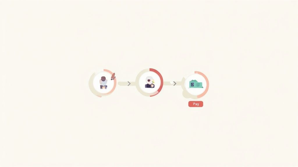
2. Streamlined Checkout Process
The checkout process is the final, most critical step in the customer journey, and it's where the majority of sales are lost. A streamlined checkout eliminates friction by minimizing steps, form fields, and distractions. This is a non-negotiable component of ecommerce website design best practices because a confusing or lengthy process is the primary driver of cart abandonment. Industry data consistently shows that nearly 70% of shoppers leave without buying, often citing a complicated checkout as the reason.
Instead of a multi-page ordeal, the goal is to create a single, clear path to purchase. This approach respects the customer's time and reduces decision fatigue, making them far more likely to complete the transaction. By focusing on simplicity and speed, you turn a potential point of failure into a conversion-driving asset.
Why It's a Top Priority
Every unnecessary field or extra click in your checkout process directly increases the probability of cart abandonment. A frictionless flow has a direct and immediate impact on your conversion rate and revenue. By simplifying the process, you remove psychological barriers to purchase. Brands like Amazon pioneered this with their 1-Click checkout, and modern storefronts like Warby Parker use clear progress indicators to manage user expectations. The principle is simple: make it as easy as possible for customers to give you their money.
Quick Wins & Implementation
- Offer Guest Checkout: Forcing account creation is a major conversion killer. Always provide a prominent guest checkout option to expedite the process for new customers.
- Use a Progress Indicator: Show customers exactly where they are in the process (e.g., Shipping, Billing, Review). Limit this to 3-5 clear steps to avoid overwhelming them.
- Enable Address Autofill: Integrate tools like the Google Places API to automatically complete address fields as the user types, reducing manual entry and errors.
- Provide Multiple Payment Options: Cater to user preferences by offering digital wallets like Apple Pay, Google Pay, and PayPal alongside traditional credit card options. This allows for a faster, more secure checkout.
Key Insight: The ideal checkout is invisible; it should be so intuitive and fast that the customer doesn't even think about it. Every element must be purposeful and geared towards completing the sale. Dive deeper into the best ecommerce checkout practices to perfect your flow.
3. High-Quality Product Imagery and Zoom Functionality
In ecommerce, your product images are the digital equivalent of an in-store tactile experience. Since customers can't physically touch or inspect your products, high-resolution photography and video aren't just decorative; they are critical decision-making tools. A customer’s confidence is built on their ability to visually verify a product’s quality, features, and details from every conceivable angle.

This visual-first approach is a non-negotiable aspect of modern ecommerce website design best practices. It bridges the gap between the online and offline shopping experience, directly impacting user engagement and conversion rates. When customers can zoom in to see the texture of a fabric or view a product in a lifestyle context, it answers questions and overcomes purchase hesitation.
Why It's a Top Priority
Superior imagery directly correlates with higher conversions and lower return rates. Studies consistently show that customers rely heavily on product photos, with over 75% citing image quality as a key factor in their purchasing decision. A lack of detailed images, or low-quality ones, creates doubt and friction. Brands like Nike, with its 360-degree shoe views, and IKEA, showcasing furniture within fully decorated rooms, demonstrate how rich visual content builds trust and helps customers visualize products in their own lives, leading to more confident purchases.
Quick Wins & Implementation
- Offer Multiple Views: Provide a gallery of at least 4-6 high-quality images per product, including front, back, side, and detailed close-up shots.
- Implement Intuitive Zoom: Use a "zoom on hover" feature for desktop and a "tap-to-zoom" or "pinch-to-zoom" function for mobile. Ensure the zoomed image is crisp and not pixelated.
- Show Products in Context: Include lifestyle images or videos that show your product being used in a real-world setting. This helps customers understand its scale, function, and appeal.
- Optimize Image Performance: Compress images using tools like TinyPNG and serve them in modern formats like WebP with JPG/PNG fallbacks. Implement lazy loading to ensure images below the fold don't slow down initial page load.
Key Insight: Product imagery is your most powerful sales tool. It's not about making products look good; it's about making customers feel confident. Invest in professional photography and technology that allows for deep visual inspection to build trust and drive sales.
4. Navigation, Search, and Filtering
If customers can't find what they're looking for, they can't buy it. An intuitive navigation structure, powered by a robust search and faceted filtering system, is the backbone of a user-friendly online store. This trio works together to create a clear pathway from the homepage to the exact product a customer wants, drastically reducing friction and frustration.
This system is a non-negotiable part of ecommerce website design best practices because it directly addresses user intent. Some users prefer to browse through logical categories (navigation), others know exactly what they want and type it into a search bar, and many land on a category page and need to narrow down thousands of options (filtering). Excelling at all three ensures you cater to every type of shopper, guiding them efficiently toward a purchase.
Why It's a Top Priority
A disorganized site is a dead end for sales. Poor navigation leads to high bounce rates, while a weak search function results in zero-result pages that kill conversion momentum. Conversely, a well-architected system enhances the user experience, boosts session duration, and increases the likelihood of a sale. Best Buy’s website is a masterclass in this, allowing users to filter a vast electronics inventory by dozens of highly specific attributes, from screen size to processor type, making complex purchases feel simple. This level of control empowers customers and builds confidence in their buying decisions.
Quick Wins & Implementation
- Simplify Main Navigation: Limit your top-level menu to 5-7 essential categories. Use clear, concise labels that customers will instantly understand. Test your information architecture with card sorting exercises to validate your structure.
- Implement Predictive Search: Use an advanced search tool that offers autocomplete, typo tolerance, and synonym recognition. This guides users to the right products faster and prevents them from hitting a dead-end page.
- Make Filters Visible & Useful: On collection pages, display the most important filters prominently. Show the item count next to each filter option (e.g., "Blue (58)") to manage expectations and use AJAX to apply filters without a full page reload for a seamless experience.
- Show Applied Filters: Clearly display all active filters at the top of the results, allowing users to easily see their selections and remove individual filters with a single click.
Key Insight: Great navigation and search aren't just about finding products; they're about discovery and control. By providing powerful, intuitive tools, you transform a potentially overwhelming catalog into a curated and manageable shopping experience.
5. Trust Signals and Security Badges
Building confidence is the invisible currency of ecommerce. Trust signals are visual cues and statements that reassure visitors your store is legitimate, their data is secure, and their purchase is protected. These elements work to reduce purchase anxiety, especially for first-time buyers who are unfamiliar with your brand.
This tactic is a core component of ecommerce website design best practices because it directly addresses the psychological barriers to online shopping. In an environment where customers can't physically inspect products or meet a salesperson, trust signals like security badges, guarantees, and customer reviews fill the confidence gap. A visitor who feels secure is far more likely to convert into a paying customer.
Why It's a Top Priority
Failing to establish trust is a primary cause of cart abandonment. Customers are rightfully wary of sharing personal and financial information online. Prominently displaying familiar security logos (like SSL certificates and payment provider seals) and clear, customer-centric policies immediately lowers perceived risk. Brands like Amazon have built empires on trust, with its A-to-z Guarantee and transparent review system becoming industry standards that shoppers now expect to see. A strong display of trust signals can dramatically lift conversion rates by making the checkout process feel safer.
Quick Wins & Implementation
- Strategic Placement: Position trust badges near high-friction areas. Place payment logos (Visa, Apple Pay) and security seals (Norton, McAfee) directly below the "Add to Cart" or "Proceed to Checkout" buttons.
- Showcase Guarantees: Clearly display your return policy, satisfaction guarantees, or free shipping thresholds in your site header, on product pages, and during checkout. Warby Parker's "Home Try-On" program is a powerful trust-building guarantee.
- Leverage Social Proof: Integrate customer reviews, star ratings, and user-generated photos directly on product pages. Authentic testimonials with real names and images are far more impactful than anonymous praise.
- Ensure Compliance: For businesses dealing with regulated items, robust age verification is a non-negotiable trust signal that enhances security and compliance. Consider implementing these age verification best practices to build credibility.
Key Insight: Trust isn't built with a single badge; it's a cumulative effect. Combine security seals, clear policies, and authentic social proof to create a comprehensive ecosystem of confidence that reassures customers at every step of their journey.
6. Fast Page Load Speed and Performance Optimization
In ecommerce, speed isn't a feature; it's the foundation of the entire user experience. Performance optimization is the technical process of making your website load as quickly as possible, aiming for an ideal load time of under three seconds. A slow site doesn't just frustrate users; it actively costs you money, with studies famously showing a 1-second delay can cause a 7% drop in conversions.
This practice is a non-negotiable part of ecommerce website design best practices because it directly influences everything from customer satisfaction to your bottom line. When a page lags, potential buyers bounce. This high bounce rate signals a poor user experience to search engines, negatively impacting your rankings. By prioritizing speed, you create a seamless, frictionless shopping journey that encourages browsing and boosts sales.
Why It's a Top Priority
Fast page load speed is a critical ranking factor for Google and a cornerstone of conversion rate optimization (CRO). Every millisecond counts. Amazon famously reported a 1% revenue increase for every 100ms of speed improvement. This isn't just a concern for giants; it's a competitive advantage for any growing brand. A fast site retains visitors, reduces cart abandonment, and improves your Core Web Vitals, which Google uses to measure overall user experience. Investing in performance is investing directly in revenue and visibility.
Quick Wins & Implementation
- Benchmark and Analyze: Use tools like Google PageSpeed Insights and GTmetrix to get a baseline performance score. These reports will highlight specific areas for improvement, from image sizes to server response times.
- Compress and Optimize Images: Images are often the biggest culprits of slow load times. Use modern formats like WebP and tools like TinyPNG to compress images without sacrificing quality.
- Leverage a Content Delivery Network (CDN): A CDN like Cloudflare or Fastly stores copies of your site's assets on servers around the world, delivering content from the location closest to the user for significantly faster load times.
- Minimize and Defer Scripts: Reduce the number of apps and third-party scripts. Use settings to defer the loading of non-critical JavaScript and CSS, allowing essential page content to render first.
Key Insight: Website performance is not a one-time fix; it's an ongoing commitment. Regularly monitoring your Core Web Vitals (LCP, FID, CLS) and optimizing your site's technical backbone ensures you are always delivering the fastest possible experience, directly translating to higher engagement and conversions.
7. Prominent Call-to-Action (CTA) Buttons
A Call-to-Action (CTA) is more than just a button; it’s the primary driver of conversions on your site. These are the strategically designed and placed buttons that guide users from browsing to buying. Effective CTAs act as clear signposts, using contrasting colors, compelling text, and intelligent placement to tell users exactly what to do next, removing friction from the path to purchase.
This is a fundamental pillar of ecommerce website design best practices because even the most beautifully designed site fails if customers don't know how to take action. A weak or hidden CTA leads to confusion, abandoned carts, and lost revenue. By making your CTAs impossible to miss and easy to understand, you create a direct line between user intent and business goals, turning passive visitors into active customers.
Why It's a Top Priority
Well-designed CTAs have a direct and measurable impact on your conversion rate. By drawing the user's eye and using persuasive, action-oriented language, you increase click-through rates on key actions like "Add to Cart" or "Buy Now." This principle is flawlessly executed by Amazon, whose iconic orange "Add to Cart" button stands out on every product page, creating a consistent and compelling user experience. Platforms like Unbounce and Optimizely have built entire businesses around the science of optimizing these critical elements, proving their immense value.
Quick Wins & Implementation
- Use High-Contrast Colors: Your primary CTA button should pop. Choose a color that stands out from your brand palette but remains harmonious. Orange and green are popular choices as they often create a strong visual contrast.
- Write Action-Oriented Text: Be specific and use verbs. Instead of a generic "Submit," use "Get Your Free Quote" or "Add to My Bag." This clarity sets expectations and encourages clicks.
- Optimize for Touch: Ensure buttons are at least 44x44 pixels. This makes them easy to tap on mobile devices, preventing user frustration and accidental clicks on adjacent elements.
- Test and Iterate: Don't assume you have the perfect CTA. Systematically A/B test everything: the color, the text ("Buy Now" vs. "Add to Cart"), the size, and its placement on the page to find what resonates most with your audience.
Key Insight: Your CTA isn't just a design element; it's a conversation with your customer. It should be clear, concise, and compelling, providing a frictionless next step at the exact moment a user is ready to take it.
8. Personalization and Recommendation Engines
Moving beyond a one-size-fits-all storefront, personalization tailors the shopping experience to individual users. By leveraging data on browsing habits, purchase history, and stated preferences, recommendation engines can dynamically display the most relevant products and content. This transforms a static catalog into a personal shopping assistant for every visitor.
This strategy is a vital component of modern ecommerce website design best practices because it directly addresses the customer's desire for relevance and discovery. In a crowded market, showing a customer you understand their needs builds loyalty and significantly boosts engagement. It's the difference between a user aimlessly browsing and a user discovering a product they genuinely want, leading to higher conversion rates and increased average order value (AOV).
Why It's a Top Priority
A robust personalization strategy is a powerful engine for revenue growth. By showing customers items they are more likely to buy, you reduce friction in the purchasing journey and encourage larger basket sizes. Amazon’s powerful recommendation engine is a classic example, often being credited for a significant portion of its sales. Similarly, Sephora uses purchase history to recommend complementary beauty products, creating a highly effective upselling and cross-selling loop that feels helpful rather than pushy. This level of curated experience makes customers feel valued and understood, fostering long-term loyalty.
Quick Wins & Implementation
- Start with Simple Rules: You don't need complex AI from day one. Begin with rule-based recommendations like "Customers who bought this also bought..." (collaborative filtering) or displaying "More from this brand" on product pages.
- Segment Your Audience: Create basic customer segments like new visitors, returning customers, and high-value VIPs. Tailor homepage banners, promotions, or pop-ups to each group for a more relevant first impression.
- Leverage First-Party Data: Use data collected with consent, such as past purchases and viewed products, to power recommendations on product pages, in the cart, and via email campaigns.
- Be Transparent: Briefly explain why a product is being recommended (e.g., "Because you viewed [Product Name]"). This builds trust and makes the recommendations feel more logical and helpful to the user.
Key Insight: Personalization isn't just about algorithms; it's about making each customer feel like the store was designed specifically for them. Start small with rule-based logic and gradually incorporate more sophisticated data points to create a truly bespoke and high-converting shopping experience.
9. Customer Reviews and Ratings
User-generated content, particularly in the form of product reviews and star ratings, is one of the most powerful tools for building trust and driving conversions. This feature provides social proof by allowing real customers to share their experiences, directly influencing the purchase decisions of prospective buyers. When 92% of consumers read online reviews before buying, integrating them is not just a feature; it's a core credibility builder.
This element is a vital component of ecommerce website design best practices because it addresses a fundamental shopper need: reassurance. Reviews answer critical questions, manage expectations about product quality and fit, and create an authentic feedback loop. They transform a static product page into a dynamic community hub where shoppers can learn from each other, significantly reducing purchase anxiety and boosting confidence.
Why It's a Top Priority
Integrating a robust review system directly impacts sales, reduces return rates, and enhances SEO. User-generated reviews provide a constant stream of fresh, relevant content for your product pages, which search engines value. More importantly, they build trust that a brand's own marketing copy cannot. A product with a high volume of positive, detailed reviews is far more compelling than one with none. Retailers like Amazon and Best Buy have built empires on this principle, where customer feedback is a central part of the shopping experience.
Quick Wins & Implementation
- Display Ratings Prominently: Place the average star rating and total review count near the product title, making it instantly visible.
- Implement a 'Verified Purchase' System: Add a badge to reviews from customers who have verifiably purchased the item. This simple addition drastically increases the credibility of the feedback.
- Simplify the Submission Process: Send automated review request emails 5-10 days post-purchase. Allow customers to leave a rating and review with minimal clicks, and consider offering a small incentive like a discount code.
- Showcase Visual Reviews: Encourage customers to upload photos or videos with their reviews. Displaying these visuals prominently provides powerful, real-world context that static product images often lack.
- Engage with Feedback: Respond publicly and professionally to both positive and negative reviews. This shows you value customer feedback and are committed to addressing issues, which builds brand loyalty.
Key Insight: Customer reviews are not just a conversion tool; they are an invaluable source of product and market intelligence. Analyze review data to identify common issues, discover new use cases, and gather ideas for product improvements.
10. Clear Product Descriptions and Specifications
High-quality images draw customers in, but comprehensive product details close the sale. Clear, detailed descriptions and specifications are essential for building trust and reducing purchase anxiety. They answer a customer's unspoken questions, setting accurate expectations about what they are buying, which directly minimizes the likelihood of costly returns and negative reviews.
This practice is a cornerstone of effective ecommerce website design best practices because it bridges the gap between the digital and physical worlds. Unlike in a brick-and-mortar store, customers can't touch, feel, or try on the product. Your product page must do that work for them. By providing thorough information, you empower shoppers to make confident, informed decisions, turning browsers into buyers.
Why It's a Top Priority
Vague or missing product information is a major conversion killer. Customers who can't find details like dimensions, materials, or compatibility information will simply leave and find a competitor who provides it. Well-crafted descriptions also play a crucial role in SEO, as they provide keyword-rich content for search engines to index, helping you rank for long-tail product searches. Brands like REI excel here, with detailed gear specs and material explanations that educate the customer and justify the product's value.
Quick Wins & Implementation
- Write for the Customer: Focus on benefits, not just features. Use the "so what?" test; for every feature, explain why it matters to the user. For example, "water-resistant coating" becomes "water-resistant coating, so your gear stays dry during unexpected rain."
- Use Scannable Formatting: Break up text with short paragraphs, bold headings, and bullet points. List key specifications like dimensions, weight, materials, and care instructions in an easy-to-read format.
- Include Sizing and Fit Guides: For apparel and accessories, provide detailed sizing charts, model measurements, and descriptions of the fit (e.g., "slim fit," "runs large"). This is critical for reducing returns.
- Address Common Questions: Proactively include an FAQ section on the product page to answer questions about compatibility, assembly, or maintenance before a customer has to ask.
Key Insight: Your product description is your digital salesperson. It should be persuasive, informative, and completely transparent, leaving no room for doubt in the customer's mind. Invest time in crafting unique, benefit-driven copy for each product to build confidence and drive conversions.
Top 10 E-commerce Design Best Practices Comparison
From Blueprint to Reality: Implementing Your High-Conversion Strategy
We've explored the essential pillars of modern ecommerce, from the non-negotiable foundation of mobile-first responsive design to the conversion-driving power of a streamlined checkout process. We delved into the visual and informational core of your store, highlighting the impact of high-quality imagery, crystal-clear product descriptions, and the undeniable influence of customer reviews. Mastering these ecommerce website design best practices is not about checking boxes; it's about building a cohesive, customer-centric experience that guides users seamlessly from discovery to purchase.
The journey from a functional online store to a high-performance conversion engine is paved with intentional, strategic decisions. It’s about understanding that elements like intuitive navigation, lightning-fast page speed, and prominent calls-to-action are not just design features. They are direct lines of communication with your customer, signaling respect for their time and a commitment to their needs. Similarly, integrating trust signals and personalization isn't just a tactic; it's about building a relationship and proving that you understand who your customers are and what they value.
Prioritizing Your Next Steps
The sheer volume of potential improvements can feel overwhelming, but progress is made through focused, iterative action. The key is to transform this knowledge into a tangible plan. Don't try to overhaul everything at once. Instead, adopt a systematic approach to implementation.
Start by conducting a thorough audit of your current website using the principles we've discussed as your checklist. This process will help you identify the most critical areas for improvement and uncover low-hanging fruit.
Actionable Starting Points:
- Quick Wins (1-2 Weeks): Can you add more prominent trust badges to your checkout page? Is it possible to rewrite your top five product descriptions for clarity and SEO? Can you A/B test a new color or text for your primary "Add to Cart" CTA? These small changes can often yield surprisingly positive results with minimal development effort.
- Medium-Term Projects (1-3 Months): This is where you might tackle more significant tasks like a comprehensive image optimization initiative to boost site speed or a project to improve your site's search and filtering logic. You could also begin a structured program to generate and display more customer reviews across your product pages.
- Long-Term Strategy (3+ Months): Ambitious goals like implementing a sophisticated personalization engine, redesigning your entire checkout flow, or migrating to a more performant Shopify theme fall into this category. These initiatives require careful planning, resources, and often, expert guidance to execute successfully.
The True Value of Exceptional Design
Ultimately, investing in these ecommerce website design best practices is an investment in your brand's future. A superior user experience does more than just increase your conversion rate. It builds customer loyalty, reduces service inquiries, and creates brand advocates who will return to your store and recommend it to others. Each optimized element, from a faster-loading image to a clearer product specification, contributes to a frictionless journey that fosters trust and drives sustainable growth.
The path forward is clear. By systematically applying these proven principles, you can elevate your website from a simple digital catalog into a dynamic, engaging, and highly profitable sales channel. The work you put in today to refine your user experience will pay dividends in customer satisfaction and revenue for years to come.
Ready to turn these best practices into measurable results for your Shopify store? The team at ECORN specializes in designing and developing high-conversion ecommerce experiences. Whether you need an expert audit to identify your biggest opportunities or a dedicated partner to execute your growth strategy, we’re here to help you build a website that not only looks great but performs even better. Book a consultation with our Shopify experts today.


Omnichannel Retail Strategy: A Shopify Playbook
Product Data Enrichment: A Guide for Shopify Brands
Instagram Shopping Features a Guide for Shopify Stores

What Is Revenue Optimization: A Holistic RevOps Guide
Benefits of Conversion Rate Optimization: Boost Your

WordPress to Shopify Migration: Your 2026 Seamless Switch
Boost Sales: Ecommerce Payment Processing Guide 2026

Unified Commerce Platform: Benefits, KPIs & Shopify Guide

How to Reduce Bounce Rate eCommerce: Your 2026 Guide

Shopify API Integration: A Practical End-to-End Guide

How to Implement Data Governance: A 2026 Guide

Shopify Store Development Cost: A 2026 Breakdown
What Is Server Side Tracking: The Shopify Guide 2026

Marketing Automation Workflows: A Shopify Guide for 2026

Shopify: How to Reduce Technical Debt

Shopify UX Design Change: A Playbook for Growth

User Generated Content Strategy: Shopify Playbook

Shopify Pause and Build Plan Cost: A Complete 2026 Guide

Compare at Price on Shopify: A Complete Guide for 2026

Where Can I Sell My Prints? 10 Best Platforms for 2026

Shopify Order Management System: The Ultimate Guide 2026

What Is Marketing Attribution? an eCommerce Guide for 2026

10 Best Black Friday Sales Sheets for 2026

Discover the Top Social Media Marketing Agencies For

Consumer Confidence Definition for eCommerce in 2026

What Is Social Commerce? Your 2026 Guide to Boosting Sales

A Social Ad Campaign Playbook for eCommerce Growth

7 Best FAQ Page Examples for SaaS & eCommerce

Market Research in Fashion Industry: A Guide for Shopify

Shopify Migration Services: Expert Guide for 2026

Mastering FB Retargeting Ads for Shopify in 2026

What Is Omnichannel Ecommerce

Master Your Shopify Plus Migration: The 2026 Guide

Shopify Integration Services: A Merchant's 2026 Guide

Shopify Collection Description: A Guide to SEO & Sales

Shopify Plus Contact: Reach Sales & Support Effectively

Top Luxury Shopify Stores: Design & UX Strategies

How to Improve Customer Experience: A Shopify Roadmap

Creative Facebook Ads: 10 Examples for Shopify Brands

Remarketing with Facebook Ads: A Shopify Guide for 2026

SEO Linking Strategies for Shopify Stores

Top 7 Statistics YouTube Channels for eCommerce in 2026

Hiring Shopify Plus Designers: A Founder's Guide

Shopify Product Variation: Master Your Variants for 2026

Leverage Ai Solutions Brands: Your 2026 Shopify Growth Guide

Filters in Shopify: A Guide for Growing Brands

Shopify Plus Developer: A Guide for Growing Brands

When Does Black Friday Online Start? A 2026 Guide

Black Friday Email Marketing: Shopify & Klaviyo Guide

Polaris Design System: The Complete Shopify Guide

How to Hire a Consultant Email Marketing Expert

What Is Q4? A Shopify Merchant's Guide to Peak Season

Marketing Organization Structure for eCommerce Growth

Top Account-Based Marketing Agency Guide for 2026

7 Remarketing Ad Examples for Your 2026 Campaigns

AI Retail Solutions: Boost Your Shopify Store

Migrate to Shopify: The Definitive 2026 Guide

Shopify Authentication App: A Guide for Secure Stores

Why Strategic Marketing Is Important for Growth in 2026

How to Create a Size Chart in Shopify: 2026 Guide

Shopify Themes for Jewelry: The Definitive 2026 Guide

Minimal Shopify Templates: Faster, Higher-Converting Stores

Maximize Profit: Shopify CC Fees 2026 Guide

Best Shopify Apps for Beginners in 2026

How to Improve Online Shopping Experience in 2026

Shopify Design and Development Services: A 2026 Guide

Small Business Social Media Marketing Agency: A Hiring Guide

Bulk Edit Shopify: A Guide to Save Hours on Store Updates

2026 Trends in Food and Beverage Industry

Post Purchase Survey Guide for Shopify Stores

How to Build an Ecommerce Brand in 2026

Conversion Rate Optimization for Ecommerce: Maximize Profit

How to Use Customer Data to Increase Sales: A Guide

Shopify for Enterprise: The 2026 Deep Dive Guide

Email Marketing Agencies: The Guide for Shopify Brands

Boost Sales With The Right Shipping Shopify App

Your Guide to the Shopify Site Map

7 Headless Commerce Examples for 2026

Mastering Trends in Cosmetic Industry for 2026

Transfer Shopify to BigCommerce The Complete 2026 Playbook

What Is Shopify Collective? Your 2026 Guide to Success

Unlock Shopify Growth with Site Link SEO

Integrating Shopify and WordPress A Complete Guide for 2026

Naming a Clothing Store: A Shopify Founder's Playbook

Guide to buying shopify store in 2026

Buying shopify store: Buying a Shopify Store: Invest Wisely

Food & Beverage Marketing: A Complete Guide for 2026

Facebook Ads Agency: A Shopify Brand's Hiring Guide

Shopify Apparel Stores: A 2026 Launch & Scale Guide

How to Deactivate Shopify Store: The 2026 Guide

Shopify and Square: The 2026 Ultimate Comparison

Your Guide to Beauty Products Ecommerce

A Guide to Marketing for Beauty Brands in 2026

Your Guide to Facebook Black Friday Ads

Facebook Ad Ecommerce for Shopify Growth

Iconography Web Design The Definitive Guide for Shopify Stores

A Modern Backlinks SEO Strategy for Shopify Stores

How to Launch an Online Store: A Step-by-Step Success Guide

Optimize Shopify Store: Master Performance in 2026

Successful Migration for Shopify: Protect SEO & Grow


newsletter in your inbox