Great product pages don't just happen by accident. They're the result of a deliberate, strategic process that marries user psychology with hard data to gently guide a visitor toward hitting that "buy" button. It all starts by truly understanding your target audience's motivations and dissecting what your competitors are doing right—and wrong.
The Strategic Blueprint for a High-Converting Product Page
Before you even think about fonts, colors, or code, you need a solid foundation. A gorgeous page will fall flat if it doesn't connect with the right person and solve their problem. This initial discovery phase is, without a doubt, the most critical piece of the puzzle. Everything you decide later—from the layout to the copy—hinges on the work you do here.
This all kicks off with some deep customer research. You have to get past the surface-level demographics and figure out the real "why" behind their purchase. What's frustrating them? What's the emotional trigger that makes them search for a solution like yours? Things like surveys, one-on-one customer interviews, and even just reading through support tickets are gold mines for this kind of information.
Analyzing the Competitive Landscape
Once you have a handle on your customer, it's time to size up the competition. Don't just glance at their pretty pictures; you need to deconstruct their entire strategy.
- Value Proposition: How are they pitching their product? Is it all about price, superior quality, unique features, or something else entirely?
- Visual Hierarchy: What’s the first thing your eye is drawn to? The main product image? The headline? That big, shiny "Add to Cart" button?
- Social Proof: How are they using reviews and customer photos? Pay close attention to what seems to be working, but more importantly, look for the gaps you can exploit.
This isn't about copying your rivals. It's about understanding the unspoken rules of your market and then finding smart ways to break them and stand out.
Think of your product page as a conversation. Your job is to anticipate every question your customer has and provide a clear, compelling answer right when they need it, making the decision to buy feel natural and obvious.
Defining Your Page's Purpose
Armed with all these customer and competitor insights, you can finally nail down your unique value proposition (UVP). This is your elevator pitch—a crystal-clear statement that explains the benefit you offer, how you solve your customer's problem, and what makes you different. Your UVP becomes the North Star for the entire page design.
Finally, you need to think about the customer journey. Where did this person just come from? A TikTok ad? A Google search for a specific problem? An email you sent them? The page's messaging needs to align with their expectations. Every single element, from the hero image down to the FAQ, must serve a specific purpose that pushes toward that ultimate goal: conversion. To really dial this in, you'll want to improve overall website conversion rates across your entire site.
This process flows logically from one step to the next, starting with broad research and narrowing down to a razor-sharp purpose.
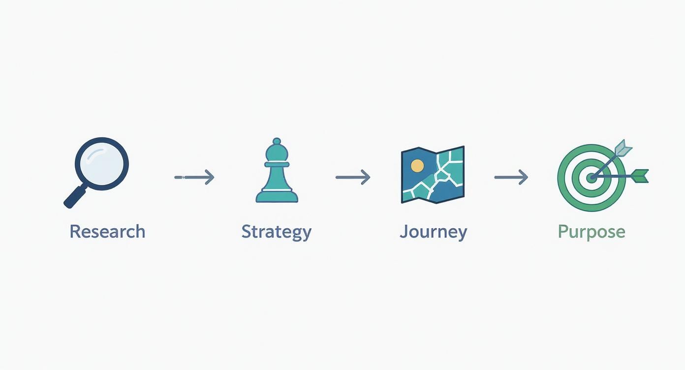
The key takeaway here is that each stage builds on the last. It’s a progression that takes you from high-level discovery to a specific, conversion-focused plan of attack.
Crafting Compelling Visuals and Persuasive Copy
Once your strategic blueprint is locked in, the real make-or-break elements of your product page are what customers see and what they read. In ecommerce, there’s no touching, feeling, or trying things on. Your visuals and copy have to do all the heavy lifting.
They need to work in tandem to create an experience that’s not just informative but also emotionally resonant, bridging that gap between a casual browse and a confident purchase. It's a classic mistake to treat these as two separate jobs. A stunning product photo without good copy is just a pretty picture, and brilliant copy with weak visuals feels hollow. They’re two sides of the same coin, each making the other stronger.
The Power of Visual Storytelling
Before a visitor reads a single word, they’re looking at your pictures. Your visuals are the first handshake, making an instant impression about your product’s quality, value, and overall vibe. This is where you make your first promise to the customer.
Product page imagery and video have a massive sway over shopper behavior. Think about it: research shows roughly 56% of users explore product images first, well before they even glance at the title or description. That first visual scan sets the tone for everything that follows.
What's more, authenticity sells. A staggering 77% of shoppers prefer seeing photos shared by other customers over polished, professional shots. This tells you that real-world proof often carries more weight than a perfect studio setup—a crucial insight when so many online stores still have a lot of room to improve here.
To really nail this, your visual strategy needs to be rock-solid:
- High-Resolution, Multi-Angle Shots: Give them crystal-clear images from every angle possible. Show the top, bottom, sides, and zoom in on the details that matter.
- Lifestyle and In-Context Photos: Don't just show a product floating on a white background. Show it being used. A backpack on a hiker scaling a trail is infinitely more compelling than one sitting on a shelf.
- Product Videos: A short, punchy video can demonstrate features and show off benefits far more effectively than a dozen photos. Seeing the product in action makes its value tangible.
- User-Generated Content (UGC): Actively encourage customers to send in their photos and feature them right in your gallery. This builds incredible trust and lets new buyers see how real people are loving your product.
Just as visuals are critical online, the same principles apply in brick-and-mortar. In a physical store, sticking to essential visual merchandising guidelines is what engages customers and drives sales. The core ideas of presentation and appeal translate directly to the digital shelf.
Writing Product Copy That Sells
With a strong visual foundation in place, your copy can finally work its magic. The goal isn't just to describe the product; it's to sell the outcome. Great copy connects your product's features to a customer's real-world problems and desires, painting a clear picture of how their life will be better with it.
Forget the dry, technical jargon. Focus on storytelling and benefits. Instead of saying, "Made with 100% merino wool," try something like, "Stay warm and comfortable without the itch, thanks to ultra-soft merino wool." The first is a feature; the second is a benefit that solves a common problem.
Your product copy should read like a helpful expert guiding a friend toward the perfect solution. It should be clear, confident, and focused entirely on the customer's needs, not just your product's specs.
To make your copy truly connect, you have to structure it for scannability. Let’s be honest, people don’t read online—they scan. Use formatting to make the key takeaways jump off the page. For a much deeper dive into this, check out our complete guide on how to write a product description that actually converts.
Formatting Copy for Maximum Impact
How you present your text is just as important as what it says. A massive wall of text is an instant conversion killer, especially on a phone screen. You need to break up your descriptions into bite-sized, digestible chunks.
Effective Formatting Strategies:
- Short Paragraphs: Keep paragraphs to two or three sentences, max. This creates breathing room and makes the content feel way less intimidating.
- Benefit-Oriented Bullet Points: Use bullet points to highlight the top three to five benefits. Kick each one off with a strong action verb to make it more dynamic.
- Strategic Bold Text: Emphasize key phrases or benefits with bold text. This is a simple way to draw the reader's eye right to the most important info.
- Descriptive Subheadings: Use H3 or H4 tags to break your description into logical sections. Think "Why You'll Love It," "Key Features," or "How to Use."
By combining stunning visuals with persuasive, easy-to-read copy, you create a powerful one-two punch. This approach ensures your product page doesn't just grab attention but holds it long enough to build trust, answer questions, and confidently guide the shopper right to that "Add to Cart" button.
Building Trust and Driving Action with UX
A stunning product page is only half the battle. If it doesn't build trust and clearly guide users toward the next step, all that beautiful imagery and clever copy goes to waste. The best product page designs are rooted in a user experience (UX) that makes the path to purchase feel secure, transparent, and effortless.
This is where you shift gears from attraction to action. We're talking about the specific UX elements—call-to-action (CTA) buttons, clear pricing, and social proof—that work together to erase doubt and give a customer the confidence they need to actually click "Add to Cart." Without these, you’re just leaving conversions on the table.

The Anatomy of a Perfect Call to Action
Your Call-to-Action button is the single most important interactive element on the page. It’s the final gateway to a sale, so its design can't be an afterthought. Every single detail matters—from its color to the words written on it.
Think of your CTA as a bright, clear signpost in a busy store. It needs to stand out. Use a high-contrast color that grabs attention but still feels at home with your brand's palette. If your site leans heavily on blue and white, a punchy orange or green CTA will pop right off the page.
Placement is just as vital. The CTA has to be "above the fold," meaning it's visible without any scrolling. As the user scrolls down for more details, I'm a big fan of using a sticky header or a second CTA at the bottom of the page so they never have to hunt for it when they're ready to buy.
And finally, the microcopy on the button itself needs to be action-oriented and dead simple. "Add to Cart" or "Buy Now" are standard for a reason—they leave zero room for confusion. Vague phrases like "Submit" or "Continue" just create uncertainty and friction.
Price Transparency Eliminates Friction
Nothing kills a potential sale faster than hidden costs and surprise fees at checkout. A core part of building trust is being completely transparent about pricing right from the start. This builds credibility and manages customer expectations, which dramatically reduces cart abandonment later.
Your pricing display needs to be clear, prominent, and easy to understand.
- Display the Full Price: Show the final price clearly, usually right near the product title and CTA.
- Showcase Discounts: If an item is on sale, display both the original price (struck through) and the new sale price. This immediately highlights the value and creates a bit of urgency.
- Be Upfront About Shipping: Use a shipping calculator or a simple banner ("Free shipping on orders over $50") to inform users about shipping costs early. Don't make them wait until the final checkout step.
This kind of upfront honesty respects the customer’s time and intelligence, making them feel much more comfortable moving forward with the purchase.
A great user experience isn't about flashy animations; it's about removing every possible point of friction. Make buying from you feel safe, simple, and obvious, and customers will reward you for it.
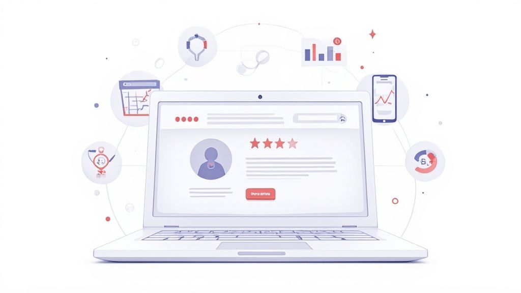
Leveraging Social Proof and Trust Signals
In ecommerce, you’re asking someone to trust you with their money for a product they’ve never touched. This is where social proof becomes your most powerful ally. It’s the digital equivalent of a friend’s recommendation, and it’s incredibly effective.
Customer reviews are the cornerstone. Always display an aggregate star rating directly below the product title for immediate validation. Further down the page, you need a full reviews section where potential buyers can read detailed feedback and see real-life photos from other customers.
Beyond reviews, other trust signals help reinforce your credibility:
- Trust Badges: Display secure payment logos (Visa, PayPal, etc.) to reassure users their financial information is safe.
- Return Policy: A clear, generous return policy reduces the perceived risk of making a purchase. Make it easy to find.
- Customer Photos: Featuring user-generated content in your gallery adds a layer of authenticity that professional photos just can't match.
Top-performing ecommerce sites have mastered this blend of UX and trust. Their product page conversion rates often hit 5% to 10%, far surpassing the industry average of around 3%. They achieve this by relentlessly optimizing trust signals, button design, and social proof to build unwavering customer confidence. You can dig into more insights about how top sites boost conversions on amraandelma.com. By focusing on these critical UX elements, you can create a product page that not only looks great but also works hard to turn browsers into loyal buyers.
Get Found: Optimizing for Search Engines and Site Speed
Let’s be honest: a stunning product page is completely wasted if nobody can find it. This is where the technical side of product page design really separates the high-performing stores from the ones that never quite take off. Digging into search engine optimization (SEO) and site speed isn't just a box-ticking exercise for your developers; it's a core part of building a great user experience that directly feeds your bottom line.
A slow, clunky page is a sales killer. It frustrates shoppers and sends all the wrong signals to search engines like Google. If your page takes an eternity to load, visitors will bounce before your beautiful photos and compelling copy have a chance to do their job.

On-Page SEO Essentials for Visibility
On-page SEO is all about optimizing the visible content and underlying code of your product page. The goal is to make it crystal clear to search engines what your product is and why it's the best answer for a searcher's query.
- Optimized Page Titles: This is the clickable blue link in the search results. It needs to grab attention and include your primary keyword (usually the product name) right at the beginning. A solid formula I've seen work time and again is:
Primary Keyword | Key Benefit | Brand Name. - Compelling Meta Descriptions: Think of this as your 160-character ad in the search results. While it doesn't directly influence rankings, a great meta description sells the click. Focus on the core benefit and throw in a call to action.
- Descriptive Image Alt Text: Alt text is your way of describing images to search engines and screen readers. Ditch "IMG_4057.jpg" for something descriptive like, "Handmade Brown Leather Tote Bag with Brass Buckles." This is huge for getting your products to show up in Google Images.
Earning Rich Snippets with Schema Markup
Schema markup is a bit of code you add to your page that gives search engines a much deeper understanding of your product. It’s the magic behind "rich snippets"—those awesome little extras in the search results like star ratings, price, and stock availability.
If you do one technical thing, make it product schema. It makes your listing pop on a crowded results page and can seriously boost your click-through rate, even if you aren't ranked number one.
These rich snippets are like a mini-advertisement for your product, giving shoppers key info before they even click. The good news is that many modern Shopify themes have this built right in, but there are also plenty of apps that can get the job done.
Prioritizing Page Speed and the Mobile Experience
With mobile devices generating over 63% of all website visits, a slow-loading page is death by a thousand cuts for your conversion rate. Every extra second of load time bleeds potential customers.
Your target should be a load time under three seconds. Any longer, and you’re actively losing money.
The single biggest win here is almost always image compression. Use modern formats like WebP and make sure you're sizing images correctly for the space they'll fill—don't upload a massive 4000-pixel-wide image for a 600-pixel container. It's a common mistake that absolutely tanks performance.
Before launching any product page, running through a technical SEO checklist is a must. It ensures you haven't missed any of the foundational elements that help you get found and convert visitors.
Key Technical SEO Checks for Product Pages
Running through this quick audit can catch simple mistakes that might otherwise hold back your page's performance.
Optimizing your site's performance is a continuous effort. For a deeper dive, our detailed guide offers many more strategies on how to improve page load speed across your entire store.
Ultimately, a fast, mobile-first, and SEO-sound product page creates a smooth path from discovery to purchase. If you skip these technical details, you're leaving sales on the table—no matter how incredible your product is.
Using Data to Continuously Refine Your Design
Launching your meticulously crafted product page isn't the finish line; it’s the starting block. The most successful ecommerce brands I've worked with treat their product page design not as a static project but as a living, breathing thing, constantly refined by real user data. This is the heart of Conversion Rate Optimization (CRO)—a systematic process of testing and learning to turn more visitors into customers.
Without a data-driven approach, any changes you make are just guesses. A button color you prefer or a headline you think sounds punchier might actually tank your sales. CRO pulls you out of the guessing game by letting your customers’ behavior tell you exactly what works. This continuous feedback loop is what transforms a good page into a high-converting powerhouse over time.
Setting Up Meaningful A/B Tests
A/B testing, also known as split testing, is the bedrock of CRO. The concept is simple: you create two versions of your page (an "A" and a "B" version) with one single change, then show them to different segments of your audience to see which one performs better.
The real key to a successful A/B test is starting with a solid hypothesis. A good hypothesis isn't just a random idea; it follows a clear structure: "If I change [X], then [Y] will happen, because [Z]."
For example, a weak hypothesis is: "Changing the CTA button color will increase clicks." A much stronger, actionable one is: "If I change the CTA button color from our branded blue to a high-contrast orange, then add-to-carts will increase, because the orange stands out more against the page background, drawing more user attention." See the difference?
Elements Ripe for A/B Testing:
- Headlines: Pit a benefit-driven headline against a feature-focused one.
- CTA Button Copy: Is "Add to Cart" better than "Buy Now"? What about "Get Yours Today"? Test it.
- Product Images: Does a clean studio shot as the main image outperform an in-context lifestyle photo?
- Price Presentation: See if showing a sale price with the original price struck through converts better than just the final price alone.
A quick word of caution: let your tests run long enough to collect meaningful data. Making a decision based on just a few dozen visitors is a recipe for disaster. Most Shopify A/B testing apps will tell you when you've reached statistical significance, so you can declare a winner with confidence.
Uncovering User Behavior with Qualitative Data
While A/B tests tell you what is happening, they don't always explain why. This is where qualitative tools are worth their weight in gold, giving you a window into your users' actual experience on the page. They help you form much better hypotheses for your next round of A/B tests.
Two tools I find indispensable for this are heatmaps and session recordings.
A heatmap is like a weather map for your website—it shows you where users are clicking, scrolling, and hovering. It instantly reveals which parts of your page are getting attention and which are being completely ignored.
Session recordings take this a step further. They are anonymous video playbacks of real user sessions on your site. Honestly, watching these can be an eye-opening, and sometimes painful, experience. You might see users repeatedly trying to click on something that isn't a link or getting stuck trying to zoom in on an image. These are the friction points you'd never find just by staring at analytics numbers.
Analyzing and Acting on Your Findings
Once your tests conclude and you've sifted through your user recordings, the final piece of the puzzle is to analyze the results and turn them into action. If your hypothesis was correct and the "B" version of your page won, implement that change for 100% of your traffic.
But don't stop there. The world of ecommerce is never static. Your winning design today might be beaten by a new idea tomorrow. The insights you gained from one test should directly inform the hypothesis for your next one. This creates a powerful cycle of continuous improvement.
For instance, if you found that a lifestyle hero image boosted conversions, your next test might be to see if a product video as the hero image performs even better. By constantly testing, analyzing, and refining, you ensure your product pages design evolves with your customers, consistently driving more revenue for your business. This iterative process is the real secret to long-term success.
Common Questions About Product Pages Design
Diving into product page design always brings up a ton of questions. I've seen it time and time again—getting these details right is what separates a page that just looks nice from one that actually sells. Let's walk through some of the most common questions I hear from store owners.
These are the typical hurdles that can trip you up, from picking the right photos to making sure the experience feels right on a tiny screen. Nailing these builds a much stronger foundation for a high-converting page.
What Are the Most Important Elements on a Product Page?
While every piece of your page has a job to do, a few elements are absolutely non-negotiable. These are the core components that have to work in harmony to answer customer questions, build confidence, and gently guide them toward the checkout.
If you’re building a checklist, these are the must-haves:
- High-Quality Visuals: I'm talking about a full gallery of sharp, multi-angle images and, if you can swing it, a short product video. This is your virtual showroom.
- A Clear Product Title: It needs to be descriptive and straightforward, telling the customer exactly what they're looking at.
- Benefit-Focused Copy: Don’t just list features. Explain how the product makes your customer's life better.
- Transparent Pricing: Show the price, any discounts, and shipping info right upfront. No surprises.
- A Highly Visible CTA: That "Add to Cart" button should be impossible to miss. Make it pop.
- Social Proof: Customer reviews and star ratings are crucial for earning the trust of first-time visitors.
Think of these as the pillars of your page. If even one is wobbly, the whole thing can feel unstable to a potential buyer.
How Can I Make My Product Page Better for Mobile Users?
Mobile optimization isn't just a good idea anymore; it's the standard. You have to design with a "thumb-friendly" mindset, creating an experience that’s clean, fast, and dead simple to navigate. Your goal is a smooth, clutter-free path from the moment someone lands on your page to the final click at checkout.
This means designing with big, easy-to-tap buttons and sticking to a clean, vertical layout that’s perfect for scrolling. Use accordions or collapsible sections for dense information like spec sheets or shipping policies to keep things tidy. But most importantly, all your images must be optimized. They have to load in a snap, even on a spotty mobile connection.
Your mobile design should feel completely effortless. The second a user has to pinch, zoom, or struggle to tap a button, you’ve introduced friction—and that friction costs you sales. Simplicity and speed are everything.
What Is the Ideal Number of Product Images to Use?
There's no single magic number that works for every single product, but from my experience, the sweet spot is somewhere between 5 and 8 high-resolution images. This gives you enough real estate to visually answer any question a customer might have, doing the heavy lifting that an in-store experience normally would.
Make sure your image gallery is diverse. You should include:
- Several angles of the product on a clean, white background.
- An "in-context" lifestyle shot showing the product in use.
- Close-ups that highlight key details, textures, or important features.
Toss a short video into that mix, and you've got a seriously compelling visual story.
What Is the Best Way to Display Customer Reviews?
Displaying reviews effectively is all about building instant trust while offering deeper insights for the shoppers who dig for them. Start by placing an aggregate star rating directly below the product title. It’s the first thing people look for and provides immediate social proof.
Further down the page, create a dedicated section for the full reviews. Here, you should let users filter reviews by rating, date, or even find reviews that include customer photos (which are gold, by the way). Don't be afraid to show a natural mix of feedback—seeing a few 4-star reviews among the 5s can actually increase authenticity and build more trust with savvy, skeptical shoppers.
Ready to turn your product pages from simple listings into powerful conversion engines? At ECORN, we specialize in Shopify design and development that drives real results. Let's build an ecommerce experience that scales with your ambition.


Master How to Improve Email Deliverability in 2026

Top 7 eCommerce Partners NYC for Shopify Brands in 2026

Machine Learning for Ecommerce: Boost Your Shopify Store

Beauty Market Research: Your 2026 Growth Guide

Shopify International Expansion: A 2026 Roadmap
What Does CRO Stand for in Business: Understanding CRO

Shopify Visual Merchandising: A Playbook for Higher Sales

Shopify Landing Page Design: Master Conversion in 2026
10 Best AI SEO Optimization Tools for Shopify in 2026

Agentic AI for Ecommerce: Boost Your Sales in 2026
Mastering Email Marketing Data for eCommerce Growth
Conversion Rate Optimisation Australia: Boost Your Sales
Conversion Rate Optimization AI: Your Shopify Store Guide

10 Product Bundling Strategies for Shopify in 2026
How to Increase Customer Lifetime Value: A Shopify Playbook
AI Customer Service Automation: Shopify Guide 2026
Clean Website Design: A Shopify Conversion Playbook

Omnichannel Retail Strategy: A Shopify Playbook
Product Data Enrichment: A Guide for Shopify Brands
Instagram Shopping Features a Guide for Shopify Stores

What Is Revenue Optimization: A Holistic RevOps Guide
Benefits of Conversion Rate Optimization: Boost Your

WordPress to Shopify Migration: Your 2026 Seamless Switch
Boost Sales: Ecommerce Payment Processing Guide 2026

Unified Commerce Platform: Benefits, KPIs & Shopify Guide

How to Reduce Bounce Rate eCommerce: Your 2026 Guide

Shopify API Integration: A Practical End-to-End Guide

How to Implement Data Governance: A 2026 Guide

Shopify Store Development Cost: A 2026 Breakdown
What Is Server Side Tracking: The Shopify Guide 2026

Marketing Automation Workflows: A Shopify Guide for 2026

Shopify: How to Reduce Technical Debt

Shopify UX Design Change: A Playbook for Growth

User Generated Content Strategy: Shopify Playbook

Shopify Pause and Build Plan Cost: A Complete 2026 Guide

Compare at Price on Shopify: A Complete Guide for 2026

Where Can I Sell My Prints? 10 Best Platforms for 2026

Shopify Order Management System: The Ultimate Guide 2026

What Is Marketing Attribution? an eCommerce Guide for 2026

10 Best Black Friday Sales Sheets for 2026

Discover the Top Social Media Marketing Agencies For

Consumer Confidence Definition for eCommerce in 2026

What Is Social Commerce? Your 2026 Guide to Boosting Sales

A Social Ad Campaign Playbook for eCommerce Growth

7 Best FAQ Page Examples for SaaS & eCommerce

Market Research in Fashion Industry: A Guide for Shopify

Shopify Migration Services: Expert Guide for 2026

Mastering FB Retargeting Ads for Shopify in 2026

What Is Omnichannel Ecommerce

Master Your Shopify Plus Migration: The 2026 Guide

Shopify Integration Services: A Merchant's 2026 Guide

Shopify Collection Description: A Guide to SEO & Sales

Shopify Plus Contact: Reach Sales & Support Effectively

Top Luxury Shopify Stores: Design & UX Strategies

How to Improve Customer Experience: A Shopify Roadmap

Creative Facebook Ads: 10 Examples for Shopify Brands

Remarketing with Facebook Ads: A Shopify Guide for 2026

SEO Linking Strategies for Shopify Stores

Top 7 Statistics YouTube Channels for eCommerce in 2026

Hiring Shopify Plus Designers: A Founder's Guide

Shopify Product Variation: Master Your Variants for 2026

Leverage Ai Solutions Brands: Your 2026 Shopify Growth Guide

Filters in Shopify: A Guide for Growing Brands

Shopify Plus Developer: A Guide for Growing Brands

When Does Black Friday Online Start? A 2026 Guide

Black Friday Email Marketing: Shopify & Klaviyo Guide

Polaris Design System: The Complete Shopify Guide

How to Hire a Consultant Email Marketing Expert

What Is Q4? A Shopify Merchant's Guide to Peak Season

Marketing Organization Structure for eCommerce Growth

Top Account-Based Marketing Agency Guide for 2026

7 Remarketing Ad Examples for Your 2026 Campaigns

AI Retail Solutions: Boost Your Shopify Store

Migrate to Shopify: The Definitive 2026 Guide

Shopify Authentication App: A Guide for Secure Stores

Why Strategic Marketing Is Important for Growth in 2026

How to Create a Size Chart in Shopify: 2026 Guide

Shopify Themes for Jewelry: The Definitive 2026 Guide

Minimal Shopify Templates: Faster, Higher-Converting Stores

Maximize Profit: Shopify CC Fees 2026 Guide

Best Shopify Apps for Beginners in 2026

How to Improve Online Shopping Experience in 2026

Shopify Design and Development Services: A 2026 Guide

Small Business Social Media Marketing Agency: A Hiring Guide

Bulk Edit Shopify: A Guide to Save Hours on Store Updates

2026 Trends in Food and Beverage Industry

Post Purchase Survey Guide for Shopify Stores

How to Build an Ecommerce Brand in 2026

Conversion Rate Optimization for Ecommerce: Maximize Profit

How to Use Customer Data to Increase Sales: A Guide

Shopify for Enterprise: The 2026 Deep Dive Guide

Email Marketing Agencies: The Guide for Shopify Brands

Boost Sales With The Right Shipping Shopify App

Your Guide to the Shopify Site Map

7 Headless Commerce Examples for 2026

Mastering Trends in Cosmetic Industry for 2026

Transfer Shopify to BigCommerce The Complete 2026 Playbook

What Is Shopify Collective? Your 2026 Guide to Success

Unlock Shopify Growth with Site Link SEO

Integrating Shopify and WordPress A Complete Guide for 2026


newsletter in your inbox