
You’ve got the raw sales numbers from Shopify, but what’s the next step? Turning that data into something you can actually use involves a few key moves: pulling the right numbers, cleaning them up so they’re accurate, creating charts to see what’s really going on, and then—the most important part—figuring out what it all means for your business strategy.
This is how you shift from simply reacting to what happened last month to proactively planning your next big win. It's about moving from guesswork to a data-backed game plan.
Why Analyzing Sales Data Is No Longer Optional
In today's market, knowing your way around sales data is what separates the stores that are just getting by from the ones experiencing serious growth. This isn't just about pulling reports to check a box. It’s about building a real strategic advantage that leads to better forecasting, smarter decisions, and a solid leg up on the competition.
When you get this right, you can start to accurately predict future trends, zero in on your most profitable customer groups, and spot leaks in your sales funnel before they turn into major problems. It's a proactive approach that keeps your team focused on the activities that actually drive revenue.
This visual breaks down the simple but powerful flow of turning raw information into a winning strategy.
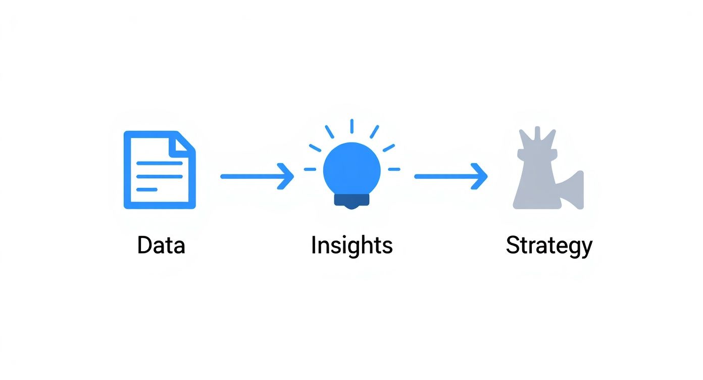
As you can see, the journey is straightforward: collect the data, find the insights, and then execute a plan based on what you’ve learned.
From Information to Implementation
The real magic happens when you turn those raw numbers into actionable business intelligence. And it’s clear that more businesses are catching on. Between 2022 and 2023, the percentage of companies investing in data analytics shot up from 87.8% to 93.9%, which really underscores its strategic value. You can dive deeper into this trend and see how data analytics will transform sales performance in 2025.
This is where you get to answer the critical questions with confidence:
- Which products are our absolute bestsellers during the holiday season versus the summer?
- Where are our most valuable customers located? Are they clustered in specific cities or regions?
- At what specific stage of our sales funnel are we losing the most potential customers?
The goal isn't just to look at data but to ask questions of it. A simple spreadsheet can tell you that sales dipped in March, but proper analysis can tell you why—perhaps a competitor launched a new promotion or a specific marketing channel completely underperformed.
By digging a little deeper, you move past the obvious observations and start uncovering the root causes driving your sales performance. That’s what allows you to make precise, impactful adjustments that actually move the needle.
Building a Solid Foundation with Clean Data
Any incredible insight you uncover is completely worthless if it's based on messy, unreliable data. Before you can even think about analyzing your sales, you have to build a solid foundation of clean, accurate numbers.
Think of it like this: you wouldn't try to cook a gourmet meal with spoiled ingredients. Skipping the prep work here guarantees a disappointing result, and in business, that often means a costly mistake.
Your data probably comes from all over the place—your Shopify store, maybe a CRM, various marketing platforms, and probably a few stray spreadsheets. The first real challenge is just getting all this information into one place without making an even bigger mess. You'll want to pull consistent data points from each source, focusing on the essentials like order dates, customer IDs, product SKUs, and transaction values.
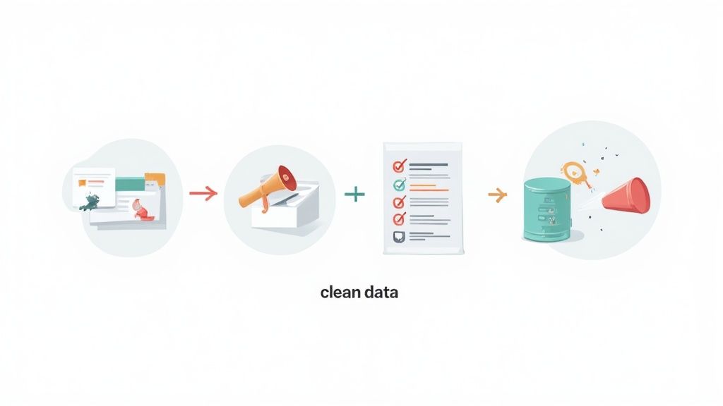
Once you've corralled your raw data, the unglamorous but absolutely critical work begins: cleaning it up. This process, often called data hygiene, is what makes your conclusions trustworthy. A single misplaced decimal or a duplicated order can throw your entire analysis off track.
Your Data Cleaning Checklist
Start by hunting for the common errors that always seem to creep in and skew your results. These issues pop up more often than you'd think, especially when you're pulling data from systems that don't talk to each other perfectly. Your job is to methodically find and fix them.
A practical cleaning process looks something like this:
- Hunt Down Duplicates: Check for identical order numbers or customer entries that got recorded more than once. This is a classic problem when importing data and will absolutely inflate your sales figures if you miss it.
- Standardize Your Formats: Get your dates, currencies, and country names on the same page. For example, you need to decide if you're using "USA," "United States," or "US" and stick with it. If you don't, your geographic analysis will be a mess.
- Tackle Missing Values: Scan for blank cells in key columns like revenue or customer location. You have to make a call: either delete the entire row or, if you can, fill in the blanks based on other information you have.
The most dangerous decisions are the ones made with total confidence based on bad data. Taking an hour to scrub your dataset clean can save you from a strategic mistake that takes months to undo.
A real-world example? You might spot a customer named "Jon Smith" and another named "Jonathan Smith" at the exact same address. Odds are, that's the same person. Merging those records is crucial, otherwise, you're seriously underestimating that customer's lifetime value.
Keeping Your Data Reliable
Here’s the thing: cleaning data isn't a one-and-done job. It’s an ongoing discipline. Set up a routine—even a quick monthly check-in can stop small errors from snowballing into a massive headache down the road.
This is the non-negotiable first step for anyone who truly wants to know how to analyze sales data the right way. By putting in the time to build and maintain a clean data foundation, you're ensuring that every analysis you run—from spotting sales trends to forecasting next quarter's revenue—is built on solid ground. It’s the only way to make smarter, data-driven decisions that actually grow your business.
Choosing Sales Metrics That Actually Matter
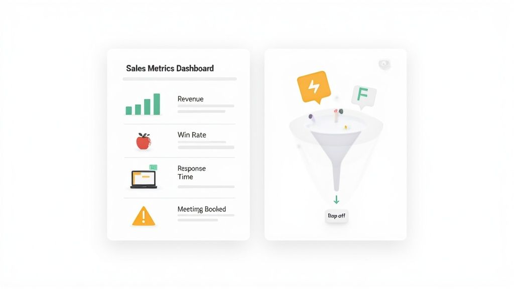
Alright, your data is clean and ready to go. The biggest mistake I see brands make at this stage is trying to track everything. It’s a classic trap. You end up drowning in a sea of numbers, which leads to analysis paralysis, not real, actionable insights.
Effective sales analysis isn’t about having the most data; it’s about focusing on the right data. The trick is to separate the metrics that just look good on a report from the ones that actually tell you how your sales engine is performing. This starts with understanding the difference between your outcome KPIs and your process KPIs.
Outcome vs. Process KPIs
Think of outcome KPIs as your final score. They tell you what happened at the end of the game. These are the big-picture numbers everyone loves to see.
- Total Revenue: The obvious one. It’s the top-line figure that shows if you're growing.
- Win Rate: Simple and powerful. What percentage of your qualified leads actually buy something?
- Customer Lifetime Value (CLV): This tells you how much a customer is worth to you over their entire relationship with your brand.
These numbers are essential for reporting to stakeholders, but they don't explain why you hit (or missed) your targets. For that, you need to look at your process KPIs.
Process KPIs, on the other hand, are the specific activities your team does every day that drive those outcomes. These are the levers you can actually pull to make a difference.
- Lead Response Time: How fast are you getting back to new inquiries? Speed is everything here.
- Meetings Booked: For B2B or high-ticket sales, this is a direct measure of pipeline health.
- Sales Cycle Length: How long does it take to turn a lead into a paying customer?
When you improve these process metrics, your outcome metrics almost always follow. Shave a few hours off your lead response time, and you'll likely see your win rate climb. If you want to dive deeper into this, our guide on the power of https://www.ecorn.agency/blog/ecommerce-data-analytics is a great next step.
It's all about trading vanity metrics for actionable ones. A huge spike in website traffic looks great, but if it doesn't lead to more qualified leads or sales, it’s just noise. Zero in on the numbers that have a direct line to revenue.
Aligning Metrics with Business Goals
The "right" KPIs aren't one-size-fits-all; they have to match your current business goals. Are you focused on grabbing more market share, boosting profitability, or just keeping the customers you already have? Your metrics need to reflect that specific objective.
For instance, if your main goal is to shorten a long sales cycle, you should be obsessing over metrics like time spent in each pipeline stage. But if you're a subscription-based store trying to improve retention, you’ll want to live and breathe customer churn rate and repeat purchase rate.
Getting a solid grasp on your financial health is also part of this. For a more advanced look, understanding key sales metrics like Days Sales Outstanding (DSO) can give you incredible insight into your cash flow and overall sales efficiency.
To help you get started, I’ve put together a table of essential KPIs that I see successful Shopify stores track. It breaks them down by what they measure and, more importantly, the business questions they help you answer.
Essential Sales KPIs and What They Tell You
Ultimately, choosing the right KPIs comes down to this alignment. By combining outcome metrics like win rate with input metrics like meetings set, you get a full picture. Funnel analysis then lets you pinpoint exactly where prospects are dropping off, revealing whether your issues are with lead quality, messaging, or something else entirely. This targeted approach is the key to truly understanding your sales data and making it work for you.
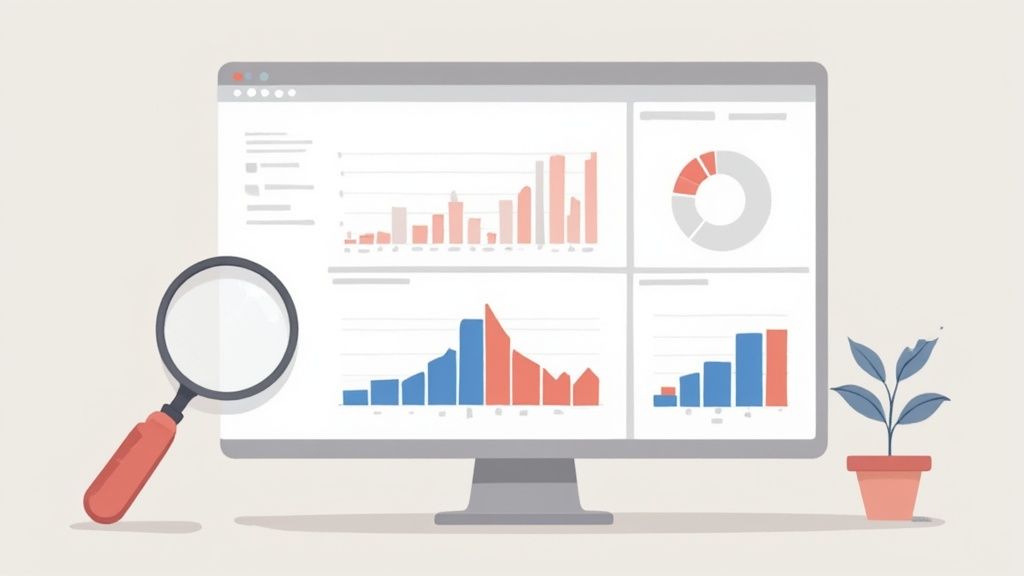
Telling a Story with Data Visualization
Let’s be honest, a spreadsheet crammed with numbers doesn't exactly scream "actionable insights." At a glance, it's just a wall of data. The real magic begins when you start visualizing that data, transforming those raw figures into charts and dashboards that tell the hidden story of your business. This is the moment you stop just having data and start actually using it.
When you think about how to analyze sales data visually, you're giving yourself a massive shortcut. You can spot trends, pick out anomalies, and see patterns in a split second—things you’d spend hours hunting for in a table. It’s the fastest way to make complex information click for everyone on your team, from the marketing intern to the CEO.
The trick is picking the right tool for the job. You wouldn't use a hammer to turn a screw, and using the wrong chart can muddy your message instead of making it crystal clear.
Matching the Chart to Your Question
Before you even think about building a chart, ask yourself one simple thing: what question am I trying to answer? Your answer will point you straight to the perfect visualization. Let's walk through a few common scenarios for any Shopify store owner.
Want to track performance over time? A line chart is your best friend here. Use it to map out your monthly recurring revenue (MRR) or watch your total sales climb quarter over quarter. It’s the quickest way to see growth, spot seasonal dips, and measure the real impact of that new marketing campaign you launched.
Need to compare different categories? Go with a bar chart. It’s perfect for stacking up the performance of different sales reps, seeing which marketing channels are pulling their weight, or figuring out your top-selling products this month. The comparisons are instant and obvious.
Trying to understand geographic performance? A heat map is fantastic for this. By coloring different states or countries based on sales volume, you can instantly see where your customer hotspots are. This is gold for focusing your ad spend where it will have the biggest impact.
Creating a Simple Sales Dashboard
You don't need to shell out for expensive, complicated software to get started. Everyday tools like Google Sheets or Microsoft Excel are more than capable of building a simple—but seriously effective—sales dashboard. The whole point is to pull your most important KPIs into one place for a quick, at-a-glance health check on your business.
A solid starter dashboard for any e-commerce store should probably include:
- A line chart showing revenue trends over the last 90 days.
- A bar chart breaking down sales by product category.
- A pie chart showing where your traffic is coming from (Organic, Paid, Social).
- Your most critical metrics front and center at the top, like Average Order Value (AOV) and Conversion Rate.
If you're on Shopify, you're already sitting on a powerful analytics suite. Getting comfortable with your native tools is a huge first step. If you want to really get the most out of what's built-in, check out our in-depth guide to mastering the Shopify analytics dashboard.
A well-designed dashboard doesn't just show you data; it guides your focus. By highlighting key trends and surfacing anomalies—like a sudden drop in conversion rate—it prompts you to ask the right questions and dig deeper for the answers.
Ultimately, visualization turns you from a data reporter into a data storyteller. It's how you find the opportunities buried in your numbers and share them in a way that actually inspires your team to take action and drive real growth.
Turning Your Analysis into Actionable Strategy
Having clean data and a few slick charts is one thing, but those visuals are just the starting point. The real magic happens when you turn that analysis into a concrete game plan. This is where you connect the dots, moving from just observing what's happening to making smart, intentional moves.
It’s all about asking the right questions.
Let's say your data shows that sales for a key product are starting to dip. A quick glance might just suggest a temporary slump. But you need to dig deeper. Is it a pricing issue? Did a new competitor just launch something similar? Or maybe, just maybe, are your customers' needs shifting away from that product entirely?
To get the full picture, you have to blend your data sources. You can’t just look at the numbers in a vacuum. Combine your quantitative findings—like pipeline velocity and conversion rates—with the qualitative gold you get from customer surveys, support tickets, and even just casual notes from your sales team. That combination is what gives you the crucial context behind the numbers.
From Data Points to Strategic Plays
Transforming insights into strategy means coming up with clear, data-driven recommendations that will actually move the needle. You’re translating what the data is telling you into specific tasks and initiatives your team can run with.
Here’s a practical way to break it down:
- Isolate the Core Problem: First, get super specific about the issue. Instead of a vague "sales are down," frame it as, "Our conversion rate for email-generated leads dropped by 15% last quarter." See the difference? One is an observation; the other is a problem you can solve.
- Hypothesize the 'Why': Now, brainstorm what could be causing it. For that drop in email lead conversion, you might guess it's ineffective email copy, a broken link in the campaign, or a change in your audience's behavior.
- Formulate an Action Plan: Create specific, measurable next steps to test your best guess. This could mean A/B testing new subject lines, running a full audit on all campaign links, or trying out a new way to segment your email list.
This structured approach keeps you from jumping to conclusions and makes sure your response is directly tied to the evidence. With today's buyer journey, this is non-negotiable. On average, 7.4 decision-makers are involved in a typical B2B purchase, and nearly 70% of their research happens before they even think about talking to a sales rep. Your strategy has to be sharp from the very first touchpoint.
True analysis isn't about finding a single 'right' answer. It's about developing a series of well-informed hypotheses and creating a plan to test them methodically. This iterative process is what leads to sustained growth.
Implementing and Measuring Your New Strategy
Once you have your action plan, it’s time to put it into motion and—this is the part everyone forgets—track the results. For more advanced ways of turning insights into results, tools like an end-to-end AI sales copilot can give your strategic capabilities a serious boost.
Define the key metrics you’ll watch to see if your changes are working. If you've launched a new pricing model to combat that sales dip, you’ll need to track more than just total sales; keep an eye on average order value and customer feedback, too.
Set a specific timeframe for your test. At the end of that period, circle back to your data. Did your strategy work? Did it have any unintended consequences? This continuous loop of analysis, action, and measurement is the engine that powers a truly data-driven business.
Got questions about digging into your sales data? You're not alone. Even with a clear plan, diving in for the first time can feel a bit overwhelming. Let's walk through some of the most common hurdles I see business owners and marketers run into.
What Are the Best Tools for a Small Business to Start Analyzing Sales Data?
You absolutely do not need a massive budget or some fancy, enterprise-level software to get started. Honestly, the most powerful tools are probably the ones you already have access to.
Microsoft Excel and Google Sheets are fantastic starting points. Both have robust features like pivot tables, sorting, and charting that can handle most of the foundational analysis you'll need, and they won't cost you an extra dime. The real key is to master the process of analysis first, not get distracted by shiny new software.
Once you feel you're hitting the limits of a spreadsheet and are ready to level up, you can explore tools that offer more advanced dashboarding and visualization:
- Google Data Studio: A free tool that’s great for creating interactive dashboards. It hooks right into other Google products like Analytics and Sheets.
- Tableau Public: This is the free version of a seriously powerful business intelligence tool. It’s perfect for creating compelling charts and maps that really tell a story.
- Microsoft Power BI: The free desktop version is incredibly capable for building out detailed reports and dynamic dashboards.
How Often Should My Team Analyze Sales Data?
The right answer here really depends on the rhythm of your business and how long your sales cycle is. There's no single "correct" frequency, but there are some solid guidelines to follow.
If you’re running a fast-moving ecommerce store, daily or at least weekly check-ins on key metrics like conversion rates and cart abandonment are vital. For a B2B company with a longer, more complex sales cycle, a really deep dive on a monthly or quarterly basis is often more practical. You'll want to supplement that with weekly pipeline reviews just to keep things on track.
A great rule of thumb for any business is to schedule a formal monthly review of your main KPIs. This cadence is frequent enough to spot trends before they become serious problems, but it also allows enough time for meaningful patterns to actually emerge.
What's the Biggest Mistake People Make When Analyzing Sales Data?
The most common—and most costly—pitfall is analyzing data without any context. Numbers can tell you what happened, but they almost never tell you why.
For example, you might see a sales dip in April and immediately assume your team’s performance dropped. But without context, you could completely miss the fact that a major competitor launched a huge discount campaign that same month, or that a technical glitch on your site was preventing checkouts for two full days.
Data is only one piece of the puzzle. You have to combine your quantitative findings from spreadsheets with the qualitative insights you get from talking to your team, reading customer feedback, and just being aware of what's happening in your market. This holistic view is what leads to truly smart, effective decisions.
How Can I Improve Sales Forecasting with Data Analysis?
Good data analysis is what turns forecasting from pure guesswork into a reliable projection. The best place to start is by looking at your historical sales data. This will help you identify seasonal patterns and calculate your average growth rates over the past few years.
Next, take a hard look at your current sales pipeline. You can apply your historical win rate to the value of the deals sitting at each stage. This gives you a weighted forecast that is far more reliable than just adding up every potential deal you have in the works.
For even better accuracy, start factoring in leading indicators. Things like the number of demos booked or website trial sign-ups often predict future revenue long before the sales are closed.
Ready to stop guessing and start making data-driven decisions for your Shopify store? ECORN specializes in turning your sales data into actionable growth strategies. From conversion rate optimization to expert eCommerce consulting, we have the team to help you scale.
Discover our flexible Shopify solutions and book a call today!


Shopify: How to Reduce Technical Debt

Shopify UX Design Change: A Playbook for Growth

User Generated Content Strategy: Shopify Playbook

Shopify Pause and Build Plan Cost: A Complete 2026 Guide

Compare at Price on Shopify: A Complete Guide for 2026

Where Can I Sell My Prints? 10 Best Platforms for 2026

Shopify Order Management System: The Ultimate Guide 2026

What Is Marketing Attribution? an eCommerce Guide for 2026

10 Best Black Friday Sales Sheets for 2026

Discover the Top Social Media Marketing Agencies For

Consumer Confidence Definition for eCommerce in 2026

What Is Social Commerce? Your 2026 Guide to Boosting Sales

A Social Ad Campaign Playbook for eCommerce Growth

7 Best FAQ Page Examples for SaaS & eCommerce

Market Research in Fashion Industry: A Guide for Shopify

Shopify Migration Services: Expert Guide for 2026

Mastering FB Retargeting Ads for Shopify in 2026

What Is Omnichannel Ecommerce

Master Your Shopify Plus Migration: The 2026 Guide

Shopify Integration Services: A Merchant's 2026 Guide

Shopify Collection Description: A Guide to SEO & Sales

Shopify Plus Contact: Reach Sales & Support Effectively

Top Luxury Shopify Stores: Design & UX Strategies

How to Improve Customer Experience: A Shopify Roadmap

Creative Facebook Ads: 10 Examples for Shopify Brands

Remarketing with Facebook Ads: A Shopify Guide for 2026

SEO Linking Strategies for Shopify Stores

Top 7 Statistics YouTube Channels for eCommerce in 2026

Hiring Shopify Plus Designers: A Founder's Guide

Shopify Product Variation: Master Your Variants for 2026

Leverage Ai Solutions Brands: Your 2026 Shopify Growth Guide

Filters in Shopify: A Guide for Growing Brands

Shopify Plus Developer: A Guide for Growing Brands

When Does Black Friday Online Start? A 2026 Guide

Black Friday Email Marketing: Shopify & Klaviyo Guide

Polaris Design System: The Complete Shopify Guide

How to Hire a Consultant Email Marketing Expert

What Is Q4? A Shopify Merchant's Guide to Peak Season

Marketing Organization Structure for eCommerce Growth

Top Account-Based Marketing Agency Guide for 2026

7 Remarketing Ad Examples for Your 2026 Campaigns

AI Retail Solutions: Boost Your Shopify Store

Migrate to Shopify: The Definitive 2026 Guide

Shopify Authentication App: A Guide for Secure Stores

Why Strategic Marketing Is Important for Growth in 2026

How to Create a Size Chart in Shopify: 2026 Guide

Shopify Themes for Jewelry: The Definitive 2026 Guide

Minimal Shopify Templates: Faster, Higher-Converting Stores

Maximize Profit: Shopify CC Fees 2026 Guide

Best Shopify Apps for Beginners in 2026

How to Improve Online Shopping Experience in 2026

Shopify Design and Development Services: A 2026 Guide

Small Business Social Media Marketing Agency: A Hiring Guide

Bulk Edit Shopify: A Guide to Save Hours on Store Updates

2026 Trends in Food and Beverage Industry

Post Purchase Survey Guide for Shopify Stores

How to Build an Ecommerce Brand in 2026

Conversion Rate Optimization for Ecommerce: Maximize Profit

How to Use Customer Data to Increase Sales: A Guide

Shopify for Enterprise: The 2026 Deep Dive Guide

Email Marketing Agencies: The Guide for Shopify Brands

Boost Sales With The Right Shipping Shopify App

Your Guide to the Shopify Site Map

7 Headless Commerce Examples for 2026

Mastering Trends in Cosmetic Industry for 2026

Transfer Shopify to BigCommerce The Complete 2026 Playbook

What Is Shopify Collective? Your 2026 Guide to Success

Unlock Shopify Growth with Site Link SEO

Integrating Shopify and WordPress A Complete Guide for 2026

Naming a Clothing Store: A Shopify Founder's Playbook

Guide to buying shopify store in 2026

Buying shopify store: Buying a Shopify Store: Invest Wisely

Food & Beverage Marketing: A Complete Guide for 2026

Facebook Ads Agency: A Shopify Brand's Hiring Guide

Shopify Apparel Stores: A 2026 Launch & Scale Guide

How to Deactivate Shopify Store: The 2026 Guide

Shopify and Square: The 2026 Ultimate Comparison

Your Guide to Beauty Products Ecommerce

A Guide to Marketing for Beauty Brands in 2026

Your Guide to Facebook Black Friday Ads

Facebook Ad Ecommerce for Shopify Growth

Iconography Web Design The Definitive Guide for Shopify Stores

A Modern Backlinks SEO Strategy for Shopify Stores

How to Launch an Online Store: A Step-by-Step Success Guide

Optimize Shopify Store: Master Performance in 2026

Successful Migration for Shopify: Protect SEO & Grow

Maximize Traffic & Sales: Get Your Free Website Audit Report

Master the Best Ads Facebook Formats for eCommerce Success

How to Find the Best Ecommerce Agency Near Me in 2026

10 Crucial White Hat Techniques SEO for Shopify in 2026

How to Reduce Returns and Boost Profits in Your eCommerce Store

What Is Ecommerce Personalization A Guide to Unlocking Growth

Payment gateways in shopify: The Ultimate Guide for Merchants 2026

Fulfillment services for shopify: Scale Your Ecommerce Brand

Shopify Landing Page Examples: 7 Winning Templates to Boost Conversions
How to Create Urgency in Sales on Shopify

The Best Review Apps for Shopify to Drive Growth in 2026

The Best Ecommerce Platform for Startups in 2026

Choosing Ecommerce Website Design Packages A Complete Guide

Shopify Plus Partners: Guide to shopify plus partners for 2026 growth


newsletter in your inbox