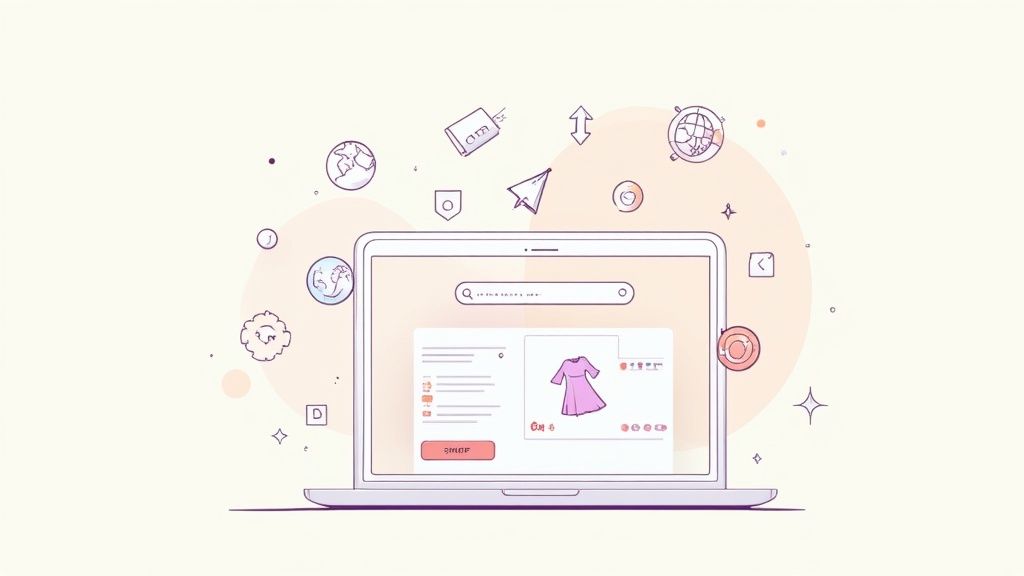
Effective ecommerce product page design isn't just about making things look good. It's the art of creating a digital experience that guides a visitor from simple curiosity to a confident purchase. It has to act as your store's best salesperson, blending compelling visuals, persuasive copy, and a frictionless layout to build trust and drive conversions.
Your Product Page Is Your Digital Salesperson
Think of your product page as the final handshake before a sale. It’s that critical moment where a browser’s casual interest has to become a customer’s firm commitment. This is where the psychology of a purchase really kicks in, moving far beyond a simple list of features.

A well-crafted page anticipates and answers a customer’s unspoken questions. It preemptively handles potential objections, builds that crucial layer of trust, and provides every last piece of information needed to confidently click "Add to Cart." The real difference between a basic product listing and a powerful conversion tool is its ability to tell a story.
The Anatomy of a Conversion-Focused Page
An exceptional ecommerce product page doesn't happen by accident; it's a deliberate assembly of strategic components. Every element has a specific job, and they all have to work together to create a seamless journey for your shopper.
This handy table breaks down the core elements every high-converting product page needs. Think of it as your quick-reference checklist for success.
Key Elements of a High-Converting Product Page
By ensuring each of these components is optimized, you create a powerful, persuasive experience that guides customers smoothly from interest to purchase.
The Current State of Product Page Experience
Despite how critical this page is, a surprising number of online stores are falling short. A benchmark study from the Baymard Institute found that a staggering 51% of leading ecommerce sites suffer from “mediocre” or worse product page UX. This isn't a small issue. It causes shoppers to abandon perfectly suitable products simply because of solvable problems like confusing layouts or hidden information.
This gap presents a massive opportunity. By focusing on creating a superior user experience, you can capture the sales your competitors are letting slip through their fingers.
Ultimately, your goal is to improve website conversion rates. Every design choice, from the font size of your description to the color of your CTA button, should be made with one question in mind: Does this make the purchasing decision easier and more appealing for the customer? Get that right, and you'll turn a one-time click into a loyal, repeat customer.
Crafting Visuals That Build Trust and Desire
When a customer can't physically hold your product, your visuals have to do all the heavy lifting. They're your single most important tool for bridging that sensory gap, building rock-solid confidence, and sparking the desire that actually leads to a sale. An effective visual strategy is about so much more than just showing an item—it's about telling its story and proving its value.
This job is tougher than ever in today's crowded market. Retail ecommerce now makes up about 22% of total retail sales globally, and the competition is fierce. The quickest way to stand out is by delivering a better user experience, and honestly, most brands are dropping the ball. Studies show a staggering 82% of sites have mediocre-to-poor product page setups, with visual quality being a massive weak spot.
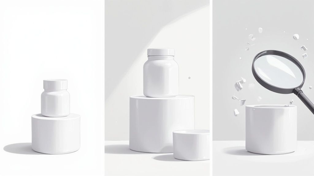
Your Essential Image Portfolio
One lonely product photo just doesn't cut it anymore. To earn a customer's trust, you need to present a complete visual story that answers their questions before they even think to ask them. Think of it as creating a mini-portfolio for every single product.
Here are the absolute must-have shots for any product:
- The Hero Shot: This is your main event, usually set against a clean, white background. It needs to be crisp, perfectly lit, and show the entire product without any distractions.
- In-Context Lifestyle Photos: Show your product in its natural habitat. A backpack on a hiker's back or a sleek coffee mug on a kitchen counter helps customers immediately picture it in their own lives.
- Detailed Close-Ups: Get in close with high-resolution shots to highlight material quality, texture, or intricate details. This is where you justify your price point and show off true craftsmanship.
- Scale and Size Comparison: Photograph the product next to a universally recognized object (like a coin or a smartphone) or on a model. This simple step helps manage expectations and slashes returns from "it was smaller than I thought!" surprises.
Nailing these shots takes more than just a decent camera. For a much deeper dive, check out our guide on how to take good product shots.
Product Videos Aren't Optional Anymore
While static images are the foundation, video is the undisputed champion of conveying function and boosting confidence. A short, well-produced video can obliterate buyer hesitation. In fact, research shows that 64% of customers are more likely to buy a product after watching a video about it.
Videos bridge the final gap between the digital and physical worlds. They demonstrate scale, movement, and functionality in a way that static images simply cannot, directly answering the customer's question "How does this actually work?"
Think about creating a few different types of videos. A quick 360-degree spin gives a full view, while a demo video can explain a complex feature in under 30 seconds. Even better, unboxing videos or user-generated testimonials can add a layer of authenticity that even the most polished professional content can't match.
Optimizing for Speed Without Sacrificing Quality
The most beautiful, high-resolution images on the planet are completely useless if they take forever to load. Slow load times are the number one killer of conversions. The real trick is striking the perfect balance between visual quality and site performance.
Here’s how you do it:
- Choose the Right Format: Stick with JPEG for most of your product photos; its compression is fantastic for keeping file sizes small. Use PNG only when you need a transparent background, like for a logo.
- Compress Your Images: Before you upload anything, run your images through a tool like TinyPNG or ImageOptim. These can slash file sizes without any noticeable drop in quality. Most ecommerce platforms also have their own compression tools built-in.
- Implement Lazy Loading: This is a game-changer. Lazy loading only loads images as the user scrolls down the page, which makes the initial page load feel lightning-fast.
When you meticulously curate your visuals and make sure they’re technically optimized, you create an experience that feels both immersive and effortless. This attention to detail doesn't just put your products in the best light—it builds the deep trust needed to turn a casual browser into a loyal customer.
Writing Product Copy That Actually Sells
Let's be blunt: your product description is your 24/7 salesperson. It has to be sharp, persuasive, and completely on-brand. The best product pages treat copy not as some final detail to check off a list, but as the primary tool for turning a browser into a buyer. It’s what transforms a dry list of specs into a story a customer can see themselves in.
And this isn't just a hunch. A staggering 87% of customers say product content is the most important factor when they're deciding to buy something online. When they can't physically touch or try out an item, your words have to do the heavy lifting and build that crucial trust.
Moving From Features to Benefits
This is the most common trap I see brands fall into: they just list features. A feature is what your product is or has—the technical spec, the material, the size. A benefit, on the other hand, is what the customer gets. It’s the problem solved, the feeling created, the goal achieved.
Take a simple waterproof jacket, for example.
- Feature: Taped seams and a hydrophobic membrane. (Sounds technical, right?)
- Benefit: Stay completely dry and comfortable during a surprise downpour on your hike, so you can actually enjoy the view instead of making a mad dash for the car.
See the difference? Customers don't buy features; they buy a better version of themselves. Your copy has to paint that picture clearly. Your job is to connect the dots between your product and their real-life needs and wants.
Don't sell a mattress; sell a perfect night's sleep. Don't sell a camera; sell the ability to capture priceless family memories. This shift from "what it is" to "what it does for me" is the absolute heart of persuasive copywriting.
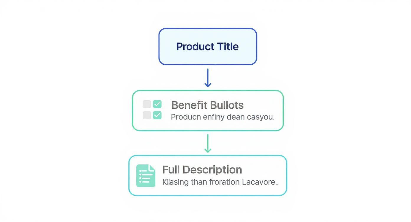
Structuring Your Copy for Scanners
Here’s the hard truth: most people don't read every word online. They scan. If your product page is a solid wall of text, you’ve already lost them. You have to design your copy to be absorbed in glances.
Instead, break it down for maximum impact:
- Compelling Product Titles: Your title is the very first thing they see. Make it descriptive and hint at the benefit. Instead of just "Leather Wallet," try "The Minimalist Leather Wallet | Holds 10 Cards, Stays Slim." This works wonders for both shoppers and SEO.
- A Short, Engaging Intro: Kick things off with two or three sentences that nail the core benefit and capture the product's essence. This is your hook.
- Benefit-Driven Bullet Points: This is your scanner's paradise. Use bullet points to translate those features into tangible outcomes. It’s shocking, but one study found 50% of ecommerce stores don’t have an easily scannable specs section—a massive missed opportunity.
- A Consistent Brand Voice: Does your brand sound playful, professional, or adventurous? Whatever your tone is, keep it consistent. This is how you build a real identity and help customers connect with you on a more personal level.
Weaving a Narrative That Sticks
Once you have the structure down, the real magic happens: storytelling. A good story can dramatically increase a product's perceived value. It creates an emotional connection that makes your product far more memorable than a competitor's, even if the features are practically identical.
Talk about the craftsmanship that went into it. Share the problem that inspired its creation. Describe the exact feeling a customer will have when they use it. This narrative transforms a simple transaction into a meaningful purchase and turns your product copy into a powerful engine for sales.
Designing a Layout for Seamless Purchases
A confusing layout is a one-way ticket to an abandoned cart. The way you structure your product page can either guide a shopper confidently toward a purchase or leave them frustrated and lost. A great layout creates a frictionless experience, instinctively leading the eye from one crucial piece of information to the next.
This isn't about just cramming content onto a page; it's about building a clear visual hierarchy. Your most important elements—the product title, images, price, and "Add to Cart" button—have to grab attention instantly. Everything else is there to support that one primary goal without creating a mess.
Establishing a Clear Visual Hierarchy
Visual hierarchy is just a fancy way of saying you need to arrange things to show their order of importance. For a product page, this means the user's journey should feel completely natural. They should never have to hunt for the price or wonder where the "Add to Cart" button is hiding.
Think of it as a top-down information flow. A user first needs to know what the product is, then see its benefits, and finally, dig into the details if they're still curious. This simple structure is a proven winner for product copy.
This setup ensures that even someone quickly scanning the page gets the most critical information first, which is often all you need to encourage them to scroll down for more.
The Anatomy of a Frictionless Layout
Beyond the copy, where you place functional elements is just as important. One of the most common mistakes I see is burying key details like shipping costs or return policies at the very bottom of the page—or worse, saving them for the checkout process. This is a classic conversion killer that creates last-minute hesitation.
Instead, get those details out in the open, right where people are making decisions.
- Product Variants: Options like size and color should be obvious, clickable buttons or swatches, not clunky dropdown menus. Make sure to show which options are out of stock right away to avoid any frustration.
- Customer Reviews: Place an average star rating directly below the product title. This gives you immediate social proof. The full, detailed reviews can live further down the page where interested shoppers can find them.
- Shipping & Returns: A short, clear summary of your shipping costs and return policy near the "Add to Cart" button works wonders. A simple line like "Free shipping on orders over $50" can build huge confidence.
For a deeper dive into structuring these elements effectively, you can explore our full guide on how to optimize product pages for better performance. If you're looking to really nail the user experience, exploring a solid user interface design framework can give you the principles you need to build a layout that truly converts.
Here's a quick reference guide that shows how small placement changes can make a big impact on user behavior.
Product Page Element Placement Guide
A comparative look at common vs. optimized placement for critical product page elements to improve user experience and guide purchasing decisions.
Making these adjustments helps answer customer questions before they even have to ask, removing friction and building the trust needed to make a purchase.
A Mobile-First Design Philosophy
Let's be real: most of your customers are shopping on their phones. Designing for mobile isn't an afterthought anymore—it has to be your first priority. A layout that looks great on a desktop will almost certainly fail on a phone if it's not adapted properly.
On mobile, a single-column layout is non-negotiable. Images need to be swipeable, and text has to be large enough to read without pinching and zooming. Most importantly, the "Add to Cart" button should be impossible to miss. Making it "sticky" so it stays visible at the bottom of the screen as the user scrolls is a game-changer.
This intense focus on usability has a direct impact on your bottom line. Every second counts. When you build a layout that is logical, intuitive, and lightning-fast, you're not just designing a page—you're creating a seamless path from discovery to checkout.
Using Social Proof and Urgency to Drive Action
Even the most beautiful product page can fall flat if a shopper is on the fence. It's just human nature to look for a sign, some kind of validation, before pulling the trigger on a purchase. This is where two powerful psychological drivers—social proof and urgency—come into play.
When you use these ethically, they work wonders to quiet that little voice of doubt in a customer's head and nudge them toward a decision. It’s all about building confidence and showing them they’re making a great choice, one that plenty of others have made and loved before them.
Building Unshakable Trust with Social Proof
At its core, social proof is just evidence that other people like your stuff. The most common and absolutely non-negotiable form is customer reviews. With a staggering 88% of consumers trusting online reviews as much as personal recommendations, they are the foundation of a high-converting page.
But great social proof is so much more than a simple star rating. To really make it work for you, think about showcasing authenticity in different ways.
- User-Generated Content (UGC): Get your customers involved! Actively encourage them to share photos or videos of them using your product on social media. Sprinkling this UGC on your product pages is pure gold—in fact, 77% of shoppers prefer seeing real customer photos over polished, professional shots.
- Expert Endorsements: Did an industry expert or a well-known influencer review your product? Feature their quote right there on the page. This is a classic move that lets you "borrow" their credibility and instantly apply it to your brand.
- Data-Driven Badges: Simple, clear labels like "Bestseller" or "Top Rated" offer instant validation at a glance. Even better, showing live data like "15 people bought this in the last 24 hours" creates a powerful feeling of popularity and makes people not want to miss out.
The goal of social proof is to answer the shopper’s subconscious question: "Are other people like me buying this, and are they happy with it?" A rich mix of reviews, real-world photos, and endorsements provides a resounding "yes."
Creating Genuine Urgency Without Manipulation
Urgency is what gets shoppers to act now instead of "later," which often means "never." It's the perfect antidote to purchase procrastination. But there’s a fine line between creating genuine urgency and using sleazy, manipulative tactics that will just kill your brand's credibility.
Never use fake scarcity, like those countdown timers that magically reset every time you refresh the page. Customers see right through that, and you'll lose their trust for good. Instead, focus on being transparent and providing real information that naturally creates a reason to act quickly.
Ethical Urgency Tactics
- Low-Stock Indicators: "Only 3 left in stock!" is one of the oldest and most effective tricks in the book because it's honest. It’s based on actual inventory levels and gives anyone hesitating a real reason to decide before the item is gone.
- Limited-Time Offers: If you’re running a sale or offering a special bonus, be crystal clear about the deadline. Simple phrases like "Sale ends tonight" or "Free gift with purchase until Sunday" set clear, honest expectations.
- Shipping Cutoff Times: This is a brilliant one. A little banner that says "Order within the next 2 hours for same-day shipping" works like a charm. It isn't about the product running out; it’s about a tangible benefit the customer gets by acting fast.
By weaving these elements into your page design, you're not tricking anyone. You're giving customers the social validation and timely info they need to click "buy" with total confidence. This is how you transform a static product listing into a dynamic sales tool that truly works.
Product Page Design Questions We Hear All the Time
Even with the best strategy in place, you’re always going to bump into specific questions when designing a product page. Getting these little details right is often what separates a page that just exists from one that actively turns browsers into buyers.
Think of this as your rapid-fire Q&A. I’ll cut through the noise and give you some straight answers on the small decisions that make a huge impact on your page's performance.
How Many Images Should a Product Page Have?
There’s no single magic number, but my go-to recommendation is 5-8 high-quality images. This gives you enough runway to tell a complete visual story without overwhelming the shopper.
Your job here is to anticipate and answer any visual question a customer might have before they even think to ask it. A solid gallery should always include:
- A clean, primary studio shot on a white or neutral background.
- Shots from several different angles.
- A detailed close-up that shows off the texture or a key feature.
- An in-context or lifestyle photo showing the product in the wild.
- A shot that gives a sense of scale (like next to a phone or in someone's hand).
If you’re selling apparel, showing the item on a model isn't optional—it's essential. For more complex products, don’t be afraid to add more images or even a short video. You need to clarify how it works and prove its value from every possible angle.
What Is the Most Important Element on a Product Page?
If you had to pick just one, it’s the 'Add to Cart' button. It’s the final gateway to a sale. But here’s the thing: it’s completely useless on its own. The button only works if the elements around it do their job first.
Think of the ATC button as the finish line. A customer will only cross it if these three things give them the confidence to do so:
- High-Quality Visuals: They have to create real desire and build trust.
- A Clear, Compelling Price: No sticker shock, no hidden fees.
- An Informative Product Title: It needs to instantly confirm they’re in the right spot.
These pieces work as a team to build the momentum needed for that final click. As for the button itself, the best practices are non-negotiable: make it pop with a contrasting color, give it a prominent spot, and for the love of conversions, keep it "above the fold" on both desktop and mobile.
How Do I Improve My Product Page for Mobile Users?
You have to think "mobile-first," period. Most of your traffic and sales are likely coming from smartphones anyway. The first priority is always speed. Compress your images so your pages load fast, even if someone’s on a spotty connection.
The layout needs to be a simple, single column that’s easy to scroll through. Use big, thumb-friendly buttons. And to avoid a massive wall of text, tuck away things like detailed specs, shipping info, and FAQs into accordions or collapsible sections.
On mobile, the "thumb zone" is everything. Your 'Add to Cart' button has to be easy to reach. One of the best tactics you can use is making the button 'sticky' so it stays fixed to the bottom of the screen as the user scrolls. It keeps the most important action front and center.
Finally, make sure your product images are built for a touchscreen. Let shoppers swipe through the gallery and use pinch-to-zoom. They need to be able to inspect the details just like they would if they were holding it in their hands.
Should Customer Reviews Be on the Product Page?
Yes, one hundred percent. And they need to be front and center. Hiding reviews on a separate page is a classic mistake. It creates friction and makes it look like you’re trying to hide something, which kills trust in an instant.
Show an average star rating right up top near the product title. It’s one of the first things people scan for to validate their interest. Then, below the main product details, feature a section with the full-text reviews.
Pro tip: a mix of glowing five-star reviews and more detailed four-star reviews actually feels more authentic than a page of nothing but perfection. And make sure the "Write a review" link is easy to find. If you really want to level up, add features that let customers filter reviews by rating or search for keywords. This helps them find the exact answers they’re looking for and is a massive conversion booster.
At ECORN, we specialize in transforming standard Shopify stores into high-performing sales engines. Our expertise in design, development, and conversion rate optimization helps brands build product pages that not only look great but also deliver measurable results.
Discover how our flexible subscription packages can scale with your business at ECORN


Instagram Shopping Features a Guide for Shopify Stores

What Is Revenue Optimization: A Holistic RevOps Guide

Benefits of Conversion Rate Optimization: Boost Your

WordPress to Shopify Migration: Your 2026 Seamless Switch
Boost Sales: Ecommerce Payment Processing Guide 2026

Unified Commerce Platform: Benefits, KPIs & Shopify Guide

How to Reduce Bounce Rate eCommerce: Your 2026 Guide

Shopify API Integration: A Practical End-to-End Guide

How to Implement Data Governance: A 2026 Guide

Shopify Store Development Cost: A 2026 Breakdown
What Is Server Side Tracking: The Shopify Guide 2026

Marketing Automation Workflows: A Shopify Guide for 2026

Shopify: How to Reduce Technical Debt

Shopify UX Design Change: A Playbook for Growth

User Generated Content Strategy: Shopify Playbook

Shopify Pause and Build Plan Cost: A Complete 2026 Guide

Compare at Price on Shopify: A Complete Guide for 2026

Where Can I Sell My Prints? 10 Best Platforms for 2026

Shopify Order Management System: The Ultimate Guide 2026

What Is Marketing Attribution? an eCommerce Guide for 2026

10 Best Black Friday Sales Sheets for 2026

Discover the Top Social Media Marketing Agencies For

Consumer Confidence Definition for eCommerce in 2026

What Is Social Commerce? Your 2026 Guide to Boosting Sales

A Social Ad Campaign Playbook for eCommerce Growth

7 Best FAQ Page Examples for SaaS & eCommerce

Market Research in Fashion Industry: A Guide for Shopify

Shopify Migration Services: Expert Guide for 2026

Mastering FB Retargeting Ads for Shopify in 2026

What Is Omnichannel Ecommerce

Master Your Shopify Plus Migration: The 2026 Guide

Shopify Integration Services: A Merchant's 2026 Guide

Shopify Collection Description: A Guide to SEO & Sales

Shopify Plus Contact: Reach Sales & Support Effectively

Top Luxury Shopify Stores: Design & UX Strategies

How to Improve Customer Experience: A Shopify Roadmap

Creative Facebook Ads: 10 Examples for Shopify Brands

Remarketing with Facebook Ads: A Shopify Guide for 2026

SEO Linking Strategies for Shopify Stores

Top 7 Statistics YouTube Channels for eCommerce in 2026

Hiring Shopify Plus Designers: A Founder's Guide

Shopify Product Variation: Master Your Variants for 2026

Leverage Ai Solutions Brands: Your 2026 Shopify Growth Guide

Filters in Shopify: A Guide for Growing Brands

Shopify Plus Developer: A Guide for Growing Brands

When Does Black Friday Online Start? A 2026 Guide

Black Friday Email Marketing: Shopify & Klaviyo Guide

Polaris Design System: The Complete Shopify Guide

How to Hire a Consultant Email Marketing Expert

What Is Q4? A Shopify Merchant's Guide to Peak Season

Marketing Organization Structure for eCommerce Growth

Top Account-Based Marketing Agency Guide for 2026

7 Remarketing Ad Examples for Your 2026 Campaigns

AI Retail Solutions: Boost Your Shopify Store

Migrate to Shopify: The Definitive 2026 Guide

Shopify Authentication App: A Guide for Secure Stores

Why Strategic Marketing Is Important for Growth in 2026

How to Create a Size Chart in Shopify: 2026 Guide

Shopify Themes for Jewelry: The Definitive 2026 Guide

Minimal Shopify Templates: Faster, Higher-Converting Stores

Maximize Profit: Shopify CC Fees 2026 Guide

Best Shopify Apps for Beginners in 2026

How to Improve Online Shopping Experience in 2026

Shopify Design and Development Services: A 2026 Guide

Small Business Social Media Marketing Agency: A Hiring Guide

Bulk Edit Shopify: A Guide to Save Hours on Store Updates

2026 Trends in Food and Beverage Industry

Post Purchase Survey Guide for Shopify Stores

How to Build an Ecommerce Brand in 2026

Conversion Rate Optimization for Ecommerce: Maximize Profit

How to Use Customer Data to Increase Sales: A Guide

Shopify for Enterprise: The 2026 Deep Dive Guide

Email Marketing Agencies: The Guide for Shopify Brands

Boost Sales With The Right Shipping Shopify App

Your Guide to the Shopify Site Map

7 Headless Commerce Examples for 2026

Mastering Trends in Cosmetic Industry for 2026

Transfer Shopify to BigCommerce The Complete 2026 Playbook

What Is Shopify Collective? Your 2026 Guide to Success

Unlock Shopify Growth with Site Link SEO

Integrating Shopify and WordPress A Complete Guide for 2026

Naming a Clothing Store: A Shopify Founder's Playbook

Guide to buying shopify store in 2026

Buying shopify store: Buying a Shopify Store: Invest Wisely

Food & Beverage Marketing: A Complete Guide for 2026

Facebook Ads Agency: A Shopify Brand's Hiring Guide

Shopify Apparel Stores: A 2026 Launch & Scale Guide

How to Deactivate Shopify Store: The 2026 Guide

Shopify and Square: The 2026 Ultimate Comparison

Your Guide to Beauty Products Ecommerce

A Guide to Marketing for Beauty Brands in 2026

Your Guide to Facebook Black Friday Ads

Facebook Ad Ecommerce for Shopify Growth

Iconography Web Design The Definitive Guide for Shopify Stores

A Modern Backlinks SEO Strategy for Shopify Stores

How to Launch an Online Store: A Step-by-Step Success Guide

Optimize Shopify Store: Master Performance in 2026

Successful Migration for Shopify: Protect SEO & Grow

Maximize Traffic & Sales: Get Your Free Website Audit Report

Master the Best Ads Facebook Formats for eCommerce Success


newsletter in your inbox