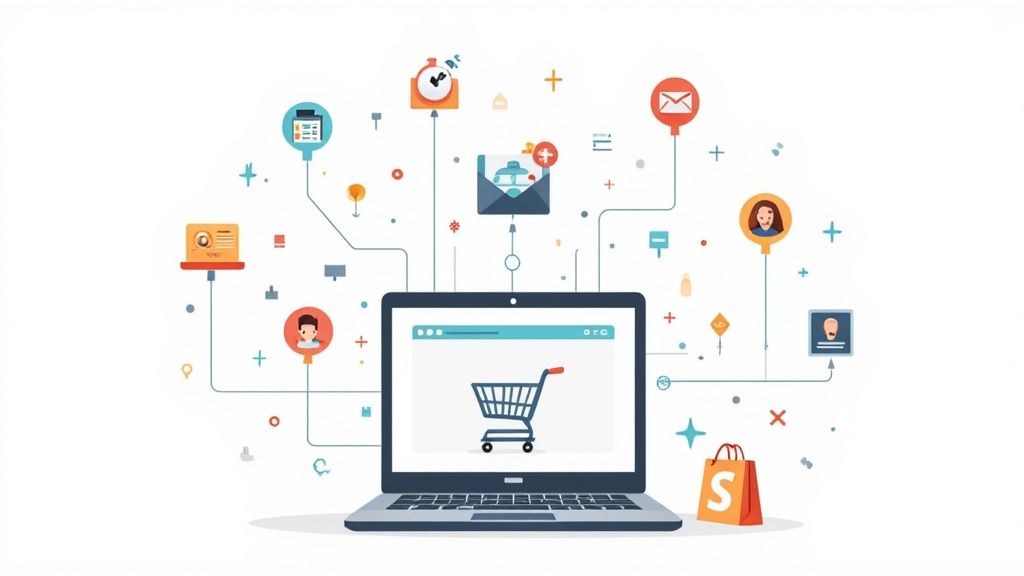
In the competitive world of eCommerce, the difference between a thriving storefront and a struggling one often comes down to small, strategic improvements. Success isn't about massive, expensive redesigns; it's about understanding user behavior and systematically removing friction from the buying journey. This is the core of Conversion Rate Optimization (CRO), a discipline that focuses on turning more of your existing website visitors into customers. By implementing proven conversion rate optimization best practices, you can significantly increase revenue without needing to spend more on acquiring new traffic.
This guide provides a prioritized, actionable roundup of the most impactful strategies. We will detail 10 data-driven changes that directly address common drop-off points in the customer experience. You will learn how to refine your checkout process, master mobile design, leverage compelling social proof, and implement effective A/B testing methodologies. Each practice is broken down into specific, actionable steps you can apply immediately to your store. For a comprehensive overview of how to achieve this, refer to a practical guide to improving e-commerce conversion rates.
Whether you are an emerging brand or an established Shopify Plus merchant, these principles are your blueprint for sustainable growth. By focusing on these incremental enhancements, you create a seamless and persuasive shopping experience that not only boosts your conversion rate but also builds long-term customer loyalty. Let’s explore the specific tactics that will transform your browsers into buyers.
1. A/B Testing & UX Research
The foundation of effective conversion rate optimization best practices lies in a dual approach: pairing quantitative A/B testing with qualitative UX research. A/B testing, or split testing, is a controlled experiment where you compare two versions of a webpage (a control and a variation) to determine which one performs better. UX research, on the other hand, uses methods like session recordings, heatmaps, and user interviews to understand why users behave the way they do.
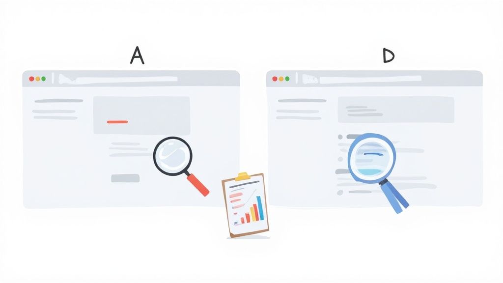
This combination allows you to form data-driven hypotheses. For example, a heatmap from a tool like Hotjar might reveal that mobile users are not clicking a crucial call-to-action (CTA) button because it's below the fold. This qualitative insight then fuels a quantitative A/B test where you move the CTA to a more prominent position. Unbounce famously used this method to help a client increase conversions by 90% simply by testing different headline copy.
How to Implement A/B Testing & UX Research
To integrate this powerful duo into your workflow, start by gathering qualitative data to identify potential friction points in your user journey.
- Start with UX Research: Use session recordings and heatmaps to observe real user behavior. You can often identify major usability issues by watching just a handful of sessions.
- Formulate a Hypothesis: Based on your observations, create a clear, testable hypothesis. For example: "Changing the product page CTA button color from grey to green will increase add-to-carts because green has a stronger visual contrast."
- Run a Controlled Test: Test one variable at a time to ensure you can attribute any change in performance directly to your modification. Run the test long enough to achieve statistical significance, typically a 95% confidence level or higher.
- Analyze and Document: Whether the test wins, loses, or is inconclusive, document the results in a shared repository. This builds a valuable knowledge base for future optimization efforts. For a deeper dive into methodology, you can explore more on A/B testing best practices.
2. Clear Value Proposition
One of the most powerful conversion rate optimization best practices is to articulate a crystal-clear value proposition. A value proposition is a concise statement that communicates the unique benefit a customer will receive from your product or service. It answers the fundamental question: "Why should I buy from you and not your competitor?" A strong value proposition immediately reduces friction and user anxiety by making your offer's relevance and superiority obvious.
![]()
This concept, championed by marketing experts like Donald Miller of StoryBrand, centers on clarity above all else. Famous examples include Slack's "Be less busy" and Dollar Shave Club's direct "Our blades are f***ing great." These aren't just clever taglines; they are succinct promises that instantly resonate with a target audience's pain points. For an eCommerce store, this means communicating why your products are better, faster, or more valuable than any other option available.
How to Implement a Clear Value Proposition
To craft a value proposition that converts, you need to deeply understand your customer and clearly articulate how you solve their problem. Place it prominently on your homepage, product pages, and in your ad copy.
- Focus on Benefits, Not Features: Customers buy outcomes, not specifications. Instead of saying "100% organic cotton," say "The softest, most breathable sheets for a perfect night's sleep."
- Use Customer Language: Dig into customer reviews, support tickets, and surveys. Use the exact words and phrases your customers use to describe their problems and desires.
- Be Specific and Concrete: Vague claims like "high-quality products" are meaningless. A more powerful statement is "Hand-stitched leather wallets guaranteed to last a lifetime."
- Test and Iterate: Your value proposition is not set in stone. Use A/B testing tools to experiment with different headlines and subheadings on key landing pages to see which one resonates most with your audience. For a masterclass in crafting compelling copy, explore the resources from Copy Hackers.
3. Simplified Forms and Checkout Process
One of the most significant friction points in any user journey is a complicated form or a lengthy checkout process. Simplifying these elements is a critical conversion rate optimization best practice because it directly reduces the effort required for a user to convert. Each unnecessary field, confusing step, or distracting element increases the cognitive load on the user, significantly raising the risk of abandonment at the final hurdle.
The goal is to create a seamless path from interest to action. Amazon’s one-click checkout is a prime example of this principle in action, eliminating nearly all steps between decision and purchase. Similarly, Basecamp famously reduced its signup form to just three essential fields, a stark contrast to the industry average of eleven, which led to a significant lift in signups. By removing barriers, you make it easier for motivated users to complete their desired action.
How to Implement Simplified Forms and Checkout
Start by auditing your existing forms and checkout flow to identify and eliminate any points of friction. The less a user has to think, the more likely they are to convert.
- Audit and Eliminate: Scrutinize every form field. Is it absolutely essential for the transaction? If not, remove it. Ask only for what you need at that specific moment.
- Enable Autofill and Address Lookup: Use browser autofill capabilities and tools like Google Places API to automatically complete address information. This drastically reduces typing and potential errors.
- Provide Real-Time Validation: Use inline validation to give users immediate feedback if a field is filled out incorrectly, rather than waiting until they submit the form.
- Show Clear Progress: For multi-step checkouts, use a visual progress bar to show users where they are in the process and how many steps are left. This manages expectations and reduces anxiety. For a more comprehensive look at streamlining this crucial stage, you can explore detailed eCommerce checkout best practices.
4. High-Quality Social Proof and Testimonials
Effective conversion rate optimization best practices must leverage social proof, a psychological principle where people conform to the actions of others under the assumption that those actions reflect the correct behavior. By showcasing testimonials, reviews, and user counts, you reduce purchase anxiety and build the credibility needed to turn hesitant visitors into confident buyers. It’s about showing, not just telling, that your product is a trusted choice.
This tactic is powerful because it addresses a fundamental question in the buyer's mind: "Can I trust this brand?" Seeing that thousands of others have already purchased and benefited from your product provides a powerful, third-party endorsement. For example, Grammarly prominently displays its high ratings from Trustpilot and G2 directly on its homepage, instantly associating its brand with established, trusted review platforms and reassuring new users.
How to Implement High-Quality Social proof and Testimonials
Integrating authentic social proof requires a strategic approach that goes beyond simply adding a few generic quotes to your site. The goal is to make it a seamless part of the user journey.
- Be Specific and Authentic: Vague praise like "Great product!" is less effective than a detailed testimonial. Aim for reviews that mention specific benefits or quantifiable results, such as "This software saved our team 10 hours per week." Always use real names and photos to enhance authenticity.
- Vary Your Social Proof: Use a mix of formats to appeal to different users and address various objections. This can include customer reviews with star ratings, detailed case studies for B2B, logos of well-known clients, or video testimonials for high-consideration products.
- Strategic Placement is Key: Don't hide your social proof on a separate page. Place relevant testimonials and reviews near key decision-making points, such as on product pages right next to the "Add to Cart" button, within the checkout process, or on landing pages to counter initial skepticism.
- Automate the Collection Process: Use email or SMS automation to request reviews from customers a week or two after their purchase. Make the submission process as frictionless as possible, ideally with a single-click rating system to start. As Robert Cialdini notes in his book Influence, social proof is most powerful in moments of uncertainty.
5. Mobile Optimization and Responsive Design
With the majority of web traffic now originating from mobile devices, a mobile-first approach is no longer optional; it is a fundamental pillar of modern conversion rate optimization best practices. Mobile optimization ensures your eCommerce site loads quickly, is easy to navigate on a small screen, and is tailored for touch interactions. A poor mobile experience creates friction, leading to high bounce rates and abandoned carts, directly impacting your bottom line and SEO performance.
This focus on the mobile user journey is not just about shrinking your desktop site. It involves rethinking navigation, simplifying forms, and prioritizing speed. For example, Target's dedicated mobile optimization strategy resulted in mobile transactions accounting for 50% of their total digital sales. Similarly, Airbnb’s mobile-first design philosophy was a key driver in a more than 30% increase in bookings, demonstrating the immense conversion potential of a seamless mobile experience.
How to Implement Mobile Optimization
To effectively optimize for mobile, you must analyze and adapt every element of your site for on-the-go users. This means prioritizing speed, usability, and a clear path to conversion.
- Audit Your Mobile Experience: Start by using Google's Mobile-Friendly Test to get a baseline report and identify immediate issues with your current site.
- Prioritize Page Speed: Compress images, minify CSS and JavaScript files, and leverage browser caching. A one-second delay in mobile load times can impact conversion rates by up to 20%.
- Design for Touch: Ensure all buttons and interactive elements are large enough for easy tapping, with a recommended minimum size of 48x48 pixels to avoid user frustration.
- Simplify Navigation and Forms: Use a hamburger menu, sticky CTAs, and streamlined checkout forms with mobile-friendly payment options like Apple Pay or Google Pay to reduce friction.
- Test on Real Devices: While browser emulation is useful, nothing beats testing your site's performance and usability on actual iPhones and Android devices to catch device-specific bugs and user experience flaws.
6. Compelling Call-to-Action (CTA) Buttons
The call-to-action (CTA) button is the pivotal moment where a visitor transitions from a passive browser to an active lead or customer. It's the gateway to your conversion goal, whether that's adding a product to the cart, signing up for a newsletter, or starting a free trial. Effective CTAs are a blend of persuasive copy, strategic design, and prominent placement, all working together to guide users toward the desired action.
Small changes to a CTA can have a massive impact, making it one of the highest ROI areas for testing. For instance, brands like Mailchimp use "Start Free" to emphasize the benefit and remove friction, while Amazon’s "Add to Cart" is a masterclass in direct, action-oriented language. The goal is to eliminate hesitation and make the next step feel both obvious and compelling. This single element is a critical component of any successful strategy for conversion rate optimization best practices.
How to Implement Compelling CTA Buttons
Optimizing your CTAs involves a systematic approach to copy, design, and placement. Focus on clarity and value to encourage more clicks.
- Use Action-Oriented, Benefit-Focused Language: Replace generic words like "Submit" or "Click Here" with specific, value-driven phrases. Try "Get Your Free Guide" or "Start My Free Trial" to connect the action to the user's reward.
- Create High Visual Contrast: Your CTA button must stand out from the rest of the page. Use a color that contrasts with your site’s background but aligns with your brand palette. Avoid colors that blend in or appear muted.
- Ensure Proper Sizing and Placement: Place your primary CTA above the fold where it can be seen without scrolling. For mobile users, ensure buttons are at least 44x44 pixels to be easily tappable, preventing user frustration.
- Limit the Choices: Avoid overwhelming users with too many CTAs on one page. Prioritize a single primary action and use secondary, less prominent buttons for other options. This creates a clear visual hierarchy and guides the user's decision-making process. For deeper insights, CRO experts like those at Unbounce offer extensive resources on CTA testing.
7. Page Speed Optimization
In the world of eCommerce, speed is not just a feature; it's a fundamental requirement for success. Page speed optimization involves enhancing the technical performance of your website to ensure pages load as quickly as possible. Slow-loading pages are a primary driver of high bounce rates and cart abandonment, directly harming your bottom line. Every second of delay erodes user patience and trust, making this one of the most critical conversion rate optimization best practices to master.
The impact of load time on conversions is well-documented. Walmart famously discovered that for every one-second improvement in page load time, they saw a 2% increase in conversions. Similarly, Pinterest reduced perceived wait times by 40% and this increased search engine traffic and sign-ups by 15%. For Shopify stores, getting average load times under three seconds can improve conversions by over 20%, demonstrating a clear and profitable link between performance and revenue.
How to Implement Page Speed Optimization
Improving your site's speed requires a multi-faceted technical approach. Start by auditing your current performance to establish a baseline and identify the most significant bottlenecks.
- Audit and Measure: Use tools like Google PageSpeed Insights or GTmetrix to analyze your site's performance on both desktop and mobile. These tools provide a detailed breakdown of issues and actionable recommendations.
- Optimize Your Media: Compress all images before uploading them, using modern formats like WebP which offer superior compression. Implement lazy loading for images and videos so they only load when they enter the user's viewport.
- Leverage Caching and CDNs: Implement browser caching so repeat visitors can load your site faster. Use a Content Delivery Network (CDN) to store copies of your site's assets on servers around the world, reducing latency for international customers.
- Minify Code and Scripts: Minify your CSS, JavaScript, and HTML files to remove unnecessary characters and reduce file sizes. Defer the loading of non-critical JavaScript to ensure the main content renders without delay, and regularly audit the impact of third-party scripts from apps or tracking pixels.
8. Targeted Landing Pages
Sending all your traffic to a generic homepage is a surefire way to dilute campaign effectiveness and hurt conversions. The solution is to create targeted landing pages, which are standalone web pages designed with a single, focused objective that directly matches the intent of the incoming traffic source. This alignment between the ad's promise and the page's experience dramatically improves relevance and reduces friction.
This practice ensures "message match," a critical concept where the headline, copy, and offer on your landing page perfectly reflect the ad or link the user clicked. For example, Unbounce famously increased a client's conversions by 40% simply by creating distinct landing pages for different PPC keywords. Instead of a generic page, users searching for "business accounting software" saw a different page than those searching for "freelancer invoicing tools," even if the core product was the same.
How to Implement Targeted Landing Pages
A crucial element of conversion rate optimization involves applying proven landing page design best practices to ensure your pages effectively convert visitors. Start by segmenting your traffic sources.
- Match Ad Copy to Headline: The headline of your landing page should be nearly identical to the copy in the ad that brought the visitor there. This instantly reassures users they are in the right place.
- Remove Distractions: Eliminate the main website navigation and any other outbound links that don't contribute to the primary conversion goal. The focus should be on a single call-to-action.
- Create Variations by Source: Develop unique landing pages for each major traffic channel, such as Google Ads, Facebook, email marketing campaigns, or even specific influencer collaborations. Each source has a different user context and expectation.
- Utilize Dynamic Text Replacement: For paid search campaigns, use dynamic text replacement (DTR) to automatically insert the user's search keyword into your landing page headline and copy, creating hyper-relevant personalization at scale.
9. Scarcity and Urgency Tactics
Leveraging the psychological principles of scarcity and urgency can effectively motivate customers to act immediately, combating decision paralysis and cart abandonment. Scarcity implies limited availability (e.g., low stock), while urgency suggests a limited time to act (e.g., a flash sale). When used ethically, these tactics tap into the fear of missing out (FOMO) and encourage users to complete their purchases sooner rather than later.
This approach is one of the most direct conversion rate optimization best practices for driving immediate action. For instance, Booking.com famously uses messages like "Only 1 room left at this price" and "Booked 15 times in the last 24 hours" to combine scarcity with social proof. Similarly, Amazon's lightning deals feature a prominent countdown timer and a stock level indicator, creating a powerful incentive to purchase before the opportunity disappears.
How to Implement Scarcity and Urgency Tactics
To apply these principles without alienating your customers, focus on transparency and genuine limitations. False scarcity can quickly erode trust and damage your brand's reputation.
- Be Authentic: Only use real scarcity and urgency. If you say only five items are left in stock, it must be true. If a sale ends in 24 hours, the price should revert once the timer expires.
- Combine with Social Proof: Enhance the effect by showing how many other people are viewing or have recently purchased the item. This validates the customer's interest and heightens the sense of competition.
- Use Countdown Timers Strategically: Add countdown timers to product pages, cart pages, or promotional banners for time-sensitive offers like flash sales or holiday promotions. Ensure they are clearly visible but not intrusive.
- Display Stock Levels: Show low inventory counts (e.g., "Only 3 left in stock!") on product pages to encourage faster decisions. This is particularly effective for popular items or products that are not regularly restocked.
10. Strategic Email Marketing and Follow-Up
Email marketing remains one of the highest ROI channels for eCommerce, making strategic follow-up a crucial component of conversion rate optimization best practices. This involves using automated sequences like welcome series, abandoned cart reminders, and post-purchase communication to nurture leads and re-engage customers. Rather than one-off blasts, this approach uses user behavior as triggers to deliver timely, relevant, and personalized messages that guide users toward conversion and enhance lifetime value.
This strategy is powerful because it meets customers where they are in their journey with contextually appropriate content. For example, Amazon’s abandoned cart emails are famous for recovering between 5-10% of otherwise lost sales by simply reminding users what they left behind. Similarly, beauty giant Sephora generates over 40% of its email revenue by using personalized product recommendations based on past purchase behavior, turning a simple follow-up into a significant conversion driver.
How to Implement Strategic Email Marketing
Integrating automated and personalized email sequences requires a thoughtful setup but delivers continuous returns once established.
- Implement Key Automations: Start with the three most critical flows: a welcome series for new subscribers, an abandoned cart sequence, and a post-purchase follow-up. The welcome email has the highest open rate, so send it immediately upon signup. For abandoned carts, send the first reminder within one hour.
- Segment Your Audience: Group your subscribers based on behavior such as purchase history, engagement level, or browsing activity. Send more frequent, targeted offers to your most engaged segments and run re-engagement campaigns for those who have become inactive.
- Personalize Content Dynamically: Go beyond using just the recipient's first name. Include dynamic content like product images of items they viewed or abandoned in their cart. Personalization based on past behavior makes the communication feel more like a helpful service than a marketing message.
- Optimize and Test: Continuously A/B test elements like subject lines, send times, and call-to-action buttons. Always make the unsubscribe link easy to find to maintain list health and build trust with your audience.
CRO Best Practices: 10-Point Comparison
Putting These Practices Into Action for Sustainable Growth
You’ve explored the landscape of conversion rate optimization best practices, from the foundational necessity of A/B testing and UX research to the tactical power of scarcity and urgency. This journey through ten critical areas isn't just a checklist to be completed; it's a blueprint for building a more intelligent, user-centric eCommerce business. The path to a higher conversion rate is paved with continuous, iterative improvements, not a single, magical fix.
Mastering these concepts transforms your approach from guessing what customers want to knowing what they need. It shifts your focus from simply driving traffic to maximizing the value of every single visitor who lands on your site. The principles of a clear value proposition, simplified checkouts, and compelling CTAs work in concert to remove friction, while mobile-first design and blazing-fast page speeds ensure a seamless experience on any device.
Synthesizing the Strategy: From Knowledge to Action
The true power of these conversion rate optimization best practices is unlocked when they are integrated into a cohesive, ongoing strategy. It's not about implementing one and moving on. Instead, view them as interconnected pillars supporting your overall growth.
Here’s how to translate this comprehensive list into your immediate next steps:
- Establish Your Baseline: Before you change anything, ensure your analytics are solid. What is your current conversion rate? Where are the biggest drop-offs in your funnel? Use tools like Google Analytics or your Shopify dashboard to identify the most significant "leaks." Is it the product page, the cart, or the final payment step?
- Prioritize for Impact (The 80/20 Rule): You cannot tackle all ten areas at once. Identify the one or two practices that will likely yield the biggest return for the least effort. For many stores, this starting point is either checkout process simplification or page speed optimization, as both have a direct and immediate impact on user experience and conversion.
- Formulate a Hypothesis: Don't just make changes blindly. Structure your efforts around clear hypotheses. For example: "By replacing our generic 'Submit' CTA with 'Get Your Free Skincare Guide Now,' we believe we can increase email sign-ups by 15% because the new copy offers specific value."
- Test, Measure, and Iterate: This is the core loop of all successful CRO. Run a structured A/B test for every significant change. Let the data guide your decisions. If a test "fails," it’s not a loss; it’s a valuable insight into what your audience doesn't respond to, which is just as important as knowing what they do.
- Amplify with Trust and Personalization: Once you’ve optimized the functional aspects of your site, layer on elements that build relationships. Integrate high-quality social proof and testimonials to build confidence, and use strategic email follow-ups to nurture leads and recover abandoned carts.
Beyond a Metric: Building a Better Business
Ultimately, conversion rate optimization is more than just a number on a dashboard. It is the practical application of empathy at scale. It’s about understanding your customer's journey, anticipating their needs, and removing obstacles before they even notice them. A higher conversion rate is the byproduct of a superior customer experience.
By committing to these conversion rate optimization best practices, you are investing in a sustainable growth engine. You create a business that not only converts more visitors into customers but also fosters the loyalty and trust that turns those customers into lifelong advocates for your brand. This continuous cycle of listening, testing, and refining is the hallmark of a modern, market-leading eCommerce store.
Ready to implement these advanced strategies without the operational overhead? The team of Shopify specialists at ECORN can help you deploy these conversion rate optimization best practices through a scalable, dedicated subscription model. Visit ECORN to see how we help brands like yours achieve measurable growth through expert execution.


User Generated Content Strategy: Shopify Playbook

Shopify Pause and Build Plan Cost: A Complete 2026 Guide

Compare at Price on Shopify: A Complete Guide for 2026

Where Can I Sell My Prints? 10 Best Platforms for 2026

Shopify Order Management System: The Ultimate Guide 2026

What Is Marketing Attribution? an eCommerce Guide for 2026

10 Best Black Friday Sales Sheets for 2026

Discover the Top Social Media Marketing Agencies For

Consumer Confidence Definition for eCommerce in 2026

What Is Social Commerce? Your 2026 Guide to Boosting Sales

A Social Ad Campaign Playbook for eCommerce Growth

7 Best FAQ Page Examples for SaaS & eCommerce

Market Research in Fashion Industry: A Guide for Shopify

Shopify Migration Services: Expert Guide for 2026

Mastering FB Retargeting Ads for Shopify in 2026

What Is Omnichannel Ecommerce

Master Your Shopify Plus Migration: The 2026 Guide

Shopify Integration Services: A Merchant's 2026 Guide

Shopify Collection Description: A Guide to SEO & Sales

Shopify Plus Contact: Reach Sales & Support Effectively

Top Luxury Shopify Stores: Design & UX Strategies

How to Improve Customer Experience: A Shopify Roadmap

Creative Facebook Ads: 10 Examples for Shopify Brands

Remarketing with Facebook Ads: A Shopify Guide for 2026

SEO Linking Strategies for Shopify Stores

Top 7 Statistics YouTube Channels for eCommerce in 2026

Hiring Shopify Plus Designers: A Founder's Guide

Shopify Product Variation: Master Your Variants for 2026

Leverage Ai Solutions Brands: Your 2026 Shopify Growth Guide

Filters in Shopify: A Guide for Growing Brands

Shopify Plus Developer: A Guide for Growing Brands

When Does Black Friday Online Start? A 2026 Guide

Black Friday Email Marketing: Shopify & Klaviyo Guide

Polaris Design System: The Complete Shopify Guide

How to Hire a Consultant Email Marketing Expert

What Is Q4? A Shopify Merchant's Guide to Peak Season

Marketing Organization Structure for eCommerce Growth

Top Account-Based Marketing Agency Guide for 2026

7 Remarketing Ad Examples for Your 2026 Campaigns

AI Retail Solutions: Boost Your Shopify Store

Migrate to Shopify: The Definitive 2026 Guide

Shopify Authentication App: A Guide for Secure Stores

Why Strategic Marketing Is Important for Growth in 2026

How to Create a Size Chart in Shopify: 2026 Guide

Shopify Themes for Jewelry: The Definitive 2026 Guide

Minimal Shopify Templates: Faster, Higher-Converting Stores

Maximize Profit: Shopify CC Fees 2026 Guide

Best Shopify Apps for Beginners in 2026

How to Improve Online Shopping Experience in 2026

Shopify Design and Development Services: A 2026 Guide

Small Business Social Media Marketing Agency: A Hiring Guide

Bulk Edit Shopify: A Guide to Save Hours on Store Updates

2026 Trends in Food and Beverage Industry

Post Purchase Survey Guide for Shopify Stores

How to Build an Ecommerce Brand in 2026

Conversion Rate Optimization for Ecommerce: Maximize Profit

How to Use Customer Data to Increase Sales: A Guide

Shopify for Enterprise: The 2026 Deep Dive Guide

Email Marketing Agencies: The Guide for Shopify Brands

Boost Sales With The Right Shipping Shopify App

Your Guide to the Shopify Site Map

7 Headless Commerce Examples for 2026

Mastering Trends in Cosmetic Industry for 2026

Transfer Shopify to BigCommerce The Complete 2026 Playbook

What Is Shopify Collective? Your 2026 Guide to Success

Unlock Shopify Growth with Site Link SEO

Integrating Shopify and WordPress A Complete Guide for 2026

Naming a Clothing Store: A Shopify Founder's Playbook

Guide to buying shopify store in 2026

Buying shopify store: Buying a Shopify Store: Invest Wisely

Food & Beverage Marketing: A Complete Guide for 2026

Facebook Ads Agency: A Shopify Brand's Hiring Guide

Shopify Apparel Stores: A 2026 Launch & Scale Guide

How to Deactivate Shopify Store: The 2026 Guide

Shopify and Square: The 2026 Ultimate Comparison

Your Guide to Beauty Products Ecommerce

A Guide to Marketing for Beauty Brands in 2026

Your Guide to Facebook Black Friday Ads

Facebook Ad Ecommerce for Shopify Growth

Iconography Web Design The Definitive Guide for Shopify Stores

A Modern Backlinks SEO Strategy for Shopify Stores

How to Launch an Online Store: A Step-by-Step Success Guide

Optimize Shopify Store: Master Performance in 2026

Successful Migration for Shopify: Protect SEO & Grow

Maximize Traffic & Sales: Get Your Free Website Audit Report

Master the Best Ads Facebook Formats for eCommerce Success

How to Find the Best Ecommerce Agency Near Me in 2026

10 Crucial White Hat Techniques SEO for Shopify in 2026

How to Reduce Returns and Boost Profits in Your eCommerce Store

What Is Ecommerce Personalization A Guide to Unlocking Growth

Payment gateways in shopify: The Ultimate Guide for Merchants 2026
Fulfillment services for shopify: Scale Your Ecommerce Brand

Shopify Landing Page Examples: 7 Winning Templates to Boost Conversions
How to Create Urgency in Sales on Shopify

The Best Review Apps for Shopify to Drive Growth in 2026
The Best Ecommerce Platform for Startups in 2026
Choosing Ecommerce Website Design Packages A Complete Guide

Shopify Plus Partners: Guide to shopify plus partners for 2026 growth

How to Find serp feature opportunities: Win SERP Snippets in 2026
Selling on Etsy vs eBay A Guide for eCommerce Brands in 2026


newsletter in your inbox