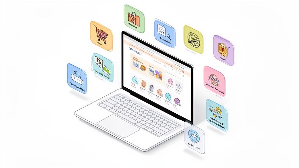
Your ecommerce homepage is your digital storefront, brand ambassador, and top salesperson all rolled into one. In the hyper-competitive world of online retail, getting it right isn't just a design choice; it's a critical business decision that directly impacts your bottom line. An optimized homepage can significantly reduce bounce rates, build immediate trust, and guide visitors seamlessly from browsing to buying. A poorly executed one, however, can turn away potential customers in seconds.
This guide cuts through the noise to provide a prioritized checklist of the 10 most impactful ecommerce homepage design best practices. We'll move beyond generic advice to offer actionable strategies, real-world examples, and CRO-focused tips specifically for ambitious brands looking to scale. For insights into the evolving landscape of digital storefronts, staying informed on current trends is essential. You can explore relevant discussions on ecommerce website design trends to see how the field is shifting.
From establishing a clear value proposition to implementing strategic trust signals and optimizing for mobile, each point is designed to be a concrete, implementable step. Whether you're launching a new store or refining an established one, these insights will help you build a homepage that doesn't just look good, but actively converts. This is your blueprint for transforming a simple welcome mat into a powerful conversion engine. Let's dive into the practices that will define your store's success.
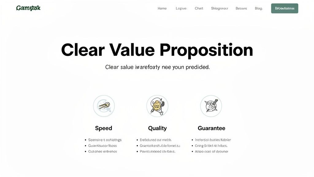
1. Clear Value Proposition and Benefit-Focused Messaging
Your homepage’s primary job is to answer one critical question in under five seconds: "What’s in it for me?" A clear, compelling value proposition placed prominently above the fold is the most crucial element of your ecommerce homepage design best practices. It’s not just a slogan; it’s a concise promise of the value you deliver, differentiating you from competitors and persuading visitors to stay and explore.
This initial messaging must be benefit-focused, not feature-focused. Instead of listing product specs, translate those features into tangible outcomes for the customer. For example, instead of "500-thread count cotton," use "Experience a luxuriously soft and breathable night's sleep." This shift in perspective connects your product directly to the customer's desires and pain points.
How to Implement This Practice
- Craft a Powerful Headline: Your main headline should communicate your biggest benefit. Brands like Dollar Shave Club ("Our blades are f***ing great") use bold, memorable language to convey quality and brand personality instantly.
- Use Supporting Sub-Pillars: Below your main headline, use three or four short phrases with icons to highlight key value drivers like "Free Shipping," "Ethically Sourced," or "Lifetime Guarantee." This makes your benefits scannable.
- Map Features to Benefits: Create a simple two-column chart. In one column, list a product feature. In the next, write down the direct benefit or outcome the customer gets from it. This exercise ensures your copy is always customer-centric.
Actionable CRO & Testing Tips
- Test Headline Variations: Use an A/B testing tool like Google Optimize or VWO to test 3-5 different headline variations monthly. Test emotional appeals vs. logical ones (e.g., "Feel More Confident" vs. "Save 20 Minutes a Day").
- Survey Your Customers: Ask existing customers why they chose you. Use their exact language in your value proposition, as it’s already proven to resonate.
- Optimize for Mobile: With over 60% of traffic coming from mobile, ensure your value proposition is fully visible and readable on smaller screens without any need for scrolling. This is a non-negotiable step.
2. High-Quality Product Imagery and Visual Hierarchy
In ecommerce, your product images are your digital storefront, and first impressions are everything. Visitors can't touch or feel your products, so professional, high-resolution imagery is essential to bridge that gap. A strong visual hierarchy guides the user's eye, drawing attention to hero products, new collections, and promotions, making it a cornerstone of effective ecommerce homepage design best practices.
Strategic use of imagery does more than just display products; it communicates brand quality, builds trust, and helps customers envision the products in their own lives. Lifestyle shots, detailed close-ups, and even user-generated content work together to create a compelling visual narrative that converts browsers into buyers. Brands like Glossier master this by showcasing products on a diverse range of real people, making their brand feel both aspirational and accessible.
How to Implement This Practice
- Invest in Professional Photography: High-quality, consistent photography is non-negotiable. This includes clean product-on-white shots for clarity and lifestyle photos to show your product in a real-world context.
- Establish a Visual Hierarchy: Use a large, compelling hero image to feature your main campaign or best-selling product. Follow this with smaller, well-organized grids or carousels for featured collections or secondary promotions.
- Integrate User-Generated Content (UGC): Showcase photos from real customers to build social proof and authenticity. Tools like Yotpo or Loox can help you collect and display UGC galleries directly on your homepage.
Actionable CRO & Testing Tips
- Optimize Image File Sizes: Large images slow down your site, hurting conversions and SEO. Use tools like TinyPNG or Shopify's built-in compression to reduce file size without sacrificing visual quality. For a deeper dive, explore this complete guide to Shopify image optimization.
- Test Hero Image Variations: A/B test different hero images to see which drives more clicks to key collection pages. Test a lifestyle shot versus a product-focused one, or try different models and settings.
- Implement Lazy Loading: This technique loads images only as the user scrolls down the page, significantly improving initial page load speed, especially for image-heavy homepages. Most modern Shopify themes have this feature built-in.
3. Simplified Navigation and Intuitive User Experience (UX)
If your value proposition hooks a visitor, your navigation determines if they stay. A cluttered, confusing menu is the digital equivalent of a messy, disorganized store; it creates friction and causes potential customers to leave. Implementing simplified navigation is a core tenet of ecommerce homepage design best practices, as it reduces cognitive load and guides users effortlessly toward their desired products.
An intuitive user experience (UX) means a visitor never has to think hard about where to click next. This is achieved through a logical category hierarchy, a prominent search bar, and clear information architecture. With mobile commerce accounting for over 60% of all traffic, a mobile-first approach using elements like hamburger menus and sticky headers is no longer optional, it’s essential for capturing sales and reducing bounce rates.
How to Implement This Practice
- Structure Logical Categories: Organize your products into clear, distinct parent and child categories. A brand like Apple excels here, using broad categories like "Mac," "iPhone," and "Watch" in their main navigation, with more specific models nested logically underneath.
- Implement a "Sticky" Header: A sticky header keeps your main navigation menu and search bar visible at the top of the screen as a user scrolls. This provides persistent access to core site functions, improving usability.
- Use Descriptive, User-Centric Labels: Name your categories using language your customers actually use. Instead of "Footwear," consider "Men's Shoes" and "Women's Shoes." Review your site search data to see what terms shoppers are using.
Actionable CRO & Testing Tips
- Conduct User Testing: Use services like UserTesting.com to watch real people try to find a specific product on your site. Their struggles will immediately highlight friction points in your navigation.
- Analyze Navigation Clicks: Use a heatmap tool like Hotjar to see which menu items get the most and least clicks. This data can inform decisions to remove or reprioritize certain links to declutter the experience.
- Test on Real Mobile Devices: Don't just rely on desktop browser emulators. Test your navigation on actual iOS and Android devices to ensure touch targets are large enough and menus function smoothly. For a deeper dive into optimizing your site’s usability, explore these eCommerce UX best practices.
4. Trust Signals and Social Proof Elements
For a new visitor, your homepage is an unknown territory. Trust signals and social proof are the signposts that tell them your store is credible, your products are high-quality, and their purchase will be secure. This is a fundamental aspect of ecommerce homepage design best practices because it directly addresses and alleviates buyer anxiety, a major cause of cart abandonment. By showcasing positive reinforcement from past customers, you build confidence and reduce the perceived risk of making a purchase.
These elements work by leveraging the psychological principle of social proof, where people conform to the actions of others under the assumption that those actions are correct. Seeing that others have had a positive experience with your brand makes new visitors feel safer. Elements like customer reviews, security badges, and clear return policies signal that you are a legitimate and trustworthy business, which is critical for converting hesitant shoppers into loyal customers.
How to Implement This Practice
- Display Customer Reviews and Ratings: Integrate a reviews platform like Yotpo or Judge.me to display star ratings and written reviews directly on your homepage. Showcase your best reviews in a dedicated testimonials section.
- Showcase Security and Payment Badges: Place recognizable logos like Norton Secured, McAfee, PayPal, Visa, and Mastercard in your site's footer. This assures customers their payment information is safe.
- Highlight Guarantees and Policies: Clearly feature trust-building policies like a "30-Day Money-Back Guarantee" or "Free & Easy Returns" in a prominent banner or near your primary calls to action.
Actionable CRO & Testing Tips
- Test Placement and Format: A/B test the location of your trust signals. Try placing a key testimonial directly below your main call-to-action versus in a carousel lower on the page to see which drives more clicks.
- Leverage User-Generated Content (UGC): Add a feed of customer photos from Instagram using a specific hashtag. Visual proof of real people enjoying your products is often more powerful than a simple text review.
- Incorporate Video Testimonials: Test replacing a static testimonial section with a short video compilation of happy customers. Videos can be more engaging and feel more authentic, potentially leading to a significant lift in conversions.
5. Strategic Call-to-Action (CTA) Placement and Design
Your homepage can have stunning visuals and persuasive copy, but without clear, compelling calls-to-action (CTAs), visitors won't know what to do next. Strategic CTA design is a cornerstone of ecommerce homepage design best practices because it transforms passive browsing into active engagement. Effective CTAs guide users through the buying journey, from exploration to purchase, acting as signposts for your desired user flow.
The key is to create a visual hierarchy. Primary CTAs, like "Shop Now" or "Explore the Collection," should be impossible to miss. They need to stand out with contrasting colors, commanding size, and action-oriented copy. Secondary CTAs, such as "Learn More" or "Read Our Story," cater to users not yet ready to buy, offering them an alternative path to engagement without distracting from the main conversion goal.
How to Implement This Practice
- Design for Visual Prominence: Your primary CTA button should use a high-contrast color that isn't used extensively elsewhere on the page. Ample whitespace around the button will also draw the eye directly to it.
- Use Action-Oriented Copy: Instead of passive words like "Submit," use strong, benefit-driven verbs. "Get Your Free Trial" or "Start Designing" are much more compelling because they communicate a clear outcome for the user.
- Create a CTA Hierarchy: Differentiate primary and secondary CTAs. For example, your main "Shop All" button could be a solid, vibrant color, while a secondary "Learn More" button could be a ghost button (outline only) or a simple text link.
Actionable CRO & Testing Tips
- A/B Test Button Copy: Test different phrases to see what resonates. Pit "Shop Now" against "Explore Bestsellers" or first-person copy like "Get My Discount" against "Get Your Discount."
- Experiment with Color and Contrast: Test your primary brand color against a completely different accent color for your main CTA buttons. Sometimes the button that "breaks" the brand palette performs best because it stands out.
- Check Mobile Tap Targets: Ensure your buttons are at least 48x48 pixels on mobile devices to be easily tappable. A button that’s too small or too close to other elements will frustrate users and lower conversions.
6. Personalization and AI-Driven Content Recommendations
In a crowded market, a one-size-fits-all homepage no longer cuts it. Modern shoppers expect experiences tailored to their unique interests and past behaviors. Leveraging AI and machine learning to deliver personalized content is one of the most powerful ecommerce homepage design best practices for boosting engagement and conversions. This involves dynamically showing different product recommendations, banners, and offers based on real-time user data.
This strategy transforms your homepage from a static catalog into a personal shopper. By analyzing browsing patterns, purchase history, and even traffic sources, you can showcase the most relevant products to each visitor. For a first-time visitor from a specific ad campaign, you might show a tailored welcome offer, while a returning customer might see new arrivals in a category they previously purchased from. This relevance significantly increases the chances of a visitor finding something they love, leading to higher average order value and lifetime value.
How to Implement This Practice
- Segment Your Audience: Start with simple behavioral segmentation. Create distinct homepage experiences for "first-time visitors," "returning customers," and "VIP loyalty members." This is the foundational step for any personalization strategy.
- Implement Personalization Tools: Integrate a personalization engine like Nosto, Dynamic Yield, or use the AI features within tools like Klaviyo. These platforms handle the complex data analysis and allow you to easily build rules for dynamic content.
- Use First-Party Data: Your most valuable asset is your own customer data. Use purchase history, on-site searches, and viewed products to power recommendation carousels like "Recommended for You" or "Because You Viewed..." directly on the homepage.
Actionable CRO & Testing Tips
- Test Personalization vs. a Control Group: Always run A/B tests to measure the real impact of your personalization efforts. Compare a dynamic, personalized homepage against your standard static version to quantify the lift in key metrics like conversion rate and AOV.
- Personalize by Traffic Source: Create unique homepage banners and hero sections for visitors arriving from different channels. Someone clicking from a Facebook ad about a specific product collection should see that collection featured prominently.
- Leverage Exit-Intent Personalization: For visitors showing signs of leaving your site, trigger an exit-intent popup with a personalized offer. This could be a discount on an item in their cart or a special offer related to products they just viewed.
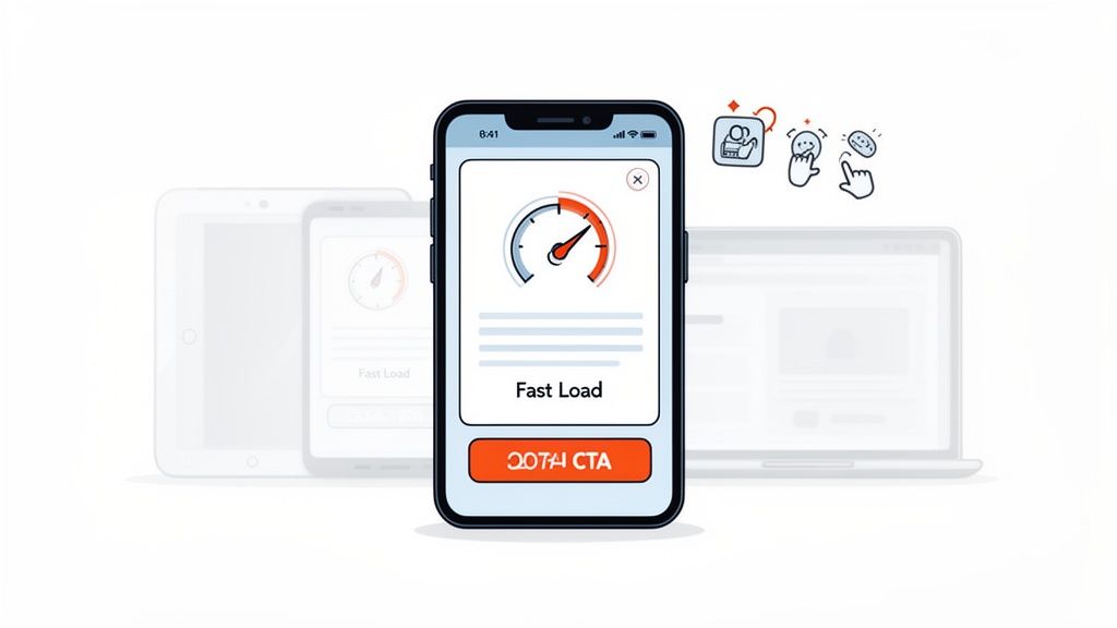
7. Mobile-First Responsive Design and Performance Optimization
With over 65% of ecommerce traffic originating from mobile devices, a mobile-first approach is no longer a recommendation; it's a fundamental requirement. This practice involves designing your homepage for the smallest screen first, then progressively enhancing it for larger screens like tablets and desktops. This ensures that the core user experience is seamless and effective for the majority of your visitors, which is a critical aspect of ecommerce homepage design best practices.
Focusing on mobile-first design forces you to prioritize essential content and functionality, leading to a cleaner, faster, and more conversion-focused experience for all users. It encompasses responsive layouts that adapt to any screen size, touch-friendly navigation, and, most importantly, blazing-fast performance. A slow-loading mobile site is one of the quickest ways to lose a potential customer and damage your search engine rankings.
How to Implement This Practice
- Choose a Performance-Optimized Theme: Start with a foundation built for speed. Shopify's free themes like Dawn are built with performance and mobile responsiveness as a top priority, meeting modern web standards out of the box.
- Prioritize Above-the-Fold Content: On mobile, screen real estate is precious. Ensure your value proposition, primary call-to-action, and search bar are immediately visible without scrolling.
- Implement Touch-Friendly Navigation: Use large, easily tappable buttons, provide ample spacing between clickable elements to prevent mis-taps, and use intuitive mobile navigation patterns like a prominent hamburger menu.
- Optimize All Images: Use modern image formats like WebP, which offers superior compression compared to JPEG or PNG. Use Shopify apps or manual tools to compress images without sacrificing quality, and implement lazy loading so images below the fold only load as the user scrolls.
Actionable CRO & Testing Tips
- Audit Your Core Web Vitals: Regularly use Google's PageSpeed Insights to measure your site's performance. Aim for a Largest Contentful Paint (LCP) under 2.5 seconds, a First Input Delay (FID) under 100 milliseconds, and a Cumulative Layout Shift (CLS) under 0.1.
- Test on Real Devices: Browser emulators are useful, but nothing beats testing on actual iOS and Android devices. This helps you identify real-world usability issues, touch target problems, and performance bottlenecks that emulators might miss.
- Minimize Code Bloat: Audit your installed Shopify apps and remove any that are unused or slowing down your site. Minify CSS and JavaScript files to reduce their size and improve load times. A Content Delivery Network (CDN), often included with Shopify plans, helps deliver assets faster to users globally.
8. Prominent Search Functionality and Smart Filtering
For stores with more than a handful of products, a powerful search bar is not an accessory; it's a critical conversion tool. Shoppers who use site search are often high-intent buyers who know what they want. Making this tool prominent and intelligent is a cornerstone of modern ecommerce homepage design best practices, as it directly reduces friction and shortens the path to purchase.
An effective search experience goes beyond a simple query box. It includes features like autocomplete, typo tolerance, and smart, faceted filtering that allow users to quickly narrow down vast catalogs. By helping visitors find exactly what they're looking for without frustration, you transform the search bar from a simple utility into a guided selling assistant that boosts both user satisfaction and revenue.
How to Implement This Practice
- Make the Search Bar Unmissable: Position the search bar in the header, making it instantly visible on every page, especially the homepage. Use a descriptive placeholder text like "Search for products, brands..." to guide users.
- Implement Advanced Search Features: Integrate a powerful search app like Algolia, Searchspring, or Klevu into your Shopify store. These tools provide essential features like "Did you mean?" suggestions for misspellings, live search results with product images, and synonym matching.
- Design Smart Filtering (Faceted Search): On your search results page, provide filters relevant to your products, such as size, color, brand, price range, and customer ratings. Best Buy excels at this, showing visual filters with product counts for each option, which helps manage customer expectations.
Actionable CRO & Testing Tips
- Analyze "No Results" Searches: Regularly review your site search analytics to identify queries that return zero results. This data is a goldmine for discovering product demand, customer vocabulary (e.g., they search "sneakers" but you use "trainers"), and potential new product categories.
- Test Search Bar Placement and Design: A/B test different search bar designs. Try a simple icon versus a full search box, test different placeholder text, or experiment with placing it in the center of the header versus on the right side.
- Enable Multi-Select Filtering: Allow users to select multiple options within a single filter category (e.g., check boxes for both "Blue" and "Green"). This gives customers more control and flexibility when refining their search, mirroring the experience on sites like Amazon.
9. Strategic Promotional Banners and Urgency Messaging
Your homepage needs to create excitement and guide visitors toward a purchase. One of the most effective ecommerce homepage design best practices for achieving this is using strategic promotional banners and urgency messaging. These elements communicate time-sensitive offers, scarcity, and exclusive deals, creating a psychological nudge that encourages immediate action instead of procrastination.
A well-placed banner for a flash sale or free shipping threshold grabs attention without being intrusive. When paired with genuine urgency, such as a countdown timer or low-stock alerts, it transforms passive browsing into active shopping. This tactic leverages FOMO (Fear of Missing Out), a powerful motivator that can significantly shorten the path to conversion by highlighting the immediate value of making a purchase now.
How to Implement This Practice
- Design Non-Intrusive Banners: Use a sticky bar at the top of the page (a "hello bar") for site-wide offers like "Free shipping on orders over $50." This keeps the promotion visible as users scroll without disrupting their journey. For flash sales, a more prominent hero-section banner is appropriate.
- Integrate Real-Time Urgency: Use countdown timers for promotions that have a clear end date, like a Black Friday sale. For popular products, implement dynamic inventory messaging like "Only 3 left in stock!" to create scarcity and encourage a quick decision.
- Be Clear and Specific: The offer must be instantly understandable. Instead of a vague "Sale On Now," use actionable language like "Get 25% Off All T-Shirts - Ends Midnight." Clarity removes friction and makes the value proposition obvious.
Actionable CRO & Testing Tips
- A/B Test Banner Placement: Test a top sticky banner against a hero-section banner or even a subtle pop-up. Measure the click-through rate (CTR) and conversion lift for each placement to find what works best for your audience.
- Experiment with Urgency Language: Test different phrases to see what resonates. Compare "Sale ends in 24 hours" with "Last chance for 30% off." Small changes in copy can have a significant impact on performance.
- Segment Your Promotions: Don't show the same offer to everyone. Use analytics to show a "Welcome! Get 10% Off Your First Order" banner to new visitors and a different, loyalty-focused promotion to returning customers.
10. Conversion-Optimized Footer and Checkout Integration
Often overlooked, the website footer is a powerful tool for conversion, trust-building, and navigation. While visitors don't start there, many scroll down to find essential information not present in the main navigation. A well-structured footer acts as a safety net, providing answers to last-minute questions, reinforcing trust, and offering secondary conversion opportunities, making it a critical component of ecommerce homepage design best practices.
This bottom-of-the-page real estate should be meticulously organized to serve multiple functions. It guides lost users, builds confidence by displaying security badges and accepted payment methods, and supports your SEO strategy with valuable internal links. It’s the final impression you leave on a visitor, and a strong footer can be the difference between a bounce and a conversion.
How to Implement This Practice
- Organize into Columns: Structure your footer into 3-5 clear columns with distinct headings like "Shop," "About Us," "Customer Service," and "Connect." This makes information scannable and easy to locate.
- Include a Compelling Newsletter CTA: Instead of a generic "Subscribe," use benefit-driven copy like "Get 10% Off Your First Order" or "Be the First to Know About New Arrivals." This simple change can significantly boost sign-ups.
- Display Trust and Security Signals: Prominently feature accepted payment method logos (Visa, PayPal, etc.) and security badges (Norton, McAfee). Also, include clear links to your shipping, returns, and privacy policies to eliminate customer uncertainty. Zappos famously builds trust by highlighting its "Free Shipping & Returns" policy directly in its footer.
Actionable CRO & Testing Tips
- Heatmap Analysis: Use a tool like Hotjar or Crazy Egg to see what links visitors are actually clicking on in your footer. Demote or remove underused links and give more prominence to popular ones.
- Test Newsletter Copy: A/B test different calls to action for your email signup. Test an offer-based CTA ("Get 10% Off") against a community-based one ("Join Our Insider Community").
- Mobile Footer Usability: On mobile, ensure your footer columns are collapsible using accordion menus. This prevents an endless scroll and allows users to quickly find the section they need without overwhelming the small screen.
10-Point Ecommerce Homepage Best Practices Comparison
Transforming Your Homepage from a Page into a Performance Engine
We've journeyed through the ten pillars of high-converting homepage design, from establishing a crystal-clear value proposition to optimizing the often-overlooked footer. It's crucial to understand that these aren't just isolated checklist items; they are interconnected components of a single, powerful system designed to guide, persuade, and convert. A well-executed homepage doesn't just look good; it acts as your brand's hardest-working employee, operating 24/7 to make a stellar first impression and initiate a profitable customer journey.
The core takeaway is that a successful homepage is a living entity. Implementing these ecommerce homepage design best practices is not a one-and-done project but the beginning of a continuous cycle of improvement. The digital landscape and consumer expectations are constantly evolving, and your homepage must evolve with them. What resonates with your audience today might need refinement tomorrow. This is where a commitment to data-driven decision-making becomes non-negotiable.
Key Takeaways and Your Path Forward
Let's distill our comprehensive guide into actionable priorities. Your immediate focus should be on creating a frictionless and trustworthy experience.
- Clarity and Trust First: Before anything else, ensure your value proposition is instantly understood and your site radiates credibility. High-quality imagery, prominent trust signals, and clear, benefit-focused messaging are the foundation upon which all other optimizations are built.
- Intuitive Navigation is Non-Negotiable: A user who can't find what they're looking for is a lost customer. Simplify your main navigation, ensure your search functionality is robust, and critically evaluate the mobile experience. Mobile-first design isn't a trend; it's the standard.
- Guide the Action with Strategic CTAs: Every element on your homepage should purposefully lead visitors toward a desired action. Your calls-to-action must be visually distinct, compellingly worded, and strategically placed to align with the user's journey.
Embracing Continuous Optimization
Mastering these concepts transforms your perspective. You stop seeing your homepage as a static digital storefront and start viewing it as a dynamic performance engine. The goal is to move beyond simply having a homepage to architecting a conversion-focused experience. Each change you make is a hypothesis, and every user interaction provides valuable data to validate or challenge that hypothesis.
To measure the real-world impact of your homepage redesign efforts, you need to track your key metrics diligently. To gauge the effectiveness of your design and identify areas for improvement, utilizing a practical conversion rate calculator can be an invaluable tool. It helps quantify the results of your A/B tests and demonstrates the tangible ROI of investing in superior design. This iterative process of testing, learning, and optimizing is what separates good ecommerce sites from great ones. By consistently applying these ecommerce homepage design best practices, you are building more than just a page; you are building a resilient, adaptable, and highly profitable engine for growth.
Ready to transform your Shopify homepage into a conversion powerhouse but need an expert partner to execute? ECORN offers a flexible, subscription-based design and development service built for ambitious brands. Get unlimited access to a world-class team to implement these best practices, run A/B tests, and continuously optimize your most critical digital asset. Discover ECORN and start building a homepage that works as hard as you do.


User Generated Content Strategy: Shopify Playbook

Shopify Pause and Build Plan Cost: A Complete 2026 Guide
Compare at Price on Shopify: A Complete Guide for 2026
Where Can I Sell My Prints? 10 Best Platforms for 2026
Shopify Order Management System: The Ultimate Guide 2026
What Is Marketing Attribution? an eCommerce Guide for 2026
10 Best Black Friday Sales Sheets for 2026

Discover the Top Social Media Marketing Agencies For
Consumer Confidence Definition for eCommerce in 2026
What Is Social Commerce? Your 2026 Guide to Boosting Sales
A Social Ad Campaign Playbook for eCommerce Growth

7 Best FAQ Page Examples for SaaS & eCommerce

Market Research in Fashion Industry: A Guide for Shopify

Shopify Migration Services: Expert Guide for 2026
Mastering FB Retargeting Ads for Shopify in 2026
What Is Omnichannel Ecommerce

Master Your Shopify Plus Migration: The 2026 Guide
Shopify Integration Services: A Merchant's 2026 Guide
Shopify Collection Description: A Guide to SEO & Sales
Shopify Plus Contact: Reach Sales & Support Effectively

Top Luxury Shopify Stores: Design & UX Strategies
How to Improve Customer Experience: A Shopify Roadmap
Creative Facebook Ads: 10 Examples for Shopify Brands

Remarketing with Facebook Ads: A Shopify Guide for 2026

SEO Linking Strategies for Shopify Stores
Top 7 Statistics YouTube Channels for eCommerce in 2026

Hiring Shopify Plus Designers: A Founder's Guide
Shopify Product Variation: Master Your Variants for 2026

Leverage Ai Solutions Brands: Your 2026 Shopify Growth Guide
Filters in Shopify: A Guide for Growing Brands

Shopify Plus Developer: A Guide for Growing Brands

When Does Black Friday Online Start? A 2026 Guide
Black Friday Email Marketing: Shopify & Klaviyo Guide

Polaris Design System: The Complete Shopify Guide

How to Hire a Consultant Email Marketing Expert

What Is Q4? A Shopify Merchant's Guide to Peak Season

Marketing Organization Structure for eCommerce Growth

Top Account-Based Marketing Agency Guide for 2026

7 Remarketing Ad Examples for Your 2026 Campaigns

AI Retail Solutions: Boost Your Shopify Store

Migrate to Shopify: The Definitive 2026 Guide
Shopify Authentication App: A Guide for Secure Stores
Why Strategic Marketing Is Important for Growth in 2026
How to Create a Size Chart in Shopify: 2026 Guide

Shopify Themes for Jewelry: The Definitive 2026 Guide

Minimal Shopify Templates: Faster, Higher-Converting Stores
Maximize Profit: Shopify CC Fees 2026 Guide

Best Shopify Apps for Beginners in 2026

How to Improve Online Shopping Experience in 2026

Shopify Design and Development Services: A 2026 Guide

Small Business Social Media Marketing Agency: A Hiring Guide
Bulk Edit Shopify: A Guide to Save Hours on Store Updates

2026 Trends in Food and Beverage Industry
Post Purchase Survey Guide for Shopify Stores

How to Build an Ecommerce Brand in 2026
Conversion Rate Optimization for Ecommerce: Maximize Profit
How to Use Customer Data to Increase Sales: A Guide

Shopify for Enterprise: The 2026 Deep Dive Guide

Email Marketing Agencies: The Guide for Shopify Brands
Boost Sales With The Right Shipping Shopify App
Your Guide to the Shopify Site Map

7 Headless Commerce Examples for 2026

Mastering Trends in Cosmetic Industry for 2026
Transfer Shopify to BigCommerce The Complete 2026 Playbook

What Is Shopify Collective? Your 2026 Guide to Success

Unlock Shopify Growth with Site Link SEO

Integrating Shopify and WordPress A Complete Guide for 2026

Naming a Clothing Store: A Shopify Founder's Playbook

Guide to buying shopify store in 2026
Buying shopify store: Buying a Shopify Store: Invest Wisely

Food & Beverage Marketing: A Complete Guide for 2026
Facebook Ads Agency: A Shopify Brand's Hiring Guide

Shopify Apparel Stores: A 2026 Launch & Scale Guide
How to Deactivate Shopify Store: The 2026 Guide

Shopify and Square: The 2026 Ultimate Comparison
Your Guide to Beauty Products Ecommerce

A Guide to Marketing for Beauty Brands in 2026
Your Guide to Facebook Black Friday Ads
Facebook Ad Ecommerce for Shopify Growth

Iconography Web Design The Definitive Guide for Shopify Stores

A Modern Backlinks SEO Strategy for Shopify Stores
How to Launch an Online Store: A Step-by-Step Success Guide
Optimize Shopify Store: Master Performance in 2026

Successful Migration for Shopify: Protect SEO & Grow

Maximize Traffic & Sales: Get Your Free Website Audit Report
Master the Best Ads Facebook Formats for eCommerce Success

How to Find the Best Ecommerce Agency Near Me in 2026
10 Crucial White Hat Techniques SEO for Shopify in 2026
How to Reduce Returns and Boost Profits in Your eCommerce Store
What Is Ecommerce Personalization A Guide to Unlocking Growth

Payment gateways in shopify: The Ultimate Guide for Merchants 2026
Fulfillment services for shopify: Scale Your Ecommerce Brand

Shopify Landing Page Examples: 7 Winning Templates to Boost Conversions
How to Create Urgency in Sales on Shopify

The Best Review Apps for Shopify to Drive Growth in 2026
The Best Ecommerce Platform for Startups in 2026
Choosing Ecommerce Website Design Packages A Complete Guide

Shopify Plus Partners: Guide to shopify plus partners for 2026 growth

How to Find serp feature opportunities: Win SERP Snippets in 2026
Selling on Etsy vs eBay A Guide for eCommerce Brands in 2026


newsletter in your inbox