Picking a Shopify theme isn’t just about finding a pretty design. It’s a strategic decision. You need to nail down your business needs (like budget and catalog size), think hard about the user experience and mobile design, and finally, double-check the technical performance and app compatibility.
Getting this groundwork right ensures your theme becomes a long-term asset, not a temporary fix you'll regret in six months.
Aligning Your Theme With Your Business Strategy
Before you even think about browsing the Shopify Theme Store, the most important work happens internally. Your theme isn’t just a skin; it's the entire operational skeleton for your online store. Get this right from day one, and you'll save yourself from the massive headache of a costly migration later on.
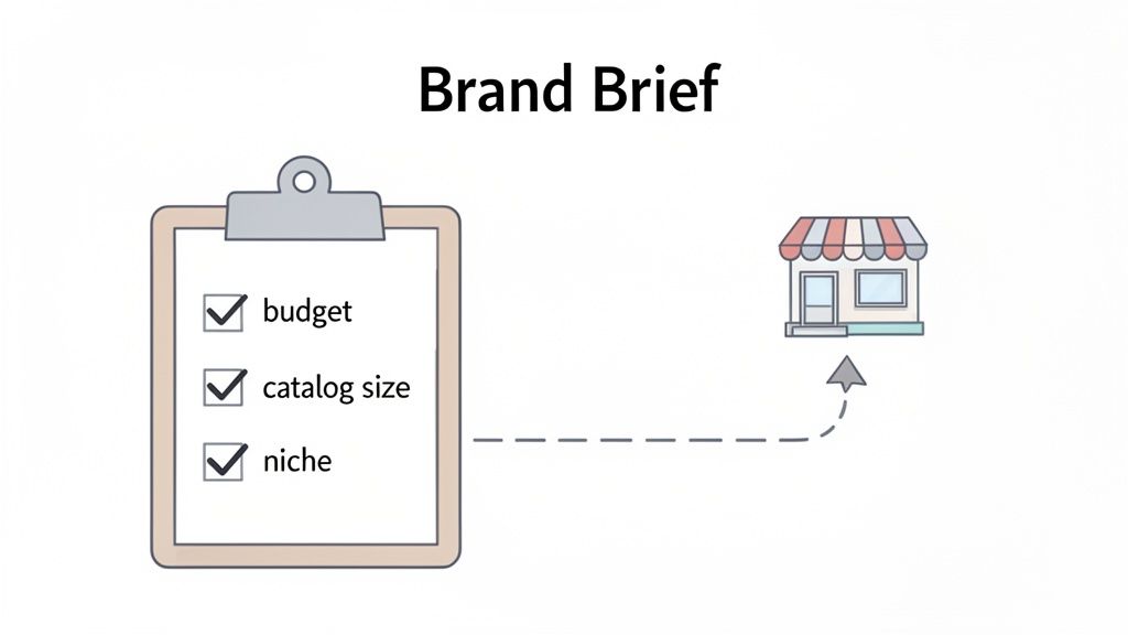
The first move is to put together a simple "theme brief." Think of it as a checklist of your absolute must-haves. This document will be your filter, letting you instantly discard themes that don't fit and zero in on the ones that actually make sense for your business now—and in the future.
Define Your Core Business Constraints
Every business has its guardrails, and these will heavily shape your theme choice. The most obvious one is your budget. Sure, free themes like Dawn are fantastic and surprisingly powerful. But a paid theme (usually $180-$350) often packs in features that would otherwise require multiple monthly app subscriptions, saving you money in the long run.
Beyond the price tag, your catalog size is a huge factor. A shop with five core products needs a completely different setup than a retailer juggling 5,000 SKUs.
- Small Catalogs (1-50 products): You can go all-in on themes that offer immersive, visually stunning product pages. High-quality media and powerful brand storytelling features should be at the top of your list.
- Large Catalogs (500+ products): Your priority shifts to discoverability. Look for themes with best-in-class filtering, a powerful search function, and mega-menus. The goal is to help customers navigate thousands of items without feeling overwhelmed.
It's also smart to zoom out and confirm Shopify is the right platform for your scale. A quick look at Shopify alternatives can help you understand its position in the market and solidify your choice.
Articulate Your Brand Identity
Your theme is your brand’s digital handshake. What vibe are you going for? A clean, minimalist aesthetic is perfect for a modern skincare line, while a rugged, textured design might be a better fit for an outdoor apparel company.
But don't stop at colors and fonts. Think about the entire brand experience.
Your theme should feel like a natural extension of your products and your mission. If your brand is about simplicity and ease of use, a complex, feature-heavy theme will create a disconnect for your customers.
For instance, a luxury watch brand requires a theme that showcases high-resolution images and video, creating an atmosphere of sophistication and trust. A discount retailer, on the other hand, needs a theme that immediately communicates "great deals" with bold sale banners and crystal-clear pricing.
Map Your Ideal Customer Journey
Finally, step into your customer's shoes. How do they actually shop? Map out their journey from the moment they land on your site to the second they complete a purchase. A great theme makes this path feel effortless.
Ask yourself some tough questions. Do your customers typically browse by collection, or do they use the search bar for something specific? Is your business driven by promotions that need a prominent announcement bar? Do you rely on in-depth blog content to educate buyers before they pull the trigger?
A brand selling custom-configured furniture, for example, needs a theme with top-notch support for product variants, maybe even a visual builder. In contrast, a subscription box service needs a theme that plays nicely with recurring payment apps and features a clean, simple customer portal. When you map these paths out first, you’re not just picking a theme—you’re engineering a conversion machine.
Moving Beyond Aesthetics to Prioritize User Experience
It’s incredibly easy to get sucked in by a theme’s demo. They’re all designed to impress with gorgeous photos and flashy animations. But a beautiful store that’s confusing to use is just an expensive art project—it won’t make you any money.
The real test of a theme is how it performs under pressure. Can it guide a first-time visitor smoothly from the homepage all the way to checkout? This is where user experience (UX) takes center stage, and it's far more important than looks alone.
A theme’s UX is the invisible architecture of your entire sales process. It’s what helps customers find what they need, understand your products, and trust you enough to pull out their wallets. Bad UX creates friction, and friction absolutely kills conversions. In fact, one study found that 70% of online businesses fail because of bad usability, so this isn't a detail you can afford to gloss over.
Analyzing a Theme Demo Through Your Customer's Eyes
The single best way to evaluate a theme’s UX is to stop thinking like a store owner and start acting like a customer. Seriously, open a theme demo and give yourself a specific mission.
Pretend you’re looking for a blue, medium-sized t-shirt.
Now, try to complete that mission, taking notes along the way. Is the main menu clear and logical? Can you find the search bar without hunting for it? When you search, are the filtering options actually helpful? This simple exercise will quickly reveal a theme's biggest strengths and weaknesses.
During your test drive, pay close attention to these critical UX elements:
- Navigation and Menus: You want clear, uncluttered header navigation. Mega-menus can be fantastic for large, complex inventories, but a simple dropdown might work much better for a small, curated catalog.
- Search and Filtering: A powerful search function is non-negotiable. Test it with common misspellings or synonyms for your products. On collection pages, check if the filtering tools are robust enough for what you sell (e.g., filtering by size, color, brand, and price).
- Product Page Layout: Does the layout put the most important information front and center? High-quality images, a clear price, and an obvious "Add to Cart" button should be immediately visible. Your key selling points shouldn't be buried "below the fold."
Connecting Layout Choices to Conversion Goals
Different business models require completely different layouts. A theme packed with huge, edge-to-edge photography is probably perfect for a luxury fashion brand selling an aspirational lifestyle. The goal there is immersion, creating an emotional connection through visuals.
On the other hand, a store selling thousands of auto parts needs a theme built for efficiency, like Warehouse. Its UX prioritizes function over form, offering list-view options and advanced filtering to help customers quickly find the exact part they need. The layout directly serves the conversion goal: making a high volume of search-intensive purchases as easy as possible.
Your theme's layout isn't just decoration; it's a strategic tool. The placement of your call-to-action buttons, the clarity of your product galleries, and the simplicity of your checkout flow are all UX decisions that directly impact your bottom line.
Don't Forget the Mobile Experience
With over 60% of ecommerce sales now happening on mobile devices, a theme's mobile UX isn't just important—it's everything.
Don't just resize the browser window on your computer to test this. That's not good enough. You need to open the theme demo on your actual smartphone.
Navigate the site with just your thumb. Can you easily tap menu items and buttons? Is the text readable without having to pinch and zoom? Most importantly, go through the entire checkout process on your phone. A clunky, confusing mobile checkout is one of the biggest reasons for cart abandonment.
A seamless mobile flow isn't a nice-to-have feature; it's a fundamental requirement for any modern online store.
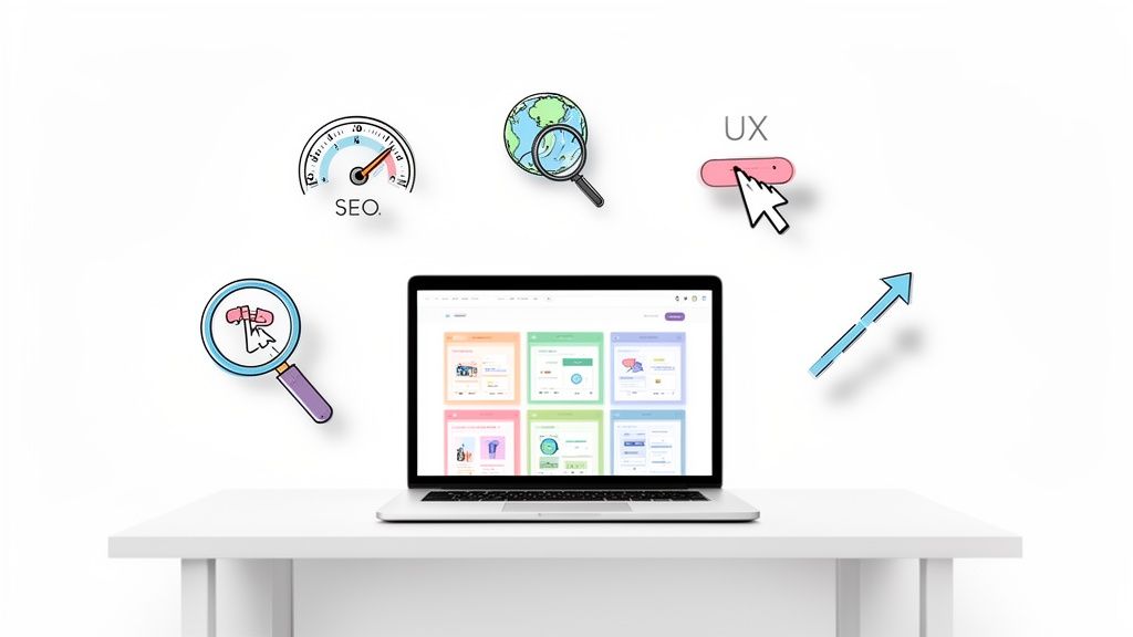
Auditing Technical Performance and SEO Readiness
A beautiful theme means nothing if it’s sluggish or invisible to Google. In ecommerce, speed is money, and solid SEO is how you stay in the game. The theme's technical foundation is the engine under the hood—if you get this wrong, you'll be fighting an uphill battle with bad conversions and weak traffic forever.
This is the part where you have to look past the slick demo sites and get your hands dirty with the code and performance data. A slow, bloated theme will quietly bleed sales and poison your search rankings over time, no matter how good it looks.
Putting Speed to the Test
Your first job is to audit for speed. A mere one-second delay in page load time can slash conversions by 7%. That's a staggering loss for any merchant. Before you even think about buying a theme, you need to run its demo store through some real-world tests.
Google’s PageSpeed Insights is your best friend for this. Just grab the URL from the theme’s demo store and let it rip. Pay close attention to the Core Web Vitals scores, because these are metrics Google uses directly for ranking.
Here's what to look for:
- Largest Contentful Paint (LCP): How fast does the main content show up? You want this under 2.5 seconds.
- First Input Delay (FID): How quickly can a user actually interact with the page? Aim for under 100 milliseconds.
- Cumulative Layout Shift (CLS): Does the content jump around while loading? Annoying, right? Google thinks so too. A score below 0.1 is what you're after.
And don't just test the homepage. Run these reports on product and collection pages, too. Those are often much heavier and are where your customers make their buying decisions. If you're serious about this, our guide on Shopify page speed optimization dives into even more advanced techniques.
Vetting a Theme for SEO Best Practices
A fast theme is a huge head start, but it also needs a rock-solid SEO structure to have any chance of ranking. This boils down to clean, logical code that search engines can easily crawl and understand. You don’t need to be a developer to check the basics.
When you're looking at a theme's demo, keep an eye out for these essential SEO features:
- Logical Heading Structure: The page title must be an
<h1>. Main sections should be<h2>tags, and their subsections should be<h3>. This simple hierarchy tells Google what's important on the page. - Schema Markup Readiness: This is just structured data that helps search engines create "rich results"—things like star ratings and prices showing up right in the search results. Any modern, quality theme should have this baked in.
- True Mobile-First Design: It needs to be genuinely responsive, not just a shrunken-down desktop site. The mobile experience must feel native, fast, and optimized for tapping and swiping.
Think of your theme's code as the blueprint for your store. If that blueprint is a confusing mess, search engines will get lost. They won't understand what your store is about, making it nearly impossible to rank for anything meaningful.
Checking for Long-Term Health and Scalability
Finally, think about the theme's long-term prospects. You're not just buying a theme; you're entering a relationship with its developer. Look for the theme's changelog or update history. Are they pushing out regular updates to fix bugs, boost performance, and stay compatible with Shopify's latest features?
This kind of foresight is what separates successful stores from struggling ones. The data shows that merchants on Shopify Plus doing between $1 million and $500 million in revenue are growing at an average of 126% year-over-year. To handle that kind of growth, larger stores gravitate toward robust themes like Dawn, Warehouse, and Stiletto.
Choosing a theme with active, reliable support today ensures it won't hold you back tomorrow, saving you from a painful and expensive migration down the road. You can dig into more Shopify growth trends on Omnisend to see just how critical this is.
Future-Proofing Your Store With App Compatibility
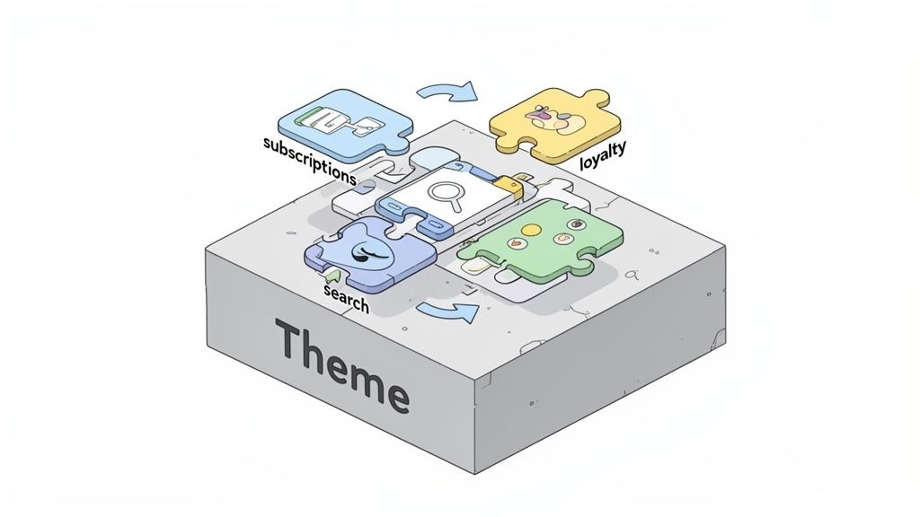
Think of your theme as the chassis of your ecommerce car. But it’s the apps that are the engine, transmission, and GPS—the parts that actually get you where you want to go. A stunning theme that breaks your most important apps is a complete non-starter. Thinking about this synergy before you commit to a theme is the secret to avoiding technical headaches later on.
Imagine this: you've just launched a gorgeous new theme, only to find out it conflicts with your subscription app, causing billing errors for your most loyal customers. This isn't just a scary story; it's a common and expensive mistake I’ve seen merchants make time and again. Checking for compatibility upfront ensures your theme supports, not sabotages, your store's core functions.
Auditing Your Current and Future App Needs
Before you can check if a theme is compatible, you need to know exactly what you’re working with. Pull together a simple list of every single app your store currently relies on.
Once you have your list, split it into two categories: "must-haves" and "nice-to-haves." Your subscription manager, loyalty program, and advanced search are probably non-negotiable. That app you use for the occasional promotional pop-up? That might be more flexible.
Now, look to the future. What new features are on your roadmap for the next 12-18 months?
- Product Personalization: Are you planning to let customers add custom engravings or monograms?
- Wholesale Portal: Will you be launching a B2B channel that demands separate pricing structures?
- International Expansion: Will you need apps for things like currency conversion and multi-language support?
This forward-thinking audit gives you a complete picture of the technical demands your new theme will face. It turns your search from a simple design hunt into a strategic technical evaluation—a key part of choosing a Shopify theme that will actually last.
Investigating Theme and App Integration
With your app inventory ready, it’s time to play detective. The burden of proof is on the theme developer to show their product works with the ecosystem. Your first stop should always be the theme's official documentation or its page in the Shopify Theme Store.
Many top-tier themes will proudly list popular apps they're built to integrate with seamlessly. If your must-have apps are on that list, that’s a fantastic sign. If not, you need to dig deeper.
Comb through the theme’s reviews, specifically searching for keywords related to your essential apps (e.g., "Recharge," "Klaviyo," "Searchanise"). Look for patterns. One negative review could just be an isolated case, but five of them complaining about the same conflict signals a real problem.
Don't just assume compatibility. A theme might technically "work" with an app, but completely break its styling or drag your site speed into the mud. The goal isn't just basic functionality; it's a smooth, professional, and fully integrated experience for your customers.
When you're not sure, just ask. Send a concise email to the theme developer with your list of must-have apps and ask point-blank if there are any known conflicts. A reputable developer will be transparent with you.
Assessing Code Flexibility for Future Customizations
Finally, you have to consider the theme's bones—its underlying structure. Some themes are built like closed systems, making them a nightmare to customize. Others are designed to be flexible foundations that developers can easily build upon. This becomes absolutely critical when you need a custom feature that no off-the-shelf app can provide.
Look for themes that advertise things like "developer-friendly code," "clean sections," or "extensive documentation." These are all good indicators that the theme was built for modification.
For example, a seemingly simple customization like adding a unique "back to blog" button can turn into a huge project if the theme is missing a standard article.json template file. This kind of structural flaw can prevent Shopify's theme editor from working as expected, forcing you into complex and costly developer workarounds. Choosing a theme with a solid, conventional code structure gives you the freedom to evolve without being trapped by its limitations.
Making Your Final Decision With Confidence
Alright, you've put in the hard work. You’ve analyzed everything from brand alignment to technical performance and narrowed it down to a handful of strong contenders. Now it’s time to make the final call. This last step is less about broad-strokes comparison and more about a meticulous, hands-on audit to make sure your chosen theme can actually walk the walk.
Think of it like the final inspection before buying a house. You've seen the glossy photos and read the specs; now you need to get in there, turn on the faucets, and check for any hidden cracks. This is how you move from a gut feeling to a data-backed decision you can feel good about.
Stress-Testing the Full Customer Journey
A theme demo is designed to look perfect—it's the best-case scenario. Your job is to push it to its limits. Don't just click around the homepage. You need to simulate the entire customer journey from start to finish, on both desktop and mobile.
For each of your final theme candidates, try to complete these exact actions:
- Homepage to Product: Can you easily get from the main landing page to a specific product? Test both the main navigation menu and any featured collection sections. Is it intuitive?
- Product Interaction: Add something to the cart. What happens? Is the notification clear and obvious? Play around with product variants, test the image zoom, and see how the full description is displayed.
- Cart to Checkout: Go to your cart. How easy is it to update quantities or remove an item? Proceed all the way through the checkout, step by step, right up until you'd enter payment details.
- Discovery and Search: Use the search bar for both a specific product name and a general term like "blue shirt." Go to a collection page and mess with the filters. Does it feel slick or clunky?
This end-to-end walkthrough is where you'll spot the little points of friction that kill conversions. A clunky cart update or a confusing mobile checkout page are red flags you can only find by actually using the theme like a real customer would.
Scrutinizing Reviews and Developer Support
Recent theme reviews are a goldmine of real-world feedback, but you have to read them with a critical eye. Filter for reviews from the last six months, because anything older might be talking about a version of the theme that no longer exists.
Look for patterns, not just star ratings. Are multiple merchants reporting the same bug after a recent Shopify update? That’s a major warning sign. On the flip side, is the developer’s support team consistently praised for being responsive and genuinely helpful? Or are people complaining about getting ghosted?
Dig deeper than just the reviews and check out the developer’s official support policy.
- What are their guaranteed response times?
- Do they offer support for customizations or conflicts with third-party apps? (Many don't.)
- Is their documentation actually helpful, or is it just a bunch of jargon?
A beautiful theme with terrible support is a liability waiting to happen. You’re not just buying a piece of code; you’re investing in a long-term partnership with the developer. Make sure they’ll have your back when things go wrong.
Theme Selection Decision Matrix
To keep this decision as objective as possible, use a simple scoring matrix. This helps you cut through the noise and compare your top themes side-by-side using the criteria that truly matter to your business.
Use this matrix to score your top theme candidates against key criteria. Rate each factor from 1 (poor) to 5 (excellent) to get a clear, data-driven comparison.
This process forces you to be brutally honest about each theme's strengths and weaknesses. Tally up the scores, and you’ll have a clear winner based on your own priorities, not just on which demo looked the prettiest.
Ultimately, remember that the "perfect" theme doesn't exist. Your goal is to find the one that scores highest on the factors that drive your specific business goals.
Your final choice should feel strategic and confident. The Shopify ecosystem is massive, with over 2.8 million live stores choosing from a vast library of themes. The market is split pretty evenly, with 50-60% of merchants investing in paid themes that typically cost $180-$350. For new stores, a proven free theme is a fantastic starting point—our guide on the best free themes on Shopify can help you find a great one. For established brands, the high adoption of premium themes shows a clear return on investment when they find the right fit.
Common Questions About Choosing a Shopify Theme
As you zero in on a theme, you'll probably have a few nagging questions. These are the practical, "what-if" scenarios that can mean the difference between picking a good theme and the right theme. Getting these final questions answered is key to feeling confident about the long-term reality of running your store.
Making that final call can feel like a huge commitment, but a simple process can cut through the noise. This flowchart breaks down the essential steps, from building a shortlist and playing with demos to digging into what actual users are saying in reviews.
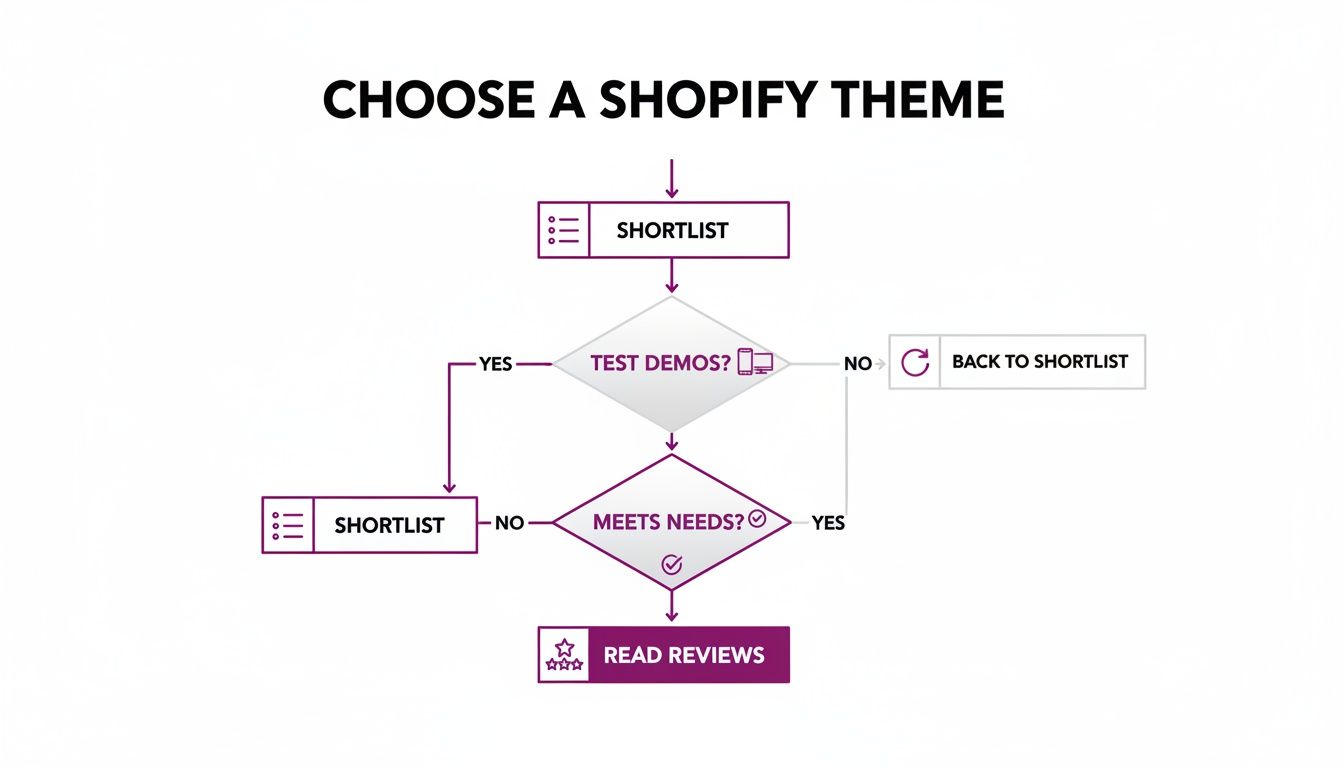
The idea here is simple: each step filters out the themes that aren't a good fit, leaving you with only the strongest contenders.
Can I Change My Shopify Theme Later?
Yes, you absolutely can, and it's a totally normal part of a brand's journey. But—and this is a big but—it’s not as simple as flipping a switch. Switching themes is a full-blown project that needs careful planning if you want to avoid messing up your live site.
A new theme doesn't magically inherit all the custom code, app settings, or unique page layouts from your old one. You have to set everything up again from scratch.
The only safe way to do this is in a "staging" environment, away from live customers. Just duplicate your current theme and work on the unpublished copy. Tinker with it, perfect it, and only then should you think about going live.
Before you hit publish on the new theme, do a complete backup of your store. No exceptions. Once it's live, run a thorough SEO audit to make sure all your meta titles, descriptions, and internal links are intact. The last thing you want is for a fresh look to tank your search rankings.
Are Paid Shopify Themes Worth The Investment?
This is the classic "it depends" answer, but it really does hinge on where your business is today and where you want it to be tomorrow. Paid themes aren't automatically better; they just solve a different set of problems.
Free themes, especially Shopify's own Dawn theme, are incredibly well-built. They're fast, clean, and more than capable of supporting a new business or one that's starting to find its footing. If you're working with a tight budget, starting free is a smart move.
The real value in a paid theme usually boils down to two things:
- Built-in Features: A premium theme might come with a mega-menu, colour swatches, or a "quick view" function already built in. This could save you from paying for three or four separate apps, each with its own monthly fee.
- Dedicated Support: When you buy a theme, you're also buying a direct line to the developers. That support can be a lifesaver when you hit a weird bug or find an app that doesn't play nice with your site.
For an established brand looking to squeeze more conversions out of their store with specific functionality, the one-time cost of a paid theme is often a no-brainer investment that pays for itself in short order.
How Does My Theme Choice Affect Site Speed?
Your theme has a massive impact on site speed. It’s the foundation everything else is built on. A theme bloated with heavy JavaScript, messy code, or massive default images will be slow, period.
Look for themes that are explicitly marketed as "performance-optimized." The developers behind these themes prioritize clean, efficient code. Before you buy anything, take the theme's demo store and run it through Google PageSpeed Insights. This gives you a raw, unbiased look at its real-world performance.
But remember, the theme is only half the story. What you do matters just as much. Even the fastest theme in the world will grind to a halt if you overload it with apps, upload huge uncompressed images, or slap on custom scripts without a second thought. A fast site starts with a good theme, but it's maintained through disciplined store management.
Ready to build a store that not only looks great but actually converts? The team at ECORN specializes in Shopify design, development, and conversion rate optimization. We're here to help you choose the right foundation and scale your business with confidence. Explore our Shopify solutions today.


What Is Marketing Attribution? an eCommerce Guide for 2026

10 Best Black Friday Sales Sheets for 2026

Discover the Top Social Media Marketing Agencies For

Consumer Confidence Definition for eCommerce in 2026

What Is Social Commerce? Your 2026 Guide to Boosting Sales

A Social Ad Campaign Playbook for eCommerce Growth

7 Best FAQ Page Examples for SaaS & eCommerce

Market Research in Fashion Industry: A Guide for Shopify

Shopify Migration Services: Expert Guide for 2026

Mastering FB Retargeting Ads for Shopify in 2026

What Is Omnichannel Ecommerce

Master Your Shopify Plus Migration: The 2026 Guide

Shopify Integration Services: A Merchant's 2026 Guide

Shopify Collection Description: A Guide to SEO & Sales

Shopify Plus Contact: Reach Sales & Support Effectively

Top Luxury Shopify Stores: Design & UX Strategies

How to Improve Customer Experience: A Shopify Roadmap

Creative Facebook Ads: 10 Examples for Shopify Brands

Remarketing with Facebook Ads: A Shopify Guide for 2026

SEO Linking Strategies for Shopify Stores

Top 7 Statistics YouTube Channels for eCommerce in 2026

Hiring Shopify Plus Designers: A Founder's Guide

Shopify Product Variation: Master Your Variants for 2026

Leverage Ai Solutions Brands: Your 2026 Shopify Growth Guide

Filters in Shopify: A Guide for Growing Brands

Shopify Plus Developer: A Guide for Growing Brands

When Does Black Friday Online Start? A 2026 Guide

Black Friday Email Marketing: Shopify & Klaviyo Guide

Polaris Design System: The Complete Shopify Guide

How to Hire a Consultant Email Marketing Expert

What Is Q4? A Shopify Merchant's Guide to Peak Season

Marketing Organization Structure for eCommerce Growth

Top Account-Based Marketing Agency Guide for 2026

7 Remarketing Ad Examples for Your 2026 Campaigns

AI Retail Solutions: Boost Your Shopify Store

Migrate to Shopify: The Definitive 2026 Guide

Shopify Authentication App: A Guide for Secure Stores

Why Strategic Marketing Is Important for Growth in 2026

How to Create a Size Chart in Shopify: 2026 Guide

Shopify Themes for Jewelry: The Definitive 2026 Guide

Minimal Shopify Templates: Faster, Higher-Converting Stores

Maximize Profit: Shopify CC Fees 2026 Guide

Best Shopify Apps for Beginners in 2026

How to Improve Online Shopping Experience in 2026

Shopify Design and Development Services: A 2026 Guide

Small Business Social Media Marketing Agency: A Hiring Guide

Bulk Edit Shopify: A Guide to Save Hours on Store Updates

2026 Trends in Food and Beverage Industry

Post Purchase Survey Guide for Shopify Stores

How to Build an Ecommerce Brand in 2026

Conversion Rate Optimization for Ecommerce: Maximize Profit

How to Use Customer Data to Increase Sales: A Guide

Shopify for Enterprise: The 2026 Deep Dive Guide

Email Marketing Agencies: The Guide for Shopify Brands

Boost Sales With The Right Shipping Shopify App

Your Guide to the Shopify Site Map

7 Headless Commerce Examples for 2026

Mastering Trends in Cosmetic Industry for 2026

Transfer Shopify to BigCommerce The Complete 2026 Playbook

What Is Shopify Collective? Your 2026 Guide to Success

Unlock Shopify Growth with Site Link SEO

Integrating Shopify and WordPress A Complete Guide for 2026

Naming a Clothing Store: A Shopify Founder's Playbook

Guide to buying shopify store in 2026

Buying shopify store: Buying a Shopify Store: Invest Wisely

Food & Beverage Marketing: A Complete Guide for 2026

Facebook Ads Agency: A Shopify Brand's Hiring Guide

Shopify Apparel Stores: A 2026 Launch & Scale Guide

How to Deactivate Shopify Store: The 2026 Guide

Shopify and Square: The 2026 Ultimate Comparison

Your Guide to Beauty Products Ecommerce

A Guide to Marketing for Beauty Brands in 2026

Your Guide to Facebook Black Friday Ads

Facebook Ad Ecommerce for Shopify Growth

Iconography Web Design The Definitive Guide for Shopify Stores

A Modern Backlinks SEO Strategy for Shopify Stores

How to Launch an Online Store: A Step-by-Step Success Guide

Optimize Shopify Store: Master Performance in 2026

Successful Migration for Shopify: Protect SEO & Grow

Maximize Traffic & Sales: Get Your Free Website Audit Report

Master the Best Ads Facebook Formats for eCommerce Success

How to Find the Best Ecommerce Agency Near Me in 2026

10 Crucial White Hat Techniques SEO for Shopify in 2026

How to Reduce Returns and Boost Profits in Your eCommerce Store

What Is Ecommerce Personalization A Guide to Unlocking Growth

Payment gateways in shopify: The Ultimate Guide for Merchants 2026
Fulfillment services for shopify: Scale Your Ecommerce Brand
Shopify Landing Page Examples: 7 Winning Templates to Boost Conversions
How to Create Urgency in Sales on Shopify

The Best Review Apps for Shopify to Drive Growth in 2026

The Best Ecommerce Platform for Startups in 2026
Choosing Ecommerce Website Design Packages A Complete Guide
Shopify Plus Partners: Guide to shopify plus partners for 2026 growth

How to Find serp feature opportunities: Win SERP Snippets in 2026
Selling on Etsy vs eBay A Guide for eCommerce Brands in 2026

10 Proven Sample Email Campaigns for Shopify to Boost Sales in 2026

A Winning Digital Content Marketing Strategy for Shopify in 2026

Top 7 Best Shopify Agencies to Scale Your Business in 2026

Ecommerce Website Development Cost in 2026 A Realistic Guide

10 Advanced Link Building Tips for eCommerce Brands in 2026


newsletter in your inbox