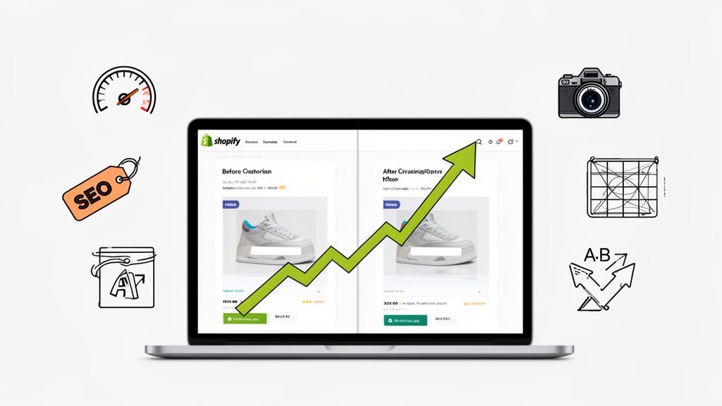
Optimizing your Shopify product page is all about taking every single element—your copy, your images, the page speed, the user experience—and tuning it to get as many sales as possible. It's the make-or-break moment that turns casual browsers into paying customers. The best pages nail three things: clarity, persuasion, and a dead-simple path to checkout.
Why Most Product Pages Fail to Convert
Getting traffic to your Shopify store is only half the battle. The real challenge, and where I see so many stores stumble, is turning those hard-won clicks into actual sales. It's a common story: you pour your budget into ads, get people to the page, and then... they leave. This isn't just bad luck; it’s a sign of a broken bridge between your product and your customer.
The gap between a store that just exists and one that truly thrives is almost always found on the product pages. Too many brands treat them like a digital catalog—a list of features, a price, and a button. They fail because they’re missing the essential ingredients that make someone want to buy.
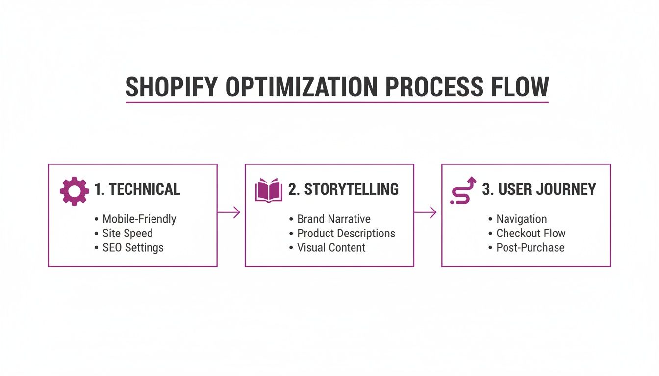
Before we dive into the specific tactics, it's crucial to understand the foundational pillars that separate a failing page from a high-converting one. I've broken them down into a simple framework to guide your optimization efforts.
Core Pillars of Shopify Product Page Optimization
Mastering these three areas isn't just about tweaking a button color; it's about building a comprehensive, persuasive experience from the ground up. Now, let's explore the core principles that bring these pillars to life.
The Three Pillars of a High-Converting Page
Getting your product page right isn't about finding one magic bullet. It’s about getting three core areas to work together seamlessly to build trust and drive action.
- Rock-Solid Technical Performance: A slow page is a conversion killer. Full stop. If a visitor has to wait, they’re gone before they even see how great your product is.
- A Story That Sells: Your page needs to do more than just list specs. It must tell a story, solve a real problem for the customer, and forge an emotional connection that makes them feel the value of what you’re selling.
- A Frictionless User Journey: The path from landing on the page to clicking "Add to Cart" has to be completely intuitive. Any confusion, doubt, or extra effort is an open invitation for them to leave.
One of the biggest reasons product pages fail is that they create friction, which directly leads to people ditching their carts. Fixing your page is the first step, but it’s also critical to know how to reduce cart abandonment and win back lost sales.
Think about a new apparel brand I worked with. They had amazing designs, but their product pages were a mess—stock supplier photos, a slow-loading video, and descriptions that didn't explain the fit or feel. Shoppers would land, get confused by the sizing chart, question the quality from the grainy images, and bounce. Their sales funnel was leaking at its most critical point.
In the cutthroat world of eCommerce, speed is everything. The average Shopify store converts at just 1.4%, but the top-tier stores? They hit 4.8% or even higher, largely by ensuring their pages load in under 2 seconds. Every extra second a page takes to load slashes conversions by 0.3%. Pages loading in the 1-2 second sweet spot see a 3.05% conversion rate—that’s three times better than a page that takes five seconds. Discover more insights about Shopify conversion rates.
Fixing these core pillars is how you transform that leaky funnel into a powerful conversion engine.
Nailing the Technical Foundation for Speed and SEO
Before you even think about dazzling customers with slick design and killer copy, you need to get the boring stuff right. The technical foundation of your product page is the absolute bedrock of a successful Shopify store. It's what gets you seen in the first place, acting as your best source of free, high-intent traffic from search engines.
It's a step that countless merchants skip over, but solid technical optimization is where you start to dominate the organic search results. It's wild to think that while SEO can drive up to 65% of a store's traffic, it's an afterthought for 42% of merchants. Little tweaks like optimizing your meta tags can boost click-through rates by 25%, and having the right technicals is key to grabbing a piece of the 54% of clicks that go straight to the top Google positions.
This process really breaks down how everything is connected—technical optimization is the starting line, which then allows your storytelling and user journey to actually have an impact.
The big takeaway here is that each stage supports the next. A fast, well-indexed page makes your compelling copy and smooth user experience that much more powerful.
Master Your On-Page SEO Signals
First up, you need to make your product pages dead simple for both search engines and potential customers to understand at a glance. This all starts with clean, keyword-focused URLs, meta titles, and descriptions that practically beg to be clicked.
Don't just accept Shopify’s default URL structure. A clean URL like /products/womens-merino-wool-crewneck is worlds better than /products/sku-12345-red. It immediately signals relevance to Google and users.
Your meta title is your single most important on-page SEO element—it's that blue link everyone sees in the search results. A great formula to follow is: Primary Keyword | Secondary Benefit | Brand Name. For example: "Women's Merino Wool Crewneck | Ultra-Soft & Breathable | Aspen Apparel". It’s clear, informative, and includes your brand.
Finally, the meta description is your 160-character sales pitch. While it doesn't directly affect rankings, it has a massive impact on whether someone clicks your link or your competitor's. Use it to shout out key benefits, mention free shipping, or create a little urgency. Think of it as free ad copy.
Prioritize Blazing-Fast Page Speed
Page speed isn't just some techy metric; it’s a massive factor for user experience and, ultimately, your conversion rate. Google's Core Web Vitals are the key metrics here, measuring real-world user experience and directly influencing your search rankings.
Here are the three vitals you need to obsess over:
- Largest Contentful Paint (LCP): How long it takes for the biggest element on the page (usually your main product image) to load. You want this under 2.5 seconds.
- First Input Delay (FID): The time it takes for the page to respond when a user first interacts with it, like clicking a button. Aim for less than 100 milliseconds.
- Cumulative Layout Shift (CLS): This measures visual stability. A low CLS score means elements aren't annoyingly jumping around as the page loads.
"A one-second delay in page response can result in a 7% reduction in conversions. For an ecommerce site making $100,000 per day, a 1-second page delay could potentially cost you $2.5 million in lost sales every year."
This really drives home the point: every millisecond counts. Faster pages mean lower bounce rates, happier customers, and better rankings.
Actionable Steps for a Faster Shopify Store
Getting your Core Web Vitals in shape usually boils down to a few key moves. One of the biggest wins is learning how to properly optimize images for web, which helps pages load quickly without turning your photos into pixelated mush.
Next, it's time for a ruthless app audit. Shopify apps are great, but every single one adds code that can slow your store down. Get rid of any apps you're not actively using. For the ones you can't live without, dig into their settings to see if they offer any performance-friendly loading options.
Finally, make sure you're using lazy loading for images and videos. This smart technique waits to load media until a user actually scrolls down to it, which dramatically speeds up the initial page load and gives your LCP score a serious boost. Most modern Shopify themes have this built-in, but there are apps that can handle it too. To really go deep on this, check out our complete guide on image optimization for Shopify.
Crafting Persuasive Content That Drives Action
A technically perfect, lightning-fast page gets shoppers in the door. But it's your content that convinces them to stay, browse, and ultimately, buy. This is where we pivot from the science of SEO to the art of persuasion.
It’s all about creating a connection. Great content doesn’t just list specs; it sells an experience. It shows customers how your product solves a problem, makes their life easier, or brings them a little bit of joy.
This means shifting your focus from what your product is to what your product does for the customer.
Honestly, moving from features to benefits is probably the single most powerful tweak you can make to your product pages.
Writing Product Descriptions That Sell
Think of your product description as your best salesperson, working 24/7. Its main job isn't just to inform—it's to persuade. Too many Shopify merchants fall into the trap of writing descriptions that read like a user manual, full of jargon that fails to create any real desire.
Don't lead with "100% Pima cotton." Instead, try something like, "Experience a softness so incredible, it feels like a second skin." One is a feature; the other is a benefit that taps into emotion. This kind of language helps shoppers feel what it's like to own your product.
A simple but effective formula is to structure your copy like a mini-story:
- The Problem: Touch on a pain point your customer knows all too well.
- The Solution: Introduce your product as the hero that solves it.
- The Transformation: Paint a picture of the amazing outcome or feeling they'll get.
This narrative hook creates an emotional bond that a bulleted list of features just can't match. For a deeper dive, check out our full guide on writing product descriptions that convert.
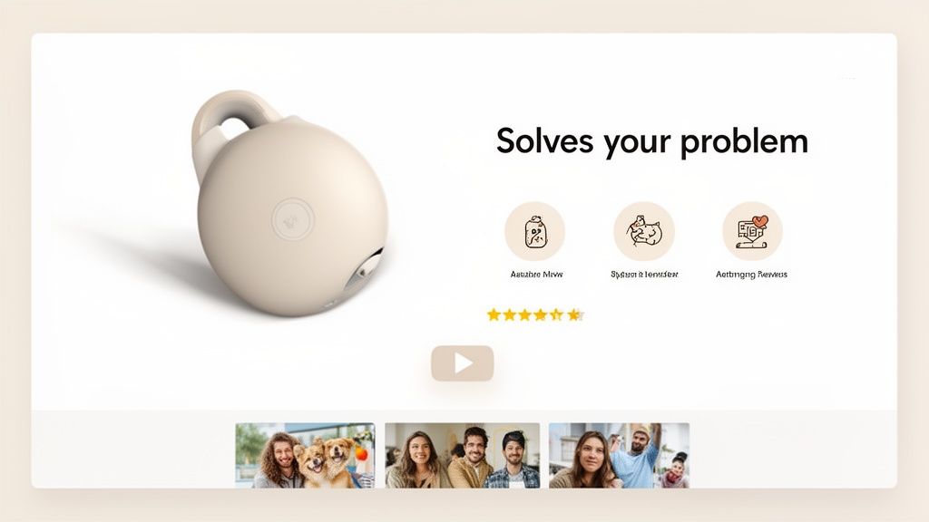
Leveraging Visuals to Build Trust and Desire
Words are crucial, but visuals seal the deal. In eCommerce, high-quality photos and videos aren't a luxury—they're a necessity. Customers can’t touch your product, so your media has to do all the heavy lifting to show off its quality and value.
Your visual arsenal should include:
- High-Res Studio Shots: Clean, perfectly lit images from every angle on a simple background.
- Lifestyle Photos: Show your product in a real-world setting, helping customers see it in their own lives.
- Close-Up Shots: Highlight the details—the texture, the stitching, the craftsmanship.
- Product Videos: A short video is often more powerful than a dozen photos. It can show how something works, its actual size, and its benefits in action.
Video, in particular, is a game-changer. A quick 30-second demo can answer a ton of questions and ease any hesitation a customer might have before buying.
Harnessing Social Proof and Schema Markup
What you say about your products is important. But what other customers say is often far more powerful. Social proof, like reviews and user-generated content (UGC), is one of the most potent conversion tools you have.
Make sure customer reviews are front and center on your product page. Featuring photos and videos from real customers adds a layer of authenticity that slick, branded content can never quite achieve. It’s proof that people out there are using and loving your stuff.
Want to take it up a notch? Implement Schema markup for your reviews and FAQs. This is structured data that tells search engines what your content is about. Google often rewards this with rich snippets—those little star ratings or dropdown Q&As you see in search results. They grab attention and can seriously boost your click-through rates.
By weaving together benefit-driven copy, stunning visuals, and genuine social proof, you turn a simple product page into a conversion machine. Every piece works together to build trust, eliminate doubt, and guide the shopper straight to that "Add to Cart" button. It's this comprehensive approach that defines modern Shopify product page optimization.
Designing a High-Trust User Experience
An exceptional product page experience feels completely effortless. It doesn't just display a product; it guides a potential customer from curiosity to confidence, making the decision to buy feel natural and easy. We're going to break down the anatomy of a layout that builds that essential trust and moves users seamlessly toward checkout.
This isn't about simple aesthetics. It’s about strategic design choices that have a direct, measurable impact on your conversion rates. The goal is to eliminate friction, answer questions before they're even asked, and make the shopper feel secure every step of the way.
Building a Mobile-First Visual Hierarchy
With the majority of eCommerce traffic now coming from mobile devices, a "mobile-first" approach isn't just a buzzword—it's a requirement for survival. This means designing for the smallest screen first, ensuring the most critical information is immediately visible without any pinching or zooming.
Think about the user's thumb zone. Your add-to-cart button needs to be large, high-contrast, and ridiculously easy to tap. Product images must be swipeable, and variant selectors for size or color should be simple dropdowns or tappable swatches, not tiny radio buttons nobody can hit on the first try.
On mobile, a clean visual hierarchy looks like this:
- Product Title and Price: Positioned prominently at the very top.
- Primary Product Image: The first thing the user sees.
- Call-to-Action (CTA): Immediately visible "above the fold."
- Key Trust Signals: Things like "Free Shipping" or star ratings, placed near the CTA.
This focused layout ensures that even on a small screen, the user knows exactly what they're looking at and what to do next.
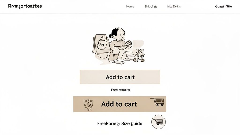
Placing Trust Signals Where They Matter Most
Trust is the currency of eCommerce. A visitor who feels uncertain about your store's legitimacy or policies will never become a customer. You build this trust by strategically placing signals that communicate security and reliability right where the action happens.
Don't bury these elements in your footer where they'll never be seen. They need to be visible right where the buying decision is being made—near the add-to-cart button.
Key Takeaway: Shoppers often look for reassurance right before committing to a purchase. Placing trust badges for secure payments (like Visa, Mastercard, PayPal) or guarantees (like "30-Day Money-Back Guarantee") directly below your CTA can significantly reduce hesitation and cart abandonment.
This small design choice acts as a final nudge, assuring the customer that their purchase is safe and risk-free. It's a simple but powerful component of effective Shopify product page optimization.
To get this right, you need to nail a handful of key UX elements. This table breaks down the essentials, why they matter, and how to implement them in your Shopify store.
Essential UX Elements for High-Converting Product Pages
By checking off these elements, you're not just designing a page; you're building a trustworthy, friction-free path to purchase that works for you 24/7.
Eliminating Friction with Clear Information
Every unanswered question in a shopper's mind is a point of friction that can kill a sale. Your product page should be a comprehensive resource that anticipates and answers these questions proactively. In short, clarity is your best conversion tool.
Start by making your policies impossible to miss. A customer shouldn't have to hunt for your shipping or return information. Display it clearly using icons or short text snippets right there in the product description area.
Consider these essential friction-reducers:
- Clear Shipping Details: Don't just say "Free Shipping." Specify the threshold, like "Free Shipping on Orders Over $50." If you offer expedited options, show those costs upfront.
- Hassle-Free Return Policy: Use reassuring language like "Easy 30-Day Returns." This simple phrase removes the perceived risk of making a bad purchase.
- Comprehensive Size Guides: For apparel or anything fitted, a detailed size guide with measurements and international conversions is non-negotiable. Even better, include a model's height and the size they're wearing for context.
- An On-Page FAQ: Add a simple accordion or tabbed section to answer the top 3-5 questions you get about that specific product. This keeps users on the page instead of sending them on a hunt for a separate FAQ page they might never come back from.
By designing a user experience that prioritizes trust and clarity, you transform your product page from a static catalog entry into a dynamic, persuasive sales tool that works for you around the clock.
Using Data to Fuel Continuous Improvement
Getting your product page live isn't the finish line. Frankly, it's just the starting gun. The best Shopify stores aren't static catalogs; they're dynamic, constantly evolving conversion engines. The secret? They don't rely on gut feelings or what "looks good." Every decision is backed by cold, hard data.
This is where you graduate from just building the page to truly understanding how your customers use it. Forget blindly changing button colors and hoping for a miracle. It’s time to learn how to spot the weak points, form educated guesses about how to fix them, and then test those ideas like a scientist.
This commitment to testing is what separates the amateur sellers from the pros. It’s the final, and most important, piece of the Shopify product page optimization puzzle.
Setting Up Your Analytics Dashboard
You can't fix what you can't measure. Your analytics tell a story about what’s clicking with customers and what’s making them click away. The trick is to tune out the noise—the vanity metrics that look impressive but don't actually drive action—and focus on what truly matters for a product page.
For this, Shopify Analytics and Google Analytics (GA4) are your two best friends. Shopify gives you a quick, at-a-glance view of your conversion rates, while GA4 lets you go much deeper into the why behind user behavior.
Here are the essential KPIs you should have on your product page scorecard:
- Conversion Rate by Device: Is your mobile conversion rate trailing way behind desktop? That’s a massive red flag pointing to a clunky user experience on smaller screens.
- Add-to-Cart Rate: This is your "purchase intent" metric. If people are visiting but not adding to the cart, your call-to-action, price, or product description just isn't sealing the deal.
- Bounce Rate: While GA4 has changed how we look at this, the core idea is the same. A high number of users leaving without doing anything suggests the page isn't what they expected, or worse, it's taking forever to load.
- Average Time on Page: Are visitors sticking around long enough to actually read your copy and look through the images? If they're gone in a few seconds, something is seriously wrong.
Pro Tip: Create a simple dashboard that tracks just these four metrics for your top 10 product pages. Make it a habit to check it every single week. This routine will quickly show you which pages are bleeding money and need your attention first.
A Practical Guide to A/B Testing
Once your data flags a potential problem area, A/B testing (or split testing) is how you find the cure. The idea is simple: you show two different versions of your page to two different groups of visitors at the same time. Then you see which version gets more people to do what you want, like clicking "Add to Cart."
The real challenge isn't the technical side of running the test; it's figuring out what to test to get the biggest bang for your buck. Don't waste your time testing 50 shades of green on your CTA button. Go for the big swings first.
Here’s a priority list of what to test for maximum impact:
- Your Headline & Value Prop: It's the first thing people read. Test a headline that sells the benefit ("Finally, a T-Shirt That Breathes With You") against one that just states the feature ("100% Organic Cotton T-Shirt").
- Product Images: The main image is everything. Does a lifestyle shot of someone enjoying your product outperform a sterile studio photo on a white background? Test it and find out.
- The Call-to-Action (CTA): Before you ever touch the color, test the words. A simple "Add to Cart" might feel standard, but a more urgent "Buy Now & Ship Today" could create the urgency you need.
- Social Proof Placement: Don't bury your five-star reviews at the bottom of the page. Try pulling them up directly under the product title and see what happens to your add-to-cart rate.
- Product Description Format: Is your audience a "just the facts" crowd or do they want a story? Test a short, snappy description with bullet points against a more detailed, narrative-style paragraph.
Tools like Shogun or VWO make it surprisingly easy to set these tests up without having to bother a developer. My advice? Start small. Pick one high-traffic product and run one test. Let it run until your testing tool tells you there's a "statistically significant" winner.
By methodically testing these high-impact elements, you stop guessing and start knowing. Every winning test gives you a small lift in conversions. Over time, these small wins stack up, compounding into serious revenue growth and turning your product pages into finely tuned assets that work for you around the clock.
Common Questions About Shopify Product Page Optimization
Even with the best guide in hand, you're bound to run into some specific questions when you start digging in. I've been there. This section is your go-to reference for those common "what about..." moments that pop up during Shopify product page optimization.
Let's clear up the practical, real-world questions so you can move forward with confidence.
How Many Product Images Should I Use?
There's no single magic number, but my experience shows the sweet spot is usually between 5 and 8 high-quality images. This gives you enough room to cover all the important angles without overwhelming your customer or bogging down the page speed. It’s all about quality and variety, not just hitting a certain count.
Think of your image gallery as a visual story that answers questions before they're even asked. A winning lineup always includes:
- A clean, primary studio shot on a simple white or neutral background. This is your hero image.
- Lifestyle photos showing the product being used in a real-world setting. Help them picture it in their own lives.
- Close-up detail shots that highlight the texture, materials, or unique craftsmanship.
- An image showing scale. Put it next to a common object or show it on a model so there are no surprises about size.
The goal is to digitally replicate the feeling of holding the product in their hands. Leave no room for doubt.
Should I Use an App for Page Building?
Page builder apps like Shogun or GemPages can be absolute game-changers, especially if you aren't comfortable diving into code. They give you drag-and-drop control to customize your product pages in ways that most standard Shopify themes just can't match.
The biggest win here is speed and flexibility. You can quickly spin up unique layouts, run A/B tests on different designs, and drop in advanced features like countdown timers without ever needing a developer. For agile marketing teams, that's huge.
Now, for the trade-off. These apps do add extra code to your site, which can sometimes slow things down. It's really important to pick a well-built, reputable app and keep a close eye on your Core Web Vitals after you install it. For most stores, the power to control the design and test everything far outweighs the potential performance hiccups.
How Often Should I Update My Product Pages?
This isn't a "set it and forget it" task. Product page optimization is a living, breathing part of your business. As a baseline, you should be reviewing your most important product pages at least quarterly. But some situations should trigger an immediate update.
Think of these pages as living documents that need to evolve with new customer feedback, performance data, and what's happening in the market.
Here are a few triggers that mean it's time for an update right now:
- New Customer Questions: If your support team keeps getting the same question over and over, that's a clear sign you need to add the answer directly to the product page, maybe in an FAQ section.
- Fresh User-Generated Content: Did a customer just leave a glowing five-star review with a fantastic photo? Get that on the page immediately. Social proof is pure gold.
- Performance Dips: If you see in your analytics that a page that used to perform well is suddenly seeing its add-to-cart rate drop, it's time to investigate. Start testing new headlines, images, or calls-to-action.
- Seasonal Relevance: For products that have a seasonal angle, a quick refresh of the copy and images can make a massive difference. Swapping "the perfect summer dress" for "your go-to fall layering piece" keeps it relevant and can give you a nice conversion bump.
Giving your product pages regular attention is a small time investment that pays back big time in sales and customer trust.
At ECORN, we specialize in turning Shopify stores into conversion powerhouses. If you're ready to move beyond guesswork and start making data-driven improvements to your product pages, we can help. Explore our Shopify CRO services today.


Shopify Order Management System: The Ultimate Guide 2026

What Is Marketing Attribution? an eCommerce Guide for 2026

10 Best Black Friday Sales Sheets for 2026

Discover the Top Social Media Marketing Agencies For

Consumer Confidence Definition for eCommerce in 2026

What Is Social Commerce? Your 2026 Guide to Boosting Sales

A Social Ad Campaign Playbook for eCommerce Growth

7 Best FAQ Page Examples for SaaS & eCommerce

Market Research in Fashion Industry: A Guide for Shopify

Shopify Migration Services: Expert Guide for 2026

Mastering FB Retargeting Ads for Shopify in 2026

What Is Omnichannel Ecommerce

Master Your Shopify Plus Migration: The 2026 Guide

Shopify Integration Services: A Merchant's 2026 Guide

Shopify Collection Description: A Guide to SEO & Sales

Shopify Plus Contact: Reach Sales & Support Effectively

Top Luxury Shopify Stores: Design & UX Strategies

How to Improve Customer Experience: A Shopify Roadmap

Creative Facebook Ads: 10 Examples for Shopify Brands

Remarketing with Facebook Ads: A Shopify Guide for 2026

SEO Linking Strategies for Shopify Stores

Top 7 Statistics YouTube Channels for eCommerce in 2026

Hiring Shopify Plus Designers: A Founder's Guide

Shopify Product Variation: Master Your Variants for 2026

Leverage Ai Solutions Brands: Your 2026 Shopify Growth Guide

Filters in Shopify: A Guide for Growing Brands

Shopify Plus Developer: A Guide for Growing Brands

When Does Black Friday Online Start? A 2026 Guide

Black Friday Email Marketing: Shopify & Klaviyo Guide

Polaris Design System: The Complete Shopify Guide

How to Hire a Consultant Email Marketing Expert

What Is Q4? A Shopify Merchant's Guide to Peak Season

Marketing Organization Structure for eCommerce Growth

Top Account-Based Marketing Agency Guide for 2026

7 Remarketing Ad Examples for Your 2026 Campaigns

AI Retail Solutions: Boost Your Shopify Store

Migrate to Shopify: The Definitive 2026 Guide

Shopify Authentication App: A Guide for Secure Stores

Why Strategic Marketing Is Important for Growth in 2026

How to Create a Size Chart in Shopify: 2026 Guide

Shopify Themes for Jewelry: The Definitive 2026 Guide

Minimal Shopify Templates: Faster, Higher-Converting Stores

Maximize Profit: Shopify CC Fees 2026 Guide

Best Shopify Apps for Beginners in 2026

How to Improve Online Shopping Experience in 2026

Shopify Design and Development Services: A 2026 Guide

Small Business Social Media Marketing Agency: A Hiring Guide

Bulk Edit Shopify: A Guide to Save Hours on Store Updates

2026 Trends in Food and Beverage Industry

Post Purchase Survey Guide for Shopify Stores

How to Build an Ecommerce Brand in 2026

Conversion Rate Optimization for Ecommerce: Maximize Profit

How to Use Customer Data to Increase Sales: A Guide

Shopify for Enterprise: The 2026 Deep Dive Guide

Email Marketing Agencies: The Guide for Shopify Brands

Boost Sales With The Right Shipping Shopify App

Your Guide to the Shopify Site Map

7 Headless Commerce Examples for 2026

Mastering Trends in Cosmetic Industry for 2026

Transfer Shopify to BigCommerce The Complete 2026 Playbook

What Is Shopify Collective? Your 2026 Guide to Success

Unlock Shopify Growth with Site Link SEO

Integrating Shopify and WordPress A Complete Guide for 2026

Naming a Clothing Store: A Shopify Founder's Playbook

Guide to buying shopify store in 2026

Buying shopify store: Buying a Shopify Store: Invest Wisely

Food & Beverage Marketing: A Complete Guide for 2026

Facebook Ads Agency: A Shopify Brand's Hiring Guide

Shopify Apparel Stores: A 2026 Launch & Scale Guide

How to Deactivate Shopify Store: The 2026 Guide

Shopify and Square: The 2026 Ultimate Comparison

Your Guide to Beauty Products Ecommerce

A Guide to Marketing for Beauty Brands in 2026

Your Guide to Facebook Black Friday Ads

Facebook Ad Ecommerce for Shopify Growth

Iconography Web Design The Definitive Guide for Shopify Stores

A Modern Backlinks SEO Strategy for Shopify Stores

How to Launch an Online Store: A Step-by-Step Success Guide

Optimize Shopify Store: Master Performance in 2026

Successful Migration for Shopify: Protect SEO & Grow

Maximize Traffic & Sales: Get Your Free Website Audit Report

Master the Best Ads Facebook Formats for eCommerce Success

How to Find the Best Ecommerce Agency Near Me in 2026

10 Crucial White Hat Techniques SEO for Shopify in 2026

How to Reduce Returns and Boost Profits in Your eCommerce Store

What Is Ecommerce Personalization A Guide to Unlocking Growth

Payment gateways in shopify: The Ultimate Guide for Merchants 2026
Fulfillment services for shopify: Scale Your Ecommerce Brand
Shopify Landing Page Examples: 7 Winning Templates to Boost Conversions
How to Create Urgency in Sales on Shopify

The Best Review Apps for Shopify to Drive Growth in 2026

The Best Ecommerce Platform for Startups in 2026
Choosing Ecommerce Website Design Packages A Complete Guide

Shopify Plus Partners: Guide to shopify plus partners for 2026 growth

How to Find serp feature opportunities: Win SERP Snippets in 2026
Selling on Etsy vs eBay A Guide for eCommerce Brands in 2026

10 Proven Sample Email Campaigns for Shopify to Boost Sales in 2026

A Winning Digital Content Marketing Strategy for Shopify in 2026

Top 7 Best Shopify Agencies to Scale Your Business in 2026

Ecommerce Website Development Cost in 2026 A Realistic Guide


newsletter in your inbox