
A lot of Shopify teams hit the same wall at the same stage of growth. The storefront gets redesigned for conversion. The app gets built for operations. Customer accounts get updated later. Admin tools come from a different sprint, a different agency, or a different internal team. The result is one brand with several interface personalities.
Customers notice it. Staff notice it faster.
When account pages, embedded apps, internal tools, and checkout-adjacent flows all behave differently, people stop trusting the interface. They hesitate before clicking. Support gets more tickets for avoidable UI confusion. Product teams waste time debating solved patterns instead of shipping the next useful feature.
That's where the polaris design system matters. Not as a visual layer. As operating discipline for Shopify experiences.
Your Brand's Experience Problem and Its Solution
Growing brands rarely create fragmented UX on purpose. It usually happens because each Shopify surface solves a different business problem. Marketing pushes the storefront. Operations need merchant tools. Support wants faster workflows. Product wants custom account experiences. Every team makes reasonable choices, but the combined result feels inconsistent.
This becomes expensive long before anyone labels it a design-system issue. Teams duplicate components. Developers rebuild form logic. Designers create another card layout because the old one lives in a different file. The brand voice shifts between customer account screens and admin-facing tools. If you haven't documented the relationship between brand rules and UI rules, start there with a practical framework for creating brand guidelines.
What fragmentation looks like in Shopify
A Shopify stack usually spreads across several contexts:
- Admin experiences: Embedded apps, operational dashboards, order tools, merchandising interfaces.
- Customer accounts: Logged-in areas where people manage orders, subscriptions, addresses, and returns.
- Checkout-adjacent surfaces: Flows that need clarity, trust, and very little friction.
- Headless or custom builds: Front ends that may look branded but often lose behavioral consistency.
The problem isn't only visual mismatch. It's interaction mismatch. One form validates inline. Another throws errors after submit. One table supports bulk actions. Another forces one-by-one changes. One page follows Shopify's native logic. Another behaves like a separate SaaS product.
Practical rule: If users have to relearn buttons, forms, or navigation inside the same commerce ecosystem, the system isn't scaled yet.
Why Polaris is the fix
Polaris gives Shopify teams a shared language for interface decisions. That matters because a shared language cuts down debates, reduces rework, and raises the baseline quality of every merchant-facing surface.
The strongest use of Polaris isn't copying components blindly. It's deciding which parts of your Shopify experience should feel native, which should feel branded, and which should stay custom because the business case is stronger than strict consistency.
That distinction is where many teams either overuse Polaris or ignore it. Both create waste.
Used correctly, Polaris helps teams do three things well:
- Ship faster because common interface patterns don't need reinvention.
- Improve trust because users move through familiar, predictable interactions.
- Scale cleanly because design and development stop drifting in different directions.
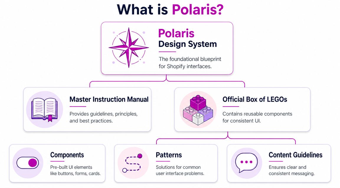
What Is the Polaris Design System
Polaris is Shopify's long-running design system for admin experiences, not just a component library. Public references describe it as the shared design language for Shopify admin applications, with principles centered on consistency, accessibility, and modularity, and its broad component coverage helped establish a reusable UI foundation for the wider Shopify app ecosystem through a single framework available to external developers as well as internal teams, as summarized in this Shopify Polaris overview.
A simple way to think about it is this: Polaris is the instruction manual and the parts bin. It gives teams the rules for how interfaces should behave, and it gives them reusable building blocks to implement those rules.
More than a UI kit
A lot of teams first encounter Polaris as buttons, forms, cards, or layout primitives. That's useful, but incomplete. A real design system also defines what “good” looks like in repeated situations. It tells teams how to structure dense admin screens, how to present feedback, and how to avoid each product area inventing its own logic.
That's why Polaris matters so much in Shopify work. Shopify isn't one website. It's an ecosystem of admin tasks, apps, configuration flows, customer-facing account areas, and platform-native conventions. If your app or operational interface ignores those conventions, it immediately feels off.
Why the history matters
Because Polaris has been public and widely referenced for years, it has shaped expectations inside the Shopify ecosystem. Merchants, partners, and app builders already associate certain interaction patterns with “this feels like Shopify.”
That expectation has practical value:
- For founders: It reduces the risk of shipping a tool that feels foreign inside admin.
- For marketers: It protects trust when teams launch new merchant-facing flows.
- For developers: It shortens the path from design intent to implementation.
- For product teams: It provides reusable patterns instead of one-off UI decisions.
A quick walkthrough helps illustrate how Polaris is framed in practice:
What Polaris is not
Polaris is not a reason to make every Shopify surface look identical. It also isn't a replacement for product thinking. If a workflow is confusing, wrapping it in Polaris components won't save it.
Polaris works best when teams use it as a decision system, not a skin.
That difference becomes important once you move beyond embedded admin apps and start dealing with Shopify Plus, customer accounts, and headless builds.
The Core Principles and Components of Polaris
Polaris is useful because it combines two things teams usually separate. It gives principles that shape decisions, and it gives components that make those decisions repeatable in code.
According to the public system summary, Polaris is Shopify's design system for the admin and is explicitly meant for designers, developers, and app creators. It provides design guidance, code libraries, and API documentation so teams can align UI patterns, implementation details, and merchant-facing behavior against a shared system rather than building ad hoc components, which helps reduce fragmentation across apps and admin surfaces, as outlined by Design Systems Surf's Polaris summary.
The principles that actually matter in build work
Teams often nod at design principles and then ignore them during implementation. That's where quality drops.
In practical Shopify work, these ideas are the ones that affect outcomes most:
- Consistency: A merchant shouldn't have to decode a new interaction model every time they move between pages or tools.
- Accessibility: The component should already support usable states, focus behavior, and readable hierarchy before the team adds custom styling.
- Modularity: Teams need pieces that can be reused across forms, tables, filters, and navigation without copy-pasting logic.
- Clarity: Dense admin experiences still need obvious labels, readable status messaging, and predictable action placement.
If your team works on operational tools, these principles show up in very concrete places: bulk actions, validation behavior, filter chips, pagination, table density, empty states, and error messaging.
The components are only the visible layer
Polaris standardizes broad categories such as forms, feedback indicators, lists and tables, and navigation patterns in the admin ecosystem. Those categories matter because they match the actual work merchants do. They enter data, review records, scan statuses, move between settings, and resolve issues.
Here's how that tends to play out in product work:
| Component area | What it solves | Where teams get into trouble |
|---|---|---|
| Forms | Structured merchant input | Custom validation and inconsistent field spacing |
| Feedback | Status, alerts, confirmation, loading | Overdesigned success states and vague error copy |
| Lists and tables | Data-dense admin workflows | Reinvented row actions and poor bulk editing UX |
| Navigation | Wayfinding across tools and settings | Deep custom menus that don't match Shopify expectations |
Where teams should be strict
Strict adherence makes sense when the interaction is common, repeatable, and merchant-facing inside Shopify admin.
Examples:
- app settings
- onboarding steps inside embedded apps
- order or product management interfaces
- tables, filters, save bars, and alerts
The less original the workflow, the less reason you have to improvise. That's also why teams dealing with operational complexity, including handling high-volume DTC customer changes, usually benefit from stronger system discipline. Repetition amplifies inconsistency.
Repeated workflows should feel boring in the best possible way. Predictability is a feature.
Where principles matter more than components
Not every Polaris decision starts with a component import. Sometimes the value is in following the logic rather than the exact UI primitive. A headless account dashboard, for example, may not use the same implementation stack, but it still benefits from Polaris thinking around hierarchy, action priority, form behavior, and status communication.
That's the point many teams miss. The design system is most valuable when it shapes behavior, not just visuals.
Polaris in Action From Admin to Storefront
The biggest mistake teams make with the polaris design system is assuming it should be applied the same way everywhere. It shouldn't.
Polaris works differently depending on whether you're building inside Shopify Admin, extending Shopify Plus experiences, or creating a headless storefront. The right question isn't “Should we use Polaris?” It's “Which parts of Polaris belong on this surface?”
Admin is Polaris territory
Inside Shopify Admin, Polaris is the native language. Strict adoption in this environment usually pays off fastest.
Partner guidance notes that Polaris encodes interaction and data-display patterns into reusable UI primitives and can be implemented with React or HTML, which lowers integration cost. The same guidance emphasizes the practical effect for merchants and developers: teams don't need to reinvent common admin patterns, and UX consistency improves across multiple storefronts and markets, as described in this overview of Polaris for Shopify app development.
If you're building embedded apps, internal merchant tooling, or operational interfaces, custom UI should be the exception. Native-feeling admin experiences reduce friction because merchants already understand the surrounding environment.
Apps should feel integrated, not branded first
Third-party Shopify apps often fail because they prioritize surface-level branding over familiarity. The logo is polished. The experience isn't.
A strong embedded app usually does three things:
- borrows established admin patterns for forms, navigation, and tables
- keeps custom branding lightweight and intentional
- reserves bespoke UI for differentiated workflows, not common interface elements
Often, founders over-correct. They want the app to “feel like us.” That's fair. But if every modal, status message, and action bar is custom, the app stops feeling trustworthy inside Shopify.
The more your app behaves like Shopify in routine moments, the more credibility you earn in complex moments.
Plus and customer-facing surfaces need a split approach
Shopify Plus changes the conversation because you're often dealing with brand-sensitive experiences, especially in checkout-adjacent flows and customer accounts. Here, strict visual reuse is less important than pattern consistency.
A useful decision model looks like this:
| Surface | Use Polaris components directly | Use Polaris principles | Diverge intentionally |
|---|---|---|---|
| Admin app | Yes, by default | Yes | Rarely |
| Customer accounts | Selectively | Yes, strongly | When brand or journey requires it |
| Checkout-adjacent UX | Selectively, where supported | Yes | Only with strong conversion rationale |
| Headless storefront | Usually no | Yes | Often, but governed |
That last column matters. If you're exploring branded experiments on the storefront, teams should still protect core UX rules. For conversion-focused work, resources on e-commerce CRO for Shopify stores are useful because they reinforce the same principle: change the right variables, not every variable at once.
Headless should borrow discipline, not mimic admin
Headless teams sometimes make two opposite mistakes. One group ignores Polaris entirely because the storefront stack is custom. The other tries to transplant admin-style UI into customer-facing commerce.
Both miss the point.
Headless experiences usually need their own visual language. But they still benefit from the system's habits:
- semantic hierarchy
- predictable action placement
- clean state handling
- accessible forms
- consistent feedback patterns
Use Polaris directly when the user is operating a Shopify-native workflow. Use Polaris as reference when the user is shopping, managing an account, or moving through a brand-led experience.
Advanced Customization Theming and Tokens
Teams often don't break Polaris by customizing it. They break it by customizing it in the wrong layer.
The safest layer for change is the foundation. That usually means design tokens, theming rules, spacing scales, typography decisions, and controlled variants. The most dangerous layer is last-minute component-level override work that solves one screen and gradually creates drift across the rest of the system.
Public Shopify community discussion highlights the fundamental governance challenge here. Shopify positions Polaris as a single UI framework across Admin, Checkout, and Customer Accounts, which creates tension for enterprise teams balancing consistency with surface-specific UX needs. The more useful question for growth-stage brands is how to operationalize Polaris without slowing conversion-focused experimentation, as raised in the Shopify community discussion on Polaris governance.
Theme when the structure is right
If the component already solves the right interaction problem, theme it. Don't rebuild it.
Good candidates for theming include:
- color roles
- type styles
- border radius choices
- spacing adjustments within approved system limits
- icon treatment
- surface emphasis
This is the clean path because it preserves the component's behavior while aligning the interface with the brand. For many brands, that's enough to make admin tools and account-related experiences feel connected to the larger business.
If your team is already reviewing broader Shopify theme customization, use the same mindset here. Change the variables that control consistency first. Reach for bespoke builds only when the underlying pattern itself no longer fits.
Extend when the workflow is real and repeatable
Extension is different from one-off customization. You extend Polaris when a business has a repeated workflow that isn't well served by stock components, but still deserves reusable structure.
Examples include:
- a merchandising workflow unique to your catalog model
- a subscription management pattern repeated across account and support tools
- a hybrid dashboard that combines multiple data views in one merchant task flow
In those cases, build new components that inherit system behavior and naming logic. Document them. Review them. Treat them as part of your product system, not as “custom stuff.”
Diverge only when the surface changes the job
The strongest reason to diverge is not aesthetics. It's context.
A headless product discovery experience, branded editorial commerce flow, or conversion test on a customer-facing page may need a different pattern than an admin interface. That's fine. The mistake is diverging without rules.
Use this quick filter before you diverge:
- Is the user doing a Shopify-native task? If yes, stay closer to Polaris.
- Is the workflow repeated in multiple places? If yes, extend rather than improvise.
- Is the difference mainly visual? If yes, theme.
- Does the change alter behavior for a measurable business reason? If yes, divergence may be justified.
System governance isn't about saying no to customization. It's about making sure every deviation has a job.
Implementation Workflow and Best Practices
A Polaris rollout usually breaks in a familiar place. Design signs off on polished mockups, development rebuilds them with whatever is already in the codebase, and three sprints later the product has two button styles, three form patterns, and no clear rule for what belongs where. That problem gets worse on Shopify because teams often span admin apps, Plus experiences, and custom storefront work at the same time.
The fix is operational discipline. Polaris works best when teams treat it as a governed implementation system, not a loose visual reference. The workflow has to decide which surfaces stay close to Shopify standards, which ones need controlled extension, and where a branded or headless experience can justify a different pattern.
Current design-system discussion also puts AI in the review path. The issue is speed and control. Teams need clear rules for AI-assisted composition, accessibility checks, and component review so generated UI does not drift away from Polaris patterns, as discussed in this design-system conversation about AI and governance.

A workflow that holds up in real teams
Use a workflow that forces the right decision early.
Map the surface before designing
Identify whether the work is for Shopify Admin, a Plus customer experience, or a headless storefront. That decision sets the level of Polaris fidelity. Admin tools should stay closer to system defaults. Storefront and editorial commerce flows usually allow more visual range, but interaction patterns still need consistency.Design from approved patterns first
Start in Figma with Polaris-aligned resources and documented internal extensions. Teams move faster when the first draft already respects spacing, hierarchy, and interaction behavior.Review pattern fit before brand polish
Check whether the user is solving the right task with the right structure. A well-themed wrong pattern still creates friction. Founders often lose time at this stage because late workflow changes are expensive in both design and code.Build with production components, not approximations
Use the component layer in React or the implementation path your stack supports. If you're hiring for this stage, practical guidance on how to hire react developers helps filter for teams that can work inside a component system instead of rebuilding screens from scratch.Test states and rules, not just happy-path screens
Review loading, empty, validation, error, success, permissions, and edge-case states. In Shopify work, the awkward cases usually define the quality of the experience.
Practices that keep Polaris useful at scale
Polaris saves time only if teams protect it from casual drift.
Do
- Set adoption rules by context: Define where Polaris is the default, where your team can extend it, and who approves divergence.
- Use existing primitives first: Start with system patterns for forms, tables, actions, navigation, and feedback.
- Document every extension: Record the business case, usage rules, and expected behavior.
- Review accessibility during implementation: Focus order, labels, keyboard behavior, and feedback states should be checked before QA.
- Create an AI review checklist: Any generated interface should be checked for pattern fit, token use, and accessibility before it reaches production.
Don't
- Override components with one-off CSS: That creates local fixes and system-wide inconsistency.
- Create near-duplicate patterns for different teams: If two squads need the same thing, standardize it once.
- Let design files outrun the codebase: If Figma shows patterns engineering cannot ship reliably, the handoff is already broken.
- Approve divergence without a business reason: A different pattern should improve conversion, content delivery, or workflow speed. Visual preference is not enough.
Governance needs named owners
Someone has to make the call when a team wants to theme, extend, or diverge. In smaller Shopify teams, that is often a lead designer and senior developer working together. In larger organizations, product design, front-end, and platform leads usually share ownership with a documented review process.
The model matters less than the accountability. Without it, every urgent release creates another exception, and Polaris turns into a library people reference but do not follow.
If no one owns system decisions, consistency disappears one sprint at a time.
Unifying Your Brand with Polaris
A common Shopify pattern looks fine at first. The app uses Polaris in admin, the Plus storefront follows a separate campaign style, and the headless team ships its own components to hit deadlines. Six months later, the brand feels fragmented, teams argue over basic UI decisions, and every new feature costs more than it should.
Polaris helps prevent that drift when it is treated as a decision system, not just a component library. The practical question is not whether to use Polaris everywhere. The fundamental question is where strict alignment saves time, where controlled extension adds value, and where brand or conversion goals justify a different approach.
In admin, default to Polaris unless a workflow has a clear business case for change. Merchant tools benefit from familiar interaction patterns, predictable states, and lower training overhead. In Plus environments and customer account experiences, Polaris should still shape hierarchy, feedback, and task flow, even if the visual expression moves closer to the brand. In headless builds, Polaris works best as governance through tokens, content rules, accessibility standards, and reusable interaction patterns.
That distinction matters because each Shopify context serves a different job.
- Adhere in admin and repeatable merchant workflows where speed, clarity, and consistency matter more than visual novelty.
- Extend when the business has recurring processes Polaris does not cover cleanly, such as custom merchandising tools or operational dashboards.
- Diverge in customer-facing flows when a different pattern supports storytelling, merchandising, or conversion more effectively.
Teams that apply Polaris this way spend less time debating solved interface problems. Design reviews shift toward flow quality and business outcomes. Engineering reuses decisions instead of rebuilding them. The customer and merchant experience stays coherent even when different teams own different surfaces.
Brand consistency also gets more precise. The goal is not to make admin, checkout-adjacent tools, and a headless storefront look identical. The goal is to make them feel related, behave predictably, and express the same standards for clarity and trust.
Strong teams use Polaris as operating discipline for Shopify UX. That is what keeps growth from turning into interface sprawl.
If your team needs to align admin tools, customer account experiences, and conversion-focused Shopify builds under one system, ECORN can support the design, development, and optimization work required to do it with control.


WordPress to Shopify Migration: Your 2026 Seamless Switch

Boost Sales: Ecommerce Payment Processing Guide 2026

Unified Commerce Platform: Benefits, KPIs & Shopify Guide

How to Reduce Bounce Rate eCommerce: Your 2026 Guide
Shopify API Integration: A Practical End-to-End Guide

How to Implement Data Governance: A 2026 Guide
Shopify Store Development Cost: A 2026 Breakdown
What Is Server Side Tracking: The Shopify Guide 2026

Marketing Automation Workflows: A Shopify Guide for 2026

Shopify: How to Reduce Technical Debt

Shopify UX Design Change: A Playbook for Growth

User Generated Content Strategy: Shopify Playbook

Shopify Pause and Build Plan Cost: A Complete 2026 Guide

Compare at Price on Shopify: A Complete Guide for 2026

Where Can I Sell My Prints? 10 Best Platforms for 2026

Shopify Order Management System: The Ultimate Guide 2026

What Is Marketing Attribution? an eCommerce Guide for 2026

10 Best Black Friday Sales Sheets for 2026

Discover the Top Social Media Marketing Agencies For

Consumer Confidence Definition for eCommerce in 2026

What Is Social Commerce? Your 2026 Guide to Boosting Sales

A Social Ad Campaign Playbook for eCommerce Growth

7 Best FAQ Page Examples for SaaS & eCommerce

Market Research in Fashion Industry: A Guide for Shopify

Shopify Migration Services: Expert Guide for 2026
Mastering FB Retargeting Ads for Shopify in 2026
What Is Omnichannel Ecommerce

Master Your Shopify Plus Migration: The 2026 Guide
Shopify Integration Services: A Merchant's 2026 Guide

Shopify Collection Description: A Guide to SEO & Sales

Shopify Plus Contact: Reach Sales & Support Effectively

Top Luxury Shopify Stores: Design & UX Strategies
How to Improve Customer Experience: A Shopify Roadmap

Creative Facebook Ads: 10 Examples for Shopify Brands

Remarketing with Facebook Ads: A Shopify Guide for 2026

SEO Linking Strategies for Shopify Stores

Top 7 Statistics YouTube Channels for eCommerce in 2026

Hiring Shopify Plus Designers: A Founder's Guide

Shopify Product Variation: Master Your Variants for 2026

Leverage Ai Solutions Brands: Your 2026 Shopify Growth Guide

Filters in Shopify: A Guide for Growing Brands

Shopify Plus Developer: A Guide for Growing Brands

When Does Black Friday Online Start? A 2026 Guide

Black Friday Email Marketing: Shopify & Klaviyo Guide

How to Hire a Consultant Email Marketing Expert

What Is Q4? A Shopify Merchant's Guide to Peak Season

Marketing Organization Structure for eCommerce Growth

Top Account-Based Marketing Agency Guide for 2026

7 Remarketing Ad Examples for Your 2026 Campaigns

AI Retail Solutions: Boost Your Shopify Store

Migrate to Shopify: The Definitive 2026 Guide

Shopify Authentication App: A Guide for Secure Stores

Why Strategic Marketing Is Important for Growth in 2026

How to Create a Size Chart in Shopify: 2026 Guide

Shopify Themes for Jewelry: The Definitive 2026 Guide

Minimal Shopify Templates: Faster, Higher-Converting Stores

Maximize Profit: Shopify CC Fees 2026 Guide

Best Shopify Apps for Beginners in 2026

How to Improve Online Shopping Experience in 2026

Shopify Design and Development Services: A 2026 Guide

Small Business Social Media Marketing Agency: A Hiring Guide
Bulk Edit Shopify: A Guide to Save Hours on Store Updates

2026 Trends in Food and Beverage Industry

Post Purchase Survey Guide for Shopify Stores

How to Build an Ecommerce Brand in 2026

Conversion Rate Optimization for Ecommerce: Maximize Profit

How to Use Customer Data to Increase Sales: A Guide

Shopify for Enterprise: The 2026 Deep Dive Guide

Email Marketing Agencies: The Guide for Shopify Brands

Boost Sales With The Right Shipping Shopify App

Your Guide to the Shopify Site Map

7 Headless Commerce Examples for 2026

Mastering Trends in Cosmetic Industry for 2026

Transfer Shopify to BigCommerce The Complete 2026 Playbook

What Is Shopify Collective? Your 2026 Guide to Success

Unlock Shopify Growth with Site Link SEO

Integrating Shopify and WordPress A Complete Guide for 2026

Naming a Clothing Store: A Shopify Founder's Playbook

Guide to buying shopify store in 2026

Buying shopify store: Buying a Shopify Store: Invest Wisely

Food & Beverage Marketing: A Complete Guide for 2026

Facebook Ads Agency: A Shopify Brand's Hiring Guide

Shopify Apparel Stores: A 2026 Launch & Scale Guide

How to Deactivate Shopify Store: The 2026 Guide

Shopify and Square: The 2026 Ultimate Comparison

Your Guide to Beauty Products Ecommerce

A Guide to Marketing for Beauty Brands in 2026

Your Guide to Facebook Black Friday Ads

Facebook Ad Ecommerce for Shopify Growth

Iconography Web Design The Definitive Guide for Shopify Stores

A Modern Backlinks SEO Strategy for Shopify Stores

How to Launch an Online Store: A Step-by-Step Success Guide
Optimize Shopify Store: Master Performance in 2026

Successful Migration for Shopify: Protect SEO & Grow

Maximize Traffic & Sales: Get Your Free Website Audit Report

Master the Best Ads Facebook Formats for eCommerce Success

How to Find the Best Ecommerce Agency Near Me in 2026

10 Crucial White Hat Techniques SEO for Shopify in 2026

How to Reduce Returns and Boost Profits in Your eCommerce Store

What Is Ecommerce Personalization A Guide to Unlocking Growth


newsletter in your inbox