
You launch the store on a Friday night. By Monday, the basics are in place. Products are live, payments work, and the first few orders give you enough proof to keep going. Two weeks later, the pattern gets harder to ignore. Traffic comes in, conversion is uneven, repeat purchase is light, and every sale still feels like it required a full re-introduction.
That is the point where a founder stops asking how to build a Shopify store and starts asking how to build a brand that can scale.
The difference shows up in the economics. A store can process orders. A brand lowers the cost of acquiring the next customer, improves conversion once they land, and gives you a better chance of getting a second and third purchase without relying on discounts. In a crowded market with millions of competing stores, product quality alone rarely carries the business for long.
Generic branding advice usually falls apart here. Founders do not need another reminder to pick colors, write a mission statement, and post consistently on social. They need a brand system that holds up inside Shopify, supports margin, and works under real operating pressure. That means clear positioning, a storefront built for trust, conversion work from day one, retention mechanics such as subscriptions, and smarter use of customer data to personalize the experience.
The brands that win on Shopify tend to make a few disciplined choices early. They know who they are for. They make the first session easier to convert. They build retention into the model instead of treating it like a cleanup job later. They use AI where it improves execution, such as product recommendations, merchandising decisions, and lifecycle segmentation, rather than adding tech for its own sake.
That is the standard for this guide. The goal is not to make your store look branded. The goal is to build a business customers remember, trust, and come back to profitably.
From Online Store to Unforgettable Brand
A founder launches a Shopify store, turns on Meta ads, sees a few early orders, and assumes the model is working. Three months later, acquisition costs rise, conversion stalls on mobile, and returning customer rate is too low to support paid growth. The store is live. The brand still is not.
That gap shows up fast in the numbers. Traffic has to be re-convinced on every visit. Product pages explain features but do not create confidence. Social content gets reach, yet little of that attention turns into profitable demand. Without a brand, every channel has to do more persuasion than it should.
What a brand does in ecommerce
In practice, a brand has a job description.
It helps shoppers recognize you in a crowded category, trust you before the first purchase, accept your pricing without waiting for a discount, and come back with less resistance on the second order. On Shopify, that affects more than perception. It changes how your homepage is structured, how collection pages guide choice, how product pages handle objections, and how retention flows are written after checkout.
That matters even more on small screens and short sessions. Customers are comparing tabs, skimming product pages, and deciding quickly whether your store feels credible. Brand work is not a layer you add after performance marketing. It improves performance marketing by reducing friction at the point of decision.
A strong brand lowers the amount of explanation required to win the next sale.
Founders often miss this because they treat branding as a visual exercise. The logo gets approved. The palette looks polished. Packaging is on-brand. None of that fixes weak positioning, generic claims, or a storefront that feels interchangeable with ten other Shopify stores in the same niche.
The better approach is operational. Define what your customer should believe within seconds of landing. Build trust markers into the theme, not as an afterthought. Use merchandising, copy, reviews, and offer structure to make the buying decision easier. Then support that experience with retention mechanics that raise lifetime value, including subscriptions where repeat purchase behavior makes sense and personalized post-purchase journeys that use AI in a controlled, useful way.
For founders working through positioning, message-market fit, and proof, app store research's validation insights are a useful reference point. If the brand promise is vague, no amount of theme customization will save conversion.
A working ecommerce brand usually gets five things right:
- Recognition: the store is memorable after the session ends
- Trust: shoppers can verify the promise quickly
- Differentiation: the offer is distinct enough to avoid pure price competition
- Consistency: ads, landing pages, email, and post-purchase experience match
- Retention: the business gives customers a reason to reorder, subscribe, or stay engaged
That is the shift from store-building to brand-building. If you need a clearer framework for the identity side of that work, this guide on how to create a brand identity for ecommerce is a useful companion. A key test is simpler. Can a first-time visitor understand why you exist, why your product is worth trusting, and why buying from you feels like a safer choice than buying from the category average? If the answer is no, the brand is still under construction.
The Brand Blueprint Before You Build
Most stores start backwards. The founder picks a theme, writes a homepage headline, chooses a color palette, and hopes the identity will reveal itself later.
It usually doesn’t.
A usable brand starts with strategic constraints. Who exactly are you for? Why should someone choose you instead of a familiar competitor? What promise are you making every time a customer lands on your site, opens an email, or sees your packaging?

Define the customer before the creative
A lot of founders describe their audience too broadly. “Women interested in wellness” or “men who like premium basics” isn’t enough to shape messaging, merchandising, or offers.
Build a profile that can drive decisions. Include:
- Buying context. What triggered the search in the first place?
- Current alternatives. What are they using now, even if it’s not a direct competitor?
- Decision criteria. Do they care most about ingredients, convenience, design, speed, gifting, or social proof?
- Risk sensitivity. What makes them hesitate?
- Language patterns. How do they describe the problem in their own words?
That last point matters more than founders think. Positioning often improves when you validate messaging against real market language. A useful reference for that process is app store research's validation insights, especially for pressure-testing whether your claimed differentiators are legible to buyers.
Build a value proposition your competitors can’t copy easily
Your unique value proposition shouldn’t be “high quality” or “sustainable” or “premium.” Those are market entry requirements in many categories, not a moat.
Stronger positioning usually sits in one of these buckets:
| Positioning angle | What it sounds like | Where founders go wrong |
|---|---|---|
| Problem-specific | Solves a narrow, painful issue | They broaden too early |
| Process-specific | Made, sourced, or delivered differently | They hide the proof |
| Identity-driven | Signals belonging to a customer group | They confuse aesthetic with meaning |
| Convenience-driven | Easier, faster, simpler to buy or use | They don't operationalize the promise |
| Belief-driven | Stands for a clear point of view | They say it once and never reinforce it |
A good test is simple. If a competitor could copy your homepage headline in one afternoon, your positioning is still weak.
Practical rule: If your offer only sounds strong when paired with a discount, the brand foundation isn’t finished.
Give the brand a mission that affects decisions
A mission statement only matters if it changes what you say no to.
If your mission is about transparency, then your product pages should explain materials, sourcing, limitations, and usage clearly. If your mission is about simplicity, your catalog shouldn’t sprawl into unrelated categories. If your mission is about performance, your content should educate and compare, not just inspire.
That’s why mission is a competitive advantage. It prevents drift.
Create a lean brand identity guide
You do not need a giant PDF to get this right. You do need one document that keeps the brand coherent across the site, email, paid creative, and customer support.
Use this checklist:
- Brand promise. One sentence describing the core outcome customers should expect.
- Audience summary. Who you serve, what they want, what they fear.
- Voice rules. Are you direct, warm, clinical, playful, authoritative?
- Words to use and avoid. This prevents generic copy.
- Visual basics. Logo usage, typography, color palette, image style.
- Offer hierarchy. Which benefits matter most and in what order?
- Proof standards. Reviews, guarantees, policy language, founder story, product detail depth.
If you need a practical reference for documenting those elements, ECORN’s guide on how to create a brand identity is a useful framework.
Building Your Digital Flagship on Shopify
Your Shopify store is the place where strategy becomes believable. If the brand blueprint says “premium,” the site can’t feel cluttered. If the brand promises simplicity, the path to purchase can’t be noisy. If the positioning is trust-heavy, your product pages need depth.
That’s why the store should be treated as a flagship, not a template with products dropped into it.

Choose a theme for operational fit, not just looks
Founders often choose themes by demo aesthetics. That’s the wrong filter.
Choose based on three things:
- Merchandising needs. Can the theme support bundles, subscriptions, variants, and collection storytelling cleanly?
- Content flexibility. Can your team update landing pages and product education without constant developer help?
- Mobile behavior. Does the theme preserve clarity when attention is short and thumb navigation matters?
A visually dramatic theme can hurt conversion if it buries product information or slows scanning. In most categories, clean hierarchy beats visual flair. Buyers need to understand the category, trust the product, and move through the funnel with minimal friction.
Build trust into the homepage structure
The homepage doesn’t need to do everything. It needs to answer the first wave of questions fast.
A strong Shopify homepage usually includes:
- A sharp hero section with one core promise, not three.
- A proof block showing reviews, press mentions, product outcomes, or trust cues.
- Category or product discovery paths for different buyer intents.
- A concise brand story that explains why this company exists.
- A featured offer area for bundles, bestsellers, or starter kits.
- Policy confidence including shipping, returns, and support access.
Many stores get too clever. Carousels, oversized lifestyle banners, and vague headlines often reduce clarity. The best brand sites feel edited.
Customers don’t reward originality if they can’t tell what you sell in the first few seconds.
Treat the product page like a sales asset
Most revenue is won or lost here.
According to Sales Layer’s guide to product data sheets, enriched product data sheets can boost conversions by 28-42%, and brands that maintain cross-platform consistency in branding see 40% higher customer retention. That’s why product detail work isn’t back-office admin. It’s brand work.
A strong Shopify PDP should include:
- Clear product naming that aligns with search intent and brand tone
- Above-the-fold clarity on what it is, who it’s for, and why it matters
- Variant logic that doesn’t force users to guess
- High-quality media including multiple angles and real-use context
- Bullet-point benefits for scannability
- Technical specs when relevant
- Shipping, returns, and warranty details
- Reviews and customer-generated proof
- Cross-sells or bundles that feel helpful, not forced
Here’s a useful build walkthrough before you start implementing components: building a Shopify site.
Shopify app categories that strengthen the brand
Specific apps change over time, but the categories matter consistently. For most brands, these are the right areas to invest in early:
- Reviews and UGC tools to add social proof on PDPs and collection pages
- Search and filtering apps so buyers can find products by need, not just SKU
- Returns management tools that reduce post-purchase anxiety
- Subscription apps for replenishable products
- Bundling apps to improve merchandising and average order value
- Email and SMS platforms connected to behavior, not just campaigns
A common mistake is installing too many apps without a clear role. Every app adds complexity. If it doesn’t strengthen trust, improve conversion, or support retention, it probably doesn’t belong.
Your PDP standard should be visible to the whole team
A short video can help align everyone involved in content, design, and merchandising.
When teams treat the product page as a living document rather than a one-time upload, the site gets sharper over time. That’s usually where branded ecommerce starts feeling credible.
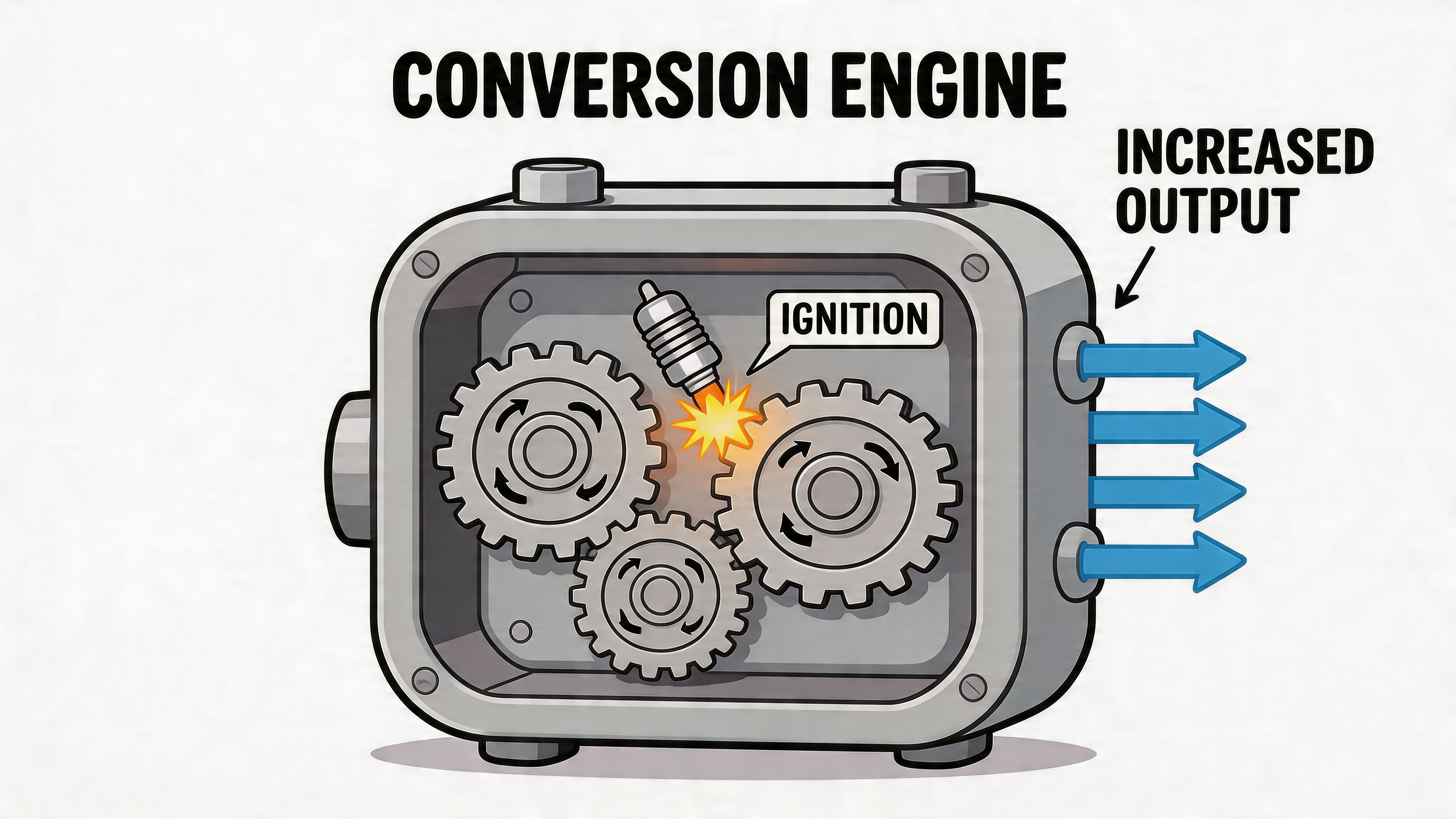
Igniting The Conversion Engine with CRO
A brand without conversion discipline turns into an expensive creative exercise.
At this juncture, many Shopify stores stall. The founder launches, traffic comes in, and every weak assumption gets exposed at once. The offer isn’t landing. The page hierarchy is off. The wrong objections are being answered. Or the traffic is hearing one promise in the ad and a different promise on the page.
CRO fixes that, but only if you treat it as a system.
Stop testing button colors first
Small UI tests have their place, but they’re not the most effective place to begin. The biggest gains usually come from testing marketing angles.
According to Build Grow Scale’s marketing angles analysis, ad costs are rising 28% YoY, brands testing 5+ unique angles see 41% higher ROAS, and only 12% of DTC brands run structured tests. That gap matters. It means most brands are still guessing which promise resonates most.
An angle is the lens through which the customer sees your product. For the same product, you might test:
- Convenience over craftsmanship
- Transparency over luxury
- Performance over aesthetics
- Identity and belonging over price efficiency
- Routine simplification over feature depth
That’s a more meaningful test than changing a green button to black.
Use one hypothesis template across ads, landing pages, and email
Good CRO teams don’t test random ideas. They document assumptions.
A practical template looks like this:
If we present the offer through [specific angle] for [specific audience or traffic segment], then [specific conversion event] should improve because [specific buyer motivation or objection].
Example:
If we position the product around routine simplicity for new visitors from paid social, then add-to-cart rate should improve because those users are still comparing options and need lower cognitive load.
That hypothesis can then shape the ad headline, landing page hero, PDP copy, and welcome email. That’s how you validate a USP instead of just decorating a site.
High-impact CRO work on Shopify
If you want practical priorities, start here:
- Tighten message match. Keep the promise in the ad consistent with the headline on the landing page and the proof on the PDP.
- Reduce choice overload. Cut weak variants, simplify bundles, and make the default path obvious.
- Improve site search. Buyers who search usually show intent. Bad search experiences leak revenue.
- Use real customer proof. Reviews, photos, and use cases answer objections faster than polished brand copy.
- Audit checkout friction. Shipping surprises, unclear delivery expectations, and coupon-hunting behavior often kill intent late.
For more tactical inspiration, SelfServe has a practical resource on how to Boost your Shopify conversion rate.
What disciplined testing looks like in practice
Here’s a simple decision table teams can use:
| Test area | Weak approach | Strong approach |
|---|---|---|
| Homepage hero | Rewrite headline based on opinion | Align headline to a tested customer angle |
| PDP layout | Add more sections everywhere | Reorder content based on objections |
| Paid traffic landing page | Use one page for all campaigns | Match page structure to audience intent |
| Email flows | Send generic promotions | Mirror the angle that drove the first visit |
Most conversion problems aren’t design problems. They’re prioritization problems. The page is answering the wrong question first.
That’s what separates stores that “look good” from stores that compound. They don’t assume. They test.
Fueling Growth with Modern Marketing and Retention
Acquisition gets attention because it’s visible. Retention drives durability because it compounds.
A lot of founders still treat marketing as a top-of-funnel exercise. Run Meta ads. Post on social. Work with creators. Send a campaign. Push traffic into the store and hope volume makes the model work. That can create bursts of growth, but it usually creates a fragile business if customers don’t come back.
The economics are clearer when you look at loyalty. According to Elementor’s ecommerce statistics roundup, businesses that reach a 40% repeat customer rate generate nearly 50% more revenue than those at 10%, and the probability of selling to an existing customer is 60-70%, compared with 5-20% for a new prospect. That’s why retention isn’t a post-purchase bonus. It’s a core part of how to build an ecommerce brand profitably.
Acquisition should feed retention, not fight it
The best acquisition channels are the ones that pre-qualify the right customer for a second purchase.
That changes how you evaluate channels:
- SEO and content can attract intent-rich traffic if the brand has something credible to teach
- Paid social works better when the creative filters for fit instead of trying to appeal to everyone
- Influencer and creator partnerships perform better when the audience overlap is obvious
- Email capture should promise value tied to the buying journey, not just a discount
If a channel drives one-time bargain shoppers who disappear, it may look healthy in platform reporting and still hurt the business.
Build retention into the offer from day one
Retention starts before checkout. The offer itself should answer a repeat-purchase question.
For replenishable or habit-based products, that usually means a subscription path. Not because subscriptions are fashionable, but because they align the brand with routine. If the product naturally fits regular use, a subscription model reduces purchase friction and gives the customer one less thing to remember.
The mistake is forcing subscriptions onto products that don’t justify them. The stronger approach is to design a reason to stay:
- Convenience through scheduled delivery
- Exclusive access to limited variants or member-only bundles
- Education that improves outcomes over time
- Loyalty rewards tied to real usage, not gimmicks
- Account experience that makes managing frequency and skip behavior easy
If your subscription takes away control, customers won’t trust it. If it removes friction, they often will.
What a healthy retention system includes
A real retention engine is broader than email campaigns. It usually includes a combination of operational and marketing touchpoints:
Post-purchase onboarding
Teach the customer how to use the product well. This is especially important for products with routines, setup steps, sizing nuance, or learning curves.Behavior-based lifecycle messaging
Different customers need different nudges. First-time buyers need reassurance. Repeat buyers may need replenishment timing, complementary products, or product education.Customer service that protects the brand
Support isn’t separate from brand. Slow, scripted, or defensive support can wipe out the trust your creative built.Merchandising for second purchase paths
Don’t leave the next order to chance. Curate follow-up products, restock flows, and “build your routine” logic directly into the site.
Brand community matters more than brand broadcasting
Brand growth gets stronger when customers can participate in it.
That doesn’t mean every store needs a massive social community. It means the brand should create reasons for customers to engage beyond the first order. Useful education, customer stories, creator integrations, refill reminders, and routine-based content all do that better than generic motivational posts.
This is also where first-party channels become more valuable. Email, SMS, and on-site personalization give you direct access to customers you already earned. If your whole growth plan depends on renting attention, you’ll keep paying to reacquire people who already know you.
A practical retention lens for founders
Ask these questions every month:
- Are we attracting customers who look like repeat buyers?
- Is our second purchase path obvious on-site and in lifecycle flows?
- Does our support experience increase confidence or create doubt?
- Have we made replenishment or reordering easy enough?
- Does our offer structure give customers a reason to stay connected?
Brands that answer those questions effectively tend to build stronger economics over time. The ones that don’t often stay stuck in launch mode, even after years in market.
Scaling Smart with Analytics and AI
A common scaling moment looks like this. Sales are up, ad spend is up, the team is busier than ever, and nobody agrees on why profit moved.
Shopify shows one version of performance. Meta shows another. Klaviyo, GA4, subscription data, support tickets, and inventory reports all tell partial stories. Once that happens, growth stops being a channel question and becomes an operating model question.

Start with one source of truth
Analysts at Intentwise on ecommerce data strategy found that brands using a warehouse to centralize data from platforms like Shopify and Google Analytics make decisions faster and often improve ad efficiency. The point is simple. Clean reporting shortens the time between spotting a problem and fixing it.
For Shopify brands, the first job is not buying more dashboards. It is deciding what the business needs to know every week. Usually that means contribution margin by channel, new versus returning customer mix, subscription retention, product-level conversion, refund rate, and stock risk.
A workable setup usually follows this order:
- Define business questions first. Focus on the decisions leadership needs to make, such as where to cut spend, which products deserve more traffic, and whether subscription customers are holding margin.
- Map every data source. Shopify, GA4, Meta, Google Ads, Klaviyo, subscription apps, helpdesk tools, and any inventory or ERP layer.
- Create one reporting layer. A warehouse plus BI tool is often the cleanest route once the brand is beyond basic Shopify reporting.
- Standardize definitions. Agree on what counts as a repeat customer, an active subscriber, a high-intent session, and a profitable order.
- Set review cadences. Weekly reviews should lead to actions. Monthly reviews should lead to bigger changes in budget, merchandising, and retention strategy.
The definitions piece causes more problems than founders expect. I have seen teams spend hours debating performance when the actual issue was that finance, marketing, and retention were each using a different definition of customer value.
AI should earn its place in the stack
AI is useful when it removes manual work, improves relevance, or speeds up decisions. That is the standard.
For Shopify stores, the strongest use cases are usually operational before they are flashy:
- Personalized product recommendations that respond to browsing, cart behavior, and order history
- Predictive reorder prompts for replenishable products, especially when paired with subscription offers
- Lifecycle segmentation that helps email and SMS flows adapt to customer behavior instead of sending the same sequence to everyone
- Creative and copy support for faster test production across product pages, ads, and retention campaigns
- Support automation for common pre-purchase and post-purchase questions, with a clear handoff to a human team member
AI should improve conversion and lifetime value from day one, not sit in the stack as a brand story. If a tool cannot help merchandisers rank products better, help marketers segment with more precision, or help retention teams drive the second and third order, it is probably early for that tool.
For teams assessing the next layer of automation, this overview of AI agents for ecommerce gives useful context.
Use AI and analytics to reduce decision lag
The goal is not more data. The goal is faster, better decisions with less noise.
If recommendation logic conflicts with your merchandising strategy, or if your reporting cannot tie CAC to downstream retention, the stack gets expensive fast. The same goes for personalization. AI-driven recommendations can lift average order value, but only if product data, tagging, and inventory logic are clean enough to support them.
Founders should pressure test the system with a few hard questions:
- Can we see channel performance by first-order profitability, not just top-line revenue?
- Can we identify which customer cohorts subscribe, reorder, or churn?
- Can the merchandising team change collections, bundles, and recommendation rules without waiting on a developer every time?
- Are we using AI to improve a known bottleneck, or just adding software because competitors are talking about it?
Some brands build this internally. Others bring in specialist support. ECORN is one option for Shopify brands that want design, development, CRO, and analytics execution handled through a subscription model while keeping priorities tied to commercial outcomes.
Better systems do not replace judgment. They give operators cleaner inputs, faster feedback loops, and more control as complexity rises.
Your Brand is a Journey Not a Destination
A strong ecommerce brand isn’t created in one sprint. It’s built through a sequence of disciplined choices.
First, get the positioning right so the brand means something specific. Then build a Shopify storefront that makes that promise credible. After that, improve conversion through structured testing, not guesswork. Then protect profitability with retention, subscriptions, and lifecycle marketing. Finally, put analytics and AI in place so growth doesn’t collapse under its own complexity.
The brands that last don’t treat any of those steps as one-time tasks. They revisit them as the market changes, the catalog evolves, and customer expectations get sharper.
If you’re serious about learning how to build an ecommerce brand, start with the clearest unresolved problem in front of you. Tighten the strategy, fix the store, improve the funnel, or strengthen retention. Then keep going.
If you want a team to help turn that roadmap into execution, ECORN works with Shopify brands on design, development, CRO, and scalable ecommerce systems, including flexible subscription support for growing stores.


What Is Voice of Customer Research for eCommerce

SMS Marketing for Ecommerce That Actually Converts

Master How to Improve Email Deliverability in 2026
Top 7 eCommerce Partners NYC for Shopify Brands in 2026
Machine Learning for Ecommerce: Boost Your Shopify Store

Beauty Market Research: Your 2026 Growth Guide

Shopify International Expansion: A 2026 Roadmap
What Does CRO Stand for in Business: Understanding CRO
Shopify Visual Merchandising: A Playbook for Higher Sales

Shopify Landing Page Design: Master Conversion in 2026
10 Best AI SEO Optimization Tools for Shopify in 2026

Agentic AI for Ecommerce: Boost Your Sales in 2026
Mastering Email Marketing Data for eCommerce Growth

Conversion Rate Optimisation Australia: Boost Your Sales
Conversion Rate Optimization AI: Your Shopify Store Guide

10 Product Bundling Strategies for Shopify in 2026
How to Increase Customer Lifetime Value: A Shopify Playbook
AI Customer Service Automation: Shopify Guide 2026
Clean Website Design: A Shopify Conversion Playbook

Omnichannel Retail Strategy: A Shopify Playbook
Product Data Enrichment: A Guide for Shopify Brands
Instagram Shopping Features a Guide for Shopify Stores
What Is Revenue Optimization: A Holistic RevOps Guide

Benefits of Conversion Rate Optimization: Boost Your
WordPress to Shopify Migration: Your 2026 Seamless Switch
Boost Sales: Ecommerce Payment Processing Guide 2026
Unified Commerce Platform: Benefits, KPIs & Shopify Guide

How to Reduce Bounce Rate eCommerce: Your 2026 Guide

Shopify API Integration: A Practical End-to-End Guide

How to Implement Data Governance: A 2026 Guide

Shopify Store Development Cost: A 2026 Breakdown
What Is Server Side Tracking: The Shopify Guide 2026

Marketing Automation Workflows: A Shopify Guide for 2026

Shopify: How to Reduce Technical Debt

Shopify UX Design Change: A Playbook for Growth

User Generated Content Strategy: Shopify Playbook

Shopify Pause and Build Plan Cost: A Complete 2026 Guide

Compare at Price on Shopify: A Complete Guide for 2026

Where Can I Sell My Prints? 10 Best Platforms for 2026

Shopify Order Management System: The Ultimate Guide 2026

What Is Marketing Attribution? an eCommerce Guide for 2026

10 Best Black Friday Sales Sheets for 2026

Discover the Top Social Media Marketing Agencies For

Consumer Confidence Definition for eCommerce in 2026

What Is Social Commerce? Your 2026 Guide to Boosting Sales

A Social Ad Campaign Playbook for eCommerce Growth

7 Best FAQ Page Examples for SaaS & eCommerce

Market Research in Fashion Industry: A Guide for Shopify

Shopify Migration Services: Expert Guide for 2026

Mastering FB Retargeting Ads for Shopify in 2026

What Is Omnichannel Ecommerce

Master Your Shopify Plus Migration: The 2026 Guide

Shopify Integration Services: A Merchant's 2026 Guide

Shopify Collection Description: A Guide to SEO & Sales

Shopify Plus Contact: Reach Sales & Support Effectively

Top Luxury Shopify Stores: Design & UX Strategies

How to Improve Customer Experience: A Shopify Roadmap

Creative Facebook Ads: 10 Examples for Shopify Brands

Remarketing with Facebook Ads: A Shopify Guide for 2026

SEO Linking Strategies for Shopify Stores

Top 7 Statistics YouTube Channels for eCommerce in 2026

Hiring Shopify Plus Designers: A Founder's Guide

Shopify Product Variation: Master Your Variants for 2026

Leverage Ai Solutions Brands: Your 2026 Shopify Growth Guide

Filters in Shopify: A Guide for Growing Brands

Shopify Plus Developer: A Guide for Growing Brands

When Does Black Friday Online Start? A 2026 Guide

Black Friday Email Marketing: Shopify & Klaviyo Guide

Polaris Design System: The Complete Shopify Guide

How to Hire a Consultant Email Marketing Expert

What Is Q4? A Shopify Merchant's Guide to Peak Season

Marketing Organization Structure for eCommerce Growth

Top Account-Based Marketing Agency Guide for 2026

7 Remarketing Ad Examples for Your 2026 Campaigns

AI Retail Solutions: Boost Your Shopify Store

Migrate to Shopify: The Definitive 2026 Guide

Shopify Authentication App: A Guide for Secure Stores

Why Strategic Marketing Is Important for Growth in 2026

How to Create a Size Chart in Shopify: 2026 Guide

Shopify Themes for Jewelry: The Definitive 2026 Guide

Minimal Shopify Templates: Faster, Higher-Converting Stores

Maximize Profit: Shopify CC Fees 2026 Guide

Best Shopify Apps for Beginners in 2026

How to Improve Online Shopping Experience in 2026

Shopify Design and Development Services: A 2026 Guide

Small Business Social Media Marketing Agency: A Hiring Guide

Bulk Edit Shopify: A Guide to Save Hours on Store Updates

2026 Trends in Food and Beverage Industry

Post Purchase Survey Guide for Shopify Stores

Conversion Rate Optimization for Ecommerce: Maximize Profit

How to Use Customer Data to Increase Sales: A Guide

Shopify for Enterprise: The 2026 Deep Dive Guide

Email Marketing Agencies: The Guide for Shopify Brands

Boost Sales With The Right Shipping Shopify App

Your Guide to the Shopify Site Map

7 Headless Commerce Examples for 2026

Mastering Trends in Cosmetic Industry for 2026

Transfer Shopify to BigCommerce The Complete 2026 Playbook

What Is Shopify Collective? Your 2026 Guide to Success

Unlock Shopify Growth with Site Link SEO


newsletter in your inbox