
Most advice about Shopify themes is backwards. Merchants get told to buy the theme with the longest feature list, the flashiest demo, and the most built-in sections. In practice, that often creates a slower storefront, a noisier buying experience, and more maintenance work every time the brand wants to evolve.
A better question is simpler: does the theme help customers reach the product, trust the offer, and complete checkout with less friction? That’s why minimal shopify templates matter. They aren’t just a visual style. They’re an operating model for faster pages, cleaner merchandising, and easier iteration.
The Hidden Cost of Feature-Packed Themes
Feature-packed themes look efficient because they promise fewer apps and faster launch. On real stores, they often do the opposite. They ship with extra scripts, oversized section libraries, and settings that merchants rarely use but every visitor still pays for in load time and interface clutter.
That matters because theme choice isn’t cosmetic. Design-focused eCommerce companies using optimized Shopify themes can achieve up to 75% higher revenue growth than competitors using default or poorly configured templates, according to Craftberry’s Shopify theme statistics. The gap isn’t about prettier templates. It’s about execution.
A lot of merchants try to solve conversion issues by adding more. More sliders. More badges. More popups. More “helpful” widgets. Most of those additions dilute intent instead of strengthening it.
Practical rule: If a feature doesn’t help product discovery, decision-making, or checkout completion, it probably belongs on the chopping block.
Minimal themes force a better discipline. They give you fewer places to hide a weak offer and fewer distractions around a strong one. That’s useful because shoppers rarely need more interface. They need clearer hierarchy, faster product pages, and pages that don’t feel busy.
If you’re auditing an existing store, SelfServe on store optimization is a useful read for spotting speed issues that damage conversion. For a more technical audit path inside Shopify, this guide to Shopify page speed optimization is the right next step.
What feature bloat usually looks like
- Heavy homepage stacks that push the product grid and key call-to-action too far down the page.
- Overlapping upsell mechanics where bundles, sticky carts, review drawers, and popup offers compete at the same moment.
- Redundant app functions such as installing an app for a feature the theme already handles through native sections or Liquid.
The hard truth is simple. A premium theme can still be a poor business choice if it adds complexity your store doesn’t need.
What Makes a Shopify Template Truly Minimal
A minimal theme isn’t just a clean-looking homepage with lots of white space. It’s a template built around restraint. The code, layout, and content architecture all stay focused on one job: helping customers move from landing to purchase without friction.

Minimal in appearance versus minimal in architecture
Some themes only look minimal. The demo uses sparse copy, neutral colors, and large product photography, but under the hood the theme still carries bulky JavaScript, too many optional components, and weak defaults for product pages.
A minimal theme behaves more like a race car than a minivan. It doesn’t try to carry every possible passenger or use case. It’s tuned for one thing. Speed, control, and a direct route to the outcome you care about.
That usually shows up in a few places:
- Lean front-end behavior with fewer dependencies and less script-driven decoration.
- Focused templates for home, collection, product, cart, and key landing pages.
- Clear section hierarchy so merchants can build pages without creating visual noise.
- Strong defaults for product media, price, variants, descriptions, and calls-to-action.
The operational test
I judge minimal shopify templates by how they behave after customization, not how they look in the demo store. A strong minimal theme should still feel clean after the merchant adds real product data, metafields, reviews, policy content, and merchandising blocks.
If the template starts breaking down the moment you add normal commerce content, it wasn’t minimal. It was empty.
A good minimal theme removes decision fatigue for both the shopper and the team managing the store.
There’s also a platform reason minimal themes often perform well. Shopify requires themes submitted to the Theme Store to meet a minimum average Lighthouse performance score of 60 across critical pages, as outlined in Shopify’s theme store requirements. That baseline doesn’t guarantee a great storefront, but it does reward themes that avoid unnecessary code and prioritize stable page structures.
What should be present in a minimal theme
Minimalism doesn’t mean barebones. It means disciplined inclusion. Look for:
| Element | Why it matters |
|---|---|
| Flexible product media layout | Lets you present products clearly without hacks |
| Usable collection filters | Helps shoppers narrow large catalogs quickly |
| Native section controls | Reduces the need for one-off apps and custom edits |
| Strong typography and spacing defaults | Makes content readable before any design polish |
| Predictable mobile behavior | Prevents broken layouts and hidden purchase actions |
The best minimal themes feel quiet, but they’re not passive. They guide.
The Framework for Evaluating Minimal Themes
Choosing among minimal shopify templates gets easier when you stop judging demos and start auditing systems. I use five pillars. Not because every store needs the same exact setup, but because weak themes fail in the same predictable ways.
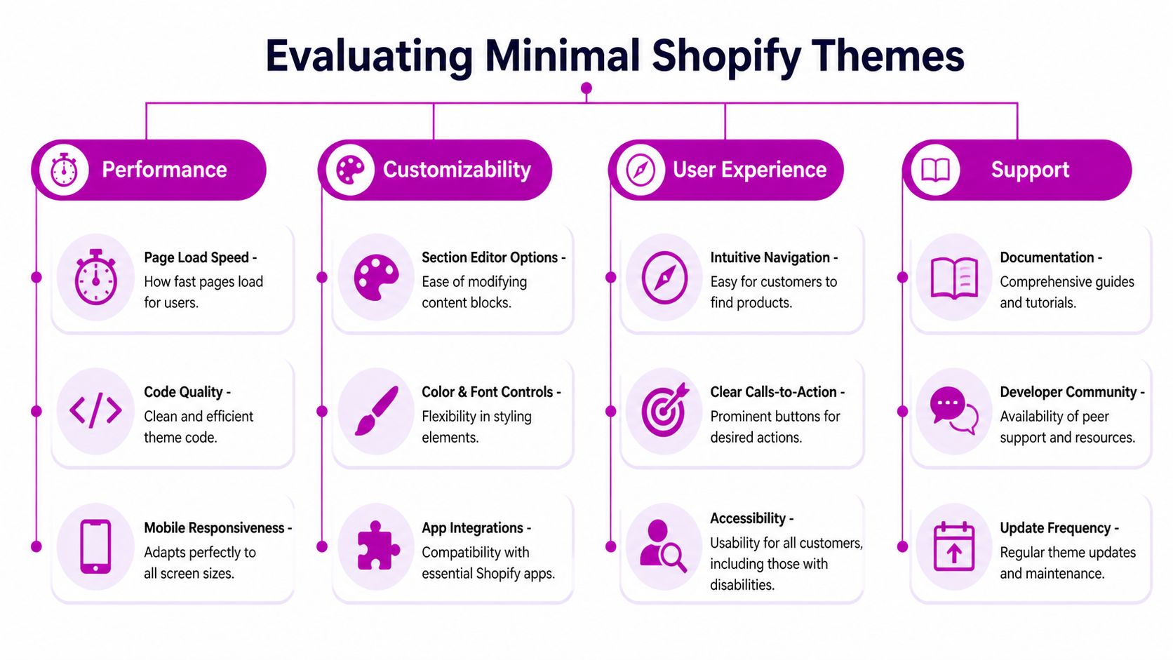
Pillar one performance under real content
Theme demos are staged. Your store isn’t. Load the preview with full-size images, actual products, review widgets, and your typical app stack. Then test homepage, collection, product, and cart pages.
Shopify’s approval standard is a floor, not the finish line. A theme can meet store requirements and still perform poorly once the merchant layers in media, app blocks, and custom sections. What you want is consistency under realistic merchandising conditions.
Check for:
- Stable layout behavior when images load
- Responsive variant pickers that don’t lag
- Fast section rendering on long homepages
- No script pileups from duplicated functionality
Pillar two user experience clarity
Minimal design should make decisions easier. If the navigation feels vague, filters hide too much inventory, or product pages bury core information, the theme is working against conversion.
I look at the path from collection page to add-to-cart. Is the product card clear? Does the product page answer the main purchase questions quickly? Are there competing actions fighting with the primary CTA?
A clean interface is useful only when it sharpens intent.
The best-performing product pages usually feel obvious within a few seconds. The shopper knows what the item is, what it costs, what options exist, and what to do next.
Pillar three mobile-first behavior
Many themes are mobile-friendly in the weakest sense. They shrink to fit the screen. That’s not enough. A good minimal theme should be designed around thumb-friendly actions, compressed hierarchy, and mobile-specific readability.
Use this quick test:
- Open a collection page on mobile and check whether filters are easy to find and dismiss.
- Open a product page and make sure media, price, variants, shipping cues, and add-to-cart appear in a sensible order.
- Scroll to supplementary content such as FAQs or size guidance. It should support the decision, not bury the CTA.
If mobile pages force too much hunting, the theme needs work.
Pillar four accessibility and structure
Accessibility isn’t a compliance afterthought. It affects usability for everyone. Minimal themes should make readable contrast choices, support keyboard navigation, preserve heading order, and avoid interface tricks that depend on hover or hidden states.
I also care about content structure. Strong semantic markup makes the store easier to maintain and less likely to break when you add apps or custom Liquid.
Pillar five app compatibility without dependency
The best theme is the one that doesn’t need an app for every small request. Native sections, blocks, metafields, and Liquid snippets should cover most merchandising needs.
Ask these questions before buying:
| Question | Why it matters |
|---|---|
| Can the theme handle your product content model? | Complex products need flexible templates |
| Can you add trust content natively? | Avoids installing apps for simple reassurance blocks |
| Does the cart experience stay clean after app installs? | App collisions often hurt conversion |
| Is the documentation usable? | Teams need predictable edits, not guesswork |
A minimal theme earns its keep when it stays simple after the first month, not just on launch day.
Customizing Minimal Themes Without Adding Bloat
Most stores don’t fail because they customized a theme. They fail because they customized it carelessly. The goal isn’t to preserve a pristine demo. The goal is to adapt the theme to the brand without turning a fast storefront into a patchwork of scripts and overrides.
Start with what the theme already gives you
Before you install anything, exhaust the native controls. Shopify sections, blocks, metafields, color settings, typography controls, and template assignments usually cover more ground than merchants expect.
That means using the theme editor deliberately. Build product-specific templates. Create collection variants for different merchandising goals. Use metafields for size guides, ingredient notes, care instructions, or feature callouts instead of hardcoding repeated content into the description.
If you’re planning larger edits, this guide to Shopify theme customization is a useful reference point before you start changing files.
Use code for precision, not for decoration
Custom code is often the right move when the request is small and specific. A lightweight Liquid snippet or a focused CSS rule is usually better than installing an app for one feature.
Good examples:
- Adding a homepage blog post section through a custom section if the theme doesn’t include one
- Inserting product-level trust content based on metafields
- Adjusting spacing, button states, or typography with targeted CSS
- Creating conditional content blocks for certain collections or product types
Bad examples:
- Installing a large app to change one label
- Adding multiple apps that each inject front-end scripts into the cart
- Writing broad CSS overrides that fight the theme’s existing system
- Loading JavaScript for visual flourishes that don’t affect purchase intent
Build advice: If a merchant request can be solved with native settings, metafields, or a small snippet, start there.
Keep a customization hierarchy
The cleanest stores follow an order of operations:
- Theme settings first for layout, sections, colors, and typography.
- Metafields second for structured product and collection content.
- Liquid snippets third for reusable presentation logic.
- JavaScript last and only when interaction demands it.
This hierarchy protects the theme’s original strength. It also makes future maintenance easier when Shopify updates the theme or the store expands into new templates.
Watch the usual performance traps
A minimal theme can get bloated fast if you stack quick fixes. Watch for app embed leftovers, duplicate tracking scripts, oversized hero media, and global code snippets that run on every page whether needed or not.
Personalization should be visible in the brand voice, product storytelling, and page hierarchy. It doesn’t need to come from a dozen moving parts.
Boosting Conversions With Minimalist Design
Minimalist design helps conversion when it removes competing signals. That's its key advantage. It creates a clearer path between interest and action, which gives your product, pricing, social proof, and offer structure more room to do their jobs.

A lot of content about minimal shopify templates gets stuck at aesthetics. That’s a weak way to evaluate a storefront. As noted in this review of accessible Shopify themes, most minimal theme guides talk about look and philosophy while performance metrics and conversion data are largely absent. For operators and marketers, that’s the wrong lens.
Where minimal design usually improves buying behavior
A sparse interface by itself doesn’t convert. What works is focused hierarchy.
On a product page, that often means:
- One dominant purchase action
- Variant selection that’s easy to scan
- Product media that clarifies the offer instead of filling space
- Trust and shipping details near the decision point
- Secondary content placed below the core buying block
On collection pages, it means fewer distractions between the grid and the product click. On the cart, it means resisting the urge to turn every cart into a carnival of upsells.
High-value tests to run on minimal themes
Minimal themes are great testing environments because they make changes easier to isolate. Start with tests that tighten the decision path.
| Test idea | What you’re trying to learn |
|---|---|
| Single CTA label versus alternative copy | Which framing reduces hesitation |
| Condensed product summary versus long intro copy | Whether brevity improves first-screen clarity |
| Trust block near the button versus lower on page | Where reassurance helps most |
| Media-first layout versus benefits-first layout | Which sequence drives stronger product understanding |
Keep the tests close to purchase intent. Don’t waste cycles on decorative homepage changes if product pages are where shoppers stall.
Here’s a practical walkthrough worth watching before redesigning your product page logic:
What usually hurts conversion on minimal stores
Minimalism becomes a problem when teams confuse it with omission. If a store removes key trust cues, hides policy information, or strips product education too aggressively, conversion suffers.
The job is not to say less. It’s to say the right things in the right order.
A product page should feel simpler after optimization, but the shopper should know more, not less.
That’s why the strongest minimal stores often look calm while carrying a lot of structured information. They just don’t dump it all above the fold or scatter it across popups and tabs without intent.
A Safe-Launch Checklist for Migrating Themes
Theme migration is where good planning protects revenue. A minimal theme can improve the storefront quickly, but a rushed launch can still break navigation, remove app output, or misplace critical content.
Before you touch the live theme
Start in a duplicate or unpublished theme. Never design directly in production. Work in preview, map required templates, and document every live-store dependency before replacing anything.
Run an audit across:
- Apps: Which apps inject widgets, snippets, or app blocks?
- Content: Which pages rely on custom templates, metafields, or hardcoded sections?
- Navigation: Which menus, filters, and links are essential for category discovery?
- Tracking: Which scripts appear in theme files, customer events, or app embeds?
A migration usually fails because no one knows what the old theme was quietly doing.
Launch checklist that catches most issues
Use a plain checklist and assign ownership. Don’t rely on memory.
Build template parity
Match home, collection, product, article, blog, cart, and key landing page templates.Reconnect structured content
Check metafields, dynamic sources, collapsible rows, badges, and policy content.Test the buying journey
Browse collection pages, apply filters, open products, select variants, add to cart, and complete a test order.Review app output
Confirm reviews, subscriptions, bundling, personalization, and analytics appear where expected.Check mobile manually
Don’t trust desktop preview alone. Test real devices when possible.QA content details
Verify headings, image crops, button labels, and internal links.
After launch
Monitor the first days closely. Watch for broken layouts, missing app embeds, and customer service complaints that point to navigation or product page confusion.
The safest migrations aren’t the fastest ones. They’re the ones where every key flow gets tested before the switch.
Troubleshooting and Advanced Optimization
Minimal themes are a strong foundation, not a shortcut around store complexity. If you sell configurable bundles, subscription-heavy products, B2B catalogs, or products with dense compliance content, you may still need deeper customization than the theme provides out of the box.
That doesn’t make the theme wrong. It means your implementation has to be disciplined.
When a minimal theme isn’t enough by itself
Common friction points include advanced product configurators, unusual cart logic, layered pricing displays, and content models that depend on several metafield relationships. In those cases, merchants often make one of two mistakes. They either force the theme too far with messy workarounds, or they install too many apps and lose the benefits of the lightweight setup.
A better approach is to decide which functions belong to the theme, which belong to apps, and which deserve custom development.
The Minimal theme as a real example
The old Shopify Minimal theme is a useful case because it shows both the upside and the limit of a popular lightweight template. It currently powers 1,215 active stores and ranks as the #7 most popular theme on Shopify, according to Commerce Rank’s analysis of the Minimal theme. That same analysis found an average PageSpeed score of 59/100 across 322 stores using it.
That combination is revealing. Merchants like the theme because it offers a clean base. But popularity doesn’t equal optimization. A minimal template can still underperform when stores add apps carelessly, upload poor media, or leave product pages structurally weak.
What advanced optimization usually targets
- Template-level asset loading so product-only scripts don’t run on every page
- Section simplification on homepages that grew too long over time
- Media handling for oversized images and video embeds
- Cart and product page cleanup where stacked apps create duplicate UX patterns
- Liquid refactoring when years of edits leave the theme hard to maintain
If your store feels close but not quite right, that’s often the signal. The foundation is usable, but the implementation needs expert cleanup and CRO judgment to reach its potential.
Frequently Asked Questions
Are minimal shopify templates only good for small catalogs
No. They work well for many small and mid-sized catalogs, but they can also support larger stores when collection architecture, filtering, and product templates are well planned. The limit isn’t catalog size by itself. It’s whether the theme can present your inventory clearly without relying on messy workarounds.
Will a minimal theme hurt branding
Not if it’s customized properly. Strong branding comes from product photography, typography, content hierarchy, color use, and how consistently the store communicates its value. A minimal template gives those elements more room to work. It doesn’t erase them.
Do I need apps to make a minimal theme useful
Usually fewer than you think. Native sections, metafields, and small Liquid edits often cover the essentials. Apps should solve real business requirements, not fill avoidable gaps created by poor planning.
Can a minimal theme still convert for complex products
Yes, if the product page explains the offer well. Complex products need better structure, not always more visual clutter. Use grouped information, strong variant logic, clear shipping and returns content, and focused trust cues near the purchase action.
Should I choose a free minimal theme or a premium one
Choose based on fit, not price tier. A free theme can work well if your requirements are straightforward and your team can customize responsibly. A premium theme makes sense when its template system, merchandising options, and support save meaningful time.
What’s the biggest mistake merchants make after switching
They keep adding elements until the store recreates the same bloat they wanted to escape. Minimal themes work when teams protect clarity, audit new apps, and treat every new section as something that must earn its place.
If your Shopify store needs a cleaner theme architecture, faster pages, or sharper conversion paths, ECORN can help you redesign, develop, and optimize the storefront without piling on unnecessary complexity.


Shopify Pause and Build Plan Cost: A Complete 2026 Guide

Compare at Price on Shopify: A Complete Guide for 2026

Where Can I Sell My Prints? 10 Best Platforms for 2026

Shopify Order Management System: The Ultimate Guide 2026

What Is Marketing Attribution? an eCommerce Guide for 2026

10 Best Black Friday Sales Sheets for 2026

Discover the Top Social Media Marketing Agencies For

Consumer Confidence Definition for eCommerce in 2026

What Is Social Commerce? Your 2026 Guide to Boosting Sales

A Social Ad Campaign Playbook for eCommerce Growth

7 Best FAQ Page Examples for SaaS & eCommerce

Market Research in Fashion Industry: A Guide for Shopify

Shopify Migration Services: Expert Guide for 2026

Mastering FB Retargeting Ads for Shopify in 2026

What Is Omnichannel Ecommerce

Master Your Shopify Plus Migration: The 2026 Guide

Shopify Integration Services: A Merchant's 2026 Guide

Shopify Collection Description: A Guide to SEO & Sales

Shopify Plus Contact: Reach Sales & Support Effectively

Top Luxury Shopify Stores: Design & UX Strategies

How to Improve Customer Experience: A Shopify Roadmap

Creative Facebook Ads: 10 Examples for Shopify Brands

Remarketing with Facebook Ads: A Shopify Guide for 2026

SEO Linking Strategies for Shopify Stores

Top 7 Statistics YouTube Channels for eCommerce in 2026

Hiring Shopify Plus Designers: A Founder's Guide

Shopify Product Variation: Master Your Variants for 2026

Leverage Ai Solutions Brands: Your 2026 Shopify Growth Guide

Filters in Shopify: A Guide for Growing Brands

Shopify Plus Developer: A Guide for Growing Brands

When Does Black Friday Online Start? A 2026 Guide

Black Friday Email Marketing: Shopify & Klaviyo Guide

Polaris Design System: The Complete Shopify Guide

How to Hire a Consultant Email Marketing Expert

What Is Q4? A Shopify Merchant's Guide to Peak Season

Marketing Organization Structure for eCommerce Growth

Top Account-Based Marketing Agency Guide for 2026

7 Remarketing Ad Examples for Your 2026 Campaigns

AI Retail Solutions: Boost Your Shopify Store

Migrate to Shopify: The Definitive 2026 Guide

Shopify Authentication App: A Guide for Secure Stores

Why Strategic Marketing Is Important for Growth in 2026

How to Create a Size Chart in Shopify: 2026 Guide

Shopify Themes for Jewelry: The Definitive 2026 Guide

Maximize Profit: Shopify CC Fees 2026 Guide

Best Shopify Apps for Beginners in 2026

How to Improve Online Shopping Experience in 2026

Shopify Design and Development Services: A 2026 Guide

Small Business Social Media Marketing Agency: A Hiring Guide

Bulk Edit Shopify: A Guide to Save Hours on Store Updates

2026 Trends in Food and Beverage Industry

Post Purchase Survey Guide for Shopify Stores

How to Build an Ecommerce Brand in 2026

Conversion Rate Optimization for Ecommerce: Maximize Profit

How to Use Customer Data to Increase Sales: A Guide

Shopify for Enterprise: The 2026 Deep Dive Guide

Email Marketing Agencies: The Guide for Shopify Brands

Boost Sales With The Right Shipping Shopify App

Your Guide to the Shopify Site Map

7 Headless Commerce Examples for 2026

Mastering Trends in Cosmetic Industry for 2026

Transfer Shopify to BigCommerce The Complete 2026 Playbook

What Is Shopify Collective? Your 2026 Guide to Success

Unlock Shopify Growth with Site Link SEO

Integrating Shopify and WordPress A Complete Guide for 2026

Naming a Clothing Store: A Shopify Founder's Playbook

Guide to buying shopify store in 2026

Buying shopify store: Buying a Shopify Store: Invest Wisely

Food & Beverage Marketing: A Complete Guide for 2026

Facebook Ads Agency: A Shopify Brand's Hiring Guide

Shopify Apparel Stores: A 2026 Launch & Scale Guide

How to Deactivate Shopify Store: The 2026 Guide

Shopify and Square: The 2026 Ultimate Comparison

Your Guide to Beauty Products Ecommerce

A Guide to Marketing for Beauty Brands in 2026

Your Guide to Facebook Black Friday Ads

Facebook Ad Ecommerce for Shopify Growth

Iconography Web Design The Definitive Guide for Shopify Stores

A Modern Backlinks SEO Strategy for Shopify Stores

How to Launch an Online Store: A Step-by-Step Success Guide

Optimize Shopify Store: Master Performance in 2026

Successful Migration for Shopify: Protect SEO & Grow

Maximize Traffic & Sales: Get Your Free Website Audit Report

Master the Best Ads Facebook Formats for eCommerce Success

How to Find the Best Ecommerce Agency Near Me in 2026

10 Crucial White Hat Techniques SEO for Shopify in 2026

How to Reduce Returns and Boost Profits in Your eCommerce Store

What Is Ecommerce Personalization A Guide to Unlocking Growth

Payment gateways in shopify: The Ultimate Guide for Merchants 2026
Fulfillment services for shopify: Scale Your Ecommerce Brand
Shopify Landing Page Examples: 7 Winning Templates to Boost Conversions
How to Create Urgency in Sales on Shopify

The Best Review Apps for Shopify to Drive Growth in 2026

The Best Ecommerce Platform for Startups in 2026
Choosing Ecommerce Website Design Packages A Complete Guide
Shopify Plus Partners: Guide to shopify plus partners for 2026 growth

How to Find serp feature opportunities: Win SERP Snippets in 2026
Selling on Etsy vs eBay A Guide for eCommerce Brands in 2026

10 Proven Sample Email Campaigns for Shopify to Boost Sales in 2026

A Winning Digital Content Marketing Strategy for Shopify in 2026


newsletter in your inbox