
Traffic is coming in. Your ad account looks healthy. Email is driving sessions. Organic keeps doing its job. But revenue doesn't rise the way it should, and the dashboard starts to feel accusatory.
That’s where most ecommerce teams get stuck. They know something is leaking in the journey, but they can’t tell whether the problem sits on product pages, in mobile UX, in checkout, or in the handoff between channels. So they start testing random button colors, swapping headlines, and copying whatever “best practice” they saw last week.
That approach burns time because it skips diagnosis.
Conversion rate optimization for ecommerce works when it behaves like an operating system, not a list of hacks. Strong teams run a repeatable process. They audit the funnel, isolate friction, prioritize by likely business impact, test changes properly, and roll winning patterns into the store. The payoff isn’t just a better conversion rate. It’s better use of acquisition spend, stronger margins, and fewer opinion-driven decisions.
Moving Beyond Guesswork to a CRO Playbook
Most ecommerce managers don’t need more ideas. They need a way to decide which ideas deserve attention.
A real CRO playbook gives you that. It answers five practical questions:
- What is broken
- Why shoppers are getting stuck
- Which fixes deserve priority
- How to test changes without fooling yourself
- How to turn isolated wins into an ongoing program
That’s the difference between optimization and activity. Activity feels productive because the team is always changing something. Optimization is stricter. It requires evidence before action and discipline after launch.
A lot of broad advice online is useful for inspiration. If you want a wider collection of tactics, Ecommerce Boost’s ultimate guide to increasing ecommerce conversion rates is a solid companion read. The key is not to treat any guide like a checklist to apply all at once.
The stores that improve fastest usually don’t test more ideas. They reject more weak ideas earlier.
A playbook also forces better trade-offs. For one brand, the right move is simplifying a bloated checkout. For another, the issue is weak product presentation that never creates buying intent in the first place. For a third, the problem is that mobile traffic gets a desktop-designed experience.
That’s why effective CRO starts with system design. You need a method for collecting evidence, turning it into hypotheses, and measuring outcomes in a way the team can trust. Without that, “testing” becomes expensive guessing with prettier screenshots.
Building Your Data Foundation for CRO
A store can look healthy at the top line and still be leaking revenue in three different places.
I see this constantly. A team focuses on a 2.8% sitewide conversion rate, assumes the problem is checkout, and starts changing payment icons, trust badges, or button colors. Then the audit shows the actual issue sits earlier. Mobile shoppers are reaching product pages, struggling with variant selection, and never building enough buying intent to begin with. That is why the data foundation matters. It keeps the team from solving the wrong problem well.
Most ecommerce brands already collect plenty of data. The gap is structure. You need a repeatable way to verify tracking, inspect the funnel, and combine behavior data with customer feedback so decisions hold up under scrutiny.
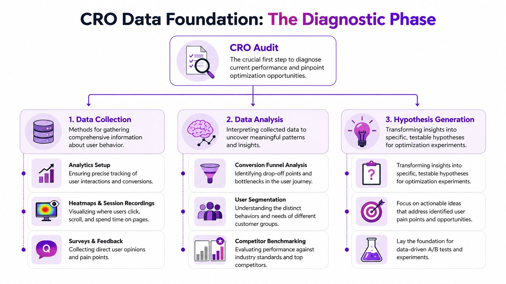
Start with instrumentation, not interpretation
Open Google Analytics 4 and deal with the boring work first. Confirm that purchases are recorded accurately. Check whether add-to-cart, begin_checkout, and other funnel events fire consistently. Make sure reporting can be segmented by device, channel, landing page, and new versus returning users.
If tracking is unreliable, every insight after that gets weaker.
Benchmarks can help with context, but they should never drive the diagnosis. Shopify notes in its guide to average ecommerce conversion rates and benchmarks that conversion rates vary widely by industry, device, and traffic quality. That is the practical point. A single storewide average can hide a healthy email segment, an underperforming paid traffic segment, and a serious mobile UX issue at the same time.
Use benchmarks to frame questions, not to declare success or failure.
Audit the funnel by stage
Sitewide conversion rate is the scoreboard. It is not the film review.
Break the journey into stages and inspect each one on its own:
- Landing page engagement: Are visitors arriving on the right page for the promise that brought them there, and do they continue deeper into the site?
- Product page progression: Are shoppers viewing media, selecting variants, reading key information, and clicking add to cart?
- Cart movement: Do they start checkout after they see shipping, delivery, and pricing details?
- Checkout completion: Where do exits cluster once purchase intent is already high?
This stage-by-stage view changes the quality of decisions. A weak add-to-cart rate usually points to offer clarity, product presentation, pricing context, or merchandising issues. A weak checkout completion rate usually points to friction, trust gaps, forced account creation, payment limitations, or unexpected costs.
Practical rule: Never prescribe a checkout fix for a product page problem.
That mistake burns time because the team can report activity without changing the actual bottleneck.
Pair GA4 with behavioral and customer research tools
Analytics shows where people drop. It does not show what they struggled with in the moment.
Use behavioral tools to examine the friction behind the numbers. Heatmaps can show whether shoppers miss key content or stop before they reach sizing, shipping, or returns information. Session recordings often reveal repeated taps on non-clickable elements, confusion around image galleries, or hesitation during variant selection. On-site surveys add another layer by capturing objections that analytics cannot infer cleanly, especially around trust, fit, delivery timing, and price perception.
Mixpanel’s guide to ecommerce metrics is useful here because it reinforces a point many teams skip. Funnel data becomes more actionable when you analyze behavior at each step instead of relying on one blended conversion metric.
Review mining belongs in this stack too. Customer reviews, support tickets, and return reasons often reveal the words buyers use when they decide, hesitate, or regret the purchase. Those patterns are valuable because they shape both diagnosis and later test ideas.
Segment before you decide
Averages hide expensive problems.
Segment performance by:
- Device
- Traffic source
- Geography
- New versus returning users
- Product category
- Campaign landing page
A returning branded search visitor behaves differently from a cold paid social click. A shopper landing on a bestselling hero SKU behaves differently from someone entering through a broad collection page. If those sessions are blended together, the team gets safe conclusions and weak priorities.
This is also where trade-offs become clearer. A test that improves conversion rate for discount-driven paid traffic can reduce revenue quality if it attracts lower-intent orders or suppresses average order value. That is why strong CRO programs track more than conversion rate.
A short KPI view keeps the audit commercially grounded:
| KPI | What it tells you | Why it matters |
|---|---|---|
| Conversion rate | Final purchase efficiency | Useful, but incomplete on its own |
| Add-to-cart rate | Product page buying intent | Reveals offer and presentation strength |
| Checkout conversion | Ability to close intent | Exposes friction and trust issues |
| Revenue per visitor | Commercial quality of traffic and experience | Helps compare changes beyond raw conversion |
| Profit per visitor | Margin-aware performance | Prevents “wins” that hurt profitability |
I push teams to watch revenue per visitor and profit per visitor closely because they force better decisions. A variant that lifts conversion rate by pushing heavier discount usage may still be a bad test outcome. A lower-converting experience with higher margin and stronger average order value can be the better business result.
That is the purpose of a data foundation. It gives the team a reliable picture of where the leak is, how big it is, and whether fixing it will improve the business.
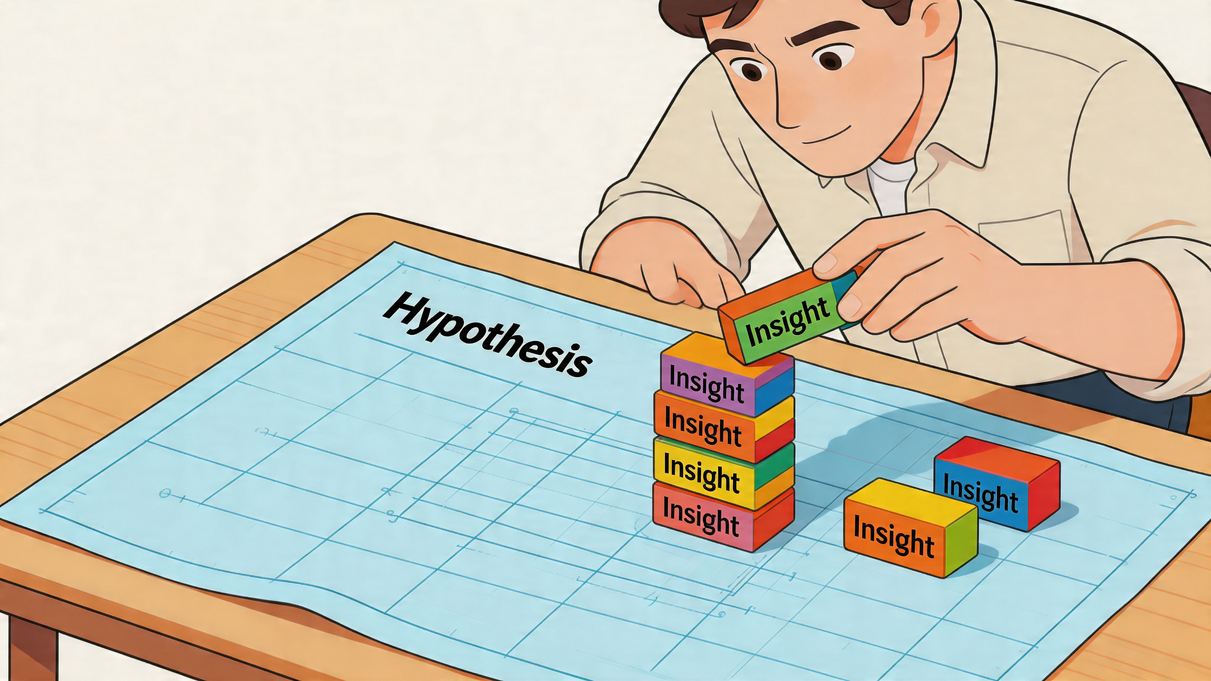
How to Craft and Prioritize Test Hypotheses
Raw data doesn’t create growth. Decisions do. The bridge between those two is the hypothesis.
Most weak tests start with a design opinion. “Let’s try a larger button.” “Let’s move reviews higher.” “Let’s add urgency.” None of those ideas are automatically wrong. They’re just incomplete. A proper hypothesis ties a specific observation to a specific change for a specific audience.
Use a structure that forces clarity
A practical format looks like this:
Because we observed [evidence], we believe that changing [element] for [audience] will improve [metric].
Example:
- Evidence: mobile users scroll product pages but interact poorly with variant selectors
- Change: redesign variant selection to be more touch-friendly and visually clearer
- Audience: mobile visitors on high-traffic product pages
- Metric: add-to-cart rate
That gives the team something testable. It also makes post-test review easier because you can see whether the reasoning was sound even if the variation loses.
Separate symptoms from causes
Many teams write hypotheses around symptoms. “Checkout abandonment is high, so we should add more reassurance.” Maybe. But what kind of reassurance, where, and in response to what concern?
Better hypotheses come from identifying the mechanism behind the leak. For example:
- Shoppers may hesitate because shipping costs appear too late
- They may distrust the product because images don’t show enough detail
- They may fail to complete purchase because mobile tap targets feel awkward
The stronger your diagnosis, the stronger your hypothesis.
Prioritize with ICE
Once the backlog fills up, prioritization matters more than ideation. I like the ICE model because it keeps conversations grounded:
| Factor | What to ask |
|---|---|
| Impact | If this works, how much business value could it create? |
| Confidence | How strong is the evidence behind the idea? |
| Ease | How hard is it to design, build, QA, and launch? |
A homepage hero rewrite might look exciting but have weak evidence and broad ambiguity. A checkout field simplification might be less glamorous but score higher because the leak is visible and the implementation is straightforward.
Prioritization is where mature CRO teams separate themselves. They don’t chase the most creative idea. They chase the clearest return on effort.
A simple internal scoring habit also prevents political testing. The CEO’s favorite idea goes into the same queue as everyone else. If the evidence is thin and the lift is speculative, it drops down the list.
What a strong test backlog looks like
A healthy backlog has variety, not chaos. It should include:
- Fast fixes where evidence is obvious and implementation is light
- Structural tests that address major funnel friction
- Segment-specific experiments for high-value audiences
- Exploratory tests where the upside is meaningful but confidence is lower
That mix keeps velocity up without sacrificing rigor. It also prevents the common trap of spending a whole quarter on cosmetic experiments that don’t reach the core buying journey.
Executing High-Impact A/B Tests Correctly
A test goes live on Monday. By Tuesday afternoon, someone posts a screenshot in Slack showing a 14% lift, and the pressure starts. Ship it now, call it a win, move to the next idea.
That is how weak testing programs create expensive false positives.
Strong ecommerce CRO teams treat experimentation as an operating process, not a scoreboard. The goal is not to get more tests live. The goal is to make decisions you can trust, then compound those decisions across the funnel.
Define the decision before the test starts
Every test needs a clear job. If the variation changes a PDP, the primary metric might be add-to-cart rate. If it changes cart or checkout, completed purchase is often the better target. Secondary metrics still matter, but they should stay secondary. Changing the success metric after seeing early results ruins the read.
Scope matters just as much. A broad test across homepage, collection, PDP, and cart usually produces a muddy answer because each page serves a different intent. Tight tests are easier to interpret, easier to QA, and easier to roll out with confidence.
Before launch, lock these in:
- One primary KPI tied to the page's purpose
- A fixed audience and traffic split
- A controlled set of changes so the result is interpretable
- Working analytics and event tracking
- A written hypothesis with the expected mechanism behind the lift
I also want teams to decide the rollback rule before launch. If checkout completion drops past a defined threshold, the test comes down immediately. That protects revenue while keeping the process disciplined.
Run tests that can actually reach a trustworthy result
Underpowered tests waste time. They also create bad confidence, which is worse.
Industry guidance from Optimizely's experimentation team stresses calculating sample size in advance and running tests long enough to account for normal conversion variability, rather than calling winners off early movement in the first few days. If your traffic volume cannot support a clean read in a reasonable window, change the test design. Narrower audience targeting can help if the hypothesis is segment-specific, but many stores need the opposite approach. Test a higher-traffic template, a larger friction point, or a stronger variant so the signal is easier to detect.
For a practical reference on setup, QA, and interpretation, ECORN has a useful guide to A/B testing best practices.
Teams building an experimentation roadmap can also compare their test ideas against broader frameworks like these 10 powerful conversion rate optimization techniques, then pressure-test which ones are realistic for their traffic levels and development bandwidth.
Protect test integrity once traffic starts
A live experiment needs fewer opinions and more control.
These are the failure patterns I see most often in ecommerce programs:
- Stopping on a spike: Early lifts often disappear once weekday mix, device mix, and campaign traffic normalize.
- Editing the variant mid-test: Copy tweaks, layout changes, and offer adjustments break the comparison.
- Testing several unrelated ideas at once: You might get a winner, but you will not know what caused it.
- Skipping segment review: A variation can help desktop and hurt mobile, or lift new visitors while suppressing returning customers.
- Ignoring QA drift: App conflicts, broken events, and merchandising changes can contaminate the result after launch.
This is why experienced CRO teams keep a test log. It records launch date, audience, variant details, QA notes, merchandising changes, promo calendar conflicts, and the final decision. That record matters later when a stakeholder asks why a past winner stopped working during BFCM traffic or after a theme update.
Judge the outcome through a commercial lens
A winning test is not automatically a good business decision.
I have seen variants raise add-to-cart rate while lowering revenue per visitor. I have also seen urgency treatments improve conversion while increasing cancellation rates, support contacts, or margin pressure because they attracted lower-intent buyers. If you only report the headline lift, you can ship changes that hurt the business.
Use a simple review framework after every experiment:
| Test outcome | What to do next |
|---|---|
| Clear winner | Roll out carefully, monitor post-launch performance, and document why it likely worked |
| Inconclusive | Keep the learning, strengthen the variant, or test the idea on a higher-traffic page type |
| Negative result | Record what failed and update the assumption behind the hypothesis |
| Mixed by segment | Consider a segmented rollout instead of forcing a sitewide decision |
The stores that get consistent gains from CRO do not rely on isolated wins. They build a repeatable testing system with clear rules, clean execution, and documented learning. That is what turns experimentation from a marketing activity into a reliable growth process.
Essential Ecommerce Optimization Plays
A store can have a disciplined testing program and still miss obvious revenue on the table. I see it often. Traffic is healthy, experiments are running, but the product page leaves questions unanswered, mobile adds friction, and checkout asks buyers to do too much work at the worst possible moment.
That is why this part of the playbook starts with the core buying journey. These are the changes that clean up demand you already paid for before you add more targeting, automation, or AI.
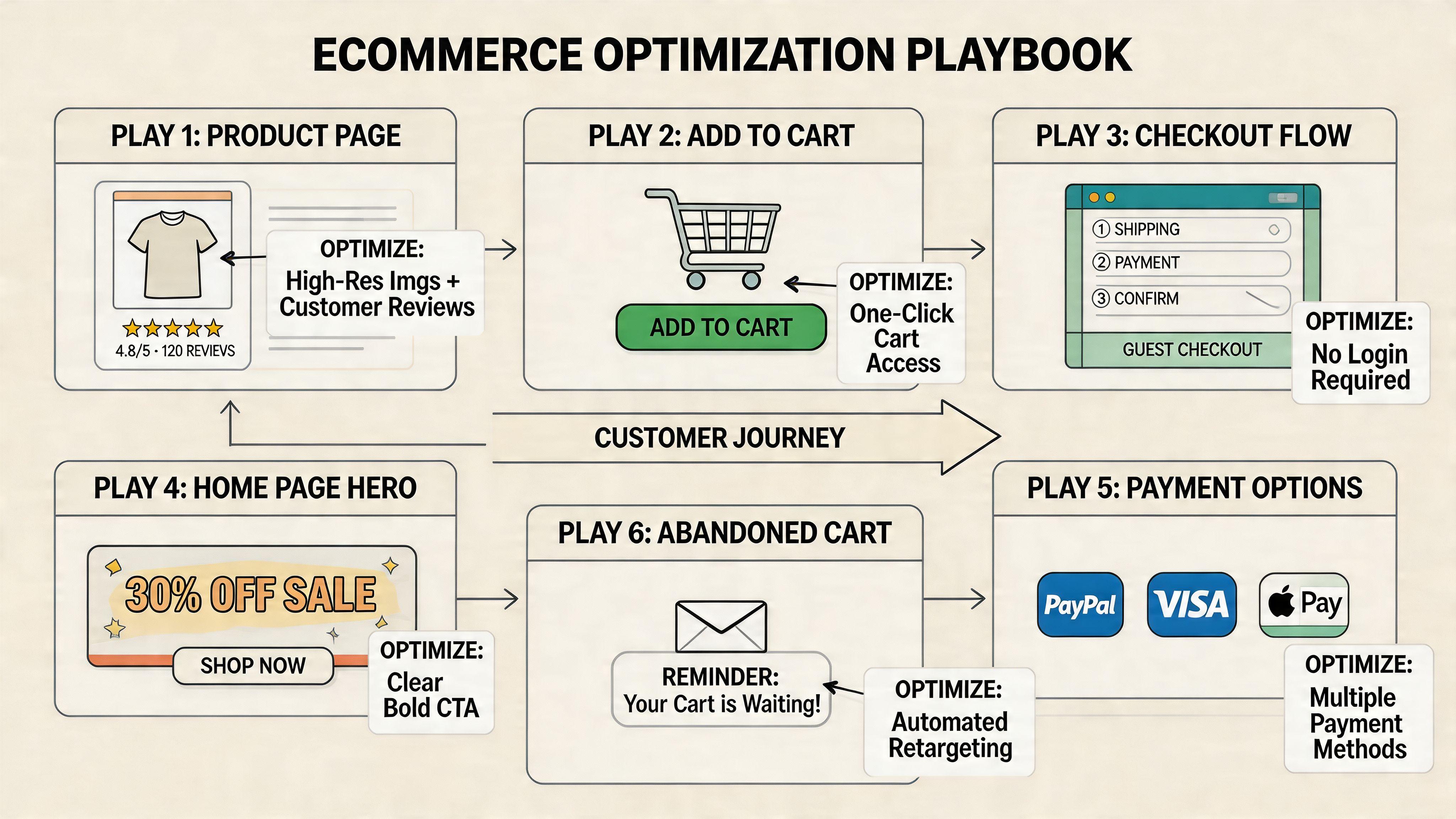
Fix the product page before chasing sophistication
Product pages do the heaviest conversion work in ecommerce. If they fail to create confidence, every downstream metric gets harder to improve.
The strongest product page programs usually focus on four jobs:
- Visual clarity: shoppers need to inspect the product closely enough to judge quality, fit, finish, or scale
- Offer comprehension: price, shipping timing, returns, subscription terms, and stock status should be easy to understand
- Decision support: reviews, FAQs, sizing guidance, ingredients, materials, and comparison details reduce hesitation
- Call-to-action visibility: the add-to-cart path should stay obvious as shoppers scroll and evaluate
Visual quality deserves more respect than many teams give it. Nector’s guidance on ecommerce benchmarks notes that poor product visuals are a common purchase blocker and recommends high-resolution imagery, zoom, and video to improve trust and buying confidence in its discussion of ecommerce conversion benchmarks.
In practice, the trade-off is usually speed versus persuasion. More media can help conversion, but overloaded galleries, autoplay video, and heavy third-party scripts can slow mobile pages enough to erase the gain. The right answer is not “add more content.” It is “add the media that answers the buyer’s next question fast.”
If you want outside examples, Toki’s roundup of 10 powerful conversion rate optimization techniques is useful for idea generation. Use it as a source of test inputs, not a checklist to deploy blindly.
Treat mobile as the primary buying context
For many Shopify stores, mobile is the store. Revenue depends on how quickly a shopper can understand the product, choose a variant, and move toward checkout with one thumb on a small screen.
Small usability problems stack fast. A review widget pushes the CTA below the fold. A sticky app bar overlaps the size selector. The shipping message wraps awkwardly and hides key information. None of those issues looks dramatic in isolation. Together, they suppress conversion.
A practical review lens looks like this:
| Area | What good looks like |
|---|---|
| Navigation | Clear category paths, compact menus, easy return to browsing |
| Product interaction | Fast image loading, intuitive swiping, variant selection without mis-taps |
| CTA design | Strong visibility, comfortable tap targets, clear next step |
| Form entry | Fewer fields, autofill support, smart defaults, low typing effort |
I also look at mobile through a merchandising lens, not just a UX lens. Many stores add loyalty widgets, bundles, urgency bars, chat, reviews, and cross-sells one app at a time. A significant problem is cumulative clutter, slower rendering, and too many competing messages. A cleaner mobile page often outperforms a more “feature-rich” one.
Teams planning more advanced segmentation should study proven AI personalization examples for ecommerce brands, but only after the mobile buying flow is stable.
Remove checkout friction first
Checkout is the highest-intent step in the funnel. It is also where buyers become least tolerant of surprises.
Baymard Institute’s ongoing checkout research reports an average documented online cart abandonment rate of 70.19%. In a separate Baymard study on checkout usability, respondents cited extra costs as the top reason for abandonment, followed by requirements like account creation, concerns about trust, and a checkout flow that felt too long or complicated in its analysis of cart abandonment reasons.
Those patterns match what shows up in real store audits. The fixes are usually operational, not clever:
- Show likely total cost earlier: surface shipping thresholds, delivery expectations, and return terms before checkout
- Allow guest checkout: account creation should support retention, not block first purchase
- Cut unnecessary steps: every extra field or decision point creates another chance to abandon
- Increase reassurance at the right moment: return policy, delivery messaging, payment options, and contact access should reduce doubt
- Use accelerated payment methods where they fit: Shop Pay, Apple Pay, and PayPal can shorten the path materially on mobile
The highest-ROI checkout work usually comes from subtraction.
For Shopify Plus brands, checkout extensibility creates more room to test messaging, field logic, and post-purchase flows. Standard Shopify stores have less control in checkout itself, so the biggest gains often come earlier. Cart design, estimated delivery communication, discount-code handling, and payment messaging can remove friction before the buyer ever reaches checkout.
Search and navigation deserve more respect
Search traffic is high intent. If a shopper uses your search bar, they are telling you what they want. Poor search logic wastes some of the best demand on the site.
The commercial upside here is straightforward. Better autocomplete, stronger synonym handling, more useful zero-result states, cleaner filters, and tighter collection structure help ready-to-buy visitors reach the right products faster. These are not cosmetic improvements. They affect product discovery, average session depth, and conversion efficiency.
I usually prioritize search and navigation fixes in three cases: large catalogs, stores with complex attributes like size or compatibility, and brands running paid traffic to broad entry pages. In those situations, better findability can outperform another round of homepage optimization because it helps buyers self-sort into the right path sooner.
Advanced CRO with Personalization and AI
A store can have a clean PDP, a solid cart, and a respectable checkout flow and still leave revenue behind because every shopper gets the same experience. That is usually the point where personalization starts to matter. Not as a novelty layer, but as a way to make the path to purchase more relevant for people who already show clear signals.

Personalization works when it reflects buying context
A visitor from a cold prospecting ad should not always see the same message as a returning customer who already viewed a product twice and opened an abandoned-cart email. The homepage hero, collection order, recommendation set, and support prompts can shift based on intent without making the experience feel inconsistent.
The practical rule is simple. Personalize only where the signal is strong enough to justify the added complexity.
Useful layers usually include:
- Campaign-matched landing pages
- Recommendations based on browsing or purchase history
- Different messaging for new versus returning visitors
- Cart recovery flows with reminders tied to viewed or added products
- Consistent product and offer logic across site, email, and chat
That last point matters more than many teams expect. If the ad promises one product angle, email pushes another, and the site highlights a third, conversion drops because the customer has to reorient. Good personalization reduces that cognitive load.
AI helps where volume and speed matter
AI is most valuable in parts of the program where manual review stops scaling. Teams can still inspect session recordings, survey responses, search logs, and support transcripts by hand. At some point the volume gets too high, and analysis slows down enough that good opportunities sit untouched.
That is where AI can help a CRO team work faster and make better use of existing behavior data.
High-value use cases include:
- Product recommendation logic
- Search query interpretation and zero-result recovery
- On-site chat routing for fit, shipping, or compatibility questions
- Audience clustering for sharper merchandising and messaging
- Predicting likely next-best products or content paths
For a practical look at how brands are applying this, ECORN’s article on AI personalization examples in ecommerce shows common implementation patterns.
A short walkthrough helps ground the concept:
Use AI where it improves decision quality
Recommendations get most of the attention, but they are only one part of the play.
I usually see stronger returns when AI supports moments of hesitation. A shopper comparing two similar SKUs may need a clearer comparison module. A visitor who keeps revisiting a product category may respond better to tighter merchandising and proof points than to another discount. A returning cart abandoner may need continuity, the same product set, the same offer logic, and a faster route back to checkout.
There are trade-offs. More dynamic content means more QA, more segmentation decisions, and more ways reporting can get messy. It also increases the risk of showing contradictory messages across devices or channels if the logic is not governed well.
Start with use cases where intent is obvious and the business impact is easy to verify. If personalized recommendations increase Revenue Per Visitor on PDPs, expand from there. If AI-assisted search reduces dead ends for large catalogs, build on that. The agency mindset here matters. Treat personalization and AI as parts of the testing system, not as a separate innovation project.
Measuring True Success and Scaling Your Program
A merchant approves six tests in a quarter. Four show a lift. The dashboard looks healthy. Then finance closes the quarter and contribution margin is flat, returning customer rate has not improved, and the biggest gain came from a discount treatment that is hard to scale.
That is the difference between isolated wins and a real CRO program.
Strong programs measure impact the way the business experiences it, then turn those learnings into a repeatable operating system. The question is not whether a variant beat control on one metric. The question is whether the change improved the economics of the store and deserves a permanent place in the experience.
Measure business impact, not just test lifts
Conversion rate still matters. It shows how efficiently a session turns into an order. It just cannot carry the whole scorecard on its own.
A higher conversion rate can hide weaker baskets, lower margin orders, or heavier dependence on promotions. I have seen checkout tests raise order completion while dragging down Profit Per Visitor because the winning variant changed incentive framing and trained shoppers to wait for an offer.
Mature reporting tracks a set of metrics that reflect both efficiency and quality:
- Conversion rate to measure order completion efficiency
- Revenue Per Visitor to see commercial impact per session
- Profit Per Visitor to account for margin, discounting, and product mix
- Average order value and item mix to catch weaker basket quality
- Performance by segment such as device, channel, geography, and new versus returning customers
That mix prevents false positives. It also changes prioritization. A PDP test that lifts Revenue Per Visitor on paid social traffic can matter more than a sitewide test with a small conversion gain if the paid segment carries stronger revenue density.
Build an ROI model around your store economics
Generic ROI math is useful for explaining the concept, but it is not enough for planning a serious program. The right model starts with your traffic quality, margin profile, operational constraints, and where the buying journey is leaking.
A simple way to model opportunity is to estimate the value of improvement on a page or step, then pressure-test the effort required to get it live and maintain it. For example, an uplift on checkout usually affects higher-intent traffic than a homepage hero test. A template fix on PDPs can scale across hundreds of SKUs. A campaign-specific tweak may produce a faster result, but it often has a shorter shelf life.
Adobe’s explanation of common ecommerce KPIs is useful here because it frames conversion rate, average order value, and revenue per visit as connected performance measures rather than isolated numbers: Adobe Commerce on ecommerce KPIs and conversion rate.
A practical ROI screen looks like this:
- How much qualified traffic reaches this step?
- Does the change affect only conversion, or also AOV, margin, and repeat purchase behavior?
- What is the implementation cost across design, development, QA, analytics, and legal or brand review?
- Will the learning apply to one campaign, one template, or the wider store?
- How confident are we that we can measure the result cleanly?
Good prioritization favors changes with clear measurement, meaningful traffic, and reusable learning. It also respects cost. A complex experiment that takes six weeks of engineering time has to clear a higher bar than a merchandising or messaging test that can ship in days.
Scale through process, not heroics
Programs stall when knowledge stays inside the testing team. They scale when test learning changes how the broader business works.
Document every experiment. Keep the hypothesis, audience, setup, QA notes, result, and rollout decision in one place. That record stops the same weak idea from resurfacing under a new name, and it gives new team members context fast.
Share the findings beyond CRO. If repeated tests show that delivery messaging drives hesitation, paid media should stop sending traffic into vague shipping promises. If sizing friction keeps appearing on PDPs, merchandising and customer support need the same signal. If mobile visitors respond better to tighter page structure, design should apply that learning across templates.
Then keep a roadmap with real sequencing. Some changes are easy wins. Others depend on analytics cleanup, app conflicts, design debt, or Shopify theme limitations. A roadmap helps teams choose the next highest-value work instead of reacting to the loudest request.
A simple cadence works well:
| Cadence | Focus |
|---|---|
| Weekly | Review active tests, QA issues, tracking integrity, and unusual behavior changes |
| Monthly | Re-rank hypotheses, assess shipped winners, and retire weak ideas |
| Quarterly | Review contribution by template, channel, and segment, then reset the testing roadmap |
That is how optimization compounds. Each test should improve performance, improve decision quality, or improve both.
If your Shopify store has traffic but too many leaks in the buying journey, ECORN can help structure the work into a real CRO program. That can include audit-driven prioritization, Shopify UX improvements, experimentation support, and implementation work that turns research into shipped changes.


SMS Marketing for Ecommerce That Actually Converts

Master How to Improve Email Deliverability in 2026

Top 7 eCommerce Partners NYC for Shopify Brands in 2026

Machine Learning for Ecommerce: Boost Your Shopify Store

Beauty Market Research: Your 2026 Growth Guide

Shopify International Expansion: A 2026 Roadmap
What Does CRO Stand for in Business: Understanding CRO

Shopify Visual Merchandising: A Playbook for Higher Sales

Shopify Landing Page Design: Master Conversion in 2026
10 Best AI SEO Optimization Tools for Shopify in 2026

Agentic AI for Ecommerce: Boost Your Sales in 2026
Mastering Email Marketing Data for eCommerce Growth

Conversion Rate Optimisation Australia: Boost Your Sales
Conversion Rate Optimization AI: Your Shopify Store Guide

10 Product Bundling Strategies for Shopify in 2026
How to Increase Customer Lifetime Value: A Shopify Playbook
AI Customer Service Automation: Shopify Guide 2026

Clean Website Design: A Shopify Conversion Playbook

Omnichannel Retail Strategy: A Shopify Playbook
Product Data Enrichment: A Guide for Shopify Brands

Instagram Shopping Features a Guide for Shopify Stores
What Is Revenue Optimization: A Holistic RevOps Guide

Benefits of Conversion Rate Optimization: Boost Your

WordPress to Shopify Migration: Your 2026 Seamless Switch
Boost Sales: Ecommerce Payment Processing Guide 2026

Unified Commerce Platform: Benefits, KPIs & Shopify Guide

How to Reduce Bounce Rate eCommerce: Your 2026 Guide

Shopify API Integration: A Practical End-to-End Guide

How to Implement Data Governance: A 2026 Guide

Shopify Store Development Cost: A 2026 Breakdown
What Is Server Side Tracking: The Shopify Guide 2026

Marketing Automation Workflows: A Shopify Guide for 2026

Shopify: How to Reduce Technical Debt

Shopify UX Design Change: A Playbook for Growth

User Generated Content Strategy: Shopify Playbook

Shopify Pause and Build Plan Cost: A Complete 2026 Guide

Compare at Price on Shopify: A Complete Guide for 2026

Where Can I Sell My Prints? 10 Best Platforms for 2026

Shopify Order Management System: The Ultimate Guide 2026

What Is Marketing Attribution? an eCommerce Guide for 2026

10 Best Black Friday Sales Sheets for 2026

Discover the Top Social Media Marketing Agencies For

Consumer Confidence Definition for eCommerce in 2026

What Is Social Commerce? Your 2026 Guide to Boosting Sales

A Social Ad Campaign Playbook for eCommerce Growth

7 Best FAQ Page Examples for SaaS & eCommerce

Market Research in Fashion Industry: A Guide for Shopify

Shopify Migration Services: Expert Guide for 2026

Mastering FB Retargeting Ads for Shopify in 2026

What Is Omnichannel Ecommerce

Master Your Shopify Plus Migration: The 2026 Guide

Shopify Integration Services: A Merchant's 2026 Guide

Shopify Collection Description: A Guide to SEO & Sales

Shopify Plus Contact: Reach Sales & Support Effectively

Top Luxury Shopify Stores: Design & UX Strategies

How to Improve Customer Experience: A Shopify Roadmap

Creative Facebook Ads: 10 Examples for Shopify Brands

Remarketing with Facebook Ads: A Shopify Guide for 2026

SEO Linking Strategies for Shopify Stores

Top 7 Statistics YouTube Channels for eCommerce in 2026

Hiring Shopify Plus Designers: A Founder's Guide

Shopify Product Variation: Master Your Variants for 2026

Leverage Ai Solutions Brands: Your 2026 Shopify Growth Guide

Filters in Shopify: A Guide for Growing Brands

Shopify Plus Developer: A Guide for Growing Brands

When Does Black Friday Online Start? A 2026 Guide

Black Friday Email Marketing: Shopify & Klaviyo Guide

Polaris Design System: The Complete Shopify Guide

How to Hire a Consultant Email Marketing Expert

What Is Q4? A Shopify Merchant's Guide to Peak Season

Marketing Organization Structure for eCommerce Growth

Top Account-Based Marketing Agency Guide for 2026

7 Remarketing Ad Examples for Your 2026 Campaigns

AI Retail Solutions: Boost Your Shopify Store

Migrate to Shopify: The Definitive 2026 Guide

Shopify Authentication App: A Guide for Secure Stores

Why Strategic Marketing Is Important for Growth in 2026

How to Create a Size Chart in Shopify: 2026 Guide

Shopify Themes for Jewelry: The Definitive 2026 Guide

Minimal Shopify Templates: Faster, Higher-Converting Stores

Maximize Profit: Shopify CC Fees 2026 Guide

Best Shopify Apps for Beginners in 2026

How to Improve Online Shopping Experience in 2026

Shopify Design and Development Services: A 2026 Guide

Small Business Social Media Marketing Agency: A Hiring Guide

Bulk Edit Shopify: A Guide to Save Hours on Store Updates

2026 Trends in Food and Beverage Industry

Post Purchase Survey Guide for Shopify Stores

How to Build an Ecommerce Brand in 2026

How to Use Customer Data to Increase Sales: A Guide

Shopify for Enterprise: The 2026 Deep Dive Guide

Email Marketing Agencies: The Guide for Shopify Brands

Boost Sales With The Right Shipping Shopify App

Your Guide to the Shopify Site Map

7 Headless Commerce Examples for 2026

Mastering Trends in Cosmetic Industry for 2026

Transfer Shopify to BigCommerce The Complete 2026 Playbook

What Is Shopify Collective? Your 2026 Guide to Success

Unlock Shopify Growth with Site Link SEO

Integrating Shopify and WordPress A Complete Guide for 2026


newsletter in your inbox