
You're probably looking at the same pattern many apparel and footwear merchants hit sooner than they expect. Customers browse, add a product, pause at the size selector, and either leave or buy the wrong size and send it back a few days later. The issue isn't usually the product. It's uncertainty.
A size chart in shopify looks like a small feature, but it affects conversion, returns, support volume, and customer trust all at once. The right setup depends on your stage. A new store usually needs something fast and easy. A growing catalog needs a native system that stays organized. A Shopify Plus brand often needs deeper control, better performance, and a more customized sizing experience across regions and product types.
Why a Missing Size Chart Is Costing You Sales
If you sell anything where fit matters, a missing size guide creates friction at the exact moment a shopper is ready to buy. They've chosen the product, color, and maybe even the quantity. Then they hit the size selector and realize they're guessing.
That hesitation is expensive. Size charts on Shopify stores can reduce product return rates by up to 40%, and sizing issues like “fits too small” or “fits too large” can affect 15 to 25% of clothing orders, based on Booster Theme's guide to reducing returns with size charts. That's why size guidance isn't just a product page detail. It's a profitability tool.
The hidden cost isn't only the return label or restocking process. It's also the first-time buyer who doesn't trust your sizing enough to complete the purchase. It's the support ticket asking for fit advice. It's the discounting that follows when returned stock comes back late or out of season.
Practical rule: If customers have to leave the product page to figure out sizing, the store is doing extra work and the shopper is carrying extra doubt.
A lot of merchants treat returns as a post-purchase operations problem. In practice, sizing is a conversion problem first. When the product page gives clear guidance close to the variant selector, customers move with more confidence.
That's especially true for brands with mixed fits across categories. A unisex tee, slim-fit shirt, oversized hoodie, and custom-fit trouser shouldn't all rely on the same generic chart. The more your assortment grows, the more a lazy sizing setup starts to erode trust.
If returns are already climbing, it's worth reviewing broader return patterns alongside fit-related fixes. This guide on how to reduce returns is useful if you want to tighten the full post-purchase loop, not just the sizing layer.
Method 1 The Easiest Way with Shopify Apps
If you need a working solution today and you don't want to touch Liquid, apps are the fastest route. For many early-stage stores, that's the right call.
Here's the simple comparison I use when choosing a size chart method.
Choosing Your Shopify Size Chart Method
| Method | Best For | Effort Level | Cost |
|---|---|---|---|
| App | New stores, lean teams, fast setup | Low | Monthly app fee or free plan |
| Metafield | Most stores on OS 2.0 themes | Medium | Usually no extra app cost |
| Custom code | High-traffic brands, custom themes, Shopify Plus | High | Developer time |

Why apps work well early on
Apps solve the operational problem quickly. You install one, choose a display style, assign charts by product or collection, and publish. That's enough for stores that need a reliable guide without building a system from scratch.
The main advantages are straightforward:
- No-code setup means the founder, marketer, or merchandiser can usually manage it.
- Prebuilt templates help if you don't have design resources.
- Assignment rules make it easier to show one chart for tees, another for dresses, and another for shoes.
- Faster launch matters more than perfect architecture when your store is still validating product demand.
If you're still building your stack, this expert guide to choosing Shopify apps is a good reference for evaluating app quality without defaulting to the first listing you see.
What to check before installing
Not every size chart app is worth keeping. I'd look at these points before committing:
- Theme compatibility: Check whether the app works cleanly with your current theme and product page layout.
- Mobile behavior: The chart should be readable on a phone without turning into a cramped table.
- Display options: Pop-up, inline, accordion, and tab placements all have different UX trade-offs.
- Assignment logic: You want control by product, collection, or tag, not one global chart forced across the catalog.
- Styling limits: Some apps look obviously “app-like” and break the visual consistency of the product page.
The best app isn't the one with the longest feature list. It's the one that solves sizing clearly without slowing down merchandising.
Where apps start to break down
Apps become less attractive as your catalog and traffic grow. The usual problems are messy assignment rules, styling constraints, and extra scripts on the product page. If your store has different regions, different fits, or custom PDP layouts, an app can start feeling like a patch instead of a system.
That doesn't mean apps are bad. It means they're often best for brands that need speed more than precision.
For merchants still assembling a practical starter toolkit, this list of best Shopify apps for beginners is a sensible place to compare what's worth adding early and what can wait.
Method 2 The Standard Way with Metafields
For most stores running an Online Store 2.0 theme, metafields are the best default. They're cleaner than an app, more scalable than hardcoded links, and much easier to manage once your catalog grows.
Shopify's size chart functionality evolved with metafield-based pop-up integrations becoming a standard feature by 2021. Shopify's official tutorial for Online Store 2.0 themes supports this approach, and it addresses fit uncertainty tied to the 67% of online shoppers who abandon carts due to sizing concerns, as shown in Shopify's metafield pop-up tutorial.
How the metafield setup works
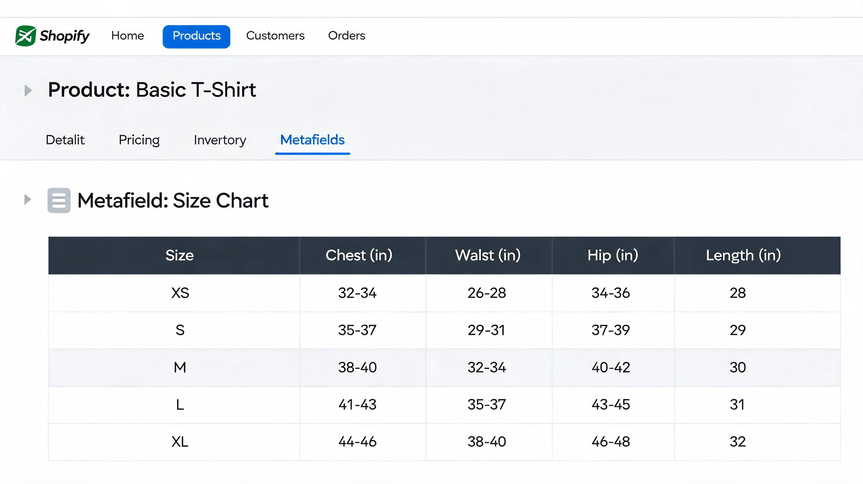
The logic is simple. You create one or more size chart pages in Shopify. Then you create a product metafield that points to the right page. Your theme displays that metafield as a pop-up link, collapsible row, or another supported block on the product page.
This works well because the content and the product assignment stay separate. Merchants can update the chart content without editing code, and different products can point to different guides.
The practical setup
Create the content first
In Shopify admin, go to Online Store, then Pages. Create a page for each chart you need, such as Men's Tops, Women's Denim, or Footwear. Use tables, simple formatting, and short fit notes. Keep it readable.Create a product metafield
In Settings, open Custom data, then Products. Add a metafield definition that references a page. Name it something obvious like “Size chart page” so merchandisers don't guess what it does.Assign the right page to each product Open a product in admin and populate the metafield with the matching page. The system starts paying off at this step. One product can show a specific guide without duplicating content manually inside the description.
Connect it inside the theme editor
In Online Store 2.0 themes, open the product template in Customize. Add a pop-up or collapsible block, then connect the dynamic source to the metafield you created.
Why this method is the best middle ground
Metafields give you native control without monthly app dependency. They also make handoff cleaner. Your marketing team can update fit notes. Your merchandiser can assign charts. Your developer only needs to set the pattern once.
That separation matters. A lot of stores get stuck because every product-page improvement turns into a dev request. Metafields remove that bottleneck.
Here's where they fit best:
- Small but growing catalogs: Enough structure to stay organized
- Multi-category stores: Different charts for different product types
- Teams with non-technical operators: Content updates don't require code changes
- Brands moving away from app bloat: Cleaner stack, fewer moving parts
A native setup usually wins when the store has moved past “just make it work” but doesn't need a fully custom solution yet.
Common mistakes with metafields
The method is solid, but execution often isn't. The biggest mistakes are operational:
- One generic chart for everything: This creates confidence on paper and confusion in reality.
- Poor page formatting: Dense tables with no spacing are hard to use, especially on mobile.
- No fit notes: Measurements alone don't explain whether a garment is slim, relaxed, or oversized.
- Weak placement: If the link is buried in a tab or low on the page, shoppers won't use it.
If you want a size chart in shopify that balances maintainability and control, metafields are usually the strongest answer.
Method 3 The Professional Way with Custom Code
Once a brand starts caring about every element on the product page, the app-first approach usually stops being enough. That's where custom code becomes the right method.
Embedding a size chart directly into the theme can deliver 20 to 30% faster load times than app-based alternatives, based on Shopify Community benchmarks for custom size chart snippets. That matters when product pages carry heavy traffic and every script competes for speed, especially on mobile.

What custom code gives you
The biggest gain is control. You decide exactly where the size guide appears, how it looks, when it loads, and which products trigger it. That's different from adjusting an app's settings. You're shaping the product-page experience at the theme level.
For higher-volume stores, that usually means:
- Tighter placement near the variant picker or add-to-cart area
- Cleaner styling that matches the rest of the theme
- Conditional rendering so the chart only appears when sizing is relevant
- Less dependency on third-party scripts and app UI limits
This approach also makes sense when the product page already has a custom structure and an app would need workarounds to fit cleanly.
The core implementation pattern
A standard build usually follows this structure:
- Create a dedicated size chart page or use a metafield-driven content source.
- Add a snippet such as
size-chart.liquid. - Use Liquid logic to show the chart only when the product includes a size-related option.
- Render that snippet above or near the add-to-cart area in the product template.
- Add the modal, drawer, collapsible section, or inline container that matches the UX you want.
The technical detail matters less than the architecture. The point is to avoid hardcoding one chart across all products while keeping the output fast and consistent.
What can go wrong
Custom code isn't automatically better. It's better when the implementation is disciplined.
The common failure points are familiar:
- Liquid errors: One bad conditional can affect the product page.
- Theme file mismatch: Older theme structures and OS 2.0 layouts don't always use the same template logic.
- Overengineering: A size guide shouldn't become a mini app inside the theme.
- Weak handoff: If only one developer understands the logic, content updates become fragile.
A quick walkthrough can help if you want to see a real implementation flow before touching the theme:
Build custom sizing only as far as the business needs it. Extra flexibility is useful only if the team can maintain it.
Who should choose this method
Custom code is the right fit when your store checks several of these boxes:
- You have a developer or agency partner
- Your theme is already customized
- Performance matters enough to justify theme-level work
- Your sizing logic changes by product type, market, or merchandising rule
- You want the guide integrated into the PDP, not layered on top of it
For a serious fashion or footwear brand, custom theme implementation often becomes the most stable long-term version of a size chart in shopify.
Optimizing Your Size Chart for Conversions and UX
Adding a chart is only half the job. Customers still need to notice it, trust it, and use it without friction.
A lot of stores install a size guide and assume the problem is solved. It isn't. If the chart is hidden, cramped, unclear, or poorly placed on mobile, shoppers still hesitate. The chart exists, but it doesn't help.

Placement matters more than most stores think
For the 62% of Shopify traffic coming from mobile, placement testing matters. Inline tables placed directly under the Add to Cart button can lift AOV by 15%, while poorly optimized pop-ups can cause a 20% drop-off, according to the placement testing data referenced in this Shopify sizing video.
That doesn't mean inline always wins. It means stores should stop treating placement as arbitrary. A pop-up can work well when it opens fast and stays readable. An inline chart can work well when it doesn't dominate the product page. The right answer depends on catalog complexity, theme layout, and how much detail customers need.
What customers actually need inside the chart
The best charts aren't just tables. They help customers make a decision.
Include these elements where relevant:
- Body measurements: Chest, waist, hips, inseam, foot length, or other useful dimensions
- Fit guidance: Slim, relaxed, oversized, true-to-size, or size up/down suggestions
- Unit conversion: Inches and centimeters if you sell internationally
- Regional labels: US, UK, and EU sizing when categories require it
- How-to-measure help: Short instructions and simple diagrams
For a good example of practical measuring guidance, jewelry brands often explain home measurement better than apparel stores do. This resource on Moissanite Diamond home sizing tools is worth studying for how clearly it turns measurement into an actionable step.
If a shopper has to interpret the chart, the chart is incomplete.
Mobile-first fixes that improve usability
Many otherwise good charts fail in this regard. They were built on desktop and then squeezed onto a phone.
I'd fix these first:
- Avoid horizontal chaos: Wide tables that force awkward side-scrolling lose people quickly.
- Use spacing generously: Dense rows and tiny text make comparison hard.
- Keep the trigger obvious: Place the link near price, variants, or the buy box.
- Don't overload the modal: Long educational content belongs below the fold or in a secondary help layer.
Pop-up versus inline
There isn't one universal winner. Use the trade-off that matches the product and shopper behavior.
| Format | Works Best When | Main Risk |
|---|---|---|
| Pop-up | You want a cleaner product page and a quick reference | Slow load or cramped mobile view |
| Inline | The chart is central to the buying decision | It can push key content too far down |
| Collapsible row | You need balance between visibility and page cleanliness | Shoppers may not expand it |
| Tab | The PDP already uses a tab system well | Low discoverability |
A useful size chart in shopify doesn't just exist. It removes doubt at the point of decision.
Advanced Sizing Strategies for Shopify Plus
Static charts solve a real problem, but they don't solve every problem. On Shopify Plus, especially in fashion, footwear, and international catalogs, a one-size-fits-all chart often stops being enough.
That's the point where many brands need to challenge a common assumption. Better size information doesn't always mean a bigger chart. Sometimes it means a more personalized recommendation.
For Shopify Plus stores scaling internationally, early adopters of AI-powered size recommenders that use customer inputs report a further 25% reduction in return rates and an 18% conversion lift in fashion categories, as described in Popupsmart's discussion of advanced Shopify size chart approaches.
Why static charts hit a ceiling
A static table can tell a shopper what a medium measures. It usually can't tell them whether that medium will feel right based on height, weight, body shape, fit preference, or regional expectations.
That gap gets wider when brands operate across storefronts. A shopper in one market may think in centimeters and EU sizing. Another expects inches and US labels. One category may run slim. Another may be intentionally oversized. The chart becomes accurate on paper but incomplete in practice.
For Plus stores, the problem isn't only display. It's orchestration.
What advanced sizing looks like in practice
The stronger setups usually combine several layers:
- Metafield-driven chart management so the base content stays organized by product type
- Localized sizing presentation for different markets and storefronts
- Fit recommendation inputs such as height, weight, or preferred fit
- App or API-based recommendation engines that generate a more specific answer than a static table can
The goal is to shift sizing from passive reference material to active decision support.
Where merchants should be careful
AI sizing tools can improve fit confidence, but they also introduce complexity. If the recommendation logic isn't aligned with actual product measurements, the tool adds false precision instead of clarity.
The operational side matters as much as the front-end experience:
- Your product data must be clean
- Measurements must be consistent across suppliers
- Recommendations should reflect fit intent, not only raw dimensions
- Localization needs to stay synchronized across storefronts
The bigger the catalog, the less a generic size chart helps. At scale, sizing becomes a data management problem and a CRO problem at the same time.
Shopify Plus brands usually get the best results when sizing is treated as part of the wider conversion system. Product data, merchandising logic, theme UX, and recommendation tooling have to work together. Otherwise, the store ends up with polished charts that still leave customers unsure.
If your team needs a size chart setup that matches your growth stage, whether that's a quick app launch, a metafield-based native system, or a Shopify Plus sizing experience with deeper CRO thinking, ECORN can help design and implement the right approach without adding unnecessary complexity.


Shopify: How to Reduce Technical Debt

Shopify UX Design Change: A Playbook for Growth

User Generated Content Strategy: Shopify Playbook

Shopify Pause and Build Plan Cost: A Complete 2026 Guide

Compare at Price on Shopify: A Complete Guide for 2026

Where Can I Sell My Prints? 10 Best Platforms for 2026

Shopify Order Management System: The Ultimate Guide 2026

What Is Marketing Attribution? an eCommerce Guide for 2026

10 Best Black Friday Sales Sheets for 2026

Discover the Top Social Media Marketing Agencies For

Consumer Confidence Definition for eCommerce in 2026

What Is Social Commerce? Your 2026 Guide to Boosting Sales

A Social Ad Campaign Playbook for eCommerce Growth

7 Best FAQ Page Examples for SaaS & eCommerce

Market Research in Fashion Industry: A Guide for Shopify

Shopify Migration Services: Expert Guide for 2026

Mastering FB Retargeting Ads for Shopify in 2026

What Is Omnichannel Ecommerce

Master Your Shopify Plus Migration: The 2026 Guide

Shopify Integration Services: A Merchant's 2026 Guide

Shopify Collection Description: A Guide to SEO & Sales

Shopify Plus Contact: Reach Sales & Support Effectively

Top Luxury Shopify Stores: Design & UX Strategies

How to Improve Customer Experience: A Shopify Roadmap

Creative Facebook Ads: 10 Examples for Shopify Brands

Remarketing with Facebook Ads: A Shopify Guide for 2026

SEO Linking Strategies for Shopify Stores

Top 7 Statistics YouTube Channels for eCommerce in 2026

Hiring Shopify Plus Designers: A Founder's Guide

Shopify Product Variation: Master Your Variants for 2026

Leverage Ai Solutions Brands: Your 2026 Shopify Growth Guide

Filters in Shopify: A Guide for Growing Brands

Shopify Plus Developer: A Guide for Growing Brands

When Does Black Friday Online Start? A 2026 Guide

Black Friday Email Marketing: Shopify & Klaviyo Guide

Polaris Design System: The Complete Shopify Guide

How to Hire a Consultant Email Marketing Expert

What Is Q4? A Shopify Merchant's Guide to Peak Season

Marketing Organization Structure for eCommerce Growth

Top Account-Based Marketing Agency Guide for 2026

7 Remarketing Ad Examples for Your 2026 Campaigns

AI Retail Solutions: Boost Your Shopify Store

Migrate to Shopify: The Definitive 2026 Guide

Shopify Authentication App: A Guide for Secure Stores

Why Strategic Marketing Is Important for Growth in 2026

Shopify Themes for Jewelry: The Definitive 2026 Guide

Minimal Shopify Templates: Faster, Higher-Converting Stores

Maximize Profit: Shopify CC Fees 2026 Guide

Best Shopify Apps for Beginners in 2026

How to Improve Online Shopping Experience in 2026

Shopify Design and Development Services: A 2026 Guide

Small Business Social Media Marketing Agency: A Hiring Guide

Bulk Edit Shopify: A Guide to Save Hours on Store Updates

2026 Trends in Food and Beverage Industry

Post Purchase Survey Guide for Shopify Stores

How to Build an Ecommerce Brand in 2026

Conversion Rate Optimization for Ecommerce: Maximize Profit

How to Use Customer Data to Increase Sales: A Guide

Shopify for Enterprise: The 2026 Deep Dive Guide

Email Marketing Agencies: The Guide for Shopify Brands

Boost Sales With The Right Shipping Shopify App

Your Guide to the Shopify Site Map

7 Headless Commerce Examples for 2026

Mastering Trends in Cosmetic Industry for 2026

Transfer Shopify to BigCommerce The Complete 2026 Playbook

What Is Shopify Collective? Your 2026 Guide to Success

Unlock Shopify Growth with Site Link SEO

Integrating Shopify and WordPress A Complete Guide for 2026

Naming a Clothing Store: A Shopify Founder's Playbook

Guide to buying shopify store in 2026

Buying shopify store: Buying a Shopify Store: Invest Wisely

Food & Beverage Marketing: A Complete Guide for 2026

Facebook Ads Agency: A Shopify Brand's Hiring Guide

Shopify Apparel Stores: A 2026 Launch & Scale Guide

How to Deactivate Shopify Store: The 2026 Guide

Shopify and Square: The 2026 Ultimate Comparison

Your Guide to Beauty Products Ecommerce

A Guide to Marketing for Beauty Brands in 2026

Your Guide to Facebook Black Friday Ads

Facebook Ad Ecommerce for Shopify Growth

Iconography Web Design The Definitive Guide for Shopify Stores

A Modern Backlinks SEO Strategy for Shopify Stores

How to Launch an Online Store: A Step-by-Step Success Guide

Optimize Shopify Store: Master Performance in 2026

Successful Migration for Shopify: Protect SEO & Grow

Maximize Traffic & Sales: Get Your Free Website Audit Report

Master the Best Ads Facebook Formats for eCommerce Success

How to Find the Best Ecommerce Agency Near Me in 2026

10 Crucial White Hat Techniques SEO for Shopify in 2026

How to Reduce Returns and Boost Profits in Your eCommerce Store

What Is Ecommerce Personalization A Guide to Unlocking Growth

Payment gateways in shopify: The Ultimate Guide for Merchants 2026
Fulfillment services for shopify: Scale Your Ecommerce Brand

Shopify Landing Page Examples: 7 Winning Templates to Boost Conversions
How to Create Urgency in Sales on Shopify

The Best Review Apps for Shopify to Drive Growth in 2026

The Best Ecommerce Platform for Startups in 2026

Choosing Ecommerce Website Design Packages A Complete Guide

Shopify Plus Partners: Guide to shopify plus partners for 2026 growth

How to Find serp feature opportunities: Win SERP Snippets in 2026


newsletter in your inbox