A sales pop-up is that small window that shows up on a website, usually to give you an offer, ask for your email, or point you toward a specific action. Used the right way, it’s a seriously powerful tool to increase conversions, capture email leads, and cut down on cart abandonment, effectively turning casual browsers into paying customers.
Why a Sales Pop Up Is Your Secret Conversion Tool

Let's be honest—most people claim to hate pop-ups. But what if that common complaint completely misses their real power? A strategic sales pop-up is so much more than an interruption; it’s one of the most effective conversion tools any Shopify merchant has.
Think of it like a sharp retail associate who steps in at the perfect moment—not to be pushy, but to offer a helpful discount or prevent a shopper from walking away empty-handed.
These pop-ups create a direct line of communication with your visitors. They let you deliver a timely, relevant message that can completely change their path from "just looking" to making a purchase.
From Annoyance to Asset
The entire game is about shifting your perspective. Yes, a poorly timed, generic pop-up is annoying. But a well-crafted one feels like a genuinely helpful service. Picture a customer about to leave your store with items still in their cart. An exit-intent pop-up that offers free shipping can be the exact nudge they need to check out.
The top Shopify brands have mastered this by weaving their pop-up strategy directly into the customer experience. They don't just blast random discounts at everyone. Instead, they use pop-ups to:
- Welcome new visitors with a special first-time buyer discount.
- Prevent cart abandonment by showing a last-minute incentive.
- Grow their email list by offering exclusive content or deals for an email signup.
- Announce flash sales or new product drops to build instant excitement.
A smart sales pop-up doesn’t just chase one sale; it builds a relationship. By offering real value at the right moment, you turn a potential annoyance into a powerful asset that drives engagement and a measurable ROI.
This approach transforms the pop-up from a simple marketing trick into a core part of your conversion rate optimization (CRO) efforts. A visitor who might have left and forgotten your brand now has a compelling reason to stay, subscribe, or buy. In today's market, you can't afford to ignore a tool that gives you such a direct path to more revenue and loyal customers.
Building Your High-Impact Sales Pop Up Strategy
A great sales popup doesn't just appear out of thin air. It’s the result of a deliberate, well-thought-out strategy. Before you even think about design or copy, you need a clear game plan. This is what separates a popup that genuinely boosts your conversions from one that visitors close in a split second.
The single biggest mistake we see merchants make is trying to cram too much into one popup. Asking for an email, announcing a flash sale, and promoting a new product all at once is a recipe for disaster. When you overwhelm a visitor with choices, they’ll almost always choose to do nothing.
Instead, zero in on a single, primary goal. Are you trying to grow your email list? Is your main objective to slash cart abandonment rates with a last-minute offer? Or maybe you need to build serious urgency for an upcoming sale.
Your popup's goal should be specific and measurable. Instead of a vague goal like "get more sales," aim for something concrete like "capture 300 new email leads this month" or "reduce cart abandonment by 15% with an exit-intent offer."
Once you nail down that one objective, every other decision—from the copy to the offer itself—falls right into place.
Define Your Core Objective
What's the one action you absolutely need a visitor to take? This should tie directly into your biggest business priorities right now.
- Lead Generation: If growing your audience for email or SMS campaigns is the priority, your goal is simple: capture contact info. Your popup acts as a welcome mat, trading a small incentive for a long-term relationship.
- Sales Conversion: To drive revenue directly, the goal is to get an immediate purchase. This is where you'd push a site-wide discount, a product bundle, or a time-sensitive deal.
- Cart Recovery: Abandoned carts eating into your profits? Your goal is to stop visitors right before they leave. An exit-intent popup that speaks directly to what's in their cart can be incredibly powerful here.
With a clear goal in mind, the next piece of the puzzle is creating an offer they can't refuse.
Crafting the Perfect Offer
The offer is the real heart of your sales popup. It’s the "what's in it for me?" that makes someone stop and take action. A generic "10% off" can work in a pinch, but a little creativity will get you much better results.
Your offer has to feel valuable and, just as importantly, relevant to where the visitor is in their journey. A first-time visitor might be swayed by a discount on their first purchase, but a loyal, returning customer might be more excited about getting early access to a new drop.
Let's move beyond the basic percentage-off discount and look at some offers that really convert:
- Free Shipping: This is a classic for a reason. Shipping costs are consistently one of the biggest reasons shoppers abandon their carts. Removing that barrier is a huge motivator.
- Free Gift with Purchase: This tactic is fantastic for increasing the perceived value of an order. For example, a beauty brand could offer a free travel-size product with any order over $50.
- Exclusive Access: Make your subscribers feel like VIPs by offering them early access to new collections or sales. This builds a powerful sense of community and is a magnet for your most dedicated fans.
- Contest Entry: A giveaway is a great way to drive engagement and build your list fast. Something like, "Enter your email for a chance to win a $250 gift card!" is a proven winner for lead generation.
The key is to match your offer not just to your goal, but to the specific person you're targeting. A new visitor who clicked through from a social media ad is in a completely different mindset than a loyal customer who has bought from you five times. A well-designed sales pop up anticipates this, tailoring the incentive to make the interaction feel personal and genuinely helpful, not intrusive.
Alright, you've got your strategy nailed down. Now for the fun part: actually designing the sales popup that will do the heavy lifting. This is where you turn your goals and offers into a real, clickable experience for your visitors.
Be warned, though. The line between a welcome offer and a site-killing annoyance is razor-thin. It all comes down to thoughtful design.
A high-converting popup is more than just a box with an offer. It’s a finely-tuned piece of communication where every single element—from the headline down to the color of the button—has a job to do. Your goal is to make it feel like a helpful, natural part of their shopping journey, not a roadblock.
The Anatomy of a High-Converting Pop Up
Great popup design really boils down to three things working in harmony: a headline that grabs attention, copy that shows the value, and a call-to-action (CTA) that’s impossible to ignore. Get these right, and you’ll guide users from curiosity straight to conversion.
The Headline: This is your one shot at a first impression. It has to immediately answer the visitor’s silent question: "What's in it for me?" Forget generic phrases. Use action-oriented language that highlights the benefit. "Get 15% Off Your First Order" will always beat "Sign Up for Our Newsletter."
The Body Copy: Keep it short and sweet. Your copy should clearly and quickly explain the value of what you're offering and what they need to do to get it. Cut the jargon and any complicated steps—friction is the enemy here.
The Call-to-Action (CTA): This is where the magic happens. Your CTA button needs to feel urgent and exciting. Use strong, action-focused verbs like "Claim My Discount," "Unlock Free Shipping," or "Shop the Sale Now." A simple "Submit" just doesn't cut it.
Remember, the entire design should serve one single purpose. If you're collecting emails, make that form field front and center. If you're pushing a sale, that CTA button should be the undeniable star of the show.
This whole approach is about respecting the user’s time and attention. If you want to go deeper, our guide on user-centered design principles explains how to apply this philosophy across your entire site.
Here's a quick checklist to keep you on track. Think of these as the non-negotiables for any popup you create.
Key Design Elements for a High-Converting Sales Pop Up
Stick to these fundamentals, and you'll be building popups that add value instead of just adding noise.
Mobile-First Design Is Non-Negotiable
A bad mobile popup is a guaranteed way to lose a sale. Period. With more than half of all web traffic coming from phones, a desktop popup that breaks on a small screen is an instant turn-off. We’ve all seen them: they block content, the close button is off-screen, and the form fields are too tiny to tap.
You have to design for mobile first. Make sure every element is easy to read, easy to tap, and easy to interact with on a small screen. That means big buttons, legible fonts, and a layout that doesn’t require any pinching or zooming. Once you've perfected the mobile version, you can adapt it for desktop.
And please, make the exit button easy to find. Trying to hide the "X" or making it microscopic is a dark pattern that screams desperation. It erodes trust and makes people angry. A user who feels trapped is a user who will never come back.
Using Visuals and Branding to Build Trust
Your sales popup shouldn't feel like a random ad that just appeared. It needs to look and feel like it belongs to your brand. Use your brand’s specific colors, fonts, and tone of voice to create a seamless and trustworthy experience. Consistency is key—it reassures visitors that the offer is legit and comes directly from you.
For merchants on platforms like Shopify, which powers over 5 million active stores, this branding is especially crucial. The ecosystem is massive, with a projected gross merchandise value soaring past $300 billion for 2025, and popups have become a go-to tool for growth.
The data shows it works. An impressive 80% of retailers who tried a popup campaign called it a success. And with 44% of those campaigns launching for under $5,000, it’s an incredibly accessible strategy for scaling sales.
By tying your clear strategic goals to thoughtful, user-first design, your popup transforms from a potential annoyance into a powerful tool for connection and conversion.
Mastering Pop-Up Triggers and Audience Targeting
A great pop-up design and a killer offer can fall completely flat if they show up at the wrong moment. The real secret behind a sales pop-up that feels helpful instead of infuriating lies in the timing.
Think of it this way: you wouldn't walk up to a shopper the second they enter your store and demand their email address. You'd wait for the right moment. The same goes for your website. Mastering the art of triggers and audience targeting is what separates a disruptive annoyance from a welcome, conversion-driving interaction.
Finding the Perfect Moment with Triggers
Choosing the right trigger is all about anticipating your visitor's behavior and intent. Instead of just blasting a pop-up after a random delay, you can use smarter triggers to deliver your message right when a visitor's interest is at its peak—or at a moment of hesitation.
Here are the most effective triggers I see working for stores today:
Time on Page: This is a classic, but you need to be strategic. Don't just set it for five seconds. Dig into your site analytics. If you see the average visitor spends 45 seconds on a product page before deciding, triggering a pop-up at the 30-second mark with a special offer could be the perfect nudge.
Scroll Depth: When a visitor scrolls down your page, they're signaling engagement. Triggering a sales pop-up after they've scrolled 70% of the way down a blog post or a long product description is a great way to reach an already-interested audience. This is an ideal time to ask for an email signup in exchange for more valuable content.
Exit-Intent: This is your most powerful weapon against cart and site abandonment. Exit-intent technology tracks a user's cursor movement. When it darts toward the back button or to close the tab, the pop-up appears. It’s your last-chance saloon to make an impression with an offer they can't refuse, like free shipping or a surprise discount.
This level of strategic timing isn't just a "nice-to-have." The pop-up market's global trajectory is expected to hit $80 billion by 2024-25. For Shopify stores that saw a staggering 875 million unique shoppers in 2024, a well-timed pop-up is a critical tool for boosting conversions, especially as Google search trends for "pop-up shop" peak during key sales seasons. You can find more pop-up retail statistics and trends to get the full picture.
Moving Beyond One-Size-Fits-All Targeting
A generic, one-size-fits-all pop-up is a wasted opportunity. Modern tools let you slice and dice your audience, showing them hyper-relevant offers based on who they are and what they're doing on your site.
The most effective pop-up feels like a personal recommendation, not a generic ad. This is achieved by combining smart triggers with even smarter audience targeting.
This flowchart breaks down the flow of a high-converting pop-up, from getting their attention to sealing the deal.
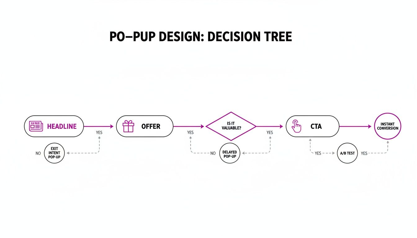
As you can see, a compelling offer and a clear call-to-action are just as crucial as the headline. Now, let’s see how to apply this by tailoring the message to specific visitor segments.
Real-World Targeting Scenarios
Let's look at how you can apply these targeting rules to deliver the perfect pop-up to the right person.
Scenario 1: The New Visitor from Instagram
A user clicks through from an Instagram ad for your new summer dress collection. They've never been to your site before.
- The Play: Show them a pop-up only if they are a new visitor and their referral source is Instagram. Trigger it after they’ve browsed 2 product pages.
- The Offer: "Welcome! Enjoy 15% off your first order. Use code: NEW15". This acknowledges where they came from and gives them an immediate incentive to buy.
Scenario 2: The Returning Customer
A loyal customer who has purchased from you twice before is browsing your "New Arrivals."
- The Play: Show a pop-up to returning customers with 2+ previous orders who are specifically on the
/collections/new-arrivalsURL. Trigger it on exit-intent. - The Offer: "Hey, welcome back! Get early access to our next drop. Enter your email to join the VIP list." This rewards loyalty with exclusivity, not just another discount.
Scenario 3: The Almost-There Cart
A visitor has added $120 worth of products to their cart. Your free shipping threshold is $100, but they've gone idle.
- The Play: Target visitors with a cart value over $100 who have been inactive for 60 seconds on the cart page.
- The Offer: A gentle reminder pops up: "Good news! Your order qualifies for free shipping. Complete your purchase now." This reinforces a benefit they’ve already earned and nudges them over the finish line.
By combining these triggers with granular targeting, you stop interrupting and start assisting. This thoughtful approach is the key to a pop-up strategy that respects your visitors, strengthens your brand, and ultimately drives more revenue.
Choosing the Right Sales Pop Up Tool for Shopify
You've got your strategy mapped out and your designs are looking sharp. Now for the fun part: bringing your sales popup to life on your Shopify store. This is where you pick the engine that will power everything.
You're looking at two main roads here: using a dedicated app from the Shopify App Store or going all-in with a custom-coded solution. This isn't about finding the one "best" tool. It’s about finding the right tool for your business, right now. The decision really boils down to your budget, your team's technical skills, and where you see your brand heading long-term.
Shopify Apps: The Plug-and-Play Solution
For most Shopify merchants, especially if you're just getting started or need to move fast, a dedicated popup app is the way to go. The Shopify App Store is packed with powerful, user-friendly options that let you build and launch a high-converting sales popup in minutes, often without touching a single line of code.
The advantages of using a Shopify app are pretty clear:
- Easy to Use: Most of these apps have intuitive drag-and-drop editors. You don't need to be a developer to make your popups look great.
- Fast to Launch: You can literally go from installation to a live popup in less than an hour. This kind of speed is a game-changer for agile marketing teams wanting to test new offers on the fly.
- Affordable: Many apps offer free plans for basic features. Even the paid tiers are a fraction of the cost of hiring a developer for a custom build.
Of course, that convenience can have its downsides. Some third-party apps might add extra code to your site, which can have a minor impact on loading speeds. And while customization is usually great, you might hit a wall if you're trying to achieve a very specific, pixel-perfect design that's unique to your brand.
Custom-Coded Popups: The High-Control Option
A custom-coded solution is exactly what it sounds like: a developer builds a sales popup directly into your store’s theme. This approach gives you absolute control and flexibility, but it's a much bigger investment in both time and money.
So, when does a custom build actually make sense?
A custom-coded sales popup is best for established, high-traffic brands where even a fractional improvement in site speed can translate to substantial revenue, or for businesses with highly specific design or functionality requirements that no app can meet.
With a custom build, your popup is perfectly optimized for your theme. This means lightning-fast load times and virtually zero impact on site performance. You get total creative freedom and can build in complex targeting logic that goes way beyond what most standard apps can do. But before you get too deep into complex targeting, you have to know who you're targeting in the first place. This guide on How to Identify a Target Audience is a fantastic playbook for all of your marketing efforts.
The main drawbacks are the cost and the lack of agility. You'll need a skilled Shopify developer, and even simple changes—like A/B testing a new headline—will require you to go back to them. This can really slow down your marketing workflow.
Must-Have Features in a Sales Popup App
If you decide an app is the right path for your store, don't just grab the first one you see. You need a tool with a solid set of features that will let you execute all the strategies we've talked about. To dig deeper, check out our guide on how to choose the right promotional apps for your Shopify store.
Here are the non-negotiable features you should be looking for:
Choosing your tool is a foundational step. By weighing the speed and ease of an app against the total control of a custom build, you can pick the path that fits your resources and sets you up for success.
How to Measure and Optimize Your Pop Up Performance
Getting your sales popup live is a great first step, but that’s really just the beginning. The real growth comes from paying close attention to your data, figuring out what's resonating, and making constant improvements.
Don't fall into the common trap of "set it and forget it." Your popup is a living, breathing part of your store's ecosystem, and it needs regular check-ups to perform at its best. To do that, you need a simple way to track what’s working without getting bogged down in useless metrics.
Identifying Your Core Metrics
It’s tempting to watch every number go up and down, but to truly understand your popup’s impact, you need to focus on the key performance indicators (KPIs) that tie directly to your goal. Forget vanity metrics like impression counts—they don't pay the bills.
Here are the numbers that actually move the needle:
- Conversion Rate: This is your north star metric. It's the percentage of visitors who saw your popup and actually did what you asked them to do, whether that was signing up for your email list or copying a discount code. A low conversion rate is a clear sign that there’s a disconnect between your offer and your audience.
- Engagement Rate: This tells you how many people are interacting with your popup versus just mashing the "X" button to make it go away. A high engagement rate means your headline and design are compelling enough to stop them in their tracks.
- Direct Revenue Impact: If your goal is to drive sales, you need to connect the dots. The easiest way is to track how many times a unique discount code from a popup is used at checkout. This gives you a hard dollar amount you can attribute directly back to that specific popup.
Once your popups are collecting data, the real work of continuous improvement begins. As these insights on optimizing pop-ups show, the secret to boosting revenue is methodical testing.
A Practical Guide to A/B Testing
A/B testing, also known as split testing, is how you remove the guesswork from optimization. It’s a simple concept: show two different versions of your popup to similar audiences and see which one performs better. This data-driven approach is your best friend.
The golden rule of A/B testing is to test only one element at a time. If you change both the headline and the offer, you'll never know which one was actually responsible for the change in conversions.
Always start by testing the biggest, most impactful elements first. You'd be surprised how small tweaks can lead to massive gains.
What to A/B Test for Maximum Impact:
- The Offer: This is by far the most powerful lever you can pull. Test a 15% discount against an offer for free shipping. You might discover that free shipping converts twice as well, even if it’s a lower-cost offer on your end.
- The Headline: Your headline is your hook. Try pitting a benefit-driven headline like "Get Flawless Skin" against a direct-offer headline like "Get 10% Off Now."
- The Call-to-Action (CTA): The text on your button matters. Does "Claim My Discount" work better than "Shop Now"? The right wording can create a powerful sense of urgency and ownership that encourages clicks.
- The Visuals: Test a popup that features a slick product image against a minimalist version with no image at all. Sometimes, simpler is better and less distracting.
By methodically testing these key elements, you can turn a decent-performing popup into a consistent, reliable revenue machine for your store.
Frequently Asked Questions About Sales Pop Ups
If you're thinking about using sales popups on your Shopify store, you've probably got a few questions. That's a good thing.
Most store owners I talk to worry about the same two things: messing up their SEO and annoying their visitors. Let's get those common concerns out of the way so you can use popups with confidence.
Will A Sales Pop Up Hurt My SEO Ranking?
This is a huge concern for many merchants, but the short answer is no—as long as you're smart about it.
Google's main issue is with "intrusive interstitials" on mobile. These are the popups that block the entire page the second a user lands from a search result, creating a dead-end experience. Nobody likes that.
As long as your popup is easy for a visitor to close and only shows up after they've had a chance to look around, you'll be fine. Using triggers like exit-intent or a simple time delay ensures you aren't throwing up a roadblock right away. Focus on adding value, not an obstacle, and your SEO will be perfectly safe.
What Is The Best Offer For A Sales Pop Up?
The "best" offer is always the one your specific audience actually wants. There’s no magic bullet here, which is exactly why A/B testing is your best friend.
That said, some offers are proven winners and make great starting points.
- For grabbing emails, a 10% discount or free shipping on a first order is a timeless classic. It just works.
- To rescue an abandoned cart, a time-sensitive discount can create that little bit of urgency needed to get them across the finish line.
- To launch a new collection, offering early access makes subscribers feel like true VIPs and builds a loyal following.
Start with your best guess based on what you're trying to achieve, then test, test, and test again. You'll quickly find out what really gets your customers to click.
Quality and relevance will always beat quantity. Instead of adding more pop ups, use advanced targeting rules to ensure the single pop up you show is the most relevant one for that specific visitor and their journey. This builds trust and drives more conversions.
Ready to turn your Shopify store's visitors into customers with perfectly timed, high-converting pop ups? The team at ECORN specializes in CRO and Shopify development to help you implement a sales pop up strategy that works. Start a project with us today!


What Does CRO Stand for in Business: Understanding CRO
Shopify Visual Merchandising: A Playbook for Higher Sales
Shopify Landing Page Design: Master Conversion in 2026
10 Best AI SEO Optimization Tools for Shopify in 2026

Agentic AI for Ecommerce: Boost Your Sales in 2026
Mastering Email Marketing Data for eCommerce Growth
Conversion Rate Optimisation Australia: Boost Your Sales
Conversion Rate Optimization AI: Your Shopify Store Guide

10 Product Bundling Strategies for Shopify in 2026
How to Increase Customer Lifetime Value: A Shopify Playbook
AI Customer Service Automation: Shopify Guide 2026
Clean Website Design: A Shopify Conversion Playbook

Omnichannel Retail Strategy: A Shopify Playbook
Product Data Enrichment: A Guide for Shopify Brands
Instagram Shopping Features a Guide for Shopify Stores
What Is Revenue Optimization: A Holistic RevOps Guide
Benefits of Conversion Rate Optimization: Boost Your
WordPress to Shopify Migration: Your 2026 Seamless Switch
Boost Sales: Ecommerce Payment Processing Guide 2026
Unified Commerce Platform: Benefits, KPIs & Shopify Guide

How to Reduce Bounce Rate eCommerce: Your 2026 Guide

Shopify API Integration: A Practical End-to-End Guide

How to Implement Data Governance: A 2026 Guide

Shopify Store Development Cost: A 2026 Breakdown
What Is Server Side Tracking: The Shopify Guide 2026

Marketing Automation Workflows: A Shopify Guide for 2026

Shopify: How to Reduce Technical Debt

Shopify UX Design Change: A Playbook for Growth

User Generated Content Strategy: Shopify Playbook

Shopify Pause and Build Plan Cost: A Complete 2026 Guide

Compare at Price on Shopify: A Complete Guide for 2026

Where Can I Sell My Prints? 10 Best Platforms for 2026

Shopify Order Management System: The Ultimate Guide 2026

What Is Marketing Attribution? an eCommerce Guide for 2026

10 Best Black Friday Sales Sheets for 2026

Discover the Top Social Media Marketing Agencies For

Consumer Confidence Definition for eCommerce in 2026

What Is Social Commerce? Your 2026 Guide to Boosting Sales

A Social Ad Campaign Playbook for eCommerce Growth

7 Best FAQ Page Examples for SaaS & eCommerce

Market Research in Fashion Industry: A Guide for Shopify

Shopify Migration Services: Expert Guide for 2026

Mastering FB Retargeting Ads for Shopify in 2026

What Is Omnichannel Ecommerce

Master Your Shopify Plus Migration: The 2026 Guide

Shopify Integration Services: A Merchant's 2026 Guide

Shopify Collection Description: A Guide to SEO & Sales

Shopify Plus Contact: Reach Sales & Support Effectively

Top Luxury Shopify Stores: Design & UX Strategies

How to Improve Customer Experience: A Shopify Roadmap

Creative Facebook Ads: 10 Examples for Shopify Brands

Remarketing with Facebook Ads: A Shopify Guide for 2026

SEO Linking Strategies for Shopify Stores

Top 7 Statistics YouTube Channels for eCommerce in 2026

Hiring Shopify Plus Designers: A Founder's Guide

Shopify Product Variation: Master Your Variants for 2026

Leverage Ai Solutions Brands: Your 2026 Shopify Growth Guide

Filters in Shopify: A Guide for Growing Brands

Shopify Plus Developer: A Guide for Growing Brands

When Does Black Friday Online Start? A 2026 Guide

Black Friday Email Marketing: Shopify & Klaviyo Guide

Polaris Design System: The Complete Shopify Guide

How to Hire a Consultant Email Marketing Expert

What Is Q4? A Shopify Merchant's Guide to Peak Season

Marketing Organization Structure for eCommerce Growth

Top Account-Based Marketing Agency Guide for 2026

7 Remarketing Ad Examples for Your 2026 Campaigns

AI Retail Solutions: Boost Your Shopify Store

Migrate to Shopify: The Definitive 2026 Guide

Shopify Authentication App: A Guide for Secure Stores

Why Strategic Marketing Is Important for Growth in 2026

How to Create a Size Chart in Shopify: 2026 Guide

Shopify Themes for Jewelry: The Definitive 2026 Guide

Minimal Shopify Templates: Faster, Higher-Converting Stores

Maximize Profit: Shopify CC Fees 2026 Guide

Best Shopify Apps for Beginners in 2026

How to Improve Online Shopping Experience in 2026

Shopify Design and Development Services: A 2026 Guide

Small Business Social Media Marketing Agency: A Hiring Guide

Bulk Edit Shopify: A Guide to Save Hours on Store Updates

2026 Trends in Food and Beverage Industry

Post Purchase Survey Guide for Shopify Stores

How to Build an Ecommerce Brand in 2026

Conversion Rate Optimization for Ecommerce: Maximize Profit

How to Use Customer Data to Increase Sales: A Guide

Shopify for Enterprise: The 2026 Deep Dive Guide

Email Marketing Agencies: The Guide for Shopify Brands

Boost Sales With The Right Shipping Shopify App

Your Guide to the Shopify Site Map

7 Headless Commerce Examples for 2026

Mastering Trends in Cosmetic Industry for 2026

Transfer Shopify to BigCommerce The Complete 2026 Playbook

What Is Shopify Collective? Your 2026 Guide to Success

Unlock Shopify Growth with Site Link SEO

Integrating Shopify and WordPress A Complete Guide for 2026

Naming a Clothing Store: A Shopify Founder's Playbook

Guide to buying shopify store in 2026

Buying shopify store: Buying a Shopify Store: Invest Wisely

Food & Beverage Marketing: A Complete Guide for 2026

Facebook Ads Agency: A Shopify Brand's Hiring Guide


newsletter in your inbox