
When we talk about iconography in web design, we're really talking about the strategic use of symbols to guide customers, explain what they can do next, and strengthen your brand's presence. For any Shopify store, this isn't just about making things look pretty; it's a silent language that can seriously improve the user experience and, ultimately, drive more sales.
The Silent Sales Language Your Shopify Store Needs
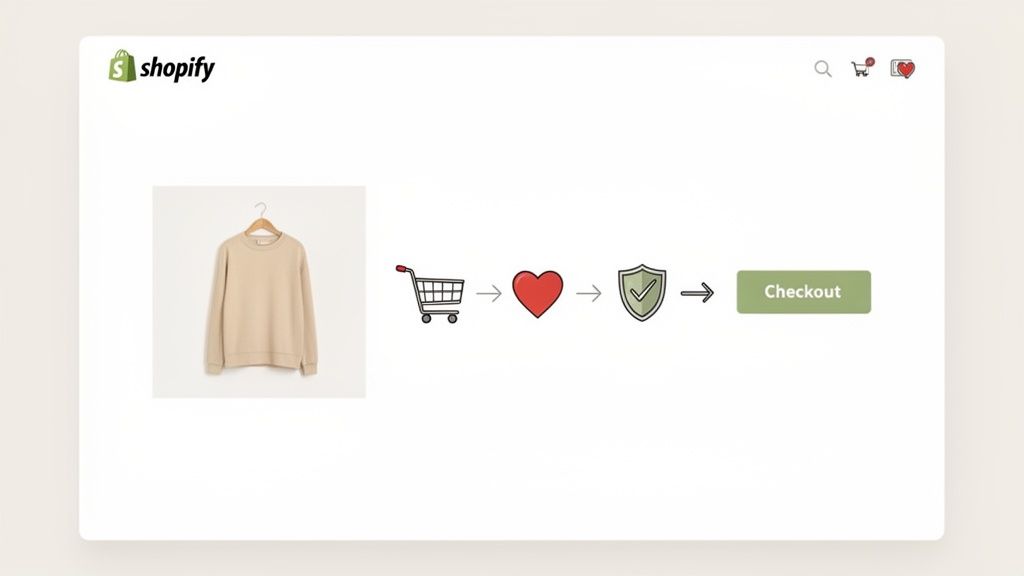
In the world of online shopping, a customer's attention span is razor-thin. Every single element on your Shopify store is either helping or hurting their path to purchase, and icons are a huge part of that. Think of them less as simple decorations and more as hard-working tools that can make or break the customer's journey.
Good iconography acts like a universal translator. A well-designed shopping cart icon instantly tells a user from anywhere in the world where to find their items, cutting through language barriers and reducing the mental effort needed to shop. That split-second understanding is crucial when a customer is moments away from deciding to buy.
Beyond Generic Symbols
This is where you can really start to separate your brand from the pack. While using a standard magnifying glass for your search bar is a must for basic usability, your icons for value propositions—like "Free Shipping," "Easy Returns," or "Sustainable Materials"—are a massive opportunity to inject your brand's personality.
Consider the difference it makes:
- A store selling high-tech gadgets could use sharp, precise, geometric icons to reflect innovation and quality.
- An organic skincare brand might opt for softer, hand-drawn style icons to communicate a natural, gentle, and trustworthy feel.
This kind of visual consistency helps you build a cohesive brand story, making your store far more memorable and building trust with every click.
An icon's main job is to help people find what they're looking for, faster. When you get them right, icons cut through the clutter and guide the eye, creating a cleaner, more intuitive interface that directly supports your conversion goals.
The Direct Impact on Conversions
Make no mistake, strategic iconography has a direct line to your bottom line. Think about the checkout process. Clear, reassuring icons—like security shields, credit card symbols, and delivery trucks—calm customer anxieties and are proven to reduce cart abandonment. Our brains process visual cues much faster than text, making icons a powerful way to nudge user behavior toward completing a purchase.
This guide will be your practical roadmap. We're going to walk through how to transform your store's icons from forgettable placeholders into sophisticated tools for brand storytelling and conversion. We'll cover how to design, implement, and optimize an icon system that doesn't just look good but delivers real, tangible results for your Shopify store.
Building Your Brand's Visual Language With Custom Icons
Using a generic icon pack on your Shopify store is a massive missed opportunity. Sure, it gets the job done, but it says absolutely nothing about your brand. Creating a custom iconography system is about developing a unique visual language that weaves itself into the very fabric of your brand identity.
This isn't just about making things look pretty; it's about turning simple symbols into hard-working brand assets. Think about it this way: a store selling high-tech gadgets would want sharp, geometric icons that feel precise and modern. On the other hand, an organic skincare brand would benefit more from soft, hand-drawn icons that convey a natural, gentle, and trustworthy vibe.
That distinction is a strategic one. When you get it right, your custom icons reinforce what your brand stands for at every single touchpoint, from your homepage all the way to the final checkout button.
Defining Your Iconography Style
Before anyone opens up a design program, you need to lay down the ground rules. This foundational step ensures every icon—from a simple search magnifying glass to a complex "sustainably sourced" badge—looks like it belongs to the same family. Consistency is everything in effective iconography.
Start by outlining a clear set of stylistic guidelines. Here are the key elements you'll need to define:
- Line Weight: Are your icons going to be bold and punchy, or thin and delicate? Settle on a consistent stroke width and stick with it.
- Style: Will they be outlined (stroked), filled (solid), or a mix? Outlined icons often feel lighter, while filled icons have more visual weight.
- Corner Style: Do your icons have sharp, squared-off corners, or are they soft and rounded? This tiny detail makes a huge difference to the overall feel.
- Color Palette: Stick to your brand's primary and secondary colors. You can use color strategically to highlight key actions, but don't go overboard.
These rules become the blueprint for your designer, guaranteeing the final set feels unified and intentional. This is a critical piece of building a larger design system, a topic we cover in our guide to creating a Shopify design system.
Collaborating on Custom Icon Creation
Once your style guide is locked in, the fun part begins. Whether you’re working with a freelance designer or our team here at Ecorn, clear communication is the key to getting what you want.
Don’t just send over a list that says "delivery icon." Give your designer context. A better request would be, "We need an icon for our 'Free 2-Day Shipping' banner. Our brand is all about speed and reliability, so it should feel modern and dynamic." That context is gold—it helps the designer create symbols that not only look great but also communicate the right message instantly.
Icons have a fascinating history, starting with ancient cave paintings and evolving into the digital shorthand we rely on today. Their use in personal computing really set the stage for their modern role as interactive elements that are central to UI design. In eCommerce, they're essential for creating a visual hierarchy that steers the user's eye, which is a make-or-break function for any online business.
The Power of A Cohesive Set
A unified icon set does more than just look polished; it actually makes your site easier to use by reducing cognitive load. When a customer learns what a particular icon style means, they can navigate your store more intuitively. This learned behavior creates a smoother, more pleasant shopping journey.
Imagine a user sees a soft, rounded checkmark when they add an item to their cart. Later, in the checkout, they see a similarly styled, soft, rounded shield icon next to the payment fields. Their brain instantly connects the two: both symbols represent a positive, trustworthy action.
This subtle consistency builds confidence and shows an attention to detail that customers absolutely notice, whether they realize it or not. By investing in a custom iconography system, you’re not just buying a few graphics; you’re building a more intuitive and effective sales environment for your Shopify store.
Implementing Icons on Shopify: The Technical Playbook
So you’ve got your beautiful, on-brand icon designs ready to go. Now what? This is where the magic really happens—turning those designs into fast, flexible assets on your live Shopify store.
Getting the technical side right isn’t just for developers. It’s a critical step that impacts your site’s speed, user experience, and even how easy it is to make updates down the road. The single most important decision you'll make here is choosing the right file format.
While you might be used to formats like PNGs, for modern eCommerce, Scalable Vector Graphics (SVGs) are the clear winner. Unlike pixel-based images (like PNG or JPG) that get blurry when you resize them, SVGs are built with code. This means you can scale them to any size—from a tiny mobile favicon to a large desktop banner—and they’ll stay perfectly crisp.
![]()
Think of it as a repeatable system. You define what your brand needs, design the visuals, and then launch them using the right technical approach.
Why SVGs Reign Supreme on Shopify
The benefits of SVGs go way beyond just looking sharp. Their real power lies in how they boost your store's performance and creative potential.
Because they’re just lightweight code, SVG files are often much smaller than their PNG counterparts. That translates directly to faster page loads, which is a massive factor for both keeping customers happy and ranking higher on Google.
Better yet, you can style SVGs directly with CSS, opening up a ton of interactive possibilities:
- On-Hover Effects: Want an icon to change color when a user hovers over it? Easy.
- Subtle Animations: You can add simple transitions to make icons subtly pulse or shift, drawing attention to important actions.
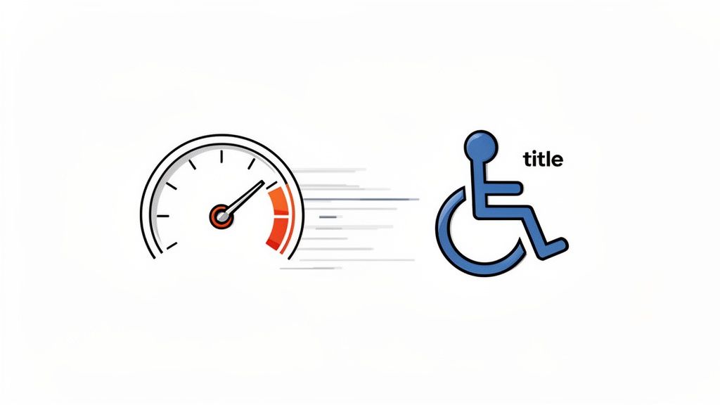
- Accessibility Wins: Since the code is right there on the page, it’s readable by search engines and can be properly tagged for screen readers, making your site more accessible.
It's fascinating to see how far we've come. The first digital icons appeared back in the 1980s on early systems like the Xerox and Macintosh, changing how we interact with computers forever. If you're a design history buff, you can take a deep dive into the history of digital iconography to see how those early symbols still shape what we do today.
Embedding SVGs as Shopify Snippets
One of the cleanest and most efficient ways to handle your icons is by turning them into reusable Shopify snippets. This is a pro-level move that keeps your theme code tidy and makes global updates a breeze.
Here’s the basic workflow:
- Clean Your SVG: Before you do anything, run your SVG file through an optimizer like SVGOMG. This tool strips out all the junk code from design software, shrinking the file size without affecting the quality.
- Create a New Snippet: In your Shopify theme editor, head to the
snippetsdirectory and create a new file. Give it a clear name, likeicon-cart.liquid. - Paste the Code: Open your optimized SVG file in a text editor, copy the code, and paste it directly into your new
.liquidsnippet file. - Render It Anywhere: Now, whenever you need that cart icon in your theme, you just use one simple line of Liquid:
{% render 'icon-cart' %}.
Building a library of icon snippets creates a single source of truth. If you ever need to change an icon or update brand colors, you only have to edit one file for the change to apply everywhere. It’s a huge time-saver.
The Icon Font vs. Inline SVG Debate
Another method you might hear about is using icon fonts. This was a popular technique a few years back, but it comes with some serious drawbacks, especially when you compare it to inline SVGs.
Before you make a decision, it's helpful to see how these two methods stack up for an eCommerce site where performance and accessibility are non-negotiable.
Icon File Format Comparison for eCommerce
This table breaks down the pros and cons of the most common file formats, making it clear why we almost always recommend SVGs for Shopify stores.
| Attribute | SVG (Scalable Vector Graphics) | PNG (Portable Network Graphics) | Icon Font |
|---|---|---|---|
| Performance | Excellent. Only loads the code for the icons you use. Can be inlined to avoid extra server requests. | Poor. Larger file sizes. Each icon is a separate HTTP request, slowing down your site. | Fair. The browser must download the entire font file, even if you only need a couple of icons. |
| Scalability | Excellent. Vector-based, so it scales to any size with zero quality loss. Perfect for responsive design. | Poor. Pixel-based, so it becomes blurry and pixelated when scaled up. | Good. Scales well like text, but can have rendering inconsistencies. |
| Styling | Excellent. Full CSS control over color, stroke, size, and even complex animations. | None. You're stuck with the saved image. To change color, you need a new file. | Limited. You can change the color and size, but that's about it. No multi-color or animations. |
| Accessibility | Excellent. You can add <title> and <desc> tags to make them perfectly clear for screen readers. | Fair. Relies on alt text, which is often forgotten. | Poor. Often read as "blank" or a random character by screen readers, creating a confusing experience. |
For any modern Shopify store focused on speed, brand control, and an inclusive user experience, the verdict is in. Inline SVGs, managed as Shopify snippets, are the most robust and future-proof solution you can choose. This approach gives you total creative and technical control over these small but mighty visual assets.
Optimizing Icons for Performance and Accessibility
In eCommerce, a slick-looking icon is only half the battle. Truly great iconography is invisible in two critical ways: it loads so fast users don't notice it, and it's so intuitive that it doesn't create a roadblock for anyone. This all comes down to prioritizing site speed and web accessibility from day one.
Unoptimized icons, like a folder full of clunky PNGs or bloated SVGs, act like tiny anchors dragging your site speed into the mud. Every extra kilobyte adds to your page load time. When studies show a mere 1-second delay can slash conversions by 7%, you literally can't afford to be slow. For an online store, this isn't a minor tech issue—it's a direct hit to your bottom line.
Keeping Your Icons Lean and Fast
The first order of business is to clean up your SVG code. When you export an SVG from a design tool like Figma or Illustrator, it’s almost always packed with junk code—editor comments, hidden layers, and overly complex paths that inflate the file size.
Before you even think about adding an SVG to your Shopify theme, run it through a free tool like SVGOMG. I can't stress this enough. This one simple step can often shrink an icon’s file size by over 50% with zero visible difference. It’s one of the easiest performance wins you’ll ever get.
For icons that aren't essential for the initial page view—think icons in the footer or way down a long product page—you should absolutely be using lazy loading. This smart technique tells the browser to wait to load those assets until a user actually scrolls near them. It’s a game-changer for prioritizing above-the-fold content and making your site feel lightning-fast.
A fast website isn't a perk anymore; it's the price of entry. Every single icon has to earn its keep. Optimizing your icon library is one of the highest-impact, lowest-effort technical fixes you can make to your Shopify store.
If you’re juggling a massive library of icons, looking into a digital asset management AI system can be a lifesaver. These platforms can automate a lot of the optimization work and ensure your whole team is always pulling the fastest, most current version of every visual asset.
Designing Icons for Everyone
Speed is crucial, but it’s worthless if a chunk of your audience can't even use your site. Accessibility isn't an optional checkbox; it's just good, smart design. When it comes to icons, this means making sure every symbol’s purpose is crystal clear to people who use screen readers.
To someone with a visual impairment, an icon without a proper text alternative is just a silent, confusing shape on the page. Picture trying to check out when the "delete item" button is just an "X" icon with no label. A screen reader might just say "button," or worse, nothing at all. You’ve just created a dead end and lost a sale.
Thankfully, the fix is just a few simple lines of code.
Providing Context with ARIA and SVG Titles
There are two main ways to make your icons accessible, and it all depends on how they’re being used.
For Decorative Icons: If an icon is just for visual flair and sits right next to visible text (like a truck icon next to "Free Shipping"), you can tell screen readers to just skip it. Add
aria-hidden="true"to the SVG element, and you’re done. This avoids annoying, redundant announcements.For Functional Icons: If an icon is the only thing a user clicks (like a search magnifying glass or a pop-up's 'X'), it absolutely must communicate its function. The cleanest way to handle this with inline SVGs is to add a
<title>element right inside the SVG code.
Here’s what a perfectly accessible close button looks like in practice:
<svg ... role="img" aria-labelledby="close-title">
In this snippet, the <title> tag gives the screen reader the word "Close" to announce. The role="img" tells assistive tech that this is an image, and aria-labelledby creates the connection between the SVG and its title. This tiny bit of code transforms a vague symbol into a clear, usable control for every single customer.
Testing Your Icons for Maximum Conversion Impact
Creating a beautiful, on-brand set of icons is a great first step. But if you stop there, you're only doing half the job. The most successful eCommerce brands know better than to rely on guesswork; they use cold, hard data to prove their design choices actually work. This is where Conversion Rate Optimization (CRO) comes in, transforming your iconography from a subjective art form into a bottom-line booster.
You simply can't assume an icon works just because it looks good. You have to test it. This means shifting your mindset from "I think this looks better" to asking, "Does this design actually get more people to click and buy?" Applying a real testing framework to your iconography web design is what separates a decent store from a dominant one.
Building Your Testing Hypothesis
Every solid test begins with a clear hypothesis. It’s just a simple, testable statement predicting what you think will happen. Instead of just swapping icons out randomly and hoping for the best, you should be making educated guesses rooted in user behavior.
For instance, you might suspect a more literal icon will crush an abstract one for a critical action.
- Hypothesis: "Switching our 'Free Shipping' icon from a generic star to a delivery truck will boost clicks on the announcement banner because users will instantly grasp the value."
- Hypothesis: "Using a solid, filled-in 'Add to Cart' icon instead of a simple outline will increase add-to-cart actions because its stronger visual weight will grab more attention."
See how these are specific and measurable? They're tied directly to a business goal, which is the whole point of data-driven design.
Key Metrics to Track for Icon Performance
When you start testing, you need to know what winning looks like. Just looking at overall page views is useless here. You’ve got to zero in on the metrics that truly reflect user engagement and the intent to purchase.
Here are the most important numbers to watch:
- Click-Through Rate (CTR): This is your most direct feedback. Are people actually clicking on the button, banner, or link your icon is part of? It’s the perfect metric for testing anything interactive.
- Add-to-Cart Rate: For icons living on your product pages or in quick-view pop-ups, this is the holy grail. Does that slick new "Add to Cart" or "Wishlist" icon actually encourage more users to take that crucial next step?
- Conversion Rate: The ultimate bottom-line metric. Do small changes to trust icons in the checkout—like security shields or payment logos—result in more people completing their purchase?
- Time on Page / Engagement: Sometimes, an icon's job is just to provide clarity. Better icons in your product details (like for materials or dimensions) might lead to users spending more time on the page, signaling deeper interest before they buy.
Tracking these gives you undeniable, quantitative feedback on your design choices. If you're just getting into this, we have a great breakdown on how to start A/B testing on Shopify.
Tools for the Job
You don't need a massive budget to run these kinds of tests. There are some seriously powerful tools out there that can get you started, and many of them play nicely with Shopify right out of the box.
While the old go-to, Google Optimize, is being sunsetted, a whole new wave of A/B testing apps has popped up on the Shopify App Store. These tools let you serve different icon versions to different groups of your audience and automatically track which one performs better. This is how you start making decisions based on real user data, not just a gut feeling. To really take things to the next level, you can pair icon testing with optimizing your entire web button design to guide users exactly where you want them to go.
The explosion of mobile commerce has completely changed the game for iconography. With over 64% of website traffic now coming from mobile devices, icons have become the unsung heroes of navigation on small screens. When icons are confusing, they create friction and frustration, which directly harms user experience and your brand's reputation. You can discover more insights about the history of digital design’s most used icon on martechoa.com.
Your Iconography Web Design Questions Answered
Jumping into iconography design always brings up a few key questions. You know the goal—a clean, branded, high-converting store—but figuring out the nitty-gritty of how to get there can be a real headache. Let's tackle some of the most common things we hear from Shopify merchants every day.
We'll cut through the noise and give you straight answers on everything from budgeting for custom work to the must-have icons every single eCommerce site needs to get right.
How Much Should I Budget For Custom Icons?
This is the big one, and the honest answer is: it really depends. A custom icon set can run you anywhere from a few hundred dollars with a freelancer to several thousand if you're working with a specialized agency on a full-blown system.
The cost really comes down to three things:
- How many icons you actually need.
- The style and complexity you're going for.
- The designer's experience and track record.
As a solid benchmark, a small to mid-sized Shopify store should probably set aside between $500 and $2,000. That investment usually gets you a core set of 15-20 custom icons, which is more than enough to create a unique visual identity across your most important touchpoints.
Can I Just Use Free Icon Packs On My Store?
You can, but you have to go into it with your eyes wide open. Free icon packs are tempting for obvious reasons, but they come with some serious trade-offs that can water down your brand.
The main problem is that free icons are, by definition, generic. They’ve been used on thousands of other websites, which immediately makes your brand feel less unique. If a customer sees the same icons on your site that they just saw on three other stores, it subtly chips away at your credibility.
If you do go the free route, please double-check the license. Many require you to give credit or are banned from commercial use altogether. Getting into legal trouble over a free icon pack just isn't worth the risk.
A smarter play for a serious brand is a hybrid approach. Start with a quality free pack for less critical, back-end icons. Then, invest in custom designs for your high-impact elements—think "Add to Cart" buttons, value proposition highlights, and checkout trust badges. This gives you the best of both worlds: you save some money without sacrificing your brand where it really counts.
What Are The Most Important Icons For An ECommerce Store?
While every store has its own personality, a core set of icons has become the universal language of online shopping. Getting these right isn't a "nice-to-have"; it's essential for a smooth, intuitive experience. If you get these wrong, you'll confuse customers and lose sales. Simple as that.
Here are the non-negotiables:
- Search: A magnifying glass. Don't try to reinvent the wheel here. It’s what everyone on the planet recognizes for search.
- User Account: A simple person silhouette or a user profile outline. It’s the clearest way to signal where users can log in or manage their account.
- Shopping Cart / Bag: The icon needs to match your site's copy. If your button says "Add to Cart," use a cart icon. If it says "Add to Bag," use a shopping bag. Consistency is key.
- Mobile Menu ("Hamburger"): Three stacked horizontal lines are the undisputed standard for revealing the navigation menu on mobile.
- Trust Icons: These are absolutely critical during checkout. Icons for secure payments (a lock or shield), accepted credit cards (Visa, Mastercard logos), free shipping (a truck), and money-back guarantees build that last-minute confidence needed to reduce cart abandonment.
Focus on making this core set incredibly clear and instantly recognizable. This foundation ensures shoppers can navigate your store’s most crucial functions without a second thought, which is the whole point of effective iconography.
Ready to elevate your Shopify store with a custom iconography system that drives conversions? At ECORN, we specialize in designing and developing eCommerce experiences that blend beautiful branding with data-driven performance. Let's talk about how we can build a visual language that sets your brand apart.


Clean Website Design: A Shopify Conversion Playbook

Omnichannel Retail Strategy: A Shopify Playbook
Product Data Enrichment: A Guide for Shopify Brands
Instagram Shopping Features a Guide for Shopify Stores

What Is Revenue Optimization: A Holistic RevOps Guide
Benefits of Conversion Rate Optimization: Boost Your
WordPress to Shopify Migration: Your 2026 Seamless Switch

Boost Sales: Ecommerce Payment Processing Guide 2026

Unified Commerce Platform: Benefits, KPIs & Shopify Guide

How to Reduce Bounce Rate eCommerce: Your 2026 Guide

Shopify API Integration: A Practical End-to-End Guide

How to Implement Data Governance: A 2026 Guide

Shopify Store Development Cost: A 2026 Breakdown
What Is Server Side Tracking: The Shopify Guide 2026

Marketing Automation Workflows: A Shopify Guide for 2026

Shopify: How to Reduce Technical Debt

Shopify UX Design Change: A Playbook for Growth

User Generated Content Strategy: Shopify Playbook

Shopify Pause and Build Plan Cost: A Complete 2026 Guide

Compare at Price on Shopify: A Complete Guide for 2026

Where Can I Sell My Prints? 10 Best Platforms for 2026

Shopify Order Management System: The Ultimate Guide 2026

What Is Marketing Attribution? an eCommerce Guide for 2026

10 Best Black Friday Sales Sheets for 2026

Discover the Top Social Media Marketing Agencies For

Consumer Confidence Definition for eCommerce in 2026

What Is Social Commerce? Your 2026 Guide to Boosting Sales

A Social Ad Campaign Playbook for eCommerce Growth

7 Best FAQ Page Examples for SaaS & eCommerce

Market Research in Fashion Industry: A Guide for Shopify

Shopify Migration Services: Expert Guide for 2026

Mastering FB Retargeting Ads for Shopify in 2026

What Is Omnichannel Ecommerce

Master Your Shopify Plus Migration: The 2026 Guide

Shopify Integration Services: A Merchant's 2026 Guide

Shopify Collection Description: A Guide to SEO & Sales

Shopify Plus Contact: Reach Sales & Support Effectively

Top Luxury Shopify Stores: Design & UX Strategies

How to Improve Customer Experience: A Shopify Roadmap

Creative Facebook Ads: 10 Examples for Shopify Brands

Remarketing with Facebook Ads: A Shopify Guide for 2026

SEO Linking Strategies for Shopify Stores

Top 7 Statistics YouTube Channels for eCommerce in 2026

Hiring Shopify Plus Designers: A Founder's Guide

Shopify Product Variation: Master Your Variants for 2026

Leverage Ai Solutions Brands: Your 2026 Shopify Growth Guide

Filters in Shopify: A Guide for Growing Brands

Shopify Plus Developer: A Guide for Growing Brands

When Does Black Friday Online Start? A 2026 Guide

Black Friday Email Marketing: Shopify & Klaviyo Guide

Polaris Design System: The Complete Shopify Guide

How to Hire a Consultant Email Marketing Expert

What Is Q4? A Shopify Merchant's Guide to Peak Season

Marketing Organization Structure for eCommerce Growth

Top Account-Based Marketing Agency Guide for 2026

7 Remarketing Ad Examples for Your 2026 Campaigns

AI Retail Solutions: Boost Your Shopify Store

Migrate to Shopify: The Definitive 2026 Guide

Shopify Authentication App: A Guide for Secure Stores

Why Strategic Marketing Is Important for Growth in 2026

How to Create a Size Chart in Shopify: 2026 Guide

Shopify Themes for Jewelry: The Definitive 2026 Guide

Minimal Shopify Templates: Faster, Higher-Converting Stores

Maximize Profit: Shopify CC Fees 2026 Guide

Best Shopify Apps for Beginners in 2026

How to Improve Online Shopping Experience in 2026

Shopify Design and Development Services: A 2026 Guide

Small Business Social Media Marketing Agency: A Hiring Guide

Bulk Edit Shopify: A Guide to Save Hours on Store Updates

2026 Trends in Food and Beverage Industry

Post Purchase Survey Guide for Shopify Stores

How to Build an Ecommerce Brand in 2026

Conversion Rate Optimization for Ecommerce: Maximize Profit

How to Use Customer Data to Increase Sales: A Guide

Shopify for Enterprise: The 2026 Deep Dive Guide

Email Marketing Agencies: The Guide for Shopify Brands

Boost Sales With The Right Shipping Shopify App

Your Guide to the Shopify Site Map

7 Headless Commerce Examples for 2026

Mastering Trends in Cosmetic Industry for 2026

Transfer Shopify to BigCommerce The Complete 2026 Playbook

What Is Shopify Collective? Your 2026 Guide to Success

Unlock Shopify Growth with Site Link SEO

Integrating Shopify and WordPress A Complete Guide for 2026

Naming a Clothing Store: A Shopify Founder's Playbook

Guide to buying shopify store in 2026

Buying shopify store: Buying a Shopify Store: Invest Wisely

Food & Beverage Marketing: A Complete Guide for 2026

Facebook Ads Agency: A Shopify Brand's Hiring Guide

Shopify Apparel Stores: A 2026 Launch & Scale Guide

How to Deactivate Shopify Store: The 2026 Guide

Shopify and Square: The 2026 Ultimate Comparison

Your Guide to Beauty Products Ecommerce

A Guide to Marketing for Beauty Brands in 2026

Your Guide to Facebook Black Friday Ads

Facebook Ad Ecommerce for Shopify Growth

A Modern Backlinks SEO Strategy for Shopify Stores

How to Launch an Online Store: A Step-by-Step Success Guide

Optimize Shopify Store: Master Performance in 2026

Successful Migration for Shopify: Protect SEO & Grow


newsletter in your inbox