
You’re probably in one of two places right now. Either your jewelry brand already has a Shopify store, but it looks cleaner in your product tray than it does on screen. Or you’re preparing a launch and realizing that picking a theme feels oddly high-stakes for something many people treat like a design preference.
That instinct is right.
For jewelry, the wrong theme doesn’t just make the site look dated. It makes fine details harder to inspect, weakens trust at the exact moment a buyer is deciding whether your piece is worth the price, and turns a premium buying experience into a generic catalog. In a category where material, finish, scale, and craftsmanship matter, your theme shapes how valuable the product feels before anyone reads a word of copy.
Why Your Shopify Theme Is Your Most Important Hire
A jewelry founder can spend months refining packaging, stone selection, metal finishes, and brand positioning, then lose the sale because the store feels flat, slow, or improvised. That’s what a generic Shopify theme does in this category. It strips away the context that helps buyers trust what they’re seeing.
A better way to think about your theme is this. It’s your digital sales associate, your display case, and your operations layer at the same time. It determines how products are presented, how quickly pages load, how variants behave, how trust signals appear, and whether the path to checkout feels calm or chaotic.
The category itself is moving toward digital attention at meaningful scale. The online jewelry market reached 333,012 median monthly unique users in 2022, up from 311,634 in 2021, which represents 6.9% year-over-year growth according to Omnithemes' analysis of jewelry Shopify themes. More shoppers are evaluating jewelry online, which raises the standard for what your storefront has to do well.
What the theme is actually responsible for
A strong theme handles jobs most merchants underestimate:
- Perceived value: The layout, spacing, type, and product media determine whether your pieces feel collectible or commodity-like.
- Merchandising control: Collection pages, featured assortments, swatches, and content blocks affect how buyers browse and compare.
- Conversion mechanics: Sticky add-to-cart behavior, product page hierarchy, announcement bars, and cart design all influence whether a shopper keeps moving.
- Operational flexibility: The better the theme architecture, the easier it is to add reviews, custom options, gift messaging, and campaign landing pages without breaking the experience.
If you’re still shaping your broader online sales strategy, JewelryBuyDirect's guide for online retailers is a useful companion because it frames the business side of selling jewelry online beyond theme selection.
Treat the decision like an investment review
Don’t ask, “Which theme looks nicest in the demo?” Ask, “Which theme helps a hesitant buyer feel secure enough to purchase a high-consideration product?”
Practical rule: If a theme looks good only when the demo content is perfect, it’s not a strong theme. It’s a strong demo.
The smartest evaluation process starts with business requirements, not aesthetics. A clear framework like how to choose a Shopify theme for your store helps because it forces you to review structure, feature depth, and scalability before you commit to customization.
Decoding the Visual Language of Luxury and Trust
Luxury on Shopify isn’t about adding gold accents or serif fonts and hoping the store feels expensive. Buyers read quality through restraint, consistency, and clarity. Jewelry stores that convert well usually feel deliberate. Nothing fights for attention. Nothing looks accidental.
Minimalism only works when it’s disciplined
Many merchants say they want a minimalist theme. What they instead choose is an empty theme. Those aren’t the same thing.
A disciplined luxury layout gives the product room to breathe while still answering buying questions. The homepage should establish mood and range. Collection pages should stay visually quiet enough for comparison. Product pages should keep the image gallery, title, material details, and purchase controls in a clean visual order.
Look for these signs of a theme that understands premium presentation:
- Strong whitespace control: Space should separate information, not create dead zones.
- Quiet section styling: Promotional modules shouldn’t overpower the product grid.
- Consistent card design: Product tiles need predictable image ratios, typography, and hover behavior.
- Editorial capability: Jewelry brands often need room for story, sourcing, gifting, or craftsmanship content.
Typography is doing more work than you think
Typography carries more emotional weight in jewelry than in many other categories. A sharp geometric sans serif can make a collection feel contemporary and architectural. A refined serif can support heritage, bridal, or artisanal positioning. The mistake is using decorative fonts where clarity matters most.
Use display typography sparingly. Product titles, pricing, materials, and shipping information should remain easy to scan. Luxury buyers don’t want friction disguised as style.
A premium store feels composed. The shopper shouldn’t have to work to understand what’s being sold, what it’s made from, or how to buy it.
Evaluate the theme with your real assets
Never judge a jewelry theme with demo photography alone. A theme that flatters studio-lit campaign images can fall apart when you upload actual product shots, hand model images, or mixed aspect ratios from different vendors.
That’s why image quality planning belongs in the design review. If your current photography is uneven, it helps to review tools for consistency before you redesign. This roundup of best AI product imaging software is a practical starting point for brands trying to improve visual uniformity without rebuilding the whole content pipeline first.
The visual hierarchy test
A simple way to pressure-test any candidate theme is to open a product page and ask four questions:
| What to check | What good looks like | What usually fails |
|---|---|---|
| First glance | Product image dominates | Too many badges and labels |
| Second glance | Material and variant options are obvious | Variant selectors feel buried |
| Third glance | Trust information appears near the buy box | Shipping and returns are hard to find |
| Scroll behavior | Story and supporting info deepen confidence | Long blocks of copy dilute urgency |
If the page doesn’t guide attention in that order, the theme is working against the sale.
Essential Theme Features That Drive Jewelry Sales
The design can be elegant and still fail commercially. For shopify themes for jewelry, the feature set decides whether the store supports the way customers shop for rings, necklaces, bracelets, and fine accessories.

Product media has to do real selling
Jewelry isn’t a category where one hero image and a few thumbnails are enough. Buyers want to inspect prongs, clasps, texture, polish, stone setting, and how a piece sits on the body. If the theme treats media as a basic gallery, it creates uncertainty.
Industry benchmarks cited in jewelry theme research show that incorporating product videos can lead to a 49% increase in sales, which is why video support in jewelry Shopify themes should be treated as a core requirement rather than a bonus feature.
A useful media stack inside the theme includes:
- Zoom that feels native: Not a clunky lightbox that breaks mobile browsing.
- Video embedded in the gallery: Buyers should see motion in the same decision flow as stills.
- Variant-aware media: Yellow gold, white gold, gemstone, and size changes should update visuals cleanly.
- Stable image ratios: Collection pages get messy fast when product cards crop inconsistently.
Variant handling is a conversion issue, not a catalog issue
Jewelry stores often sell combinations of size, metal, stone, length, and finish. A weak theme turns this into a messy dropdown experience that increases mistakes and slows decisions.
The best setups use visual swatches where the choice is visual, such as metal color or gemstone tone, and structured selectors where the choice is factual, such as size or chain length. That distinction matters. Don’t force every option into the same UI pattern.
What to test in the theme demo
Open the demo product page and check whether the theme can handle:
- Multiple option sets without pushing the add-to-cart button too far down.
- Unavailable combinations in a way that’s obvious but not alarming.
- Backordered or made-to-order states with clear messaging.
- Custom fields for engraving, gift notes, or personalization.
Buyer psychology note: Confusing option logic makes shoppers wonder what else might go wrong after purchase.
Collection filtering needs to match how people shop jewelry
Jewelry shoppers rarely browse by title alone. They narrow by occasion, style, material, recipient, stone, or price range. Your theme should support collection filtering that feels fast and intuitive, especially on mobile where filter UX often collapses into frustration.
Good filtering helps a customer move from “I want a gift” to “I want a yellow gold pendant under my target budget” without bouncing between collections. Bad filtering forces them to scroll large grids and mentally sort products themselves.
Trust features should be built into the page flow
Some features aren’t glamorous, but they remove anxiety:
- Customer reviews modules that can sit close to the buy box or lower on the page without looking bolted on
- Wishlist support for considered purchases and gift planning
- Secure checkout indicators placed with restraint
- Live chat or question prompts for sizing, shipping, and care concerns
- Recently viewed or recommended products that help comparison rather than distract from it
A theme doesn’t need every feature built in. It does need enough flexibility to place them where they support the sale instead of cluttering it.
A practical scorecard
When I review themes for jewelry brands, I use a simple pass-or-fail lens:
| Capability | Non-negotiable for jewelry | Why it matters |
|---|---|---|
| High-quality gallery | Yes | Buyers need close inspection |
| Native-feeling mobile media | Yes | Mobile shoppers still expect detail |
| Robust variants | Yes | Jewelry options are often complex |
| Strong filters | Yes | Discovery depends on narrowing |
| Trust element placement | Yes | High-ticket purchases need reassurance |
| Editorial sections | Usually | Brand story often supports conversion |
If a theme misses two or three of these, customization costs rise fast and the storefront usually feels patched together.
Building a Fast and Findable Jewelry Store
The most common mistake I see is treating speed as a developer concern and design as a brand concern. On a jewelry store, they’re the same concern. Heavy imagery, animation, and oversized apps can undermine the experience that premium brands are trying to create.

Why jewelry sites get slow so easily
Jewelry needs large, sharp imagery. It often needs video too. Add a few gallery scripts, review widgets, wishlist tools, and promotional popups, and the storefront starts carrying weight on every page.
A strong theme reduces that burden through clean code, sensible section architecture, and media handling that doesn’t load everything at once. A weak one may still look fine in a controlled demo, then become sluggish after launch because the merchant adds real content, campaign blocks, and app embeds.
Three technical checks matter immediately:
- Lazy loading for images so below-the-fold assets wait their turn
- Mobile-first responsive behavior that doesn’t just shrink desktop layouts
- Lean section output so every homepage block isn’t shipping unnecessary scripts
If your current store is already carrying oversized product assets, this guide to Shopify image optimization is a useful operational reference before you blame the theme alone.
Findability starts with theme structure
A jewelry brand can have excellent product photography and still struggle in search because the theme makes content hard for search engines to interpret. Structure matters. Product pages should support clean headings, descriptive text blocks, and schema markup compatibility for product details and ratings.
The practical question isn’t whether a theme says it’s “SEO-friendly.” Almost every theme says that. The useful question is whether the theme helps you publish structured collection pages, educational content, and product templates without forcing workarounds.
What to inspect before you buy
Use this pre-purchase checklist:
- Open the mobile demo first: That’s where weak themes expose awkward spacing, hidden filters, and oversized media.
- Review collection templates: Jewelry stores often live or die on category browsing.
- Check app overlap: If the theme includes promo banners, sticky carts, or badges, don’t install duplicate apps that add script weight.
- Ask how custom sections behave: Some themes look flexible until you build real landing pages.
Fast stores feel more premium because the experience feels controlled. Slowness doesn’t just hurt usability. It makes the brand feel less polished.
Designing a Path to Purchase That Builds Confidence
The highest-performing jewelry stores don’t rush the sale. They remove uncertainty in the right order. That’s different.
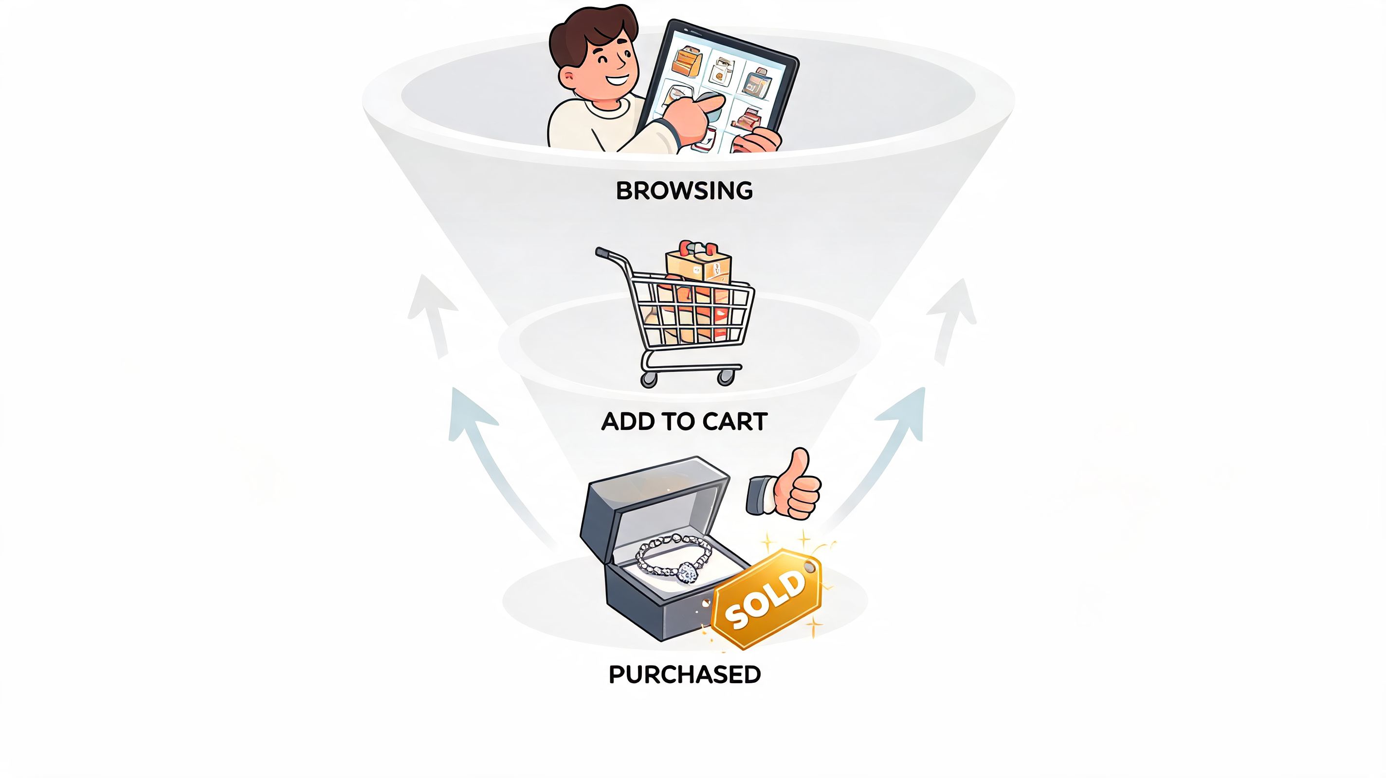
A buyer lands on a product page with a few immediate questions. Is this piece as refined as it looks? Can I trust the materials? Will it arrive on time? What happens if it doesn’t fit or isn’t right in person? Your theme should answer those questions before the shopper has to hunt for them.
The product page should reassure before it persuades
The buy box isn’t just where you place a button. It’s where the store either calms the customer or creates hesitation. Keep the purchase zone tight, readable, and predictable.
The strongest jewelry product pages usually include:
- Material and sizing clarity near the top, not buried in tabs
- Shipping and return guidance visible before checkout intent
- Care or craftsmanship notes that support quality perception
- Review summaries close enough to matter during the decision
For merchants comparing tools for social proof placement and moderation, this review of best Shopify review app insights is useful because it helps you choose an app that fits your theme structure instead of fighting it.
Trust signals need restraint
A common mistake is overloading jewelry product pages with every reassurance badge available. Too many icons create the opposite effect. The page starts to look defensive.
Use trust markers selectively. Security messaging belongs near checkout actions. Reviews belong where they influence product judgment. Artisan stories or sourcing details work better slightly lower on the page, where they deepen interest after the core buying questions are resolved.
The page should feel like a calm conversation with a knowledgeable associate, not a screen full of objections and responses.
The cart and checkout transition matter more than most brands think
A shopper who adds a bracelet or ring to cart often still has unresolved concerns. That’s why the mini-cart or cart drawer needs to maintain confidence, not just summarize items.
Look for theme behavior that supports:
| Checkout stage | Confidence-building element | Common mistake |
|---|---|---|
| Add to cart | Clear item details and selected options | Tiny, ambiguous variant labels |
| Cart review | Easy edits and visible shipping context | Surprising fees or missing delivery info |
| Final intent | Express payments plus standard checkout | Pushing too hard into one payment method |
A helpful walkthrough of conversion-focused customer flow can also be seen below.
Small confidence builders that outperform flashy redesigns
Merchants often chase homepage changes when product-level reassurance is the actual issue. In jewelry, a few practical details often move the needle more than a dramatic visual overhaul:
- A real size guide that reflects how the product is worn
- Visible lead-time messaging for made-to-order items
- Gift-ready cues when relevant, including packaging expectations
- Simple comparison paths back to related pieces without losing context
Those elements don’t make the site louder. They make it easier to say yes.
Extending Your Theme with Powerful Integrations
No theme is complete on day one. That’s normal. A jewelry store usually needs a set of integrations that support customization, service, retention, and trust. The mistake is adding apps one by one without deciding what role each should play in the customer journey.
Start with functions, not app names
Merchants often ask which apps they should install before they’ve mapped the experience they want to create. That leads to overlap. One tool adds product options. Another adds a different options widget. A third adds a popup that conflicts with both. The result is visual inconsistency and slower performance.
A cleaner approach is to group needs by function:
Product customization
This matters if you offer engraving, made-to-order variations, stone selection, or custom lengths. The theme should provide a stable product template, and the integration should handle complexity without turning the page into a form.
Look for apps or custom builds that support conditional fields, clear price logic, and clean order data inside Shopify admin. If a customization tool creates confusing line items or breaks inventory logic, it usually becomes an operations problem later.
Customer service
Jewelry buyers ask questions that generic FAQ pages don’t always answer. Fit, delivery timing, packaging, and care all affect purchase confidence. Live chat, help widgets, and AI-assisted FAQs can work well if they’re implemented with restraint.
Don’t let support tools dominate the viewport on mobile. A chat bubble that blocks the add-to-cart area creates more friction than it solves.
Marketing and retention should fit the brand
Jewelry usually performs better with thoughtful retention than with constant discount pressure. That’s why review systems, loyalty programs, waitlists, lookbooks, and email capture tools should feel integrated into the theme, not pasted on top of it.
Useful categories include:
- Review collection tools that support photo and post-purchase feedback
- Wishlist tools for gifting and longer consideration cycles
- Lookbook or shoppable gallery apps for editorial merchandising
- Email and SMS capture configured around launches, back-in-stock alerts, or gifting periods
One practical option some brands use during implementation is ECORN, which provides Shopify design, development, and CRO support for merchants that need help aligning theme setup, app selection, and custom storefront changes inside one workflow.
Security and post-purchase trust
Jewelry buyers often care about authenticity, insurance, shipping security, and packaging condition. Depending on your business model, you may need integrations that support signature delivery, package protection, authenticity workflows, or specialized order messaging.
Add integrations only when they improve a specific part of the buying journey. If you can’t name the exact job an app is doing, it probably doesn’t belong on the store.
The right mindset is simple. Your theme provides the foundation. Integrations should extend it without changing the store’s visual language or slowing the path to purchase.
Accelerate Your Launch and Growth with Expert Help
Choosing among shopify themes for jewelry looks simple until you get into the actual decisions. Which layout protects your brand positioning. Which theme can handle complex variants cleanly. Which customizations belong in the theme and which should live in apps. How to preserve speed while adding reviews, personalization, and merchandising tools.
That’s where most brands lose time. Not because the decisions are impossible, but because they’re interconnected. One design choice affects media strategy. One app choice affects performance. One product template decision affects conversion and operations together.
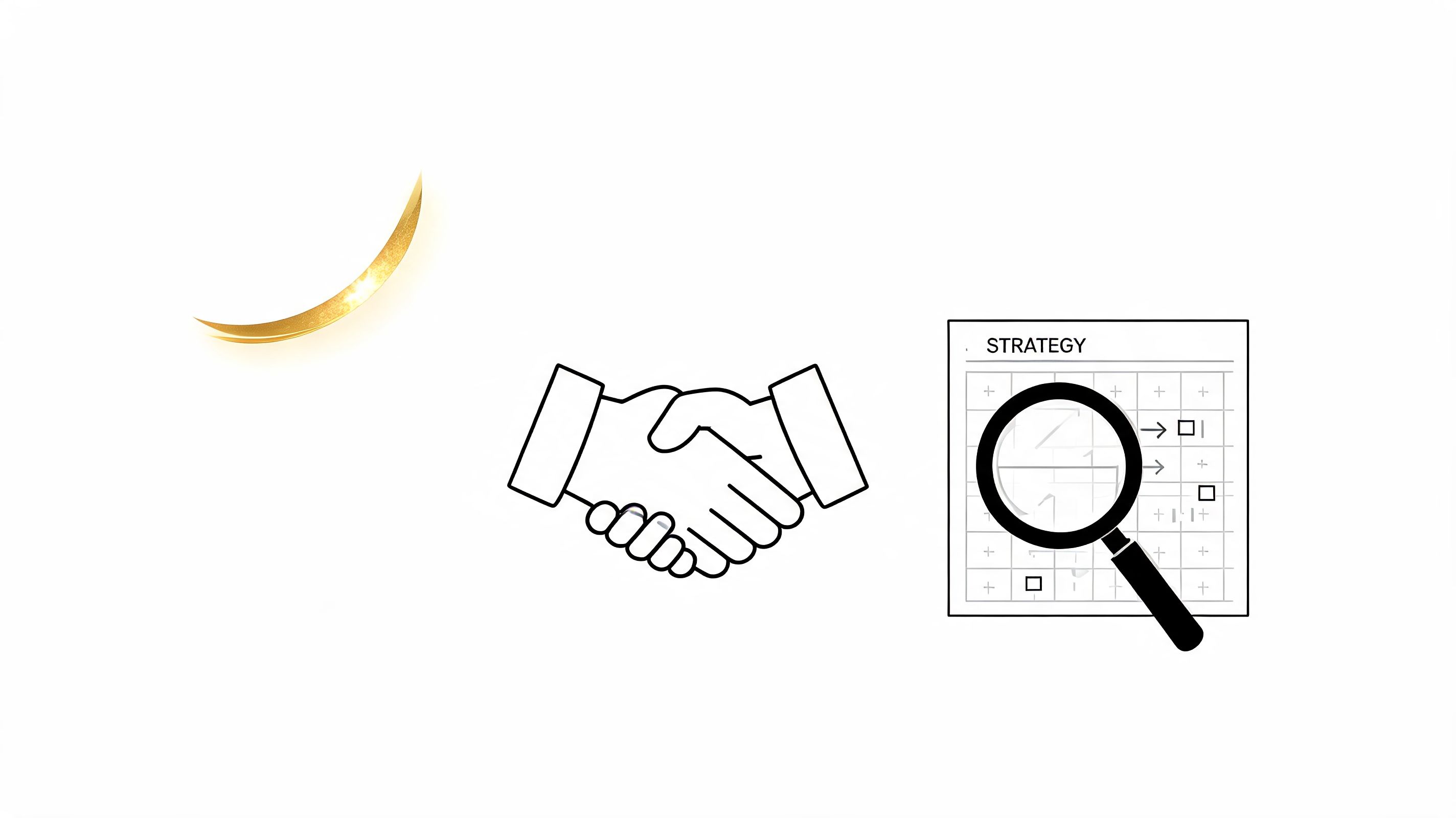
If you want to move faster with fewer rebuilds, expert support usually pays for itself in avoided mistakes. A specialized Shopify team can evaluate themes against your catalog structure, product media, customer journey, and growth plans before you invest in customization that doesn’t scale.
For brands that need hands-on execution, ECORN can help with custom theme development, conversion rate optimization, and ongoing Shopify support. That’s useful when the goal isn’t just launching a prettier store, but launching one that performs well under real merchandising, campaign, and operational demands.
Frequently Asked Questions About Shopify Jewelry Themes
Can I use a free Shopify theme for a jewelry store
Yes, you can, especially if you’re early-stage and need to validate demand before investing in a premium build. Free themes can work when your catalog is small, your product options are simple, and your brand presentation is still evolving.
The limitation usually appears when you need richer product storytelling, more flexible collection merchandising, stronger filtering, or cleaner handling for jewelry-specific variants. At that point, the theme may still be free, but the workarounds aren’t.
Should I choose a premium theme or custom development
Most jewelry brands should start with a premium theme that has a strong structure, then customize selectively. Full custom development makes more sense when your store has unusual product logic, a distinctive editorial experience, or operational needs that commercial themes don’t handle well.
The expensive path isn’t always the refined one. A well-chosen premium theme with disciplined customization often performs better than a custom build that overcomplicates the storefront.
How should I test a theme before committing
Use your actual content. Upload your product photography, create a realistic product with variants, build one collection page, and test the mobile experience first. Don’t judge the theme by its homepage alone.
Check these areas during the trial:
- Product page behavior: Variant changes, gallery handling, buy box clarity
- Collection browsing: Filters, card consistency, quick comparisons
- Content flexibility: Brand story, gifting, FAQs, care, or sizing
- App compatibility: Reviews, wishlist, and customization tools
What should I budget for theme customization
The answer depends on complexity, so it’s better to budget by scope than by a single number. Basic setup usually includes branding, typography, homepage sections, and standard product templates. More advanced work includes custom product logic, merchandising modules, landing pages, and app styling.
A useful rule is to separate your budget into three buckets: theme acquisition, implementation, and post-launch refinement. Most jewelry stores need all three, even if they don’t need them all at once.
If you’re evaluating shopify themes for jewelry and want a second set of expert eyes, ECORN can help you assess the right theme, plan the customizations that matter, and build a storefront that supports both brand perception and conversion.


User Generated Content Strategy: Shopify Playbook

Shopify Pause and Build Plan Cost: A Complete 2026 Guide

Compare at Price on Shopify: A Complete Guide for 2026

Where Can I Sell My Prints? 10 Best Platforms for 2026

Shopify Order Management System: The Ultimate Guide 2026

What Is Marketing Attribution? an eCommerce Guide for 2026

10 Best Black Friday Sales Sheets for 2026

Discover the Top Social Media Marketing Agencies For

Consumer Confidence Definition for eCommerce in 2026

What Is Social Commerce? Your 2026 Guide to Boosting Sales

A Social Ad Campaign Playbook for eCommerce Growth

7 Best FAQ Page Examples for SaaS & eCommerce

Market Research in Fashion Industry: A Guide for Shopify

Shopify Migration Services: Expert Guide for 2026

Mastering FB Retargeting Ads for Shopify in 2026

What Is Omnichannel Ecommerce

Master Your Shopify Plus Migration: The 2026 Guide

Shopify Integration Services: A Merchant's 2026 Guide

Shopify Collection Description: A Guide to SEO & Sales

Shopify Plus Contact: Reach Sales & Support Effectively

Top Luxury Shopify Stores: Design & UX Strategies

How to Improve Customer Experience: A Shopify Roadmap

Creative Facebook Ads: 10 Examples for Shopify Brands

Remarketing with Facebook Ads: A Shopify Guide for 2026

SEO Linking Strategies for Shopify Stores

Top 7 Statistics YouTube Channels for eCommerce in 2026

Hiring Shopify Plus Designers: A Founder's Guide

Shopify Product Variation: Master Your Variants for 2026

Leverage Ai Solutions Brands: Your 2026 Shopify Growth Guide

Filters in Shopify: A Guide for Growing Brands

Shopify Plus Developer: A Guide for Growing Brands

When Does Black Friday Online Start? A 2026 Guide

Black Friday Email Marketing: Shopify & Klaviyo Guide

Polaris Design System: The Complete Shopify Guide

How to Hire a Consultant Email Marketing Expert

What Is Q4? A Shopify Merchant's Guide to Peak Season

Marketing Organization Structure for eCommerce Growth

Top Account-Based Marketing Agency Guide for 2026

7 Remarketing Ad Examples for Your 2026 Campaigns

AI Retail Solutions: Boost Your Shopify Store

Migrate to Shopify: The Definitive 2026 Guide

Shopify Authentication App: A Guide for Secure Stores

Why Strategic Marketing Is Important for Growth in 2026

How to Create a Size Chart in Shopify: 2026 Guide

Minimal Shopify Templates: Faster, Higher-Converting Stores

Maximize Profit: Shopify CC Fees 2026 Guide

Best Shopify Apps for Beginners in 2026

How to Improve Online Shopping Experience in 2026

Shopify Design and Development Services: A 2026 Guide

Small Business Social Media Marketing Agency: A Hiring Guide

Bulk Edit Shopify: A Guide to Save Hours on Store Updates

2026 Trends in Food and Beverage Industry

Post Purchase Survey Guide for Shopify Stores

How to Build an Ecommerce Brand in 2026

Conversion Rate Optimization for Ecommerce: Maximize Profit

How to Use Customer Data to Increase Sales: A Guide

Shopify for Enterprise: The 2026 Deep Dive Guide

Email Marketing Agencies: The Guide for Shopify Brands

Boost Sales With The Right Shipping Shopify App

Your Guide to the Shopify Site Map

7 Headless Commerce Examples for 2026

Mastering Trends in Cosmetic Industry for 2026

Transfer Shopify to BigCommerce The Complete 2026 Playbook

What Is Shopify Collective? Your 2026 Guide to Success

Unlock Shopify Growth with Site Link SEO

Integrating Shopify and WordPress A Complete Guide for 2026

Naming a Clothing Store: A Shopify Founder's Playbook

Guide to buying shopify store in 2026

Buying shopify store: Buying a Shopify Store: Invest Wisely

Food & Beverage Marketing: A Complete Guide for 2026

Facebook Ads Agency: A Shopify Brand's Hiring Guide

Shopify Apparel Stores: A 2026 Launch & Scale Guide

How to Deactivate Shopify Store: The 2026 Guide

Shopify and Square: The 2026 Ultimate Comparison

Your Guide to Beauty Products Ecommerce

A Guide to Marketing for Beauty Brands in 2026

Your Guide to Facebook Black Friday Ads

Facebook Ad Ecommerce for Shopify Growth

Iconography Web Design The Definitive Guide for Shopify Stores

A Modern Backlinks SEO Strategy for Shopify Stores

How to Launch an Online Store: A Step-by-Step Success Guide

Optimize Shopify Store: Master Performance in 2026

Successful Migration for Shopify: Protect SEO & Grow

Maximize Traffic & Sales: Get Your Free Website Audit Report

Master the Best Ads Facebook Formats for eCommerce Success

How to Find the Best Ecommerce Agency Near Me in 2026

10 Crucial White Hat Techniques SEO for Shopify in 2026

How to Reduce Returns and Boost Profits in Your eCommerce Store

What Is Ecommerce Personalization A Guide to Unlocking Growth

Payment gateways in shopify: The Ultimate Guide for Merchants 2026
Fulfillment services for shopify: Scale Your Ecommerce Brand
Shopify Landing Page Examples: 7 Winning Templates to Boost Conversions
How to Create Urgency in Sales on Shopify

The Best Review Apps for Shopify to Drive Growth in 2026

The Best Ecommerce Platform for Startups in 2026
Choosing Ecommerce Website Design Packages A Complete Guide

Shopify Plus Partners: Guide to shopify plus partners for 2026 growth

How to Find serp feature opportunities: Win SERP Snippets in 2026
Selling on Etsy vs eBay A Guide for eCommerce Brands in 2026

10 Proven Sample Email Campaigns for Shopify to Boost Sales in 2026


newsletter in your inbox