


What makes luxury Shopify stores feel expensive online when so many of them use the same platform as fast-growing challenger brands? It isn't the font pairing, the monochrome palette, or the oversized campaign photography on their own. Most stores can imitate those surface signals in a week, and most of them still won't feel like a digital flagship.
The gap is architectural. Strong luxury ecommerce on Shopify combines controlled merchandising, clean information hierarchy, selective friction, and fast purchase paths. It tells a brand story without burying the buy button. It preserves exclusivity without making checkout feel clumsy. That tension matters more now because Shopify itself notes that online sales in the luxury market are projected to reach $91 billion by 2025, and the same Shopify coverage highlights tactics like cross-border transactions, VIP drops, connected personalization, and augmented reality as part of the category's shift online.
That's the lens worth using when evaluating luxury Shopify stores. Not “Does it look premium?” but “How is the store engineered to convert, scale, and protect brand equity?” If you're also refining your understanding of luxury style, these seven brands are useful because they show different answers to the same commercial problem.
1. SKIMS
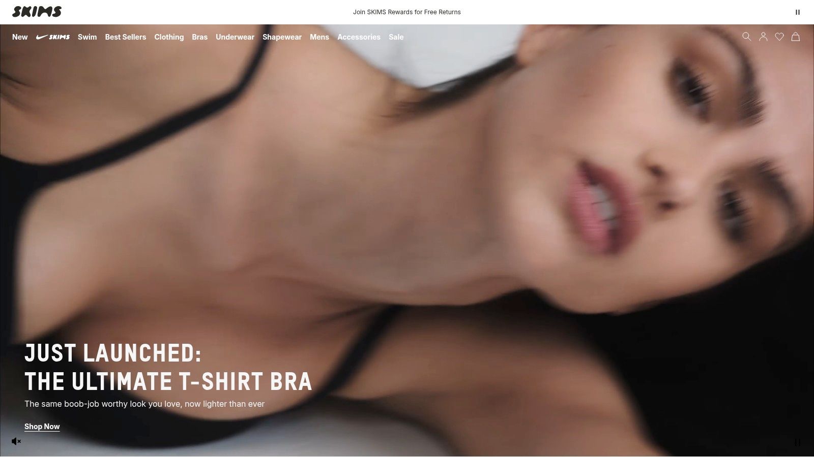
SKIMS is one of the clearest examples of a luxury-adjacent Shopify store built for volume without sacrificing brand control. The site doesn't lean on old luxury codes like sparse navigation and restrained merchandising. It does the opposite. It makes size, color, fit, and launch context easy to process fast, which is exactly what high-demand drops require.
That matters because drop businesses fail when merchandising lags behind demand. Shoppers arrive with intent, but if variant selection is messy, if restock messaging is weak, or if mobile PDPs bury the fit logic, the brand creates avoidable friction at the exact moment demand peaks.
What SKIMS gets right
The store is engineered around launch behavior. Collection pages are clean, but they still carry enough product density to support browsing during capsule releases. Product pages do heavy lifting through image-led selling, clear option structures, and fast paths into checkout on mobile.
A few practical strengths stand out:
- Drop-aware merchandising: Newness, waitlist behavior, and back-in-stock logic support the brand's launch rhythm instead of treating every SKU like evergreen inventory.
- Checkout acceleration: Shop Pay and strong CRM capture fit the model because repeat buyers don't want a theatrical checkout. They want speed.
- Inclusive conversion design: Broad size presentation and consistent imagery lower uncertainty for a wider audience.
For brands studying luxury ecommerce brand execution on Shopify, SKIMS is useful because it shows that premium positioning doesn't require minimal merchandising. It requires disciplined merchandising.
Practical rule: If your store relies on launches, every sellout signal should feed the next conversion event through waitlists, restock alerts, and segmented follow-up.
The trade-off is obvious. Fast sell-through creates social proof, but it also creates frustration. Popular items disappear quickly, and peak-demand periods tend to expose order and returns friction more than a slower-selling luxury catalog would. That doesn't make the model weak. It means the operations layer has to be as polished as the front end.
2. Glossier

Glossier takes a very different route. Where SKIMS pushes controlled intensity, Glossier wins through restraint. The site feels editorial first, but not in the self-indulgent way many beauty brands copy. The product storytelling is tight, and the interface stays out of the way.
That's hard to do well. A lot of luxury Shopify stores confuse “clean” with “empty.” Glossier avoids that trap by making every page carry brand tone, product education, and commerce intent at the same time.
The real lesson in Glossier's UX
Its product detail pages are built for low-friction confidence. Shoppers get visual identity, usage framing, and a direct route to purchase without having to decode the page. That's especially effective in beauty, where aspiration matters, but decision fatigue kills conversion.
The store also benefits from Shopify-native activations and a checkout flow that supports digital wallets. For operators weighing whether enterprise Shopify can preserve a strong brand layer, Glossier is a good argument for using Shopify Plus as a growth and experience platform, not just a transaction engine.
There is a strategic limitation, though. Curated assortments make the experience feel premium and legible, but they can also constrain basket-building if the merchandising system doesn't intentionally create routines, bundles, or replenishment logic.
Clean UX works for luxury only when the customer still has enough buying context to act quickly.
That's the key takeaway here. Glossier doesn't try to impress with complexity. It removes enough complexity that brand trust can do more of the selling.
3. Rebecca Minkoff

Rebecca Minkoff is useful to study because it solves a different luxury ecommerce problem than apparel-first brands. A customer buying a handbag is not worrying about fit. She is judging scale, hardware, finish, structure, and whether the piece feels premium enough to justify the price.
That changes the job of the storefront.
Rebecca Minkoff uses 3D and AR on product pages in a way that supports buying decisions. The technology is tied to merchandising, not added as a novelty feature. Shoppers can inspect the product more closely, understand how it carries in real life, and get answers that static PDP layouts often fail to provide.
Why immersive product detail matters
For accessories, product media does more of the selling than copy. If a shopper cannot judge size, texture, or construction quickly, she starts comparison shopping, opens more tabs, and the brand loses control of the decision process.
Rebecca Minkoff's approach helps reduce that drift by making key questions easier to resolve on-page:
- Scale and proportion: Better visualization helps customers judge how a bag will look and feel in use.
- Material clarity: Richer media gives leather, finish, and hardware more credibility than flat imagery alone.
- First-purchase confidence: Customers get enough detail to buy without relying on guesswork.
The rest of the site supports that same logic. Navigation is straightforward. Promotional messaging is present but restrained. Seasonal campaigns appear without overwhelming the catalog or turning the experience into a discount storefront.
There is a real trade-off, though. Rebecca Minkoff operates in a segment where premium positioning meets heavy comparison behavior. Better product visualization reduces uncertainty, but it does not remove price sensitivity. Brands in this position need the site to keep reinforcing design value, craftsmanship cues, and product differentiation. If the PDP does not carry that burden, margin usually gets defended with promotions instead.
4. Kith
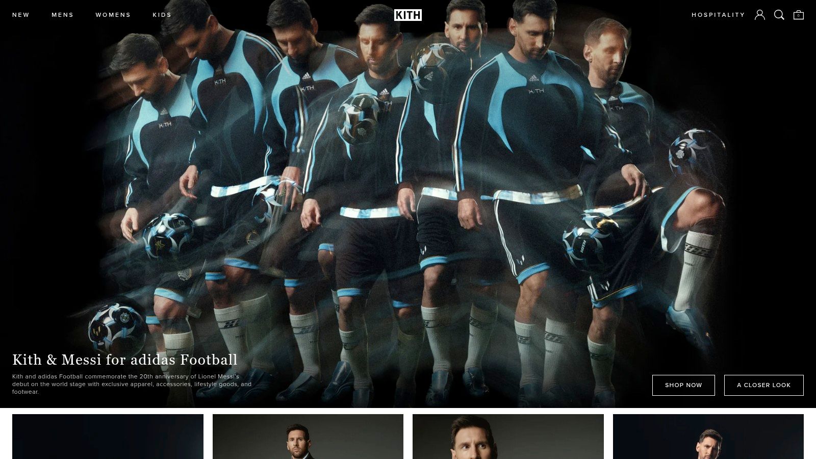
Kith isn't built like a classic luxury store. It's built like a release machine. That distinction matters because many brands want Kith-style energy but copy only the visual language, not the operational model underneath it.
The site works because scarcity, editorial context, and launch mechanics are tightly coordinated. Collaborations don't appear as random product uploads. They arrive with enough narrative framing to feel culturally significant, then move through a storefront designed for fast demand concentration.
Scarcity is only valuable when the system can support it
Kith uses Shopify Plus architecture with a mature CX stack, including Shop Pay, Klaviyo, and Gorgias. That combination is practical for drop-heavy luxury retail because the demand event doesn't end at checkout. The customer service load rises, post-drop communication matters, and launch-specific segmentation becomes part of retention.
This is also where platform maturity matters. Third-party Shopify summaries describe a platform footprint of 4.82 million websites, merchants in more than 175 countries, and roughly $1 trillion in cumulative online sales. For luxury brands, that kind of scale matters less as bragging rights and more as proof that Shopify can support global, multi-channel commerce rather than just boutique direct-to-consumer stores.
The best drop stores don't merely create urgency. They route urgency through stable systems, clear customer messaging, and predictable post-purchase handling.
Kith's downside is familiar to anyone who has worked on launch commerce. If queueing, payments, or stock allocation feel uneven at peak demand, excitement turns into support tickets quickly. Scarcity amplifies demand, but it also amplifies every operational weakness. That's why Kith is a better model for brands with strong release discipline than for brands still struggling with basic catalog hygiene.
5. Aimé Leon Dore

Aimé Leon Dore shows what many luxury Shopify stores miss. Minimalism only works when the brand has enough identity to carry it. Otherwise, the result is a sparse site with weak buying signals.
Here, the restraint feels intentional. The storefront behaves more like a magazine than a marketplace, but it still supports commerce. Collections are staged with clear visual direction, and the custom editorial approach helps the brand maintain a boutique feel even during seasonal merchandising changes.
Distinctiveness beats generic elegance
One of the most underexplored questions in luxury ecommerce is whether premium minimalism is always the right answer. It often isn't. Independent Shopify conversion research on selling angles argues that shoppers respond to signals like expertise, rarity, and personalization, and that brands perform better when they focus on an underserved segment rather than broad appeal in this Shopify selling-angle analysis.
Aimé Leon Dore is a useful case because the brand doesn't try to feel universally elegant. It feels specific. That specificity creates stronger status logic than generic polish ever could.
A few strategic choices support that:
- Editorial theme discipline: The site keeps distractions low, which helps premium positioning.
- Capsule-first merchandising: Seasonal drops feel curated rather than crowded.
- Post-purchase clarity: FAQs and account flows reduce avoidable service friction.
The risk is availability. Tight supply keeps desirability high, but new customers can struggle to find an entry point if evergreen inventory is too thin. Luxury stores need scarcity, but they also need discoverable pathways into the brand. If everything is elusive, the site starts serving insiders only.
6. Fear of God

Fear of God is a strong technical reference because it balances campaign expression with system flexibility. A lot of fashion brands build beautiful launch pages that are painful to maintain. Fear of God's Online Store 2.0 approach is more disciplined. Modular templates let the brand move quickly without rebuilding the visual logic for every collection.
That matters more than most realize. Seasonal complexity is where luxury storefronts often break down. Merchants want campaign-level storytelling, but they also need scalable content structures, consistent PDP behavior, and clean regional readiness.
Why OS 2.0 matters in luxury fashion
A Shopify 2.0 rebuild can produce meaningful gains when the architecture is right. In a 12-month before-and-after case study for Medley Jewellery, a Shopify 2.0 upgrade increased desktop performance by 40% and mobile performance by 62%, while average session duration rose by 13%. That's jewelry, not apparel, but the principle carries over. Theme architecture affects experience, discoverability, and engagement.
Fear of God benefits from that kind of modular logic. Large-format imagery carries the creative direction, while template flexibility supports rapid campaign launches. Clear sizing and fit guidance do another job luxury brands often neglect. They protect conversion by reducing uncertainty without making the page feel transactional.
Luxury design shouldn't fight the shopping task. It should frame it.
The main trade-off is commercial reach. High price points and limited runs naturally narrow the audience. That's fine if the store understands its role. Fear of God doesn't try to convert everyone. It builds a strong environment for the right customer and makes new collection execution efficient.
7. Mejuri
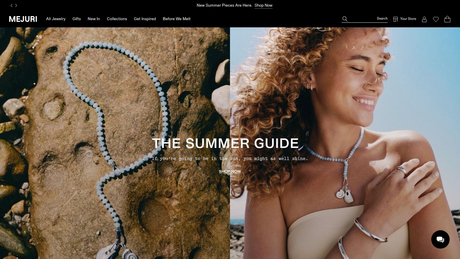
Mejuri is one of the more instructive luxury Shopify stores because it sits at the intersection of fine jewelry, everyday wear, and repeatable ecommerce behavior. That combination changes the operating model. The store can't rely only on rarefied brand cues. It also needs to support replenishment, gifting, membership logic, and omnichannel consistency.
The result is a more pragmatic luxury architecture. The storefront stays refined, but the business model is less dependent on one-off statement purchases than many traditional jewelry brands are.
What Mejuri gets strategically right
The migration to Shopify Plus, paired with a performance-minded setup and leaner app approach, points to a common enterprise lesson. Luxury doesn't benefit from a bloated stack. It benefits from a controlled one. Error monitoring, post-purchase cues, and membership framing all support trust without cluttering the buying path.
That's especially relevant in jewelry because retention is structurally difficult. Rivo's category benchmarks put Shopify luxury goods at a 9.9% repeat purchase rate, versus an average ecommerce retention rate of 30%. For luxury operators, that's a reminder to build around lifetime value, clienteling, and segmented lifecycle flows rather than assuming broad repeat frequency.
Mejuri's model aligns well with that reality:
- Membership-led retention: Mejuri+ gives shoppers a reason to stay engaged beyond the first order.
- Everyday luxury positioning: The assortment creates more frequent purchase occasions than pure occasion jewelry.
- Operational readiness: Global fulfillment and omnichannel coordination matter because jewelry buyers expect reliability.
The pressure point is quality perception. In fine jewelry, customer tolerance for inconsistency is low. A strong Shopify build can protect conversion, but it can't compensate for product or QC concerns at scale. That's why Mejuri works best as a lesson in lifecycle architecture, not just design polish.
7 Luxury Shopify Stores: Side-by-Side Comparison
| Brand | 🔄 Implementation complexity | ⚡ Resource requirements | 📊 Expected outcomes | Ideal use cases | ⭐ Key advantages / 💡 Tip |
|---|---|---|---|---|---|
| SKIMS | High, Shopify Plus + drop/queue systems | High, performance ops, email/SMS, mobile assets | 📊 High launch sales, repeat demand, strong social proof | High‑velocity drops, multi‑region capsule launches | ⭐ Exceptional drop mechanics; 💡 Invest in returns/fulfillment resilience |
| Glossier | Medium, Shopify native with Shop integrations | Moderate, community, editorial content, ad/CRM sync | 📊 Strong loyalty and conversion velocity | Brand‑first DTC with community‑led activations | ⭐ Clean editorial UX; 💡 Expand SKU depth carefully |
| Rebecca Minkoff | Medium, Plus + 3D/AR integration | Moderate‑High, AR content production, global campaign ops | 📊 Higher purchase confidence, lower returns | Premium accessories where visualization aids conversion | ⭐ 3D/AR reduces uncertainty; 💡 Pair visuals with size/fit guidance |
| Kith | High, Plus with raffle/queue/launch tooling | High, mature CX stack, ops for surge traffic | 📊 High engagement, frequent sellouts, cultural buzz | Collaboration‑driven streetwear drops | ⭐ Strong omnichannel storytelling; 💡 Harden payment/queue flows |
| Aimé Leon Dore | Medium, custom editorial theme, lean apps | Moderate, strong visual production, curated merchandising | 📊 Boutique experience, premium positioning | Limited seasonal drops and lifestyle brand storytelling | ⭐ Distraction‑free luxury UX; 💡 Offer some evergreen to capture new customers |
| Fear of God | Medium, OS2.0 modular templates for campaigns | Moderate, creative assets and template management | 📊 Fast landing‑page rollout, consistent brand presentation | Seasonal campaigns and rapid collection launches | ⭐ Flexible modular templates; 💡 Emphasize sizing/fit clarity |
| Mejuri | Medium, Shopify Plus migration with global ops | High, fulfillment, membership, QC monitoring | 📊 Improved scale and repeat rates, better omnichannel ops | Fine‑jewelry DTC scaling globally | ⭐ Strong repeat purchase ladder; 💡 Tighten QC and monitor feedback |
Your Blueprint for a Luxury Shopify Experience
What separates a luxury Shopify store that merely looks expensive from one that sells with discipline?
The answer sits in the store's digital architecture. The brands in this list do more than present polished creative. They use Shopify to control how shoppers discover products, evaluate quality, understand scarcity, and move to checkout with confidence. That is the pattern worth copying.
Luxury performance comes from fit between brand model and storefront design. A drop-driven label needs different collection logic, traffic handling, and launch merchandising than a fine-jewelry brand focused on repeat purchase. A fashion brand with high-consideration products needs stronger PDP depth than a brand selling low-SKU essentials. The best stores reflect those choices in the theme, content system, and app stack, not just in the art direction.
Mobile is usually where that discipline shows. Small screens expose weak merchandising fast. If collection pages are cluttered, if product pages hide material or sizing details, or if checkout gets crowded with distractions, premium positioning starts to break. Strong luxury stores protect atmosphere while making buying decisions easier.
I usually reduce the work to three operating choices.
Define the few signals that justify the premium. Scarcity, craftsmanship, provenance, fit confidence, personal service, and exclusivity do not carry equal weight for every brand. Pick the ones that matter commercially, then make them visible in navigation, product storytelling, and post-purchase communication.
Match merchandising to the revenue model. Evergreen products, seasonal capsules, memberships, and launch drops each need different landing pages, collection structures, inventory messaging, and campaign timing. Brands get into trouble when they borrow a luxury visual style from one model and apply it to another.
Keep the stack controlled. Stores that feel calm on the front end usually come from clear decisions behind the scenes. Fewer apps. Better theme governance. Reusable content blocks. Clean analytics. Faster campaign deployment.
That is where many brands miss the mark. They copy the surface cues of luxury and ignore the operating system underneath. The result is a store that photographs well, but struggles on conversion rate, average order value, repeat purchase, and launch execution.
If a brand is building these systems on Shopify Plus and needs support with development, UX, CRO, or merchandising architecture, a partner such as ECORN can help when the work requires more than a visual refresh.


10 Best Podcast Ecommerce Shows for Store Growth in 2026
Shopify Developer Hourly Rate: What to Pay in 2026
Ecommerce Conversion Tracking: The Complete How-To Guide
Shopify Design Agency: How to Pick the Right Partner
Mastering Multi Store Management on Shopify
Scale Shopify Store
10 Shopify App Ideas Worth Building in 2026
Conversion Rate Optimization for Landing Pages: The Playbook
Shopify Plus Automation: A Guide for 2026
10 Social Selling Platforms for Shopify Merchants

Shopify Website Design Examples: 7 Stores Worth Studying

7 Ecommerce Newsletter Examples for Shopify Brands
One Product Shopify Store: Build and Scale
Mobile Pop Up Strategy for Shopify Stores That Converts

Sitemap for Shopify: How to Find, Optimize, and Submit It
7 Single Product Websites Worth Emulating
Product Variants Shopify: The Complete 2026 Guide
Ecommerce Analytics Consulting for Growth

What Is AI Integration for eCommerce
How to Choose the Right eCommerce Website Development Firm

E Business Strategy Implementation
Conversion Tracking Setup for Shopify Stores
BigCommerce vs Shopify Plus Which Enterprise Wins in 2026
Shopify Theme Kit: Setup, Commands, and Migration Guide

Shopify Extension Development: A Practical 2026 Guide
Shopify Speed Score Explained and How to Improve It
Shopify Mobile Optimization: The 2026 Playbook
How to Add Subcategory in Shopify for Better UX
How to Implement Structured Data for Ecommerce in 2026
SEO App Mobile: Shopify Store Optimization Guide
Shopify Plus Support: What It Includes and How to Choose
Google Ads for Shopify: The Complete 2026 Playbook
Shopify New York: How to Find and Hire the Right Agency
Google Search Console for Shopify: The Complete Setup
First Party Data Collection for eCommerce Growth
FAQ Online Store Guide: Build and Measure It Right
Do FB Ads Work for eCommerce in 2026?
One Page Checkout for Shopify: Design and Implementation
Shopify GraphQL vs REST: The 2026 Developer Decision
Shopify Ecommerce Consulting: Strategy, Pricing &

Are Reddit Ads Worth It for eCommerce Brands
Shopify Title and Meta Description: A Practical 2026 Guide

Product Video Best Practices for Shopify Brands

Real-Time Inventory Management: A 2026 Guide

AI Chatbot Integration for Shopify Stores
Affiliate Program Management: A Shopify Guide
10 Best Performance Monitoring Tools for Shopify in 2026

Digital Asset Management for eCommerce Brands in 2026
Every Type of Facebook Ads Explained for eCommerce Growth
Product Information Management Explained for Shopify Brands
Support Ticket System: A Guide for Shopify Stores

10 Best Customer Service Tools for Shopify in 2026

Can I Start a Business with No Money? a 2026 Blueprint
What Sells Good on Etsy: Best Niches for 2026

Shopify Add to Cart Button: A Practical 2026 Guide

Customer Feedback Automation: A Practical eCommerce Guide
Critical Rendering Path: A Guide for Shopify Stores

How to Promote on TikTok for eCommerce in 2026

B2B eCommerce Consulting That Drives Real Revenue

10 Best Practices for Site Navigation in 2026
Return vs Refund for Shopify Stores: A Practical Guide
What Is Customer Lifetime Value and Why It Matters
What Is Voice of Customer Research for eCommerce

SMS Marketing for Ecommerce That Actually Converts

Master How to Improve Email Deliverability in 2026

Top 8 eCommerce Partners NYC for Shopify Brands in 2026

Machine Learning for Ecommerce: Boost Your Shopify Store
Beauty Market Research: Your 2026 Growth Guide

Shopify International Expansion: A 2026 Roadmap

What Does CRO Stand for in Business: Understanding CRO
Shopify Visual Merchandising: A Playbook for Higher Sales

Shopify Landing Page Design: Master Conversion in 2026

10 Best AI SEO Optimization Tools for Shopify in 2026

Agentic AI for Ecommerce: Boost Your Sales in 2026
Mastering Email Marketing Data for eCommerce Growth

Conversion Rate Optimisation Australia: Boost Your Sales
Conversion Rate Optimization AI: Your Shopify Store Guide

10 Product Bundling Strategies for Shopify in 2026
How to Increase Customer Lifetime Value: A Shopify Playbook

AI Customer Service Automation: Shopify Guide 2026
Clean Website Design: A Shopify Conversion Playbook

Omnichannel Retail Strategy: A Shopify Playbook
Product Data Enrichment: A Guide for Shopify Brands
Instagram Shopping Features a Guide for Shopify Stores

What Is Revenue Optimization: A Holistic RevOps Guide

Benefits of Conversion Rate Optimization: Boost Your
WordPress to Shopify Migration: Your 2026 Seamless Switch
Boost Sales: Ecommerce Payment Processing Guide 2026
Unified Commerce Platform: Benefits, KPIs & Shopify Guide
How to Reduce Bounce Rate eCommerce: Your 2026 Guide
Shopify API Integration: A Practical End-to-End Guide

How to Implement Data Governance: A 2026 Guide
Shopify Store Development Cost: A 2026 Breakdown
What Is Server Side Tracking: The Shopify Guide 2026

Marketing Automation Workflows: A Shopify Guide for 2026
Shopify: How to Reduce Technical Debt

Shopify UX Design Change: A Playbook for Growth
User Generated Content Strategy: Shopify Playbook
Shopify Pause and Build Plan Cost: A Complete 2026 Guide
Compare at Price on Shopify: A Complete Guide for 2026


newsletter in your inbox