

Why do some Shopify brands keep raising budget while results stay flat?
In many accounts, the problem starts with the ad itself. Targeting can be reasonable. The offer can be competitive. Performance still stalls because the creative does not stop the scroll, frame the product clearly, or give the shopper a believable reason to care right now.
That is the main gap in a lot of advice about creative Facebook ads. Brands spend too much time debating format choices and too little time matching the message to buyer awareness, objections, and purchase intent. A strong ad is not just visually polished. It makes a specific promise to a specific customer at the right stage of consideration.
Before changing your entire media plan, audit the creative. Check whether the ad answers one clear buying question, shows the product or outcome fast, and gives the shopper a next step that fits their level of intent. If performance is already slipping, this guide for failing Facebook ad campaigns is a useful companion.
The 10 concepts below are built for execution, not just inspiration. Each one includes the strategy behind the format, swipe copy you can adapt, and testing angles Shopify brands can put into market quickly.
1. Video Testimonial and Case Study Format
Video testimonials work when they feel specific enough to reduce risk. Generic praise doesn't move buyers. A founder talking plainly about the problem, the fix, and the business impact usually does.
For Shopify brands, this format works especially well when the ad mirrors the objections a buyer already has. That could be product quality, fit, shipping confidence, subscription value, or why your brand is worth switching to.
Here's a useful example of the format in action:
How to Build It
Use a simple narrative:
- Problem first: “We kept trying product ads, but customers didn't understand why this was different.”
- Proof second: show the product in use, show the person speaking, and add on-screen text with the core outcome.
- Decision close: tell people what to do next, whether that's shop now, take the quiz, or explore a bundle.
Keep the speaker close to your customer profile. If you sell premium skincare, a beauty creator or customer works better than a polished brand spokesperson. If you sell founder-led niche products, the founder often outperforms a scripted actor.
Practical rule: Don't film a testimonial to “build trust.” Film it to answer one buying objection.
Swipe Copy Template
Primary text:
“Still deciding if [product] is worth it? Hear how [customer type] used it for [specific use case] and why they switched from [old solution].”
Headline:
“Why [customer type] chose [brand]”
Description:
“See the product in real use”
Testing Ideas
- Hook test: lead with the problem in one version, lead with the outcome in another.
- Speaker test: compare founder, customer, and creator-style delivery.
- Edit test: subtitles-only version versus subtitles plus bold on-screen callouts.
What usually fails is overproducing it. If the video looks like an ad before it feels like proof, people keep scrolling.
2. Carousel Ad with Step by Step Service Breakdown
Carousel ads are strong when the buyer needs a little education before clicking. They're weak when every card says the same thing in a slightly different design.
For product brands, a carousel can break down a process that reduces confusion. That might be “how it works,” “what's in the bundle,” “how to choose your formula,” or “how we custom-make your order.”
The strongest real benchmark here comes from a retargeting campaign for Criquet Shirts. In that case, the team used audience windows of 3, 14, 30, 60, and 90 days, tested video, carousel, single-image, and collection formats, and found the most successful setup was a carousel with the first card as a video, according to the Criquet Shirts retargeting case study.
What Makes the Carousel Work
That result matters because it highlights structure, not just format. A moving first card can stop the scroll, then the next cards can do the selling more calmly.
Use the sequence intentionally:
- Card 1: pattern interrupt, motion, or strongest claim
- Card 2: explain the problem
- Card 3: show the product or offer
- Card 4: add proof, ingredients, reviews, or use-case detail
- Card 5: clear CTA
Swipe Copy Template
Card sequence:
- Card 1: “Still dealing with [pain point]?”
- Card 2: “Most products solve [surface issue], not [deeper issue].”
- Card 3: “[Brand] was built for [specific outcome].”
- Card 4: “Use it for [use case 1], [use case 2], or [use case 3].”
- Card 5: “Shop the best-sellers”
Testing Ideas
Try a “story carousel” against a “product lineup carousel.” The first teaches. The second merchandises. Both can work, but usually not for the same audience temperature.
Also test whether the first card should introduce pain, promise, or product. A lot of brands default to product. Warm traffic often responds better to pain plus solution progression.
3. Interactive Poll and Quiz Format
Poll and quiz ads don't need to be fancy to work. Their job is to get the customer to self-identify. Once someone tells you what they care about, your retargeting gets easier.
This format is especially useful for products that involve choice. Skincare, supplements, apparel fit, haircare, and gifting all benefit from helping the buyer narrow the path instead of dumping them on a collection page.
Where Brands Get This Wrong
They ask broad questions that create engagement but no selling context. “What's your biggest challenge?” sounds interactive, but it doesn't always push the user toward purchase.
Ask narrower questions tied to a merchandising path:
- Skin concern poll: dryness, breakouts, dullness
- Apparel fit quiz: relaxed, fitted, oversized
- Gift finder poll: under a set budget, premium gift, last-minute gift
- Routine selector: morning, night, travel, full regimen
If the answer doesn't help you decide the next ad, the poll is entertainment, not strategy.
Swipe Copy Template
Primary text:
“Not sure which [product category] is right for you? Pick your biggest concern and we'll point you to the best match.”
Headline:
“Find your best fit”
Description:
“Fast, personalized recommendation”
Testing Ideas
Run one poll by product category and another by customer motivation. Those are different segmentation models. Product category helps merchandising. Motivation helps message angle.
The bigger strategic point is that message angle should change by awareness stage. Public advice often stays stuck on hooks and formats, but stronger campaigns shift the core message depending on whether the audience is unaware, problem-aware, solution-aware, or product-aware, as discussed in this guide to Facebook creative angle strategy. That applies to quizzes too. Don't ask the same question to every audience and expect clean conversion behavior.
4. Before and After Transformation Visual Format
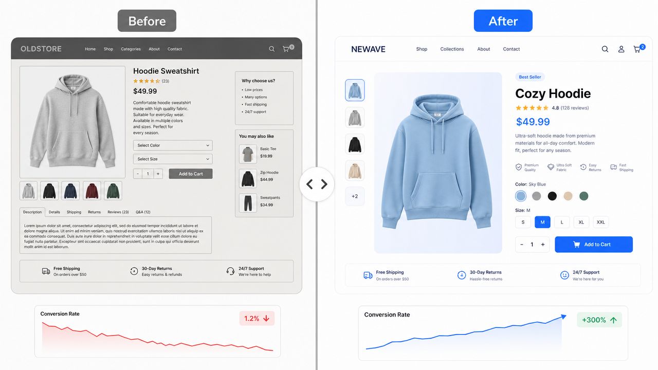
Before-and-after creative works because it compresses the promise into a single glance. If your product visibly changes something, this is one of the easiest creative Facebook ads formats to test.
For Shopify brands, “before and after” doesn't only mean beauty or fitness. It can mean cluttered pantry versus organized shelf, plain room versus styled room, dry hair versus finished look, or bare routine versus complete ritual.
When This Format Converts
The strongest before-and-after ads are easy to decode without audio. The customer should understand the shift immediately.
That means:
- Keep the frame consistent: same angle, same lighting if possible
- Label both states clearly: “before” and “after” still help
- Focus on one change: don't mix five benefits into one visual
- Pair the visual with a reason: ingredient, process, or product mechanism
If you want more examples of how brands adapt creative formats for ecommerce, ECORN's best Facebook ads breakdown for eCommerce brands is worth reviewing.
Swipe Copy Template
Primary text:
“From [undesired state] to [desired state]. See what happens when you use [product] for [specific use case].”
Headline:
“Real transformation, no complicated routine”
Description:
“Shop the set”
Testing Ideas
Test visual-first against explanation-first. In one version, show the transformation instantly. In another, lead with the product and reveal the transformation later in the video or carousel.
This format tends to fail when brands overdesign it. If the creative looks overly polished, buyers start reading it as concept art instead of believable proof.
5. Educational Series with Lead Magnet CTA
Not every ad should ask for the sale on the first click. If your product needs education, a lead magnet can qualify demand without forcing an immediate purchase.
This is especially useful in crowded categories where customers don't fully understand the difference between options. Think ingredient education, sizing guidance, product routine design, subscription optimization, or care instructions.
What to Offer
The lead magnet has to solve a specific friction point, not just collect emails. Broad assets like “the ultimate guide” usually underperform compared with something practical.
Better angles include:
- Routine builder: “Which products to use in what order”
- Buyer guide: “How to choose the right [product] for your needs”
- Fit guide: “What size to buy based on body shape or preference”
- Care guide: “How to make [product] last longer”
Swipe Copy Template
Primary text:
“Buying [product category] shouldn't feel like guesswork. Get the short guide we made for customers who want the right option without wasting money.”
Headline:
“Free [category] buying guide”
Description:
“Useful, practical, and easy to apply”
Education works best when it reduces purchase friction, not when it tries to impress people with how much your brand knows.
Testing Ideas
Compare a downloadable asset against a native content ad that teaches inside the creative itself. Some brands discover that the best “lead magnet” is a useful 30-second explainer with a direct shop CTA.
Also test lead magnets by awareness stage. Problem-aware users often want diagnosis. Product-aware users usually want reassurance and comparison.
6. User Generated Content Social Proof Format
UGC works because it borrows the rhythm of organic content. The best versions don't look lazy. They look native.
This format is effective when buyers need to see the product in real life, in real hands, in real environments. That's why it keeps working for categories like cosmetics, food and beverage, home, apparel, and wellness.
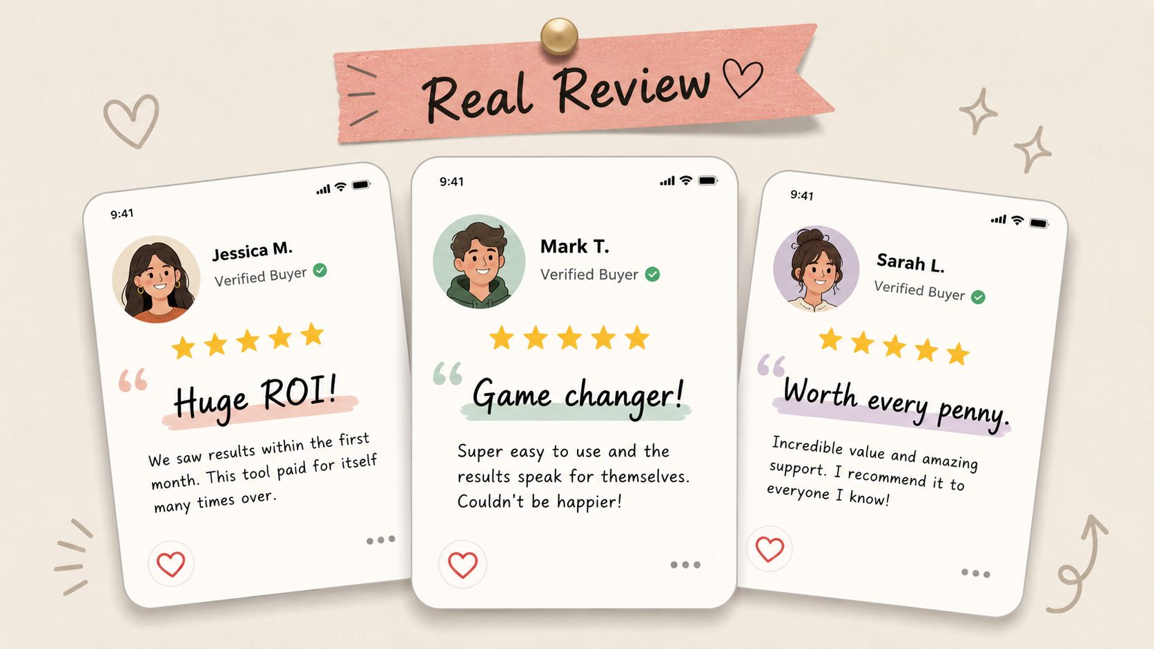
What Good UGC Actually Looks Like
A lot of brands misunderstand UGC and just ask creators for generic positivity. That leads to vague videos with lots of smiling and no selling.
Ask for one of these structures instead:
- Problem-solution diary: “I tried this because…”
- Unboxing plus first use: useful for tactile or giftable products
- Objection handling: “I thought this would be too expensive, too complicated, too harsh”
- Comparison angle: “Why I switched from…”
Swipe Copy Template
Primary text:
“Not sponsored-looking. Just a real look at how [customer type] uses [product] and why they kept it in their routine.”
Headline:
“See it in real life”
Description:
“Watch before you buy”
Testing Ideas
Mix polished creator UGC with rougher customer-shot clips. Don't assume lower production always wins. Native feel matters, but clarity still matters more.
A real reminder comes from Seltzer Goods. Their Facebook creative test used single-image ads in a 1:1 format and generated a 9.68x ROAS, a 785% increase in monthly revenue, a $4.87 CPA, 105% more brand impressions, 319% more clicks, a 105% lift in CTR, and 25% of monthly revenue, according to the Seltzer Goods Facebook ads case study. The lesson isn't “static beats UGC.” It's that message, offer, and audience alignment still decide whether a creative wins.
7. Retargeting Sequential Story Ad Series
Retargeting creative shouldn't repeat the same ad harder. It should move the buyer forward. That's the difference between a sequence and a reminder.
Most Shopify brands waste warm traffic by showing a product ad, then showing that same product ad again with a slightly different thumbnail. A proper sequence changes the message based on what the person has already seen or done.
A Better Retargeting Flow
Use a progression like this:
- Ad 1: restate the problem or desire
- Ad 2: show proof or credibility
- Ad 3: answer objections
- Ad 4: present offer, bundle, or urgency
- Ad 5: reinforce category leadership or ease of purchase
That's especially important for products with longer consideration cycles. You don't need more frequency. You need more relevance.
If you're refining that flow, ECORN's guide to remarketing with Facebook ads for eCommerce brands is a useful reference.
Swipe Copy Template
Ad 1:
“Still looking for a better way to [desired outcome]?”
Ad 2:
“Here's what customers notice first after switching to [brand].”
Ad 3:
“Worried about [common objection]? Start here.”
Ad 4:
“Your first [routine, bundle, order] is ready.”
Testing Ideas
Build separate sequences for product viewers, cart abandoners, and repeat customers. Those audiences need different creative, not just different budgets.
One underused tactic is creative diversification through distinct angle families tied to motivations, use cases, and proof types. Meta-focused practitioners increasingly emphasize testing multiple angles within each creative type rather than assuming one winning format scales everywhere, as discussed in this Meta creative diversification discussion. That advice matters most in retargeting, where audience intent can vary a lot.
8. Niche Community and Founder Focused Messaging Format
Some ads work because they're broad. Others work because they make the right buyer feel seen immediately.
Founder-focused and niche-community creative is about using the language your customer already uses. Not slang for the sake of it. Specificity. If you sell to runners, estheticians, moms buying lunch gear, coffee obsessives, or high-ticket interior design clients, the ad should sound like it belongs in their world.
How to Make It Sound Real
Study comments, support tickets, reviews, Reddit threads, and creator conversations. Pull recurring phrases and buying concerns. Then build ads that speak to those realities directly.
Examples:
- For subscription brands, speak to reorder fatigue, routine consistency, and running out at the wrong time.
- For apparel, speak to rise, inseam, compression, layering, or drape.
- For specialty food, speak to ingredients, sourcing, or prep context.
The ad doesn't need to appeal to everyone. It needs to make the right person stop.
Swipe Copy Template
Primary text:
“Built for [specific customer identity] who are tired of [common workaround or frustration].”
Headline:
“Finally, [product category] for [niche audience]”
Description:
“Made with your use case in mind”
Testing Ideas
Run one niche-specific version and one broad-market version with the same offer. Watch not only CTR, but also on-site behavior and purchase quality. Sometimes the narrower ad attracts fewer clicks but better buyers.
This format usually fails when brands force insider language they haven't earned. If the copy sounds borrowed, buyers feel it immediately.
9. Social Proof ROI Calculator and Tool Ad Format
A calculator ad can be a strong bridge between interest and intent, especially when the buyer needs to justify the purchase. This works well for products with repeat use, replacement logic, subscription savings, bundling economics, or time-saving value.
The mistake is making the tool too complex. If the user has to think hard to complete it, they'll bounce. Keep the interaction quick and the output useful.
Best Use Cases
Shopify brands can adapt this in several ways:
- Bundle saver calculator: compare one-off purchase versus bundle
- Routine cost calculator: show cost per use or cost per month
- Subscription comparison tool: demonstrate convenience and replenishment fit
- Gift budget tool: recommend products by spend level and recipient
Swipe Copy Template
Primary text:
“See which [plan, bundle, routine, subscription] makes the most sense for how you shop.”
Headline:
“Try the quick calculator”
Description:
“Personalized recommendation in minutes”
Testing Ideas
Test whether the result should be gated or ungated. If your priority is lead capture, a gate can work. If your priority is conversion momentum, showing the result immediately may outperform.
Also test what kind of answer the tool gives. A number isn't always enough. Product recommendation plus rationale often converts better than a sterile estimate.
For colder audiences, pair the calculator with social proof. People are more willing to interact when they already believe the brand is credible.
10. Authority Building Expert Content and Webinar Promotion Format
Webinar and expert-content ads aren't only for SaaS. They can work for ecommerce brands that sell education-heavy products or serve customers who want confidence before they buy.
This format fits categories where usage affects results. Beauty routines, wellness protocols, training gear, specialty nutrition, home improvement products, and premium hobby equipment all benefit from a teaching-led approach.
What Makes This Worth Clicking
The topic has to be specific. “Learn how to improve your routine” is weak. “How to build a simple nighttime routine for sensitive skin” gives people a reason to register or watch.
A good authority ad usually combines three things:
- A clear lesson
- A credible host
- A next step tied to commerce
Swipe Copy Template
Primary text:
“Join our live session on how to choose and use [product category] without wasting money on the wrong setup.”
Headline:
“Free live workshop for [audience]”
Description:
“Reserve your spot”
Testing Ideas
Test live webinar promotion against recorded expert clips repackaged as ads. In many cases, the shortest path is better. A strong two-minute teaching clip can build more authority than a registration page.
This format also works for founder-led brands. If the founder has real product expertise, put that expertise in front of the audience. The ad becomes less about hype and more about trusted guidance.
10 Creative Facebook Ad Formats Compared
| Ad Format | Implementation Complexity 🔄 | Resource Requirements ⚡ | Expected Outcomes 📊 | Ideal Use Cases 💡 | Key Advantages ⭐ |
|---|---|---|---|---|---|
| Video Testimonial & Case Study Format | 🔄 Medium–High (client coordination + production) | ⚡ High (video shoot, editing, client access) | 📊 High trust, stronger CTRs and proven ROI signals | 💡 Case validation for growing eCommerce and Shopify brands | ⭐ Social proof + engagement; demonstrates measurable results |
| Carousel Ad with Step-by-Step Service Breakdown | 🔄 Medium (card strategy & sequence planning) | ⚡ Medium (multiple card designs) | 📊 Better engagement than static; educates through sequence | 💡 Explaining methodology and consideration-stage prospects | ⭐ Clear storytelling of process; cost-efficient vs long-form video |
| Interactive Poll & Quiz Format | 🔄 Low–Medium (setup + segmentation logic) | ⚡ Low (simple creative, platform tools) | 📊 Very high engagement and first‑party insights; low direct conversions | 💡 Lead qualification and audience segmentation for retargeting | ⭐ Strong data capture and personalization potential |
| Before/After Transformation Visual Format | 🔄 Medium (asset access + validation) | ⚡ Medium (before/after assets; video ups performance) | 📊 Immediate perceived value; high shareability and impact | 💡 Showcasing redesigns, CRO wins, and visual transformations | ⭐ Clear demonstration of improvement; strong psychological effect |
| Educational Series with Lead Magnet CTA | 🔄 Medium–High (content series + nurture flow) | ⚡ Medium–High (content creation, landing pages, automation) | 📊 Generates qualified leads and builds long-term authority | 💡 Thought leadership and sustained lead generation campaigns | ⭐ High lead quality and reduced CAC over time |
| User-Generated Content (UGC) Social Proof Format | 🔄 Low–Medium (collecting & approving UGC) | ⚡ Low (fast, low-cost production; permission work) | 📊 Very high trust, lower CPM, improved conversions | 💡 Trust-building for skeptical eCommerce founders | ⭐ Highest authenticity and fast scalability |
| Retargeting Sequential Story Ad Series | 🔄 High (multi-touch sequencing + exclusions) | ⚡ High (many creatives, precise audience management) | 📊 Strong conversion lift from warm audiences; better ROI | 💡 Nurturing website visitors, past leads, and trial users | ⭐ Highly effective at moving prospects down the funnel |
| Niche Community & Founder-Focused Messaging Format | 🔄 Medium–High (deep community research & tone testing) | ⚡ Medium (tailored creatives and targeting) | 📊 High relevance and engagement; qualified niche leads | 💡 Targeting specific communities (Shopify owners, D2C founders) | ⭐ Exceptional resonance and cultural fit with target buyers |
| Social Proof ROI Calculator/Tool Ad Format | 🔄 High (tool development + accuracy maintenance) | ⚡ High (engineering, UX, data upkeep) | 📊 High-intent leads, personalized ROI education; viral potential | 💡 Convincing operators with quantified impact and project context | ⭐ Powerful qualification and strong case-for-investment |
| Authority-Building Expert Content & Webinar Promotion Format | 🔄 High (speaker prep, production, promotion) | ⚡ High (expert time, hosting tech, promotion) | 📊 Attracts education‑forward, high‑intent leads; builds authority | 💡 Enterprise / Shopify Plus and education-focused audiences | ⭐ Deep credibility and high-quality pipeline generation |
Your Blueprint for Creative Ad Success
What separates a Facebook ad that gets cheap clicks from one that drives profitable Shopify revenue?
Across these 10 formats, the answer is usually the same. Strong creative gives the right buyer the right proof at the right moment. Format matters, but message sequencing matters more. A polished ad with the wrong angle still underperforms. A simpler ad with the right objection handling often wins.
That is the actual use of this list. It is not just a swipe file. Each concept can become a repeatable testing unit with a message angle, a copy structure, a creative treatment, and a clear next test. That is how Shopify teams turn inspiration into output instead of collecting examples they never execute.
For most brands, the best next step is narrower than expected. Pick one or two formats from this article and build a disciplined test plan around them. Test one promise against another. Test creator-led UGC against founder-led explanation. Test whether a retargeting sequence introduces new proof, new objections, or new stakes instead of replaying the same ad in a different cut.
Use a practical review standard:
- Match the ad to buyer awareness. Prospecting creative should identify the problem or desire. Retargeting creative should reduce risk and answer objections.
- Score ads on downstream quality. CTR matters, but blended CPA, conversion rate, AOV, and contribution margin matter more.
- Refresh the argument, not just the edit. New hooks, proof points, offers, and customer motivations usually outperform cosmetic changes.
- Build multiple angles inside one format. A testimonial can sell results, speed, ease of use, or reduced risk. Treat those as separate tests.
- Keep the click path consistent. The product page, offer framing, and merchandising should continue the same sales conversation the ad started.
The strongest Meta accounts usually treat creative as an operating system. Teams brief around customer beliefs, not around vague requests for "more content." They know which messages introduce the product, which messages convert skeptics, and which messages help returning visitors finally buy. That clarity makes creator direction better, edit reviews faster, and scaling decisions less reactive.
If your team already has traffic and product demand but creative execution is inconsistent, outside support can help. ECORN is one option for Shopify brands that need design, development, and CRO support tied to ecommerce growth work. For teams also measuring demand beyond the storefront, this piece on measuring true ROI for Amazon sellers is a useful reminder that Meta creative can influence sales paths that do not show up cleanly in a single dashboard.
Creative ideas are easy to collect. A working system takes more discipline. Build the concept, write the angle, ship the first version, review it against revenue, and iterate until the winner is obvious.
If you want help turning these concepts into campaigns, ECORN works with Shopify brands on design, development, and CRO, and can support the buildout of more effective creative systems for Meta advertising.


Ecommerce Conversion Tracking: The Complete How-To Guide
Shopify Design Agency: How to Pick the Right Partner
Mastering Multi Store Management on Shopify
Scale Shopify Store
10 Shopify App Ideas Worth Building in 2026
Conversion Rate Optimization for Landing Pages: The Playbook
Shopify Plus Automation: A Guide for 2026
10 Social Selling Platforms for Shopify Merchants

Shopify Website Design Examples: 7 Stores Worth Studying
7 Ecommerce Newsletter Examples for Shopify Brands
One Product Shopify Store: Build and Scale
Mobile Pop Up Strategy for Shopify Stores That Converts
Sitemap for Shopify: How to Find, Optimize, and Submit It
7 Single Product Websites Worth Emulating
Product Variants Shopify: The Complete 2026 Guide
Ecommerce Analytics Consulting for Growth
What Is AI Integration for eCommerce
How to Choose the Right eCommerce Website Development Firm
E Business Strategy Implementation
Conversion Tracking Setup for Shopify Stores
BigCommerce vs Shopify Plus Which Enterprise Wins in 2026
Shopify Theme Kit: Setup, Commands, and Migration Guide
Shopify Extension Development: A Practical 2026 Guide
Shopify Speed Score Explained and How to Improve It
Shopify Mobile Optimization: The 2026 Playbook
How to Add Subcategory in Shopify for Better UX
How to Implement Structured Data for Ecommerce in 2026
SEO App Mobile: Shopify Store Optimization Guide
Shopify Plus Support: What It Includes and How to Choose
Google Ads for Shopify: The Complete 2026 Playbook
Shopify New York: How to Find and Hire the Right Agency
Google Search Console for Shopify: The Complete Setup
First Party Data Collection for eCommerce Growth
FAQ Online Store Guide: Build and Measure It Right
Do FB Ads Work for eCommerce in 2026?
One Page Checkout for Shopify: Design and Implementation
Shopify GraphQL vs REST: The 2026 Developer Decision
Shopify Ecommerce Consulting: Strategy, Pricing &
Are Reddit Ads Worth It for eCommerce Brands
Shopify Title and Meta Description: A Practical 2026 Guide
Product Video Best Practices for Shopify Brands
Real-Time Inventory Management: A 2026 Guide
AI Chatbot Integration for Shopify Stores
Affiliate Program Management: A Shopify Guide
10 Best Performance Monitoring Tools for Shopify in 2026
Digital Asset Management for eCommerce Brands in 2026
Every Type of Facebook Ads Explained for eCommerce Growth
Product Information Management Explained for Shopify Brands
Support Ticket System: A Guide for Shopify Stores

10 Best Customer Service Tools for Shopify in 2026

Can I Start a Business with No Money? a 2026 Blueprint
What Sells Good on Etsy: Best Niches for 2026

Shopify Add to Cart Button: A Practical 2026 Guide

Customer Feedback Automation: A Practical eCommerce Guide
Critical Rendering Path: A Guide for Shopify Stores

How to Promote on TikTok for eCommerce in 2026

B2B eCommerce Consulting That Drives Real Revenue
10 Best Practices for Site Navigation in 2026
Return vs Refund for Shopify Stores: A Practical Guide
What Is Customer Lifetime Value and Why It Matters
What Is Voice of Customer Research for eCommerce

SMS Marketing for Ecommerce That Actually Converts

Master How to Improve Email Deliverability in 2026
Top 7 eCommerce Partners NYC for Shopify Brands in 2026
Machine Learning for Ecommerce: Boost Your Shopify Store
Beauty Market Research: Your 2026 Growth Guide
Shopify International Expansion: A 2026 Roadmap
What Does CRO Stand for in Business: Understanding CRO
Shopify Visual Merchandising: A Playbook for Higher Sales
Shopify Landing Page Design: Master Conversion in 2026
10 Best AI SEO Optimization Tools for Shopify in 2026

Agentic AI for Ecommerce: Boost Your Sales in 2026
Mastering Email Marketing Data for eCommerce Growth
Conversion Rate Optimisation Australia: Boost Your Sales
Conversion Rate Optimization AI: Your Shopify Store Guide

10 Product Bundling Strategies for Shopify in 2026
How to Increase Customer Lifetime Value: A Shopify Playbook
AI Customer Service Automation: Shopify Guide 2026
Clean Website Design: A Shopify Conversion Playbook

Omnichannel Retail Strategy: A Shopify Playbook
Product Data Enrichment: A Guide for Shopify Brands
Instagram Shopping Features a Guide for Shopify Stores
What Is Revenue Optimization: A Holistic RevOps Guide
Benefits of Conversion Rate Optimization: Boost Your
WordPress to Shopify Migration: Your 2026 Seamless Switch
Boost Sales: Ecommerce Payment Processing Guide 2026
Unified Commerce Platform: Benefits, KPIs & Shopify Guide
How to Reduce Bounce Rate eCommerce: Your 2026 Guide
Shopify API Integration: A Practical End-to-End Guide
How to Implement Data Governance: A 2026 Guide
Shopify Store Development Cost: A 2026 Breakdown
What Is Server Side Tracking: The Shopify Guide 2026
Marketing Automation Workflows: A Shopify Guide for 2026
Shopify: How to Reduce Technical Debt

Shopify UX Design Change: A Playbook for Growth
User Generated Content Strategy: Shopify Playbook
Shopify Pause and Build Plan Cost: A Complete 2026 Guide
Compare at Price on Shopify: A Complete Guide for 2026
Where Can I Sell My Prints? 10 Best Platforms for 2026
Shopify Order Management System: The Ultimate Guide 2026


newsletter in your inbox