
You've probably done this already. You polished your product pages, tuned your homepage, maybe even rewrote your About page, and your collection pages still say something like “Browse our latest styles” or nothing at all.
That's a mistake.
A strong Shopify collection description does two jobs at once. It helps shoppers understand what they're looking at, and it gives search engines useful context about the page. When it's handled well, a collection page becomes more than a product grid. It becomes a category landing page that qualifies traffic, guides browsing, and sends people deeper into the catalog.
Most merchants get stuck on one question: should the description be short for clean UX, or long for SEO? The best answer usually isn't one or the other. It's how you structure the page.
Why Your Shopify Collection Description Is a Secret Weapon
A shopper lands on your "running shoes" collection from Google. The product grid loads, the filters are visible, and the copy at the top says, "Browse our latest styles." That page is supposed to help them choose. Instead, it gives them nothing.
That is the missed opportunity.
A Shopify collection page is a category page customers can browse, sort, filter, and enter from search, ads, email, or site navigation. The description is part of that experience. It is not just a field in the admin. It shapes how clearly the page matches intent and how useful the page feels once someone arrives.
Collection pages influence both discovery and buying decisions
Product pages close the sale on a specific item. Collection pages do the heavier sorting work earlier in the journey.
If someone lands on a "linen shirts" collection, they usually want quick answers. Are these casual or fitted? Are they lightweight enough for summer? Do you stock oversized fits, neutrals, short sleeves, plus sizes? A precise description can answer those questions before the shopper opens a single product card.
That matters on Shopify because the platform operates at enormous scale. Mipler notes there are about 4.82 million live Shopify websites, and merchants processed an average of 199 million orders per month in 2023 in its Shopify reporting overview. On stores with large catalogs, collection pages often become some of the highest-traffic templates outside the homepage and product pages.
I see this in audits all the time. Merchants spend weeks polishing PDPs, then leave collection copy blank. The result is a category page that can attract traffic but does very little to qualify it.
Practical rule: If a collection page can bring in search traffic, support filtering, and move shoppers deeper into the catalog, treat its description like revenue-driving copy.
Why merchants underuse this field
The problem is rarely laziness. It is usually a trade-off question.
Store owners want more text for SEO, but they do not want to push the product grid below the fold. They want cleaner design, but they also want category pages to rank for terms like "men's work boots" or "organic cotton bedding." Many guides give generic writing advice and skip the implementation problem.
That is why collection descriptions are underrated. A well-structured description helps search engines understand the category and helps shoppers confirm they are in the right place. Poor copy does neither.
Weak descriptions usually fail in three predictable ways:
- They stay generic: "Shop our collection" gives no signal about product type, material, style, use case, or customer fit.
- They hide buying context: A shopper comparing "standing desks" needs details about size ranges, adjustability, cable management, or office fit, not broad brand language.
- They treat UX and SEO as opposites: Merchants either write one vague sentence to keep the page clean or dump a long block of text above the grid and hurt browsing.
The smart move is not choosing one side. It is structuring the page so the description can do both jobs. That is where collection copy stops being filler and starts working like a category-level sales tool.
Crafting Descriptions That Convert Shoppers into Buyers
A collection description shouldn't read like a mini essay. It should help someone decide whether to keep browsing this category.
The simplest structure I use has three parts: a hook, a value statement, and a directional close. That framework works whether you sell knitwear, cookware, or Bluetooth speakers.
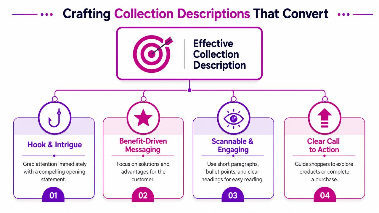
Start with a hook that names the collection clearly
Your opening line should confirm relevance fast. Don't be clever before you're clear.
If the collection is “Women's Waterproof Jackets,” say that in plain language. If it's “Walnut Dining Tables,” say that directly. The shopper should know within a second that they're in the right category.
Compare these two openings:
| Version | Example |
|---|---|
| Weak | “Explore timeless pieces designed for modern living.” |
| Strong | “Shop women's waterproof jackets built for daily commutes, weekend walks, and wet-weather layering.” |
The second one works because it names the product type and hints at use case.
Explain why this collection is worth browsing
Conversion-focused copy outperforms generic SEO writing. You're not just describing products. You're reducing uncertainty.
For a fictional apparel brand, the middle of the description might cover fit, material, style range, or occasion. For example:
- Fashion example: “Choose from oversized sweatshirts, cropped hoodies, and relaxed joggers made for easy layering and all-day comfort.”
- Home goods example: “Our ceramic dinnerware sets include everyday neutrals and statement glazes, with options that work for both weeknight meals and hosting.”
- Electronics example: “Find wireless speakers with compact travel-friendly builds, room-filling sound, and simple pairing for home or office use.”
Notice what these lines do. They don't list technical specs for the sake of it. They translate product range into shopper value.
The best collection descriptions answer the question behind the search, not just the keyword itself.
End with a directional nudge
Collection pages often lose momentum because the copy stops without guiding the next action. That action doesn't always need to be “buy now.” On a category page, the better move is often to guide exploration.
Useful closing moves include:
- Point to a subcategory: “Looking for lighter layers? Browse our short-sleeve linen shirts.”
- Point to a use case: “Need something giftable? View our best-selling table lamps.”
- Point to a comparison path: “Not sure which model fits your setup? Explore our compact desk collection.”
A simple template that works
If you want a repeatable format, use this:
Opening line
Name the collection and the main shopper need.Middle lines
Clarify assortment, materials, fit, style, price positioning, or intended use.Closing line
Link to a related collection or relevant products.
Here's a full example for a lifestyle apparel collection:
Shop our women's linen trousers for warm-weather dressing, easy layering, and polished everyday wear. This collection includes wide-leg, tapered, and drawstring styles in breathable fabrics and versatile neutrals that work for travel, office days, and weekends. Pair them with our lightweight shirts or browse matching linen sets for a complete look.
That's useful because it sounds like a merchant who understands the buying decision, not a search engine prompt.
Integrating Keywords for Search Engine Dominance
A collection page can target the right term and still underperform if the copy sounds like it was written for a crawler instead of a customer. The fix is usually simple. Choose one primary keyword that matches the products on the page, then support it with the phrases shoppers use while comparing options.
For most stores, a short collection description is enough to do that job well. A practical working range is 75 to 150 words, which aligns with this collection description guidance. That limit helps store owners stay specific. It leaves less room for empty brand talk and more room for product type, use case, material, fit, and other terms that help both rankings and clicks.
Put the main keyword in the places that carry the most weight:
- Collection title: Match the phrase people search, such as “men's running shorts” instead of a vague label.
- URL handle: Keep it clean and readable.
- Opening sentence: Confirm relevance early, in natural language.
- Meta description: Write for the click, not just the keyword.
If you need a practical refresher on how to optimize meta descriptions, that guide is useful for tightening search snippets without making them robotic.
Keyword choice also improves when it reflects buyer intent instead of internal catalog logic. Merchants often name collections too broadly because that is how inventory is grouped in the backend. Search demand is usually narrower and more specific.
A stronger collection keyword often combines a few signals:
- Product type such as “floor lamps”
- Audience such as “for small apartments”
- Style or feature such as “modern,” “solid wood,” or “wireless”
- Use case such as “travel,” “office,” or “winter”
Here's what that looks like in practice:
| Weak target | Better target |
|---|---|
| “lighting” | “modern table lamps” |
| “furniture” | “solid wood dining benches” |
| “audio” | “portable Bluetooth speakers” |
The second column gives you a page that can rank and convert. It also makes merchandising decisions easier, because the copy, filters, and product grid can all support the same promise.
Collection SEO also depends on alignment across the page. The title, URL, body copy, and search snippet should point to the same topic. The products on the page need to back that up. If a collection targets “linen summer dresses” but the grid is full of polyester occasionwear, rankings will be harder to win and harder to keep.
If you're building a broader SEO system around collections, filters, and site architecture, this guide to Shopify SEO for stores is a useful companion because collection copy only works when the surrounding page structure supports it.
Keep the rule simple. One primary keyword. A few natural supporting terms. Copy that matches the products and the way customers shop. That is the version of keyword optimization that saves time and drives qualified traffic.
The Split-Description Strategy for SEO and UX
A shopper lands on your collection page from Google, sees a wall of text before any products, and bounces. Cut all the copy, though, and the page loses the context that helps it rank and helps hesitant buyers decide. That tension is real on Shopify collection pages, and generic advice rarely solves it.
The practical fix is to split the description so each part of the page does a different job.
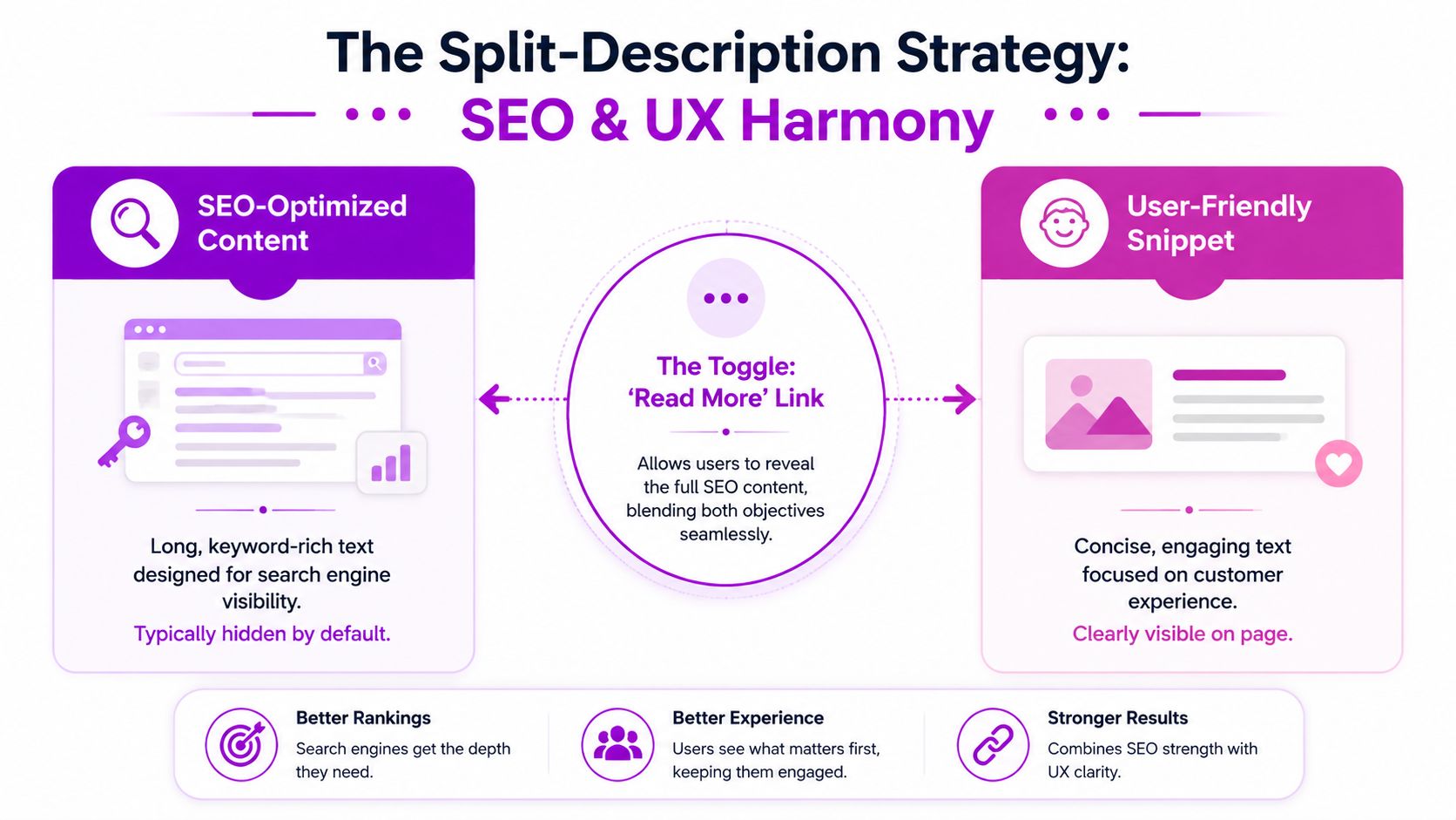
What the split-description method actually looks like
A Shopify-focused recommendation from Double Your Ecommerce's guide to splitting collection content suggests keeping the intro above the grid under 50 words, then placing a longer buyer-focused block below the product grid.
That setup works because it respects how people use collection pages. First they confirm they are in the right place. Then they browse products. Then, if needed, they scroll for buying help, FAQs, and supporting detail.
| Placement | Purpose | What belongs there |
|---|---|---|
| Above the grid | Quick relevance check | Short intro, primary keyword, clear collection promise |
| Below the grid | Decision support | Buying advice, FAQs, materials, style notes, internal links |
This is the trade-off most articles skip. SEO wants depth. Shoppers want speed. A split description gives you both without forcing one goal to damage the other.
What goes above the product grid
Keep the top block tight so products stay visible fast, especially on mobile collection pages where a few extra lines can push the grid down more than merchants expect.
Use the opening copy to answer three questions in one glance:
- What is this collection?
- Who is it for or what is it good for?
- Why is this selection worth browsing?
Example:
Shop men's merino wool sweaters designed for lightweight warmth, easy layering, and everyday wear.
That works because it orients the shopper quickly. It also gives search engines a clean, on-topic summary without turning the top of the page into an article.
What goes below the product grid
The lower block handles the heavier work, adding the context that supports rankings and helps buyers compare options without clogging the top of the page.
Useful content for the lower section includes:
Buying guidance
Explain fit differences, fabric weights, sizing logic, or which products suit different use cases.Collection pathways
Link to relevant subcategories or adjacent collections such as crew necks, cardigans, or winter accessories.FAQ content
Answer real pre-purchase questions about care, layering, delivery expectations, or seasonality.Category-level context
Write for the collection, not the SKU. Product pages can handle individual features and benefits.
That last point matters more than many merchants realize. If the collection description repeats the same language used across every product card and product page, the copy adds very little. A better lower block helps shoppers choose between types, styles, materials, or use cases across the category.
For stores that want cleaner control over this layout, Shopify metafields for collection-specific content blocks are often the easiest way to separate the short intro from the longer supporting copy.
Long collection copy can work well. It just needs the right placement.
When the split approach works best
Use this method on collections that carry real commercial intent and need a bit of explanation to convert well. Apparel categories with size or fabric questions are a good fit. Furniture collections with material, dimensions, or room-type considerations are another. Beauty collections often benefit too, especially when shoppers need help choosing by skin type, finish, or ingredient preference.
It is less useful on very small, simple collections where shoppers can evaluate the full range instantly. In those cases, a short top description may be enough.
For serious category pages, split descriptions are one of the simplest ways to improve SEO without making the page harder to shop.
How to Display Descriptions in Your Shopify Theme
You add a solid collection description in Shopify, save it, open the category page, and nothing shows. That usually is not a content problem. It is a theme output problem.
Many Shopify themes do not render collection descriptions the way merchants expect out of the box, especially on collection templates built around banners or custom sections. That confusion shows up regularly in Shopify support discussions, including this Shopify Community thread about Dawn collection descriptions. The practical takeaway is simple. Before rewriting copy or blaming the admin, confirm that your theme is set up to display the field.
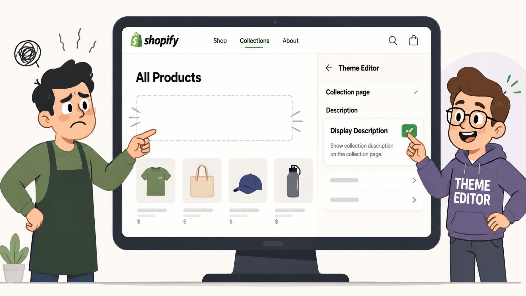
Check the theme editor first
Start in the customizer, not the code editor. In many stores, the fix is a setting that was never enabled.
Follow this path:
- Open Shopify admin
- Go to Online Store > Themes
- Click Customize on the active theme
- Open a collection template
- Check sections such as Collection banner, Main collection, or any text/content block tied to the collection
Theme behavior varies more than merchants expect. Some themes show the description only inside a banner. Some tie it to the page heading layout. Others hide it unless the collection image is enabled. Dawn-based builds often add another layer of confusion because a developer may have already modified the default section files.
If the setting exists, use it. Theme settings are faster to maintain than hardcoded edits, and they are less likely to break after a theme update.
Add a split-description layout with Liquid
If the theme only gives you one description slot, that is where the SEO versus UX conflict usually starts. A long block above the product grid can help search visibility, but it also pushes products down the page. A short intro keeps the page clean, but it leaves useful category context on the table.
The clean fix is to split the content. Keep the short intro in the default collection description field, then render longer supporting copy from a metafield below the grid.
{% if collection.description != blank %}<div class="collection-intro rte">{{ collection.description }}</div>{% endif %}{% if collection.metafields.custom.bottom_description != blank %}<div class="collection-bottom-description rte">{{ collection.metafields.custom.bottom_description }}</div>{% endif %}Place the intro near the top of the main collection section. Place the bottom description after the product grid or after pagination, depending on how the theme is structured. On a large apparel store, for example, the top block might be two tight sentences about fit and style range, while the lower block handles materials, sizing guidance, and links to related buying paths.
Keep the implementation clean
A few technical decisions make a big difference here:
- Keep the top block short. One concise paragraph is usually enough before the grid.
- Render the lower block in a stable location. After the grid is usually the safest choice for readability and maintenance.
- Give each block a separate job. The top copy orients the shopper. The lower copy adds depth.
- Style both blocks intentionally. Width, spacing, and font size affect whether the text feels useful or intrusive.
- Test mobile before publishing. Long rich text can look fine on desktop and become clumsy on smaller screens.
This matters even more on stores with multiple collection templates. A merchandised collection, a seasonal landing page, and a standard category page often should not all display description content the same way. That is one reason custom theme work is sometimes the right call. If you want a developer-focused reference point, Cleffex Digital's Shopify guide is one example.
For merchants who would rather not edit Liquid themselves, agencies that handle Shopify development and CRO, including ECORN, can implement collection template changes as part of broader store optimization work. That route usually saves time when the store has custom sections, app conflicts, or several collection templates with different layouts.
A walkthrough can also help if you want to see the editing flow before touching live code:
Use metafields when the content needs to scale
Manual edits are manageable on a small catalog. They become messy fast on stores with dozens of high-value collections.
Metafields give the team a cleaner operating model. Merchandisers can update lower-page content without opening theme files. Developers can keep one reusable template. SEO teams can expand category content where it matters without cluttering every collection page. That is the practical advantage of the split-description method. It solves the ranking-versus-usability problem at the template level, not just at the writing level.
For stores serious about category growth, that is usually the better long-term setup.
Common Collection Description Mistakes to Avoid
Most underperforming collection pages don't fail because of one big technical problem. They fail because of a stack of small, avoidable decisions.
Do this, not that
Don't stuff the main keyword into every line.
Use the primary term once in the opening, then write naturally. Repetition makes the page harder to read and rarely improves the experience.Don't write generic brand copy.
“Designed for modern living” could describe almost anything. Name the product type, the use case, and what makes this collection worth browsing.Don't duplicate the same description across multiple collections.
If your “black dresses,” “party dresses,” and “new dresses” pages all reuse the same copy, none of them is doing a clear job. Each collection needs its own angle and intent.
If two collections deserve separate URLs, they deserve separate copy.
Don't front-load long blocks of text above the grid.
Shoppers came to browse products. Give them context quickly, then let them see inventory.Don't treat internal links as optional.
Related collections, complementary categories, and useful buyer paths belong in the description strategy. They help customers move, not just search engines.
Quick audit checklist
Use this when reviewing any Shopify collection description:
| Check | Good sign | Warning sign |
|---|---|---|
| Clarity | Collection is obvious in first sentence | Vague lifestyle language |
| Intent | Copy matches products shown | Description promises items not on page |
| UX | Short top copy, easy scan | Large text wall above grid |
| SEO | Primary term used naturally | Awkward repetition |
| Navigation | Relevant internal links included | Dead-end page with no onward path |
One smarter rule for every collection page
Write the description for the customer who just landed there cold.
They don't know your internal taxonomy. They don't care how your merchandising team labels assortments. They want to know whether this page has the right products for their need, budget, style, or problem.
If your description helps them answer that quickly, it's doing its job.
If your collection pages look clean but don't explain enough, or they explain too much and bury the product grid, ECORN can help you rebuild that balance. Their team works on Shopify design, development, and CRO, which makes them a practical fit for brands that need collection templates, metafields, and on-page merchandising to work together instead of fighting each other.


Shopify Visual Merchandising: A Playbook for Higher Sales
Shopify Landing Page Design: Master Conversion in 2026
10 Best AI SEO Optimization Tools for Shopify in 2026

Agentic AI for Ecommerce: Boost Your Sales in 2026
Mastering Email Marketing Data for eCommerce Growth
Conversion Rate Optimisation Australia: Boost Your Sales
Conversion Rate Optimization AI: Your Shopify Store Guide

10 Product Bundling Strategies for Shopify in 2026
How to Increase Customer Lifetime Value: A Shopify Playbook
AI Customer Service Automation: Shopify Guide 2026
Clean Website Design: A Shopify Conversion Playbook

Omnichannel Retail Strategy: A Shopify Playbook
Product Data Enrichment: A Guide for Shopify Brands
Instagram Shopping Features a Guide for Shopify Stores
What Is Revenue Optimization: A Holistic RevOps Guide
Benefits of Conversion Rate Optimization: Boost Your
WordPress to Shopify Migration: Your 2026 Seamless Switch
Boost Sales: Ecommerce Payment Processing Guide 2026
Unified Commerce Platform: Benefits, KPIs & Shopify Guide

How to Reduce Bounce Rate eCommerce: Your 2026 Guide

Shopify API Integration: A Practical End-to-End Guide

How to Implement Data Governance: A 2026 Guide

Shopify Store Development Cost: A 2026 Breakdown
What Is Server Side Tracking: The Shopify Guide 2026

Marketing Automation Workflows: A Shopify Guide for 2026

Shopify: How to Reduce Technical Debt

Shopify UX Design Change: A Playbook for Growth

User Generated Content Strategy: Shopify Playbook

Shopify Pause and Build Plan Cost: A Complete 2026 Guide

Compare at Price on Shopify: A Complete Guide for 2026

Where Can I Sell My Prints? 10 Best Platforms for 2026

Shopify Order Management System: The Ultimate Guide 2026

What Is Marketing Attribution? an eCommerce Guide for 2026

10 Best Black Friday Sales Sheets for 2026

Discover the Top Social Media Marketing Agencies For

Consumer Confidence Definition for eCommerce in 2026

What Is Social Commerce? Your 2026 Guide to Boosting Sales

A Social Ad Campaign Playbook for eCommerce Growth

7 Best FAQ Page Examples for SaaS & eCommerce

Market Research in Fashion Industry: A Guide for Shopify

Shopify Migration Services: Expert Guide for 2026

Mastering FB Retargeting Ads for Shopify in 2026

What Is Omnichannel Ecommerce

Master Your Shopify Plus Migration: The 2026 Guide

Shopify Integration Services: A Merchant's 2026 Guide

Shopify Plus Contact: Reach Sales & Support Effectively

Top Luxury Shopify Stores: Design & UX Strategies

How to Improve Customer Experience: A Shopify Roadmap

Creative Facebook Ads: 10 Examples for Shopify Brands

Remarketing with Facebook Ads: A Shopify Guide for 2026

SEO Linking Strategies for Shopify Stores

Top 7 Statistics YouTube Channels for eCommerce in 2026

Hiring Shopify Plus Designers: A Founder's Guide

Shopify Product Variation: Master Your Variants for 2026

Leverage Ai Solutions Brands: Your 2026 Shopify Growth Guide

Filters in Shopify: A Guide for Growing Brands

Shopify Plus Developer: A Guide for Growing Brands

When Does Black Friday Online Start? A 2026 Guide

Black Friday Email Marketing: Shopify & Klaviyo Guide

Polaris Design System: The Complete Shopify Guide

How to Hire a Consultant Email Marketing Expert

What Is Q4? A Shopify Merchant's Guide to Peak Season

Marketing Organization Structure for eCommerce Growth

Top Account-Based Marketing Agency Guide for 2026

7 Remarketing Ad Examples for Your 2026 Campaigns

AI Retail Solutions: Boost Your Shopify Store

Migrate to Shopify: The Definitive 2026 Guide

Shopify Authentication App: A Guide for Secure Stores

Why Strategic Marketing Is Important for Growth in 2026

How to Create a Size Chart in Shopify: 2026 Guide

Shopify Themes for Jewelry: The Definitive 2026 Guide

Minimal Shopify Templates: Faster, Higher-Converting Stores

Maximize Profit: Shopify CC Fees 2026 Guide

Best Shopify Apps for Beginners in 2026

How to Improve Online Shopping Experience in 2026

Shopify Design and Development Services: A 2026 Guide

Small Business Social Media Marketing Agency: A Hiring Guide

Bulk Edit Shopify: A Guide to Save Hours on Store Updates

2026 Trends in Food and Beverage Industry

Post Purchase Survey Guide for Shopify Stores

How to Build an Ecommerce Brand in 2026

Conversion Rate Optimization for Ecommerce: Maximize Profit

How to Use Customer Data to Increase Sales: A Guide

Shopify for Enterprise: The 2026 Deep Dive Guide

Email Marketing Agencies: The Guide for Shopify Brands

Boost Sales With The Right Shipping Shopify App

Your Guide to the Shopify Site Map

7 Headless Commerce Examples for 2026

Mastering Trends in Cosmetic Industry for 2026

Transfer Shopify to BigCommerce The Complete 2026 Playbook

What Is Shopify Collective? Your 2026 Guide to Success

Unlock Shopify Growth with Site Link SEO

Integrating Shopify and WordPress A Complete Guide for 2026

Naming a Clothing Store: A Shopify Founder's Playbook

Guide to buying shopify store in 2026

Buying shopify store: Buying a Shopify Store: Invest Wisely

Food & Beverage Marketing: A Complete Guide for 2026

Facebook Ads Agency: A Shopify Brand's Hiring Guide

Shopify Apparel Stores: A 2026 Launch & Scale Guide

How to Deactivate Shopify Store: The 2026 Guide


newsletter in your inbox