

Most Shopify CRO advice starts in the wrong place. It tells you to change a button color, rewrite a call to action, or add a pop-up, then treats any short-term lift as proof that the tactic works everywhere. Strong examples of conversion rate optimization start with a defined customer hesitation, connect one strategic change to a measurable behavior, and turn the result into a repeatable workflow.
That distinction matters because eCommerce conversion rates generally sit in the low single digits. OptiMonk's analysis of 18,000 eCommerce sites reported an average conversion rate of 1.81%, while broader benchmark roundups place global figures in a wider range depending on the dataset, channel mix, and market scope. A move from 1.8% to 2.4% can already represent a 33% relative increase in purchases, so credible CRO work focuses on percentage-point movement, segment quality, and downstream revenue, not dramatic headlines.
The eight examples below connect each tactic to a Shopify growth problem. For every one, use the same operating loop: diagnose friction, make one strategic change, measure the right outcome, and decide what to test next. Supplied benchmarks and case examples are clearly separated from results your own store still needs to validate.
1. A/B Testing Split Testing
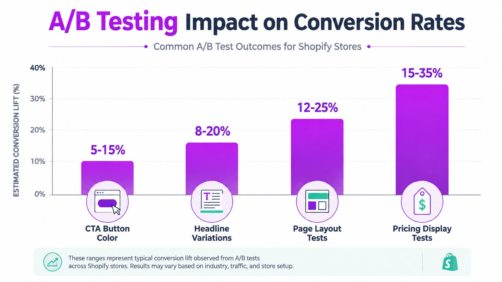
A/B testing becomes useful when a Shopify team has a specific uncertainty, not when it wants to “test everything.” You compare a current experience with one deliberate alternative, such as a clearer product-page layout against the existing control. The test should answer a question about customer behavior, for example, whether shoppers need delivery information before they add an item to cart.
One eCommerce test changed the product-page experience and saw conversion move from 1.8% to 2.4%, with the result stabilizing at a 30% to 34% lift over a 14-day testing period after validity checks. The reported A/B testing case study is useful less as a promise than as a measurement lesson. The team waited for the result to stabilize instead of stopping after an encouraging early signal.
A focused Shopify workflow
Start with one page and one hypothesis. If mobile shoppers view product details but don't add to cart, test a single change that improves product clarity, such as moving shipping, returns, or product-comparison information closer to the purchase decision.
Track more than the primary conversion event:
- Primary metric: Measure the behavior the change is meant to influence, such as add-to-cart rate or completed orders.
- Segment view: Break results down by device, traffic source, new versus returning shopper, and relevant product category.
- Guardrail metrics: Watch average order value, refund behavior, and checkout progression so a higher click rate doesn't hide weaker purchase quality.
Don't copy a button-color “win” from another store. Your audience, offer, traffic intent, and device mix may be different. Document the hypothesis, audience, implementation, duration, result, and next test so your team builds institutional knowledge instead of repeating the same ideas.
Practical rule: A test result is only portable as a question. The answer belongs to the audience and funnel that produced it.
2. Checkout Optimization and Friction Reduction
Checkout friction is often a clearer revenue problem than a weak homepage. A shopper who has selected a product has already expressed meaningful intent, yet unexpected shipping costs, unclear delivery timing, forced account creation, or awkward mobile fields can interrupt the purchase.
For Shopify merchants, the first diagnosis should map the checkout path by device and traffic source. Look for repeated errors, payment-method drop-off, address-entry problems, and sessions that return to the cart after shipping information appears. The fix may be operational rather than visual. Transparent delivery rules can outperform a decorative redesign because they answer the question that stops the purchase.
Make one change at a time
A focused checkout experiment might make guest checkout more prominent, reveal delivery costs earlier, or reduce unnecessary information requests. Shopify Plus brands can use checkout extensibility where the business case requires a customized flow, but customization adds maintenance, testing, and compatibility responsibilities. A simpler native path can be the better choice when the main problem is unclear pricing rather than missing functionality.
Use this guide to one-page checkout as a starting point for evaluating whether consolidation addresses your store's friction. Don't assume fewer visible steps automatically create a better experience. A one-page checkout can still feel difficult if it presents too many fields, hides payment options, or performs poorly on a small screen.
Measure completed orders, checkout completion, payment errors, customer support contacts, and refund or cancellation behavior. If conversion rises while support questions about delivery also rise, the change may have shifted confusion downstream rather than removed it.
A visual walkthrough can help a team inspect the sequence of checkout decisions before implementation:
When the change is live, review the experience on an actual phone, including address autocomplete, wallet payment, error recovery, and back-button behavior.
3. Landing Page Optimization and Value Proposition Testing
A landing page should answer one question quickly: why should this visitor continue? Sending paid social visitors, branded-search visitors, email subscribers, and returning customers to the same homepage often forces each group to interpret the offer independently. A focused page preserves the promise behind the click and limits distractions.
Start with the Shopify growth problem, not the button. If visitors understand the product but do not see why it fits their situation, test the value proposition before changing the call to action. A skincare brand might lead with a specific routine outcome, then support it with ingredients, usage guidance, and credible proof.
Build around one buying context
Give each page one audience, one offer, and one primary action. A first-time-buyer campaign may need education, reassurance, and a starter bundle. A repeat-customer campaign may need replenishment, compatibility information, or a new variation. Combining both audiences makes the page do too much interpretive work.
Examples in Unbounce's collection of high-performing pages commonly use a clear goal, persuasive proof, and a visible call to action. Treat those patterns as hypotheses, not evidence for your store. Diagnose the friction, make one strategic change, measure completed purchases and downstream quality, then choose the next test.
Possible tests include:
- Hero message: Compare a benefit-led headline with a feature-led version.
- Proof placement: Move reviews, guarantees, or usage evidence nearer to the first purchase decision.
- Page depth: Compare concise copy with fuller education when shoppers need product context.
- Offer framing: Test a bundle, sample, or first-order incentive while keeping conditions visible.
The right outcome depends on the problem. A higher click-through rate is useful only if it leads to completed purchases, acceptable support demand, and a product experience that matches the promise.
Keep the headline, product details, delivery terms, and post-purchase experience aligned. A polished page that overpromises can raise initial engagement while creating disappointment later.
4. Personalization and Dynamic Content
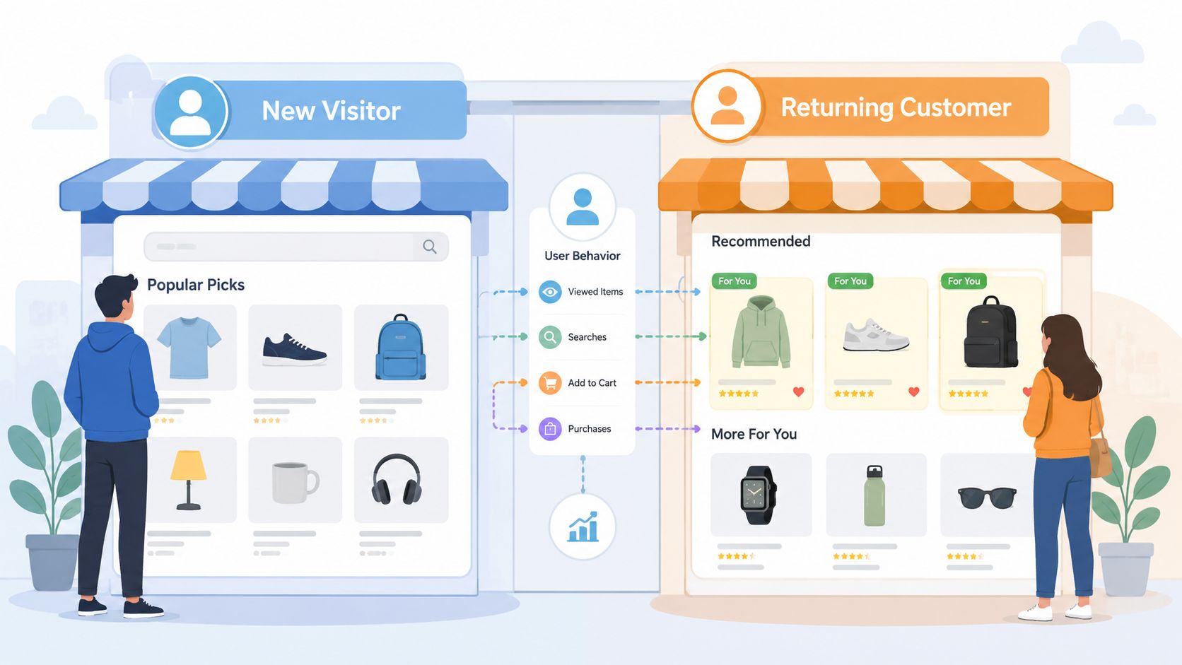
Personalization works best when it removes a specific choice barrier. It underperforms when a Shopify store adds recommendations without enough behavioral data, creating irrelevant options, privacy concerns, and extra implementation work. Start with usable segments, such as new visitors, returning customers, product viewers, or buyers from a specific category, before attempting one-to-one experiences.
Consider a returning shopper who viewed a product but left without buying. Showing that product again, alongside care information, compatible accessories, or a delivery reminder, may answer the next question blocking purchase. The strategic change is not adding AI. It is matching the message to the shopper's demonstrated intent.
Use first-party signals with restraint
Browsing behavior, purchase history, and declared preferences can support relevant merchandising. A product page might show a small group of comparable items for shoppers still evaluating options. A broad carousel of unrelated products can increase cognitive load and pull attention away from the primary purchase.
Review eCommerce personalization examples, then reduce the idea to one Shopify workflow: diagnose the friction, make one targeted change, measure the outcome, and choose the next test. Apparel brands could test personalized product suggestions for apparel, but the recommendation must earn its placement through business results.
Choose the metric according to the problem:
- First-order conversion: Does the experience help a new visitor understand the offer?
- Average order value: Does the recommendation add a relevant item, or distract from the main purchase?
- Repeat purchase: Does post-purchase messaging encourage replenishment or a relevant next product?
- Customer quality: Do personalized offers increase refunds, discount dependence, or support demand?
A higher conversion rate is not enough if the change also creates poor-fit orders, heavier support demand, or lower customer value. Review those downstream effects before expanding the experience.
Explain how customer data is used and follow applicable privacy requirements. A message can feel intrusive even when it is relevant, particularly for a young brand still building trust with its customers.
5. Social Proof and Trust Building
A new Shopify brand usually asks shoppers to take a risk. The product may be unfamiliar, the fit may be uncertain, or the buyer may wonder whether delivery and returns will be handled professionally. Social proof reduces that uncertainty when it provides specific, credible evidence close to the decision point.
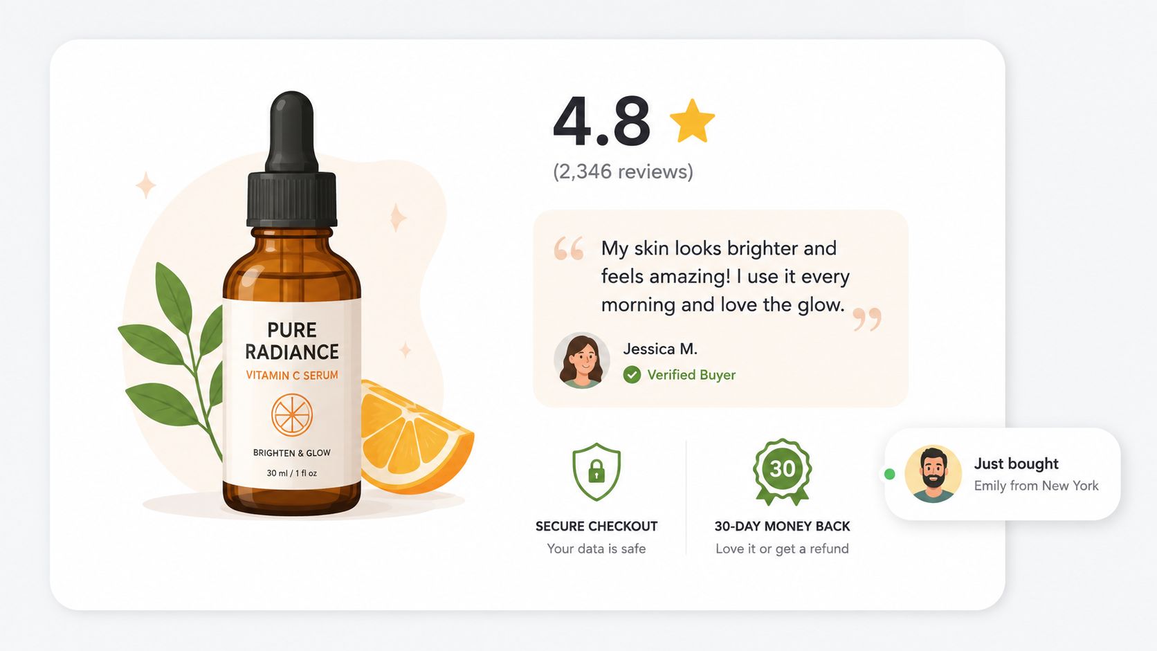
Reviews shouldn't sit in a buried tab while the product page asks shoppers to buy on brand photography alone. Put rating visibility, review themes, customer images, and answers to recurring questions where hesitation occurs. A clothing brand might place fit comments beside size selection. A supplement brand might explain how customers use the product, while avoiding unsupported health promises.
Credibility beats volume
Don't manufacture urgency with fake purchase notifications or present vague testimonials without context. Those tactics can make an emerging brand look less trustworthy. Use verified reviews, customer-submitted images, detailed testimonials, and clear responses to negative feedback instead.
A strong workflow starts with support and review analysis. Group recurring objections into themes, then make one change, such as adding a fit guide beside the selector or placing delivery reassurance near the add-to-cart area. Measure product-page progression, add-to-cart behavior, completed orders, and returns. If shoppers convert but return more often because the proof overpromises, the test failed its broader business purpose.
Trust signals should answer a real objection. They shouldn't decorate a page that still leaves shoppers uncertain about price, fit, delivery, or product performance.
A customer photo can be more useful than a polished campaign image when it shows scale, texture, fit, or real-world use. Ask permission, identify the context clearly, and keep the original customer language where it clarifies the experience. The aim is not to make every shopper feel guaranteed success. It's to help the right shopper make a better-informed decision.
6. High-Impact Copywriting and Headline Testing
A headline can increase clicks and still hurt revenue if it attracts shoppers who are unlikely to buy. For Shopify brands, the copy problem usually starts earlier: product details describe what the item is, while the first screen fails to explain why it fits a specific situation.
Use customer language from reviews, support conversations, search queries, and product questions to identify that situation. A travel-clothing brand might keep fabric composition in the technical details, while the headline focuses on staying comfortable through changing conditions. The technical fact supports the promise, but the promise gives shoppers a reason to continue.
Start with the friction
Choose one objection or decision delay before writing a new headline. Then make one strategic change and connect it to a measurable outcome.
- Benefit versus feature: Lead with the customer outcome, then explain how the product produces it.
- Specific use case versus broad appeal: Name the situation the product serves instead of claiming it suits everyone.
- Customer voice versus brand voice: Test language shoppers already use to describe the problem.
- Urgency versus reassurance: Check whether a deadline speeds action or creates pressure that reduces trust.
A stronger test compares meanings, not minor adjective changes. One version may emphasize speed, another confidence, and a third value. Each promise must match the product, offer, and supporting evidence on the page.
Copy should make the next decision easier, not merely make the brand sound more persuasive.
Measure the full path. Review headline engagement alongside product-page progression, add-to-cart activity, checkout starts, completed orders, average order value, and returns where the data supports it. A higher click-through rate with weaker order quality is not a winning test.
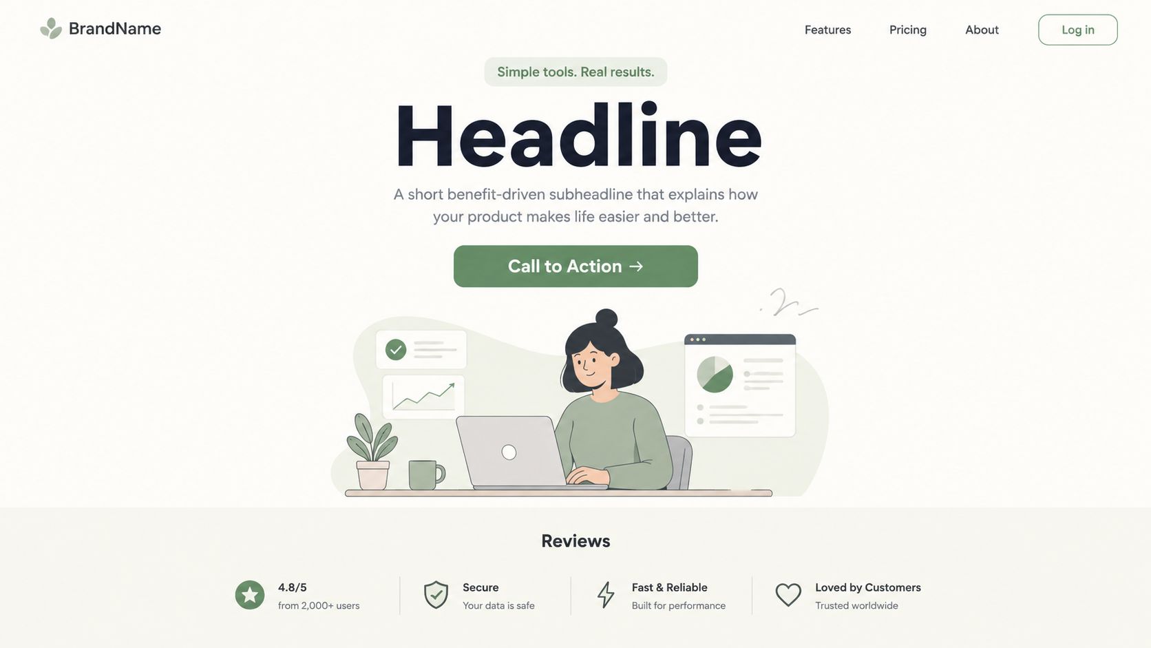
Copy also needs visual proof. A product demonstration, comparison section, or usage sequence can answer questions that text leaves open. Keep the first screen clear enough to explain the offer without forcing shoppers to decode brand language. After the test, keep the change only if it improves the business outcome, then use the remaining objection to choose the next test.
7. Form Optimization and Progressive Profiling
A lead form can lose a high-intent visitor before the sales team ever sees the opportunity. The problem may be the number of questions, unclear labels, poor mobile input behavior, or a request for information that doesn't yet feel justified.
Progressive profiling changes the timing. Instead of asking for every detail in the first interaction, collect the minimum information needed for the immediate next step, then ask for more when the shopper has received value or shown stronger intent. For a Shopify brand, this might mean capturing an email for back-in-stock notification first, then learning product preferences through later interactions.
Reduce the first commitment
Audit every field and classify it as essential, useful, or optional. Remove fields that don't change the immediate experience. If the store needs a delivery location to show availability, explain why the field matters. If a business asks for a phone number, it should state how the number will be used and avoid creating uncertainty about unwanted contact.
Mobile form behavior deserves its own review. Use appropriate input types, autocomplete, clear error messages, and inline validation that doesn't erase completed fields. Test the form with real devices and realistic information, including long names, apartment details, international addresses where relevant, and shoppers who make an error.
Measure form starts, completion, valid submissions, qualified leads, and eventual revenue. A shorter form isn't automatically better if it floods the business with low-quality contacts. For checkout, compare completed orders and customer service friction. For lead generation, connect the form to downstream sales quality before scaling the change.
A useful next test often comes from the failure point. If shoppers abandon after seeing an optional phone field, test removing it. If they abandon after submitting, test clearer confirmation, expectations, and follow-up timing. The strongest form optimization decisions come from observed behavior, not a universal rule about how many fields a form should contain.
8. Mobile Optimization and Mobile-First Design
Mobile CRO is not a narrower desktop exercise. Shoppers use fingers instead of a cursor, see less product context, may rely on a slower connection, and often move from social content or search directly to a product page. On a phone, spacing, hierarchy, and unclear next steps can turn interest into abandonment.
Start with a friction diagnosis. Combine device analytics with session recordings, support questions, and hands-on testing across real phones. Check image loading, touch-friendly variant selectors, sticky elements that may cover information, and error recovery. A shopper should not have to restart after a small mistake.
Prioritize the purchase path
Begin with pages carrying the strongest purchase intent, usually the product page, cart, and checkout. Campaign landing pages may follow if paid traffic enters there. Make one strategic change at a time: compress oversized media, bring delivery details into view, simplify variant selection, or position the purchase action where it is reachable with one hand.
The OptiMonk benchmark analysis reports device and traffic-source differences, with desktop often converting better than mobile. Treat that pattern as a diagnostic signal, not proof that mobile visitors lack intent. Segment results by device, source, and landing page to locate the specific friction.
Mobile-first CRO should reduce decision effort while preserving the information needed to buy confidently.
Measure mobile add-to-cart rate, checkout progression, completed orders, interaction with key elements, and error behavior. Review average order value and returns as well. A faster purchase can still create downstream problems if shoppers miss product details or choose the wrong variant.
The next test should follow the observed failure point. If visitors leave before selecting a variant, improve selector clarity. If they abandon after delivery information appears, test clearer placement or wording. Remove unnecessary scripts and heavy media first, then confirm that product details, shipping clarity, reviews, and comparison information still support the decision. Mobile-first design makes the essential path easier, rather than just shrinking the desktop page.
8 Conversion Rate Optimization Strategies Compared
| Approach | Implementation Complexity 🔄 | Resource Requirements ⚡ | Expected Outcomes 📊 | Ideal Use Cases 💡 | Key Advantages ⭐ |
|---|---|---|---|---|---|
| A/B Testing (Split Testing) | Easy–Medium, experiment setup & stats | Moderate traffic, A/B tool, analytics | 8–35% conversion uplift (test-dependent) | Validate design/copy changes, CTAs, headlines | Data-driven decisions, low-risk iterative gains |
| Checkout Optimization & Friction Reduction | Medium–High, backend + UX changes | Dev effort, payment integrations, testing traffic | 15–45% reduced abandonment; 20–30% revenue recovery | High cart-abandonment stores, high-AOV checkout flows | Direct revenue impact; improved customer experience |
| Landing Page Optimization & Value Proposition Testing | Medium, design, copy & tracking | Design/copy resources, landing builders, traffic | 20–50% improvement on landing-page conversion | Paid campaigns, segmented traffic, product launches | Targeted messaging; higher relevance and conversions |
| Personalization & Dynamic Content | High, data infra, models & rules | Significant data, AI tools, ongoing ops | 10–35% conv lift; 15–25% AOV increase | Returning customers, large catalogs, repeat buyers | Increased relevance, higher AOV and retention |
| Social Proof & Trust Building | Easy–Medium, content collection & moderation | Low–Moderate: review/UGC tools, moderation time | 3–15% conv improvement; +10–20% trust metrics | New brands, high-consideration products, marketplaces | Builds credibility quickly; low cost to implement |
| High-Impact Copywriting & Headline Testing | Medium, creative + testing cycles | Low: copywriters, A/B testing traffic | 5–25% conversion improvement (varies) | High-traffic pages, hero sections, CTAs | Immediate impact, scalable across pages & channels |
| Form Optimization & Progressive Profiling | Easy–Medium, UX tweaks, conditional logic | Low–Moderate: form tools, small dev work | 20–50% improvement in form completion rates | Lead capture, signup flows, checkout fields | Higher completion rates; better quality data over time |
| Mobile Optimization & Mobile-First Design | High, redesign & performance engineering | Significant dev/testing across devices | 25–50% mobile conv lift; 30–40% bounce reduction | Mobile-heavy traffic stores, SEO-priority sites | Essential for mobile users; improves SEO and retention |
Turn These CRO Examples Into a Shopify Testing Roadmap
A Shopify brand doesn't need to launch all eight tactics at once. The sequence should follow customer intent and measurement confidence. Start with the places where a small amount of friction can block an otherwise ready buyer, then move toward more complex experiences once the basics work reliably.
Begin with mobile and checkout friction. Confirm that shoppers can browse, select, pay, and recover from errors on real devices. Make pricing, delivery, returns, payment methods, and account requirements clear before adding visual complexity. This stage often reveals whether the store has a genuine UX problem or a measurement problem.
Next, improve forms and core messaging. Reduce unnecessary fields, clarify the first commitment, and rewrite product or landing-page copy around the customer's actual concern. A form completion event or button click isn't enough by itself. Connect the test to qualified leads, completed orders, average order value, returns, and other guardrail metrics that reflect business quality.
Then add trust signals and focused landing pages. Place proof beside the objection it answers, and create campaign-specific pages when different audiences need different explanations. Don't treat a landing-page example as a template to copy. Treat it as a hypothesis about message match, information hierarchy, and customer confidence.
Introduce personalization after the measurement foundation is reliable. Segments, recommendations, and adaptive content require dependable event tracking and responsible data handling. If your team can't explain which audience saw a variation, what changed, and how downstream revenue behaved, more advanced targeting will make the analysis harder rather than better.
For every experiment, write down:
- Baseline: Record the current performance for the relevant page, audience, device, and traffic source.
- Hypothesis: State the customer hesitation and the one strategic change that should address it.
- Primary metric: Choose the behavior that defines success for the test.
- Guardrails: Monitor order quality, average order value, refunds, returns, lead quality, and support impact where relevant.
- Decision rule: Decide in advance whether you'll adopt, revise, or reject the change.
- Documentation: Save the implementation, audience definition, test period, result, and next question.
Benchmarks provide context, not permission to declare success. Recent summaries place the top 10% of websites at 11.5% or higher on their best landing pages, roughly 3 to 5 times typical eCommerce baselines, but category and channel differences make direct comparisons unreliable. The 2026 benchmark summary also illustrates why a store should compare itself with an appropriate category and traffic mix rather than chase a universal target.
ECORN can support brands that need Shopify design, development, CRO research, audits, testing, eCommerce consulting, or Shopify Plus development. Its relevance depends on implementation complexity. A focused project may suit a store validating one funnel hypothesis, while a growing multi-storefront operation may need ongoing research, UX work, development, and experiment management.
ECORN offers Shopify design, development, conversion research, CRO audits, testing support, and Shopify Plus services for brands working through the friction points described here. Visit ECORN to discuss a focused CRO project or a broader Shopify growth roadmap built around measurable customer behavior.


How to Conversion Rate Optimization for Shopify Stores

Shopify Design Essentials Every Store Owner Needs
Ecommerce Terms of Service: How to Draft and Implement
How to Implement Structured Data for Ecommerce in 2026
SEO App Mobile: Shopify Store Optimization Guide
Shopify Plus Support: What It Includes and How to Choose
Google Ads for Shopify: The Complete 2026 Playbook
Shopify New York: How to Find and Hire the Right Agency
Google Search Console for Shopify: The Complete Setup
First Party Data Collection for eCommerce Growth
FAQ Online Store Guide: Build and Measure It Right
Do FB Ads Work for eCommerce in 2026?
One Page Checkout for Shopify: Design and Implementation
Shopify GraphQL vs REST: The 2026 Developer Decision
Shopify Ecommerce Consulting: Strategy, Pricing &

Are Reddit Ads Worth It for eCommerce Brands
Shopify Title and Meta Description: A Practical 2026 Guide

Product Video Best Practices for Shopify Brands
Real-Time Inventory Management: A 2026 Guide

AI Chatbot Integration for Shopify Stores
Affiliate Program Management: A Shopify Guide
10 Best Performance Monitoring Tools for Shopify in 2026
Digital Asset Management for eCommerce Brands in 2026
Every Type of Facebook Ads Explained for eCommerce Growth
Product Information Management Explained for Shopify Brands
Support Ticket System: A Guide for Shopify Stores

10 Best Customer Service Tools for Shopify in 2026

Can I Start a Business with No Money? a 2026 Blueprint

What Sells Good on Etsy: Best Niches for 2026

Shopify Add to Cart Button: A Practical 2026 Guide

Customer Feedback Automation: A Practical eCommerce Guide
Critical Rendering Path: A Guide for Shopify Stores

How to Promote on TikTok for eCommerce in 2026

B2B eCommerce Consulting That Drives Real Revenue
10 Best Practices for Site Navigation in 2026
Return vs Refund for Shopify Stores: A Practical Guide
What Is Customer Lifetime Value and Why It Matters
What Is Voice of Customer Research for eCommerce

SMS Marketing for Ecommerce That Actually Converts

Master How to Improve Email Deliverability in 2026

Top 7 eCommerce Partners NYC for Shopify Brands in 2026
Machine Learning for Ecommerce: Boost Your Shopify Store

Beauty Market Research: Your 2026 Growth Guide

Shopify International Expansion: A 2026 Roadmap
What Does CRO Stand for in Business: Understanding CRO

Shopify Visual Merchandising: A Playbook for Higher Sales
Shopify Landing Page Design: Master Conversion in 2026
10 Best AI SEO Optimization Tools for Shopify in 2026

Agentic AI for Ecommerce: Boost Your Sales in 2026
Mastering Email Marketing Data for eCommerce Growth

Conversion Rate Optimisation Australia: Boost Your Sales
Conversion Rate Optimization AI: Your Shopify Store Guide

10 Product Bundling Strategies for Shopify in 2026
How to Increase Customer Lifetime Value: A Shopify Playbook
AI Customer Service Automation: Shopify Guide 2026

Clean Website Design: A Shopify Conversion Playbook

Omnichannel Retail Strategy: A Shopify Playbook
Product Data Enrichment: A Guide for Shopify Brands
Instagram Shopping Features a Guide for Shopify Stores
What Is Revenue Optimization: A Holistic RevOps Guide
Benefits of Conversion Rate Optimization: Boost Your
WordPress to Shopify Migration: Your 2026 Seamless Switch
Boost Sales: Ecommerce Payment Processing Guide 2026
Unified Commerce Platform: Benefits, KPIs & Shopify Guide
How to Reduce Bounce Rate eCommerce: Your 2026 Guide
Shopify API Integration: A Practical End-to-End Guide

How to Implement Data Governance: A 2026 Guide
Shopify Store Development Cost: A 2026 Breakdown
What Is Server Side Tracking: The Shopify Guide 2026
Marketing Automation Workflows: A Shopify Guide for 2026
Shopify: How to Reduce Technical Debt

Shopify UX Design Change: A Playbook for Growth
User Generated Content Strategy: Shopify Playbook
Shopify Pause and Build Plan Cost: A Complete 2026 Guide
Compare at Price on Shopify: A Complete Guide for 2026
Where Can I Sell My Prints? 10 Best Platforms for 2026
Shopify Order Management System: The Ultimate Guide 2026
What Is Marketing Attribution? an eCommerce Guide for 2026

10 Best Black Friday Sales Sheets for 2026

Discover the Top Social Media Marketing Agencies For
Consumer Confidence Definition for eCommerce in 2026
What Is Social Commerce? Your 2026 Guide to Boosting Sales
A Social Ad Campaign Playbook for eCommerce Growth

7 Best FAQ Page Examples for SaaS & eCommerce

Market Research in Fashion Industry: A Guide for Shopify
Shopify Migration Services: Expert Guide for 2026
Mastering FB Retargeting Ads for Shopify in 2026
What Is Omnichannel Ecommerce

Master Your Shopify Plus Migration: The 2026 Guide
Shopify Integration Services: A Merchant's 2026 Guide
Shopify Collection Description: A Guide to SEO & Sales

Shopify Plus Contact: Reach Sales & Support Effectively

Top Luxury Shopify Stores: Design & UX Strategies
How to Improve Customer Experience: A Shopify Roadmap
Creative Facebook Ads: 10 Examples for Shopify Brands

Remarketing with Facebook Ads: A Shopify Guide for 2026

SEO Linking Strategies for Shopify Stores
Top 7 Statistics YouTube Channels for eCommerce in 2026

Hiring Shopify Plus Designers: A Founder's Guide
Shopify Product Variation: Master Your Variants for 2026


newsletter in your inbox