


You can have strong products, solid paid traffic, and a clean Shopify theme and still watch revenue underperform. The usual problem isn't demand. It's presentation.
Most stores leak sales on collection pages, homepage modules, and category flows that feel assembled instead of merchandised. Products compete with each other. New arrivals bury proven winners. Filters confuse shoppers. Mobile layouts make browsing harder than it should be. When that happens, your store stops acting like a salesperson and starts acting like storage.
Good Shopify visual merchandising fixes that. It controls what shoppers see first, how they scan, what feels premium, and how quickly they get from interest to confidence. The strongest stores treat merchandising as an operating system, not a finishing touch.
Why Great Products Need Strategic Visual Merchandising
A lot of founders think visual merchandising means making the storefront look polished. That's too narrow. In practice, it's the system that decides how customers move through the store, what products earn attention, and whether the brand feels coherent enough to trust.
If your homepage hero says premium, but your collection grid feels chaotic, the customer notices. If your ads promise a focused category experience, but the landing page mixes out-of-stock products, poor photography, and weak sorting, the session loses momentum fast. Every acquisition channel gets less efficient when the merchandising layer is weak.
Merchandising is a conversion function
Shoppers don't browse a Shopify store the way operators do. They don't know your assortment structure, margin priorities, or launch calendar. They need visual hierarchy. They need obvious entry points. They need a store that reduces choices at the right moment and expands choices when they're ready.
That's why Shopify visual merchandising has to sit close to CRO, product data, and inventory strategy. It isn't just visual taste. It's commercial sequencing.
A messy storefront makes even strong products feel less desirable.
The biggest gap I see in the market is operational. Most content stops at static advice like cleaner imagery, better spacing, or stronger color consistency. That matters, but it doesn't solve scale. As Kimonix notes in its ecommerce merchandising strategy discussion, existing Shopify visual merchandising guidance often misses the operational need for automating dynamic sorting based on real-time inventory and sales velocity for growing and multi-store brands.
That's the shift that matters. Once a catalog expands, once multiple markets come into play, and once inventory changes weekly, manual curation alone breaks down. You need rules, data quality, automation, and a repeatable process. If you want more context on that broader operating model, this breakdown of ecommerce merchandising strategies is a useful companion.
What weak merchandising usually looks like
The symptoms are easy to spot:
- Homepage clutter: Too many competing promos, no clear featured path, and banners that rotate without a clear priority.
- Flat collection pages: Best-sellers, low performers, and new products all get treated the same.
- Inconsistent product cards: Different image crops, mixed lighting, and uneven visual weight across the grid.
- Filters built for the team, not the buyer: Internal naming logic instead of shopper language.
None of that is a design problem alone. It's a decision problem.
The brands that outperform usually do three things better. They define what each page is supposed to do, they standardize how products appear, and they automate enough of the logic to keep the store current without rebuilding it every week.
Foundations of Your Visual Merchandising Strategy
Before changing layouts, decide what the merchandising system is supposed to achieve. A good strategy ties business priorities to visible actions in the storefront. Without that link, teams make aesthetic changes and call it optimization.
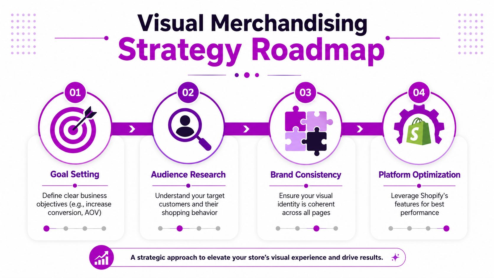
Start with the commercial objective
Different goals require different merchandising behavior. A launch campaign needs prominence and story. Excess inventory needs strategic exposure without making the brand feel discount-led. A category expansion needs clear product education and stronger pathing.
Use a simple planning model:
| Business goal | Merchandising response |
|---|---|
| Increase average order value | Group complementary products, strengthen featured bundles, elevate add-on friendly categories |
| Push a new collection | Reserve top homepage and collection real estate, support with editorial imagery |
| Move aging inventory | Blend it into relevant collections instead of isolating it in a dead-end sale area |
| Support seasonal demand | Rotate heroes, featured collections, and promo language on a set calendar |
Many teams often take the wrong approach. They try to solve every objective with one homepage refresh. That rarely works. Each page needs a job.
Build a visual signature
Your store should feel recognizable before a shopper reads a single line of copy. That comes from consistency in image treatment, spacing, product framing, editorial style, and how promotional content appears inside the shopping flow.
A useful standard looks like this:
- Photography rules: Use one clear approach for backgrounds, lighting, and product angle.
- Card hierarchy: Keep price, title, badge, and swatch behavior consistent across categories.
- Editorial rhythm: Use supporting lifestyle imagery in a controlled way so it adds context without interrupting shopping.
- Promotion style: Keep campaign language visually aligned with the rest of the storefront.
Practical rule: If two adjacent products look like they belong to different brands, your merchandising system is too loose.
Run on a calendar, not on instinct
Strong stores feel fresh because someone planned the refreshes. Shopify's guidance on visual merchandising cadence is useful here. Featured tables and endcaps should be updated every 4–6 weeks, front window displays including homepage hero sections should be refreshed every 2–3 weeks, and hero and featured collections should rotate seasonally 4 times per year, according to Shopify's visual merchandising guidance.
That cadence gives operators a real framework:
- Every 2–3 weeks refresh homepage hero creative and primary promotional framing.
- Every 4–6 weeks update featured collection modules, category callouts, and key landing experiences.
- Each season rework hero collections to match inventory cycles and demand patterns.
- Annually run a full audit of navigation, collection logic, image consistency, and campaign execution.
A merchandising calendar should live alongside your marketing calendar. It should include launches, campaigns, seasonal transitions, and content production deadlines. If photography, tagging, and homepage updates aren't coordinated, the storefront starts to drift.
Assign ownership
Merchandising often fails because everyone touches it and no one owns it. The founder changes the hero banner. Marketing updates badges. Operations adds collections. Creative uploads assets. The result is fragmentation.
Set clear ownership across three layers:
- Brand and creative: image standards, campaign assets, editorial modules
- Ecommerce and CRO: page structure, sorting logic, collection rules, testing
- Operations and merchandising: tagging, inventory priorities, launch sequencing
That operating model is what turns Shopify visual merchandising into a reliable growth lever instead of a series of disconnected updates.
Designing High-Converting Collection Pages
A shopper lands on a collection page from an ad, sees 24 products, and makes a decision in seconds. If the page is hard to scan, visually uneven, or filled with weak first-row choices, they leave before your PDPs get a chance to sell.
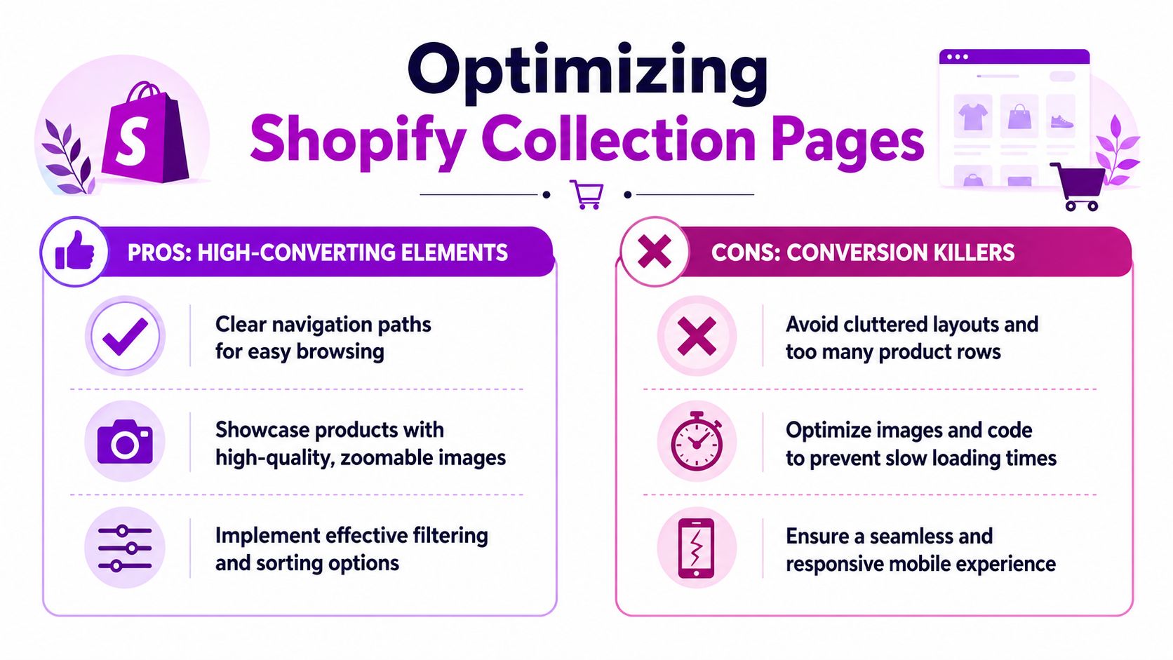
Good collection page design reduces decision friction. Great collection page design also creates the conditions for smarter merchandising later, because the layout, image system, and filtering UX need to support rule-based sorting, AI-driven ranking, and continuous testing.
Use a grid built for comparison
Collection pages are comparison tools first. Start there.
A grid with 3 to 4 columns on desktop and 2 on mobile is a reliable baseline for most Shopify catalogs. As noted earlier, Shopify visual merchandising benchmarks also recommend consistent image ratios such as 1:1 or 4:5, 5 to 8 strong product images per SKU, and placing best-sellers near the top of collections. Those standards work because they support fast scanning without turning the page into visual clutter.
The trade-off is straightforward. Dense grids show more products per screen, which can help broad catalogs. They also shrink imagery, reduce badge legibility, and make swatches harder to use. Sparse grids create more impact per card, but they slow comparison and increase scrolling. For most brands, the middle ground wins.
Common layout mistakes show up fast:
- Desktop rows with too many cards, making products feel interchangeable
- Single-column mobile grids in categories where shoppers need to compare options
- Product cards with inconsistent heights because title lengths, badges, and image crops were never standardized
- Hover states or quick-add modules that push the card out of alignment
Set fixed card rules inside your theme. Then test from there. If your team changes card behavior every campaign, merchandising performance gets harder to read.
Standardize image ratios and photo logic
Uneven photography weakens trust. It also breaks the grid.
The fix is not just "better images." It is a production standard that every new product follows. Pick one crop system for the collection page, define what the first image must show, and decide which secondary image appears on hover. Fashion brands often do well with a front-on hero and a secondary worn shot. Beauty and home brands usually need a clean pack shot first, then a texture or in-use image.
Use the collection page to answer the first visual questions before the click:
- What is it?
- What does the shape look like?
- What changes across variants?
- What detail justifies the price?
If your team is still relying on inconsistent vendor uploads or manual naming conventions, fix the underlying feed. Product data enrichment for Shopify catalogs is what makes visual merchandising scalable, because image roles, tags, color groups, and variant attributes need to be structured before they can be sorted, filtered, or personalized well.
Merchandize the first rows with intent
The first row gets more attention than the fifth. Treat it like premium shelf space.
Lead with products that have a job to do. That usually means proven sellers, launch priorities, high-margin styles, or campaign products with enough demand signal to justify the placement. Pure recency is rarely the best choice unless the collection exists specifically for new arrivals.
A practical structure looks like this:
| Zone | What to place there |
|---|---|
| First rows | Best-sellers, hero products, launch SKUs, products with strong click appeal |
| Mid-grid | Category breadth, supporting styles, key variants, cross-sell adjacencies |
| Content breaks | Lifestyle tiles, fit guidance, material stories, promotional modules |
| Lower grid | Niche products, long-tail variants, lower-priority inventory |
Editorial blocks can improve engagement, but only when they help the shopper choose. A fit guide in apparel can earn its space. A campaign image with no commercial purpose often just interrupts browsing.
Fix mobile filters before adding more merchandising layers
Filtering shapes what shoppers see. On mobile, bad filtering can cancel out strong product curation.
Use filter panels that are easy to open, easy to reset, and clear about what is active. Selected states should stay visible. Result counts should update quickly. Shoppers should not have to guess whether a size, color, or material filter applied correctly.
The bigger mistake is filter sprawl. Teams often keep adding options because the platform allows it. That creates noise. Keep the filters that match how customers shop the category, then demote or remove the rest. A fashion collection may need size, color, fit, and price. It usually does not need ten marginal filters that only add friction.
Strong collection pages make three things easy. Scan the options. Compare the differences. Get to the right product fast. That is the design standard to hold before you layer in advanced sorting and AI-driven merchandising.
Using Sorting Rules and Product Data to Guide Shoppers
A shopper lands on a collection page, sorts by “newest,” sees three weak products in the first row, and leaves before your actual winners appear. That is not a design problem. It is a merchandising logic problem.
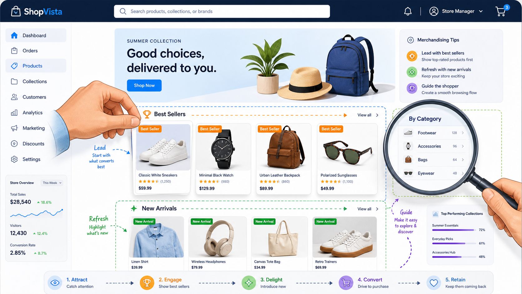
Sorting decides which products get seen first, which products support discovery, and which products stay buried. On Shopify, default sort options are only a starting point. High-performing stores set collection-specific rules based on intent, margin, stock position, seasonality, and conversion history.
Pick the sort logic based on the collection's job
Each collection needs a clear commercial role.
Core categories usually perform best with best-seller weighting plus a few manual overrides. New arrivals need freshness, but they still need guardrails so low-quality launches or weak visuals do not take over the top row. Sale collections need tighter controls than many teams expect. If left to simple discount sorting, they turn into a cluttered grid of broken sizes and low-demand leftovers.
Use this as the default decision framework:
| Collection type | Better default approach | Why |
|---|---|---|
| Core category | Best-selling with manual overrides | Keeps proven products visible while protecting brand priorities |
| New arrivals | Newest with pinned anchors | Preserves freshness and stabilizes first impressions |
| Sale collection | Rule-based promotion and demotion | Pushes worthwhile deals up and weak inventory down |
| Seasonal edit | Manual curation | Supports story, styling logic, and campaign intent |
The trade-off is straightforward. The more commercial complexity a collection carries, the less you should trust platform defaults.
Blend proof with discovery
Strong merchandising does not force a choice between best-sellers and new products. It stages them together.
A practical pattern is to pin a few proven SKUs in the first row, then thread in selected new arrivals nearby. That gives newer products borrowed credibility and stronger exposure without sacrificing conversion efficiency. Rewarx found that stores with consistent presentation saw stronger shopping outcomes overall, including lower bounce rates and fewer presentation-driven cart abandons, and also noted that placing new items near category winners can improve discovery by 25%, according to its analysis of visual branding and merchandising performance in Shopify stores: Rewarx's visual branding benchmarks.
This works especially well in apparel, beauty, and home categories where shoppers want both reassurance and novelty.
Build filters around buyer language, not internal naming
Sorting gets products into position. Product data determines whether shoppers can refine the set fast enough to keep moving.
The common failure is structural. Merchandising teams inherit tags from ERP exports, supplier spreadsheets, or legacy naming rules, then expose that logic directly in the storefront. Shoppers do not browse by internal shorthand. They browse by fit, shade, material, routine, room, use case, and price band.
A good filter system usually has these traits:
- Plain-language labels customers recognize immediately
- Multi-select behavior that does not reset the page
- Attribute values normalized across the catalog
- Category-specific options that match actual buying criteria
Clean data pays for itself. If metafields are inconsistent, color values are fragmented, or fit information is missing, the filter UI looks functional while still failing commercially. Teams that invest in product data enrichment usually get better filter accuracy, cleaner sorting rules, and less manual collection maintenance.
Use rules for scale, and reserve manual control for exceptions
Manual merchandising still matters. It is the right tool for launches, capsule edits, gift guides, and campaign collections where product sequence carries a clear message.
It is the wrong operating model for a catalog that changes daily.
For scale, set rules that reflect how the business trades:
- Pin hero products with strong conversion or strategic value.
- Promote in-stock items with healthy margin or campaign relevance.
- Demote products with poor imagery, broken size runs, or weak sell-through.
- Suppress products that are technically available but likely to disappoint, such as fragmented variants or low-stock edge cases.
That approach turns merchandising into a managed system instead of a weekly cleanup task. It also creates the groundwork for more advanced automation, including dynamic badges, collection reshuffling, and even generating Shopify product videos for products that need stronger click-through support.
The goal is simple. Show the right products first, based on data you can maintain, rules you can defend, and logic that improves revenue as the catalog grows.
Leveraging AI for Dynamic and Personalized Merchandising
A shopper lands on a collection page after clicking a paid ad for a new range. The products are relevant, but the grid looks uneven. Some images are tightly cropped, others sit on different backgrounds, a few bestsellers are buried, and the recommendation block pushes low-priority items. Traffic was expensive. The merchandising failed at the last step.
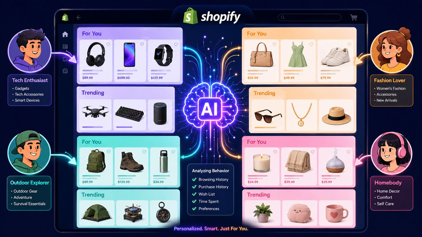
AI helps when the problem is speed, scale, or pattern recognition. It can standardize image presentation across thousands of SKUs, adjust product exposure based on behavior, and keep collections current without a merchandiser touching every page each week.
Used badly, it creates noise faster.
Use AI where manual merchandising stops scaling
The highest-return AI applications are usually operational before they are creative. Start with the work that teams already know matters but struggle to maintain consistently: image cleanup, attribute tagging, recommendation logic, and automated collection updates.
For catalog imagery, AI can batch-remove backgrounds, identify products that break crop standards, and flag photos that do not match your visual rules. That matters because shoppers read visual inconsistency as product inconsistency. If a category page mixes polished hero images with weak supplier photography, trust drops before anyone clicks.
A practical rollout looks like this:
- Group products by photography style, category, or material
- Set fixed rules for crop, aspect ratio, angle, and background treatment
- Use AI tools to detect outliers and route them for review
- Recheck new arrivals weekly so fresh inventory does not degrade the grid
That process keeps the storefront visually stable while the catalog changes underneath it.
Personalization works best with merchant control
Personalization should improve product discovery, not hand the storefront over to an algorithm. Left alone, recommendation engines often optimize for short-term clicks. That can conflict with margin goals, launch support, inventory priorities, or the story a collection needs to tell.
The better model is layered control.
Set the commercial rules first. Protect hero SKUs, campaign products, and strategic categories. Then let AI personalize within those boundaries using signals like browsing history, cart behavior, device, geography, and stock position. The result is more relevant merchandising without losing brand intent.
This also applies to creative assets. If a product needs more context to convert, richer media can help the algorithm and the shopper at the same time. Teams exploring generating Shopify product videos often use them to improve in-grid engagement, support PDP storytelling, and give recommendation surfaces stronger content to work with.
Motion is particularly useful for products where still photography leaves open questions. Apparel drape, texture, scale, mechanism, and before-and-after use cases all benefit.
Here's a useful overview of the broader AI-commerce shift:
Where AI usually earns its keep first
Brands do not need advanced one-to-one personalization on day one. They need AI in the places where manual effort is highest and merchandising drift is most expensive.
Prioritize these use cases first:
- Image governance: keep product cards visually consistent across large or fast-changing assortments
- Recommendation tuning: improve related products, cross-sells, and substitute logic
- Search relevance: connect shopper intent to the right products faster
- Collection automation: reshuffle assortments based on availability, performance, and campaign priorities
- Exception handling: flag products that need manual review because the automation should not decide alone
The commercial test is simple. AI should help the team keep collections current, relevant, and on-brand with less manual maintenance. If it adds complexity without improving discovery or conversion, it is the wrong implementation.
How to Measure and Improve Your Visual Merchandising
If merchandising changes aren't measured, the team usually defaults back to opinions. One person likes the new hero. Another prefers the old sort order. Someone else thinks the collection page feels cleaner. None of that is enough.
Track performance at the page type and template level. Look at collection page click-through to product pages, add-to-cart behavior from merchandised landing pages, average order value, and how shoppers interact with filters, badges, and promotional modules. The point is to evaluate behavior, not aesthetics.
Test one variable at a time
Merchandising tests get messy when teams change too much at once. If you update the hero banner, collection sort order, product badges, and card imagery in one release, you won't know what caused the change.
Keep testing controlled:
- Choose one hypothesis: for example, pinning a hero product family higher in a category.
- Define the observation window: long enough to capture normal buying behavior.
- Measure against the page's role: collection engagement, product clicks, cart starts, or order mix.
- Document the outcome: keep a running log so decisions accumulate instead of repeating.
Treat merchandising changes like operational experiments, not creative refreshes.
For teams trying to build a stronger measurement habit, this practical guide to data-driven design is worth reviewing because it frames design decisions around evidence rather than preference.
Audit the system, not just the page
A weak result often comes from upstream issues. Product data may be incomplete. Images may be inconsistent. Campaign updates may have landed late. A collection may be using the wrong sort rule for its intent. Good audits trace the problem back to the operating model.
Use this checklist to keep implementation grounded:
| Area | Task | Status (Not Started, In Progress, Complete) |
|---|---|---|
| Homepage | Refresh hero content on planned cadence | Not Started / In Progress / Complete |
| Collection pages | Confirm grid, spacing, and mobile presentation are consistent | Not Started / In Progress / Complete |
| Product imagery | Standardize crop, background, and image sequence | Not Started / In Progress / Complete |
| Sorting | Define logic for core, seasonal, sale, and launch collections | Not Started / In Progress / Complete |
| Filters | Rename filters in buyer language and remove low-value options | Not Started / In Progress / Complete |
| Product data | Clean tags, attributes, and metafields that power merchandising | Not Started / In Progress / Complete |
| Testing | Set a recurring review for merchandising experiments | Not Started / In Progress / Complete |
| Governance | Assign ownership across creative, ecommerce, and operations | Not Started / In Progress / Complete |
The stores that improve fastest don't redesign everything. They tighten the system, test changes in sequence, and keep what earns its place.
If your Shopify store needs sharper merchandising logic, stronger collection performance, or a more scalable approach to design, development, and CRO, ECORN can help you turn merchandising from a visual exercise into a growth system.


How to Build a Shopify Clothing Website That Converts

How to Launch a Box Subscription Business in 2026

Luxury Skincare Branding Playbook That Converters
10 Best Podcast Ecommerce Shows for Store Growth in 2026
Shopify Developer Hourly Rate: What to Pay in 2026

Critical Shopify Setup Errors That Are Secretly Sabotaging Your Store
Ecommerce Conversion Tracking: The Complete How-To Guide

Shopify Design Agency: How to Pick the Right Partner
Mastering Multi Store Management on Shopify
Scale Shopify Store
10 Shopify App Ideas Worth Building in 2026
Conversion Rate Optimization for Landing Pages: The Playbook
Shopify Plus Automation: A Guide for 2026
10 Social Selling Platforms for Shopify Merchants

Shopify Website Design Examples: 7 Stores Worth Studying
7 Ecommerce Newsletter Examples for Shopify Brands
One Product Shopify Store: Build and Scale

Mobile Pop Up Strategy for Shopify Stores That Converts

Sitemap for Shopify: How to Find, Optimize, and Submit It

7 Single Product Websites Worth Emulating
Product Variants Shopify: The Complete 2026 Guide
Ecommerce Analytics Consulting for Growth

What Is AI Integration for eCommerce

How to Choose the Right eCommerce Website Development Firm

E Business Strategy Implementation
Conversion Tracking Setup for Shopify Stores
BigCommerce vs Shopify Plus Which Enterprise Wins in 2026
Shopify Theme Kit: Setup, Commands, and Migration Guide

Shopify Extension Development: A Practical 2026 Guide

Shopify Speed Score Explained and How to Improve It
Shopify Mobile Optimization: The 2026 Playbook

How to Add Subcategory in Shopify for Better UX
How to Implement Structured Data for Ecommerce in 2026

SEO App Mobile: Shopify Store Optimization Guide

Shopify Plus Support: What It Includes and How to Choose

Google Ads for Shopify: The Complete 2026 Playbook

Shopify New York: How to Find and Hire the Right Agency

Google Search Console for Shopify: The Complete Setup

First Party Data Collection for eCommerce Growth
FAQ Online Store Guide: Build and Measure It Right
Do FB Ads Work for eCommerce in 2026?
One Page Checkout for Shopify: Design and Implementation
Shopify GraphQL vs REST: The 2026 Developer Decision
Shopify Ecommerce Consulting: Strategy, Pricing &

Are Reddit Ads Worth It for eCommerce Brands
Shopify Title and Meta Description: A Practical 2026 Guide

Product Video Best Practices for Shopify Brands
Real-Time Inventory Management: A 2026 Guide

AI Chatbot Integration for Shopify Stores
Affiliate Program Management: A Shopify Guide
10 Best Performance Monitoring Tools for Shopify in 2026

Digital Asset Management for eCommerce Brands in 2026
Every Type of Facebook Ads Explained for eCommerce Growth
Product Information Management Explained for Shopify Brands

Support Ticket System: A Guide for Shopify Stores

10 Best Customer Service Tools for Shopify in 2026

Can I Start a Business with No Money? a 2026 Blueprint

What Sells Good on Etsy: Best Niches for 2026

Shopify Add to Cart Button: A Practical 2026 Guide

Customer Feedback Automation: A Practical eCommerce Guide
Critical Rendering Path: A Guide for Shopify Stores

How to Promote on TikTok for eCommerce in 2026

B2B eCommerce Consulting That Drives Real Revenue

10 Best Practices for Site Navigation in 2026
Return vs Refund for Shopify Stores: A Practical Guide
What Is Customer Lifetime Value and Why It Matters
What Is Voice of Customer Research for eCommerce

SMS Marketing for Ecommerce That Actually Converts

Master How to Improve Email Deliverability in 2026

Top 8 eCommerce Partners NYC for Shopify Brands in 2026

Machine Learning for Ecommerce: Boost Your Shopify Store

Beauty Market Research: Your 2026 Growth Guide

Shopify International Expansion: A 2026 Roadmap

What Does CRO Stand for in Business: Understanding CRO

Shopify Landing Page Design: Master Conversion in 2026

10 Best AI SEO Optimization Tools for Shopify in 2026

Agentic AI for Ecommerce: Boost Your Sales in 2026
Mastering Email Marketing Data for eCommerce Growth

Conversion Rate Optimisation Australia: Boost Your Sales
Conversion Rate Optimization AI: Your Shopify Store Guide

10 Product Bundling Strategies for Shopify in 2026

How to Increase Customer Lifetime Value: A Shopify Playbook

AI Customer Service Automation: Shopify Guide 2026

Clean Website Design: A Shopify Conversion Playbook

Omnichannel Retail Strategy: A Shopify Playbook
Product Data Enrichment: A Guide for Shopify Brands
Instagram Shopping Features a Guide for Shopify Stores

What Is Revenue Optimization: A Holistic RevOps Guide

Benefits of Conversion Rate Optimization: Boost Your
WordPress to Shopify Migration: Your 2026 Seamless Switch
Boost Sales: Ecommerce Payment Processing Guide 2026
Unified Commerce Platform: Benefits, KPIs & Shopify Guide
How to Reduce Bounce Rate eCommerce: Your 2026 Guide
Shopify API Integration: A Practical End-to-End Guide

How to Implement Data Governance: A 2026 Guide

Shopify Store Development Cost: A 2026 Breakdown
What Is Server Side Tracking: The Shopify Guide 2026
Marketing Automation Workflows: A Shopify Guide for 2026
Shopify: How to Reduce Technical Debt

Shopify UX Design Change: A Playbook for Growth


newsletter in your inbox