


Google dominates more than 95.2% of global mobile search, while smartphones generate 62.73% of global website traffic (SEO statistics from SEOPROFY). For Shopify merchants, that makes mobile SEO the primary storefront experience, not a secondary version of desktop.
The phrase seo app mobile often suggests that installing an app is the fastest route to better rankings. In practice, Shopify stores rarely suffer because they lack enough SEO apps. They suffer because several apps inject overlapping scripts, duplicate structured data, modify theme files, or add storefront elements that slow down the customer journey. A lean technical foundation usually beats a crowded app stack.
Why Mobile SEO Drives Shopify Revenue
Mobile commerce already shapes how shoppers discover and buy. In 2024, 57% of global ecommerce sales took place on mobile devices, with that share projected to reach 59% in 2025 (SEO statistics from SEOPROFY). The same source reports that 75% of ecommerce website traffic came from mobile devices, while U.S. retail mobile commerce sales reached $564 billion in 2024.
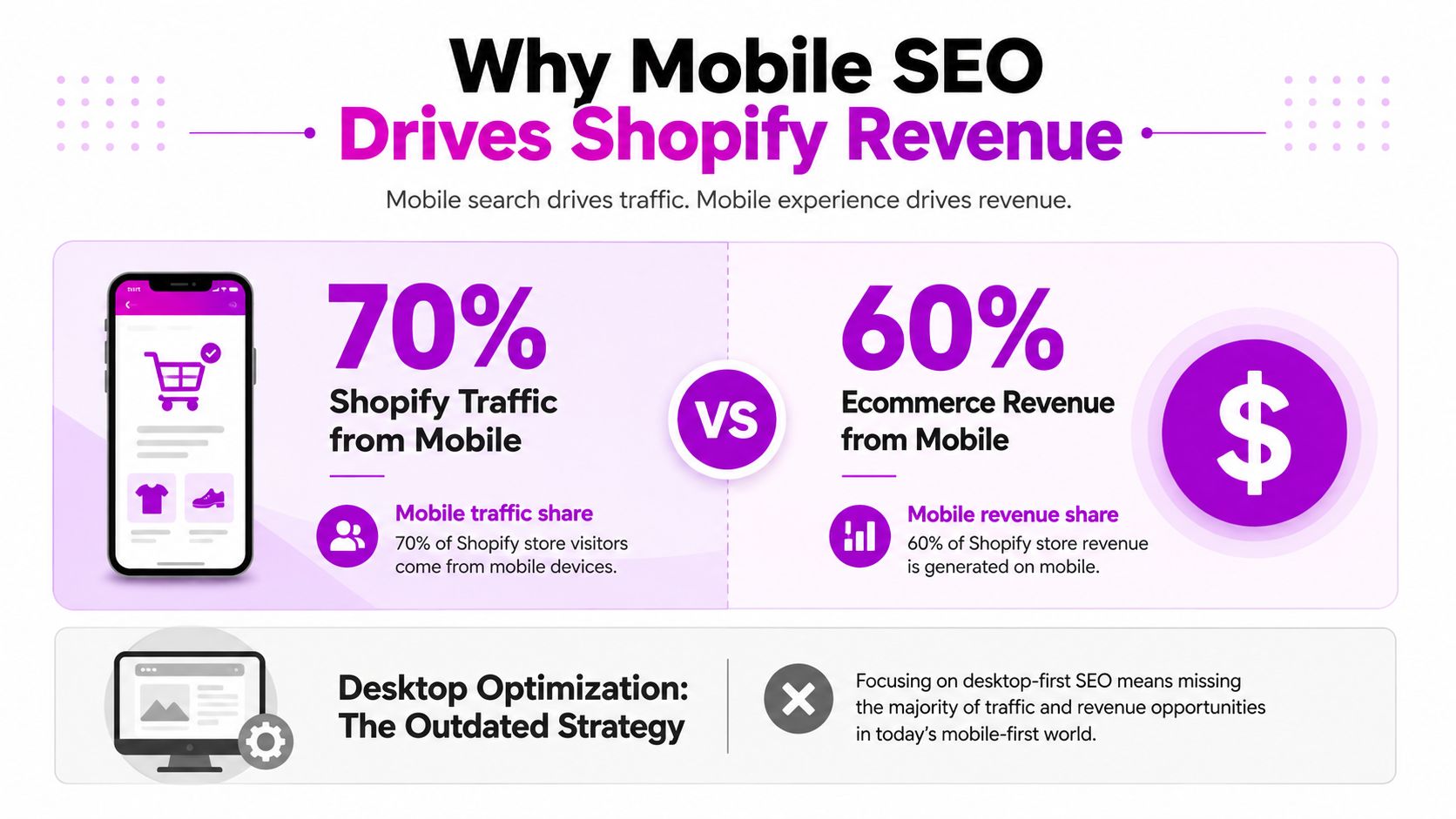
The exact mix varies by store, product category, audience, and acquisition channel, but the commercial direction is clear. A shopper who lands on a cramped product page, waits for several scripts to load, or can't tap the variant selector easily won't experience your brand as polished. Search visibility may bring that shopper in, but the mobile storefront decides whether the visit becomes a product view, an add-to-cart event, or an exit.
Google's mobile-first indexing also changes the technical priority. Google primarily evaluates the mobile version of a site for crawling and indexing, so hidden mobile content, incomplete product descriptions, missing links, or mobile-only rendering problems can affect how search engines understand a page. Your desktop theme can look flawless while the indexed experience remains incomplete.
Why app quantity isn't an SEO strategy
A Shopify SEO app can help with a defined task, such as editing metadata, generating redirects, or adding schema. It can't compensate for a heavy theme, an oversized hero image, or an app that blocks rendering before the main content appears. In fact, adding another storefront script may make the original problem harder to isolate.
Practical rule: Install an app only when it solves a documented problem that your theme, Shopify admin, or a small code change can't solve cleanly.
Mobile-first design principles matter because SEO and usability share the same page experience. Shopify teams should assess mobile-first design principles alongside crawlability, content parity, and conversion paths rather than treating mobile SEO as a metadata exercise.
The strongest approach is therefore selective. Keep the mobile storefront lean, measure changes on representative templates, and make each app justify its JavaScript, network requests, DOM additions, and maintenance burden.
Diagnosing Mobile SEO Issues in Your Store
Don't begin by browsing the Shopify App Store. Begin with evidence from the store you already have.
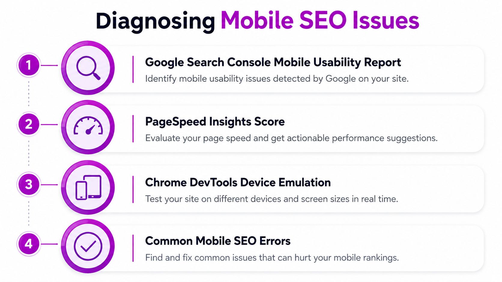
Open Google Search Console and review the Mobile Usability report for recurring issues affecting real URLs. Then inspect the Page indexing report and the URL Inspection tool. Search Console can reveal pages Google hasn't indexed, blocked resources, soft 404s, redirects, and canonical selections that differ from your intended setup. For the storefront performance side, Website Speedy can help identify and address speed issues affecting page load times and Core Web Vitals, giving Shopify merchants another way to evaluate and improve mobile performance alongside Search Console data.
A practical diagnostic sequence
- Capture a baseline. Choose a homepage, collection page, product page, blog article, and any high-value landing page. Test each with PageSpeed Insights using the mobile configuration and record the main findings before changing the theme.
- Inspect the critical rendering path. In Chrome DevTools, open the Network panel, enable device emulation, and reload with the cache disabled. Look for JavaScript files loaded from multiple SEO, review, upsell, analytics, and personalization apps. A cluster of scripts in the document head is a warning sign, especially when the files load synchronously.
- Find the largest visible element. Use the Performance panel to identify the element responsible for Largest Contentful Paint. On Shopify stores, it's often a hero image, product image, promotional banner, or slideshow. Check whether the image is oversized, served in an inefficient format, or loaded before essential content.
- Test interaction, not just appearance. At narrow and wide mobile breakpoints, open menus, select variants, use filters, expand accordions, and reach the checkout button. Touch targets should be easy to activate without accidental taps. Check that text remains readable and that sticky bars don't cover headings or purchase controls.
Check what Google can actually access
Use rendered inspection to compare mobile and desktop content. Product titles, descriptions, pricing, availability, internal links, reviews, and structured data shouldn't disappear from the mobile DOM because a theme uses a compact layout. A visual accordion can be fine, but content loaded only after an interaction or injected by a failing script deserves investigation.
Review the source and rendered HTML for canonical tags. Filter parameters, variant URLs, collection paths, and app-generated landing pages can create competing signals if canonicals point to inconsistent destinations. Also inspect robots directives and blocked assets. A page may be technically available to shoppers while important resources remain inaccessible to crawlers.
Record each issue in a simple table with the URL, template, evidence, likely owner, severity, and proposed fix. Only after that inventory exists should you decide whether the answer is a native Shopify setting, a Liquid change, a theme refactor, or an app.
Use this video as a practical visual supplement while reviewing the workflow:
Prioritized Fixes for Mobile Performance
Fix the storefront in impact order. Metadata changes matter, but a mobile page that takes too long to render still creates a poor search and shopping experience.
Start with images and loading behavior
Keep the above-the-fold image available immediately, then defer images below the initial viewport. In Shopify's theme code, a Liquid image filter can generate responsive sources:
{{ product.featured_image | image_url: width: 800 | image_tag: loading: 'eager', widths: '400, 600, 800', sizes: '(min-width: 750px) 50vw, 100vw', alt: product.title }}
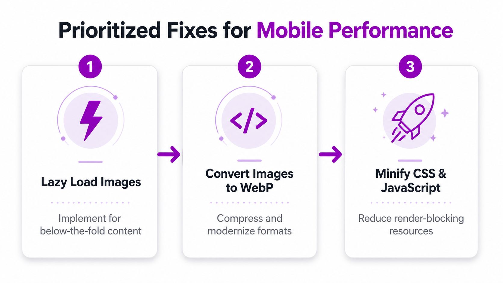
Use eager loading only for the primary visible image. Below-the-fold product cards, recommendation blocks, and editorial images should use lazy loading. Shopify's CDN can resize images, but you still need to request dimensions appropriate to the rendered slot. Converting source assets to WebP can reduce transfer weight when the theme and browser support the format.
Refactor the mobile layout
Remove desktop-first CSS overrides that force the browser to calculate styles the customer won't use. Keep navigation compact, give buttons enough spacing, reserve image dimensions to prevent layout movement, and avoid autoplay video or animated sliders in the first viewport unless they serve a clear commercial purpose.
Check the theme editor under Online Store, Themes, Customize for duplicated sections and unused blocks. In Edit code, inspect theme.liquid, layout files, and section assets for app embeds that remain enabled after an app is no longer needed. Shopify's App embeds area can also contain active integrations that aren't obvious from the visible page.
Add search signals once the page works
Product structured data belongs close to the product template and should describe the product displayed on the page. Use one coherent JSON-LD graph for product identity, offers, availability, and reviews where eligible. Before adding a schema app, check whether the Shopify theme already outputs Product, BreadcrumbList, Organization, or WebSite markup. Two competing Product objects can be worse than one accurate object.
For international stores, configure language alternatives through the translation and market setup, then verify the resulting hreflang links. Canonicals should identify the preferred URL for each page, not automatically collapse legitimate localized versions into one language.
Content parity is essential. The mobile template should expose the same core product information, links, and indexable content as desktop, even if the presentation differs.
Implementation note: Treat speed work as conversion work too. Practical bounce rate tips by Carti can help you connect landing-page friction with what shoppers do after they arrive.
Finally, minify only after removing unnecessary code. Minification makes existing assets smaller, but it doesn't make redundant scripts useful. Delete unused app assets, defer noncritical scripts, and load third-party widgets after the main purchase path is interactive.
How to Select and Evaluate Mobile SEO Apps
Every app should pass a performance and functionality review before it reaches the live theme. A useful tool may automate redirects or metadata at scale, but it should not add several scripts, duplicate schema, or install tracking pixels you didn't approve.
A broad understanding of app architecture helps here. This guide to types of mobile apps explained is useful context when deciding whether a feature belongs in a web theme, a progressive web app, or a native experience. For Shopify SEO, the practical question is simpler: does the feature improve crawlable storefront content without burdening every mobile page?
Evaluation CriteriaWhat to MeasurePass ThresholdRed FlagCore Web Vitals impactLighthouse and PageSpeed results before and after installationNo material regression on key templatesLCP worsens or interaction becomes delayedMobile feature depthActual support for responsive images, schema, redirects, or mobile controlsA documented feature solves the identified issueGeneric promises with no implementation detailsTheme compatibilityApp behavior across product, collection, cart, and custom templatesCorrect output on the active themeBroken sections, duplicated markup, or layout shiftsVendor transparencyScript locations, app embeds, theme changes, and data collectionClear installation and removal instructionsSynchronous head scripts or silent trackingUninstall cleanlinessTheme diff, source inspection, and network requests after removalNo orphaned snippets or assets remainLeftover code and requests after deletion
Quantify the cost before committing
Use Chrome DevTools' Network panel to compare request count, transferred bytes, initiators, and loading order. Test a fresh session and a repeat session because caching can hide an app's first-load cost. WebPageTest can provide another view of the waterfall and render sequence, especially when an app's effect isn't obvious in a local Lighthouse run.
Look for synchronous scripts in <head>, large JavaScript bundles loaded on every template, duplicated JSON-LD, and DOM nodes that appear even when the feature is disabled. A mobile SEO app should load only what the current page needs. A redirect tool that injects storefront JavaScript, for example, deserves close scrutiny because redirects generally belong at the server or platform layer.
Progressive web app decisions also affect the tool stack. Review progressive web app vs native before adding an app that tries to reproduce navigation, installation prompts, or offline behavior inside a conventional Shopify theme.
Choose the smallest toolset that covers a verified gap. If two apps perform the same schema or image function, keep the one with clearer code ownership and cleaner removal.
Safe Integration and Testing Workflow
Installing an SEO app directly on a live store is a risky deployment method. A theme copy gives you a controlled place to inspect code, measure requests, and confirm that the app doesn't alter critical templates.
Use a repeatable sequence
- Duplicate the live theme. In Shopify, open Online Store, Themes, select the theme actions menu, and create a duplicate. Label it with the app name and test date so the change is traceable.
- Record the baseline. Run PageSpeed Insights and Lighthouse on the same representative URLs. Save screenshots, waterfall details, key field data, indexability observations, and the current structured data output.
- Install and inspect. Add the app to the duplicate theme, enable only the required feature, and inspect
theme.liquid, snippets, assets, app embeds, and rendered HTML. Check whether the app loads on templates where it isn't needed. - Validate search signals. Use Google's Rich Results Test for structured data, inspect canonical tags, and review
hreflangoutput for localized pages. Crawl the test theme or its accessible preview with Screaming Frog where practical, looking for blocked URLs, orphaned pages, redirect chains, and duplicate metadata.
Before publishing, compare the same URLs against the baseline. If the app adds unnecessary requests, changes the main content, or creates layout instability, disable it and investigate rather than accepting the regression as a trade-off.
After deployment, use Search Console's URL Inspection tool to request a fresh check of important pages and monitor indexing, enhancements, and mobile issues. Keep the previous theme available for rollback. If removal is necessary, uninstall the app, disable its app embed, remove documented snippets and assets from theme.liquid or section files, then search the theme for the app's namespaces and script URLs.
Rollback principle: A clean uninstall is part of app quality. If the vendor can't explain how to remove its code, don't make it a permanent dependency.
KPIs to Track and When to Scale with Experts
Mobile SEO success isn't a ranking screenshot. It connects search demand, usable pages, and completed transactions.
Build a weekly view in Google Analytics 4 and Search Console that separates mobile from desktop and tracks the same templates over time. Review mobile organic clicks and impressions, landing-page engagement, product views, add-to-cart events, checkout starts, purchases, and revenue per session. Pair those outcomes with technical observations from PageSpeed Insights and Lighthouse so a traffic change doesn't hide a storefront regression.
Use a diagnostic KPI set
- Organic visibility: Track impressions, clicks, queries, and landing pages in Search Console. Zero-click behavior makes impressions and query coverage valuable even when clicks don't rise proportionally. Recent coverage reports that over 58% of Google searches end without a click, while mobile devices account for over 63% of organic search traffic globally (mobile SEO reporting from UpRankd).
- Commercial behavior: Compare mobile conversion rate, revenue per session, and add-to-cart rate by landing page. A page can attract qualified search demand while losing sales through poor navigation or delayed interaction.
- Experience quality: Monitor LCP, CLS, and INP in lab and field tools. Use the thresholds your team has selected as release criteria, but don't treat a single lab score as a permanent verdict because device, network, cache, and page content affect results.
- App discovery: For businesses with a mobile SEO app or companion app, measure web-to-install journeys, store-listing visits, and branded versus non-branded discovery. Search drives 65% of iOS discovery and 58% of Google Play discovery, according to ASO data from Digital Applied.
The measurement problem is broader than traditional traffic. App content can surface through web indexing and mobile discovery pathways, so teams should evaluate whether pages answer intent before installation, whether store listings convert that interest, and whether AI-generated recommendations mention the brand. Ranking alone won't show those gaps.
Know when code needs specialist attention
DIY changes usually reach their limit when an international store has complex language relationships, when thousands of products need consistent structured data, or when mobile and desktop indexing remain inconsistent after standard template fixes. Persistent script conflicts, custom Liquid architecture, and rendering requirements also call for deeper technical work.
ECORN offers Shopify development, custom app work, conversion optimization, and technical ecommerce consulting. A specialist can audit the theme and app stack, refactor Liquid templates, and help replace unnecessary app behavior with controlled implementation.
ECORN can audit your Shopify theme, app injections, structured data, and mobile performance as one connected system. Visit ECORN to discuss a focused mobile SEO review or a broader Shopify optimization project before adding another app.


Shopify Developer Hourly Rate: What to Pay in 2026
Ecommerce Conversion Tracking: The Complete How-To Guide

Shopify Design Agency: How to Pick the Right Partner
Mastering Multi Store Management on Shopify

Scale Shopify Store
10 Shopify App Ideas Worth Building in 2026
Conversion Rate Optimization for Landing Pages: The Playbook
Shopify Plus Automation: A Guide for 2026

10 Social Selling Platforms for Shopify Merchants

Shopify Website Design Examples: 7 Stores Worth Studying

7 Ecommerce Newsletter Examples for Shopify Brands
One Product Shopify Store: Build and Scale

Mobile Pop Up Strategy for Shopify Stores That Converts

Sitemap for Shopify: How to Find, Optimize, and Submit It
7 Single Product Websites Worth Emulating
Product Variants Shopify: The Complete 2026 Guide

Ecommerce Analytics Consulting for Growth

What Is AI Integration for eCommerce

How to Choose the Right eCommerce Website Development Firm

E Business Strategy Implementation
Conversion Tracking Setup for Shopify Stores
BigCommerce vs Shopify Plus Which Enterprise Wins in 2026
Shopify Theme Kit: Setup, Commands, and Migration Guide

Shopify Extension Development: A Practical 2026 Guide
Shopify Speed Score Explained and How to Improve It
Shopify Mobile Optimization: The 2026 Playbook

How to Add Subcategory in Shopify for Better UX
How to Implement Structured Data for Ecommerce in 2026

Shopify Plus Support: What It Includes and How to Choose

Google Ads for Shopify: The Complete 2026 Playbook

Shopify New York: How to Find and Hire the Right Agency
Google Search Console for Shopify: The Complete Setup

First Party Data Collection for eCommerce Growth

FAQ Online Store Guide: Build and Measure It Right

Do FB Ads Work for eCommerce in 2026?

One Page Checkout for Shopify: Design and Implementation
Shopify GraphQL vs REST: The 2026 Developer Decision
Shopify Ecommerce Consulting: Strategy, Pricing &

Are Reddit Ads Worth It for eCommerce Brands

Shopify Title and Meta Description: A Practical 2026 Guide

Product Video Best Practices for Shopify Brands

Real-Time Inventory Management: A 2026 Guide

AI Chatbot Integration for Shopify Stores

Affiliate Program Management: A Shopify Guide
10 Best Performance Monitoring Tools for Shopify in 2026

Digital Asset Management for eCommerce Brands in 2026

Every Type of Facebook Ads Explained for eCommerce Growth
Product Information Management Explained for Shopify Brands

Support Ticket System: A Guide for Shopify Stores

10 Best Customer Service Tools for Shopify in 2026

Can I Start a Business with No Money? a 2026 Blueprint

What Sells Good on Etsy: Best Niches for 2026

Shopify Add to Cart Button: A Practical 2026 Guide

Customer Feedback Automation: A Practical eCommerce Guide

Critical Rendering Path: A Guide for Shopify Stores

How to Promote on TikTok for eCommerce in 2026

B2B eCommerce Consulting That Drives Real Revenue

10 Best Practices for Site Navigation in 2026
Return vs Refund for Shopify Stores: A Practical Guide

What Is Customer Lifetime Value and Why It Matters

What Is Voice of Customer Research for eCommerce

SMS Marketing for Ecommerce That Actually Converts

Master How to Improve Email Deliverability in 2026

Top 7 eCommerce Partners NYC for Shopify Brands in 2026

Machine Learning for Ecommerce: Boost Your Shopify Store

Beauty Market Research: Your 2026 Growth Guide

Shopify International Expansion: A 2026 Roadmap

What Does CRO Stand for in Business: Understanding CRO

Shopify Visual Merchandising: A Playbook for Higher Sales

Shopify Landing Page Design: Master Conversion in 2026

10 Best AI SEO Optimization Tools for Shopify in 2026

Agentic AI for Ecommerce: Boost Your Sales in 2026
Mastering Email Marketing Data for eCommerce Growth

Conversion Rate Optimisation Australia: Boost Your Sales
Conversion Rate Optimization AI: Your Shopify Store Guide

10 Product Bundling Strategies for Shopify in 2026

How to Increase Customer Lifetime Value: A Shopify Playbook
AI Customer Service Automation: Shopify Guide 2026

Clean Website Design: A Shopify Conversion Playbook

Omnichannel Retail Strategy: A Shopify Playbook

Product Data Enrichment: A Guide for Shopify Brands

Instagram Shopping Features a Guide for Shopify Stores
What Is Revenue Optimization: A Holistic RevOps Guide

Benefits of Conversion Rate Optimization: Boost Your
WordPress to Shopify Migration: Your 2026 Seamless Switch
Boost Sales: Ecommerce Payment Processing Guide 2026

Unified Commerce Platform: Benefits, KPIs & Shopify Guide

How to Reduce Bounce Rate eCommerce: Your 2026 Guide
Shopify API Integration: A Practical End-to-End Guide

How to Implement Data Governance: A 2026 Guide

Shopify Store Development Cost: A 2026 Breakdown
What Is Server Side Tracking: The Shopify Guide 2026
Marketing Automation Workflows: A Shopify Guide for 2026

Shopify: How to Reduce Technical Debt

Shopify UX Design Change: A Playbook for Growth

User Generated Content Strategy: Shopify Playbook
Shopify Pause and Build Plan Cost: A Complete 2026 Guide
Compare at Price on Shopify: A Complete Guide for 2026
Where Can I Sell My Prints? 10 Best Platforms for 2026
Shopify Order Management System: The Ultimate Guide 2026


newsletter in your inbox