

You've installed a Shopify theme, replaced the demo logo, uploaded your products, and removed the stock photography. Yet the storefront still feels strangely unlike the polished brands that influenced you. The pages may look acceptable, but navigation feels awkward, the product page doesn't answer obvious questions, and mobile shoppers have to work too hard.
That gap usually isn't caused by a missing theme setting. Shopify design is a layered system, combining visual structure, shopper psychology, performance, accessibility, and, for larger operations, custom commerce functionality. Treating it as a theme-picking exercise makes each later decision harder.
What Shopify Design Really Means in 2026
A theme provides the storefront's chassis. It defines the available templates, sections, settings, typography controls, product presentation, and much of the responsive behavior. But the chassis doesn't decide whether shoppers understand your offer, trust your product, or know what to do next.
The second layer is conversion structure. Navigation, product grids, collection filters, promotional banners, reviews, shipping information, and calls to action all shape the route from interest to purchase. The third is performance. Images, scripts, animations, apps, and section density determine whether the page feels immediate or keeps shoppers waiting. The fourth is accessibility, which affects whether visitors can read, browse, operate, and complete checkout regardless of their abilities or the device they use.
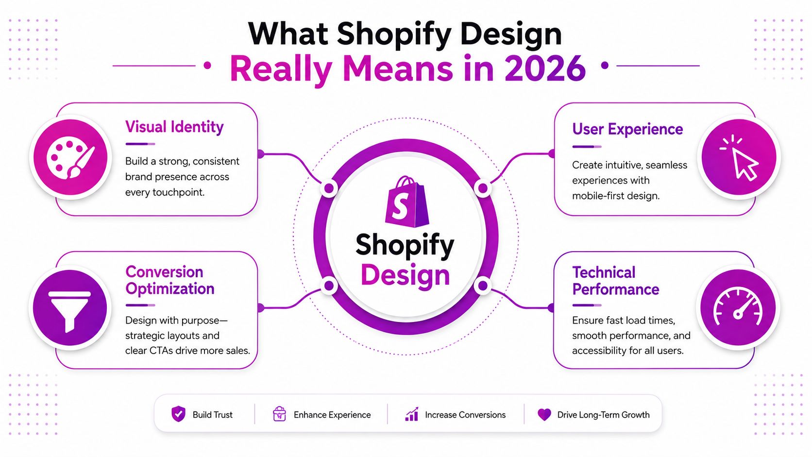
The four layers work together
A visually distinctive theme with heavy media can undermine the layout if pages become slow. A fast template can still lose sales when its buttons blend into the background or its menus are difficult to operate. A persuasive product page excludes shoppers when labels, focus states, or keyboard paths are missing.
Independent accessibility research identifies recurring Shopify usability problems involving layout consistency, standardized interactions, and labeling, an often overlooked part of storefront quality (accessibility research on Shopify design). Performance guidance from Shopify also treats fast, smooth browsing as central to ecommerce user experience, rather than as a separate developer concern (Shopify's UX design guidance).
Working definition: Shopify design is the coordinated system that helps the right shopper understand, trust, and buy your product with as little friction as possible.
The official ecosystem reflects this maturity. By mid-2025, Shopify's theme marketplace listed 268 themes, including 23 free Shopify themes and 245 paid third-party themes (Shopify theme marketplace statistics). More choice makes selection important, but it also means a theme alone can't be your strategy. You need to judge the structure beneath the styling.
Choosing and Customizing the Right Theme
Start with the practical choice. A free Shopify theme gives you a dependable foundation with limited direct cost and a smaller set of built-in patterns. A paid third-party theme may offer richer merchandising features, more layouts, and stronger niche positioning, but it adds licensing, support, and maintenance considerations. Online Store 2.0 themes are important because they use sections and blocks more flexibly across templates, giving merchants more control without editing every page manually.
| Factor | Free Shopify Theme | Paid Third-Party Theme | OS 2.0 Theme |
|---|---|---|---|
| Flexibility | Focused settings and proven layouts | Broader layouts and merchandising features | Sections and blocks can be used across more templates |
| Total cost | Lower initial cost | License or purchase cost, plus support considerations | Varies by theme and feature set |
| Custom code needs | May require code for specialized layouts | May reduce code needs, but can add complexity | Often reduces template-level work when sections are well designed |
| Best fit | New merchants validating an offer | Brands needing more built-in presentation options | Merchants wanting modular editing and scalable templates |
Customize in the right order
Use the theme editor first for section order, content, product selections, navigation, colors, typography, and spacing. These changes preserve the theme's intended logic and are usually easier for your team to maintain. Use CSS for controlled visual adjustments, such as button styling, border treatments, or small spacing corrections.
Custom code is appropriate when the store needs behavior the theme doesn't support, but it shouldn't become the default response to every limitation. If you're considering a more utility-driven styling workflow, styling with Tailwind CSS can help a developer create consistent interfaces, though it still requires a sound component and maintenance strategy.
Switching rule: If more than three core sections need workarounds, the theme is probably the constraint, not the tool.
Before choosing, test the actual demo content. Replace the demo products mentally, inspect the collection page on a narrow screen, open the search experience, test variant selection, read the footer, and check whether the theme supports the content your brand needs. A useful companion is this guide on how to choose a Shopify theme, especially when several themes appear similar in screenshots.
UX and UI Principles That Shape Every Page
Your homepage's first viewport is the storefront window. It doesn't need to explain the entire company. It needs to signal what you sell, who it's for, and where the shopper should begin. A strong hero usually combines a clear value proposition, relevant product imagery, and one primary action without forcing visitors to interpret decorative copy.
The product detail page is the sales floor. Since no salesperson stands beside the shopper, the page must establish hierarchy: product name, price, options, imagery, availability, delivery expectations, returns, reviews, and the add-to-cart action. Put related information close to the decision it supports. Shipping details belong near the price or purchase controls, not buried exclusively in the footer.
Turn interface elements into decisions
A button isn't just a colored rectangle. Its size, contrast, wording, and location tell shoppers what action matters most. “Add to cart” should be visually distinct from secondary actions such as “Save” or “View details.” Body text needs comfortable reading size on a phone, while headings should create a clear path through the page rather than compete for attention.
White space has a job. Use it to separate choices, group related information, and prevent product cards from merging into one dense block. Navigation should reflect how shoppers think about the catalog, not how the internal team happens to organize products. If visitors regularly search by product type, concern, use case, or collection, those routes should be visible.
Microcopy removes uncertainty. “Ships in two business days,” “Free delivery over the qualifying order value,” or “Select a size to see availability” answers questions at the moment they arise. Keep the wording specific and honest.
Apply one simple page test
Review every section and ask which question it answers:
- Why this brand? Use origin, proof, materials, craftsmanship, or point of view.
- Why this product? Explain the benefit, use, fit, ingredients, or specifications.
- Why now? Clarify availability, seasonal relevance, a bundle, or a time-sensitive offer.
If a section answers none of these questions, it may be decoration. Decoration can support a brand, but it shouldn't interrupt the shopper's route to understanding.
Designing for Mobile Shoppers
Mobile responsiveness isn't a final polish pass. It's a design discipline that determines how content stacks, how images load, where the thumb lands, and how much information appears before a shopper scrolls.
Start with the mobile canvas. Product grids often work best as a clear single-column or compact multi-column arrangement, depending on product complexity and image detail. Filters should collapse into an obvious control, product options should be easy to select, and the price and primary call to action should remain within comfortable thumb reach. A sticky add-to-cart bar can help on long product pages, provided it doesn't cover important content or create a second confusing purchase path.
Desktop-first creates predictable problems
A desktop-first product page may place a large image beside a dense purchase panel. On mobile, that relationship becomes a long vertical sequence. The shopper may reach the product description before finding the purchase controls, while variant selectors become cramped and promotional elements push essential information down the page.
A mobile-first version prioritizes the product title, price, key proof, selection controls, and purchase action. Desktop can then expand the layout without changing the underlying hierarchy.
| Metric or Pattern | Target | Design Move |
|---|---|---|
| Largest Contentful Paint | Under 2.5 seconds on mobile | Prioritize the main product or hero asset and remove unnecessary render-blocking work |
| Interaction to Next Paint | Under 200 milliseconds | Reduce heavy scripts and keep controls responsive |
| Product page action | Easy to reach with one hand | Place selection and purchase controls in a predictable thumb zone |
| Collection browsing | Clear scanning path | Use readable cards, compact filters, and consistent image ratios |
| Hero imagery | Lightweight delivery | Serve responsive image sizes rather than one oversized desktop file |
Test with Chrome DevTools throttling, then repeat on a real mid-tier Android device. Inspect the store's mobile behavior after every major app, theme, or imagery change. Shopify's own UX guidance places speed and high-performance browsing at the center of modern ecommerce experience (Shopify UX design trends), so mobile performance belongs in the design brief, not only in the technical backlog.
Conversion-Focused Layout Patterns
Conversion-focused design follows the shopper's question at each stage. A homepage should explain what the store offers and where to begin. A collection page should support comparison. A product page should remove doubt before the purchase decision.
Start with the collection grid. Consistent image ratios let shoppers scan without visual jolts, while readable titles, visible prices, and relevant variant details make comparison faster. Filters should reflect how customers choose, such as size, use case, or material. A grid is a shop assistant, not a warehouse dump. The theme's promotional screenshot cannot tell you which merchandising structure fits your products.
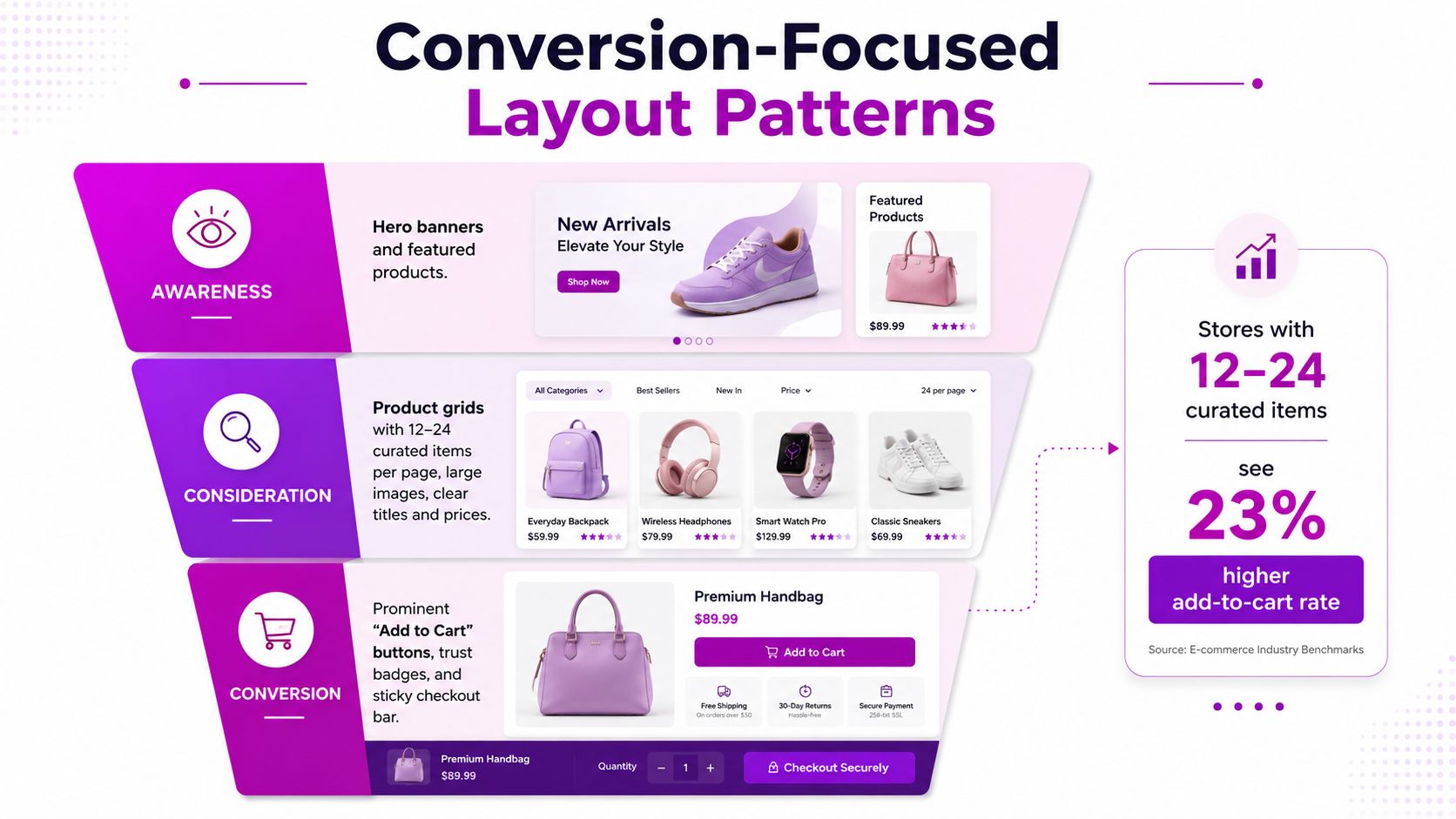
Match page elements to the question
A product page should answer practical concerns near the buying controls. Place reviews, shipping expectations, returns, stock information, and payment details close to the price and purchase action. Variant swatches should show exactly what changes. Urgency messages should describe real conditions, not manufacture pressure.
The homepage hero needs a clear promise and one primary path. If shoppers must scroll to learn what the store sells or which collection matters, the opening view is using attention without directing it.
Choose the cart pattern according to purchase complexity. A cart drawer works for straightforward orders because shoppers can review items without losing the current page. A dedicated cart page gives more room for complex options, delivery choices, notes, and detailed order review.
Score the layout before editing code
Review each major section in the theme editor or theme.json configuration:
- Does it answer a defined shopper question?
- Can the headline stand alone?
- Is the primary action visually dominant?
- Does the section still communicate when an image is cropped or unavailable?
- Is the next step obvious from the current section?
- Does its value justify the media, script, or visual weight it adds?
Mark each answer pass, needs work, or remove. Then test the sequence as a shopper would: arrive on the homepage, filter a collection, open a product, select a variant, and reach checkout. This exposes misplaced proof and competing actions that isolated section reviews can miss.
A stock theme has usually served its purpose when these decisions require repeated workarounds, custom sections, or app dependencies. At that point, the problem is no longer choosing a prettier template. It is defining a layout system that supports the brand's buying process without making every improvement a code exception.
Performance and Accessibility as Design Priorities
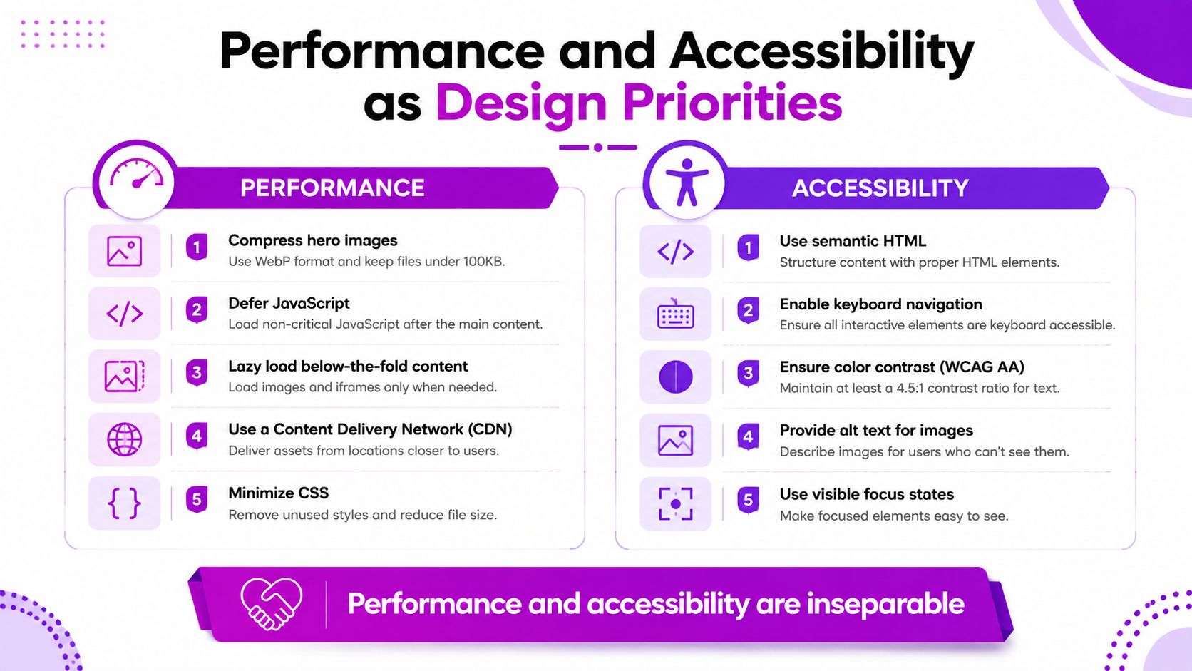
A shopper on a slow connection and a shopper using a screen reader encounter the same storefront, but they need different kinds of clarity. Performance reduces waiting; accessibility reduces uncertainty. Both depend on design decisions made before code is added.
Start with the visual payload. Compress hero imagery into efficient formats such as WebP, defer non-critical JavaScript, lazy-load below-the-fold media, and inspect each third-party app that injects scripts. Shopify's adaptive loading can deliver suitable resources, but it cannot simplify an overloaded page. Review homepage section count, animation behavior, font loading, and recommendation widgets as one system. The Shopify page speed optimization guide can help organize this technical review alongside design work.
Translate accessibility into store tasks
Apply WCAG principles to ordinary Shopify components:
- Contrast: Keep text and interface controls distinct from their backgrounds, including product-card prices and sale labels.
- Tap targets: Make mobile buttons and selectors large enough to operate without precision tapping.
- Alternative text: Describe the product and relevant attributes, rather than writing “image” or an internal file name.
- Keyboard operation: Test menus, search, variant selectors, pop-ups, and cart controls without a mouse.
- Focus states: Show keyboard users which control is active.
- Heading order: Use headings to describe content structure, not just to create visual size.
A collection page with ordered headings helps sighted visitors scan and gives screen-reader users a clearer route. Shopify accessibility research identifies layout consistency, standardized interactions, and labeling as recurring concerns in Shopify design (Shopify accessibility research).
Run a manual audit, then compare the results with Lighthouse and PageSpeed. Check the actual purchase path, including search, variant selection, cart updates, and keyboard focus. A stock theme has outgrown its role when these requirements repeatedly demand workarounds, custom sections, or app dependencies. The solution is then a design system built around the brand's buying process, not another template change.
When Custom Shopify Plus Development Makes Sense
A polished stock theme won't solve every operational problem. Shopify Plus development makes sense when the commerce model, market structure, or internal workflow exceeds what theme settings can reasonably support.
Common triggers include several regional storefronts with different currencies and catalogs, complex B2B purchasing, subscription and direct-to-consumer combinations, ERP or order-management integrations, advanced merchandising rules, and checkout behavior that requires custom logic. Shopify Plus capabilities such as Checkout Extensibility and Shopify Functions can support specialized checkout and commerce workflows, while a headless architecture may suit brands that need a more independent presentation layer.
Look for operational signals
A migration deserves serious evaluation when the merchandising team repeatedly requests blocks the theme can't provide, market launches require duplicated work, or conversion testing produces no clear explanation for a persistent plateau. High sales volume alone isn't a sufficient reason. The question is whether the additional platform, agency, development, and maintenance costs remove a constraint that is already expensive.
For teams evaluating creator-led commerce, taap.bio insights on creator stores offer useful context for comparing a focused storefront approach with broader Shopify capabilities.
Practical rule: Treat Plus as a scaling decision, not a prestige upgrade.
Audit the current store first. Document the workflow that fails, the revenue or operational cost of that failure, and the smallest module that could solve it. A sandbox or staged pilot is safer than committing immediately to a full rebuild. Custom checkout logic, an improved catalog experience, or an integration layer may be enough. A complete headless storefront may be unnecessary.
Putting It All Together
Strong Shopify design becomes manageable when you turn it into an operating routine rather than a dramatic redesign. Start with the store you have, identify the pages and constraints that matter most, and change the smallest useful layer first.
Use this working sequence
- Audit the theme foundation. Check its Online Store 2.0 section flexibility, template coverage, app compatibility, and content editing workflow.
- Find the important pages. Use analytics to identify the pages that receive the most traffic and generate the most commercial value.
- Map intent to layout. Decide whether each page needs orientation, comparison, confidence, or purchase momentum, then remove sections that don't support that job.
- Test mobile behavior. Use throttled browser testing and real devices to inspect layout shifts, control placement, image loading, and sticky elements.
- Run an accessibility pass. Check contrast, alternative text, heading order, focus visibility, keyboard navigation, and form labels.
- Set a performance budget. Review hero media, scripts, fonts, apps, animations, and below-the-fold loading after every meaningful theme update.
- Choose the growth path. Refine the current theme when its structure fits. Switch themes when workarounds dominate. Investigate Shopify Plus when operational requirements, not aesthetics, justify custom development.
A mature team schedules recurring conversion reviews, performance checks, and accessibility regression tests after theme or app changes. Shopify's growing platform scale, including more than $1.6 trillion in cumulative sales and approximately $11.5 billion in 2025 revenue, helps explain why storefront quality now carries consequences across a large commerce infrastructure (Shopify platform statistics). Those figures describe platform scale, not a guaranteed result for any individual store, so your decisions still need to come from your customers, analytics, and usability testing.
Ship the simplest design that earns the next unit of growth, then measure before iterating.
ECORN offers Shopify store design, custom theme development, conversion rate optimization, and Shopify Plus development for brands that need a clearer path from storefront experience to scalable commerce operations. If your current theme has become a constraint, visit ECORN to discuss a focused redesign, optimization project, or staged development plan.


Ecommerce Terms of Service: How to Draft and Implement
How to Implement Structured Data for Ecommerce in 2026

SEO App Mobile: Shopify Store Optimization Guide

Shopify Plus Support: What It Includes and How to Choose

Google Ads for Shopify: The Complete 2026 Playbook

Shopify New York: How to Find and Hire the Right Agency
Google Search Console for Shopify: The Complete Setup

First Party Data Collection for eCommerce Growth
FAQ Online Store Guide: Build and Measure It Right
Do FB Ads Work for eCommerce in 2026?
One Page Checkout for Shopify: Design and Implementation
Shopify GraphQL vs REST: The 2026 Developer Decision
Shopify Ecommerce Consulting: Strategy, Pricing &

Are Reddit Ads Worth It for eCommerce Brands
Shopify Title and Meta Description: A Practical 2026 Guide

Product Video Best Practices for Shopify Brands
Real-Time Inventory Management: A 2026 Guide

AI Chatbot Integration for Shopify Stores
Affiliate Program Management: A Shopify Guide
10 Best Performance Monitoring Tools for Shopify in 2026

Digital Asset Management for eCommerce Brands in 2026

Every Type of Facebook Ads Explained for eCommerce Growth
Product Information Management Explained for Shopify Brands
Support Ticket System: A Guide for Shopify Stores

10 Best Customer Service Tools for Shopify in 2026

Can I Start a Business with No Money? a 2026 Blueprint

What Sells Good on Etsy: Best Niches for 2026

Shopify Add to Cart Button: A Practical 2026 Guide

Customer Feedback Automation: A Practical eCommerce Guide
Critical Rendering Path: A Guide for Shopify Stores

How to Promote on TikTok for eCommerce in 2026

B2B eCommerce Consulting That Drives Real Revenue

10 Best Practices for Site Navigation in 2026
Return vs Refund for Shopify Stores: A Practical Guide

What Is Customer Lifetime Value and Why It Matters
What Is Voice of Customer Research for eCommerce

SMS Marketing for Ecommerce That Actually Converts

Master How to Improve Email Deliverability in 2026

Top 7 eCommerce Partners NYC for Shopify Brands in 2026

Machine Learning for Ecommerce: Boost Your Shopify Store

Beauty Market Research: Your 2026 Growth Guide

Shopify International Expansion: A 2026 Roadmap

What Does CRO Stand for in Business: Understanding CRO

Shopify Visual Merchandising: A Playbook for Higher Sales

Shopify Landing Page Design: Master Conversion in 2026

10 Best AI SEO Optimization Tools for Shopify in 2026

Agentic AI for Ecommerce: Boost Your Sales in 2026
Mastering Email Marketing Data for eCommerce Growth

Conversion Rate Optimisation Australia: Boost Your Sales
Conversion Rate Optimization AI: Your Shopify Store Guide

10 Product Bundling Strategies for Shopify in 2026

How to Increase Customer Lifetime Value: A Shopify Playbook
AI Customer Service Automation: Shopify Guide 2026

Clean Website Design: A Shopify Conversion Playbook

Omnichannel Retail Strategy: A Shopify Playbook
Product Data Enrichment: A Guide for Shopify Brands

Instagram Shopping Features a Guide for Shopify Stores

What Is Revenue Optimization: A Holistic RevOps Guide

Benefits of Conversion Rate Optimization: Boost Your
WordPress to Shopify Migration: Your 2026 Seamless Switch
Boost Sales: Ecommerce Payment Processing Guide 2026
Unified Commerce Platform: Benefits, KPIs & Shopify Guide
How to Reduce Bounce Rate eCommerce: Your 2026 Guide
Shopify API Integration: A Practical End-to-End Guide

How to Implement Data Governance: A 2026 Guide

Shopify Store Development Cost: A 2026 Breakdown
What Is Server Side Tracking: The Shopify Guide 2026
Marketing Automation Workflows: A Shopify Guide for 2026

Shopify: How to Reduce Technical Debt

Shopify UX Design Change: A Playbook for Growth
User Generated Content Strategy: Shopify Playbook
Shopify Pause and Build Plan Cost: A Complete 2026 Guide
Compare at Price on Shopify: A Complete Guide for 2026
Where Can I Sell My Prints? 10 Best Platforms for 2026
Shopify Order Management System: The Ultimate Guide 2026
What Is Marketing Attribution? an eCommerce Guide for 2026

10 Best Black Friday Sales Sheets for 2026

Discover the Top Social Media Marketing Agencies For
Consumer Confidence Definition for eCommerce in 2026
What Is Social Commerce? Your 2026 Guide to Boosting Sales

A Social Ad Campaign Playbook for eCommerce Growth

7 Best FAQ Page Examples for SaaS & eCommerce

Market Research in Fashion Industry: A Guide for Shopify
Shopify Migration Services: Expert Guide for 2026

Mastering FB Retargeting Ads for Shopify in 2026
What Is Omnichannel Ecommerce

Master Your Shopify Plus Migration: The 2026 Guide
Shopify Integration Services: A Merchant's 2026 Guide
Shopify Collection Description: A Guide to SEO & Sales

Shopify Plus Contact: Reach Sales & Support Effectively

Top Luxury Shopify Stores: Design & UX Strategies
How to Improve Customer Experience: A Shopify Roadmap

Creative Facebook Ads: 10 Examples for Shopify Brands

Remarketing with Facebook Ads: A Shopify Guide for 2026

SEO Linking Strategies for Shopify Stores

Top 7 Statistics YouTube Channels for eCommerce in 2026

Hiring Shopify Plus Designers: A Founder's Guide
Shopify Product Variation: Master Your Variants for 2026

Leverage Ai Solutions Brands: Your 2026 Shopify Growth Guide

Filters in Shopify: A Guide for Growing Brands


newsletter in your inbox