

You're probably in one of two situations right now. You're either sending paid traffic to a Shopify product page that wasn't built to convert cold visitors, or you already built a landing page and it looks polished, but the conversion rate still feels soft.
That usually isn't a design software problem. It's a strategy problem.
Most Shopify landing page design advice stays at the template level. Add a hero. Add benefits. Add reviews. Add a CTA. That's not wrong, but it misses the two decisions that shape performance most: matching the page to the traffic source and handling objections in the right order.
A click from TikTok behaves differently than a click from email. A visitor from a branded search already trusts you more than someone from a broad paid social ad. If you show the same proof, same copy sequence, and same page structure to all of them, you force every audience through the same persuasion path. That's where a lot of conversion opportunity gets lost.
Strategy First Defining Your Page's Single Goal
The most common mistake in Shopify landing page design is simple. The page tries to do too much.
It wants to sell a hero product, capture emails, educate shoppers, cross-sell bundles, and introduce the brand. That's a homepage job. A landing page needs one job only. Buy this product. Claim this offer. Start this subscription. Join this waitlist.
When the goal is vague, every design choice gets weaker. The headline gets broader. The CTA gets softer. The proof gets scattered. The page starts asking the visitor to think instead of guiding them to act.
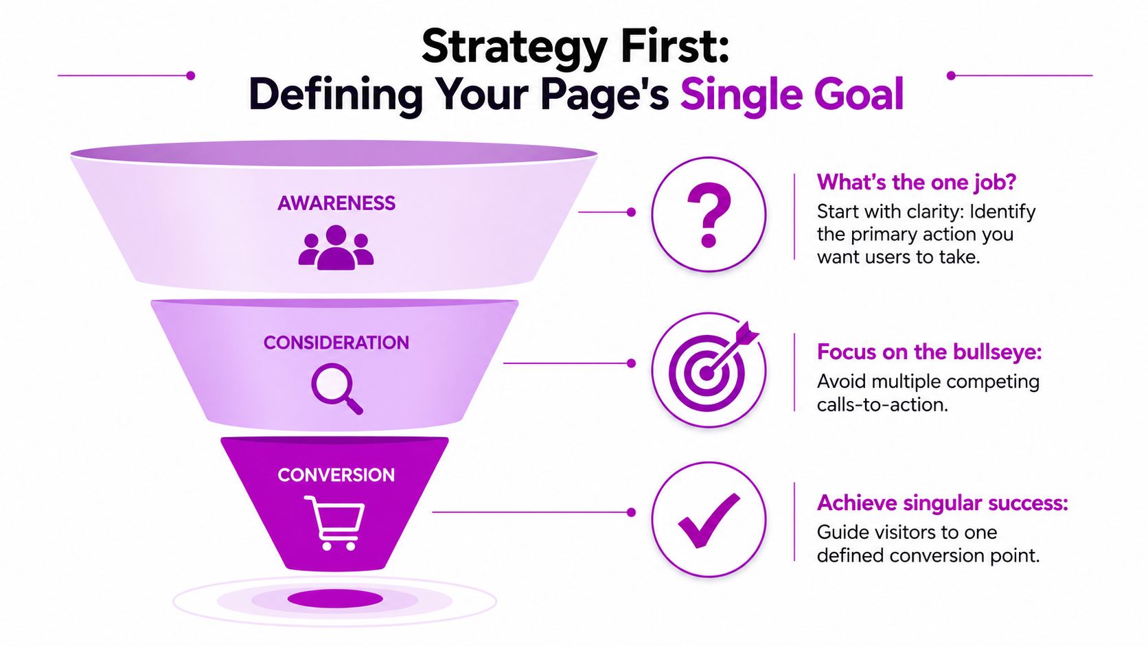
Define the conversion before you design the page
Start with a sentence, not a wireframe:
Practical rule: If you can't describe the page's one desired action in a single sentence, the page isn't ready to design.
Good examples:
- Product launch: Buy one featured SKU.
- Subscription push: Start a recurring order for one core product.
- Lead generation: Submit an email for early access.
- Promo campaign: Redeem one limited-time bundle offer.
Weak examples sound like this:
- Increase sales: Too broad.
- Improve engagement: Not actionable.
- Tell our brand story: Useful, but not a landing page goal.
That single decision affects everything else. If the job is to sell a hero SKU, the page needs focused proof around that product. If the job is to capture leads, the page should remove purchase friction and make the exchange feel low risk.
Match the page to the traffic source
Generic landing pages fall short. The same structure doesn't work equally well for every visitor because the click context changes what that visitor needs to believe first.
A few practical examples:
- TikTok or influencer traffic: These visitors often respond to visual proof, creator-style demonstrations, and user-generated content.
- Google search traffic: These visitors often need clarity, credibility, and direct relevance to the query they typed.
- Email traffic: These visitors are warmer. You can move faster because the relationship already exists.
- Cold paid social: These visitors need the page to earn trust quickly.
That difference matters. Pages that fail to align proof type with traffic origin can lose up to 35% of conversions, and 68% of high-converting Shopify pages use dynamic proof insertion such as UGC for TikTok traffic and press logos for SEO traffic according to Shopify's landing page design guidance.
In practice, that means social proof shouldn't be static. The same five-star review block shouldn't appear unchanged for every audience if those audiences arrived with different levels of awareness and trust.
For teams refining this process, this guide on conversion rate optimization is useful because it helps frame landing pages as part of a broader CRO system, not a one-off design task.
Build the brief before the mockup
Before anyone opens Figma, Shopify theme editor, or a page builder, lock these three inputs:
Traffic source
Decide where most visitors will come from first. Don't design for all traffic equally.Awareness level
Cold traffic needs more trust and objection handling. Warm traffic can move faster to offer and CTA.Primary proof type
Choose the proof that fits the click context. UGC, reviews, expert validation, press mentions, or founder credibility all work differently depending on source.
A strong page feels obvious to the visitor because it answers the exact question they already had when they clicked. That's strategy. Design only makes it visible.
The Conversion-Focused Design Blueprint
A high-performing landing page doesn't need to look complicated. It needs to remove uncertainty in the right order.
The strongest layouts usually feel simple because they guide attention well. Visitors see the offer, understand why it matters, decide whether they trust it, and find the next action without friction.
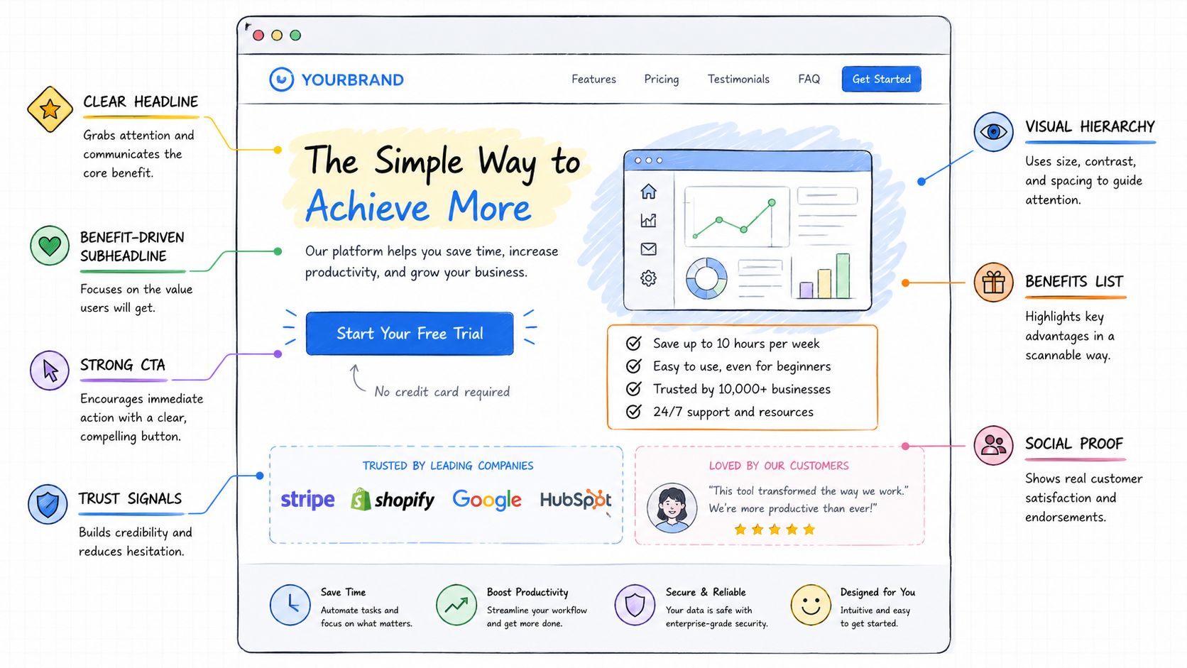
What has to happen above the fold
Above the fold, the page has to answer four questions fast:
- What is this?
- Why should I care?
- Can I trust it?
- What do I do next?
That usually translates into a compact structure:
| Element | What it needs to do |
|---|---|
| Headline | Make the offer instantly clear |
| Supporting copy | Add context without slowing the reader down |
| Primary CTA | Give one obvious next step |
| Trust signal | Reduce skepticism early |
If any one of those is missing, the page leaks attention. A beautiful hero image won't save a vague offer. A strong CTA won't recover a trust gap. A dense paragraph won't outperform a clean, scannable value proposition.
Cold traffic needs a different sequence
Many Shopify pages underperform in this regard. Standard advice says to lead with benefits before features. That works in many contexts, but cold traffic often needs something else first. It needs reassurance.
Splitbase data cited by Shopify shows that 72% of non-converting cold-traffic pages fail because they delay shipping, returns, and pricing objections until the FAQ, and a 2025 case study found that moving those objection handlers to above the fold, immediately after the hero, increased cold-traffic conversion by 28% on average in Shopify's ecommerce landing page article.
That pattern shows up constantly in audits. The page opens with aspirational language, then benefits, then lifestyle imagery, then reviews, and only later explains shipping, returns, subscription terms, or guarantees. By then, skeptical visitors are already gone.
Cold traffic doesn't need more hype. It needs fewer unanswered questions.
A better sequence for cold audiences looks like this:
- Hero with clear offer
- Immediate objection handlers
- Benefits and outcomes
- Proof
- Deeper education
- Repeated CTA
Immediate objection handlers can be short. They don't need a full FAQ module. They need to neutralize the obvious blockers before the visitor feels risk.
Examples include:
- Shipping clarity: State delivery expectations plainly.
- Return reassurance: Summarize the policy in one line.
- Pricing transparency: Explain bundle math, subscription terms, or discounts without hiding them.
- Trust reinforcement: Mention guarantees, secure checkout, or notable customer feedback close to action points.
For marketers looking at the psychology behind this sequence, boost revenue with website psychology is a useful companion read.
Structure the middle of the page around decision support
Once the page clears the initial trust barrier, the middle section should help the visitor justify the decision.
That usually means combining:
- Outcome-driven benefit blocks
- Proof modules tied to likely objections
- Product visuals that answer “what do I get?”
- Comparison elements when the category is crowded
A helpful way to evaluate your structure is to study working examples in context. This roundup of Shopify landing page examples is useful because you can reverse-engineer how different brands handle proof, layout, and CTA rhythm.
Here's a simple before-and-after test I use in reviews:
If I remove your brand name and logo, does the page still communicate a distinct offer and a reason to believe it?
If the answer is no, the page is relying on brand familiarity too heavily. That's risky for acquisition traffic.
A strong blueprint doesn't just look organized. It mirrors the way a visitor evaluates risk, value, and trust in real time.
Crafting Compelling Copy and Unmissable CTAs
Once the structure is right, the words decide whether the page converts cleanly or stalls. Good copy doesn't sound clever. It reduces friction.
The first job is message match. If someone clicks an ad about a specific outcome, the headline on the landing page needs to continue that exact conversation. Any disconnect creates doubt. The visitor wonders whether they landed in the right place, whether the offer changed, or whether the ad oversold the page.
Start with headline continuity
The headline should carry over the promise, pain point, or offer that triggered the click. Not approximately. Directly.
Bad pattern:
- Ad promises one thing.
- Page headline introduces the brand instead.
- Visitor has to translate the connection alone.
Better pattern:
- Ad promise appears again in the headline.
- Supporting line explains how it works.
- CTA reflects the same action implied by the click.
Shopify landing pages with a single clear offer and one primary CTA repeated down the page convert significantly better than pages with multiple offers, and pages with message match between ad and headline plus immediate trust signals and social proof achieve higher CVR according to Shopify Partners guidance on landing page optimization.
That means the headline isn't a branding line. It's a conversion device.
Write benefits like a buyer talks
Most weak Shopify landing page design projects fall into feature language too early. They describe ingredients, materials, formats, or technical specs before establishing why the visitor should care.
Use a simple translation method:
| Feature | Benefit angle |
|---|---|
| Refillable packaging | Easier to reorder and less wasteful |
| Concentrated formula | Lasts longer per purchase |
| Adjustable fit | More comfortable for daily use |
| Subscription option | Fewer reorders to remember |
Features support credibility. Benefits create momentum. The body copy should move from outcome to mechanism, not the other way around.
A good rule for scanning copy drafts is this: if a line sounds like a product manager wrote it, rewrite it in customer language.
Place proof where doubt appears
Proof works best when it resolves a specific hesitation. Don't dump all reviews into one carousel near the bottom and call it done.
Use different proof formats for different jobs:
- Short reviews near the hero: Fast trust.
- UGC near demonstration sections: Real-world believability.
- Testimonials near objections: Reassurance at the moment of hesitation.
- Press or authority markers lower on the page: Added credibility without crowding the top.
Copy check: Every major claim on the page should sit near a proof element, a policy, or a product visual that helps the visitor believe it.
Build one CTA path, then repeat it
Many pages sabotage themselves with too many buttons: Shop now, learn more, bundle and save, see ingredients, explore reviews, take the quiz. Each extra action competes with the main conversion.
The strongest pages pick one primary CTA and repeat it throughout the page. The wording should be specific enough that the visitor knows what happens next.
Examples of stronger CTA language:
- Get the starter kit
- Start your subscription
- Claim the bundle
- Join the waitlist
Generic CTA copy isn't always fatal, but it often wastes intent. “Submit” and “Learn more” usually underperform because they don't communicate value.
On longer pages, repeat the CTA after each meaningful decision block. Not mechanically. Place it after moments where the visitor has enough information to act.
Keep the button visually obvious too. Use contrast, leave enough surrounding space, and make sure the CTA remains easy to tap on mobile. A lot of CTA problems aren't copy problems at all. They're hierarchy problems.
Choosing Your Shopify Landing Page Builder
The build method matters less than commonly believed. The wrong workflow matters a lot.
Teams often start by comparing apps before they've defined the page strategy, content hierarchy, and mobile behavior. That's backwards. The page builder should support the conversion plan, not shape it.
The practical choice usually comes down to three routes: use your existing theme, use a dedicated page builder, or build it custom.
Compare the three main paths
Here's the trade-off in a simple view.
| Build Method | Best For | Flexibility | Speed Impact | Cost |
|---|---|---|---|---|
| Existing Shopify theme sections | Simple campaigns, lean teams, fast deployment | Low to medium | Usually lighter if kept clean | Lower |
| Third-party page builders | Marketing teams that need speed and design control | Medium to high | Varies by app and implementation | Medium |
| Custom development | Complex experiences, unique UX, advanced brands | High | Can be excellent or poor depending on build quality | Higher |
Option one uses your current theme
This is the fastest route if your theme already has strong sections and your offer is straightforward.
It works well when:
- the page doesn't need unusual interactions
- your team wants to launch quickly
- your developer wants fewer third-party dependencies
The downside is layout rigidity. If the page needs source-specific modules, advanced storytelling, or non-standard product merchandising, theme sections can become a compromise fast.
Option two uses a dedicated page builder
Many brands choose it for its balance of speed and flexibility. Tools like PageFly, Shogun, and Replo are popular because marketers can launch without waiting on development for every layout change.
The trade-off is performance discipline. Some teams stack too many widgets, scripts, animations, and app embeds, then wonder why the page feels heavy. A page builder can move fast, but it can also accumulate technical drag if nobody governs it.
For a broader breakdown of app-level pros and cons, this review of Shopify page builders is a practical reference.
Option three is custom development
Custom builds make sense when the page needs tighter control over performance, custom merchandising logic, or a very specific front-end experience. Shopify Plus brands often go this route for campaign systems they'll reuse across regions or product lines.
This route gives you more freedom, but it also asks for stronger process. Without a clear brief, custom work can produce expensive versions of the same strategic mistakes.
The most expensive landing page is the one you custom-build before you know what should be on it.
Decide based on workflow, not hype
A research-driven process should come first. Splitbase recommends using qualitative and quantitative inputs such as customer interviews, chat logs, analytics, heatmaps, and scroll maps before building, and the build process should include compressing product photos, using a CDN, minimizing heavy scripts, with buttons at least 44×44 pixels and body text at 16 pixels for mobile usability in their Shopify landing page guide.
That has two implications.
First, don't choose a tool because the editor feels nice. Choose it because it lets your team publish, test, and maintain pages without compromising speed or mobile usability.
Second, make sure whoever owns the page can iterate on it. A custom page nobody can update is a bottleneck. A page builder everyone can edit without discipline becomes cluttered.
One practical middle ground is to combine strategic design support with a maintainable build system. Agencies such as ECORN offer Shopify design, development, and CRO support for brands that need landing pages built inside a broader optimization workflow rather than as isolated mockups.
The right builder is the one your team can use repeatedly without turning every campaign into a redevelopment project.
Launch Measure and Optimize for Performance
Publishing the page isn't the finish line. It's when the important work starts.
A landing page only proves itself under live traffic. That's when you find out whether the message matches the click, whether mobile visitors can use it comfortably, whether your scripts slow down the experience, and whether the CTA is strong enough to carry intent through to conversion.
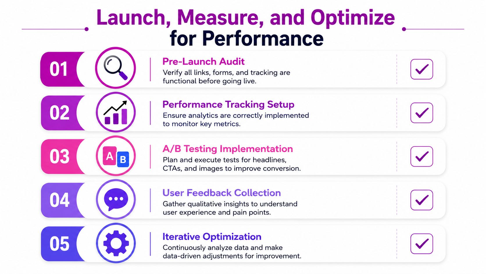
Start with a pre-launch audit
Before traffic hits the page, run a short but serious check:
- CTA path: Every primary button should lead to the correct destination.
- Mobile usability: Buttons should be easy to tap and text should be readable without zooming.
- Tracking: Analytics events, purchases, and form submissions need to fire correctly.
- Content accuracy: Offers, pricing language, shipping claims, and policy summaries should match checkout reality.
- Script load: Remove anything that isn't necessary for this page.
Preventing bad data is key for teams. If tracking is broken or mobile interactions fail, you won't know whether the page underperformed or the setup did.
Treat speed as a conversion requirement
Performance isn't a technical afterthought in Shopify landing page design. It directly affects revenue.
Pages that load within 1 second generate conversion rates 3 times higher than pages that take 5 seconds to load, even a 0.1 second delay can cause a measurable conversion drop, and high-converting Shopify pages are expected to load in under 2 seconds according to this Shopify landing page speed guide.
That changes how you should build and maintain pages. It means every visual decision carries a performance cost.
The usual culprits are predictable:
- Oversized images: Export to WebP where possible and size assets to their actual display dimensions.
- Heavy app scripts: Remove widgets that don't contribute directly to conversion.
- Bloated sections: Keep layouts clean, especially on mobile.
- Too many redirects or assets: Reduce requests where you can.
A fast page feels more trustworthy before the visitor reads a single word.
Build a testing rhythm after launch
Once the page is stable, start testing. Keep it controlled. Don't change the headline, hero image, button copy, and review module all at once or you won't know what moved performance.
A practical testing sequence looks like this:
Headline and message match
Tighten continuity with the traffic source first.Hero composition
Test what appears immediately on arrival. Offer framing, product image, or trust cue.CTA copy and placement
Small wording changes can clarify intent without changing the offer.Proof type
Swap review style, UGC format, or trust indicators based on traffic quality.Objection handling
Test what happens when you move shipping, returns, or pricing reassurance earlier.
For teams that want a broader playbook on post-launch refinement, this guide on e-commerce landing page conversions is worth reviewing alongside your own analytics.
The strongest optimization loops combine quantitative data with qualitative signals. Analytics tell you where users drop. Session reviews, on-site feedback, support chats, and post-purchase comments tell you why.
That combination is what turns a decent landing page into a dependable acquisition asset.
Your Path to Higher Conversions
High-performing Shopify landing page design isn't about making pages look more modern. It's about making decisions in the right order.
Start with one goal. If the page has multiple jobs, it will usually do none of them well. Match the structure to the traffic source so the visitor sees proof that fits the reason they clicked. Handle objections early, especially for cold traffic, instead of hiding the important reassurance in the FAQ. Keep the copy tight, the CTA singular, and the build method realistic for your team. Then launch, measure, and iterate without guessing.
That process is repeatable.
It also changes how you evaluate underperforming campaigns. Instead of assuming the ad audience is weak or the product isn't resonating, you can inspect the actual conversion path. Is the message matching? Is the trust sequence right? Is the page fast enough? Is the CTA too diffuse? Is the proof credible for that traffic source?
Most brands don't need more landing pages. They need better systems for building the right landing page for the right visitor.
If you apply that lens, your landing page stops being a one-off campaign asset and starts becoming an operating advantage inside your Shopify growth engine.
If you want help turning this into a working Shopify landing page system, ECORN supports brands with Shopify design, development, and CRO work that connects strategy, build quality, and ongoing optimization.


Luxury Skincare Branding Playbook That Converters
10 Best Podcast Ecommerce Shows for Store Growth in 2026
Shopify Developer Hourly Rate: What to Pay in 2026
Critical Shopify Setup Errors That Are Secretly Sabotaging Your Store
Ecommerce Conversion Tracking: The Complete How-To Guide
Shopify Design Agency: How to Pick the Right Partner
Mastering Multi Store Management on Shopify
Scale Shopify Store
10 Shopify App Ideas Worth Building in 2026
Conversion Rate Optimization for Landing Pages: The Playbook
Shopify Plus Automation: A Guide for 2026
10 Social Selling Platforms for Shopify Merchants
Shopify Website Design Examples: 7 Stores Worth Studying
7 Ecommerce Newsletter Examples for Shopify Brands
One Product Shopify Store: Build and Scale
Mobile Pop Up Strategy for Shopify Stores That Converts
Sitemap for Shopify: How to Find, Optimize, and Submit It
7 Single Product Websites Worth Emulating
Product Variants Shopify: The Complete 2026 Guide
Ecommerce Analytics Consulting for Growth
What Is AI Integration for eCommerce
How to Choose the Right eCommerce Website Development Firm
E Business Strategy Implementation
Conversion Tracking Setup for Shopify Stores
BigCommerce vs Shopify Plus Which Enterprise Wins in 2026
Shopify Theme Kit: Setup, Commands, and Migration Guide
Shopify Extension Development: A Practical 2026 Guide
Shopify Speed Score Explained and How to Improve It
Shopify Mobile Optimization: The 2026 Playbook
How to Add Subcategory in Shopify for Better UX
How to Implement Structured Data for Ecommerce in 2026
SEO App Mobile: Shopify Store Optimization Guide
Shopify Plus Support: What It Includes and How to Choose
Google Ads for Shopify: The Complete 2026 Playbook
Shopify New York: How to Find and Hire the Right Agency
Google Search Console for Shopify: The Complete Setup
First Party Data Collection for eCommerce Growth
FAQ Online Store Guide: Build and Measure It Right
Do FB Ads Work for eCommerce in 2026?
One Page Checkout for Shopify: Design and Implementation
Shopify GraphQL vs REST: The 2026 Developer Decision
Shopify Ecommerce Consulting: Strategy, Pricing &
Are Reddit Ads Worth It for eCommerce Brands
Shopify Title and Meta Description: A Practical 2026 Guide
Product Video Best Practices for Shopify Brands
Real-Time Inventory Management: A 2026 Guide
AI Chatbot Integration for Shopify Stores
Affiliate Program Management: A Shopify Guide
10 Best Performance Monitoring Tools for Shopify in 2026
Digital Asset Management for eCommerce Brands in 2026
Every Type of Facebook Ads Explained for eCommerce Growth
Product Information Management Explained for Shopify Brands
Support Ticket System: A Guide for Shopify Stores

10 Best Customer Service Tools for Shopify in 2026

Can I Start a Business with No Money? a 2026 Blueprint
What Sells Good on Etsy: Best Niches for 2026

Shopify Add to Cart Button: A Practical 2026 Guide

Customer Feedback Automation: A Practical eCommerce Guide
Critical Rendering Path: A Guide for Shopify Stores

How to Promote on TikTok for eCommerce in 2026

B2B eCommerce Consulting That Drives Real Revenue
10 Best Practices for Site Navigation in 2026
Return vs Refund for Shopify Stores: A Practical Guide
What Is Customer Lifetime Value and Why It Matters
What Is Voice of Customer Research for eCommerce

SMS Marketing for Ecommerce That Actually Converts

Master How to Improve Email Deliverability in 2026
Top 8 eCommerce Partners NYC for Shopify Brands in 2026
Machine Learning for Ecommerce: Boost Your Shopify Store
Beauty Market Research: Your 2026 Growth Guide
Shopify International Expansion: A 2026 Roadmap
What Does CRO Stand for in Business: Understanding CRO
Shopify Visual Merchandising: A Playbook for Higher Sales
10 Best AI SEO Optimization Tools for Shopify in 2026

Agentic AI for Ecommerce: Boost Your Sales in 2026
Mastering Email Marketing Data for eCommerce Growth
Conversion Rate Optimisation Australia: Boost Your Sales
Conversion Rate Optimization AI: Your Shopify Store Guide

10 Product Bundling Strategies for Shopify in 2026
How to Increase Customer Lifetime Value: A Shopify Playbook
AI Customer Service Automation: Shopify Guide 2026
Clean Website Design: A Shopify Conversion Playbook

Omnichannel Retail Strategy: A Shopify Playbook
Product Data Enrichment: A Guide for Shopify Brands
Instagram Shopping Features a Guide for Shopify Stores
What Is Revenue Optimization: A Holistic RevOps Guide
Benefits of Conversion Rate Optimization: Boost Your
WordPress to Shopify Migration: Your 2026 Seamless Switch
Boost Sales: Ecommerce Payment Processing Guide 2026
Unified Commerce Platform: Benefits, KPIs & Shopify Guide
How to Reduce Bounce Rate eCommerce: Your 2026 Guide
Shopify API Integration: A Practical End-to-End Guide
How to Implement Data Governance: A 2026 Guide
Shopify Store Development Cost: A 2026 Breakdown
What Is Server Side Tracking: The Shopify Guide 2026
Marketing Automation Workflows: A Shopify Guide for 2026
Shopify: How to Reduce Technical Debt
Shopify UX Design Change: A Playbook for Growth
User Generated Content Strategy: Shopify Playbook
Shopify Pause and Build Plan Cost: A Complete 2026 Guide


newsletter in your inbox