

Most Shopify advice treats a one page checkout as an automatic conversion win. That's an attractive rule, but it's incomplete. A shorter-looking checkout can help a returning customer buying a simple product, while the same layout can overwhelm a first-time mobile shopper comparing delivery options for an expensive order.
The practical question isn't whether one page checkout looks cleaner. It's whether your checkout removes the right friction for your customers, on the devices they use, with the order complexity they bring. A 2010 A/B test found that a single-page flow beat a multi-step checkout by 21.8%, with the experiment stopping after 606 transactions once the result was clear, as documented by CartWhisper's checkout analysis. That result matters, but it shouldn't be treated as a universal prescription.
When One Page Checkout Actually Wins
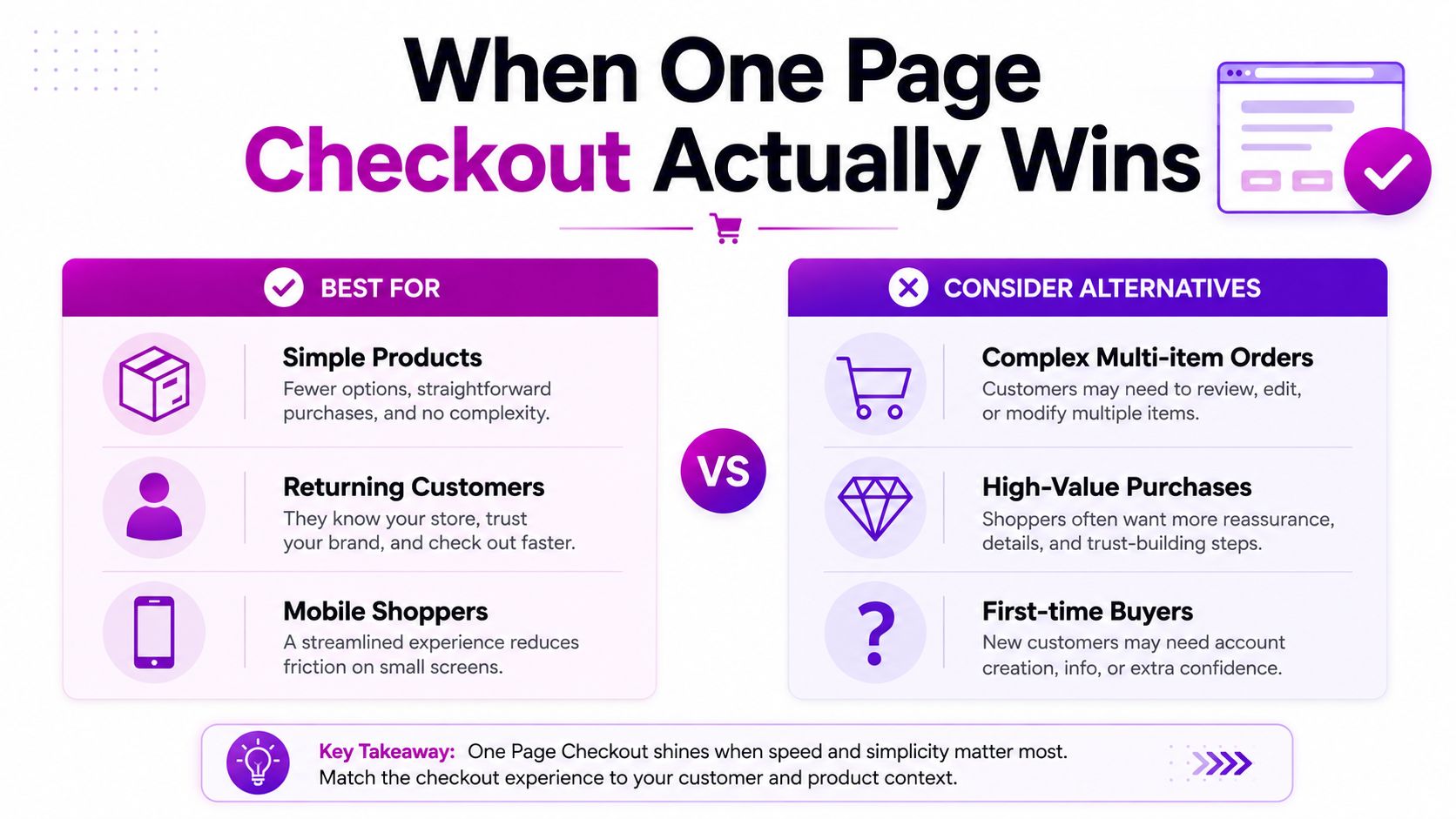
One Page Checkout is not a universal conversion upgrade. It earns its place when shoppers already understand the product, trust the store, and have few decisions left before payment. That usually means returning customers, straightforward catalogs, repeat purchases, and desktop sessions where the full form can stay visible without becoming difficult to scan.
A Shopify-focused review describes a store test in which checkout conversion rose from 54% to 57%. Industry summaries also commonly report lifts of 5% to 15% from one-page implementations, while average cart abandonment is placed around 70%. These figures explain the appeal of checkout simplification, but they do not establish that combining pages caused every improvement. The findings are summarized in Digismoothie's comparison of one-page and multi-page checkout.
Where the shorter flow helps
The strongest use cases share several traits:
- Returning customers: Saved details, existing trust, and familiarity reduce the need for reassurance during payment.
- Simple products: Few variants and limited shipping choices keep the page readable.
- Low-value or replenishment orders: Buyers who know the product often prefer speed to more explanation.
- Desktop traffic: A wider viewport can show the order summary, shipping choices, and payment form together.
- Strong existing trust: Extra checkout stages can feel like delay when shoppers already understand the store.
A controlled example used a 50/50 traffic split and stopped after 606 transactions once the directional signal was strong, as described in Edmonds Commerce's account of the experiment. Treat that result as evidence that a test can produce a clear decision, not as proof that every Shopify store should combine its checkout steps.
When multi-step can be the better experience
First-time buyers often need context before submitting payment. Separate stages can make each decision easier to process, show progress clearly, and create deliberate points for delivery commitments, returns information, or payment reassurance.
Mobile requires its own review. A layout that feels efficient on a desktop monitor can turn into a dense field sequence on a phone. High-value purchases, complex baskets, product customization, business orders, and multiple shipping scenarios may also benefit from progressive disclosure.
Independent coverage describes the same conditional pattern. One Page Checkout tends to suit returning customers, low-AOV baskets, and desktop traffic, while multi-step flows can better serve first-time buyers, mobile-heavy audiences, and higher-AOV orders, according to Growth Engines' checkout optimization analysis.
Practical rule: Choose the flow around customer intent and order complexity, not the number of screens.
The UX Principles Behind Effective Checkout Design
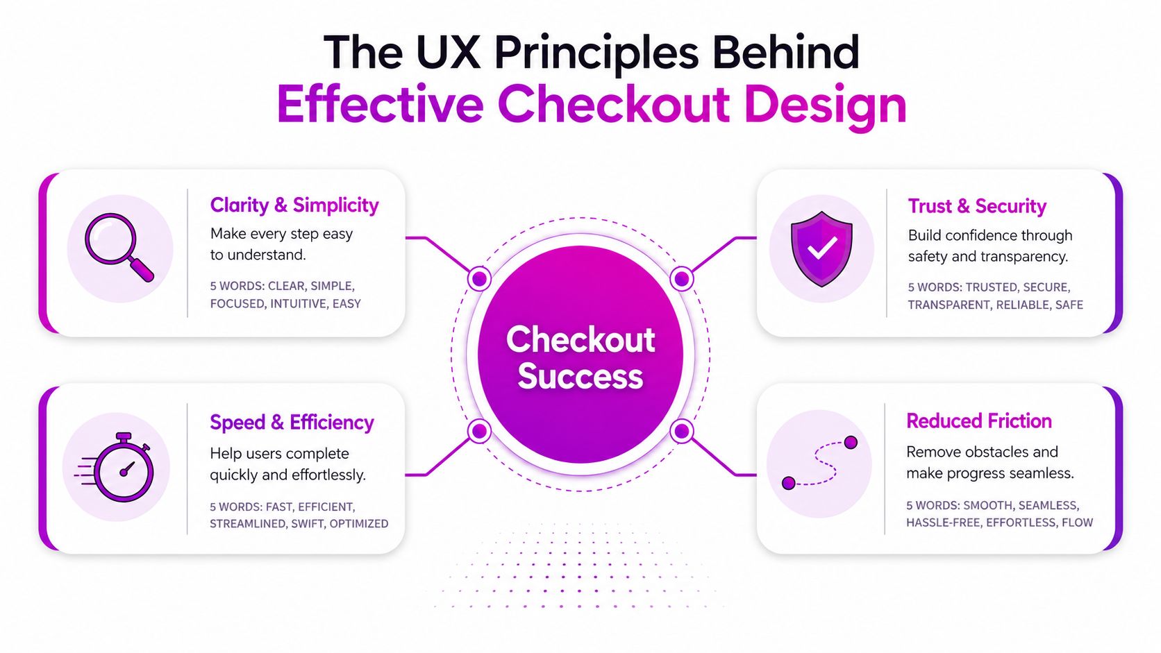
A shorter checkout is not automatically a better checkout. A multi-step flow with clear labels, sensible defaults, guest purchasing, and relevant payment options can outperform a crowded one page checkout. A one-page layout earns its place when it reduces effort and keeps decisions understandable, rather than presenting every field and choice in one intimidating block.
Reduce work, not merely pages
Begin with the form. Keep fields required for shipping calculations, payment processing, customer contact, and fulfillment. Add inline validation, specific error messages, suitable input types, and address autocomplete when the Shopify setup supports them.
Keep guest checkout easy to find. Account creation should not block payment. If an account gives the customer a useful benefit, offer it after order confirmation, when the purchase is complete and the value is clear.
The distinction matters because Baymard's usability analysis found that splitting identical fields across two pages can produce little or no change in abandonment. Tagada's discussion of one-page checkout usability relays the practical conclusion: field count, guest access, and interaction simplicity matter more than page count alone.
Make confidence visible
Checkout asks customers to commit money and share personal information. Display the order total clearly, explain shipping costs before payment, and make delivery and returns information easy to locate. Security badges and payment marks should match the business and its current configuration.
Express payment options can alter the path to purchase. Shop Pay, Apple Pay, Google Pay, and PayPal reduce manual entry for eligible customers, so place them where shoppers can see them without making the standard card route confusing or visually secondary.
For guidance on usability, clarity, trust, and conversion fundamentals, Rite NRG's UX growth guide adds context beyond checkout layout. The ecommerce checkout best-practices guide also works as a practical audit reference for Shopify teams.
Design for the actual device
Desktop layouts can use two columns to keep the form and order summary visible together. Mobile layouts need a different review. Collapse the summary intelligently, preserve readable spacing, keep touch controls comfortable, and test autofill across the browsers your customers use.
Order type matters as well. A low-complexity basket may suit a compact one-page flow, while customization, business purchasing, or multiple delivery scenarios can require progressive disclosure. That choice should follow the information customers need at each step.
A clear hierarchy should answer three questions immediately: which information is required, what the customer will pay, and what happens after submission. Reducing page count cannot compensate for answers that are hidden, ambiguous, or difficult to find.
Three Technical Paths on Shopify
A one-page layout is not automatically a better checkout. Shopify merchants usually choose among three technical paths based on basket complexity, device mix, required checkout logic, and the team's capacity to maintain custom work as Shopify changes its platform.
| Approach | Best For | Cost | Customization | Complexity |
|---|---|---|---|---|
| Native Shopify checkout | Stores that want dependable checkout with minimal maintenance | Included within the Shopify plan, with any separate app costs | Limited to supported settings, branding, payments, and extensions | Low |
| Checkout app or third-party flow | Merchants needing specific features without building everything internally | App subscription or usage fees may apply | Moderate, depending on the app's capabilities | Medium |
| Shopify Plus extensions | Brands requiring tailored checkout content, validation, or interaction patterns | Higher platform and development investment | Highest within Shopify's supported extension model | High |
Native checkout
Native checkout is the practical starting point for most stores. Shopify manages payment security, checkout infrastructure, supported payment methods, and platform compatibility. Your team can focus on removing unnecessary fields, improving copy, allowing guest purchase, and making shipping information easier to understand.
The trade-off is limited control. Standard plans do not let merchants freely rebuild every checkout behavior, and a preference for one long page does not justify unsupported workarounds. Native checkout often wins when the problem is unclear delivery information, weak trust signals, or awkward mobile form behavior.
A low-complexity basket with one delivery method may benefit from a compact flow. Custom products, business orders, subscriptions, or several delivery scenarios may need progressive disclosure instead. For these orders, forcing every decision onto one screen can increase cognitive load and make errors harder to correct.
Apps and simulated one-page experiences
A checkout app can provide address tools, upsells, custom content, or an alternative presentation without requiring an internal build. It also adds a subscription, scripts, a support relationship, and another possible conflict with payments or Shopify updates.
Assess the app in a staging workflow before launch. Test discounts, accelerated payments, subscription products, localization, tax display, analytics, failed payments, and accessibility. Check the mobile experience separately. A page that looks compact but makes validation errors or payment recovery harder is a poor trade.
Physical-goods stores also need accurate shipping assumptions. If checkout calculations depend on package dimensions or fulfillment rules, reliable packaging suppliers can support more consistent delivery calculations. The checkout must still explain shipping costs and timing clearly to the buyer.
Shopify Plus extensions
Shopify Plus gives teams more room for custom checkout content, validation, and interactions through supported Checkout Extensibility. Checkout UI extensions can place content in designated areas, while branding tools shape the visual system without requiring a fragile platform fork.
Legacy implementations may still involve checkout.liquid, but teams should treat that route carefully as Shopify directs merchants toward Checkout Extensibility. The engineering decision is whether the required behavior fits supported extension points and remains maintainable, not whether the page can be forced into a single screen.
Review this Shopify checkout extensibility overview when comparing Plus extension options with app-based approaches. The right path depends on the customer and order, not on the page count alone.
Implementing Your Chosen Approach
Start by documenting the current checkout before changing anything. Capture every field, payment method, shipping rule, discount behavior, validation message, and analytics event. A redesign that removes a field but breaks a shipping script or loses purchase attribution isn't an optimization.
Native Shopify implementation
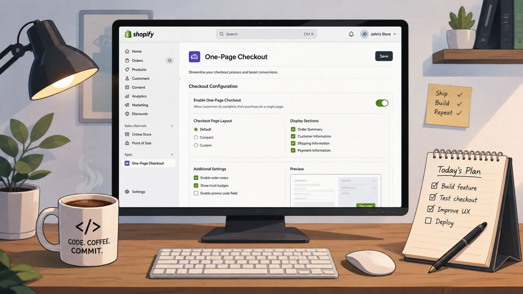
In the Shopify admin, begin with the checkout branding and customer information settings available to your plan. Review the following in order:
- Customer information: Keep guest checkout available and confirm that email, phone, and address requirements match fulfillment needs.
- Payment methods: Enable relevant accelerated options, then verify their buttons, eligibility rules, and fallback behavior.
- Shipping configuration: Make delivery methods, costs, and estimated timing understandable before the payment decision.
- Checkout branding: Use familiar typography, colors, logos, and policy links so the hosted checkout feels connected to the storefront.
- Analytics: Confirm that checkout initiation, payment selection, errors, and purchase events still reach your analytics stack.
Don't add decorative content just because the page has available space. Every extra message competes with the form and order total.
App-based implementation
Select an app only after writing a requirements list. Install it in a duplicate theme or controlled test environment, then run real scenarios, including a discounted order, an out-of-stock variant, an express payment, an address correction, and a failed card attempt.
Audit catalog data before you configure dynamic messages or upsells. Inconsistent product names, variant labels, and packaging attributes make checkout copy look unreliable. Guidance on naming consistency in catalogs can help teams establish cleaner product data before they build customer-facing logic around it.
Shopify Plus implementation
For Plus stores, define extension boundaries before design begins. Use Checkout UI Extensions for supported content and interactions, validate the buyer's context without blocking legitimate purchases, and keep business logic in maintainable services rather than embedding everything into presentation code.
A practical Plus workflow looks like this:
- Map extension points: Decide where delivery notes, trust content, loyalty information, or validation belongs.
- Protect core payment behavior: Never compromise payment completion for a cosmetic customization.
- Create fallback states: Handle missing data, unsupported payment methods, and extension failures gracefully.
- Test platform updates: Recheck extensions whenever Shopify changes checkout APIs or supported targets.
- Document ownership: Record who maintains each extension, integration, and analytics event.
For all three paths, test the checkout on real devices and with real payment scenarios in test mode. A page that works in a desktop browser can still fail when mobile autofill, keyboard behavior, or a third-party wallet enters the flow.
Testing and Measuring Real Impact
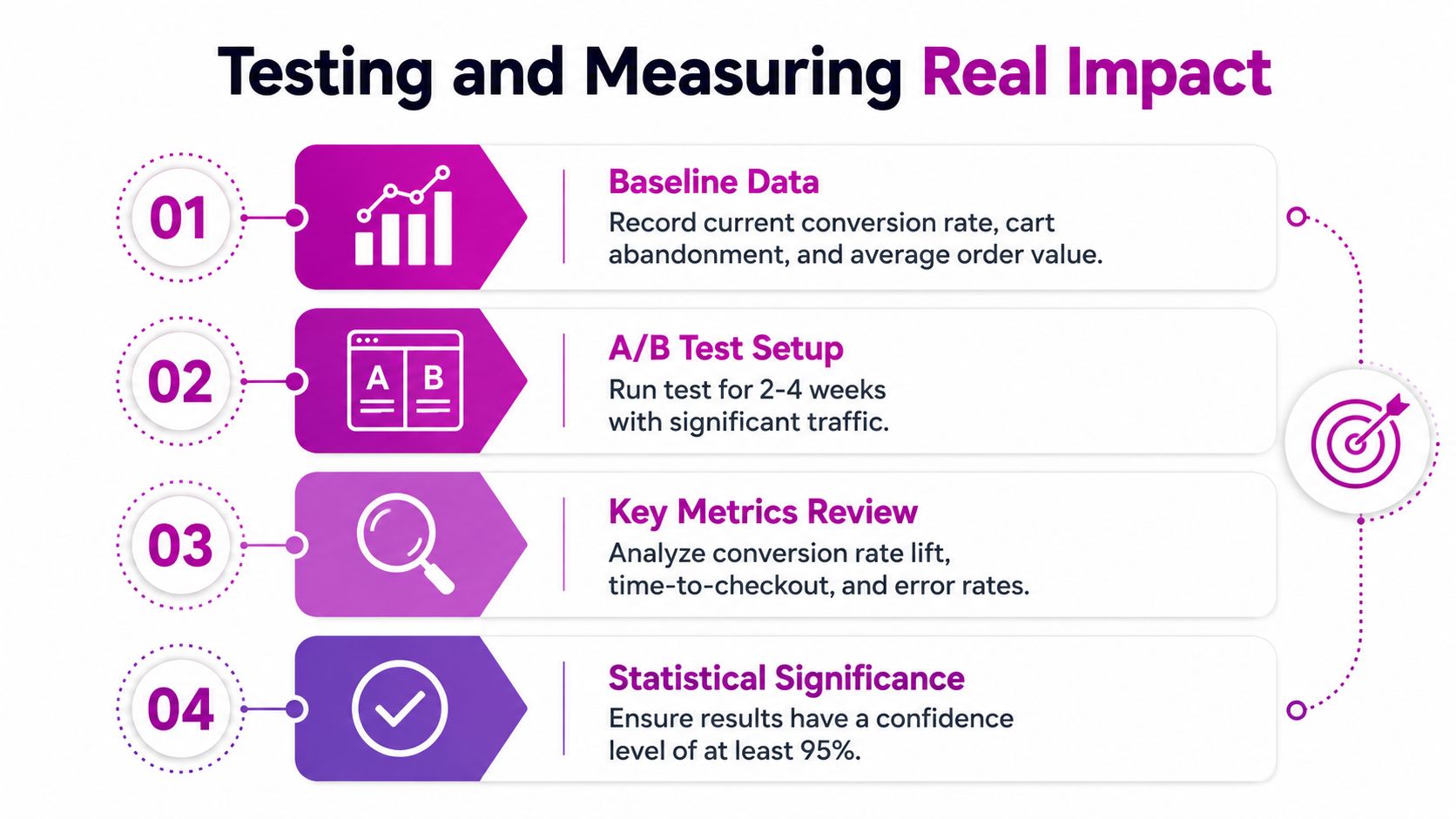
A checkout redesign needs a measurement plan before it needs a new layout. Record the current completion rate, abandonment behavior, average order value, payment-method mix, device type, customer status, and checkout errors. That baseline helps separate a genuine improvement from a result driven by a shift in traffic or customer mix.
Build a fair comparison
Run the control and variant at the same time when your testing tool supports it. A before-and-after comparison can confuse checkout changes with seasonality, promotions, stock availability, traffic quality, or payment outages.
A historical single-page test used a 50/50 split and stopped after 606 transactions once the result was clear, according to Edmonds Commerce's research summary. Use a pre-defined stopping rule rather than repeatedly checking the dashboard and ending the test when the result looks favorable.
Don't judge the layout by screenshots. Judge it by completed orders, revenue quality, and error behavior.
Segment the result
An overall result can conceal opposing outcomes. Break the analysis down by:
- Device: Compare desktop, tablet, and mobile behavior separately.
- Customer status: Separate new buyers from returning customers.
- Order complexity: Review single-item and multi-item baskets, including orders with special shipping requirements.
- Payment method: Compare card entry with Shop Pay, Apple Pay, Google Pay, PayPal, and other enabled options.
- Order value: Use value bands that reflect your own purchasing patterns.
Track completion rate, time to complete, validation errors, payment failures, revenue per checkout session, and average order value. A faster flow can still hurt the business if it lowers order quality or removes reassurance that helps a first-time buyer proceed.
Decide what to ship
Let the test cover ordinary traffic patterns, and avoid changing unrelated checkout elements during the comparison. If the result is mixed, retain the segment-level findings. One-page checkout may suit desktop returning customers, while a guided multi-step flow performs better for mobile shoppers or first-time buyers.
Maintenance belongs in the decision. A small conversion lift that requires constant custom intervention may be less valuable than a stable native checkout with better payment placement, clearer delivery messaging, and fewer fields.
The following video provides another visual reference for checkout testing and implementation:
Common Pitfalls and How to Avoid Them
A one-page checkout can reduce clicks while increasing work. On mobile, shipping details, delivery choices, optional fields, and payment content may form one long sequence. Shoppers must remember more context and make more decisions without clear separation. Fewer pages do not guarantee lower friction.
Keep the page focused on the order. Remove optional inputs, place the order summary in a clear collapsible area, and validate fields as shoppers complete them. Test on real phones, including smaller screens and different keyboard states. One page isn't automatically one task. A guided sequence can be easier when the purchase involves several decisions.
High-value orders create a different risk. Removing returns information, delivery commitments, contact details, or payment reassurance may make the layout look cleaner, yet leave first-time buyers uncertain at the payment step. For purchases that require explanation, use steps that answer real concerns. Extra ceremony adds friction, but useful information can remove hesitation.
Custom checkout code also increases operational work. Extensions, apps, analytics events, and shipping integrations require review when Shopify changes its APIs or when the store adds a payment method. If native checkout supports the required journey, improve field behavior, payment placement, and reassurance before building a custom one-page experience for appearance alone.
After any major app, payment, shipping, or catalog change, audit the complete flow. Test guest purchase, returning-customer autofill, discount codes, failed payments, mobile keyboard behavior, and confirmation emails. The right design is the one customers can complete confidently and the team can maintain reliably.
ECORN helps Shopify brands evaluate checkout friction, improve payment and form experiences, and plan Shopify Plus development or CRO work around customer segments. Visit ECORN to discuss a checkout audit, redesign, or implementation project for your store.



Shopify Website Design Examples: 7 Stores Worth Studying
7 Ecommerce Newsletter Examples for Shopify Brands
One Product Shopify Store: Build and Scale

Mobile Pop Up Strategy for Shopify Stores That Converts
Sitemap for Shopify: How to Find, Optimize, and Submit It

7 Single Product Websites Worth Emulating
Product Variants Shopify: The Complete 2026 Guide
Ecommerce Analytics Consulting for Growth
What Is AI Integration for eCommerce

How to Choose the Right eCommerce Website Development Firm
E Business Strategy Implementation
Conversion Tracking Setup for Shopify Stores
BigCommerce vs Shopify Plus Which Enterprise Wins in 2026
Shopify Theme Kit: Setup, Commands, and Migration Guide

Shopify Extension Development: A Practical 2026 Guide
Shopify Speed Score Explained and How to Improve It

Shopify Mobile Optimization: The 2026 Playbook

How to Add Subcategory in Shopify for Better UX
How to Implement Structured Data for Ecommerce in 2026

SEO App Mobile: Shopify Store Optimization Guide
Shopify Plus Support: What It Includes and How to Choose

Google Ads for Shopify: The Complete 2026 Playbook

Shopify New York: How to Find and Hire the Right Agency

Google Search Console for Shopify: The Complete Setup
First Party Data Collection for eCommerce Growth
FAQ Online Store Guide: Build and Measure It Right
Do FB Ads Work for eCommerce in 2026?

Shopify GraphQL vs REST: The 2026 Developer Decision
Shopify Ecommerce Consulting: Strategy, Pricing &

Are Reddit Ads Worth It for eCommerce Brands
Shopify Title and Meta Description: A Practical 2026 Guide

Product Video Best Practices for Shopify Brands

Real-Time Inventory Management: A 2026 Guide

AI Chatbot Integration for Shopify Stores
Affiliate Program Management: A Shopify Guide
10 Best Performance Monitoring Tools for Shopify in 2026

Digital Asset Management for eCommerce Brands in 2026

Every Type of Facebook Ads Explained for eCommerce Growth
Product Information Management Explained for Shopify Brands
Support Ticket System: A Guide for Shopify Stores

10 Best Customer Service Tools for Shopify in 2026

Can I Start a Business with No Money? a 2026 Blueprint

What Sells Good on Etsy: Best Niches for 2026

Shopify Add to Cart Button: A Practical 2026 Guide

Customer Feedback Automation: A Practical eCommerce Guide
Critical Rendering Path: A Guide for Shopify Stores

How to Promote on TikTok for eCommerce in 2026

B2B eCommerce Consulting That Drives Real Revenue

10 Best Practices for Site Navigation in 2026
Return vs Refund for Shopify Stores: A Practical Guide

What Is Customer Lifetime Value and Why It Matters
What Is Voice of Customer Research for eCommerce

SMS Marketing for Ecommerce That Actually Converts

Master How to Improve Email Deliverability in 2026

Top 7 eCommerce Partners NYC for Shopify Brands in 2026

Machine Learning for Ecommerce: Boost Your Shopify Store

Beauty Market Research: Your 2026 Growth Guide

Shopify International Expansion: A 2026 Roadmap

What Does CRO Stand for in Business: Understanding CRO

Shopify Visual Merchandising: A Playbook for Higher Sales

Shopify Landing Page Design: Master Conversion in 2026

10 Best AI SEO Optimization Tools for Shopify in 2026

Agentic AI for Ecommerce: Boost Your Sales in 2026
Mastering Email Marketing Data for eCommerce Growth

Conversion Rate Optimisation Australia: Boost Your Sales
Conversion Rate Optimization AI: Your Shopify Store Guide

10 Product Bundling Strategies for Shopify in 2026

How to Increase Customer Lifetime Value: A Shopify Playbook

AI Customer Service Automation: Shopify Guide 2026

Clean Website Design: A Shopify Conversion Playbook

Omnichannel Retail Strategy: A Shopify Playbook

Product Data Enrichment: A Guide for Shopify Brands

Instagram Shopping Features a Guide for Shopify Stores

What Is Revenue Optimization: A Holistic RevOps Guide

Benefits of Conversion Rate Optimization: Boost Your
WordPress to Shopify Migration: Your 2026 Seamless Switch
Boost Sales: Ecommerce Payment Processing Guide 2026
Unified Commerce Platform: Benefits, KPIs & Shopify Guide
How to Reduce Bounce Rate eCommerce: Your 2026 Guide
Shopify API Integration: A Practical End-to-End Guide

How to Implement Data Governance: A 2026 Guide

Shopify Store Development Cost: A 2026 Breakdown
What Is Server Side Tracking: The Shopify Guide 2026
Marketing Automation Workflows: A Shopify Guide for 2026
Shopify: How to Reduce Technical Debt

Shopify UX Design Change: A Playbook for Growth

User Generated Content Strategy: Shopify Playbook

Shopify Pause and Build Plan Cost: A Complete 2026 Guide
Compare at Price on Shopify: A Complete Guide for 2026

Where Can I Sell My Prints? 10 Best Platforms for 2026
Shopify Order Management System: The Ultimate Guide 2026
What Is Marketing Attribution? an eCommerce Guide for 2026

10 Best Black Friday Sales Sheets for 2026

Discover the Top Social Media Marketing Agencies For
Consumer Confidence Definition for eCommerce in 2026

What Is Social Commerce? Your 2026 Guide to Boosting Sales

A Social Ad Campaign Playbook for eCommerce Growth

7 Best FAQ Page Examples for SaaS & eCommerce

Market Research in Fashion Industry: A Guide for Shopify
Shopify Migration Services: Expert Guide for 2026


newsletter in your inbox