
You're probably looking at a dashboard that says traffic is healthy, ad spend is live, and conversion rate still isn't where it should be. Then you check bounce rate and see the underlying issue. People are landing, taking one look, and leaving.
That's why how to reduce bounce rate in ecommerce isn't a reporting question. It's a revenue question. If the wrong visitor lands on the wrong page, or the right visitor lands on a slow, confusing one, you've already paid for a session that had almost no chance of turning into a sale.
Why Your Store's Bounce Rate Is Costing You Sales
A high bounce rate is easy to dismiss as “just engagement.” That's a mistake. In ecommerce, a bounce often means wasted acquisition spend, a weak first impression, and a customer who never got far enough to see why your product is worth buying.
Recent benchmark data puts the average ecommerce bounce rate between 38% and 47%, with top performers under 30% according to OpenSend's ecommerce bounce rate analysis. That means a large share of store visits end before the shopper does anything useful.
What bounce rate actually tells you
Bounce rate usually points to one of three problems:
- Expectation mismatch: The visitor expected one thing and landed on something else.
- Friction at first glance: The page loads slowly, looks untrustworthy, or feels hard to use.
- Weak next step: The page doesn't make it obvious where to click, what to read, or why to stay.
Store owners often focus on the number itself. That's backwards. Bounce rate is the symptom. The diagnosis sits underneath it.
A bounce is often your clearest signal that the promise made before the click doesn't match the experience after it.
If you're paying for Meta, Google, TikTok, affiliates, or influencers, every low-quality landing experience gets amplified. You don't just lose one shopper. You multiply waste across every click you buy.
Why this matters more on Shopify stores
Shopify makes it easy to launch. It also makes it easy to accumulate friction. I see the same pattern all the time: too many apps, too many scripts, a theme that looked good in a demo, and product pages built around brand language instead of buyer clarity.
Common examples include:
- Homepage traffic sent to generic category pages
- Product pages with nice visuals but weak purchase cues
- Mobile navigation that hides important categories too much
- Pop-ups firing before a shopper even understands the offer
None of that shows up as a dramatic technical failure. It shows up as people leaving.
The real cost is not the bounce itself
The cost is everything that bounce represents:
| What happened | Business impact |
|---|---|
| Paid visitor leaves instantly | Marketing spend is wasted |
| First-time shopper exits | Trust never gets established |
| Product page gets one glance | Merchandising work goes unseen |
| Mobile user abandons early | Conversion opportunity disappears before intent builds |
If your store has a bounce problem, don't ask “How do I lower this metric?” Ask, “Why did this person decide this page wasn't worth another click?”
That question leads to better fixes.
Find Your Leakiest Buckets with Analytics
A high bounce rate rarely means your whole store is broken. It usually means a few pages, traffic sources, or device segments are doing most of the damage.
That is why the first job is diagnosis, not redesign. Store owners waste time rebuilding pages that are already doing their job, while underlying leaks sit in one paid landing page, one mobile template, or one campaign that promised something the page never delivers.
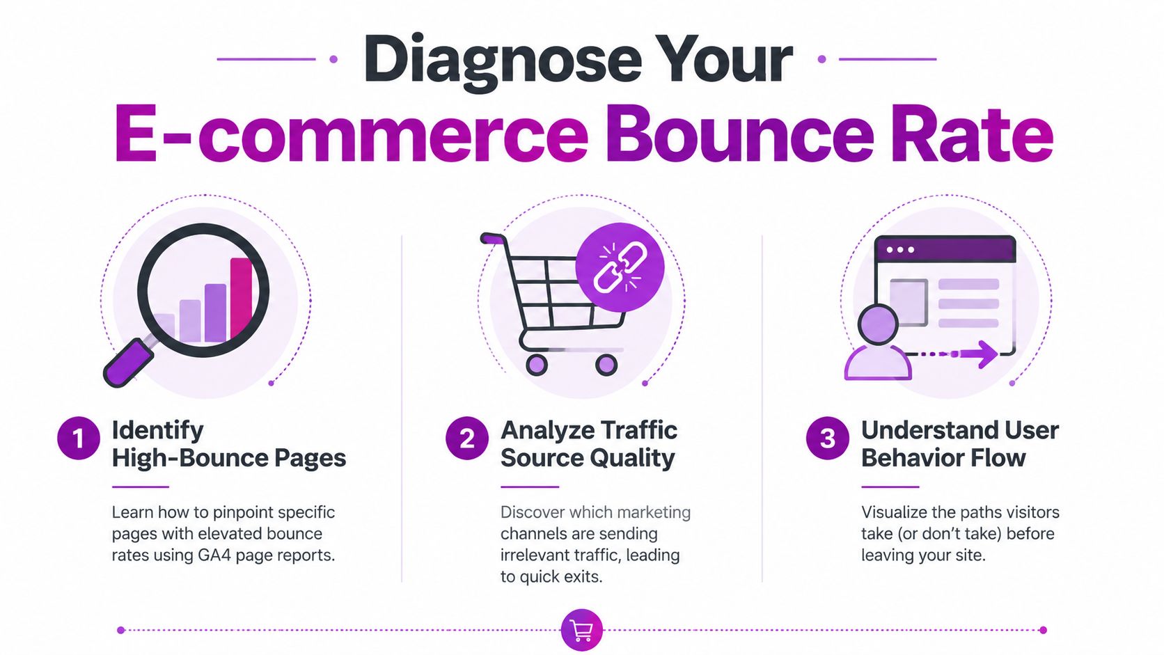
Start with landing pages, not storewide averages
In GA4, look at landing pages first, then layer in acquisition data. A storewide bounce or engagement average is too blunt to help you decide what to fix.
I usually sort pages by two things:
- Traffic volume
- Weak engagement after landing
That combination gives you a practical priority list. A low-traffic blog page can wait. A collection page getting paid traffic and producing almost no product clicks cannot.
For ecommerce teams, the most useful questions are simple:
- Which landing pages get meaningful traffic but fail to earn a second click?
- Which paid pages attract visits but not product views, add-to-carts, or deeper browsing?
- Which product or collection pages underperform relative to similar pages?
- Which pages look acceptable in aggregate but collapse on mobile or under one channel?
On Shopify, this often exposes a familiar pattern. Branded traffic lands on pages that perform fine. Paid social traffic lands on campaign pages or PDPs with weaker message match, vague headlines, and no clear next step.
Segment by device, channel, and campaign
Bounce problems become easier to fix once you stop treating all traffic as one audience.
Break performance down by:
Device category
Mobile sessions usually reveal friction first. Hidden navigation, stacked app widgets, long product pages, and awkward thumb reach show up here fast.Source and medium
Email traffic, branded search, Google Shopping, Meta prospecting, and influencer traffic arrive with different intent. They should not be judged against one blended average.Campaign, ad set, or creative angle
If one campaign sends traffic that exits fast, the issue may start before the click. Weak audience targeting or ad-to-page mismatch can sink engagement before on-site UX has a chance.Page type
Homepages, collection pages, PDPs, quiz funnels, and campaign landers each have a different job. Compare like with like.
This is the part many guides miss. Bounce rate is not only an on-site problem. If your Meta ad promises a problem-specific solution and sends traffic to a generic collection page, analytics will show a page issue, but the correct fix is shared between media buying and landing page strategy.
Review what happens after the landing
Landing page analysis gets sharper when you check the next step. The question is not only who bounced. The question is who moved forward in a meaningful way.
Look at path exploration, landing page reports, and downstream events. For a fuller workflow, this guide to conversion funnel analysis for ecommerce teams helps turn report screenshots into a ranked action plan.
Use a simple review table like this:
| Segment | What to inspect | Likely issue |
|---|---|---|
| Mobile paid social | Short sessions, weak scroll depth, few product views | Message mismatch, cluttered landing page, weak mobile hierarchy |
| Branded search | Strong engagement on some pages, weak on others | Inconsistent page quality or merchandising |
| Collection pages | Visits without filter use or product clicks | Poor category fit, weak product sorting, unclear next action |
| Product pages | Exits before cart activity | Missing trust signals, weak offer framing, poor CTA placement |
If a page does not create a clear second action, define the page's job again. A collection page should drive product discovery. A PDP should build confidence and move the shopper toward cart. A campaign page should continue the promise made in the ad, not restart the conversation from scratch.
Build a short hit list your team can act on
The output from this review should fit on one page. If it turns into a giant dashboard, it will not get used.
Use three buckets:
- Fix now: High-traffic pages or campaigns with clear engagement problems
- Investigate next: Segments where the issue may sit between traffic quality and page experience
- Monitor only: Low-volume pages, seasonal templates, or pages without enough data yet
For Shopify merchants, I like to pair each issue with an owner. Media buyer for targeting or creative mismatch. CRO or design for landing page clarity. Developer for tracking gaps or template friction. If nobody owns the leak, it stays in the report.
One more point. Clean analytics matter here. If your store is slow because of script bloat, reports can get messy fast, especially on mobile-heavy traffic. This guide from UpTime Web Hosting for site optimization is useful if you need to reduce technical noise before trusting the numbers.
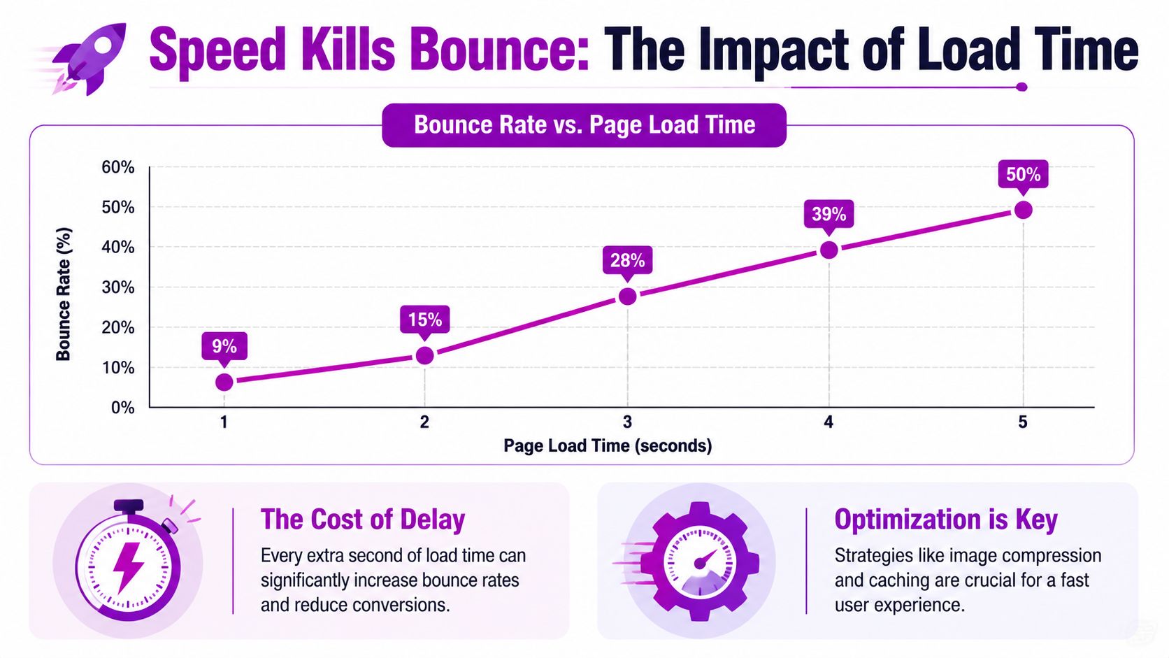
Slash Load Times and Stop Losing Impatient Shoppers
Speed is usually the first hard filter shoppers apply to your store. They don't think “this page has poor technical performance.” They think “this feels slow” and leave.
The most important benchmark here is clear. Page load time should stay under 2.5 seconds, because 53% of mobile users abandon sites that take longer than that, and delaying non-essential JavaScript, implementing lazy loading, and using CDNs can reduce bounce rates by up to 30% according to Speedsize's ecommerce bounce rate guide.
What usually slows Shopify stores down
On Shopify, performance problems are rarely one big issue. They're usually several medium-sized issues stacked together.
The common offenders:
- Heavy theme code from feature-rich themes that load too much on every page
- App bloat from scripts added by reviews, upsells, chat, subscriptions, tracking, and pop-ups
- Oversized images that look fine in the CMS but are much heavier than needed
- Third-party scripts that compete for priority before core content appears
If your hero image, header, announcement bar, review widget, chat app, and pop-up tool all want attention at once, the shopper loses.
Here's a useful walkthrough for merchants who need a practical starting point on how to improve page load speed on Shopify.
What to fix first
Don't try to optimise everything at once. Work top-down from biggest user impact.
Run PageSpeed Insights
Use it to identify bottlenecks. You're looking for render-blocking scripts, image opportunities, and heavy unused code.Delay non-essential JavaScript
Live chat, social widgets, and some marketing apps don't need to load before the product title, image, and add-to-cart area.Implement lazy loading carefully
It helps with below-the-fold assets. It should not delay core above-the-fold content that users need immediately.Audit apps quarterly
If an app isn't driving a clear commercial outcome, remove it. “Might be useful later” is a bad reason to keep code on a live storefront.Use a CDN and reliable hosting setup
Infrastructure matters, especially for stores serving multiple regions. If you need a practical reference on server-side considerations and delivery performance, UpTime Web Hosting for site optimization gives a useful overview.
A lot of merchants also benefit from reviewing whether their current theme is helping or hurting. A visually polished theme can still be a conversion liability if it loads too much before the shopper sees useful content.
Before you make changes, this video gives a good high-level view of where speed problems usually come from:
What not to do
Some fixes lower scores on paper but don't improve the visit. Others make UX worse.
Avoid these mistakes:
- Lazy-loading everything, including critical above-the-fold imagery
- Installing another app to fix the slowdown caused by existing apps
- Using intrusive pop-ups immediately on landing
- Keeping old tracking scripts after agency, app, or campaign changes
Faster storefronts don't just feel better. They preserve intent long enough for shoppers to actually evaluate the offer.
If your bounce rate is high and your pages are slow, speed work isn't optional. It's the price of entry.
Refine Your UX to Make Visitors Want to Stay
Once the page loads quickly, the next question is blunt. Does the page make buying feel easy, safe, and obvious?
Many stores lose visitors because the interface asks for too much work. Navigation is cramped. Product pages bury key details. The primary action doesn't stand out. On mobile, tiny tap targets and overlapping elements make simple browsing irritating.
Fix navigation before you touch aesthetics
Good UX in ecommerce starts with orientation. Shoppers need to know where they are, what you sell, and where to go next.
According to Ultrafade's ecommerce engagement benchmarks, implementing mega menus where all categories are visible immediately and adding white space around tappable elements can improve mobile navigation success by 40% and reduce mobile bounce rates by 22%. The same source notes that 84% of users abort transactions on sites without visible security indicators like trust badges.
That lines up with what works in practice. Stores that reduce mental load at the top of the session usually keep more shoppers around long enough to evaluate products.
A simple comparison:
| Weak UX choice | Better UX choice |
|---|---|
| Hidden categories in layered menus | Visible category structure with clear labels |
| Tight clusters of buttons and links | Space around tap targets on mobile |
| Brand-first naming | Customer-first naming |
| Security cues buried in footer | Trust signals near buying moments |
Product pages need to answer questions fast
A product page shouldn't read like a brochure. It should remove doubt in the order a shopper feels it.
That usually means:
- Clear product title and variant logic
- Strong image hierarchy
- Visible reviews or proof points
- Easy-to-find add-to-cart button
- Shipping, returns, and payment clarity
- Trust signals near the CTA
If a visitor has to hunt for sizing, delivery expectations, or reviews, many won't bother. They'll leave and compare elsewhere.
If the shopper's first screen creates uncertainty, bounce rate rises even when the product itself is strong.
Mobile UX is where many stores quietly fail
A desktop review isn't enough. Most stores that struggle with bounce rate have a more severe version of the problem on mobile.
Check your mobile experience for:
- Stacked pop-ups that interrupt browsing
- Sticky elements that hide product content
- Filters that are hard to open or close
- Buttons placed too close together
- Typography that looks elegant but reads poorly on a phone
On Shopify, this often comes down to theme settings and app interactions, not a full rebuild. A cleaner header, a more disciplined PDP layout, and fewer overlays can change the feel of the session quickly.
Trust has to be visible, not implied
Merchants often assume brand polish equals trust. It doesn't. Shoppers look for concrete reassurance.
Use cues such as:
- Secure checkout indicators
- Recognisable payment methods
- Review summaries
- Straightforward policy access
- Professional, consistent layout with no broken visual elements
You don't need to flood the page with badges. You do need to place reassurance where hesitation happens.
Good UX lowers bounce rate because it reduces decision fatigue. The visitor doesn't need to figure the store out. They can just shop.
Fix Your Traffic Quality and Attract Eager Buyers
A lot of bounce rate advice starts after the click. That misses one of the biggest causes of the problem.
If your campaigns attract the wrong people, even an excellent landing page will struggle. Bounce rate often begins in targeting, offer framing, and creative strategy, not just onsite UX.
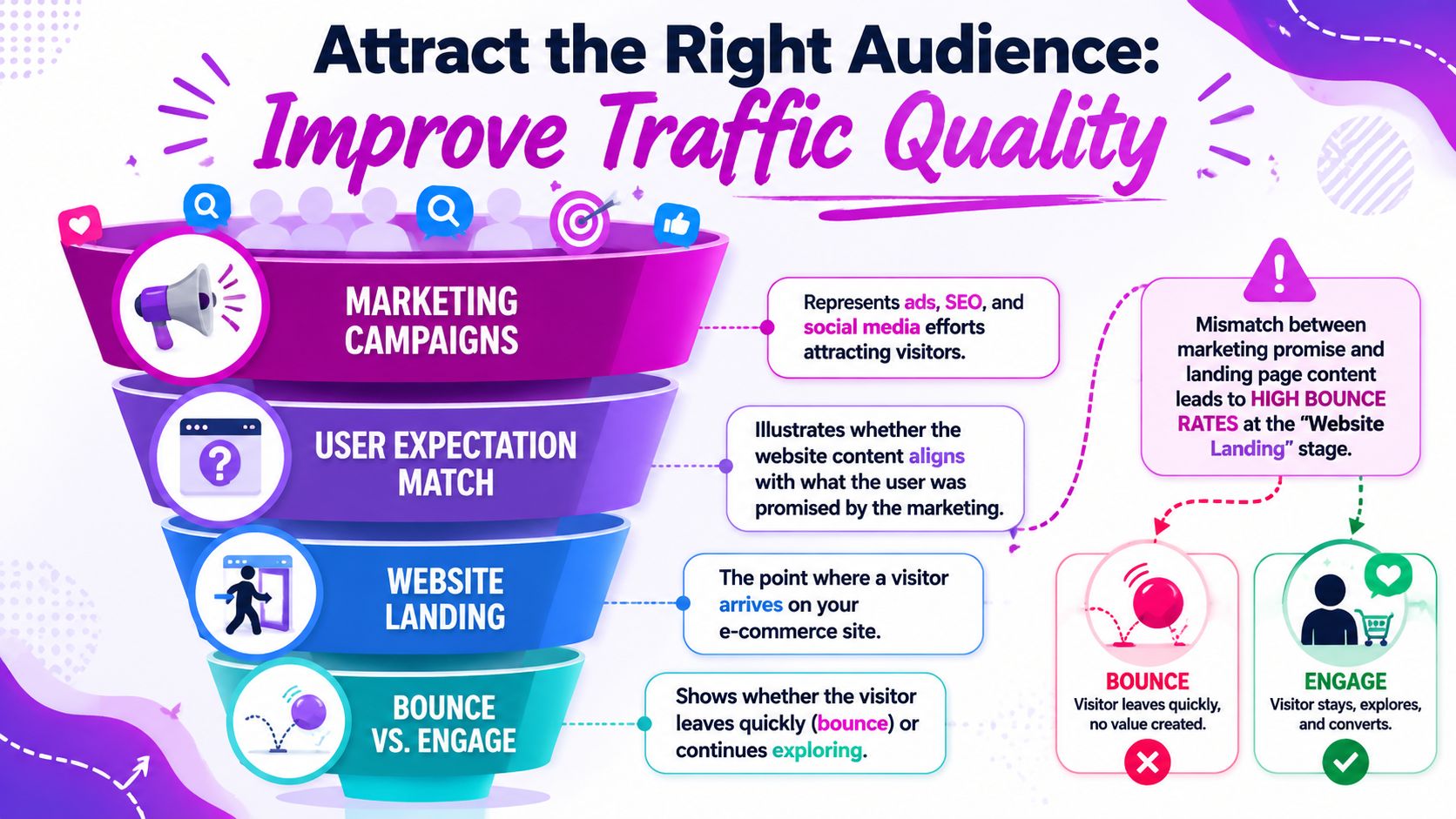
Traffic-fit mismatch is a real bounce driver
This is the part many teams underweight. According to Crazy Egg's analysis of bounce reduction, 30% to 50% of bounces stem from ads targeting low-fit audiences, and refining exclusion criteria in ad platforms can reduce bounce rates by up to 40% without on-site changes.
That changes the conversation. A high bounce rate doesn't always mean your page is weak. It can mean your acquisition is undisciplined.
Examples of mismatch include:
- Discount-led ads sending people to full-price product pages
- Specific product creatives linked to generic collections
- Broad targeting that attracts curiosity clicks instead of buying intent
- UGC-style ads that promise one use case while the landing page leads with another
Tighten the promise before the click
When I audit campaigns with high bounce rates, I usually check three things first:
Audience exclusions
Remove low-fit segments where possible. Broad reach can look efficient until you inspect what happens after the click.Creative-to-page alignment
If the ad sells a specific hero product, the landing page should open with that product or a tightly related offer.Offer clarity
Don't imply a deal, benefit, or product angle that the page doesn't immediately confirm.
Creative workflow is important. If your paid team is producing a lot of variants, tools like ShortGenius AI ad creative tool can help generate and test message angles faster. The key is not volume for its own sake. It's finding which messages attract visitors who fit the landing experience.
Better traffic quality can lower bounce rate before a designer or developer changes a single page element.
Read campaign performance the right way
Don't judge channels only by click volume or cheap sessions. Judge them by engagement quality after landing.
Review channel performance against questions like these:
| Channel or campaign issue | What it usually means |
|---|---|
| High clicks, weak on-site engagement | Message or audience mismatch |
| Strong CTR, weak product interaction | Curiosity traffic, not buying intent |
| Good engagement from one ad set only | One audience or promise is properly aligned |
| Repeat bounce on promo traffic | Offer framing is attracting the wrong visitor |
For Shopify merchants, this often means building cleaner destination paths. A campaign for bundles should land on a bundle page. A campaign built around one product benefit should lead with that benefit above the fold.
Don't blame the page for every bounce
Sometimes the page is doing its job. It's the campaign that isn't.
That's why serious work on how to reduce bounce rate in ecommerce has to connect media buying, merchandising, and landing page strategy. Otherwise you keep polishing pages while low-fit traffic keeps pouring in.
Measure Your Impact and Build a Continuous CRO Loop
Bounce rate work isn't finished when the number drops. The question remains whether the drop came from better traffic, better UX, better performance, or a change that accidentally reduced useful exploration elsewhere.
That's why strong teams treat bounce reduction as part of a broader CRO loop. Diagnose. Change one meaningful variable. Measure. Keep what improves the session quality and the business outcome.
What to measure alongside bounce rate
Bounce rate on its own can mislead. Pair it with other behavior and business signals in GA4 and Shopify reporting.
Track combinations like:
- Engagement rate with landing page performance
- Add-to-cart behaviour after key page changes
- Conversion trends by device and channel
- Landing page performance after campaign updates
If you change a page and bounce rate falls, but product discovery also falls, that fix may not be a win. The same applies to traffic changes. Lower bounce from narrower targeting is good only if the remaining traffic still scales profitably.
Build a simple operating rhythm
This doesn't need to become a research project. A practical review cadence works better than occasional deep dives.
A clean operating loop looks like this:
Identify one priority leak
Example: a mobile PDP with weak engagement from paid social.Form one clear hypothesis
Example: the page loads acceptably now, but trust and CTA visibility are weak.Ship one focused change set
Update image order, trust placement, CTA hierarchy, or message match.Review the result with context
Look at bounce rate, engagement, and conversion together.Document what happened
Keep a changelog. Stores often forget which edits moved behavior.
For content-led traffic and landing page messaging, this kind of discipline also applies to developing data-driven content. Strong content strategy reduces mismatch because it starts from real audience needs instead of assumptions.
A practical checklist for store teams
Use this as your working shortlist:
- Audit landing pages: Find the pages with the highest business impact and weakest engagement.
- Check mobile first: Review navigation, tap targets, overlays, and page clarity on a real phone.
- Trim scripts: Remove or delay apps and third-party code that don't support the first screen.
- Sharpen PDPs: Make reviews, trust signals, shipping clarity, and add-to-cart easy to find.
- Fix campaign alignment: Match ad promise, audience, and landing page precisely.
- Test continuously: Change one meaningful thing, measure it, then decide.
One toolset some merchants use for this kind of workflow is ECORN's mix of Shopify design, development, and CRO support, especially when stores need implementation help across analytics, UX, and testing rather than strategy alone.
Lower bounce rate is useful. Lower bounce rate from the right visitors, on the right pages, with stronger conversion performance, is what matters.
If you want a second set of eyes on why shoppers are dropping off, ECORN helps Shopify brands diagnose bounce rate issues across speed, UX, landing pages, and CRO implementation. It's a practical fit for teams that need changes shipped, not just problems identified.


Shopify API Integration: A Practical End-to-End Guide

How to Implement Data Governance: A 2026 Guide

Shopify Store Development Cost: A 2026 Breakdown
What Is Server Side Tracking: The Shopify Guide 2026

Marketing Automation Workflows: A Shopify Guide for 2026

Shopify: How to Reduce Technical Debt

Shopify UX Design Change: A Playbook for Growth

User Generated Content Strategy: Shopify Playbook

Shopify Pause and Build Plan Cost: A Complete 2026 Guide

Compare at Price on Shopify: A Complete Guide for 2026

Where Can I Sell My Prints? 10 Best Platforms for 2026

Shopify Order Management System: The Ultimate Guide 2026

What Is Marketing Attribution? an eCommerce Guide for 2026

10 Best Black Friday Sales Sheets for 2026

Discover the Top Social Media Marketing Agencies For

Consumer Confidence Definition for eCommerce in 2026

What Is Social Commerce? Your 2026 Guide to Boosting Sales

A Social Ad Campaign Playbook for eCommerce Growth

7 Best FAQ Page Examples for SaaS & eCommerce

Market Research in Fashion Industry: A Guide for Shopify

Shopify Migration Services: Expert Guide for 2026

Mastering FB Retargeting Ads for Shopify in 2026

What Is Omnichannel Ecommerce

Master Your Shopify Plus Migration: The 2026 Guide

Shopify Integration Services: A Merchant's 2026 Guide

Shopify Collection Description: A Guide to SEO & Sales

Shopify Plus Contact: Reach Sales & Support Effectively

Top Luxury Shopify Stores: Design & UX Strategies

How to Improve Customer Experience: A Shopify Roadmap

Creative Facebook Ads: 10 Examples for Shopify Brands

Remarketing with Facebook Ads: A Shopify Guide for 2026

SEO Linking Strategies for Shopify Stores

Top 7 Statistics YouTube Channels for eCommerce in 2026

Hiring Shopify Plus Designers: A Founder's Guide

Shopify Product Variation: Master Your Variants for 2026

Leverage Ai Solutions Brands: Your 2026 Shopify Growth Guide

Filters in Shopify: A Guide for Growing Brands

Shopify Plus Developer: A Guide for Growing Brands

When Does Black Friday Online Start? A 2026 Guide

Black Friday Email Marketing: Shopify & Klaviyo Guide

Polaris Design System: The Complete Shopify Guide

How to Hire a Consultant Email Marketing Expert

What Is Q4? A Shopify Merchant's Guide to Peak Season

Marketing Organization Structure for eCommerce Growth

Top Account-Based Marketing Agency Guide for 2026

7 Remarketing Ad Examples for Your 2026 Campaigns

AI Retail Solutions: Boost Your Shopify Store

Migrate to Shopify: The Definitive 2026 Guide

Shopify Authentication App: A Guide for Secure Stores

Why Strategic Marketing Is Important for Growth in 2026

How to Create a Size Chart in Shopify: 2026 Guide

Shopify Themes for Jewelry: The Definitive 2026 Guide

Minimal Shopify Templates: Faster, Higher-Converting Stores

Maximize Profit: Shopify CC Fees 2026 Guide

Best Shopify Apps for Beginners in 2026

How to Improve Online Shopping Experience in 2026

Shopify Design and Development Services: A 2026 Guide

Small Business Social Media Marketing Agency: A Hiring Guide

Bulk Edit Shopify: A Guide to Save Hours on Store Updates

2026 Trends in Food and Beverage Industry

Post Purchase Survey Guide for Shopify Stores

How to Build an Ecommerce Brand in 2026

Conversion Rate Optimization for Ecommerce: Maximize Profit

How to Use Customer Data to Increase Sales: A Guide

Shopify for Enterprise: The 2026 Deep Dive Guide

Email Marketing Agencies: The Guide for Shopify Brands

Boost Sales With The Right Shipping Shopify App

Your Guide to the Shopify Site Map

7 Headless Commerce Examples for 2026

Mastering Trends in Cosmetic Industry for 2026

Transfer Shopify to BigCommerce The Complete 2026 Playbook

What Is Shopify Collective? Your 2026 Guide to Success

Unlock Shopify Growth with Site Link SEO

Integrating Shopify and WordPress A Complete Guide for 2026

Naming a Clothing Store: A Shopify Founder's Playbook

Guide to buying shopify store in 2026

Buying shopify store: Buying a Shopify Store: Invest Wisely

Food & Beverage Marketing: A Complete Guide for 2026

Facebook Ads Agency: A Shopify Brand's Hiring Guide

Shopify Apparel Stores: A 2026 Launch & Scale Guide

How to Deactivate Shopify Store: The 2026 Guide

Shopify and Square: The 2026 Ultimate Comparison

Your Guide to Beauty Products Ecommerce

A Guide to Marketing for Beauty Brands in 2026

Your Guide to Facebook Black Friday Ads

Facebook Ad Ecommerce for Shopify Growth

Iconography Web Design The Definitive Guide for Shopify Stores

A Modern Backlinks SEO Strategy for Shopify Stores

How to Launch an Online Store: A Step-by-Step Success Guide

Optimize Shopify Store: Master Performance in 2026

Successful Migration for Shopify: Protect SEO & Grow

Maximize Traffic & Sales: Get Your Free Website Audit Report

Master the Best Ads Facebook Formats for eCommerce Success

How to Find the Best Ecommerce Agency Near Me in 2026

10 Crucial White Hat Techniques SEO for Shopify in 2026

How to Reduce Returns and Boost Profits in Your eCommerce Store

What Is Ecommerce Personalization A Guide to Unlocking Growth

Payment gateways in shopify: The Ultimate Guide for Merchants 2026
Fulfillment services for shopify: Scale Your Ecommerce Brand
Shopify Landing Page Examples: 7 Winning Templates to Boost Conversions


newsletter in your inbox