


Product video works because it collapses hesitation. Shopify reports that 71% of people say videos between 30 seconds and two minutes are the most effective length, while Wistia's 2026 report says social engagement has become the fastest-rising video success metric, ranking as the top metric for almost a quarter of marketers (Shopify video marketing statistics). That's a strong signal that the job isn't to tell the whole brand story, it's to get to the point fast and make the buying decision feel safe.
The mistake most Shopify teams make is treating video like a creative asset first and a merchandising asset second. The best product video best practices are really about friction control, showing the product quickly, showing it in use, and answering the exact objection that stops a shopper from adding to cart. If the first few seconds don't earn attention, the rest of the edit rarely gets a fair shot.
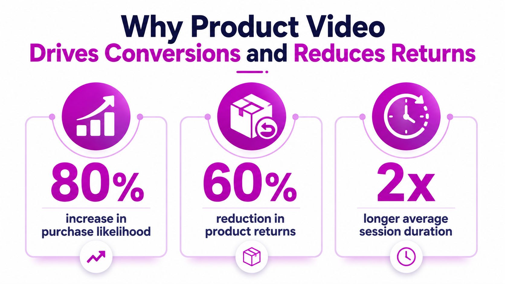
Why Product Video Drives Conversions and Reduces Returns
Product video matters because it reduces uncertainty at the exact point where shoppers hesitate. In ecommerce, hesitation is usually about fit, scale, finish, setup, or whether the item will work the way the page suggests. A video answers those questions faster than still images, because it shows motion, context, and real-world use instead of leaving the buyer to infer the rest.
That is why product video often improves both conversion and post-purchase satisfaction. Shoppers are less likely to add an item to cart when they cannot picture how it looks in use, and they are more likely to send it back when expectations were shaped by photos that were too clean, too tight, or too idealized. Video narrows that gap by showing the product the way it will arrive and perform.
Conversion happens when uncertainty drops
A strong product video does one job well, it helps the shopper understand the product quickly enough to move forward. On a Shopify product page, that usually means showing the product in use, clarifying the outcome, and answering the objection that would otherwise stop the purchase. The video is doing the work a good salesperson would do in store, but without adding extra friction to the page.
Practical rule: if the video does not help the shopper picture the product in their hands, it is not supporting conversion.
The best-performing videos usually lead with the product-in-use moment, then explain the mechanism behind it. That order matters because buyers rarely want a brand story before they understand the item itself. They want proof first, then details. For higher-consideration products, that sequence also lowers perceived risk because the shopper can see how the product behaves before they commit.
Returns are a merchandising problem, not just a logistics problem
Returns often happen because the product page did not set the right expectation. A video can reduce that risk by showing fit, movement, scale, texture, assembly, or use cases that static photography tends to miss. BusinessDasher's ecommerce statistics report that product pages with videos convert 80% higher than pages without, shoppers who view a product video are up to 144% more likely to add the item to their cart, and 57% of shoppers are less likely to return a product when a product video is available (BusinessDasher product video importance).
The practical takeaway is straightforward. A good video does not just persuade, it filters. It helps the right shopper feel confident and it helps the wrong shopper self-select out before checkout, which is often healthier for a brand than driving avoidable orders that turn into returns later.
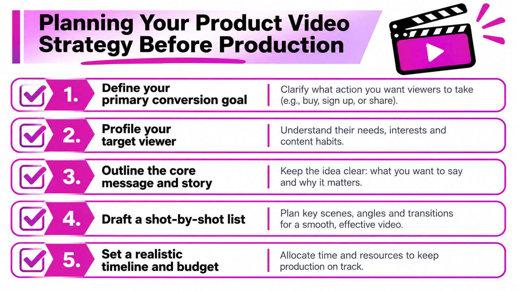
Planning Your Product Video Strategy Before Production
The fastest way to waste a production budget is to start filming before you know what the video needs to do. A video for a low-friction impulse product should look very different from a video for a premium, technical, or visually complex item. The planning work is where you decide whether you need a short hook, a detailed demo, a tutorial, or a trust-building testimonial.
Start with the buying problem, not the shoot list
Before you pick a camera, define the exact hesitation the video must remove. Is the shopper unsure about fit, setup, ingredient quality, assembly, size, or whether the product is different from cheaper alternatives? Once that objection is clear, the script and shot list get simpler because every scene has a job.
A useful internal exercise is to map products by revenue potential and decision complexity. High-revenue pages with repeated hesitation deserve the first videos in the queue. Low-value items can often be covered with shorter, lighter edits, while premium products usually need more proof and more close-ups because the cost of doubt is higher.
A good product video plan doesn't start with “What can we film?” It starts with “What do buyers need to believe before they click add to cart?”
Competitor audits help here too. Look at what other brands show, then notice what they leave out. If everyone opens with lifestyle footage but nobody shows the mechanism, the missing proof is your opening. If their videos are too polished to feel honest, a clearer, more useful demo often wins.
For a practical workflow around AI-assisted production and scripting, this guide on using AI to make product videos is a helpful companion resource because it frames AI as an acceleration layer, not a replacement for strategy.
Build the brief around one outcome
A strong brief names the primary conversion goal, the viewer, the objection, the message, and the intended placement. That keeps the edit from drifting into a general-purpose brand film. It also helps you decide early whether the project needs one hero asset or a modular package that can be cut for product pages, email, paid social, and support content.
The creative brief should also define what not to show. If the team has a habit of over-explaining, cut that out before production starts. If your product is self-explanatory, don't spend half the runtime on narration that restates what the eye already sees.
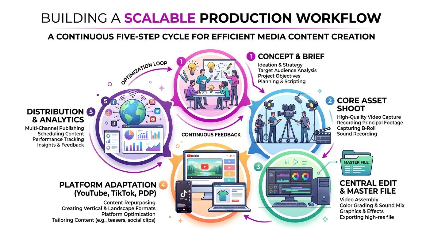
Building a Scalable Production Workflow
A scalable workflow starts with one strong master demo and then repurposes it. That's the most efficient way to serve multiple channels without filming from scratch every time. It also keeps the product story consistent, which matters when shoppers first see the brand on social, then again on the product page, then one more time in retargeting.
Shoot once, edit for three jobs
The easiest structure is to create one primary demo, then cut it into three outputs. A 60-second version works well for awareness, a 2-minute version fits consideration, and a web-optimized cut can live on the product page. Ngram's product demo guidance also offers a practical timing model, with roughly 20 seconds for the problem, 15 seconds for the before state, 60 to 90 seconds for the key workflow, and about 15 seconds for results and a clear next step (Ngram product demo best practices).
That sequencing isn't rigid, but it's useful because it forces the edit to earn each beat. The product should appear early, the pain point should be obvious, and the payoff should come before attention drops. If the product only shows up after a long introduction, you've probably lost the shopper before the demo starts.
Capture edit flexibility on set
Good production planning gives you more room in post. Film the product from angles that can cover both feature detail and broader context. Shoot close-ups of the mechanism, hands-on usage, packaging, and whatever proof points matter most to the shopper. If the product has a setup step, capture that cleanly too, because setup anxiety is often where hesitation begins.
Equipment doesn't need to be extravagant. A clean frame, stable camera, good lighting, and intelligible audio usually beat a more expensive setup that's poorly controlled. Cost saver is discipline, not gear.
Structure the day around reusable assets
Plan the shoot so you can leave with more than one final cut. Capture raw demonstrations, alternate openings, still frames for thumbnails, and short vertical snippets for paid social. When the team only records the “main video,” they usually end up re-shooting for every channel later.
One master demo, cut smartly, will almost always outperform a pile of one-off assets that don't share the same core story.
Matching Video Format to Buying Stage and Channel
The question isn't only which angle looks best, it's which format fits the shopper's stage and the channel they're on. A first-time social viewer needs a different edit than someone sitting on a product page comparing specs. That's why generic shot lists often underperform, they don't respect context.
Choose format based on intent
Amazon's sponsored products video guidance is more conversion-oriented than many general product video tips. For product-in-use videos, the product should occupy at least 50% of the frame, and the emphasis should stay on features and functionality, not brand storytelling (Amazon sponsored products video guide). That framing is useful beyond Amazon because it forces the edit to stay grounded in what the shopper needs to see.
By contrast, social platforms usually reward quicker hooks and lighter context. Product pages can support more explanation, while email often works better as a thumbnail-led clickthrough. The point is to stop treating every asset as if it belongs everywhere.
Use the right video for the right moment
A simple channel map helps teams stay honest about format fit:
| Buying stage | Best video type | Best channel |
|---|---|---|
| Awareness | Short hook or teaser | Social feed, paid social |
| Consideration | Product demo or explainer | YouTube, product page |
| Decision | Testimonial or trust proof | Email, retargeting, product page |
That table is a planning tool, not a law. A premium product may need a longer consideration asset, while a simple consumer item may only need a tight teaser and a clear product page demo. The key is to match information depth to doubt level.
Audit your current library by gap, not by volume
Most brands already have some footage, but not in the right mix. Look for missing pieces in the funnel. If you have awareness clips but no decision-stage proof, add testimonials or UGC. If you have long demos but no short hooks, create cutdowns that can work in paid social.
For teams building media plans around social placements, this breakdown of Facebook ad types is useful because it helps you place product video inside a broader paid strategy instead of treating it like a standalone creative asset.
Technical Implementation for Product Page Performance
The most persuasive video in the world can still underperform if it loads slowly or looks broken on mobile. Product page execution matters because shoppers don't give you extra patience at the point of purchase. If the player feels clunky, they move on.
Keep the player fast and the frame clean
A useful baseline from Swarmify is to aim for the first frame appearing in under 3 seconds, remove distracting platform UI like ads or suggested videos, and use the right aspect ratio for the device, usually 16:9 on desktop and a 9:16 option for mobile (Swarmify product video best practices). That technical discipline matters because the video should help the page convert, not introduce delay or friction.
Placement matters just as much as load behavior. Put the video where hesitation happens, usually near the product description, variant selection, or review block. Burying it too low on the page makes it harder to earn attention from the shoppers who need reassurance most.
Design for silent viewing and mobile first
Many shoppers watch without sound, so captions aren't optional. They're part of the conversion layer. A clean caption track also helps when the first few seconds need to communicate a benefit before narration catches up.
If the video only makes sense with audio on, it's missing a major part of its audience.
Mobile framing deserves the same care. Close-ups should stay legible on a small screen, and the opening frame should show the product or the problem immediately. Long title cards and slow logos are expensive on mobile because they consume attention without paying it back.
Make hosting a conversion choice
Where you host the video affects the shopping experience. A product page isn't the place for competing recommendations, intrusive end cards, or unnecessary distractions. If you're managing Shopify performance, this pairs naturally with broader page-speed work, and this Shopify page speed optimization guide is relevant if your player is currently competing with a heavy theme or bloated app stack.
Autoplay can work for muted hero loops, but on a product page it should never interrupt the shopper or force sound. If the video becomes a speed bump, it's hurting the page more than helping it.
Measuring Impact and Continuous Optimization
Product video shouldn't live on gut feel. The question is whether it changes shopper behavior where it matters, add to cart, checkout progression, and purchase confidence. Views are useful, but they're not the business result.
Track behavior, not vanity
Start by comparing users who watch the video with users who don't. Look at whether the video changes how often shoppers add items to cart, move deeper into the funnel, or come back to complete the purchase. If watch time is good but conversion doesn't move, the video may be entertaining without answering the buying question.
Heatmaps and session recordings help here because they show where viewers pause, skip, or bounce. That's often more revealing than a simple play count. If people click play but bail in the opening seconds, the issue is usually the hook, not the whole edit.
Test one variable at a time
A/B testing works best when you isolate the video's role. Keep the product page stable, then test the presence of video, the thumbnail, the placement, or the opening frame. If you change the copy, layout, and media at once, you won't know what moved the needle.
Three signals usually matter most:
- Play rate, whether shoppers notice and start the video.
- Completion behavior, whether the opening earns enough interest to keep them watching.
- Conversion lift, whether the video changes buying behavior.
If play rate is weak, the thumbnail or placement is probably the problem. If completion is weak, the opening is too slow. If both are healthy but sales don't move, the content isn't answering the objection.
Refresh based on what shoppers do
Product videos should age with the page. As product questions change, promo angles shift, or new variants launch, the asset library needs updates too. Sometimes the right move is a new opening. Sometimes it's a shorter edit. Sometimes it's a completely different format for decision-stage traffic.
The brands that win with video treat it like merchandising, not a one-time content project. They test, trim, replace, and re-cut based on shopper behavior, then keep the best versions in circulation.
If you want Shopify product videos that support conversion, not just fill a content slot, ECORN can help with the strategy, CRO thinking, and execution needed to make them work on real product pages. Their team builds for performance first, so you're not guessing at what should convert, you're shipping a video system tied to the way your store sells.


7 Single Product Websites Worth Emulating
Product Variants Shopify: The Complete 2026 Guide
Ecommerce Analytics Consulting for Growth

What Is AI Integration for eCommerce
How to Choose the Right eCommerce Website Development Firm

E Business Strategy Implementation
Conversion Tracking Setup for Shopify Stores
BigCommerce vs Shopify Plus Which Enterprise Wins in 2026
Shopify Theme Kit: Setup, Commands, and Migration Guide

Shopify Extension Development: A Practical 2026 Guide
Shopify Speed Score Explained and How to Improve It
Shopify Mobile Optimization: The 2026 Playbook

How to Add Subcategory in Shopify for Better UX
How to Implement Structured Data for Ecommerce in 2026

SEO App Mobile: Shopify Store Optimization Guide
Shopify Plus Support: What It Includes and How to Choose
Google Ads for Shopify: The Complete 2026 Playbook

Shopify New York: How to Find and Hire the Right Agency
Google Search Console for Shopify: The Complete Setup

First Party Data Collection for eCommerce Growth
FAQ Online Store Guide: Build and Measure It Right
Do FB Ads Work for eCommerce in 2026?
One Page Checkout for Shopify: Design and Implementation
Shopify GraphQL vs REST: The 2026 Developer Decision
Shopify Ecommerce Consulting: Strategy, Pricing &

Are Reddit Ads Worth It for eCommerce Brands
Shopify Title and Meta Description: A Practical 2026 Guide
Real-Time Inventory Management: A 2026 Guide

AI Chatbot Integration for Shopify Stores
Affiliate Program Management: A Shopify Guide
10 Best Performance Monitoring Tools for Shopify in 2026
Digital Asset Management for eCommerce Brands in 2026
Every Type of Facebook Ads Explained for eCommerce Growth
Product Information Management Explained for Shopify Brands
Support Ticket System: A Guide for Shopify Stores

10 Best Customer Service Tools for Shopify in 2026

Can I Start a Business with No Money? a 2026 Blueprint

What Sells Good on Etsy: Best Niches for 2026

Shopify Add to Cart Button: A Practical 2026 Guide

Customer Feedback Automation: A Practical eCommerce Guide
Critical Rendering Path: A Guide for Shopify Stores

How to Promote on TikTok for eCommerce in 2026

B2B eCommerce Consulting That Drives Real Revenue
10 Best Practices for Site Navigation in 2026
Return vs Refund for Shopify Stores: A Practical Guide
What Is Customer Lifetime Value and Why It Matters
What Is Voice of Customer Research for eCommerce

SMS Marketing for Ecommerce That Actually Converts

Master How to Improve Email Deliverability in 2026

Top 7 eCommerce Partners NYC for Shopify Brands in 2026
Machine Learning for Ecommerce: Boost Your Shopify Store

Beauty Market Research: Your 2026 Growth Guide

Shopify International Expansion: A 2026 Roadmap
What Does CRO Stand for in Business: Understanding CRO

Shopify Visual Merchandising: A Playbook for Higher Sales

Shopify Landing Page Design: Master Conversion in 2026
10 Best AI SEO Optimization Tools for Shopify in 2026

Agentic AI for Ecommerce: Boost Your Sales in 2026
Mastering Email Marketing Data for eCommerce Growth

Conversion Rate Optimisation Australia: Boost Your Sales
Conversion Rate Optimization AI: Your Shopify Store Guide

10 Product Bundling Strategies for Shopify in 2026
How to Increase Customer Lifetime Value: A Shopify Playbook
AI Customer Service Automation: Shopify Guide 2026

Clean Website Design: A Shopify Conversion Playbook

Omnichannel Retail Strategy: A Shopify Playbook
Product Data Enrichment: A Guide for Shopify Brands
Instagram Shopping Features a Guide for Shopify Stores
What Is Revenue Optimization: A Holistic RevOps Guide

Benefits of Conversion Rate Optimization: Boost Your
WordPress to Shopify Migration: Your 2026 Seamless Switch
Boost Sales: Ecommerce Payment Processing Guide 2026
Unified Commerce Platform: Benefits, KPIs & Shopify Guide
How to Reduce Bounce Rate eCommerce: Your 2026 Guide
Shopify API Integration: A Practical End-to-End Guide

How to Implement Data Governance: A 2026 Guide
Shopify Store Development Cost: A 2026 Breakdown
What Is Server Side Tracking: The Shopify Guide 2026
Marketing Automation Workflows: A Shopify Guide for 2026

Shopify: How to Reduce Technical Debt

Shopify UX Design Change: A Playbook for Growth

User Generated Content Strategy: Shopify Playbook
Shopify Pause and Build Plan Cost: A Complete 2026 Guide
Compare at Price on Shopify: A Complete Guide for 2026
Where Can I Sell My Prints? 10 Best Platforms for 2026
Shopify Order Management System: The Ultimate Guide 2026
What Is Marketing Attribution? an eCommerce Guide for 2026

10 Best Black Friday Sales Sheets for 2026

Discover the Top Social Media Marketing Agencies For
Consumer Confidence Definition for eCommerce in 2026
What Is Social Commerce? Your 2026 Guide to Boosting Sales

A Social Ad Campaign Playbook for eCommerce Growth

7 Best FAQ Page Examples for SaaS & eCommerce

Market Research in Fashion Industry: A Guide for Shopify
Shopify Migration Services: Expert Guide for 2026
Mastering FB Retargeting Ads for Shopify in 2026
What Is Omnichannel Ecommerce

Master Your Shopify Plus Migration: The 2026 Guide
Shopify Integration Services: A Merchant's 2026 Guide
Shopify Collection Description: A Guide to SEO & Sales


newsletter in your inbox