
Your support team keeps answering the same shipping, returns, sizing, and billing questions. Meanwhile, shoppers hit product pages, hesitate, and leave because the answer they need is buried in a policy page or stuck inside chat. That's usually the moment brands realize their FAQ isn't a housekeeping page. It's part of the conversion path.
The best faq page examples do three jobs at once. They remove friction, build trust, and help visitors self-serve without feeling pushed away from buying. For Shopify brands, that matters even more because a weak FAQ often shows up as abandoned carts, repetitive tickets, and product pages that make shoppers work too hard.
A good FAQ page also isn't static. Industry guidance recommends treating it as a living information product, monitored with query and engagement metrics such as impressions, clicks, average position, click-through rate, page views, time on page, bounce rate, and conversion rate. Google Search Console is useful for query-level performance, while GA4 events can track things like scroll depth, link clicks, and accordion expansions, as outlined in Gorgias' FAQ guidance for ecommerce brands.
Below are the best faq page examples and resources I'd use if I were building or rebuilding a Shopify FAQ with CRO in mind.
1. Shopify
Shopify's FAQ page examples guide is the most practical place to start if you run a product-led store and need something that works inside a real ecommerce stack. It stays grounded in buying objections, page placement, and store architecture rather than drifting into generic support advice.
What stands out is the placement thinking. Most brands over-centralize FAQs on a single help page, but Shopify's approach maps better to how customers shop. Shipping questions belong near delivery messaging. Subscription questions belong on the PDP. Returns, payment methods, and account issues still need a central hub.
Why it works for Shopify stores
This is the resource I'd hand to a junior ecommerce manager because it helps them make sensible decisions quickly. It also gives senior teams enough range to decide whether they need a lightweight FAQ page, product-level FAQ blocks, or a broader knowledge setup.
For implementation on Shopify, the playbook is straightforward:
- Use a central FAQ page for broad policies: Cover shipping, returns, payments, warranty, and account topics.
- Embed contextual FAQs on PDPs: Put sizing, materials, delivery timing, compatibility, or refill cadence next to the buy box or below product details.
- Link outward intentionally: Point short FAQ answers to deeper policy pages, order tracking, or help articles only when the answer needs further depth.
Practical rule: If a question can block checkout, answer it on the same page where the purchase decision happens.
A Shopify build usually works best when the FAQ content sits in theme sections or metafields, not hardcoded into templates. That gives your team faster edits and cleaner governance. If you're already improving support flows and retention, pair your FAQ rebuild with broader customer experience improvements for Shopify stores.
The trade-off is that Shopify's resource is less technical on structured data and search instrumentation than I'd like. It's strong on execution and examples, weaker on measurement detail.
2. HubSpot
A common Shopify problem looks like this. The store has an FAQ page, support volume is still high, and the questions on the page read like policy statements instead of what shoppers type into chat.
HubSpot's FAQ page examples roundup is useful for fixing that specific issue. It gives teams a practical reset on phrasing, structure, and topic selection. I use it less for design inspiration and more for message-market fit. Good FAQ pages answer real buying objections in the words customers use.
HubSpot is strongest on editorial judgment. That matters because weak FAQ pages usually fail before layout becomes the problem. If the page answers rare internal concerns, or uses stiff language that no customer would search, even a well-designed accordion will underperform.
Best use case
Use this resource when the store already has traffic, but the FAQ content is missing high-intent questions that affect conversion and support deflection.
For Shopify teams, that usually means tightening three things:
- Pull questions from real conversations: Review support tickets, pre-purchase chat, product reviews, and search logs.
- Write for scan speed: Keep answers short, then link to policy or help content only when extra detail is necessary.
- Match customer phrasing: Use “Where is my order?” or “Do you ship to Canada?” if that's how shoppers ask.
This is also where Shopify execution matters. The strongest version is not a single static FAQ page buried in the footer. Use the same language on collection pages, PDPs, cart help text, and post-purchase support content. If a question repeatedly appears in live chat before checkout, place the answer closer to the buying decision. Stores that also use AI customer service chatbots for Shopify support workflows should review chatbot transcripts monthly, because they expose phrasing gaps faster than internal brainstorming ever will.
The trade-off is clear. HubSpot helps teams choose better questions and write cleaner answers, but it offers less guidance on Shopify-specific implementation, schema markup, or theme-level placement strategy. Treat it as a content-source and copywriting reference, then apply the answers inside your storefront architecture with structured FAQ blocks, internal links to returns or shipping pages, and category-level FAQ modules where friction is highest.
3. Zendesk
Zendesk's FAQ page examples and help center guide is where I'd go when a brand has outgrown a simple FAQ page and needs real information architecture. It frames the core decision properly. Do you need one page of answers, or do you need a full support center with searchable depth?
That distinction matters. A single FAQ page works for recurring, simple questions. A help center works when users need troubleshooting, account guidance, or multi-step instructions. Many growing Shopify brands sit awkwardly in the middle and end up with one overloaded FAQ page that serves neither use case well.
Where Zendesk is strongest
Zendesk is good at diagnosing failure patterns. Cluttered layouts, vague labels, and weak navigation don't just make a page uglier. They increase deflection failure, which means customers still open tickets because they can't find what they need.
For Shopify teams, the practical move is often a layered setup:
- Top layer: A focused FAQ page for high-intent, repetitive questions.
- Second layer: Deeper help articles for setup, account management, subscriptions, or warranty workflows.
- Escalation layer: Chat or contact options when self-service stops being efficient.
When a shopper can't solve a real problem in two clicks, your FAQ has become decoration.
I also like Zendesk's governance angle. FAQ pages don't stay useful by accident. They need ownership across support, CX, and ecommerce. If you're also evaluating automation and escalation flows, it helps to connect FAQ planning with AI customer service chatbots for Shopify support.
The downside is obvious. Some recommendations lean toward the Zendesk ecosystem, and the examples aren't as DTC-heavy as a Shopify-specific roundup. But if your store is scaling fast, this is one of the better references for deciding when FAQs should mature into a real knowledge system.
4. Gorgias
A shopper lands on a product page, hesitates on shipping timing, opens your FAQ, and decides within seconds whether to keep buying or open a support ticket. That is the context where Gorgias is useful. Gorgias' ecommerce FAQ guide treats the FAQ page as part of the buying journey and the support stack, not as a leftover content page.
That matters for Shopify stores because FAQ decisions affect more than support volume. They affect conversion, pre-purchase confidence, and how often customers leave the product page to hunt for basic answers. Gorgias is strongest when the store already has recurring service questions and needs a tighter system, not just nicer formatting.
Where Gorgias stands out
The practical value is measurement. A lot of FAQ examples show layout ideas but stop there. Gorgias pushes teams to track whether people use the page, which questions get attention, and whether self-service reduces unnecessary contact.
For a Shopify build, that translates into a few concrete moves:
- Track FAQ engagement in GA4, including accordion opens, search use, and clicks into policy or help content.
- Review support tickets weekly and promote repeated pre-purchase questions into the FAQ.
- Add FAQ schema to key pages where questions influence buying intent, especially product, shipping, and returns content.
- Link high-intent answers back to the next step, such as a collection page, product page, returns portal, or contact path.
This is the part many brands miss. An FAQ page should not only answer questions. It should route the customer to action.
I also like the operational bias here. Gorgias frames FAQs as a living support asset that should change with product launches, policy updates, and seasonal peaks. That approach fits Shopify teams well because merchandising, CX, and support all create FAQ problems, even if only one team owns the page.
The trade-off is that this resource is lighter on design range than broader example roundups. You come here for workflow thinking and support logic, not a big gallery of layouts. For merchants building around Shopify and helpdesk data, that is a fair trade.
5. Helpjuice
Helpjuice's guide to writing an FAQ page is useful for stores with a familiar problem. The FAQ exists, support keeps getting the same questions, and the page is still hard to scan. On Shopify, I see this after a few growth cycles. New policies, new apps, subscription rules, and product exceptions get added faster than the page gets reorganized.
Helpjuice is strong on information architecture. That matters because FAQ performance is usually a structure problem before it is a copy problem. If shoppers cannot find the right answer in a few seconds, the quality of the answer barely matters.
What to borrow from it
The main lesson is to design the FAQ around user intent, not around how your team stores information internally. A customer does not care whether a question belongs to CX, ops, or merchandising. They care whether they can find shipping details, return terms, subscription rules, or product care instructions without digging.
For a Shopify store, that usually means a setup like this:
- Clear intent-based groups: Shipping, returns, orders, payments, subscriptions, sizing, product care, account access.
- Progressive depth: Keep the first answer short, then send people to a policy page, help article, or portal if the topic needs detail.
- Search once the page gets crowded: A simple accordion works for a small FAQ. Once the question count grows, search or filters become much more useful.
- Prominent priority questions: Put high-friction topics first, especially delivery timing, return windows, exchange rules, and subscription billing.
That answer style is a good fit for ecommerce. Short answers reduce scanning time and keep the page from turning into a wall of text. If a topic needs exceptions, such as final sale items or international shipping limits, give the short version first and link to the full policy.
The Shopify-specific takeaway is implementation discipline. Build the FAQ page so it supports both UX and conversion. Add FAQ schema where relevant, especially on pages tied to purchase hesitation. Use a help center app or page builder that supports search, category grouping, and anchor links. Then connect answers to the next step. A sizing answer should lead to the size guide or product page. A returns answer should lead to the returns portal. A subscription answer should point to the customer account or subscription management flow.
Helpjuice is less useful if you want visual inspiration or merchandising ideas. It is more useful if your FAQ has outgrown its original layout and now needs a cleaner system. For Shopify teams dealing with catalog growth and repeated support friction, that is a good trade-off.
6. Baymard Institute
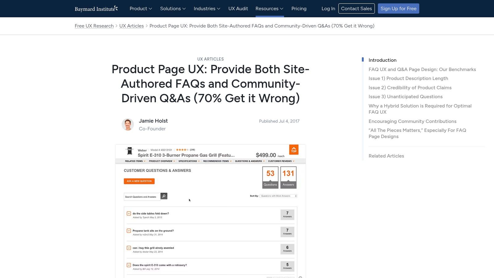
Baymard Institute's product page FAQ and Q&A research is different from the others. It isn't a gallery post. It's UX research that helps you decide what belongs on the product page versus what belongs in a central FAQ or community Q&A area.
That distinction matters because merchant-authored FAQs and customer-generated Q&A solve different problems. Your brand should answer policy, fit, shipping, materials, compatibility, and care questions directly. Customer Q&A often helps with lived-use questions, edge-case scenarios, and social proof around real ownership.
The Shopify CRO lesson
For Shopify stores, Baymard's biggest value is placement strategy. Product-level friction should be handled on the PDP. Sending shoppers to a separate help page for every buying question is bad UX and bad conversion logic.
Put merchant-authored FAQs where hesitation starts, not where support content usually lives.
Many stores get it wrong in this area. They build a polished global FAQ page, then leave PDPs under-explained. A stronger setup is to use both:
- PDP FAQ block: Answer high-intent purchase questions.
- Central FAQ page: House broader policies and operational questions.
- Customer Q&A or review content: Handle peer-to-peer credibility and edge-case use questions.
On Shopify, this is usually implemented with theme sections, product metafields, or dedicated FAQ apps that support accordion blocks and product-specific content assignment. If schema support is available, use it carefully and keep the content identical to what users see on-page.
Baymard gives you less visual inspiration than the roundup-style resources. But if your objective is conversion-focused FAQ placement, it's one of the most useful references in this list.
7. Link-Assistant
A team has the questions, the owner wants the page live this week, and design still needs direction. That is where a visual roundup like Link-Assistant helps. It gives you a fast read on common FAQ layouts, question formatting, and SEO-friendly structure so you can turn rough ideas into a Shopify build brief.
Its value is practical. Link-Assistant is less useful for deciding what your FAQ should cover, and more useful for deciding how to present it once the content strategy is already set. For Shopify stores, that matters because the wrong layout choice creates avoidable friction. Long walls of text hurt scanability. Over-nested categories hide answers. Generic headings weaken both UX and search relevance.
Best for turning strategy into a build spec
I use this kind of reference late in the process, after support themes, policy gaps, and product objections are already mapped. At that point, the job is execution. The page needs a clear structure, a search path that makes sense, and answer formatting that works on mobile.
Three ideas are worth borrowing:
- Keep the first version tight: Start with the questions that block purchases or generate repeat tickets. A shorter FAQ with strong answer coverage usually performs better than an oversized resource center.
- Group by customer task: Use categories like Shipping, Returns, Sizing, Product Care, or Orders instead of vague buckets that force extra scanning.
- Format for both users and search engines: Clear H2s, descriptive question phrasing, accordion UI where it improves scanability, and FAQ schema where your theme or app supports it all make implementation cleaner.
For Shopify, the replicable takeaway is framework, not inspiration alone. Build the global FAQ page around operational questions, then reuse the same category logic across product pages, chat flows, and help content. Apps like HelpCenter, Easify FAQ, or Gorgias can handle the front-end layer, but the primary benefit comes from consistent information architecture and answer wording across every touchpoint.
That is why Link-Assistant earns a spot on this list. It helps teams move faster once the strategic decisions are made, and it gives merchants enough pattern recognition to avoid building an FAQ page that looks organized but fails to reduce hesitation or support load.
Top 7 FAQ Page Examples Comparison
| Source | Implementation Complexity 🔄 | Resource Requirements ⚡ | Expected Outcomes 📊 | Ideal Use Cases 💡 | Key Advantages ⭐ |
|---|---|---|---|---|---|
| Shopify | Moderate, template-driven, Shopify-specific steps | Low–Medium, content team + Shopify tools | Improved conversion and clearer on-site FAQs | Shopify/Shopify Plus ecommerce teams optimizing PDPs and sitewide FAQs | Ecommerce-focused, actionable templates; up-to-date guidance |
| HubSpot | Low, simple workflow for sourcing questions | Low, support-data mining and concise copy edits | Better alignment with user intent; scannable answers | Cross-industry teams seeking inspiration and support-driven FAQs | Broad, easy-to-skim examples; emphasizes support ticket sourcing |
| Zendesk | Medium, help-center vs single-page decisions; governance | Medium, knowledge-base tooling and governance effort | Scalable help center and fewer navigation/deflection failures | Teams scaling support content and organizing help centers | Strong IA/navigation focus; highlights common pitfalls |
| Gorgias | Low–Medium, ecommerce patterns + integration notes | Low, lean for Shopify stores with helpdesk | More seamless links between FAQs and live support/escalation | Shopify brands using Gorgias or similar helpdesk tools | Practical integration with support workflows; conversion-oriented |
| Helpjuice | Medium, IA, search, and SEO planning required | Medium, UX, content design, and SEO work | Scalable FAQ UX with improved searchability and SEO value | Teams formalizing IA and search for FAQs and KBs | Detailed IA/search advice; clear do's and don'ts for FAQ UX |
| Baymard Institute | Medium, research application to PDP FAQ/Q&A design | Medium, UX research and benchmark alignment | Reduced purchase anxiety; improved findability on PDPs | Merchants embedding merchant FAQs and community Q&A on product pages | Research-backed recommendations and conversion-focused benchmarks |
| Link-Assistant | Low, template/layout focused, quick to scan | Low, visual examples + basic SEO tips | Fast design rollout with improved question phrasing/SEO | Teams needing layout inspiration and SEO-friendly FAQ templates | Large gallery of visual examples with practical SEO guidance |
Your Blueprint for a High-Performing FAQ Page
The best FAQ pages are never done. They change as your product catalog changes, as your shipping setup changes, and as customers surface new objections. That's why the strongest faq page examples in this list aren't just visually clean. They reflect a repeatable system for sourcing questions, placing answers in the right context, and measuring whether those answers are doing their job.
For Shopify brands, the practical blueprint is simple. Start with real support demand, not assumptions. Pull your most common questions from tickets, chat logs, reviews, and pre-purchase conversations. Keep the main FAQ tightly focused, then place high-intent answers on product pages, cart steps, and policy touchpoints where hesitation occurs.
The next step is structure. Group questions around user intent, not around internal departments. “Shipping,” “Returns,” “Subscriptions,” “Sizing,” and “Product Care” are simpler to use than categories built around your org chart. Keep answers concise, and only send users to deeper articles when the subject warrants detail.
Searchability matters just as much as writing. If your FAQ set is growing, add search or filters before the page becomes hard to use. On Shopify, that usually means pairing a clean FAQ template with metafields, theme sections, or a helpdesk-connected knowledge layer so content owners can update answers without developer support every time a policy changes.
Measurement is where most brands stop too early. Track which FAQ queries attract search visibility, which questions get expanded, which links get clicked, and whether the page helps people continue toward checkout or support resolution. If a question gets traffic but still leads to tickets, the answer probably isn't strong enough, visible enough, or placed closely enough to the point of friction.
The best examples here all point to the same conclusion. FAQ content works when it's treated like part of CX, SEO, and CRO at the same time. If you want a FAQ page that reduces repetitive support load and helps more shoppers buy with confidence, build it like a storefront asset, not a footer obligation.
If your Shopify FAQ is outdated, difficult to use, or disconnected from your product pages, ECORN can help you turn it into a real conversion asset. Their team works with ecommerce brands on Shopify design, development, CRO, and customer experience improvements, so your FAQ doesn't just answer questions. It helps customers move toward checkout with less friction.


SMS Marketing for Ecommerce That Actually Converts

Master How to Improve Email Deliverability in 2026
Top 7 eCommerce Partners NYC for Shopify Brands in 2026
Machine Learning for Ecommerce: Boost Your Shopify Store

Beauty Market Research: Your 2026 Growth Guide

Shopify International Expansion: A 2026 Roadmap
What Does CRO Stand for in Business: Understanding CRO
Shopify Visual Merchandising: A Playbook for Higher Sales

Shopify Landing Page Design: Master Conversion in 2026
10 Best AI SEO Optimization Tools for Shopify in 2026

Agentic AI for Ecommerce: Boost Your Sales in 2026
Mastering Email Marketing Data for eCommerce Growth
Conversion Rate Optimisation Australia: Boost Your Sales
Conversion Rate Optimization AI: Your Shopify Store Guide

10 Product Bundling Strategies for Shopify in 2026
How to Increase Customer Lifetime Value: A Shopify Playbook
AI Customer Service Automation: Shopify Guide 2026
Clean Website Design: A Shopify Conversion Playbook

Omnichannel Retail Strategy: A Shopify Playbook
Product Data Enrichment: A Guide for Shopify Brands
Instagram Shopping Features a Guide for Shopify Stores
What Is Revenue Optimization: A Holistic RevOps Guide
Benefits of Conversion Rate Optimization: Boost Your
WordPress to Shopify Migration: Your 2026 Seamless Switch
Boost Sales: Ecommerce Payment Processing Guide 2026
Unified Commerce Platform: Benefits, KPIs & Shopify Guide

How to Reduce Bounce Rate eCommerce: Your 2026 Guide

Shopify API Integration: A Practical End-to-End Guide

How to Implement Data Governance: A 2026 Guide

Shopify Store Development Cost: A 2026 Breakdown
What Is Server Side Tracking: The Shopify Guide 2026

Marketing Automation Workflows: A Shopify Guide for 2026

Shopify: How to Reduce Technical Debt

Shopify UX Design Change: A Playbook for Growth

User Generated Content Strategy: Shopify Playbook

Shopify Pause and Build Plan Cost: A Complete 2026 Guide

Compare at Price on Shopify: A Complete Guide for 2026

Where Can I Sell My Prints? 10 Best Platforms for 2026

Shopify Order Management System: The Ultimate Guide 2026

What Is Marketing Attribution? an eCommerce Guide for 2026

10 Best Black Friday Sales Sheets for 2026

Discover the Top Social Media Marketing Agencies For

Consumer Confidence Definition for eCommerce in 2026

What Is Social Commerce? Your 2026 Guide to Boosting Sales

A Social Ad Campaign Playbook for eCommerce Growth

Market Research in Fashion Industry: A Guide for Shopify

Shopify Migration Services: Expert Guide for 2026

Mastering FB Retargeting Ads for Shopify in 2026

What Is Omnichannel Ecommerce

Master Your Shopify Plus Migration: The 2026 Guide

Shopify Integration Services: A Merchant's 2026 Guide

Shopify Collection Description: A Guide to SEO & Sales

Shopify Plus Contact: Reach Sales & Support Effectively

Top Luxury Shopify Stores: Design & UX Strategies

How to Improve Customer Experience: A Shopify Roadmap

Creative Facebook Ads: 10 Examples for Shopify Brands

Remarketing with Facebook Ads: A Shopify Guide for 2026

SEO Linking Strategies for Shopify Stores

Top 7 Statistics YouTube Channels for eCommerce in 2026

Hiring Shopify Plus Designers: A Founder's Guide

Shopify Product Variation: Master Your Variants for 2026

Leverage Ai Solutions Brands: Your 2026 Shopify Growth Guide

Filters in Shopify: A Guide for Growing Brands

Shopify Plus Developer: A Guide for Growing Brands

When Does Black Friday Online Start? A 2026 Guide

Black Friday Email Marketing: Shopify & Klaviyo Guide

Polaris Design System: The Complete Shopify Guide

How to Hire a Consultant Email Marketing Expert

What Is Q4? A Shopify Merchant's Guide to Peak Season

Marketing Organization Structure for eCommerce Growth

Top Account-Based Marketing Agency Guide for 2026

7 Remarketing Ad Examples for Your 2026 Campaigns

AI Retail Solutions: Boost Your Shopify Store

Migrate to Shopify: The Definitive 2026 Guide

Shopify Authentication App: A Guide for Secure Stores

Why Strategic Marketing Is Important for Growth in 2026

How to Create a Size Chart in Shopify: 2026 Guide

Shopify Themes for Jewelry: The Definitive 2026 Guide

Minimal Shopify Templates: Faster, Higher-Converting Stores

Maximize Profit: Shopify CC Fees 2026 Guide

Best Shopify Apps for Beginners in 2026

How to Improve Online Shopping Experience in 2026

Shopify Design and Development Services: A 2026 Guide

Small Business Social Media Marketing Agency: A Hiring Guide

Bulk Edit Shopify: A Guide to Save Hours on Store Updates

2026 Trends in Food and Beverage Industry

Post Purchase Survey Guide for Shopify Stores

How to Build an Ecommerce Brand in 2026

Conversion Rate Optimization for Ecommerce: Maximize Profit

How to Use Customer Data to Increase Sales: A Guide

Shopify for Enterprise: The 2026 Deep Dive Guide

Email Marketing Agencies: The Guide for Shopify Brands

Boost Sales With The Right Shipping Shopify App

Your Guide to the Shopify Site Map

7 Headless Commerce Examples for 2026

Mastering Trends in Cosmetic Industry for 2026

Transfer Shopify to BigCommerce The Complete 2026 Playbook

What Is Shopify Collective? Your 2026 Guide to Success

Unlock Shopify Growth with Site Link SEO

Integrating Shopify and WordPress A Complete Guide for 2026


newsletter in your inbox