
Most advice about a Shopify UX redesign starts in the wrong place. It starts with inspiration boards, theme demos, and a wishlist of features. That's usually how teams end up paying for a visual overhaul when the underlying problem was a broken mobile layout, a messy product page hierarchy, or friction inside checkout.
A profitable Shopify UX design change rarely begins with “make it look new.” It begins with “find what's slowing buyers down.” Sometimes that leads to a strategic redesign. Sometimes it leads to deleting pop-ups, fixing spacing bugs, simplifying forms, and removing an app that adversely affected performance.
That distinction matters. Shopify's own design guidance ties UX work to business metrics like conversion, customer satisfaction, and retention, not surface-level polish. If you treat UX as decoration, you'll miss the point. If you treat it as a revenue system, you'll make better decisions faster.
Rethinking Your Next Shopify UX Design Change
The default move when a store stalls is to add. Add urgency widgets. Add carousels. Add animation. Add personalization. Add another app because the first three didn't solve the problem.
That instinct is expensive.
Shopify's UX trend guidance points in a different direction. The platform highlights slow browsing, which means reducing stimulation, removing unnecessary interruptions, and simplifying hierarchy because customers increasingly judge brand quality through low-friction experiences. That's a useful correction to the “more is more” mindset. In many stores, the highest-value UX change is subtraction, not expansion.
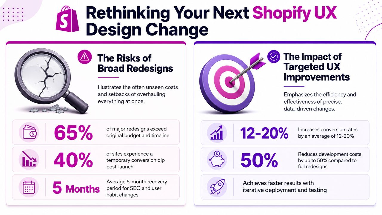
There's also a broader industry signal here. UX Collective discussed Shopify's move away from using “UX” in design job titles and toward “design,” which reflected a wider shift toward embedding user experience work across product teams rather than isolating it as a silo. The same discussion also referenced two benchmark figures often used to justify UX investment: 88% of users do not return after a single bad experience, and every $1 invested in UX can return up to $100 in UX Collective's discussion of Shopify's design rebrand.
Subtraction usually beats decoration
A store doesn't convert better because it feels busier. It converts better when shoppers can answer basic questions quickly:
- What is this product
- Why should I trust it
- How much will it cost me
- How fast can I buy it
- What happens if something goes wrong
If the page buries those answers under motion, badges, overlapping promotions, and app-generated blocks, design is getting in the way.
Practical rule: If an element doesn't improve clarity, trust, or decision speed, it needs to justify its existence.
The teams that handle this well usually follow a real process instead of jumping from mockup to code. A solid UX design process guide is useful here because it forces you to connect research, prioritization, and testing before you start changing layouts.
What a strong change actually looks like
A good Shopify UX design change does three things at once:
| Focus | Weak approach | Strong approach |
|---|---|---|
| Visual design | Refresh the homepage only | Improve clarity across the buying journey |
| Feature decisions | Add more modules | Remove friction points that distract or slow users |
| Business logic | Judge success by opinions | Judge success by conversion, retention, and customer behavior |
That's the frame to keep through the rest of the work. Your next redesign might be real. It also might be a cleanup project disguised as a redesign request.
Diagnose Your UX Problems Before You Redesign
A redesign request often starts with the wrong diagnosis.
I see this pattern all the time on Shopify stores. Revenue slips, the team gets tired of the current theme, and “we need a redesign” becomes the answer before anyone checks whether the actual problem is weak UX, broken implementation, or both. Those are different jobs with different budgets, timelines, and risks.
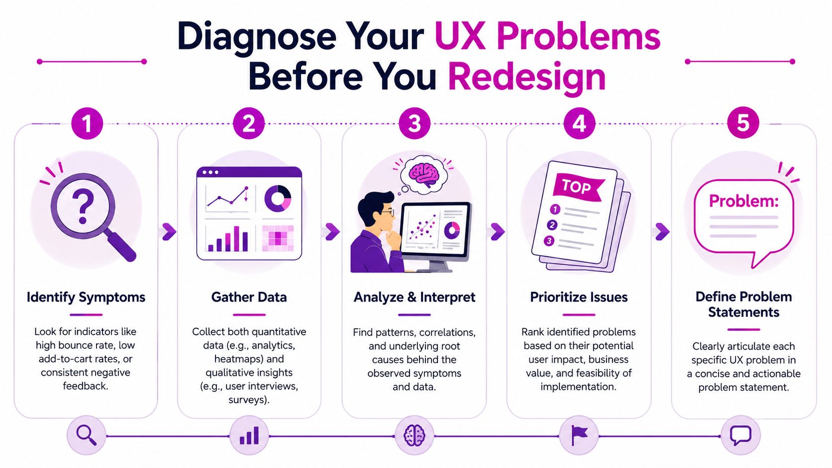
A poor mobile product template can suppress conversion even when the underlying UX strategy is sound. So can an app conflict that pushes reviews, delivery messaging, or add-to-cart buttons too far down the page. On the other hand, a technically clean store can still underperform if the buying journey is unclear. The job here is to separate friction caused by strategy from friction caused by the build.
Start with operating evidence
Begin with the parts of the funnel that affect money first. Review Shopify Analytics, channel quality, product page exits, cart abandonment patterns, and checkout drop-off before changing layouts. Then compare that against what users do in recordings and heatmaps.
The goal is simple. Find the step where buying intent breaks.
Here's the sequence I use on Shopify audits:
Read the funnel before reviewing visuals
Check where sessions stop progressing. If users reach product pages but stall before cart, the homepage is rarely the first problem to solve.Split findings by device type
Mobile issues hide inside average conversion rates. A store can look stable in blended reporting while smaller screens suffer from stacked app blocks, oversized media, or compressed purchase modules.Watch behavior, not just totals
Session recordings and heatmaps expose dead clicks, repeated taps, abrupt exits, missed calls to action, and hesitation around shipping or returns information.Inspect the theme layer
Review app embeds, custom Liquid, CSS overrides, JavaScript injections, and section settings added over time. Many “UX issues” are inherited from rushed launches and incremental edits.Check whether fixes can be validated quickly
In practice, checkout friction, broken hierarchy near the buy box, and form feedback issues often show directionally clear results within a few weeks if traffic volume is healthy and tracking is set up correctly.
That last point matters because teams often over-scope the work. If a focused fix can prove value in the current theme, you get faster learning and avoid paying for a full redesign to solve a narrow implementation problem.
Separate strategic friction from tactical defects
This distinction saves money.
| Issue type | Typical examples | Best response |
|---|---|---|
| Strategic UX problem | Weak hierarchy, poor product storytelling, unclear trust signals, confusing navigation | Redesign the flow or content structure |
| Tactical implementation problem | Large gaps, misaligned modules, broken mobile spacing, overlapping buttons, app conflicts | Debug first, then reassess |
Shopify merchants regularly run into spacing issues, misaligned sections, and layout problems caused by theme settings or code changes. That pattern shows up clearly in this Shopify community thread about site gaps and layout issues. It is a useful reminder that a conversion drop does not automatically justify a creative overhaul.
A store can have the right UX strategy and still lose sales because the front end is poorly assembled.
Use a fix-first filter before approving a redesign
Run each issue through a short decision screen:
Visible defect
If the problem is obvious on screen, such as overlap, clipping, broken spacing, or missing states, treat it as a bug first.Shared pattern across templates
If product, cart, and collection pages show the same defect, inspect shared sections, global CSS, app snippets, and theme settings before redesigning individual pages.Timing correlation
If performance dropped after a theme edit, app install, script addition, or migration, investigate that event before rewriting the experience.Behavior mismatch
If users engage with content but fail at one interaction point, the problem is often functional. Examples include variant selectors, shipping calculators, sticky carts, or validation feedback.Low effort, high commercial impact
If the issue can be corrected inside the current theme and directly affects buying confidence or completion rate, fix it before funding a broader rebuild.
For broader examples of revenue-focused fixes, this roundup of ecommerce conversion tactics is useful when deciding what deserves testing and what should be removed.
If the diagnosis is still unclear, structured research closes the gap. A practical guide to conducting usability testing for ecommerce stores helps teams verify whether shoppers are confused by the journey itself or blocked by defects in the implementation.
Building Your High-Impact UX Change Blueprint
Diagnosis gives you a list. A blueprint turns that list into a sequence.
Too many Shopify teams jump from findings to tickets without deciding what matters most. They end up redesigning low-impact surfaces while the purchase path keeps leaking revenue. A better plan ties every change to one measurable store outcome and ranks work by business effect versus implementation effort.
Shopify's own UX guidance makes that commercial lens clear. It connects UX work to conversion rates, customer satisfaction, and retention, and emphasizes reducing friction across the purchase journey. That's especially important given 70.19% cart abandonment highlighted alongside Shopify-focused UX guidance in Shopify's article on user experience design.
Rank changes by impact and effort
Once issues are confirmed, sort them into four groups:
| Category | What belongs here | What to do |
|---|---|---|
| High impact, low effort | Checkout friction, missing guest checkout options, weak form feedback, hidden shipping surprises | Ship first |
| High impact, high effort | Product page restructure, collection filtering overhaul, theme architecture changes | Scope carefully |
| Low impact, low effort | Minor styling polish, icon swaps, small copy refinements | Batch together |
| Low impact, high effort | Custom features with unclear value | Delay or cut |
This keeps the roadmap honest. A homepage redesign might be visually satisfying, but if checkout validation is weak or shipping costs appear late, the money is escaping elsewhere.
Write changes as business hypotheses
Don't write “improve PDP UX.” That's too vague to manage and too soft to test.
Write changes like this instead:
- If we simplify the product page hierarchy, more shoppers should reach the add-to-cart action without getting stuck in secondary content.
- If we reduce checkout friction, fewer buyers should abandon at the final step.
- If we clean up mobile spacing and sticky elements, users should browse product details with less friction on small screens.
That format forces accountability. It also makes testing easier later because each decision has a reason attached.
Strong UX planning doesn't ask, “What should the site look like?” It asks, “What should the buyer do more easily after this change?”
Build around the path to purchase
A first major Shopify UX design change should usually prioritize these areas in order:
Checkout flow
Reduce unnecessary steps, simplify form interactions, and remove blockers that create hesitation near purchase.Product detail pages
Clarify product benefits, variants, price context, delivery expectations, and trust cues.Mobile browsing
Audit spacing, button placement, sticky bars, accordions, and app blocks that push content into awkward patterns.Collection and search experience
Improve findability only after the product and checkout paths are stable.
Accessibility should be part of this work from the start, not a second pass. Clear contrast, consistent heading structure, keyboard-friendly interactions, and readable forms improve usability for everyone, not just users with specific access needs. In practice, they also force cleaner design decisions.
Decide what not to do
A blueprint gets stronger when it excludes work.
Cut features that only exist because a competitor uses them. Cut homepage modules that don't support product discovery. Cut app blocks that duplicate what the theme already handles. If a request can't be tied to clearer navigation, trust, speed, or conversion behavior, it shouldn't make the roadmap.
That restraint is what keeps UX work commercial instead of decorative.
Smart Implementation on Your Shopify Store
A good plan still fails if the implementation method is wrong. On Shopify, the same UX outcome can be built three different ways, and each route creates a different trade-off in speed, flexibility, performance, and maintenance.
The mistake is to treat every request as either “just use the theme editor” or “we need custom development.” Most stores need a mixed approach.
Choose the build method by risk, not preference
Here's the practical comparison:
| Method | Good for | Limits | Risk to watch |
|---|---|---|---|
| Theme editor | Content changes, section order, simple visual adjustments | Constrained by theme structure | Teams assume configuration can solve structural issues |
| Custom Liquid and CSS | Bespoke sections, layout fixes, reusable UX improvements | Needs development discipline | Quick fixes can create fragile code debt |
| Apps | Specific functionality delivered fast | Extra scripts, styling conflicts, maintenance overhead | UX degrades when too many app layers stack up |
The theme editor is ideal for testing content hierarchy and merchandising changes before committing to development. If the theme already supports the section logic you need, use it. Don't custom-code a block that the theme can manage natively.
Custom Liquid and CSS are the right move when the issue is structural. If mobile spacing breaks across templates or product information needs a new hierarchy, coded changes are usually cleaner than forcing the editor to do a job it wasn't built for.
Apps are useful when they solve a real requirement faster than a custom build. They're a poor choice when they duplicate core UX elements or inject heavy UI into critical pages.
Keep the development workflow boring
The safest Shopify work is usually the least dramatic.
Use a duplicate theme for all production-facing changes. Log every UX change that touches templates, scripts, app embeds, or theme settings. If custom code is involved, use version control and make rollback easy. A redesign becomes dangerous when nobody knows which edit changed what.
A practical implementation checklist:
Duplicate before editing
Never treat the live theme as your working environment.Audit app embeds first
A surprising number of layout issues come from scripts and app blocks, not the base theme.Document section dependencies
Shared snippets and global CSS can create side effects across collection, cart, and product templates.Check mobile before desktop signoff
Many Shopify defects hide in stacked layouts, sticky UI elements, and image ratios.
If a UX improvement makes the codebase harder to maintain, the store may pay for that “win” again later.
For teams deciding how much to build internally versus with external support, agencies such as ECORN can handle Shopify design, development, and CRO work in one workflow. That matters when a project includes both UX decisions and theme-level implementation, because the handoff between strategy and code is often where quality drops.
Roll out in layers
Implement in this order when possible:
- Fix obvious defects and unstable app behavior.
- Ship high-impact friction reductions in cart and checkout.
- Rebuild page structure where diagnosis proved the current layout is the issue.
- Add only the features that still look necessary after simplification.
The video below is useful if your team needs a visual walkthrough mindset for store-level design work before making bigger changes.
That order protects performance and keeps the store from turning into a patchwork of temporary fixes dressed up as strategy.
Testing Everything From Code to Conversions
A polished preview means very little on Shopify. Conversion gains usually fail for simpler reasons: a script fires twice, a mobile selector breaks, a trust message gets buried, or analytics stop tracking the step that matters.
Testing has to answer two questions at once. Did the UX change reduce friction for shoppers, and did the implementation introduce new friction in the theme, apps, or tracking setup? That is the difference between a redesign that performs and one that only looks better in review.
QA catches technical failures before customers do
Start with QA at the code and interface level. This is not glamorous work, but it protects revenue.
Check the parts of the store where Shopify builds tend to break under real traffic and real device conditions:
- Buttons, drawers, forms, and variant selectors
- Discount fields, shipping logic, and cart updates
- Browser and device-size behavior
- App embeds, custom scripts, and interaction states
- Event tracking for add to cart, checkout start, and other key actions
A product page can pass a design review and still lose sales because the size selector fails on Safari, the sticky add-to-cart overlaps the review widget on mobile, or a subscription app rewrites the purchase options block after the page loads. Those are not design theory problems. They are implementation problems that show up as UX problems to customers.
Build a QA sheet that covers homepage, collection, product, cart, search, account, landing pages, and checkout-adjacent flows. Review mobile and desktop separately. On Shopify, they often fail differently.
UAT shows where the interface still creates doubt
User acceptance testing answers a different question. Can a real shopper complete the task without second-guessing the store?
Give a small group clear tasks. Ask them to find a product, compare options, add it to cart, apply a discount code if relevant, and move toward purchase. Stay quiet and watch. The useful signals are hesitation, backtracking, misread labels, ignored shipping information, and moments where they stop because they are no longer sure what happens next.
A page fails when users hesitate at the wrong moment, even if every component technically works.
This is usually where teams find the expensive mistakes. A comparison table adds clutter instead of clarity. A returns message sits too low on the page. A redesigned cart drawer hides the edit link customers expect to see. None of that appears in a static mockup. All of it affects conversion.
A/B testing decides whether the change deserves to stay
Run A/B tests only after QA and UAT are clean. Otherwise, the test measures noise from defects instead of the value of the UX change.
Keep the setup narrow. One hypothesis. One primary metric. One audience segment if possible. If the test is about improving product-page conversion, do not change navigation, promo messaging, and cart behavior at the same time. You need a readable result, not a bundle of overlapping variables.
Past Shopify UX case studies have shown that checkout-focused improvements can produce meaningful lifts, but planning should stay conservative. Model upside carefully and treat every test as a validation exercise, not a promise.
A disciplined A/B testing plan includes:
| Test component | Good practice |
|---|---|
| Hypothesis | Tie it to one observed friction point |
| Primary metric | Use one success metric tied to the flow you changed |
| Secondary checks | Monitor side effects such as weaker engagement elsewhere |
| Test scope | Keep variants focused and comparable |
| Tracking | Verify events and attribution before traffic is split |
If your team needs a practical framework for structuring experiments, ECORN's guide to A/B testing on Shopify stores is a useful reference.
One warning matters here. Do not call a test early because the first few sessions look promising. Wait for enough data, confirm tracking accuracy, and review the result against margin, average order value, and downstream behavior. A UX change that raises clicks but creates returns, support tickets, or discount dependency is not a win.
The Rollout Launching Monitoring and Iteration
The launch isn't the finish line. It's the first live audit.
Teams get into trouble when they treat release day as a handoff instead of an observation period. A safe rollout keeps risk low, isolates changes, and makes it easier to connect results to specific UX decisions.
Launch in controlled steps
Avoid the “everything changes at once” release if you can. A phased rollout is easier to monitor and easier to reverse.
A practical launch sequence looks like this:
Start with low-risk changes
Push bug fixes, spacing corrections, and non-controversial hierarchy cleanups first.Release critical path updates next
Move cart, product page, and checkout-adjacent changes only when tracking is confirmed.Hold decorative updates until later
Visual extras can wait. Revenue-critical fixes can't.
This order helps teams catch side effects before they spread across the whole storefront.
Watch the first weeks closely
The first post-launch review shouldn't be broad. It should be focused on behavioral signals linked to the exact areas you changed.
Use a short monitoring dashboard that includes:
| Area changed | What to monitor |
|---|---|
| Product pages | Add-to-cart behavior, scroll depth, interaction with key content |
| Cart | Drop-off points, promo code behavior, friction around edits |
| Checkout-adjacent UX | Progression into purchase, form issues, trust-related hesitation |
| Mobile templates | Layout stability, tap targets, sticky element behavior |
The key is attribution. If revenue shifts but event tracking is weak, you won't know whether the cause was UX, traffic quality, merchandising, or promotion timing. That's why instrumentation should be part of the project before launch, not an afterthought.
Use post-launch findings to decide the next move
After the release stabilizes, sort findings into three groups:
Validated improvements
Changes that improved the intended behavior and should stay.Neutral outcomes
Changes that didn't hurt, but didn't move the target metric enough to justify further rollout.Regressions or ambiguity
Changes that introduced confusion, performance issues, or unclear results and need either revision or rollback.
Mature teams distinguish themselves. They don't defend every shipped idea. They keep what works and remove what doesn't.
The strongest UX programs treat every launch as a new round of diagnosis, not a final answer.
That loop is what turns a one-time Shopify UX design change into an operating system for growth. You diagnose, prioritize, implement, test, launch, monitor, and learn. Then you do it again with better evidence and less waste.
If your store is growing, that's the only sustainable way to approach UX. Not as a cosmetic project. Not as a trend response. As a repeated business process that protects conversion, reduces friction, and keeps the storefront aligned with how customers buy.
If you need help deciding whether your store needs a redesign, a technical cleanup, or both, ECORN works on Shopify design, development, and CRO projects that connect UX changes to implementation and measurable store performance.


User Generated Content Strategy: Shopify Playbook

Shopify Pause and Build Plan Cost: A Complete 2026 Guide

Compare at Price on Shopify: A Complete Guide for 2026

Where Can I Sell My Prints? 10 Best Platforms for 2026

Shopify Order Management System: The Ultimate Guide 2026

What Is Marketing Attribution? an eCommerce Guide for 2026

10 Best Black Friday Sales Sheets for 2026

Discover the Top Social Media Marketing Agencies For

Consumer Confidence Definition for eCommerce in 2026

What Is Social Commerce? Your 2026 Guide to Boosting Sales

A Social Ad Campaign Playbook for eCommerce Growth

7 Best FAQ Page Examples for SaaS & eCommerce

Market Research in Fashion Industry: A Guide for Shopify

Shopify Migration Services: Expert Guide for 2026

Mastering FB Retargeting Ads for Shopify in 2026

What Is Omnichannel Ecommerce

Master Your Shopify Plus Migration: The 2026 Guide

Shopify Integration Services: A Merchant's 2026 Guide

Shopify Collection Description: A Guide to SEO & Sales

Shopify Plus Contact: Reach Sales & Support Effectively

Top Luxury Shopify Stores: Design & UX Strategies

How to Improve Customer Experience: A Shopify Roadmap

Creative Facebook Ads: 10 Examples for Shopify Brands

Remarketing with Facebook Ads: A Shopify Guide for 2026

SEO Linking Strategies for Shopify Stores

Top 7 Statistics YouTube Channels for eCommerce in 2026

Hiring Shopify Plus Designers: A Founder's Guide

Shopify Product Variation: Master Your Variants for 2026

Leverage Ai Solutions Brands: Your 2026 Shopify Growth Guide

Filters in Shopify: A Guide for Growing Brands

Shopify Plus Developer: A Guide for Growing Brands

When Does Black Friday Online Start? A 2026 Guide

Black Friday Email Marketing: Shopify & Klaviyo Guide

Polaris Design System: The Complete Shopify Guide

How to Hire a Consultant Email Marketing Expert

What Is Q4? A Shopify Merchant's Guide to Peak Season

Marketing Organization Structure for eCommerce Growth

Top Account-Based Marketing Agency Guide for 2026

7 Remarketing Ad Examples for Your 2026 Campaigns

AI Retail Solutions: Boost Your Shopify Store

Migrate to Shopify: The Definitive 2026 Guide

Shopify Authentication App: A Guide for Secure Stores

Why Strategic Marketing Is Important for Growth in 2026

How to Create a Size Chart in Shopify: 2026 Guide

Shopify Themes for Jewelry: The Definitive 2026 Guide

Minimal Shopify Templates: Faster, Higher-Converting Stores

Maximize Profit: Shopify CC Fees 2026 Guide

Best Shopify Apps for Beginners in 2026

How to Improve Online Shopping Experience in 2026

Shopify Design and Development Services: A 2026 Guide

Small Business Social Media Marketing Agency: A Hiring Guide

Bulk Edit Shopify: A Guide to Save Hours on Store Updates

2026 Trends in Food and Beverage Industry

Post Purchase Survey Guide for Shopify Stores

How to Build an Ecommerce Brand in 2026

Conversion Rate Optimization for Ecommerce: Maximize Profit

How to Use Customer Data to Increase Sales: A Guide

Shopify for Enterprise: The 2026 Deep Dive Guide

Email Marketing Agencies: The Guide for Shopify Brands

Boost Sales With The Right Shipping Shopify App

Your Guide to the Shopify Site Map

7 Headless Commerce Examples for 2026

Mastering Trends in Cosmetic Industry for 2026

Transfer Shopify to BigCommerce The Complete 2026 Playbook

What Is Shopify Collective? Your 2026 Guide to Success

Unlock Shopify Growth with Site Link SEO

Integrating Shopify and WordPress A Complete Guide for 2026

Naming a Clothing Store: A Shopify Founder's Playbook

Guide to buying shopify store in 2026

Buying shopify store: Buying a Shopify Store: Invest Wisely

Food & Beverage Marketing: A Complete Guide for 2026

Facebook Ads Agency: A Shopify Brand's Hiring Guide

Shopify Apparel Stores: A 2026 Launch & Scale Guide

How to Deactivate Shopify Store: The 2026 Guide

Shopify and Square: The 2026 Ultimate Comparison

Your Guide to Beauty Products Ecommerce

A Guide to Marketing for Beauty Brands in 2026

Your Guide to Facebook Black Friday Ads

Facebook Ad Ecommerce for Shopify Growth

Iconography Web Design The Definitive Guide for Shopify Stores

A Modern Backlinks SEO Strategy for Shopify Stores

How to Launch an Online Store: A Step-by-Step Success Guide

Optimize Shopify Store: Master Performance in 2026

Successful Migration for Shopify: Protect SEO & Grow

Maximize Traffic & Sales: Get Your Free Website Audit Report

Master the Best Ads Facebook Formats for eCommerce Success

How to Find the Best Ecommerce Agency Near Me in 2026

10 Crucial White Hat Techniques SEO for Shopify in 2026

How to Reduce Returns and Boost Profits in Your eCommerce Store

What Is Ecommerce Personalization A Guide to Unlocking Growth

Payment gateways in shopify: The Ultimate Guide for Merchants 2026

Fulfillment services for shopify: Scale Your Ecommerce Brand

Shopify Landing Page Examples: 7 Winning Templates to Boost Conversions
How to Create Urgency in Sales on Shopify

The Best Review Apps for Shopify to Drive Growth in 2026

The Best Ecommerce Platform for Startups in 2026

Choosing Ecommerce Website Design Packages A Complete Guide

Shopify Plus Partners: Guide to shopify plus partners for 2026 growth

How to Find serp feature opportunities: Win SERP Snippets in 2026
Selling on Etsy vs eBay A Guide for eCommerce Brands in 2026


newsletter in your inbox