


A lot of teams still treat clean website design as a style choice. That misses the commercial point.
Users form an opinion about a site in approximately 5 seconds, and sites that load in 1 second can triple their conversion rates, with average conversion rates reaching nearly 40% at 1 second of load time according to DesignRush web design statistics. On Shopify, that turns clean design from an art direction debate into a margin discussion.
The mistake I see most often is assuming “clean” means removing selling elements. It doesn't. A high-performing Shopify store still needs review summaries, delivery messaging, stock cues, subscription options, upsells, badges, and clear calls to action. The job is to integrate those elements with discipline so the page still feels calm, fast, and obvious to use.
That's the playbook. Not minimalism for its own sake. Clean website design that protects clarity while still doing the work of eCommerce.
Why Clean Design Is a Revenue Multiplier
A clean storefront earns more because it reduces hesitation.
When shoppers land on a product page, they're making snap judgments about legitimacy, ease, and risk. If the layout feels noisy, the typography fights itself, and the page asks for attention in ten directions at once, shoppers don't carefully diagnose the issue. They just leave, delay, or browse without buying.
Speed is part of the design system, not a separate technical concern. Heavy sliders, overlapping apps, oversized media, and decorative effects often create the exact friction merchants later try to solve with more persuasion widgets. The result is a slower store and a less trustworthy one.
Clean design doesn't remove commerce. It removes ambiguity.
On Shopify, this matters even more because so many brands stack apps as they scale. One app adds a sticky cart. Another injects urgency text. Another inserts social proof popups. Another rewrites the product form. Each widget may be justified in isolation. Together, they often create a store that looks busier than it sells.
A cleaner approach usually wins because it makes the next step obvious. A shopper should know, without thinking, what the product is, why it matters, what it costs, whether they can trust the brand, and where to click.
That's why I treat clean website design as a revenue multiplier. It sharpens perception, supports faster pages, and gives conversion elements more force by removing visual competition. If everything shouts, nothing leads.
The Four Pillars of a High-Converting Clean Layout
A clean layout isn't vague. It's usually the result of four decisions made well and repeated consistently across collection pages, product templates, cart, and checkout-adjacent flows.
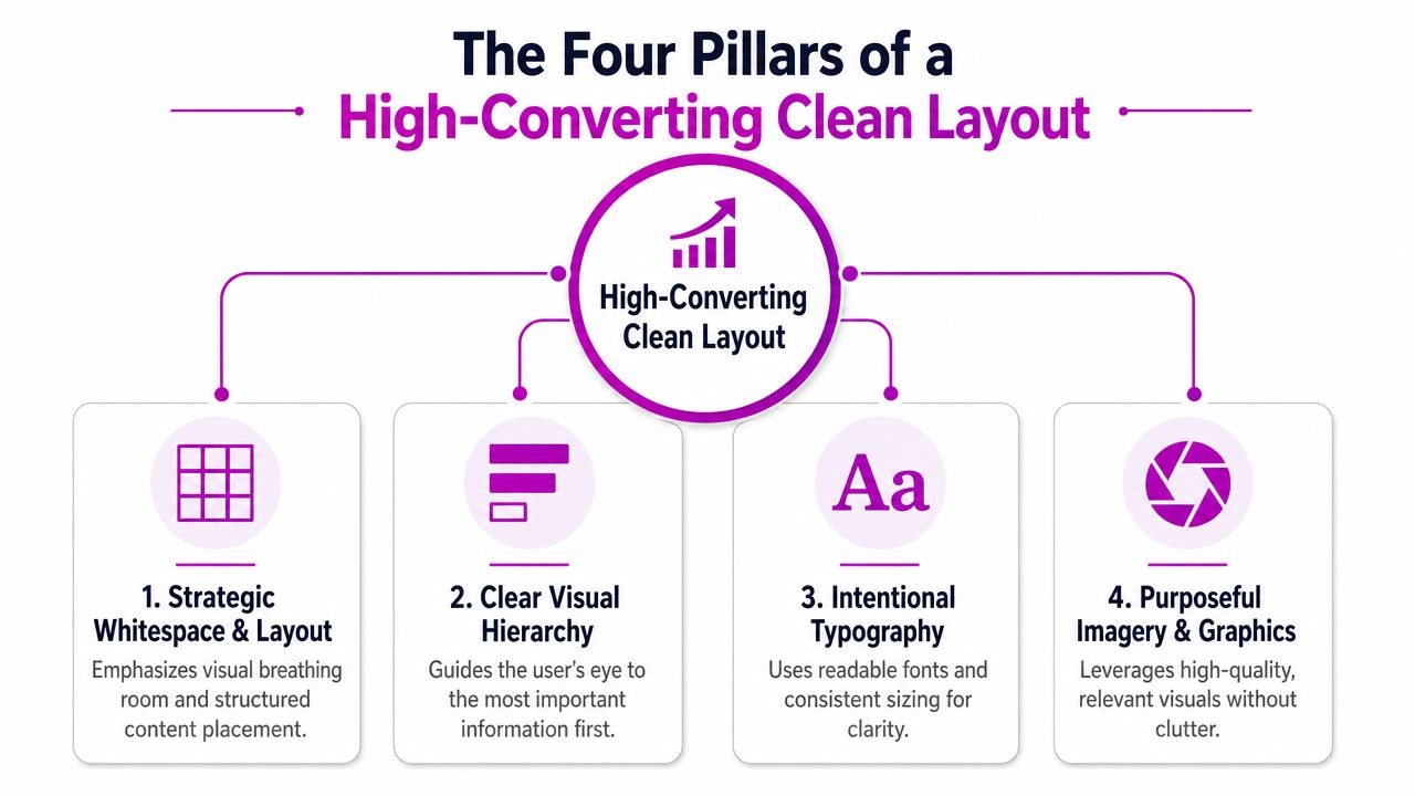
Strategic whitespace and layout
Whitespace is control. It tells shoppers what belongs together and what deserves attention first.
On Shopify, the easiest way to lose that control is to overfill every section because the theme editor makes it easy to keep adding blocks. Just because Dawn, Prestige, or Impact lets you stack text, icons, banners, app blocks, and featured collections in one template doesn't mean the page benefits from all of them.
Use spacing to create distinct content groups:
- Hero area: Keep one primary message and one main action.
- Product summary zone: Price, variant selection, delivery or returns cue, and add to cart should sit in one visual cluster.
- Trust layer: Reviews, payment messaging, and reassurance points should support the buy box, not interrupt it.
- Discovery layer: Related products and upsells belong after the core purchase decision is clear.
For a useful reference on layout discipline and merchandising structure, this guide to eCommerce website design best practices is worth reviewing alongside your theme build.
Clear visual hierarchy
Hierarchy decides what the eye sees first, second, and third.
If your product title, promotion ribbon, star rating, financing message, inventory badge, and CTA all compete with equal weight, the page feels messy even if the color palette is restrained. Strong clean website design gives each element a role.
A simple hierarchy on a product page often looks like this:
| Priority | Element | Practical rule |
|---|---|---|
| First | Product title and main image | Make the product identity immediate |
| Second | Price and core offer | Keep pricing easy to scan |
| Third | Variant selector and CTA | Put action close to decision inputs |
| Fourth | Trust and support details | Reinforce purchase confidence without dominating |
Practical rule: One screenful should communicate one main decision.
Intentional typography
Typography does more work than most merchants think. It sets pace, clarity, and trust.
A clean design framework should establish what customers want to find, where they go, and what they do. It also benefits from consistent fonts, such as Inter at 12-point with only 2–3 font sizes, plus short paragraphs and bullet points for scannability. That matters because 75% of users judge a site's credibility based on its design, according to We Are Tenet's web design statistics.
In practice, that means:
- Limit type variation: One font family is often enough.
- Reserve larger sizes: Use them for product names, collection headlines, and section intros only.
- Write shorter UI text: “Add to cart” beats a long custom CTA line if space is tight.
- Protect line length: Dense paragraphs make even a good theme feel cheaper.
Purposeful imagery and graphics
Imagery should sell the product, not decorate the page.
That means clean crops, consistent aspect ratios, and media that answers buying questions. Show texture, scale, fit, use case, packaging, and color accuracy. Skip generic lifestyle filler if it doesn't help a shopper decide.
What works best is usually simple: one strong primary image, a controlled gallery, and supporting icons or graphics only where they reduce uncertainty. When brands overuse badges, floating labels, and overlapping graphics, the store stops looking premium and starts looking improvised.
Placing Conversion Elements Without Creating Clutter
The hardest part of clean website design on Shopify isn't the homepage. It's the product page.
That's where sales pressure builds. Marketing wants urgency. CX wants policy visibility. Merchandising wants bundles. Retention wants subscription prompts. Paid media wants landing pages to mirror ad copy. If nobody curates those requests, the page becomes a pile of conversion tactics.
The better approach is selective visibility. Great UX design can drive conversion rates up to 400%, and investing in UX can generate an ROI of 9,900%, or $100 for every $1 spent, according to Clutch web design stats. That only happens when conversion elements support the buying path instead of crowding it.
Build one dominant action path
Every product page needs one primary click target. Usually that's the add-to-cart button.
Give every clickable action the same system. Use one action color for primary buttons and interactive highlights. Keep secondary actions visually quieter. If your add-to-cart, wishlist, size guide, chat prompt, and subscribe option all use equal contrast, you've flattened the hierarchy.
A practical Shopify pattern looks like this:
- Primary CTA: High-contrast solid button.
- Secondary action: Text link or outlined button.
- Supportive utility links: Smaller text near the relevant field, not in a separate promo strip.
- Sticky mobile buy bar: Useful, but only if it repeats the same message and price logic as the main buy box.
Group trust signals near the decision point
Trust shouldn't be scattered.
Reviews, shipping expectations, returns reassurance, secure checkout cues, and payment options work best when grouped close to the buy box. If you place one badge under the gallery, one financing line below the fold, another guarantee in a pop-up, and review stars in a floating widget, shoppers have to assemble the message themselves.
Use proximity to lower cognitive load. On Shopify product templates, I usually keep trust layers in three zones:
- Immediate trust: Review stars and key reassurance near title or price.
- Transactional trust: Delivery, returns, and payment messaging near the CTA.
- Depth trust: Detailed reviews, FAQs, and UGC further down the page.
If a trust signal is important enough to add, it's important enough to place intentionally.
Use progressive disclosure carefully
A lot of brands hide too much in the name of cleanliness. Then the page feels empty, and shoppers miss details they need.
The answer isn't dumping everything into the first screen. It's revealing complexity in sequence. Keep core product facts visible. Move care instructions, ingredient explanations, compatibility details, and brand story into lower sections that are easy to scan.
On Shopify, this often works better with short stacked sections than with overused accordions. Some tabs and collapsible areas help on mobile, but too many hidden panels suppress useful content and create friction. If the detail answers a buying objection, don't bury it.
Make promotions earn their space
Promotional elements are where stores get messy fastest.
A discount callout can work. A countdown timer can work. An inventory badge can work. But each one needs a clear job:
| Element | When it helps | When it hurts |
|---|---|---|
| Countdown timer | Time-bound campaign with real urgency | Always-on “fake urgency” on every SKU |
| Inventory badge | Useful on fast-moving or limited items | Flashing stock alerts on stable catalog products |
| Review snippet | Reinforces confidence near CTA | Repeated in multiple widgets on one screen |
| Bundle or upsell | Adds relevant value | Interrupts the first purchase decision |
If an element doesn't change behavior, remove it. Clean stores usually convert better not because they say less, but because each message arrives at the right time.
Implementing Clean Design on Shopify
Shopify makes clean design easier than most platforms, but it also makes clutter easy to ship if your app stack grows without governance.
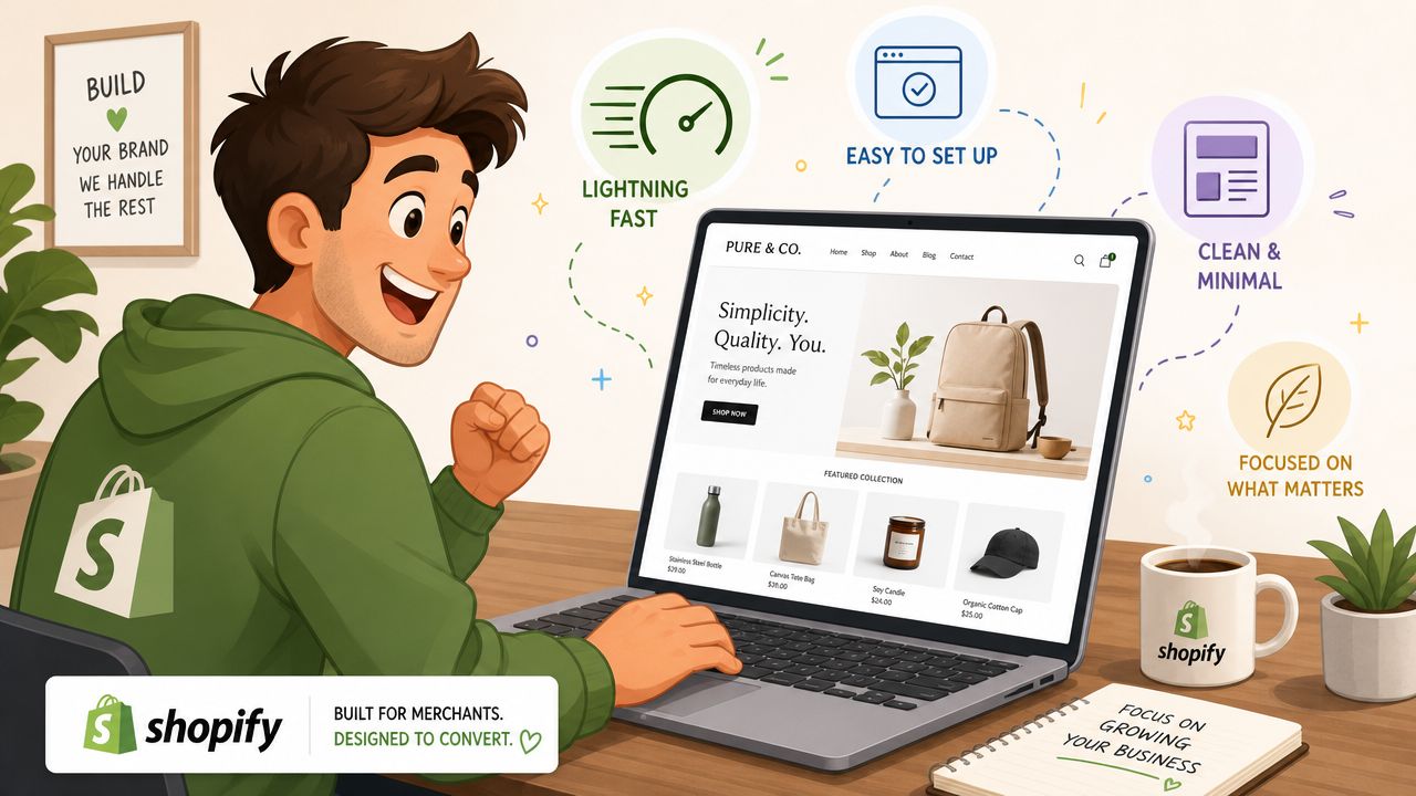
The foundation matters. Start with a lightweight theme architecture, then add only the elements that support merchandising and conversion. If you want examples of restrained storefront direction, these minimal Shopify templates are a useful starting point for evaluating what “clean” looks like in practice.
Start with a theme that stays out of the way
For most growing brands, Dawn is still a strong base because it's modular and relatively restrained. The bigger point isn't the specific theme name. It's whether the theme gives you clean defaults, sensible section spacing, and enough flexibility without forcing extra apps for basic merchandising.
Before choosing a theme, review these questions:
- Can the product template handle badges, review stars, and selling points without custom app wrappers?
- Are section settings granular enough to remove unused chrome, padding conflicts, or duplicate headings?
- Does the mobile menu stay simple when your catalog grows?
- Can you control image ratio, card density, and content width globally?
A theme that looks polished in a demo but needs multiple app injections to support your real funnel usually won't stay clean for long.
Use Online Store 2.0 sections with restraint
Online Store 2.0 gives merchants a lot of layout freedom. That's useful, but freedom without a system produces visual drift.
I recommend setting rules before anyone edits templates:
- Limit section types per page: Don't use five different merchandising patterns on one landing page.
- Create reusable content blocks: Icons, guarantee rows, promo strips, and featured reviews should follow one style.
- Assign one owner for template logic: Marketing, design, and retention can all request changes. One person should approve what gets added.
A common failure pattern is solving every campaign with a new section. After six months, the homepage becomes a storage unit for old priorities.
Handle dynamic elements like product features, not app leftovers
Most "clean design" advice falters when addressing dynamic elements. Dynamic elements aren't automatically clutter. They become clutter when they appear with no hierarchy, inconsistent styling, or duplicate intent.
That matters because 68% of high-revenue brands struggle with layout clarity when dynamic inventory badges, countdown timers, and AI upsell widgets are added, based on cited discussion of Shopify's 2025 eCommerce Report in FutureLab Digital's clean design article.
Treat these elements as part of the product interface:
- Inventory badges: Place near price or variant selection. Use one concise line.
- Countdown timers: Keep them inside the buy box region during genuine campaign windows.
- AI upsells: Show them after the main intent is established, such as in-cart or post-add, not before the shopper understands the product.
- Subscription prompts: Present them as a clear choice inside the purchase module, not as a detached sales block further down.
A dynamic widget should inherit the page system. Same spacing, same typography, same border language, same interaction logic.
A lot of app blocks fail because they arrive with their own fonts, shadows, icon styles, and spacing rules. If the app can't be styled to match the theme cleanly, it's often better to build a simpler native version with theme blocks, metafields, or a small custom snippet.
Know when custom CSS is better than another app
Not every design request needs a new tool.
If you need to tighten spacing, align icon rows, simplify a badge style, standardize card corners, or adjust mobile stacking, a few lines of theme-level CSS are usually safer than installing another visual editor. Apps are best when they provide real logic, not when they exist to patch a cosmetic issue.
Later in the build, this walkthrough can help teams think through store structure and implementation choices:
The rule is simple. If a feature changes business logic, an app may make sense. If a feature only changes presentation, solve it as close to the theme as possible.
Optimizing for Performance and Mobile Experience
A site doesn't feel clean if it loads slowly, jumps during render, or forces mobile users to hunt for the main action.
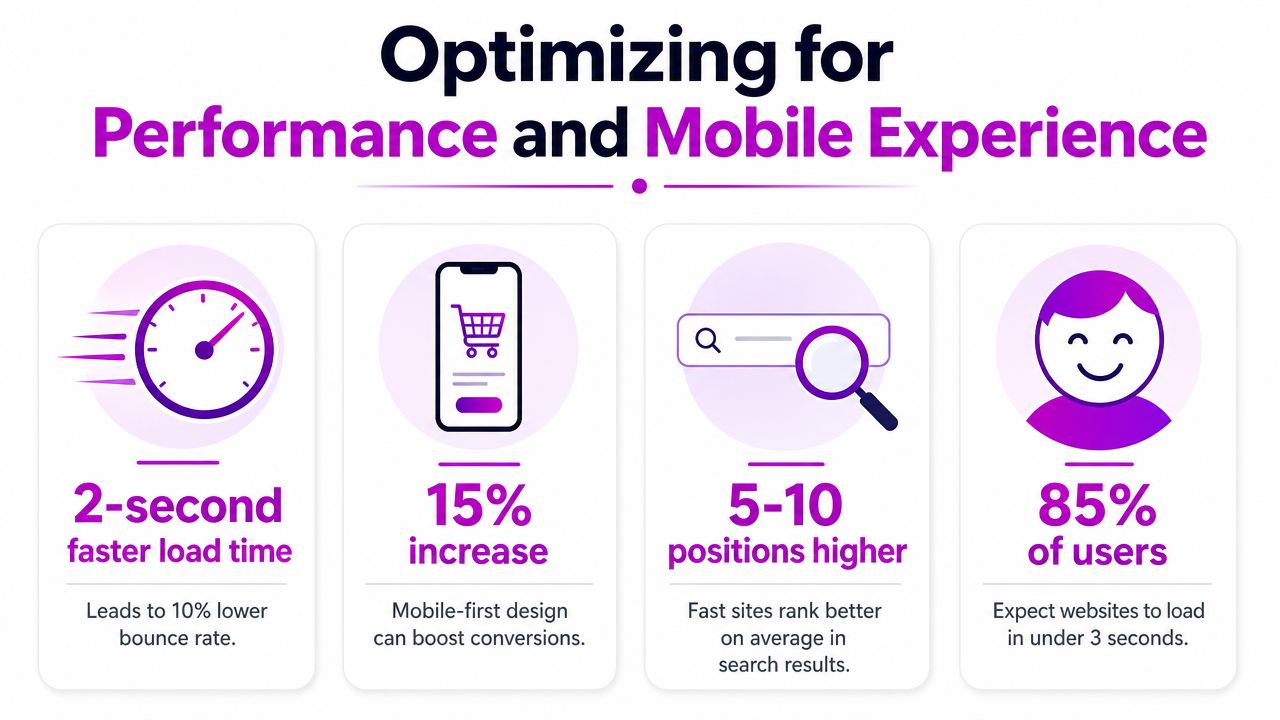
From a Shopify perspective, performance issues usually come from avoidable weight. Oversized images, autoplay media, app scripts, extra sliders, custom font files, and third-party widgets all add friction. That friction shows up first on mobile, where shoppers are trying to act quickly.
Prioritize the first screen on mobile
Technical guidance for clean design calls for fast load times under 2 seconds and mobile responsiveness. It also notes that 57% of user time is spent above the fold, while 48% of users view poor design as a credibility issue, according to Sora Partners on key website design elements.
That changes how you design product pages. The first mobile screen should focus on the essentials:
- Product identity: title, image, and price
- Decision support: key variant or offer context
- Action: a clear add-to-cart path
- Confidence: one or two reassurance cues
Everything else can follow, but it shouldn't displace the core buying moment.
Clean design under the hood
Good visual design and clean frontend code usually travel together.
Use compressed images, simplify section count, remove apps that inject duplicate JavaScript, and avoid loading media or interactive widgets before they're needed. Shopify already gives you solid hosting and CDN infrastructure. The bigger issue is what you place on top of it.
If your team creates product explainers or educational assets, it helps to transform text into videos instead of embedding heavy, custom media experiences everywhere on the page. That keeps storytelling useful without turning each landing page into a performance problem.
The fastest way to make a Shopify store feel more premium is often subtractive. Fewer scripts, fewer competing modules, fewer layout shifts.
Mobile-first clarity beats desktop decoration
Desktop gives you room to be expressive. Mobile punishes indecision.
Large comparison tables, layered promo bars, side-by-side app widgets, and decorative animation often survive internal review because they look acceptable on a wide screen. On mobile, they become stacked noise. Strong clean website design forces hard choices early, then keeps those choices consistent across templates.
Your Pre-Launch Clean Design Checklist
A redesign usually slips when teams review pages by taste instead of by function. This checklist fixes that. Run it before launch, before a campaign push, and again after each major app addition.
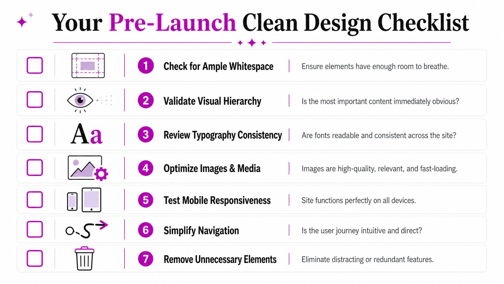
Visual clarity checks
Ask these first:
- Is the main action obvious: Can a first-time shopper identify the primary CTA immediately?
- Does each screen have one job: Or are multiple banners, badges, and promos competing at once?
- Are typography styles controlled: Font sizes, weights, and spacing should feel systemized, not improvised.
- Do images help the purchase: Every visual should answer a product question or reinforce value.
Conversion path checks
Then look at the selling mechanics:
- Are trust signals close to the buy box: Reviews, shipping cues, and returns reassurance should support the decision point.
- Are upsells placed after intent is formed: Cross-sells shouldn't interrupt product understanding.
- Do dynamic elements feel native: Timers, stock cues, and app blocks should match the theme visually.
- Is the cart path friction-light: Remove distractions between add to cart and checkout.
Performance and mobile checks
Here, many “clean” stores fail.
- Have you removed non-essential apps: If an app doesn't drive a clear purpose, deactivate it.
- Are images optimized and consistently sized: Prevent slow pages and layout shifts.
- Is the mobile buy flow thumb-friendly: Buttons, selectors, and sticky elements should be easy to use one-handed.
- Does the first mobile screen carry the page: Product, price, and action should be visible without confusion.
Before launch, review the store on a real phone, not only in a desktop browser preview. That's where clutter becomes obvious.
Governance checks
Clean stores stay clean when someone protects the system.
Use one design owner, one app review process, and one standard for introducing new badges, widgets, and promotional blocks. Most clutter doesn't arrive in one bad redesign. It accumulates through unreviewed additions.
A clean website design isn't the absence of selling. It's the presence of order.
If your Shopify store looks polished but still feels crowded where it matters, ECORN can help you simplify the experience without stripping out the conversion elements that drive revenue. Their team works across Shopify design, development, CRO, and scalable growth support, so brands can build cleaner storefronts that also perform.


Shopify Plus Automation: A Guide for 2026
10 Social Selling Platforms for Shopify Merchants

Shopify Website Design Examples: 7 Stores Worth Studying
7 Ecommerce Newsletter Examples for Shopify Brands
One Product Shopify Store: Build and Scale

Mobile Pop Up Strategy for Shopify Stores That Converts

Sitemap for Shopify: How to Find, Optimize, and Submit It
7 Single Product Websites Worth Emulating
Product Variants Shopify: The Complete 2026 Guide
Ecommerce Analytics Consulting for Growth

What Is AI Integration for eCommerce

How to Choose the Right eCommerce Website Development Firm

E Business Strategy Implementation
Conversion Tracking Setup for Shopify Stores
BigCommerce vs Shopify Plus Which Enterprise Wins in 2026
Shopify Theme Kit: Setup, Commands, and Migration Guide

Shopify Extension Development: A Practical 2026 Guide
Shopify Speed Score Explained and How to Improve It
Shopify Mobile Optimization: The 2026 Playbook

How to Add Subcategory in Shopify for Better UX
How to Implement Structured Data for Ecommerce in 2026

SEO App Mobile: Shopify Store Optimization Guide

Shopify Plus Support: What It Includes and How to Choose

Google Ads for Shopify: The Complete 2026 Playbook

Shopify New York: How to Find and Hire the Right Agency

Google Search Console for Shopify: The Complete Setup
First Party Data Collection for eCommerce Growth
FAQ Online Store Guide: Build and Measure It Right
Do FB Ads Work for eCommerce in 2026?
One Page Checkout for Shopify: Design and Implementation

Shopify GraphQL vs REST: The 2026 Developer Decision
Shopify Ecommerce Consulting: Strategy, Pricing &

Are Reddit Ads Worth It for eCommerce Brands

Shopify Title and Meta Description: A Practical 2026 Guide

Product Video Best Practices for Shopify Brands

Real-Time Inventory Management: A 2026 Guide

AI Chatbot Integration for Shopify Stores
Affiliate Program Management: A Shopify Guide
10 Best Performance Monitoring Tools for Shopify in 2026

Digital Asset Management for eCommerce Brands in 2026
Every Type of Facebook Ads Explained for eCommerce Growth
Product Information Management Explained for Shopify Brands
Support Ticket System: A Guide for Shopify Stores

10 Best Customer Service Tools for Shopify in 2026

Can I Start a Business with No Money? a 2026 Blueprint

What Sells Good on Etsy: Best Niches for 2026

Shopify Add to Cart Button: A Practical 2026 Guide

Customer Feedback Automation: A Practical eCommerce Guide
Critical Rendering Path: A Guide for Shopify Stores

How to Promote on TikTok for eCommerce in 2026

B2B eCommerce Consulting That Drives Real Revenue

10 Best Practices for Site Navigation in 2026
Return vs Refund for Shopify Stores: A Practical Guide
What Is Customer Lifetime Value and Why It Matters
What Is Voice of Customer Research for eCommerce

SMS Marketing for Ecommerce That Actually Converts

Master How to Improve Email Deliverability in 2026

Top 7 eCommerce Partners NYC for Shopify Brands in 2026

Machine Learning for Ecommerce: Boost Your Shopify Store

Beauty Market Research: Your 2026 Growth Guide

Shopify International Expansion: A 2026 Roadmap

What Does CRO Stand for in Business: Understanding CRO

Shopify Visual Merchandising: A Playbook for Higher Sales

Shopify Landing Page Design: Master Conversion in 2026

10 Best AI SEO Optimization Tools for Shopify in 2026

Agentic AI for Ecommerce: Boost Your Sales in 2026
Mastering Email Marketing Data for eCommerce Growth

Conversion Rate Optimisation Australia: Boost Your Sales
Conversion Rate Optimization AI: Your Shopify Store Guide

10 Product Bundling Strategies for Shopify in 2026

How to Increase Customer Lifetime Value: A Shopify Playbook

AI Customer Service Automation: Shopify Guide 2026

Omnichannel Retail Strategy: A Shopify Playbook
Product Data Enrichment: A Guide for Shopify Brands

Instagram Shopping Features a Guide for Shopify Stores

What Is Revenue Optimization: A Holistic RevOps Guide

Benefits of Conversion Rate Optimization: Boost Your
WordPress to Shopify Migration: Your 2026 Seamless Switch
Boost Sales: Ecommerce Payment Processing Guide 2026
Unified Commerce Platform: Benefits, KPIs & Shopify Guide
How to Reduce Bounce Rate eCommerce: Your 2026 Guide
Shopify API Integration: A Practical End-to-End Guide

How to Implement Data Governance: A 2026 Guide

Shopify Store Development Cost: A 2026 Breakdown
What Is Server Side Tracking: The Shopify Guide 2026
Marketing Automation Workflows: A Shopify Guide for 2026

Shopify: How to Reduce Technical Debt

Shopify UX Design Change: A Playbook for Growth

User Generated Content Strategy: Shopify Playbook
Shopify Pause and Build Plan Cost: A Complete 2026 Guide
Compare at Price on Shopify: A Complete Guide for 2026
Where Can I Sell My Prints? 10 Best Platforms for 2026
Shopify Order Management System: The Ultimate Guide 2026
What Is Marketing Attribution? an eCommerce Guide for 2026

10 Best Black Friday Sales Sheets for 2026

Discover the Top Social Media Marketing Agencies For
Consumer Confidence Definition for eCommerce in 2026
What Is Social Commerce? Your 2026 Guide to Boosting Sales

A Social Ad Campaign Playbook for eCommerce Growth

7 Best FAQ Page Examples for SaaS & eCommerce


newsletter in your inbox