


Roughly half of shoppers who start checkout still fail to complete their order, according to an independent 2026 Shopify-focused benchmark. The same benchmark places checkout abandonment at 45% to 55%, with mobile abandonment 10 to 15 percentage points higher than desktop and higher-consideration categories another 10 to 20 points higher. Shopify checkout abandonment data makes the commercial point clearly: checkout optimization isn't cosmetic UX work. It's revenue recovery from shoppers who've already shown meaningful purchase intent.
A good Shopify checkout optimization program doesn't begin with a redesign. It starts by locating the leak, identifying whether payment fit or form friction causes it, and applying the smallest change that removes the hesitation. Shopify-native capabilities such as Shop Pay, accelerated wallets, guest checkout, address autocomplete, payment customization, and Checkout Extensibility often outperform a costly rebuild because they solve the specific constraint without adding more code or steps.
Why Shopify Checkout Optimization Matters Right Now
Cart abandonment is already high before a shopper reaches payment. Baymard Institute's synthesis of 50 studies places average cart abandonment at 70.22%, a baseline also repeated in Shopify's 2026 educational content. The Baymard benchmark and Shopify baseline show why ecommerce teams continue to invest in the final stages of the funnel. Many shoppers browse casually, but a checkout starter has moved closer to a decision and deserves a more precise diagnosis.
The independent Shopify-focused benchmark reports combined abandonment of 78% to 85% from add-to-cart to purchase. That broader figure includes shoppers who leave before checkout, while the 45% to 55% checkout abandonment range isolates people who begin the transaction. The distinction matters. A brand may have a product-page problem, a cart problem, or a checkout problem, and a sitewide conversion rate won't tell you which one is consuming revenue.
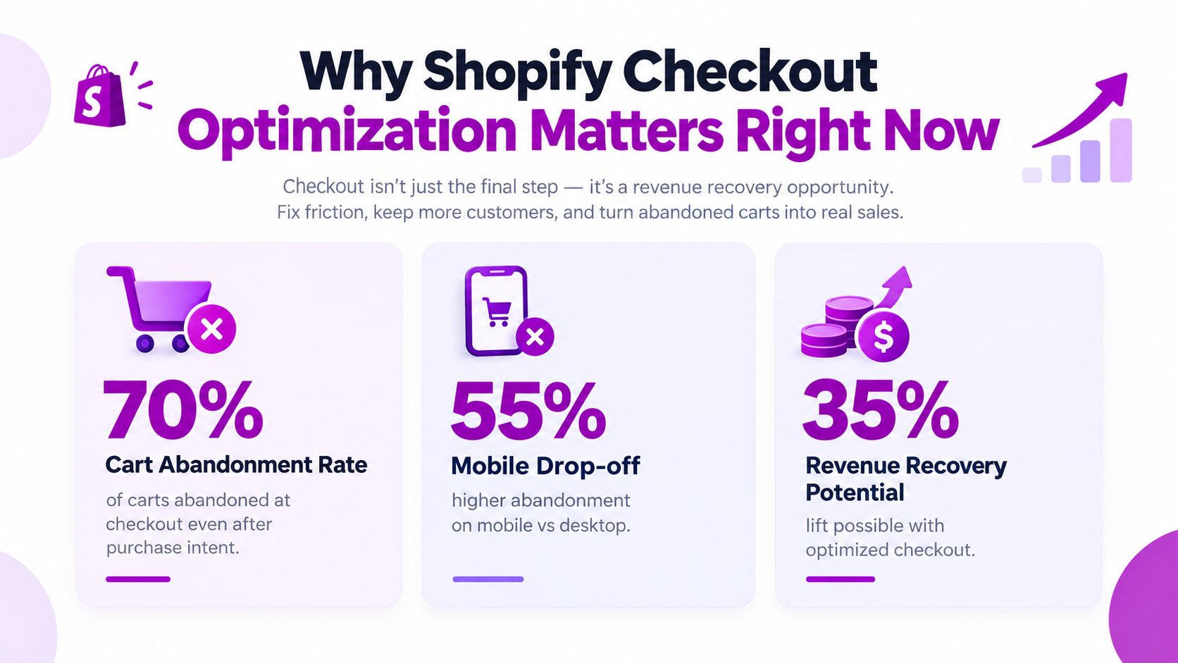
Checkout is a commercial problem, not a polish exercise
Checkout sits near the point where acquisition spend, merchandising, and product desire should become revenue. A small improvement there can affect the orders already generated by paid search, email, organic traffic, and returning customers. That doesn't mean every checkout change will pay off. It means the stage deserves its own measurement and prioritization instead of being buried inside a broad conversion-rate target.
Mobile deserves separate attention because smaller screens make typing, keyboard switching, address entry, and payment confirmation harder. Higher-consideration products create another layer of hesitation, particularly when shipping costs, delivery timing, returns, or security aren't clear.
Baymard's research identifies unexpected extra costs, forced account creation, and limited payment options among the common causes of abandonment. Those findings lead to a practical priority order:
- Remove uncertainty: Show shipping, tax, duties where applicable, and delivery information before payment submission.
- Reduce effort: Keep guest checkout available, prefill known details, and make nonessential fields optional.
- Match expectations: Offer payment methods that fit the buyer's market, device, and order context.
- Protect trust: Make returns, security cues, and support access easy to find without interrupting completion.
Commercial rule: Don't ask whether checkout looks modern. Ask which committed shoppers can't complete the purchase, and why.
How to Diagnose Checkout Friction Before You Fix Anything
The first metric to isolate is checkout completion rate:
Purchases ÷ begin-checkout events
That calculation tells you how many checkout starters become customers. It removes the noise created by product discovery and add-to-cart behavior, so you can evaluate the stage you intend to improve. An independent Shopify benchmark places median checkout completion at 38% to 48%, top-quartile stores at 52% to 60%, and top-decile stores at 60% to 75%. A blended 45% to 55% is considered healthy in that benchmark. Shopify checkout conversion benchmarks provide useful orientation, but your own segmented trend should drive decisions.
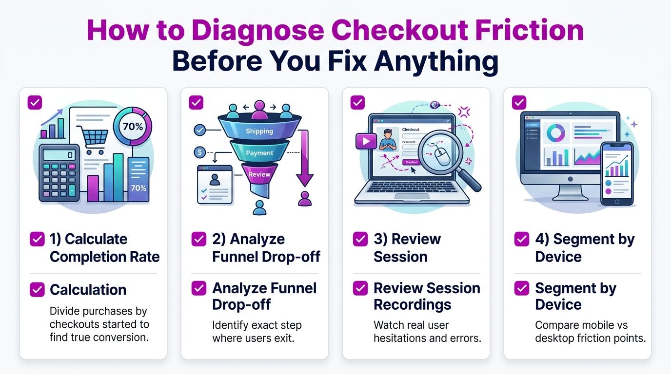
Build a segmented view
Start with Shopify Analytics and your analytics platform, then check whether the problem changes by:
- Device: Compare mobile and desktop completion. A mobile gap points toward field interaction, wallet visibility, page performance, or payment entry.
- Traffic source: Paid social, branded search, email, and direct traffic carry different levels of intent. A source-specific gap may indicate a mismatch between the promise in the ad and the cost or delivery terms at checkout.
- Customer status: Returning customers often benefit from saved details and accelerated checkout. New customers need clearer trust, policy, and payment reassurance.
- Market and currency: A checkout can work for domestic buyers while failing international shoppers because the currency, delivery estimate, or preferred payment method feels unfamiliar.
Track checkout started, contact information submitted, shipping details submitted, payment information submitted, and purchase completed. If your implementation supports custom pixels or Customer Events, validate that each event fires once and carries the correct order context. A duplicate purchase event can make an apparently successful test look stronger than it is.
For a deeper framework for separating acquisition, cart, and checkout problems, use this conversion funnel analysis guide. The key is to create a short problem list, not a dashboard full of disconnected metrics.
Watch behavior, not just exits
Session recordings and error logs help explain the number. Look for repeated address edits, payment retries, taps on disabled buttons, coupon hunting, hesitation around delivery costs, and attempts to select a missing wallet. Combine those observations with Shopify's checkout funnel so you know whether the behavior occurs before shipping, at payment selection, or after an error.
Don't start by changing every field. If payment failure is concentrated among mobile users in one market, shortening the form won't address the root cause. If new visitors exit after shipping costs appear, a trust badge won't compensate for late cost disclosure.
Streamlining the Shopify Checkout Flow and User Experience
The fastest gains usually come from removing work the buyer shouldn't have to do. Shopify Checkout already provides a structured flow, so the practical question is which settings, payment placements, and inputs create unnecessary effort for your customers.
Cut effort without removing useful information
Baymard's large-scale usability research reports that better checkout design can lift conversion by roughly 35%, and independent industry data cited in the research indicates that reducing a form from 15 fields to 6 can improve conversion by 18% to 35%. Shopify's checkout guidance connects the opportunity to practical changes such as field reduction, guest checkout, and mobile usability.
Apply the changes in this order:
- Keep guest checkout prominent. Account creation shouldn't block payment. Let the customer complete the order, then invite account creation using the email and order details already supplied.
- Prefill known data. Carry email, address, and customer information forward when Shopify or an approved app already has it. Keep fields editable so shoppers can correct errors.
- Make optional fields optional. Company, apartment, marketing consent, and other nonessential inputs shouldn't appear mandatory or demand attention before payment.
- Use address autocomplete. Selecting a recognized address is faster and less error-prone than typing every line, especially on a phone.
- Reduce step repetition. Don't ask for the same information in the cart, checkout, and post-purchase flow unless the repetition serves a clear purpose.
Mobile form design needs its own QA pass. Check that the email field opens an email-friendly keyboard, card fields use numeric entry, autofill works, tap targets aren't cramped, and error messages appear beside the field that needs correction. A one-page layout can help, but collapsing steps won't fix a payment method that shoppers can't use or a delivery charge revealed too late.
Practical rule: Remove friction from the buyer's task, not from your analytics. Keep the events and error states you need to understand what happened.
Fashion stores should preserve size, color, and delivery reassurance before checkout so the payment page doesn't carry unanswered product questions. Beauty brands should make shipping thresholds and returns easy to access because customers may be buying across regions. High-AOV stores need particularly clear delivery, refund, warranty, and security information, but those details should support completion rather than force the buyer through extra screens.
Place express payment options where eligible shoppers can see them early, while retaining a clean card path for customers who prefer it. Shop Pay can reduce manual entry for returning customers, and Apple Pay or Google Pay can make mobile payment substantially easier when the customer is already authenticated on the device.
A practical build sequence is:
- First, fix native settings: Guest checkout, address autocomplete, policy links, order summary clarity, and accelerated checkout availability.
- Then improve presentation: Make express options visible, show progress clearly, and ensure mobile fields behave correctly.
- Only then consider additions: Add an app or custom extension when the native flow cannot solve a validated problem.
A busy checkout can feel less trustworthy than a simple one. Extra surveys, cross-sells, badges, countdowns, and promotional banners compete with the payment decision. Put post-purchase offers after the order when possible, rather than making a committed buyer evaluate more products before paying.
The following walkthrough can help teams review the flow visually before release:
Test the complete journey on real devices, including a first-time customer, a returning customer, a failed payment, an address correction, a discount code, and an order with different shipping options. A checkout that works in a desktop browser can still fail when a mobile keyboard covers the submit button or a wallet opens in an unexpected context.
Payment and Shipping Optimization That Matches Buyer Expectations
The most overlooked Shopify checkout optimization opportunity is often payment-method fit. Teams frequently reduce a field, move a button, or redesign the summary while shoppers in a particular market are looking for a payment method the store doesn't offer.
Shopify's 2026 guidance emphasizes offering payment methods customers want and addressing security hesitation. Shopify's ecommerce checkout optimization guidance also highlights a useful distinction: more options aren't automatically better. The right mix is better.
Choose payment methods by market and device
A Germany-focused storefront may need PayPal and invoice options to meet local expectations, while another audience may respond more strongly to accelerated wallets. Shop Pay, Apple Pay, and Google Pay reduce typing for eligible customers, particularly on mobile. PayPal can provide familiarity and an alternative trust path for shoppers who don't want to enter card details directly.
Use a decision sequence rather than enabling every available method:
- Identify where buyers live and pay. Review market, currency, device, and completed-order data.
- Compare successful and failed payment attempts. Look for payment-method errors, retries, and abandoned sessions after a method is selected.
- Prioritize expected methods. Add the methods that remove a real market or device barrier.
- Keep the interface legible. Reorder, rename, or hide irrelevant methods when Shopify's payment customization tools allow it.
Shipping needs the same discipline. Baymard's research identifies unexpected extra costs as a leading abandonment cause, so show shipping charges and taxes as early and clearly as possible. Give buyers a delivery estimate, explain processing time where relevant, and avoid surprising mandatory fees at the final payment step.
| Optimization Lever | Best For | Implementation Effort | Expected Impact |
|---|---|---|---|
| Shop Pay and accelerated wallets | Returning customers and mobile shoppers | Low | High when buyers already use the wallet |
| Apple Pay or Google Pay | Device-led mobile audiences | Low | High when wallet authentication is available |
| PayPal or market-specific methods | Regions with strong local preferences | Medium | High when card-only checkout creates hesitation |
| Transparent shipping and tax display | Stores with variable or cross-border costs | Medium | High when cost surprise causes exits |
| Delivery estimates and policy links | High-consideration products | Low to medium | Medium to high, depending on uncertainty |
| Payment method ordering | Stores with many active options | Low | Medium, when relevance improves scanning |
Payment principle: Matching local preference often beats adding another generic checkout feature.
Don't confuse a longer payment list with better localization. A small, relevant set that's clearly labeled can outperform a crowded selector. Review currencies, eligibility rules, country restrictions, and device behavior before judging a payment method's value. A method that appears in one market but disappears for a meaningful segment can create more confusion than confidence.
Technical Performance and Shopify Plus Checkout Customization
Checkout performance depends on more than the visible form. Theme scripts, app embeds, tracking implementations, redirects, and third-party requests can slow the path before the buyer reaches Shopify Checkout. The checkout itself benefits from Shopify's hosted infrastructure, but a fast checkout can't rescue a slow product page or cart experience.
Start with a technical inventory:
- Audit app impact: Remove unused app embeds, duplicate tracking, and scripts that load on pages where they aren't needed.
- Check the path to checkout: Measure product, cart, and checkout-entry performance on mobile, not only on a fast office connection.
- Validate payment behavior: Test accelerated wallets, card failures, discount codes, shipping rates, and market-specific methods after every major app change.
- Protect event quality: Confirm Customer Events and custom pixels don't fire duplicate purchase or checkout events.
- Test release changes: Use a staging or controlled rollout process instead of editing live checkout logic without a rollback plan.
Shopify Plus gives teams more control through Checkout Extensibility, Checkout UI Extensions, Shopify Functions, and custom apps. These tools can support branding, validation, payment or delivery rules, custom content, and post-purchase experiences within Shopify's supported framework. Standard Shopify plans still support important native checkout settings and selected extensions, but they don't expose every pre-payment customization available to Plus merchants.
Choose native, app, or custom development
Use a native Shopify setting when the requirement is standard, such as guest checkout, payment activation, address autocomplete, or basic policy presentation. Choose an app when the problem is specialized and the app adds clear value without loading unnecessary code or creating conflicting logic.
Custom development makes sense when the rule is central to the business and cannot be handled safely by native settings or a maintained app. Examples include complex delivery eligibility, market-specific payment rules, or a carefully designed checkout extension for a large multi-store operation. Shopify Plus teams should favor supported extensibility over deprecated approaches and fragile direct edits.
The Shopify Checkout Extensibility resource is useful when planning that migration or deciding which existing scripts and customizations need replacement. Audit each customization by purpose, owner, dependency, and measurable outcome before rebuilding it.
Build-versus-app test: If nobody can explain which checkout problem a script solves, remove it before adding anything else.
For brands operating multiple storefronts, standardize the measurement schema and core customer experience, then localize payment, currency, shipping, and policy content where buyers need it. Don't copy every app and customization across stores automatically. Each addition creates maintenance cost, and checkout reliability matters more than feature count.
Rolling Out Testing and Measuring Checkout Improvements
A checkout change should earn its place through evidence. Start with a clean baseline for checkout completion, purchases, begin-checkout events, payment failures, and segment performance. Keep the definition stable while you test, or you won't know whether the apparent lift came from the UX change or a tracking change.
Create a controlled testing backlog
Prioritize tests by evidence and reach:
- Payment fit: Test a relevant wallet or local payment method against the existing mix when the data shows payment hesitation.
- Cost clarity: Test earlier shipping and tax disclosure when shoppers exit after delivery options appear.
- Form effort: Test field reduction, autofill, guest checkout prominence, or address autocomplete when recordings show repeated manual entry.
- Trust support: Test clearer returns, delivery, security, or contact information when new customers hesitate before payment.
- Performance and reliability: Test app removal or script changes when errors, slow loading, or payment retries cluster by device.
Change one primary variable at a time where possible. Hold traffic sources, promotional conditions, product availability, shipping rules, and payment eligibility steady enough to interpret the result. Monitor completed orders and revenue quality, not just clicks on an express-wallet button. A payment option can attract interaction without improving completed purchases if it introduces errors or confuses shoppers.
The 70.22% average cart abandonment benchmark from Baymard is useful context, but it isn't your target and it doesn't diagnose your store. Baymard's research synthesis describes a broad ecommerce pattern, while your segmented checkout completion rate tells you whether a specific change helped your customers.
Use a 30-day operating rhythm
During the first phase, validate tracking and record the current funnel by device, source, customer status, and market. Next, fix one high-confidence native issue, such as missing wallet visibility, unclear shipping costs, or unnecessary fields. Then run a controlled test on the next most supported hypothesis and review both conversion quality and operational effects, including support contacts, payment failures, fulfillment expectations, and refund behavior.
Avoid common measurement traps. Don't compare a promotional weekend with an ordinary period, mix new payment eligibility into a form test, or judge a change before enough completed orders exist to make the result interpretable. Keep a changelog with launch date, audience, hypothesis, implementation details, and outcome.
Checkout optimization becomes durable when the team treats it as an operating process rather than a one-time redesign. Review the funnel regularly, remove apps that no longer earn their cost, and revisit payment fit as markets and customer behavior change.
ECORN can audit your Shopify funnel, identify checkout friction, and implement CRO improvements across native checkout settings, payment flows, and Shopify Plus customization. Visit ECORN to request a checkout-focused CRO audit or discuss a targeted Shopify optimization project.


Shopify Inventory Sync: A Practical Setup Guide
Shopify App Integration Playbook That Scales

Shopify CMS Integration: Your 2026 Guide to Options

Shopify Store Audit: Find Hidden Conversion Leaks

Shopify Plus Experts: How to Hire the Right Team

Chargeback Protection Shopify: A Practical 2026 Guide
8 Examples of Conversion Rate Optimization
How to Conversion Rate Optimization for Shopify Stores

Shopify Design Essentials Every Store Owner Needs
Ecommerce Terms of Service: How to Draft and Implement
How to Implement Structured Data for Ecommerce in 2026

SEO App Mobile: Shopify Store Optimization Guide

Shopify Plus Support: What It Includes and How to Choose

Google Ads for Shopify: The Complete 2026 Playbook

Shopify New York: How to Find and Hire the Right Agency

Google Search Console for Shopify: The Complete Setup

First Party Data Collection for eCommerce Growth
FAQ Online Store Guide: Build and Measure It Right
Do FB Ads Work for eCommerce in 2026?

One Page Checkout for Shopify: Design and Implementation
Shopify GraphQL vs REST: The 2026 Developer Decision
Shopify Ecommerce Consulting: Strategy, Pricing &

Are Reddit Ads Worth It for eCommerce Brands

Shopify Title and Meta Description: A Practical 2026 Guide

Product Video Best Practices for Shopify Brands
Real-Time Inventory Management: A 2026 Guide

AI Chatbot Integration for Shopify Stores
Affiliate Program Management: A Shopify Guide
10 Best Performance Monitoring Tools for Shopify in 2026

Digital Asset Management for eCommerce Brands in 2026

Every Type of Facebook Ads Explained for eCommerce Growth
Product Information Management Explained for Shopify Brands
Support Ticket System: A Guide for Shopify Stores

10 Best Customer Service Tools for Shopify in 2026

Can I Start a Business with No Money? a 2026 Blueprint

What Sells Good on Etsy: Best Niches for 2026

Shopify Add to Cart Button: A Practical 2026 Guide

Customer Feedback Automation: A Practical eCommerce Guide

Critical Rendering Path: A Guide for Shopify Stores

How to Promote on TikTok for eCommerce in 2026

B2B eCommerce Consulting That Drives Real Revenue

10 Best Practices for Site Navigation in 2026
Return vs Refund for Shopify Stores: A Practical Guide

What Is Customer Lifetime Value and Why It Matters

What Is Voice of Customer Research for eCommerce

SMS Marketing for Ecommerce That Actually Converts

Master How to Improve Email Deliverability in 2026

Top 7 eCommerce Partners NYC for Shopify Brands in 2026

Machine Learning for Ecommerce: Boost Your Shopify Store

Beauty Market Research: Your 2026 Growth Guide

Shopify International Expansion: A 2026 Roadmap

What Does CRO Stand for in Business: Understanding CRO

Shopify Visual Merchandising: A Playbook for Higher Sales

Shopify Landing Page Design: Master Conversion in 2026

10 Best AI SEO Optimization Tools for Shopify in 2026

Agentic AI for Ecommerce: Boost Your Sales in 2026
Mastering Email Marketing Data for eCommerce Growth

Conversion Rate Optimisation Australia: Boost Your Sales
Conversion Rate Optimization AI: Your Shopify Store Guide

10 Product Bundling Strategies for Shopify in 2026

How to Increase Customer Lifetime Value: A Shopify Playbook

AI Customer Service Automation: Shopify Guide 2026

Clean Website Design: A Shopify Conversion Playbook

Omnichannel Retail Strategy: A Shopify Playbook

Product Data Enrichment: A Guide for Shopify Brands

Instagram Shopping Features a Guide for Shopify Stores

What Is Revenue Optimization: A Holistic RevOps Guide

Benefits of Conversion Rate Optimization: Boost Your
WordPress to Shopify Migration: Your 2026 Seamless Switch
Boost Sales: Ecommerce Payment Processing Guide 2026
Unified Commerce Platform: Benefits, KPIs & Shopify Guide

How to Reduce Bounce Rate eCommerce: Your 2026 Guide
Shopify API Integration: A Practical End-to-End Guide

How to Implement Data Governance: A 2026 Guide
Shopify Store Development Cost: A 2026 Breakdown
What Is Server Side Tracking: The Shopify Guide 2026
Marketing Automation Workflows: A Shopify Guide for 2026

Shopify: How to Reduce Technical Debt

Shopify UX Design Change: A Playbook for Growth

User Generated Content Strategy: Shopify Playbook

Shopify Pause and Build Plan Cost: A Complete 2026 Guide

Compare at Price on Shopify: A Complete Guide for 2026

Where Can I Sell My Prints? 10 Best Platforms for 2026
Shopify Order Management System: The Ultimate Guide 2026
What Is Marketing Attribution? an eCommerce Guide for 2026

10 Best Black Friday Sales Sheets for 2026

Discover the Top Social Media Marketing Agencies For
Consumer Confidence Definition for eCommerce in 2026

What Is Social Commerce? Your 2026 Guide to Boosting Sales

A Social Ad Campaign Playbook for eCommerce Growth

7 Best FAQ Page Examples for SaaS & eCommerce

Market Research in Fashion Industry: A Guide for Shopify

Shopify Migration Services: Expert Guide for 2026

Mastering FB Retargeting Ads for Shopify in 2026
What Is Omnichannel Ecommerce

Master Your Shopify Plus Migration: The 2026 Guide
Shopify Integration Services: A Merchant's 2026 Guide

Shopify Collection Description: A Guide to SEO & Sales

Shopify Plus Contact: Reach Sales & Support Effectively

Top Luxury Shopify Stores: Design & UX Strategies


newsletter in your inbox