

The most repeated advice on storefront design is to make every page look the same. That advice fails the moment a campaign, a market, or a product type needs a different layout. Shoppers don't need cloned screens. They need to know, without thinking, where search sits, what a button will do, and how an error gets fixed.
Consistent website design is a set of predictable interaction rules, not a single template stamped across the catalogue. Lock the behaviours people rely on. Vary the merchandising. Test the variation before it becomes permanent.
What to Lock and What to Vary Across Storefronts
A visually tidy site can still be a mess to use. A 2026 analysis of nearly 40,000 Shopify product pages found critical accessibility issues on 63–69% of pages depending on site size, and 96% failed at least one automated accessibility check. Mature brands don't get consistency for free.
Treat the split as a consistency budget. Locked items get one definition. Page teams can't override them. Varied items can change inside component rules, and only a measured win earns a permanent slot.
| Element | Lock or vary | Why it matters | How to test |
|---|---|---|---|
| Primary navigation placement | Lock | Shoppers scan the same place on every page | Task completion from home to product on mobile |
| Product information order | Lock | Price, variant and stock must appear in the same sequence | Add-to-cart rate by template |
| Button semantics and styles | Lock | Same action, same look and same role | Keyboard completion and screen reader labels |
| Cart and checkout access | Lock | Cart and checkout are high-stakes flows | Checkout completion rate by device |
| Error handling and messages | Lock | Errors must be found and fixed the same way | Error recovery time in form tests |
| Promotional banners | Vary | Campaigns change weekly | Click-through and conversion by campaign, with contrast checks |
| Bundles and cross-sell modules | Vary | Merchandising depends on the product mix | Average order value against a control group |
| Social proof and reviews | Vary | Content differs by product and market | Add-to-cart rate with and without the module |
| Landing-page storytelling | Vary | Campaign pages need their own narrative | Conversion and bounce rate by campaign |
| Localized copy and imagery | Vary | Language and cultural cues change by market | Conversion by market with translation review |
A homepage hero can change every week. Its call to action still uses the primary button, the same label pattern, and the same focus style. That's the difference between a campaign and a new interface.
What earns a permanent place
Compare conversion, add-to-cart rate, checkout completion, and accessibility defect rate by template, device, and market. A bundle block that lifts order value on desktop and breaks the filter keyboard path on mobile doesn't ship as a new standard. It stays a test, or it goes.
If you're setting those rules for the first time, a practical UI design guide helps a team name controls before anyone argues about colour. Pair that vocabulary with a store-specific layout plan, the kind covered in this ecommerce website design guide, so navigation and product hierarchy stay stable while campaigns move.
If a change would make a shopper relearn where to find search, cart, or checkout, it belongs in the locked column.
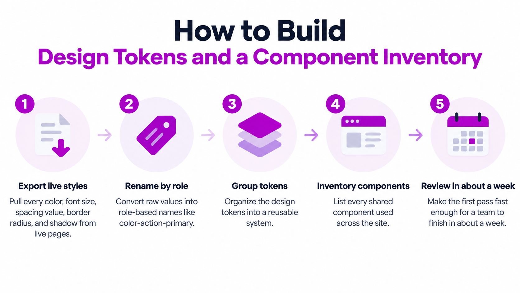
How to Build Design Tokens and a Component Inventory
You can finish a first pass in about a week if you stop designing new screens and start naming what already ships.
Colour matching is the easy part, and it's the part teams over-invest in. A 2001 usability study of 140 participants across four experiments, four task types, and eight interface designs identified nine dimensions that shape consistency, from text structure and terminology to meaning, content, and physical attributes. Structure and visual attributes that stay stable improve performance and cut errors. On a store, that means navigation, labels, content order, controls, and spacing, not only the logo.
Six steps for the first week
- Export live values. Pull every colour, font size, spacing step, radius, and shadow from home, collection, product, cart, and account. Don't design a new palette yet. Name what production already uses.
- Rename by role.
color-action-primarysurvives a rebrand.#1A6B3Cdoesn't. One token change should ripple through every template that uses that role. - Add states to each group. Hover, focus, pressed, disabled, loading, and error are part of the token, not a page-level afterthought. If focus colour lives only in one template's CSS, it will drift.
- Inventory what shoppers touch. Buttons, product cards, variant selectors, filters, search, the cart drawer, forms, promo banners, and account blocks. List every variant that exists today, including the "temporary" ones from last season.
- Merge what doesn't earn its keep. A new variant must solve a named problem, such as a destructive action or a quiet secondary action. Stores that start with eight near-identical buttons usually land on two or three. I would start with buttons and form fields, because those two leak into every flow.
- Sign off on real input. Walk each template on desktop and mobile, then again with a keyboard and with touch. A card that looks aligned in a screenshot can still trap focus or shift under a thumb.
The build check
Flag every page-specific override while you map templates to the inventory. An override is either a missing token or a variation that belongs in the budget with an end date.
Can a developer build a new collection page using only the inventory and the token list, with no Slack thread and no "match the homepage" instruction? If the answer is no, the inventory isn't done.
Documenting the Style Guide and Content Patterns
Tokens tell a developer what exists. They don't tell a merchandiser which words to use on an empty cart, or a designer which banner is allowed to break the grid. That job belongs in a living style guide, kept in the same repository as the component code so a button change and its documentation land in one pull request.
Give each token group and each component its own entry with four parts.
- Purpose: one sentence on the job, such as "primary button commits the main purchase action."
- Approved variants: names only, matching the inventory. If it isn't named, it isn't allowed.
- Do and don't examples: a correct product card next to the card that restyles the price in campaign pink.
- Required states: default, focus, disabled, error, and loading, so writers don't ship copy that only works in the happy path.
Content patterns beside the components
Pick one term per shopper concept. "Add to cart" stays "add to cart" in every market unless a local difference is logged as a deliberate variation, with an owner and an end date. The same rule covers "size," "colour," and "in stock."
Write microcopy for the moments that repeat: empty cart, out of stock, shipping cutoff, form errors, and discount codes. Each pattern uses a fixed shape. The problem is one sentence. The next action is one sentence. "This code has expired. Enter a current code or continue without a discount."
Put format rules in the same place. Currency, dates, and units. Product title length. Image ratios. Alt text that names the product and the view, not "image1." A new template doesn't ship until someone other than the writer checks that the copy uses approved terms. How those rules sit inside a wider identity system is covered in this guide to creating brand guidelines.
Accessibility Requirements for Every Shared Component
Brand consistency that fails a keyboard user isn't consistency. It's a look that only works for one way of shopping.
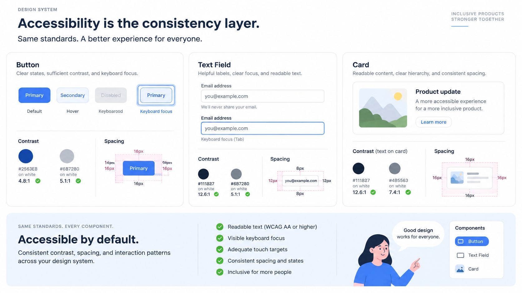
Map every shared component before you debate page layouts. The checks below are the ones that spread when a library is sloppy.
| Component | Contrast | Focus and keyboard | Labels and errors |
|---|---|---|---|
| Primary button | 4.5:1 for text, 3:1 against background | Visible focus, 2 CSS px perimeter at 3:1 | Accessible name matches visible text |
| Product card | 4.5:1 for price and title | Whole card focusable once | Image alt text, product name read first |
| Variant selector | 3:1 for swatch borders | Arrow-key support within option groups | Selected state announced to screen readers |
| Filter panel | 3:1 for checkboxes and toggles | Focus returns to results after applying | Each filter labelled with its count |
| Form field | 3:1 for field borders | Tab order follows visual order | Visible label, error text linked to field |
| Error message | 4.5:1 for text | Focus moves to first error | Icon and text, never colour alone |
| Promotional banner | 4.5:1 for overlay text | Carousel pauses and works by keyboard | Images have alt text or are marked decorative |
Why one defect becomes a store-wide defect
The 2026 Web Accessibility Annual Report found detectable WCAG failures on 95.9% of the top one million homepages. Shopping websites averaged about 71 accessibility errors per homepage in that scan. Low-contrast text, missing image alternatives, unlabeled fields, and unclear links show up again and again.
A shared button or filter with one bad name repeats that defect on every product and collection page. Fixing page 400 doesn't help. The fix belongs in the library, then every template picks it up.
Hover-only styling disappears on a phone. An error that is only red fails for anyone who can't use that cue. An icon button without an accessible name is silent to a screen reader. A carousel that doesn't pause, or that traps focus, blocks the rest of the page. Third-party review apps, chat widgets, and payment badges inject their own controls. They get the same state checks as first-party code. If a widget can't show focus or expose a name, it doesn't ship on a core journey.
Test each component in default, hover, focus, disabled, error, and loading, at the breakpoints you sell on. Page-by-page spot checks miss the shared control that looked fine on the homepage and fails inside the cart drawer.
Keeping Layout Stable Across Every Template
A button that jumps after load looks broken on every template that uses it. Stability is part of the design system, not a performance project you bolt on later.
Google's Core Web Vitals report treats a good experience as LCP of 2.5 seconds or less, INP of 200 milliseconds or less, and CLS of 0.1 or less. Search Console scores a URL group at the 75th percentile of visits. The bar is that at least 75% of visits meet all three, not a flattering lab average.
| Metric | Good threshold | Common design-system cause | First fix |
|---|---|---|---|
| LCP | 2.5 seconds or less | Hero image or banner loaded late without priority | Preload the hero image and set its dimensions |
| INP | 200 milliseconds or less | Duplicated app scripts blocking input | Remove duplicate scripts and defer nonessential ones |
| CLS | 0.1 or less | Web fonts swapping, or components changing height after load | Reserve dimensions and control font loading |
Fix order for the busiest templates
Work the highest-traffic templates in this order, then stop and remeasure.
- Reserve dimensions for images, video, and embeds, including review carousels and size charts.
- Preload only critical assets, usually the hero and the primary font files you can't avoid.
- Cut render-blocking CSS and JavaScript that the first screen doesn't need.
- Defer nonessential third-party scripts such as extra analytics, chat, and wishlist apps.
- Retest on a representative mobile network, not only on office wifi.
Late-loading web fonts shift titles. Components that change height after hydration shove the add-to-cart button. Carousels with no reserved space jump the whole product column. Duplicated app scripts, often one in the theme and one in an app embed, delay taps.
Track pass rate by template, device class, and release. If one shared card regresses any vital, block the rollout. Skeleton dimensions, stable breakpoints, and a short allow-list of third-party scripts keep the same polish on every storefront that shares the library.
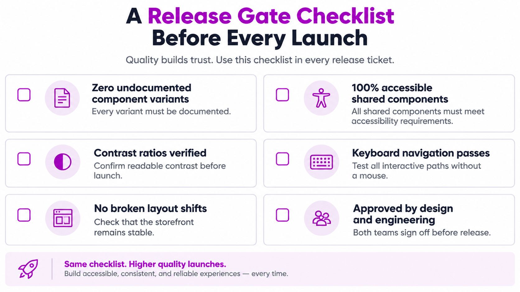
A Release Gate Checklist Before Every Launch
Rules that live in a doc and not in the ticket will be skipped on a Friday launch. Copy this gate into every release, including the small ones.
WCAG 2.2 sets the measurable floor. Normal text needs at least 4.5:1, large text 3:1, and user-interface components and meaningful graphics 3:1 against adjacent colours. Every operable control needs a visible focus indicator, with an area at least a 2 CSS pixel perimeter and 3:1 contrast between focused and unfocused states.
The ticket itself stays short.
- Zero undocumented component variants. If it isn't in the inventory, it doesn't merge.
- 100% keyboard completion of product, cart, and checkout, on desktop and mobile widths.
- Automated contrast checks for every semantic colour pair, including seasonal and dark themes.
- Manual review of focus, error, disabled, loading, and validation states.
- Field vitals passing for each touched template at the visit threshold you already track.
Measure by component state and template, not by page count. One bad shared button or form control spreads across the storefront. Block rollout when a shared component fails any line.
Three rules the checklist hides
Don't validate only the default theme. Seasonal and dark themes usually break contrast first, while the default screenshots still look fine.
Reject page-specific colour overrides unless they pass the consistency budget with a reason and an end date. "Just for this landing page" is how token files die.
Keep the gate short enough that a two-line copy change still runs it. A gate nobody runs is decoration.
Design signs tokens. Engineering signs components and keyboard paths. Merchandising signs any variation inside the budget. No change ships with an open item in a role's column.
Start the Audit on Your Highest-Traffic Template
Don't audit the whole site. Pick the template with the most sessions. On most stores that's the product page.
Label what is locked and what may vary. Confirm the page uses named tokens and documented components. Run keyboard and contrast checks on its states. Then watch field vitals for that template until the sample is stable, which usually means a few weeks of real traffic rather than one lab run.
You'll get a short list of shared-component fixes. Those pay off faster than editing templates one by one, because the next collection or landing page inherits the repair.
Name one template, one owner, and a two-week date for the first gate pass. The owner can be the design lead. The date is a pass or a written list of blockers, not a redesign.
If the team can't staff that pass, our ecommerce group covers research, design, CRO, development, and marketing in one team, which is enough to map tokens, fix shared components, and run the variation tests without splitting the work across four vendors.
ECORN designs and builds Shopify storefronts where navigation, product hierarchy, and shared components stay predictable while campaigns and markets still have room to change. We can help you lock the rules, clean up the component library, and put a release gate on the next template you ship. Visit ECORN when you want that work handled by one ecommerce team.



Shopify Development Company in USA Hiring Guide
Shopify Inventory Tracking App: How to Set It Up Right
Shopify Volume Pricing: How to Set Up Tiered Discounts
How Does Shopify Work for Sellers? a Practical Guide
Shopify Theme ZIP: How to Upload and Install It
Shopify Plus Organization Admin: Roles and Access Guide
How to Build a Drop Down Menu in Shopify: Steps and Fixes
Shopify Plus Integration Services Guide
Shopify Customer Experience: A 2026 Guide

Shopify Plus Expansion Stores: Limits and Setup
Shopify Theme Update: Safe Steps, Backups and Rollback

Shopify Website Design Packages: What You Actually Get

How to Choose a Shopify Plus Web Design Agency in 2026
Shopify Plus Ecommerce Agency: How to Pick the Right One
Shopify Themes Retina: How to Serve 2x Images

How to Cross Sell on Shopify Without Friction
Best Shopify Theme for Custom Products Compared
Multi Store Inventory Management: A Practical Guide

SEO Consulting for Ecommerce: A Practical Guide
Shopify Theme Updater App: A Safe Update Playbook
Shopify Git Integration: A Developer's Guide to 2026
Headless Ecommerce Development Services Explained

How to Build a Shopify Clothing Website That Converts

How to Launch a Box Subscription Business in 2026

Luxury Skincare Branding Playbook That Converters
10 Best Podcast Ecommerce Shows for Store Growth in 2026
Shopify Developer Hourly Rate: What to Pay in 2026
Critical Shopify Setup Errors That Are Secretly Sabotaging Your Store
Ecommerce Conversion Tracking: The Complete How-To Guide
Shopify Design Agency: How to Pick the Right Partner
Mastering Multi Store Management on Shopify

Scale Shopify Store
10 Shopify App Ideas Worth Building in 2026
Conversion Rate Optimization for Landing Pages: The Playbook
Shopify Plus Automation: A Guide for 2026
10 Social Selling Platforms for Shopify Merchants

Shopify Website Design Examples: 7 Stores Worth Studying
7 Ecommerce Newsletter Examples for Shopify Brands

One Product Shopify Store: Build and Scale
Mobile Pop Up Strategy for Shopify Stores That Converts
Sitemap for Shopify: How to Find, Optimize, and Submit It
7 Single Product Websites Worth Emulating
Product Variants Shopify: The Complete 2026 Guide

Ecommerce Analytics Consulting for Growth

What Is AI Integration for eCommerce

How to Choose the Right eCommerce Website Development Firm

E Business Strategy Implementation
Conversion Tracking Setup for Shopify Stores
BigCommerce vs Shopify Plus Which Enterprise Wins in 2026
Shopify Theme Kit: Setup, Commands, and Migration Guide

Shopify Extension Development: A Practical 2026 Guide
Shopify Speed Score Explained and How to Improve It
Shopify Mobile Optimization: The 2026 Playbook

How to Add Subcategory in Shopify for Better UX
How to Implement Structured Data for Ecommerce in 2026

SEO App Mobile: Shopify Store Optimization Guide
Shopify Plus Support: What It Includes and How to Choose

Google Ads for Shopify: The Complete 2026 Playbook
Shopify New York: How to Find and Hire the Right Agency
Google Search Console for Shopify: The Complete Setup

First Party Data Collection for eCommerce Growth
FAQ Online Store Guide: Build and Measure It Right
Do FB Ads Work for eCommerce in 2026?
One Page Checkout for Shopify: Design and Implementation
Shopify GraphQL vs REST: The 2026 Developer Decision
Shopify Ecommerce Consulting: Strategy, Pricing &

Are Reddit Ads Worth It for eCommerce Brands
Shopify Title and Meta Description: A Practical 2026 Guide

Product Video Best Practices for Shopify Brands
Real-Time Inventory Management: A 2026 Guide

AI Chatbot Integration for Shopify Stores
Affiliate Program Management: A Shopify Guide
10 Best Performance Monitoring Tools for Shopify in 2026

Digital Asset Management for eCommerce Brands in 2026
Every Type of Facebook Ads Explained for eCommerce Growth
Product Information Management Explained for Shopify Brands
Support Ticket System: A Guide for Shopify Stores

10 Best Customer Service Tools for Shopify in 2026

Can I Start a Business with No Money? a 2026 Blueprint

What Sells Good on Etsy: Best Niches for 2026

Shopify Add to Cart Button: A Practical 2026 Guide

Customer Feedback Automation: A Practical eCommerce Guide
Critical Rendering Path: A Guide for Shopify Stores

How to Promote on TikTok for eCommerce in 2026

B2B eCommerce Consulting That Drives Real Revenue
10 Best Practices for Site Navigation in 2026
Return vs Refund for Shopify Stores: A Practical Guide
What Is Customer Lifetime Value and Why It Matters
What Is Voice of Customer Research for eCommerce

SMS Marketing for Ecommerce That Actually Converts

Master How to Improve Email Deliverability in 2026

Top 8 eCommerce Partners NYC for Shopify Brands in 2026

Machine Learning for Ecommerce: Boost Your Shopify Store

Beauty Market Research: Your 2026 Growth Guide

Shopify International Expansion: A 2026 Roadmap
What Does CRO Stand for in Business: Understanding CRO

Shopify Visual Merchandising: A Playbook for Higher Sales

Shopify Landing Page Design: Master Conversion in 2026

10 Best AI SEO Optimization Tools for Shopify in 2026

Agentic AI for Ecommerce: Boost Your Sales in 2026


newsletter in your inbox