


In 2026, a real Shopify store gets judged fast. First, does it load quickly enough to hold attention? Second, does the first screen answer why buy here without making people hunt? Third, is checkout clean enough that a shopper doesn't drift away at the finish line? That's the lens for these Shopify website design examples, not a mood board. Each one gets broken down like a build brief, visual choice, UX pattern, theme logic, and the one move a growing brand can copy without starting from zero.
1. Services - Design
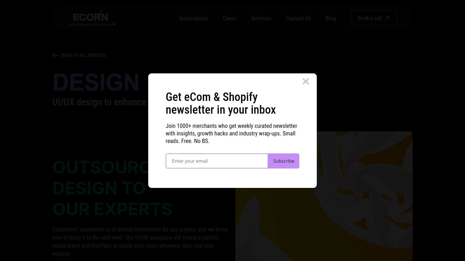
ECORN's design service is the most practical place to start because it treats Shopify design as a conversion system, not decoration. That matters in a market where checkout friction, mobile navigation, and load speed affect real revenue outcomes, as Shopify's UX guidance on cart abandonment, form length, and mobile navigation makes clear in its own ecommerce UX benchmark coverage. A strong storefront usually comes from measurable UX decisions, not just polished branding, and that's exactly where a Shopify-first service earns its keep.
What this setup gets right
The value is in the way ECORN blends responsive UX/UI, conversion rate optimization, and modular theme systems into one workflow. Instead of designing a page that looks good only in a presentation deck, the team builds component libraries that can move into production quickly, which is the right instinct for brands that need consistent storefronts across multiple markets or product lines.
A few trade-offs are obvious. If you're not on Shopify, this service isn't a fit. And if your roadmap depends on deep backend engineering beyond theming, you'll still need additional development support. But for merchants who want a storefront that can ship, test, and iterate, the model is strong.
Practical rule: if your redesign can't be broken into reusable components, it's probably going to be hard to scale.
One reason this matters is speed to value. ECORN's flexible engagement model, including monthly subscriptions and single-project work, lets teams choose between ongoing iteration and a one-off validation sprint. That's useful when a brand wants to compare a theme refresh against a bigger redesign before committing further.
For a more detailed view of how this service fits into a broader Shopify build, see ECORN's Shopify web design services breakdown. If your current store feels visually fine but conversion-flat, this is the kind of service that turns inspiration into a workable build plan.
2. Shopify Ecommerce Store Examples
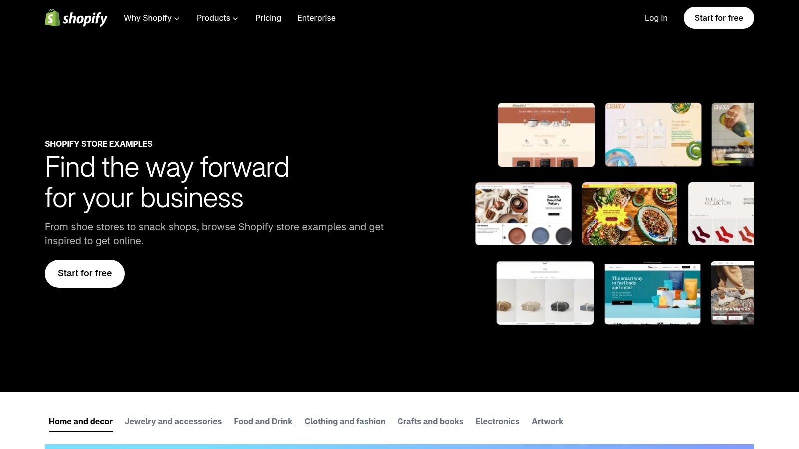
Shopify's official examples page is the cleanest baseline because it shows live stores on the platform, not mockups or stale screenshots. That makes it useful when stakeholders keep asking for proof that a certain layout, menu style, or product-page structure exists in the wild. You can move from inspiration to live site review in a few clicks, which is faster than rebuilding a research list from scratch.
How to use it without wasting time
Use the category browsing to spot patterns by vertical, then open the live sites and inspect the parts that matter most, navigation depth, product-page layout, and how the brand handles trust signals. The strength of the page is trust, not depth. The weakness is the opposite, it's not built for performance analysis or technical stack review, so don't expect it to answer every question.
The best way to work with this gallery is to treat it like a starting point, not the final shortlist. Pull one or two examples from the same category as your store, then compare them against your own product mix, merchandising needs, and checkout path. That keeps the conversation grounded in what a merchant can realistically ship.
The useful question isn't “Does this look nice?” It's “What exact pattern here could improve my product discovery or checkout flow?”
If you're evaluating examples for a rebrand or a theme migration, this is the first stop. It gives you verified Shopify storefronts without forcing you to guess whether the site is built on the platform. Visit the official Shopify examples gallery when you need a broad but reliable benchmark for what's live right now.
3. Shopify Blog Best Shopify Website Designs and 2026 Trends
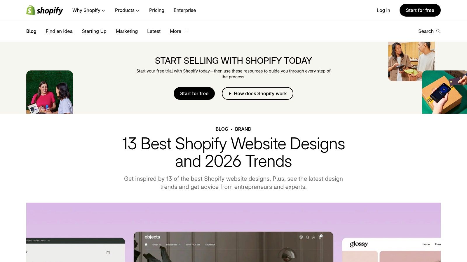
Shopify's editorial roundup works because it doesn't just show storefronts, it explains the design logic behind them. That's a big difference from a gallery that only hands you screenshots. When a merchant is trying to justify design spend internally, the commentary matters as much as the visual examples because it helps translate inspiration into requirements.
Why the editorial angle helps
The current value of this page is its tie-in to 2026 design direction. Shopify's own examples highlight editorial typography, immersive sections, and themed aesthetics, while CRO guidance warns against letting style outrun speed and readability. That tension is the core issue, because a store can look premium and still underperform if it's hard to scan on mobile or slow to load.
This is also where a lot of redesign conversations go wrong. Teams fall in love with a hero section or a fancy scroll effect, then forget that a visitor still needs a clear value proposition, a path to product, and a checkout flow that feels simple. The best lesson from this roundup is not imitation, it's prioritization.
A useful way to read it is by asking three questions for each example:
- What is the first-screen promise? If that's weak, the rest of the page has to work too hard.
- What does the product storytelling do? Good stores sell context, not just objects.
- What slows the page down? Heavy visuals can flatten the user experience if they aren't handled carefully.
For teams building a brief, this page saves time because it frames style choices in commercial terms. For a deeper planning angle that connects design to ecommerce structure, ECORN's ecommerce design analysis is the better companion read. Use Shopify's roundup when you want inspiration with commentary, not just pretty references.
4. Commerce Cream Store Design Gallery
Commerce Cream is useful because it stays close to the Shopify ecosystem while remaining visually focused. That gives it a slightly different value than Shopify's own examples page, since many entries also identify the agency behind the build. If you're comparing design partners as much as storefronts, that extra attribution is practical.
Where it fits in the research process
The main advantage here is signal quality. The catalog is narrower than broad design directories, but the examples tend to be polished and Shopify-specific, which cuts down on noise. That makes it easier to collect a reference set that a developer, designer, and founder can all react to without arguing about whether the examples are even relevant.
The limitation is equally clear. Filtering depth is thin compared with bigger directories, so this is not the place to do deep technical scoping. It's better for identifying a visual direction, noting which agency executed it, and extracting a few implementation cues you can test against your own budget and theme choice.
For merchants, the actual payoff is in the comparison between brands. You can see how different product categories handle whitespace, hero images, and product grids without drifting into generic “minimalism is good” advice. That kind of side-by-side pattern reading is often more useful than a long list of individual sites.
Good inspiration galleries don't just show taste, they show how much of that taste was probably custom work.
Use Commerce Cream when you want to move from “we like this” to “who built this and how far can our budget go?” That's the point where a shortlist becomes a build conversation, and that's where this gallery earns a spot in the workflow.
5. SiteInspire Shopify Category
A founder wants the store to feel premium, the designer wants it to stay usable, and the reference pool keeps drifting toward flashy but impractical examples. SiteInspire helps narrow that gap. Its Shopify category is human-curated, so the weaker examples are filtered out before anyone on the team loses time on them.
Best use case for brand teams
The strength here is selection, not volume. SiteInspire gives you stores that already feel production-ready, which makes it easier to compare how different brands handle type, spacing, and content hierarchy without falling into generic “minimal” advice. That is useful when a team is stuck between safe and trendy, and needs a visual direction that can still survive a real build.
The trade-off is obvious. You get much less functional detail than you would from a CRO-focused library, so product pages, mobile menus, and checkout behavior still need to be checked separately. For that reason, SiteInspire works better as a creative brief source than as a performance audit tool.
A practical way to use it is to pull three examples and mark them up by hand.
- Homepage framing, especially the first message a store puts in front of the visitor
- Product grid clarity, with a close look at mobile behavior
- Tone of the visuals, whether the site feels editorial, playful, luxury, or technical
That exercise gives the team something concrete to respond to. “Make it feel more upscale” turns into specific calls on spacing, hierarchy, and image treatment, which usually cuts down on revision loops.
Use SiteInspire first if the problem is taste alignment. Keep it in the research stack if the problem is conversion, because it will not answer that by itself.
6. Awwwards Shopify Websites
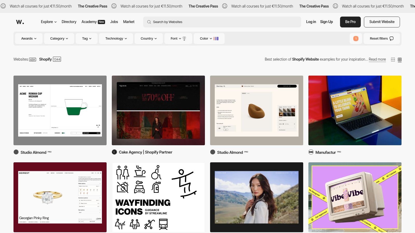
Use Awwwards when the brief needs a stronger point of view than a standard theme demonstration. Its Shopify-tagged work shows how motion, typography, transitions, and visual pacing can make a store feel premium from the first screen. The build decision is clear: spend design effort on the moments that establish brand value, rather than adding effects across every section.
One useful example might pair a restrained product layout with animated transitions and editorial spacing. That combination works because movement directs attention while the product remains the main subject. Copy the sequencing, not the full production budget. A growing brand can apply the same idea by giving one campaign or collection page a deliberate entrance treatment, then keeping the rest of the storefront fast and familiar.
Check the platform before treating an example as a Shopify reference. Some Awwwards entries may use custom or headless builds, so their interaction patterns can require more development than a theme-based store allows.
The commercial test comes before the visual one:
- Does the movement help visitors scan the page?
- Does the hero explain the offer quickly?
- Does the experience remain responsive on mobile?
- Can shoppers reach products without waiting through an effect?
Award-style design can hide weak shopping paths when teams judge only the first impression. For a luxury or design-led brand, study Awwwards for art direction, pacing, and selective interaction. For a high-volume storefront, keep the hierarchy and cut effects that delay product discovery or purchase.
7. HeyCarson Theme Showcase
A theme demo shows the intended starting point. HeyCarson's showcase shows the harder question: how that theme performs after a real brand fills it with products, imagery, navigation, and merchandising decisions. Stores grouped by theme make the comparison practical. The same foundation may support very different outcomes, giving stakeholders clearer evidence before approving a theme purchase or redesign sprint.
Start with the live implementation, then trace each visible choice back to the theme. Compare options such as Mono, Frame, or Aurora by checking which sections remain native and where custom work appears. That distinction helps scope development before the project begins.
The showcase also gives designers and developers a useful calibration exercise. An off-the-shelf theme can look polished when the brand supplies strong imagery, a disciplined layout, and clear merchandising. Its limits become visible when the brief requires unusual navigation, custom content blocks, or extended storytelling. Those requirements may justify custom sections, a different theme, or a narrower creative direction.
Use three checkpoints while reviewing each store:
How much customization appears on the homepage? Look for sections that seem theme-native versus additions built around the brand.
How are product cards handled in the collection view? Check image treatment, variant information, badges, and the amount of detail shown before a click.
Does the theme support the brand's required storytelling? Review how the store moves from brand context to collection pages and product details.
These checks expose the compromises hidden by a polished theme demo. They also give a growing brand a practical copy: identify one high-value custom section, then keep the remaining storefront close to the theme's proven structure. That approach protects scope while preserving a distinctive brand moment.
If the visual direction is already clear, use the showcase to test feasibility before locking the build brief, rather than treating the gallery as a collection of screenshots.
7 Shopify Website Design Examples Compared
| Item | 🔄 Complexity | ⚡ Resources & Speed | ⭐ Expected outcome / 📊 Impact | 💡 Ideal use case | Key advantages |
|---|---|---|---|---|---|
| Services - Design (ECORN) | Medium–High, bespoke UX + theme work and coordination with devs | ⚡ Fast delivery from an agency team; higher budget and ongoing subscription options | ⭐ High, conversion‑focused designs with measurable CRO uplift 📊 | 💡 Growing DTC or Shopify Plus brands needing production‑ready, scalable storefronts | Shopify‑first expertise, modular systems, AI‑enabled workflows |
| Shopify Ecommerce Store Examples (official) | Low, browse and review live sites | ⚡ Very low effort; immediate access | ⭐ Moderate, broad, real examples for benchmarking 📊 | 💡 Stakeholders who want platform‑owned, verified examples quickly | Official curation, wide variety, direct live links |
| Shopify Blog, Best Designs & 2026 Trends | Low, curated editorial roundup | ⚡ Low effort; includes analysis saving research time | ⭐ Moderate, actionable takeaways + trend context 📊 | 💡 Teams needing rationale behind design choices and recent trends | Explanatory commentary, recent 2026 trend guidance |
| Commerce Cream, Shopify Gallery | Low, curated gallery with agency attributions | ⚡ Low effort; focused browsing | ⭐ High visual quality; good for visual/UI benchmarking 📊 | 💡 Finding polished Shopify examples and potential agencies | High signal‑to‑noise, agency attribution on listings |
| SiteInspire, “Shopify” Category | Low, hand‑picked visual examples with tags | ⚡ Low effort; useful tagging speeds discovery | ⭐ High, strong visual/IA references across aesthetics 📊 | 💡 Seeking diverse style/industry inspiration beyond one vertical | Human curation, tagging by style and industry |
| Awwwards, Shopify Websites | Medium, many high‑production examples; verify platform | ⚡ Moderate effort to vet Shopify specificity; frequent updates | ⭐ Very High for advanced visuals/motion; variable platform fit 📊 | 💡 Pushing brand/UX ambition or motion/interaction design | Award‑screened, strong motion/animation and high production value |
| HeyCarson Theme Showcase (real stores by theme) | Low–Medium, examples organized by theme; practical to compare | ⚡ Moderate effort; quick to assess theme limits | ⭐ Practical, realistic view of theme capabilities and common customizations 📊 | 💡 Deciding between off‑the‑shelf theme vs custom build | Live examples by theme, shows common customizations and feasibility |
Your Shortlist, in Order
Start with Shopify's official examples if you need a trustworthy baseline. That gives you live stores on the platform, which is the cleanest way to separate actual Shopify builds from generic inspiration. From there, move to SiteInspire and Awwwards when the brand needs more visual ambition, editorial direction, or interaction ideas that feel a step beyond a standard theme.
If the project is really about implementation partners, Commerce Cream is the better filter because it often connects the store to the team behind it. That makes it easier to judge whether a style you admire was achieved through smart theme work, custom components, or both. Once the team has a direction, HeyCarson is the sanity check, it shows whether the theme you're considering can support the look you saved.
That sequence matters because most redesign mistakes happen when a team starts with the prettiest reference instead of the most useful one. A store can look close in a screenshot and still fail on mobile speed, navigation clarity, or checkout friction. The goal is to narrow the gap between inspiration and a realistic build before development starts.
If that gap looks larger than expected, that's the moment to bring in a Shopify-focused team that can scope what belongs in a theme and what needs custom work. ECORN is built for that handoff, design, Shopify development, and CRO in one workflow, so the brief doesn't get lost between strategy and execution.
If you want a Shopify storefront that looks stronger and converts better, ECORN can help turn example-gathering into an actual build plan. Their team handles Shopify design, theme customization, and conversion-focused implementation, so you can move from inspiration to a store that's ready to ship. Visit ECORN to see how they can shape your next redesign.


10 Social Selling Platforms for Shopify Merchants
7 Ecommerce Newsletter Examples for Shopify Brands
One Product Shopify Store: Build and Scale
Mobile Pop Up Strategy for Shopify Stores That Converts
Sitemap for Shopify: How to Find, Optimize, and Submit It
7 Single Product Websites Worth Emulating
Product Variants Shopify: The Complete 2026 Guide
Ecommerce Analytics Consulting for Growth

What Is AI Integration for eCommerce
How to Choose the Right eCommerce Website Development Firm
E Business Strategy Implementation
Conversion Tracking Setup for Shopify Stores
BigCommerce vs Shopify Plus Which Enterprise Wins in 2026
Shopify Theme Kit: Setup, Commands, and Migration Guide
Shopify Extension Development: A Practical 2026 Guide
Shopify Speed Score Explained and How to Improve It
Shopify Mobile Optimization: The 2026 Playbook
How to Add Subcategory in Shopify for Better UX
How to Implement Structured Data for Ecommerce in 2026
SEO App Mobile: Shopify Store Optimization Guide
Shopify Plus Support: What It Includes and How to Choose
Google Ads for Shopify: The Complete 2026 Playbook
Shopify New York: How to Find and Hire the Right Agency
Google Search Console for Shopify: The Complete Setup

First Party Data Collection for eCommerce Growth
FAQ Online Store Guide: Build and Measure It Right
Do FB Ads Work for eCommerce in 2026?
One Page Checkout for Shopify: Design and Implementation
Shopify GraphQL vs REST: The 2026 Developer Decision
Shopify Ecommerce Consulting: Strategy, Pricing &

Are Reddit Ads Worth It for eCommerce Brands
Shopify Title and Meta Description: A Practical 2026 Guide

Product Video Best Practices for Shopify Brands
Real-Time Inventory Management: A 2026 Guide

AI Chatbot Integration for Shopify Stores
Affiliate Program Management: A Shopify Guide
10 Best Performance Monitoring Tools for Shopify in 2026
Digital Asset Management for eCommerce Brands in 2026
Every Type of Facebook Ads Explained for eCommerce Growth
Product Information Management Explained for Shopify Brands
Support Ticket System: A Guide for Shopify Stores

10 Best Customer Service Tools for Shopify in 2026

Can I Start a Business with No Money? a 2026 Blueprint

What Sells Good on Etsy: Best Niches for 2026

Shopify Add to Cart Button: A Practical 2026 Guide

Customer Feedback Automation: A Practical eCommerce Guide
Critical Rendering Path: A Guide for Shopify Stores

How to Promote on TikTok for eCommerce in 2026

B2B eCommerce Consulting That Drives Real Revenue
10 Best Practices for Site Navigation in 2026
Return vs Refund for Shopify Stores: A Practical Guide
What Is Customer Lifetime Value and Why It Matters
What Is Voice of Customer Research for eCommerce

SMS Marketing for Ecommerce That Actually Converts

Master How to Improve Email Deliverability in 2026

Top 7 eCommerce Partners NYC for Shopify Brands in 2026
Machine Learning for Ecommerce: Boost Your Shopify Store

Beauty Market Research: Your 2026 Growth Guide

Shopify International Expansion: A 2026 Roadmap
What Does CRO Stand for in Business: Understanding CRO

Shopify Visual Merchandising: A Playbook for Higher Sales
Shopify Landing Page Design: Master Conversion in 2026
10 Best AI SEO Optimization Tools for Shopify in 2026

Agentic AI for Ecommerce: Boost Your Sales in 2026
Mastering Email Marketing Data for eCommerce Growth

Conversion Rate Optimisation Australia: Boost Your Sales
Conversion Rate Optimization AI: Your Shopify Store Guide

10 Product Bundling Strategies for Shopify in 2026
How to Increase Customer Lifetime Value: A Shopify Playbook
AI Customer Service Automation: Shopify Guide 2026
Clean Website Design: A Shopify Conversion Playbook

Omnichannel Retail Strategy: A Shopify Playbook
Product Data Enrichment: A Guide for Shopify Brands
Instagram Shopping Features a Guide for Shopify Stores
What Is Revenue Optimization: A Holistic RevOps Guide

Benefits of Conversion Rate Optimization: Boost Your
WordPress to Shopify Migration: Your 2026 Seamless Switch
Boost Sales: Ecommerce Payment Processing Guide 2026
Unified Commerce Platform: Benefits, KPIs & Shopify Guide
How to Reduce Bounce Rate eCommerce: Your 2026 Guide
Shopify API Integration: A Practical End-to-End Guide

How to Implement Data Governance: A 2026 Guide
Shopify Store Development Cost: A 2026 Breakdown
What Is Server Side Tracking: The Shopify Guide 2026
Marketing Automation Workflows: A Shopify Guide for 2026
Shopify: How to Reduce Technical Debt
Shopify UX Design Change: A Playbook for Growth
User Generated Content Strategy: Shopify Playbook
Shopify Pause and Build Plan Cost: A Complete 2026 Guide
Compare at Price on Shopify: A Complete Guide for 2026
Where Can I Sell My Prints? 10 Best Platforms for 2026
Shopify Order Management System: The Ultimate Guide 2026
What Is Marketing Attribution? an eCommerce Guide for 2026
10 Best Black Friday Sales Sheets for 2026

Discover the Top Social Media Marketing Agencies For
Consumer Confidence Definition for eCommerce in 2026
What Is Social Commerce? Your 2026 Guide to Boosting Sales
A Social Ad Campaign Playbook for eCommerce Growth

7 Best FAQ Page Examples for SaaS & eCommerce

Market Research in Fashion Industry: A Guide for Shopify


newsletter in your inbox