


Mobile devices account for 63% of all popup displays in a 2026 benchmark covering 28,674 campaigns, 11,533 businesses, 499.6 million displays, and 1.84 million leads. The median popup also converted 1.02% of mobile displays into leads, compared with 0.57% on desktop, according to Popupsmart's popup conversion benchmark. That changes the question for Shopify teams. Mobile popups aren't a scaled-down desktop component. They're a primary conversion channel.
A mobile pop up can grow an email list, recover an abandoning shopper, distribute a discount, or guide product selection. It can also cover the product someone came to inspect, trigger accidental taps, and make a store feel difficult to use. The difference isn't visual polish. It comes from format, intent, timing, touch ergonomics, consent, and measurement.
Why Mobile Pop Ups Now Dominate eCommerce Conversion
A Shopify merchant reviewing a campaign dashboard might see a familiar pattern. Desktop sessions produce a respectable number of impressions, while mobile generates most of the delivery volume. If the same creative, trigger, and form are used on both devices, the store is effectively asking a phone user to interact with a desktop experience compressed into a narrow screen.
That's a costly assumption. Mobile represented 63% of popup displays in the benchmark cited above, making it the dominant environment for popup delivery. The same dataset found that mobile clicks occurred on 2.99% of displays, compared with 1.34% on desktop, while lead conversion was 1.02% on mobile versus 0.57% on desktop. These figures don't mean every mobile popup will outperform every desktop version. They do show why a desktop-first setup leaves the largest share of impression inventory under-optimized.
| Metric | Mobile | Desktop |
|---|---|---|
| Share of popup displays | 63% | 37% |
| Median lead conversion from displays | 1.02% | 0.57% |
| Median clicks from displays | 2.99% | 1.34% |
The practical consequence is simple. A Shopify product page needs a mobile popup designed around thumb reach, scroll behavior, limited viewport space, and a short path to action. A newsletter offer might work as a bottom bar after a shopper has read enough of the page. An add-to-cart upsell needs different logic because the visitor has already demonstrated intent. A cart recovery prompt should not interrupt product discovery with the same message used for cold traffic.
The wider CRO principles behind offer clarity, friction reduction, and focused calls to action are covered in these tips for higher conversion rates. For Shopify-specific implementation decisions, Shopify mobile optimization guidance is a useful companion.
Mobile and desktop should therefore have separate designs, even when they share a campaign. The rest of the decision comes down to choosing a format that fits the page, using one meaningful trigger, and timing the interruption after the visitor has supplied enough behavioral signal.
What a Mobile Pop Up Actually Is and the Core Formats
A mobile pop up is a modal, sheet, or overlay that appears above page content on a phone-sized viewport. It isn't the same as an embedded signup form, a persistent announcement bar, or a desktop takeover that merely happens to shrink responsively. The mobile version should have its own hierarchy, spacing, imagery, and interaction path.
Full-screen modal
Use a modal when the offer deserves complete attention. Examples include a high-value product finder, a cart recovery message, or a campaign where the shopper must choose between a few clear options.
The trade-off is obvious. A modal offers the strongest visual focus, but it also blocks the product beneath it. On a phone, that interruption feels much heavier than it does on a large monitor. Keep the message short, use one primary CTA, and make dismissal immediate and obvious.
Bottom sheet
A bottom sheet rises from the lower edge while preserving some page context. It works well for email capture after a visitor has engaged with a product page, for a post-add-to-cart recommendation, or for a small incentive that supports rather than replaces browsing.
This format also respects the natural thumb zone. It can still consume meaningful vertical space, so the sheet should avoid long copy, oversized imagery, and forms that force scrolling inside the overlay.
Sticky bar
A sticky bar is the least disruptive option. It keeps an offer visible while leaving most of the page usable, making it suitable for shipping notices, discount distribution, loyalty prompts, and low-friction list growth.
It also tends to demand less attention. That's useful when preserving product discovery matters more than forcing an immediate decision, but a bar won't carry a complex explanation or a multi-step interaction effectively.
Choose the format before writing the copy. Use a modal for high intent and a high-value exchange, a bottom sheet for an action connected to current behavior, and a sticky bar when the offer should remain available without interrupting the task. Page type matters just as much as offer value. Product detail pages usually need restraint, carts can support stronger intervention, and collection pages benefit from lightweight guidance.
Trigger and Timing Strategies That Move Mobile Revenue
Mobile exit intent doesn't come from a mouse cursor moving toward the browser chrome. A practical mobile version watches for behaviors such as rapid upward scrolling, repeated back-and-forth movement, or a pause after a shopper has reached a meaningful point on the page. Treat these as signals, not proof that the visitor is leaving.
The strongest trigger is usually the one closest to the shopper's current intent. A product page can use scroll engagement to introduce a fit guide or email offer. A cart can respond to abandonment behavior. An add-to-cart event can open a relevant cross-sell while the shopper's product decision is still fresh.
Use one dominant trigger
Layering every available condition sounds advanced, but it often creates unclear delivery logic. If a shopper sees one popup after a delay, another after scrolling, and a third after adding to cart, the campaigns compete for the same attention and make attribution harder.
Set one primary trigger for each campaign. Add exclusions for checkout, thank-you pages, existing subscribers, and visitors who have already dismissed the offer. Then apply a frequency cap at the session or visitor level so a close action retains its meaning.
Let the page earn the interruption
The 2026 benchmark cited earlier found that delayed popups converted 0.83% of displays, compared with 0.61% for popups shown immediately. A separate dataset reported 5.26% conversion for delays longer than five seconds, compared with 3.46% for delays between two and five seconds. The direction is consistent: initial interaction creates a better interruption point than immediate page load. These figures come from Popupsmart's mobile versus desktop behavior analysis.
The exact delay still depends on page speed, content depth, and traffic source. Organic visitors arriving on an informational page need more context than returning customers arriving from an email campaign. Test the trigger against the visitor's behavior, not against an arbitrary timer.
| Trigger | Useful Shopify context | Main risk |
|---|---|---|
| Scroll engagement | Product and collection pages | Appears before the shopper has seen enough content |
| Mobile exit signal | Cart and high-intent sessions | Misreads ordinary scrolling as abandonment |
| Time delay | Lightweight list-growth offer | Interrupts visitors who haven't engaged |
| Add-to-cart event | Cross-sell, bundle, or shipping reassurance | Distracts from checkout progression |
The benchmark evidence makes timing a CRO variable, not a decorative setting. Measure the popup's conversion and the session's downstream value, because a trigger that produces submissions but interrupts checkout can still reduce revenue.
The trigger hierarchy shown above is a useful starting point, but your own event data should decide which behavior deserves priority.
UX Best Practices and the Mistakes That Still Sink Mobile Pop Ups
Most mobile popup failures are visible during the first real-device test. The close control sits under a browser or safe-area boundary, the keyboard covers the submit button, the image pushes the form below the fold, or a shopper taps the background and lands on an unintended product link.
Start with viewport math, not desktop proportions. Design for a narrow portrait screen with enough side padding for curved edges and enough vertical room for the underlying page to remain recognizable. Inputs should use readable text sizing, controls need generous separation, and the close action should be easy to reach and impossible to mistake.
| Scenario | Best Practice | Common Mistake |
|---|---|---|
| Email capture | Ask for the essential field and explain the exchange | Request several fields before showing value |
| Primary action | Use one clear CTA such as “Get my offer” | Present several competing buttons |
| Dismissal | Place a visible, reachable close control | Hide or disguise the close action |
| Visual assets | Load only what supports the offer | Use a heavy image that delays interaction |
| Animation | Use a restrained entrance that preserves context | Add movement that distracts or shifts controls |
| Page arrival | Let the visitor interact first | Cover the main content immediately |
A polished creative can still lose revenue if the form is long. On mobile, every additional field increases typing effort, creates more opportunities for mistaps, and gives the keyboard more ways to disrupt the layout. If the business needs richer profile data, collect the minimum useful information first and enrich the record later through a separate interaction.
Practical rule: If the shopper can't understand the offer, find the CTA, and close the overlay without thinking about the interface, the design isn't ready.
A five-signal self-audit
- Accidental taps: Review recordings or event paths for clicks on the wrong control, especially close, submit, and background elements.
- Rage closes: A cluster of rapid dismissals suggests the timing, offer, or format is irritating rather than persuasive.
- Post-popup bounce spikes: Compare sessions exposed to the popup with comparable sessions that weren't exposed.
- Form abandonment: Find the exact field or keyboard state where visitors stop.
- Layout instability: Test slow connections and real devices to catch shifting images, clipped buttons, and safe-area failures.
Don't judge the popup by whether it looks good in the theme editor. Judge it by whether shoppers can complete the intended action without losing their place.
Privacy and Compliance Rules Every Mobile Pop Up Must Respect
A popup can be technically effective and still create legal or search risk. The implementation has to distinguish between collecting information directly from a customer, storing that information in Shopify or an email platform, and firing third-party tracking technologies during the interaction.
Under GDPR, the consent experience needs a lawful basis that matches the activity. Marketing consent should be clear, specific, and separate from terms that are necessary to complete an order. A preselected marketing control or a button that makes acceptance prominent while hiding refusal creates avoidable risk. Keep the close or refusal path visible and record the consent state with the relevant jurisdiction and purpose.
California privacy obligations require a different operational lens. A store should determine whether the visitor is covered, explain relevant data practices, and provide the required choices where applicable. The popup shouldn't bundle a discount with permission for unrelated third-party marketing unless the business has established that choice is valid and transparent.
Google's mobile interstitial guidance adds a search-experience constraint. A popup that obscures the main content immediately after an organic landing can block the page that the visitor and search engine expected to see. A small, dismissible banner or a prompt shown after meaningful interaction is safer than a forced full-screen gate.
Deployment checks
- Separate essential and marketing purposes: Don't make an order-related function depend on optional advertising consent.
- Route by jurisdiction: Use the store's consent-management logic to present the relevant choices rather than one global form.
- Show a real dismissal path: Visitors must be able to reject or close without hunting for a low-contrast icon.
- Audit embedded scripts: Confirm which pixels, analytics calls, and email-platform events fire before consent.
- Retain evidence responsibly: Store consent records and preference changes according to the business's retention policy.
Marketing, legal, and engineering should approve the event map before launch. A consent checkbox added by a marketer doesn't automatically control a third-party script loaded by an app.
Measurement and A/B Testing Frameworks for Mobile Pop Ups
Impressions are useful for delivery diagnostics, but they aren't a revenue KPI. A mobile popup should be judged by the action it generates and what happens afterward. Track opt-in rate, click-through rate, form completion, downstream revenue per visitor, assisted purchase behavior, and unsubscribe rate. A high submission count isn't a win if the captured audience immediately disengages or the offer cannibalizes a purchase that would have happened anyway.
Start each experiment with a specific hypothesis:
If we replace the full-screen email modal with a bottom sheet after product engagement, mobile visitors will complete more signups without reducing product-page progression.
That statement identifies the audience, the change, the expected mechanism, and the guardrail. Test one major variable at a time, such as format, trigger, offer, CTA, or form length. Changing all of them together may produce a different result, but it won't tell the team what caused it.
Build the analysis around splits
Report mobile and desktop separately. Also segment by traffic source, landing page type, new versus returning visitors, and whether the shopper had already added an item to cart. A blended result can hide a mobile regression when desktop volume or performance dominates the aggregate.
Sample size should come from the store's own baseline and the minimum improvement worth shipping. Define the primary event before launching, estimate the traffic required for a reliable comparison, and avoid stopping the test because one early day looks promising. If the mobile audience is the strategic priority, power the decision around mobile rather than treating it as a secondary slice.
Sequence the learning
- Measure the control: Verify view, dismiss, submit, purchase, and unsubscribe events.
- Test delivery: Compare the current trigger with a behavior-based alternative.
- Test format: Keep timing and offer stable while comparing modal, sheet, or bar.
- Test friction: Reduce fields, shorten copy, or simplify the CTA.
- Review guardrails: Check bounce, checkout progression, complaints, and revenue per visitor.
- Document the decision: Record what changed, for whom, and why the result supports the next test.
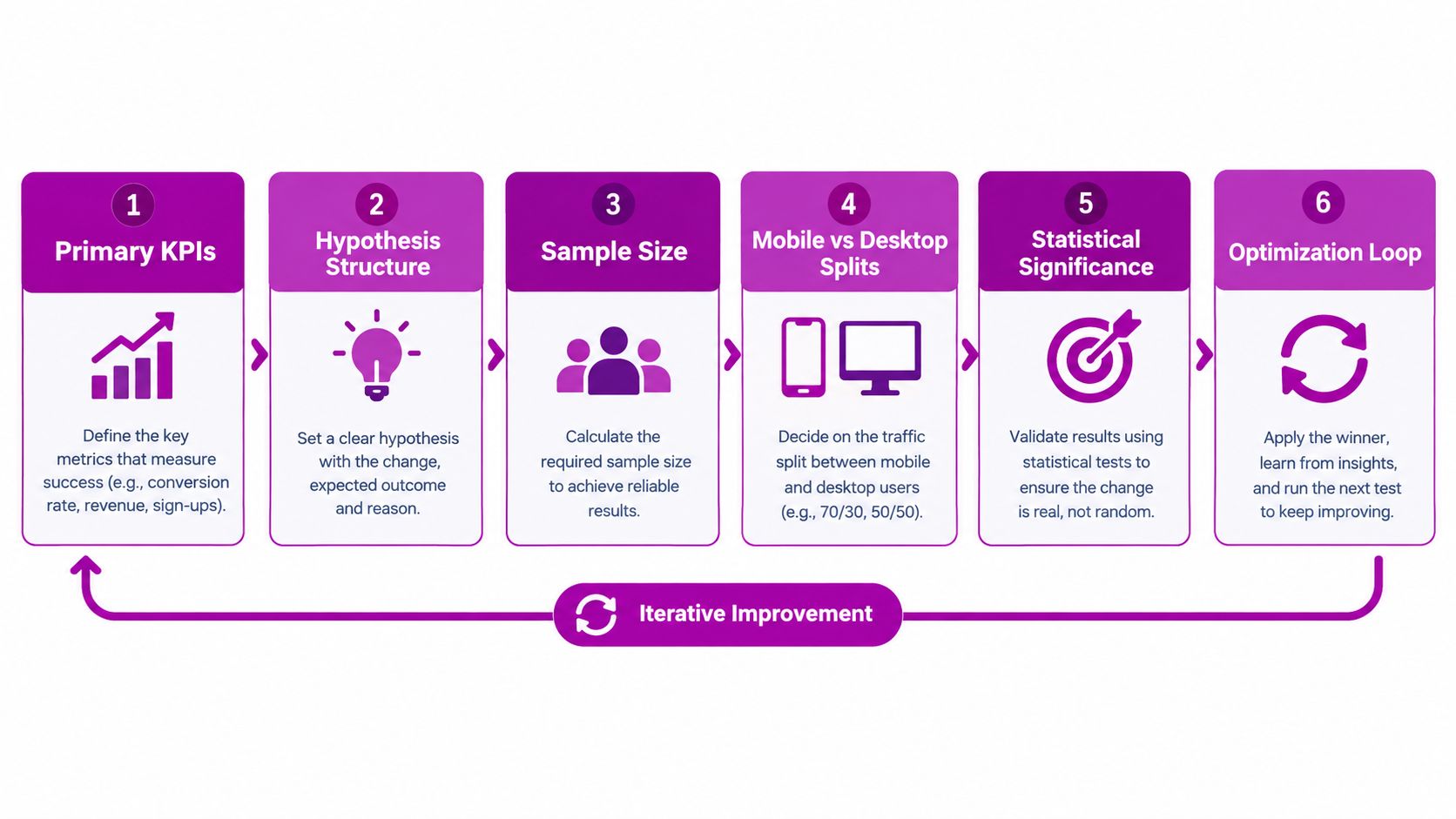
The optimization loop matters more than any single winning variation. Shopify teams get durable gains by maintaining a hypothesis backlog and retiring campaigns that no longer earn their interruption.
Implementing Mobile Pop Ups in Shopify on a Subscription
Shopify gives teams three practical implementation paths. The right choice depends on how much targeting control the campaign needs, how comfortable the team is maintaining theme code, and whether the popup must connect to email, SMS, analytics, and consent systems.
Use native theme capabilities for simple jobs
A native customer or discount form can handle straightforward email capture and offer distribution with minimal code. This route is easier to maintain, but it usually provides less behavioral targeting and experimentation depth than a dedicated popup platform. It fits a simple sticky offer or a low-complexity signup block.
Use an app when orchestration matters
Tools such as Privy, Klaviyo, Justuno, and OptinMonster can provide visual builders, audience rules, frequency controls, integrations, and reporting. The trade-off is added script weight, another system to govern, and the possibility of overlapping campaigns when multiple apps target the same visitor.
Use one campaign owner where possible. Decide which platform controls display logic, which system receives the lead, and which analytics events become the reporting source of truth. Shopify teams can also review practical sales-popup patterns in this guide to Shopify sales popups.
Hand-code a lightweight experience
A custom theme asset or Online Store 2.0 app block gives developers precise control over markup, styles, events, and suppression rules. A basic width-gated bottom bar might look like this in a theme asset:
<script>if (window.matchMedia('(max-width: 767px)').matches) {document.documentElement.classList.add('mobile-offer-enabled');}</script>That gate only decides whether the mobile experience is eligible. The production implementation still needs frequency storage, consent handling, event tracking, keyboard behavior, safe-area spacing, and a clear suppression path. Keep the logic in a theme asset or app block rather than modifying checkout code, especially on Online Store 2.0 themes.
Liquid can render server-side conditions, but it isn't a replacement for client-side viewport or interaction detection. Async app scripts can also load after the page and compete with other tags, so performance testing belongs in the deployment process. For logged-in suppression, connect the storefront state to the appropriate customer data flow and avoid exposing private customer information in client-side markup. Shopify Functions can support discount logic, but they don't replace popup UX or consent controls.
A subscription retainer turns this from a one-off widget into an operating system: maintain a monthly hypothesis backlog, ship changes in a staging theme, review GA4 events and revenue-per-visitor outcomes, and set a quarterly roadmap around the highest-value friction. That cadence keeps the popup aligned with merchandising, acquisition, and retention changes instead of leaving an old campaign running indefinitely.
Mobile Pop Up Launch Checklist and Ongoing Optimization
A launch checklist should be short enough to use and strict enough to catch the failures that preview tools miss. Run it on real phones, with the keyboard open, on a slow connection, and with the visitor arriving from an organic result.
Before publishing
- Choose the format: Confirm that the modal, bottom sheet, or sticky bar matches the offer and the page task.
- Set the trigger: Tie delivery to a meaningful mobile behavior rather than immediate interruption.
- Protect the viewport: Keep copy, inputs, and the CTA inside the safe visible area.
- Place the close control: Make it obvious, reachable, and usable without hitting another element.
- Reduce the form: Remove fields that aren't necessary for the immediate value exchange.
- Control frequency: Suppress repeat displays after submission or dismissal and prevent campaign overlap.
- Align consent: Route the right consent choices by region and audit every third-party event.
- Instrument events: Fire and validate view, click, dismiss, submit, error, and downstream purchase events.
- Check page exclusions: Suppress unsuitable contexts such as checkout, thank-you pages, and other flows where interruption harms completion.
- Test recovery states: Confirm that errors, keyboard focus, back navigation, and slow loading don't trap the shopper.
Review every quarter
Re-run the mobile and desktop conversion split, but don't stop at the headline rate. Review revenue per visitor, form completion, unsubscribes, bounce behavior, checkout progression, and the quality of leads captured. Retire triggers that repeatedly interrupt without producing downstream value, then replace them with a clearly documented hypothesis.
Keep a backlog by page type. A product page may need better timing, a collection page may need guided discovery, and a cart may need reassurance rather than another discount. Review consent-log retention and app scripts during the same cycle so compliance and performance don't become emergency fixes.
The strongest mobile pop up isn't the one with the most elaborate animation. It's the one that appears when the shopper has supplied a useful signal, asks for a proportionate action, and proves its value in the purchase data.
ECORN helps Shopify teams design, implement, and optimize mobile popups through CRO, development, and ongoing testing support. Visit ECORN to discuss a focused popup project or a subscription workflow built around recurring experiments and reporting.


Sitemap for Shopify: How to Find, Optimize, and Submit It

7 Single Product Websites Worth Emulating
Product Variants Shopify: The Complete 2026 Guide

Ecommerce Analytics Consulting for Growth

What Is AI Integration for eCommerce
How to Choose the Right eCommerce Website Development Firm

E Business Strategy Implementation
Conversion Tracking Setup for Shopify Stores
BigCommerce vs Shopify Plus Which Enterprise Wins in 2026
Shopify Theme Kit: Setup, Commands, and Migration Guide

Shopify Extension Development: A Practical 2026 Guide
Shopify Speed Score Explained and How to Improve It
Shopify Mobile Optimization: The 2026 Playbook
How to Add Subcategory in Shopify for Better UX
How to Implement Structured Data for Ecommerce in 2026

SEO App Mobile: Shopify Store Optimization Guide
Shopify Plus Support: What It Includes and How to Choose
Google Ads for Shopify: The Complete 2026 Playbook
Shopify New York: How to Find and Hire the Right Agency
Google Search Console for Shopify: The Complete Setup
First Party Data Collection for eCommerce Growth
FAQ Online Store Guide: Build and Measure It Right
Do FB Ads Work for eCommerce in 2026?
One Page Checkout for Shopify: Design and Implementation
Shopify GraphQL vs REST: The 2026 Developer Decision
Shopify Ecommerce Consulting: Strategy, Pricing &

Are Reddit Ads Worth It for eCommerce Brands
Shopify Title and Meta Description: A Practical 2026 Guide

Product Video Best Practices for Shopify Brands
Real-Time Inventory Management: A 2026 Guide

AI Chatbot Integration for Shopify Stores
Affiliate Program Management: A Shopify Guide
10 Best Performance Monitoring Tools for Shopify in 2026
Digital Asset Management for eCommerce Brands in 2026
Every Type of Facebook Ads Explained for eCommerce Growth
Product Information Management Explained for Shopify Brands
Support Ticket System: A Guide for Shopify Stores

10 Best Customer Service Tools for Shopify in 2026

Can I Start a Business with No Money? a 2026 Blueprint

What Sells Good on Etsy: Best Niches for 2026

Shopify Add to Cart Button: A Practical 2026 Guide

Customer Feedback Automation: A Practical eCommerce Guide
Critical Rendering Path: A Guide for Shopify Stores

How to Promote on TikTok for eCommerce in 2026

B2B eCommerce Consulting That Drives Real Revenue
10 Best Practices for Site Navigation in 2026
Return vs Refund for Shopify Stores: A Practical Guide
What Is Customer Lifetime Value and Why It Matters

What Is Voice of Customer Research for eCommerce

SMS Marketing for Ecommerce That Actually Converts

Master How to Improve Email Deliverability in 2026

Top 7 eCommerce Partners NYC for Shopify Brands in 2026
Machine Learning for Ecommerce: Boost Your Shopify Store

Beauty Market Research: Your 2026 Growth Guide

Shopify International Expansion: A 2026 Roadmap

What Does CRO Stand for in Business: Understanding CRO

Shopify Visual Merchandising: A Playbook for Higher Sales

Shopify Landing Page Design: Master Conversion in 2026

10 Best AI SEO Optimization Tools for Shopify in 2026

Agentic AI for Ecommerce: Boost Your Sales in 2026
Mastering Email Marketing Data for eCommerce Growth

Conversion Rate Optimisation Australia: Boost Your Sales
Conversion Rate Optimization AI: Your Shopify Store Guide

10 Product Bundling Strategies for Shopify in 2026
How to Increase Customer Lifetime Value: A Shopify Playbook
AI Customer Service Automation: Shopify Guide 2026

Clean Website Design: A Shopify Conversion Playbook

Omnichannel Retail Strategy: A Shopify Playbook
Product Data Enrichment: A Guide for Shopify Brands
Instagram Shopping Features a Guide for Shopify Stores

What Is Revenue Optimization: A Holistic RevOps Guide

Benefits of Conversion Rate Optimization: Boost Your
WordPress to Shopify Migration: Your 2026 Seamless Switch
Boost Sales: Ecommerce Payment Processing Guide 2026
Unified Commerce Platform: Benefits, KPIs & Shopify Guide
How to Reduce Bounce Rate eCommerce: Your 2026 Guide
Shopify API Integration: A Practical End-to-End Guide

How to Implement Data Governance: A 2026 Guide
Shopify Store Development Cost: A 2026 Breakdown
What Is Server Side Tracking: The Shopify Guide 2026
Marketing Automation Workflows: A Shopify Guide for 2026
Shopify: How to Reduce Technical Debt

Shopify UX Design Change: A Playbook for Growth
User Generated Content Strategy: Shopify Playbook
Shopify Pause and Build Plan Cost: A Complete 2026 Guide
Compare at Price on Shopify: A Complete Guide for 2026
Where Can I Sell My Prints? 10 Best Platforms for 2026
Shopify Order Management System: The Ultimate Guide 2026
What Is Marketing Attribution? an eCommerce Guide for 2026

10 Best Black Friday Sales Sheets for 2026

Discover the Top Social Media Marketing Agencies For
Consumer Confidence Definition for eCommerce in 2026
What Is Social Commerce? Your 2026 Guide to Boosting Sales

A Social Ad Campaign Playbook for eCommerce Growth

7 Best FAQ Page Examples for SaaS & eCommerce

Market Research in Fashion Industry: A Guide for Shopify

Shopify Migration Services: Expert Guide for 2026
Mastering FB Retargeting Ads for Shopify in 2026
What Is Omnichannel Ecommerce

Master Your Shopify Plus Migration: The 2026 Guide


newsletter in your inbox