

Most advice about a one-product Shopify store starts with the wrong promise: launch a clean landing page, send paid traffic to it, and let simplicity do the selling. That approach worked when the main challenge was removing menu clutter. It's incomplete now. A single product gives you a focused commercial system, but it also gives you one primary page, one offer, one proof burden, and very little room to hide weak positioning or a slow mobile experience.
The strongest operators treat the product detail page as a conversion engine, not a brochure. It must explain the product to a cold visitor, satisfy a shopper arriving from an AI-generated query, answer objections on a small screen, and create a credible reason to buy again. The catalog may be narrow, but the thinking behind it can't be.
Rethinking the Single SKU Model for Modern Commerce
A single SKU does not create clarity by itself. It creates a narrow commercial system where every major question must receive a convincing answer. Visitors need to understand what the product does, who it serves, why they should trust it, how it compares with familiar alternatives, and what happens after payment.
The model remains commercially relevant because focused catalogs are common on Shopify. 27.1% of active Shopify stores sell 1–9 products, and the platform has 3.06 million active stores, according to Shopify store catalog data. These figures do not show that every low-SKU merchant will beat a broader competitor. They do show that focused merchandising is an established operating choice, not a temporary workaround.
The usual landing-page formula often removes more than it should. Cutting navigation, collections, and competing offers can sharpen attention, but removing demonstrations, delivery details, returns information, or support for product claims leaves cautious buyers without enough evidence. A polished hero image and a bold promise cannot carry the entire sale.
For a single-product brand, the product detail page is the main conversion engine. It has to work for paid traffic, organic discovery, mobile shoppers, and visitors who arrive with a specific question from an AI search tool. It also has to support the economics after the first order, because a narrow catalog leaves fewer natural paths to cross-sell.
Mobile traffic changes the page hierarchy
Shopify's 2026 trend data reports that smartphones drove 72% of retail site traffic and 68% of orders in the US, while traffic from AI search tools to Shopify stores rose 8x year over year in Q1 2026. The figures come from Shopify's retail trend data. A one-product store must therefore handle two demanding entry conditions: a shopper scanning quickly on a phone and a shopper arriving with a precise question shaped by AI discovery.
The first screen should identify the product, state the customer outcome, show the price or buying choice, and present a clear route to purchase. The rest of the page must stand on its own when the visitor has no prior brand context:
- Demonstration: Show the product solving the problem, rather than relying on attractive photography.
- Proof: Use detailed reviews, customer media, testing documentation, materials, ingredients, certifications, or compatibility information where relevant.
- Comparison: Explain the meaningful difference between the product and alternatives buyers already recognize.
- Reassurance: Make shipping, returns, warranty coverage, support, and payment options easy to find.
A narrow catalog also limits the behavioral signals available for retargeting and cross-selling. Visitors cannot browse several related products to reveal intent, so the brand must build useful signals through content engagement, quiz answers, email preferences, usage education, and post-purchase behavior.
Simplicity in merchandising requires depth in positioning.
Practical rule: Remove unnecessary choices from the storefront, not necessary reasons to believe the offer.
Effective single-product website strategies create a focused route to checkout while giving shoppers enough context to evaluate materials, safety, performance, or long-term value. That balance matters more than visual minimalism, especially when repeat purchase economics depend on trust established during the first visit.
Selecting and Customizing the Right Shopify Theme
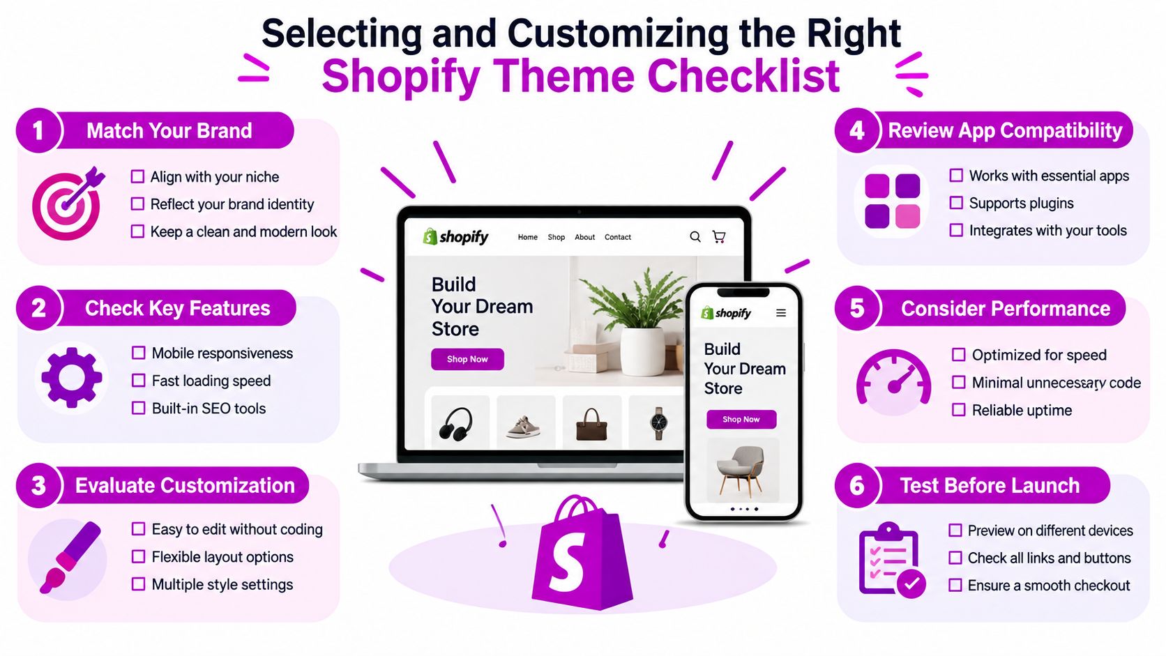
A one-product store does not need the most fashionable theme. It needs a product template that can carry a persuasive buying argument, load quickly on mobile, and adapt as discovery shifts toward search, social platforms, and AI-generated recommendations. Start with the product, audience, objections, and evidence. Choose the theme only after those requirements are clear.
Evaluate the theme against the buying journey
Review the theme against the work your product page must perform:
- Long-form content: The product template should support video, comparison tables, reviews, technical specifications, FAQs, and editorial sections without awkward custom development. A Shopify Theme Store filter for product-page sections or video support can narrow the initial shortlist, but confirm the live demo before committing.
- Mobile controls: Test sticky add-to-cart behavior, variant selection, image swiping, accordions, and tap targets on an actual phone. A responsive desktop layout can still produce a poor mobile interface.
- Performance discipline: A lightweight theme with selected functionality is easier to maintain than a feature-heavy theme that depends on several overlapping apps. Every script should justify its effect on product understanding or purchase completion.
- Content flexibility: Your team should be able to reorder sections, update proof, and create campaign-specific blocks without rebuilding the template. This matters when paid traffic, organic search, and AI discovery produce visitors with different questions.
- Checkout continuity: Cart drawers, Shop Pay, accelerated payment options, discount handling, and shipping messaging should feel consistent with the product page and brand.
The main trade-off is speed versus built-in storytelling. A minimal theme may load efficiently but lack native support for structured product education. A richer theme may include video blocks, comparison modules, and review layouts, yet create performance and maintenance risk when each feature requires an app. Choose the smallest foundation that can carry the evidence your offer needs.
Focused catalogs are already mainstream, so theme vendors have strong reason to support them, as noted earlier. Your task is not to copy a generic one-product template. Make the template specific to the audience, use case, and objections that shape the purchase.
Remove distractions without removing trust
Hide redundant collection pages, empty search results, and irrelevant filters. Keep navigation that helps a serious buyer validate the business, including About, contact, shipping, returns, warranty, and support. A single product does not mean a single page.
Use the header to direct attention toward the offer without making the brand feel evasive. Replace generic dropshipping cues with original photography, consistent typography, clear material or ingredient language, and visible customer-service ownership. Small CSS adjustments should improve hierarchy and scanning, not decorate every block.
Before committing to a theme, review how to choose a Shopify theme against your content requirements. Then test the actual product page on mobile with compressed images, loaded reviews, and any subscription or bundle logic active. The theme must support the page now and leave room for post-purchase education, replenishment prompts, and retention-focused updates.
Engineering a High-Converting Product Detail Page
A single-SKU store does not win because it has fewer pages. It wins when its product detail page becomes a focused conversion engine. Paid social, organic search, creator content, email, and AI-assisted discovery may all bring visitors to the same URL, so the page must quickly orient different types of shoppers. It should communicate the offer clearly, answer objections in the right order, and support the economics of a second purchase.
Benchmark guides report that multi-product stores typically convert at 1–3%, while well-executed one-product Shopify stores often reach 3–8% by concentrating traffic and proof on one offer, as described in this one-product Shopify conversion guide. Treat these figures as directional rather than guaranteed. Traffic quality, price, category, trust, device experience, and offer strength still determine the outcome.
Build the page in decision order
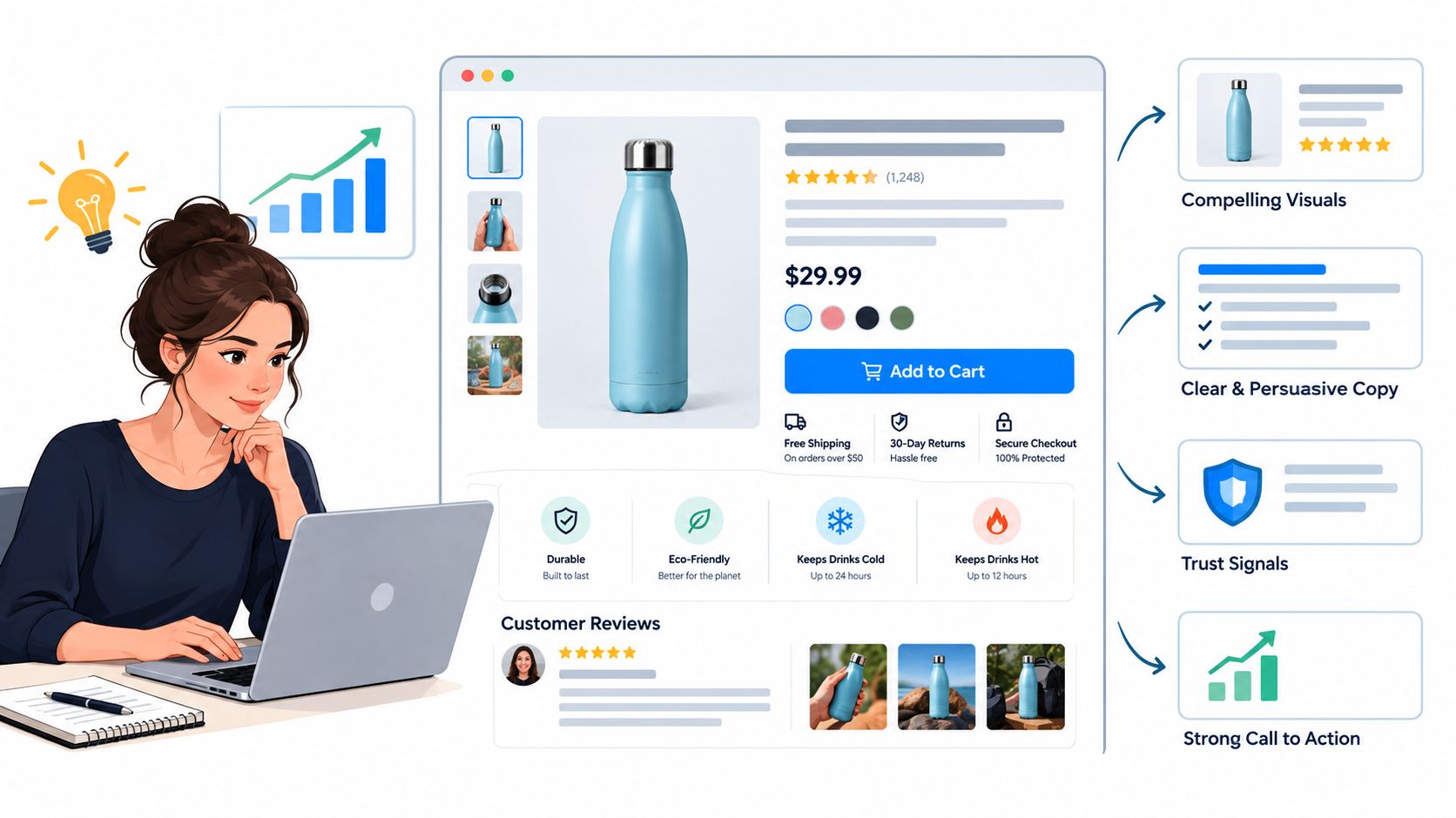
The opening view should answer what it is, who it's for, and why it matters before the visitor scrolls. Keep the product name, specific value proposition, primary image or short demonstration, price, purchase control, and strongest reassurance close together. A shopper should not need to search for basic commercial facts.
Follow the buyer's likely concerns:
- Show the use case: Demonstrate setup, handling, scale, or outcome in a short video. Attractive footage has limited value if the product's function remains unclear.
- Explain the mechanism: Clarify materials, ingredients, technology, compatibility, or construction. Use diagrams and close-up photography when a claim needs visual evidence.
- Resolve objections: Address shipping, returns, warranty, care, safety, sizing, and compatibility in a searchable FAQ or accordion. Direct answers build more confidence than broad brand language.
- Make alternatives visible: Use a comparison table to show where the product fits, but include only defensible differences. Unsupported superiority claims reduce trust.
- Repeat the buying route: Place calls to action after meaningful evidence, not after every paragraph. On mobile, a sticky purchase control can keep the route available without obscuring key content.
A skincare device needs usage instructions, safety information, skin-type guidance, and careful claim language. A kitchen tool may need capacity, cleaning, durability, and demonstration footage. The layout can be shared, but the proof must reflect the product and its risks.
Treat mobile as the primary composition
Design the narrow viewport first. Keep the title readable, make variant controls obvious, reduce galleries that require excessive swiping, and place the purchase action within comfortable thumb reach. Compress media while preserving the detail shoppers need to assess the product.
Reviews should explain more than satisfaction. Prioritize comments that describe the original problem, buying hesitation, use context, and experienced result. Customer photographs and video can add stronger evidence when permission and moderation procedures are in place.
AI-driven discovery makes precise product information more valuable. Write headings and answers around real customer questions, state compatibility and limitations plainly, and use consistent terminology for the product, problem, and outcome. This helps both shoppers and systems that extract answers from the page.
Teams prioritizing page changes can consult effective conversion optimization advice. Tie every element to a decision barrier. A block should clarify value, prove performance, reduce risk, or help the shopper buy. After launch, review those elements against repeat-purchase behavior as well as the initial conversion, because a page that acquires customers but leaves them uncertain about use, replenishment, or next steps weakens long-term economics.
Streamlining the Checkout Flow and Cart Experience
A persuasive product page can still lose the order at the cart. The buyer has accepted the product, then faces an unexpected shipping charge, an unclear delivery window, a forced account, or a payment form that feels difficult on a phone. For a single-SKU store, the cart must continue the product promise rather than behave like a separate technical screen.
Shopify-wide checkout data indicates an average checkout completion rate of 45.2%, as noted in the benchmark cited in the previous section. More than half of checkout initiations therefore fail to become completed purchases in that benchmark. The figure does not diagnose your store, but it gives teams a reason to inspect every step from add-to-cart through confirmation.
Remove friction in the cart
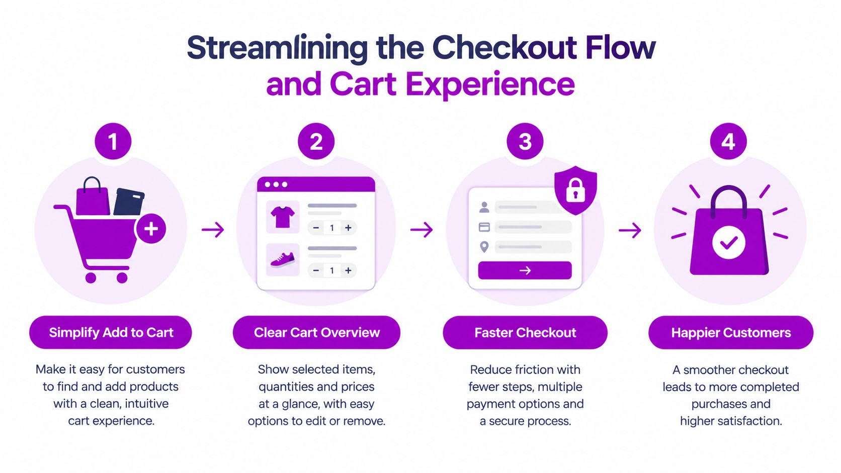
Use a slide-out cart when it lets shoppers review the product, quantity, delivery information, and total without leaving the page. Keep the primary checkout button visually dominant. If you offer a bundle, subscription, or accessory, present it as a clear choice with a specific reason. An offer that delays checkout can reduce the value of the sale it was meant to increase.
A useful cart sequence includes:
- Product confirmation: Show the selected variant, quantity, thumbnail, and any recurring-purchase terms.
- Cost clarity: Display shipping, available taxes, discounts, and the final total in plain language.
- Delivery confidence: State expected dispatch or delivery information near the purchase action, not only on a policy page.
- Relevant enhancement: Offer one logical add-on or quantity option only when it improves the product experience.
Progress bars may reassure shoppers in a multi-step flow, but they cannot fix confusing fields. Keep guest checkout available, avoid mandatory account creation, and collect only information needed to fulfill and support the order. Enable accelerated payment methods such as Shop Pay and Apple Pay where they suit your markets and customer devices.
Test the payment handoff
Use a real phone to place test orders with different variants, discount states, shipping destinations, and payment methods. Confirm that the cart preserves selections, subscription terms remain visible, error messages explain the fix, and confirmation emails match the promise made on the product page.
Conditions that appear late create hesitation. A discount limited to a recurring plan, a bundle that changes delivery timing, or a free-shipping threshold revealed at checkout can interrupt an otherwise ready buyer.
The strongest checkout experience feels uneventful. Customers know what they are buying, what it costs, when it should arrive, and how to pay. That calm comes from deliberate configuration, especially on mobile, where a small point of confusion can end the purchase.
Testing Methodologies and Post-Purchase Economics
A one-product store concentrates attention on one conversion engine, the product detail page. That makes testing faster, but it also makes weak methodology more expensive. Small samples can produce false confidence, while changing several page elements at once leaves no clear reason for the result. Treat the PDP as a system, then isolate one meaningful hypothesis at a time.
Product detail pages accounted for 47% of experiments and recorded a 37.6% win rate, with a median +1.88% conversion-rate uplift, across the European e-commerce tests reported in Drip Agency's A/B testing statistics. Start with the PDP, but validate every result against the audience, device, traffic source, and purchase context. A pattern that works for returning desktop visitors may fail for mobile shoppers arriving from an unfamiliar social or AI discovery experience.
Create a disciplined testing loop
Set one primary metric before the test begins. Completed purchase conversion fits many purchase-page experiments, while revenue per visitor reveals when a variant increases conversions but lowers order value. Add-to-cart rate, checkout initiation, refunds, and subscription selection can explain the outcome, but changing the decision rule halfway through makes the result difficult to trust.
Review outcomes by device and traffic source. A concise headline may work for branded search while cold social traffic needs more context. A product demonstration that supports desktop visitors may carry much more weight on mobile, where shoppers have less room to compare claims, proof, and purchase options. Record the hypothesis, audience, start date, end date, primary metric, and implementation details. That record prevents a later team from treating an old result as a universal rule.
| Testing parameter | Recommended benchmark | Common pitfall to avoid |
|---|---|---|
| Primary metric | Select one main conversion or value metric before launch | Calling a test a win because a secondary metric moved |
| Sample size | Aim for at least 1,000 conversions per variant | Ending the test after an early spike |
| Statistical confidence | Use 95% statistical confidence | Treating a small difference as a reliable winner |
| Runtime | Run for at least two full weeks | Ignoring weekly traffic cycles |
| Segmentation | Review device and traffic-source behavior | Hiding opposite results inside an aggregate average |
These benchmark recommendations come from eDesk's product-page testing guidance. Use them as operating guardrails, not as permission to test with inadequate qualified traffic. If the store cannot produce a dependable sample, use session recordings, customer interviews, support tickets, qualitative research, and structured usability reviews. Those inputs can reveal confusion before a formal experiment has enough volume.
Design the second sale before the first
A conversion does not prove that the business works. The store also needs a credible reason for customers to return, particularly when acquisition costs are high or the product naturally supports replenishment.
- Replenishment: Send reminders based on realistic consumption or replacement behavior.
- Subscription: Offer recurring delivery only when it adds convenience, with simple pause, skip, and cancellation controls.
- Bundles: Combine quantities or compatible accessories to improve usefulness, not merely order value.
- Education: Send setup guidance, care instructions, recipes, routines, or product-specific troubleshooting after delivery.
- First-party data: Ask about preferences and product use in ways that improve future recommendations and support.
The hero product can remain the business center while retention develops around its ownership cycle. Consumables may support replenishment and subscriptions. Durable products may support replacement parts, accessories, service, or a community that keeps customers using what they bought. The PDP should set that expectation before purchase, and post-purchase messaging should deliver on it. A strong first order is the start of the economics, not the finish.
Scaling Operations Beyond the Initial Launch Phase
The first sale proves that someone will buy. It does not prove that inventory, support, international delivery, claims management, or repeat-purchase economics can withstand volume. Increasing ad spend on an underbuilt operation usually exposes those weaknesses faster.
For a one-product Shopify store, scale should deepen the niche before it broadens the catalog. A focused hero product can support limited editions, controlled color or format variations, trusted creator partnerships, and carefully selected accessories. Each extension should reinforce the original positioning. If it attracts a different audience, creates a new use case, or adds substantial support work, place it in a separate commercial path instead of forcing it onto the primary PDP.
Protect the promise as demand grows
Connect marketing forecasts to supplier lead times, packaging availability, returns, and replacement needs. One hero SKU concentrates revenue risk, so a supply interruption can affect the entire storefront. Set clear reorder triggers, record quality checks, and keep delivery language aligned with actual fulfillment capacity. The PDP is part of that operating system: inaccurate availability or delivery promises can raise conversion briefly while increasing support volume and refunds later.
International growth also requires more than translated copy. Review duties, taxes, delivery expectations, payment preferences, returns handling, product compliance, and claim requirements for each market. Shopify Markets can support a multi-market setup, while the operating team remains responsible for commercial decisions and customer experience.
Support content must grow with order volume. Build a searchable help center around questions customers ask before and after purchase, then create saved responses for recurring issues. Keep a route to a person when the product involves safety, health, technical setup, or a high-value purchase. AI-driven discovery may bring more visitors to the PDP, but clear answers and reliable support determine whether that attention becomes a profitable relationship.
Use evidence to decide what expands
A second product should solve a demonstrated customer need, not fill empty space on the homepage. Customer requests, support conversations, usage data, and repeat-purchase behavior can indicate whether a replacement component, complementary accessory, or related offer belongs in the range. A product with no clear connection to the hero offer can dilute positioning and make acquisition harder.
Testing discipline remains useful after launch. Apply the same guardrails described earlier around sample size, confidence, and runtime to operational promises such as delivery messaging, support flows, subscription terms, and post-purchase education. Test whether the promise is understood and deliverable, not only whether a button earns more clicks.
A sustainable one-product business stays narrow in what it sells and broad in how well it serves ownership. The hero product remains the commercial center, while retention develops through replenishment, accessories, service, or education suited to its lifecycle.
ECORN provides Shopify UI/UX design, custom theme development, store development, CRO, Shopify Plus development, and eCommerce consulting for focused storefronts. If demand exists but the page, checkout, or retention system is underperforming, visit ECORN to discuss a practical Shopify growth project.


Mobile Pop Up Strategy for Shopify Stores That Converts
Sitemap for Shopify: How to Find, Optimize, and Submit It
7 Single Product Websites Worth Emulating
Product Variants Shopify: The Complete 2026 Guide
Ecommerce Analytics Consulting for Growth
What Is AI Integration for eCommerce
How to Choose the Right eCommerce Website Development Firm
E Business Strategy Implementation
Conversion Tracking Setup for Shopify Stores
BigCommerce vs Shopify Plus Which Enterprise Wins in 2026
Shopify Theme Kit: Setup, Commands, and Migration Guide
Shopify Extension Development: A Practical 2026 Guide
Shopify Speed Score Explained and How to Improve It
Shopify Mobile Optimization: The 2026 Playbook
How to Add Subcategory in Shopify for Better UX
How to Implement Structured Data for Ecommerce in 2026
SEO App Mobile: Shopify Store Optimization Guide
Shopify Plus Support: What It Includes and How to Choose

Google Ads for Shopify: The Complete 2026 Playbook

Shopify New York: How to Find and Hire the Right Agency
Google Search Console for Shopify: The Complete Setup
First Party Data Collection for eCommerce Growth
FAQ Online Store Guide: Build and Measure It Right
Do FB Ads Work for eCommerce in 2026?
One Page Checkout for Shopify: Design and Implementation
Shopify GraphQL vs REST: The 2026 Developer Decision
Shopify Ecommerce Consulting: Strategy, Pricing &

Are Reddit Ads Worth It for eCommerce Brands
Shopify Title and Meta Description: A Practical 2026 Guide

Product Video Best Practices for Shopify Brands
Real-Time Inventory Management: A 2026 Guide

AI Chatbot Integration for Shopify Stores
Affiliate Program Management: A Shopify Guide
10 Best Performance Monitoring Tools for Shopify in 2026

Digital Asset Management for eCommerce Brands in 2026
Every Type of Facebook Ads Explained for eCommerce Growth
Product Information Management Explained for Shopify Brands
Support Ticket System: A Guide for Shopify Stores

10 Best Customer Service Tools for Shopify in 2026

Can I Start a Business with No Money? a 2026 Blueprint

What Sells Good on Etsy: Best Niches for 2026

Shopify Add to Cart Button: A Practical 2026 Guide

Customer Feedback Automation: A Practical eCommerce Guide
Critical Rendering Path: A Guide for Shopify Stores

How to Promote on TikTok for eCommerce in 2026

B2B eCommerce Consulting That Drives Real Revenue

10 Best Practices for Site Navigation in 2026
Return vs Refund for Shopify Stores: A Practical Guide
What Is Customer Lifetime Value and Why It Matters
What Is Voice of Customer Research for eCommerce

SMS Marketing for Ecommerce That Actually Converts

Master How to Improve Email Deliverability in 2026

Top 7 eCommerce Partners NYC for Shopify Brands in 2026
Machine Learning for Ecommerce: Boost Your Shopify Store

Beauty Market Research: Your 2026 Growth Guide

Shopify International Expansion: A 2026 Roadmap
What Does CRO Stand for in Business: Understanding CRO

Shopify Visual Merchandising: A Playbook for Higher Sales

Shopify Landing Page Design: Master Conversion in 2026
10 Best AI SEO Optimization Tools for Shopify in 2026

Agentic AI for Ecommerce: Boost Your Sales in 2026
Mastering Email Marketing Data for eCommerce Growth

Conversion Rate Optimisation Australia: Boost Your Sales
Conversion Rate Optimization AI: Your Shopify Store Guide

10 Product Bundling Strategies for Shopify in 2026
How to Increase Customer Lifetime Value: A Shopify Playbook
AI Customer Service Automation: Shopify Guide 2026

Clean Website Design: A Shopify Conversion Playbook

Omnichannel Retail Strategy: A Shopify Playbook
Product Data Enrichment: A Guide for Shopify Brands
Instagram Shopping Features a Guide for Shopify Stores
What Is Revenue Optimization: A Holistic RevOps Guide

Benefits of Conversion Rate Optimization: Boost Your
WordPress to Shopify Migration: Your 2026 Seamless Switch
Boost Sales: Ecommerce Payment Processing Guide 2026
Unified Commerce Platform: Benefits, KPIs & Shopify Guide
How to Reduce Bounce Rate eCommerce: Your 2026 Guide
Shopify API Integration: A Practical End-to-End Guide

How to Implement Data Governance: A 2026 Guide
Shopify Store Development Cost: A 2026 Breakdown
What Is Server Side Tracking: The Shopify Guide 2026
Marketing Automation Workflows: A Shopify Guide for 2026
Shopify: How to Reduce Technical Debt

Shopify UX Design Change: A Playbook for Growth
User Generated Content Strategy: Shopify Playbook
Shopify Pause and Build Plan Cost: A Complete 2026 Guide
Compare at Price on Shopify: A Complete Guide for 2026
Where Can I Sell My Prints? 10 Best Platforms for 2026
Shopify Order Management System: The Ultimate Guide 2026
What Is Marketing Attribution? an eCommerce Guide for 2026

10 Best Black Friday Sales Sheets for 2026

Discover the Top Social Media Marketing Agencies For
Consumer Confidence Definition for eCommerce in 2026
What Is Social Commerce? Your 2026 Guide to Boosting Sales
A Social Ad Campaign Playbook for eCommerce Growth

7 Best FAQ Page Examples for SaaS & eCommerce

Market Research in Fashion Industry: A Guide for Shopify
Shopify Migration Services: Expert Guide for 2026

Mastering FB Retargeting Ads for Shopify in 2026
What Is Omnichannel Ecommerce


newsletter in your inbox