

Mobile devices now account for about 60% of global ecommerce sales, with mobile commerce projected to generate about $2.4 trillion in 2026. Yet mobile shoppers still abandon carts at around 80%, compared with 66% on desktop, according to mobile commerce data for 2026. The commercial opportunity is enormous, but traffic alone doesn't create revenue. A slow product page, a difficult variant selector, or a checkout that forces thumb-heavy form filling can turn high-intent visits into lost orders.
That's why Shopify mobile optimization should be treated as a conversion system, not a collection of PageSpeed tweaks. Across more than 100 Shopify brands supported by ECORN, the practical question has always been the same: which change removes the most buying friction for mobile shoppers? A faster score matters when it helps users see, understand, and purchase a product sooner. It matters much less when it only improves a benchmark while the checkout remains awkward.
Why Mobile Now Decides Shopify Revenue
The mobile opportunity becomes clearer when you compare attention with commercial output. One 2026 ecommerce summary reports that mobile generated roughly 76% of ecommerce traffic over the previous 12 months, while mobile conversion was near 2.9%. Average mobile order value was about $165, compared with approximately $260 on desktop. The same source cites Shopify benchmarks where mobile traffic can sit in the mid-to-high 70% range while mobile revenue remains closer to the low 40% range.
Those figures point to a specific problem. Most merchants don't need more mobile visits before they understand why visitors aren't buying. They need to discover whether shoppers are struggling with page hierarchy, product confidence, input effort, payment choice, or technical failures. Website errors and crashes were linked to about 15% of abandoned checkouts in the same industry summary, so stability belongs in the revenue conversation, not only the engineering backlog.
Start with the conversion gap
Before changing a theme file or uninstalling an app, answer three questions:
- Where do mobile shoppers drop? Separate product views, add-to-cart events, checkout starts, and completed purchases.
- Which templates create the problem? A collection page may be efficient while a product detail page loads too much JavaScript or hides key information below the fold.
- Is the issue traffic quality or UX friction? Compare landing-page intent, product engagement, cart creation, and checkout behavior rather than treating all mobile sessions as equal.
A five-point improvement in a Lighthouse score may not change purchasing behavior. Removing a needless checkout step, keeping the add-to-cart control reachable, or preventing a sticky header from covering content can matter far more because those changes affect the action itself.
Revenue rule: Prioritize fixes by the number of shoppers they affect and the buying action they unblock. Use speed scores to diagnose problems, not to define success.
Mobile versus desktop performance snapshot
| Metric | Mobile | Desktop |
|---|---|---|
| Share of ecommerce traffic | Roughly 76% | Remaining traffic share |
| Conversion rate | About 2.9% | Not specified in the benchmark |
| Average order value | About $165 | About $260 |
| Cart abandonment | Around 80% | Around 66% |
| Revenue share in cited Shopify benchmark | Closer to the low 40% range | Higher than mobile |
The rest of this playbook focuses on closing that gap. Core Web Vitals establish the technical baseline, asset work removes unnecessary delay, navigation and product pages reduce decision friction, and checkout improvements target the final commercial handoff. Monitoring then keeps those gains from disappearing after the next app installation or theme edit.
Measuring Core Web Vitals on Real Mobile Devices
A desktop Lighthouse run is useful for finding a suspected bottleneck, but it isn't a reliable picture of how mobile shoppers experience a Shopify store. The practical baseline comes from field data, measured across real devices and page templates.
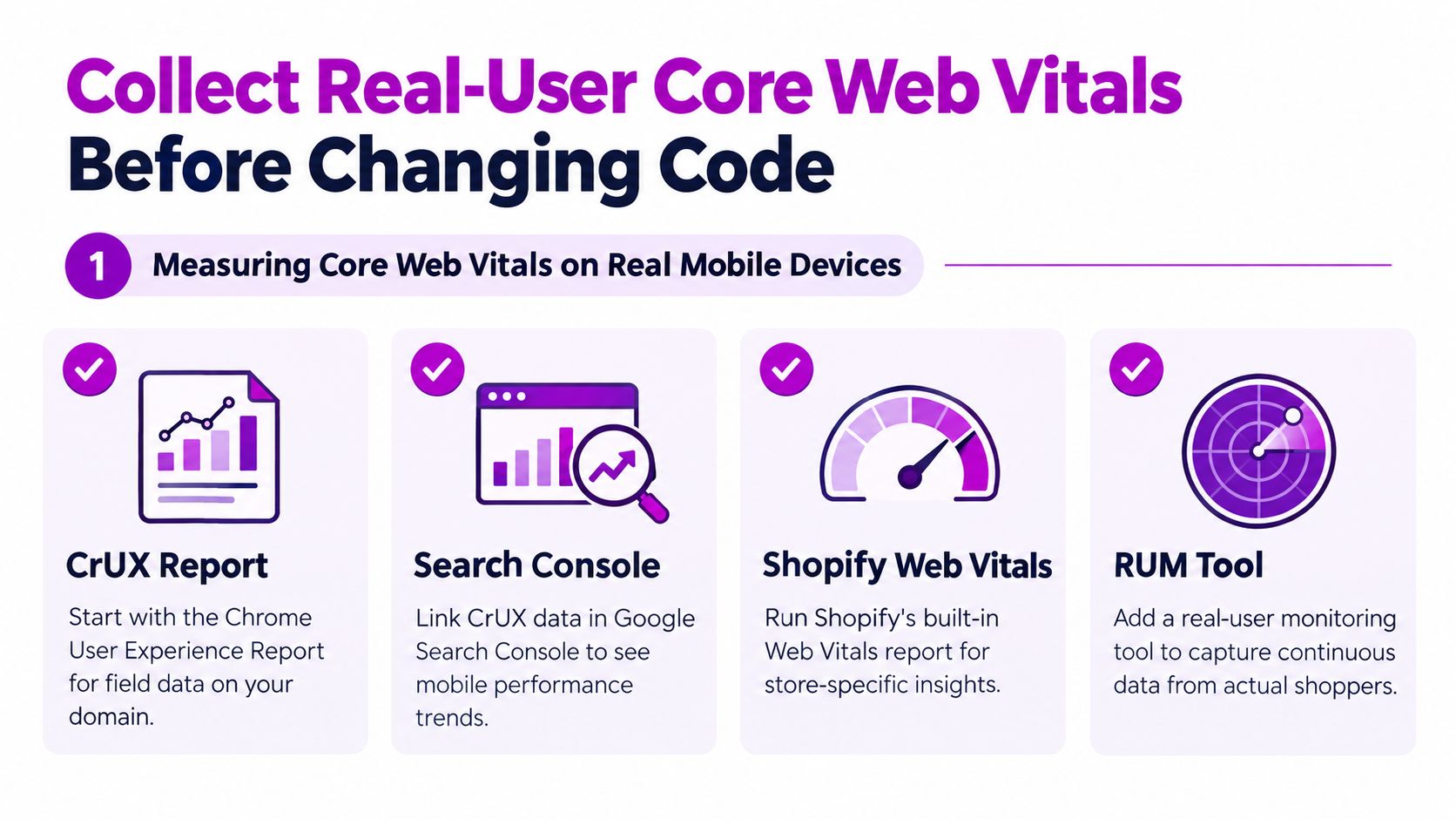
Start with the Chrome User Experience Report, then review the store's Core Web Vitals data in Google Search Console. Use the 75th percentile as the operating benchmark, because it shows whether the experience is healthy for the broad majority of users rather than only for fast test devices. Google's “good” targets are Largest Contentful Paint under 2.5 seconds, Interaction to Next Paint under 200 milliseconds, and Cumulative Layout Shift under 0.1, as outlined in Core Web Vitals research on large online stores.
Build a field-data baseline
Use a lightweight real-user monitoring setup, such as Shopify's web-vitals reporting or a suitable third-party RUM tool. Segment results by:
- Template: Compare collection pages, product detail pages, cart, and the first checkout step.
- Device: Separate high-end phones from mid-tier Android handsets.
- Connection: Review slower mobile conditions instead of relying only on office Wi-Fi.
- Metric: Track LCP, INP, and CLS independently, because each points to a different class of problem.
A large-store study found that only 36% passed all three Core Web Vitals, which means most storefronts still have room to improve before reaching the healthy threshold. The important detail is template variance. Optimizing the homepage while ignoring the product page or checkout can leave the commercial bottleneck untouched.
Run a one-week baseline
For one week, avoid major performance changes and capture the current state. Record the 75th-percentile values for each important template, identify the worst-performing device group, and pair the data with checkout completion and add-to-cart behavior. A mobile ecommerce benchmark report places median mobile LCP at 4.1 seconds and top-quartile mobile LCP at 2.6 seconds, while describing mobile performance as typically 40% to 60% worse than desktop across verticals.
That gives teams a practical interpretation. 2.6 seconds is a competitive target, while 4.1 seconds is a warning zone, but neither number proves that a change will increase revenue. After every meaningful release, compare field vitals with product engagement and checkout completion. The winning fix is the one that improves the shopper's experience without weakening the buying path.
Speeding Up Theme Assets Images and Scripts
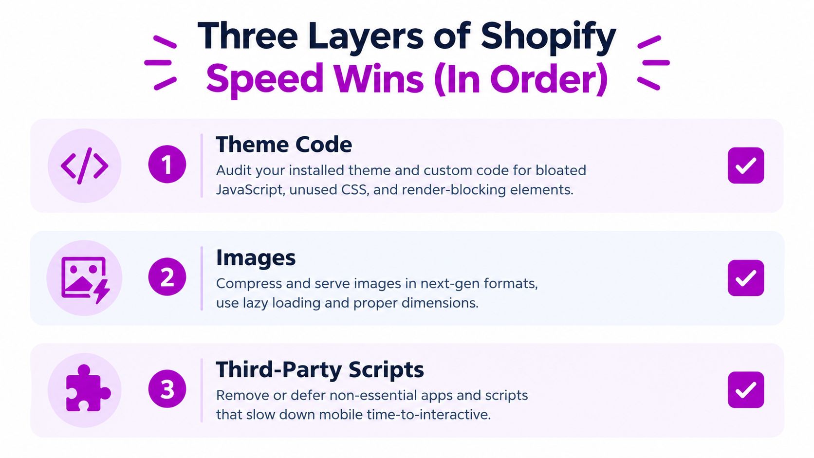
Shopify performance work usually has three layers: theme code, images, and third-party scripts. The order matters because teams often compress a few images while a bloated theme and an overloaded app stack continue to consume the main thread.
Remove unnecessary theme work
Begin with the active theme and its custom Liquid. Identify sections that aren't used, global styles that belong only to one template, and app blocks loading before the main content is usable. Defer non-critical CSS and JavaScript, but keep product selectors, cart behavior, and other controls required for immediate interaction available.
The objective isn't to make the source code look cleaner. It's to reduce the work a mobile browser must download, parse, and execute before a shopper can understand the offer or tap the next control.
Make image delivery responsive
Images are often the clearest LCP opportunity, especially on home, collection, and product templates. Use Shopify's image_url and image_tag filters with appropriate widths and sizes so a phone doesn't download an asset intended for a large desktop viewport. Shopify's CDN can deliver modern formats such as WebP or AVIF where supported, but the theme still needs to request sensible dimensions.
Use lazy loading for below-the-fold media. Don't lazy-load the hero or primary product image when it's the likely LCP element. Reserve space with intrinsic dimensions or an aspect ratio so late-loading images, reviews, banners, and recommendation modules don't push existing content around.
Audit every script by business role
Every app adds potential JavaScript, CSS, network requests, or event listeners. Review whether each app still serves an active merchandising, operational, analytics, or customer-service need. Then check whether its assets load globally when they're only needed on product pages or after a shopper interacts.
Chat, heatmaps, social widgets, and some popup functions can often load after the primary content is usable. Critical product functionality should not be delayed blindly. A script that controls variant availability or add-to-cart behavior belongs in a different priority category from a promotional widget.
Practical filter: If an app doesn't help a shopper choose, trust, buy, or receive the product, question why it runs before the first interaction.
A useful implementation checklist is:
- Theme: Remove unused sections, reduce global CSS, and conditionally load template-specific assets.
- Images: Use responsive widths, dimensions, modern formats, and correct loading priority.
- Scripts: Remove duplicates, defer non-essential code, and test app behavior after each change.
- Validation: Re-test LCP and INP on real mobile devices, then compare checkout behavior rather than celebrating a lab score alone.
The Shopify mobile commerce guidance also emphasizes obstructive pop-ups, unnecessary apps, theme features, and touch-friendly UX. That broader view matters because a technically lighter page can still convert poorly if a popup blocks the buy button or a touch control is difficult to use.
Designing Mobile Navigation and Product Pages That Convert
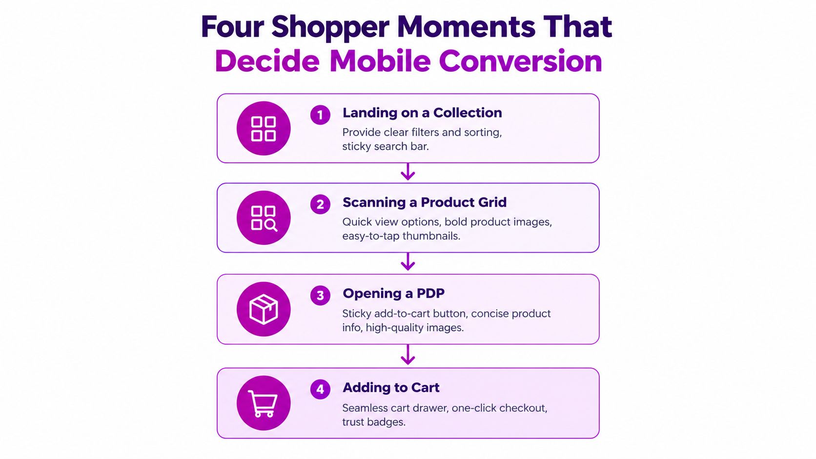
A mobile shopper usually encounters four decisive moments: entering a collection, scanning the grid, opening a product detail page, and adding the item to the cart. Each moment has a different friction pattern, so one generic “responsive” treatment won't solve all four.
On a collection page, filters and sorting should remain easy to reach after scrolling. A sticky filter or sort bar can save repeated trips to the top, provided it doesn't consume so much viewport space that product cards become difficult to inspect. Product grids should support thumb-reachable actions, clear pricing, and images that communicate the product without forcing a shopper to open every card.
Build the product page around the buying decision
The first screen should establish the product, price, primary value, and next action without making the shopper hunt. Put the main image, concise product information, and a clear add-to-cart control in the early hierarchy. Use button swatches for variants when the choices are understandable, rather than making shoppers open a dropdown and remember the available options.
A sticky add-to-cart bar can help after the shopper scrolls into specifications or reviews. It should preserve variant context, remain visually distinct, and avoid covering important content. Reviews belong near the buy box when they support confidence, but they shouldn't push the core purchase controls below a long stack of widgets.
For implementation guidance on responsive behavior and touch-first interfaces, use ECORN's mobile-first design principles. Keep primary tap targets at least 44 by 44 pixels, place important actions within the natural thumb zone, and keep breadcrumb depth restrained so navigation doesn't become another scrolling task.
Match search and filters to mobile intent
Mobile search should anticipate incomplete input. Predictive suggestions, recent searches, and useful product or category matches reduce typing and help shoppers recover from a vague query. Filters should appear as removable chips or pills after selection, so the shopper can see the active constraints without reopening a hidden menu.
A shopper searching for a specific product shouldn't have to clear several nested menus to change one attribute. A collection visitor comparing products needs a different interface from someone returning to a known item. The best mobile navigation reflects those intents instead of shrinking desktop navigation until every option becomes cramped.
Streamlining Mobile Checkout and Payments
Checkout is where mobile revenue is won or lost. A polished landing page can earn the visit, but the checkout determines whether the shopper can complete the transaction without fighting a small keyboard, a crowded form, unexpected delivery costs, or a payment method that isn't convenient on the phone.
The first operational move is to make express payment visible early. Enable Shop Pay, Apple Pay, Google Pay, and PayPal where they fit the store's market and customer base, and place those options above the standard email-and-address flow. Wallet users can complete familiar steps with less manual input, but express buttons shouldn't visually overwhelm the primary checkout path or create confusion when discounts, subscriptions, or local payment rules affect eligibility.
Reduce uncertainty before checkout
The cart drawer should answer questions that otherwise surface at the worst possible moment:
- Shipping: Show thresholds and relevant delivery expectations before the customer reaches the final step.
- Currency: Make the transaction currency clear before payment.
- Order contents: Keep quantities, variants, and removal controls easy to edit.
- Value: Present the benefit of reaching a shipping threshold without turning the cart into a promotion wall.
The standard checkout should use the minimum field set available for the store's region. Enable browser autofill, support returning customer data through Shop Pay, and keep the layout single-column on narrow screens. Address fields need generous tap areas, while validation errors should appear next to the relevant field without unexpectedly moving the shopper away from the problem.
Checkout principle: Remove uncertainty before removing persuasion. A shipping surprise or payment failure costs more than a restrained cart interface fixes.
Compare tactics by effort and learning value
| Tactic | Effort | Typical add-to-cart to purchase lift | Notes |
|---|---|---|---|
| Express wallets | Low to medium | Qualitative opportunity, varies by store | Test eligibility, placement, and payment-method clarity |
| Field reduction and autofill | Medium | Qualitative opportunity, varies by checkout setup | Preserve required regional and tax fields |
| Shipping-threshold visibility | Low | Qualitative opportunity, varies by offer | Show the threshold in the cart, not only at checkout |
| Single-column checkout | Low | Qualitative opportunity, varies by device | Reduces scanning and accidental taps |
| Explicit error states | Medium | Qualitative opportunity, varies by failure mode | Keep errors local and actionable |
| Trust and returns line | Low | Qualitative opportunity, varies by category | Place payment icons and concise returns reassurance near the action |
A compact payment-icon row, a one-line returns statement, and a stable order summary can support confidence without burying the purchase button. Don't add urgency bars or popups automatically. On a small screen, persuasion that blocks the task can create more friction than motivation.
Testing Monitoring and Tools for Ongoing Wins
Mobile improvements decay because Shopify stores change constantly. A new app, campaign script, theme section, or merchandising widget can undo earlier work without anyone noticing in a desktop browser.
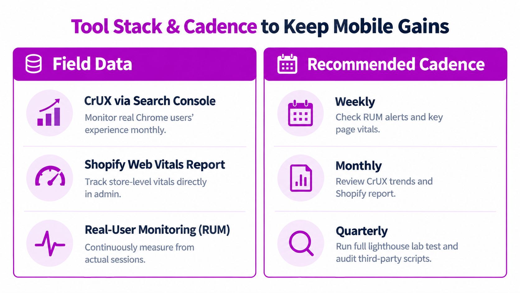
Use different tools for different questions. CrUX through Search Console shows field trends from real Chrome users. Shopify's Web Vitals reporting provides store-specific visibility, while a RUM platform such as Sentry Speed Insights or DebugBear can segment LCP, INP, and CLS by device, template, and session conditions.
Pair diagnostics with behavior
Lighthouse Mobile is useful before deployment when throttling exposes a new blocking resource or an unexpectedly heavy bundle. WebPageTest helps investigate the above-the-fold waterfall, particularly when the LCP image is discovered late or a third-party domain competes for the connection.
Performance data alone won't tell you whether a shopper understands the product. Pair it with Shopify Analytics, mobile-filtered Hotjar or Microsoft Clarity recordings, and GA4 events for scroll depth, rage taps, add-to-cart behavior, and checkout-step exits. A slow page with healthy purchase behavior may deserve less immediate attention than a fast page where shoppers repeatedly tap a disabled or obscured control.
Choose experimentation tools carefully
Mobile A/B testing should preserve page responsiveness. Shoplift, Convert, and ABConvert are options worth evaluating, but each testing layer adds client-side code and therefore needs the same INP scrutiny as any other app. Run one meaningful test at a time when possible, keep variants operationally simple, and measure the purchase path rather than only clicks.
ECORN offers Shopify design, development, CRO audits, and performance-focused consulting for brands that need implementation support alongside measurement. Its mobile audit work includes areas such as responsive design, touch optimization, and mobile checkout.
A workable cadence keeps ownership clear:
- Weekly: Review RUM alerts, mobile checkout errors, and the worst template-level vitals.
- Monthly: Inspect CrUX trends, Shopify's report, app additions, and recent releases.
- Quarterly: Run a complete Lighthouse and waterfall review, then audit third-party scripts.
For a broader operating framework, see ECORN's performance monitoring tools guide. The review should end with one prioritized sprint, not an unranked list of every possible technical improvement.
Your 30 60 90 Day Shopify Mobile Roadmap
A practical mobile program needs sequencing. Measurement, technical cleanup, UX changes, and experimentation compete for the same development capacity, so teams should ship the work most closely connected to a broken buying action first.
Days 1 to 30 focus on evidence
Install or validate real-user monitoring and baseline LCP, INP, and CLS at the 75th percentile across key templates. At the same time, map mobile sessions through product view, add to cart, checkout start, and purchase. Complete an app and script audit, documenting where each asset loads and what business function it supports.
By the end of this phase, the team should know whether the primary constraint is image delivery, JavaScript execution, layout stability, navigation, product confidence, or checkout friction.
Days 31 to 60 ship the highest-impact fixes
Start with work that affects a large share of mobile shoppers and a clear KPI:
- Theme and asset trimming: Track LCP, INP, and template load behavior.
- Responsive image delivery: Track LCP and product engagement.
- Navigation cleanup: Track collection interaction, filter use, and product views.
- Product-page hierarchy: Track variant interaction, add to cart, and cart creation.
- Express checkout activation: Track checkout completion and payment errors.
Release changes in controlled batches. If several major variables change together, you may improve the store without learning which intervention produced the result.
Days 61 to 90 add structured CRO testing
Once the core experience is stable, test mobile-specific questions such as sticky add-to-cart placement, filter presentation, payment-button hierarchy, shipping-threshold messaging, and the amount of product information shown above the fold. Keep experiments lightweight so the testing mechanism doesn't create the performance problem you're trying to solve.
Frequently asked questions
How often should a store be re-audited? Review field data weekly, perform a broader monthly check, and complete a full script and lab audit quarterly. Re-audit sooner after a theme release, major campaign, or app installation.
Should speed come before UX? Fix severe speed and stability problems first, especially when they block rendering or interaction. After the storefront becomes usable, prioritize UX changes that remove friction from navigation, product selection, cart, and checkout rather than chasing small lab-score gains.
What should you do after a theme update regresses vitals? Compare the affected template and device segment with the pre-release baseline, inspect the asset and script waterfall, and roll back or duplicate the theme while isolating the change. Don't assume the new theme is the only cause. App embeds and third-party scripts often surface at the same time.
The strongest Shopify mobile optimization program doesn't end with a scorecard. It creates a repeatable habit of measuring real shoppers, fixing the largest commercial constraint, and verifying that the fix survives the next store change.
ECORN helps Shopify brands turn mobile friction into a prioritized CRO and development roadmap, covering responsive design, touch optimization, checkout improvements, performance work, and Shopify Plus implementation. Visit ECORN to discuss a focused mobile audit or a practical optimization sprint for your store.



How to Add Subcategory in Shopify for Better UX
How to Implement Structured Data for Ecommerce in 2026

SEO App Mobile: Shopify Store Optimization Guide

Shopify Plus Support: What It Includes and How to Choose

Google Ads for Shopify: The Complete 2026 Playbook

Shopify New York: How to Find and Hire the Right Agency

Google Search Console for Shopify: The Complete Setup

First Party Data Collection for eCommerce Growth

FAQ Online Store Guide: Build and Measure It Right

Do FB Ads Work for eCommerce in 2026?

One Page Checkout for Shopify: Design and Implementation
Shopify GraphQL vs REST: The 2026 Developer Decision

Shopify Ecommerce Consulting: Strategy, Pricing &

Are Reddit Ads Worth It for eCommerce Brands

Shopify Title and Meta Description: A Practical 2026 Guide

Product Video Best Practices for Shopify Brands

Real-Time Inventory Management: A 2026 Guide

AI Chatbot Integration for Shopify Stores

Affiliate Program Management: A Shopify Guide
10 Best Performance Monitoring Tools for Shopify in 2026

Digital Asset Management for eCommerce Brands in 2026

Every Type of Facebook Ads Explained for eCommerce Growth
Product Information Management Explained for Shopify Brands

Support Ticket System: A Guide for Shopify Stores

10 Best Customer Service Tools for Shopify in 2026

Can I Start a Business with No Money? a 2026 Blueprint

What Sells Good on Etsy: Best Niches for 2026

Shopify Add to Cart Button: A Practical 2026 Guide

Customer Feedback Automation: A Practical eCommerce Guide

Critical Rendering Path: A Guide for Shopify Stores

How to Promote on TikTok for eCommerce in 2026

B2B eCommerce Consulting That Drives Real Revenue

10 Best Practices for Site Navigation in 2026
Return vs Refund for Shopify Stores: A Practical Guide

What Is Customer Lifetime Value and Why It Matters

What Is Voice of Customer Research for eCommerce

SMS Marketing for Ecommerce That Actually Converts

Master How to Improve Email Deliverability in 2026

Top 7 eCommerce Partners NYC for Shopify Brands in 2026

Machine Learning for Ecommerce: Boost Your Shopify Store

Beauty Market Research: Your 2026 Growth Guide

Shopify International Expansion: A 2026 Roadmap

What Does CRO Stand for in Business: Understanding CRO

Shopify Visual Merchandising: A Playbook for Higher Sales

Shopify Landing Page Design: Master Conversion in 2026

10 Best AI SEO Optimization Tools for Shopify in 2026

Agentic AI for Ecommerce: Boost Your Sales in 2026
Mastering Email Marketing Data for eCommerce Growth

Conversion Rate Optimisation Australia: Boost Your Sales

Conversion Rate Optimization AI: Your Shopify Store Guide

10 Product Bundling Strategies for Shopify in 2026

How to Increase Customer Lifetime Value: A Shopify Playbook

AI Customer Service Automation: Shopify Guide 2026

Clean Website Design: A Shopify Conversion Playbook

Omnichannel Retail Strategy: A Shopify Playbook

Product Data Enrichment: A Guide for Shopify Brands

Instagram Shopping Features a Guide for Shopify Stores

What Is Revenue Optimization: A Holistic RevOps Guide

Benefits of Conversion Rate Optimization: Boost Your
WordPress to Shopify Migration: Your 2026 Seamless Switch
Boost Sales: Ecommerce Payment Processing Guide 2026

Unified Commerce Platform: Benefits, KPIs & Shopify Guide

How to Reduce Bounce Rate eCommerce: Your 2026 Guide
Shopify API Integration: A Practical End-to-End Guide

How to Implement Data Governance: A 2026 Guide

Shopify Store Development Cost: A 2026 Breakdown
What Is Server Side Tracking: The Shopify Guide 2026

Marketing Automation Workflows: A Shopify Guide for 2026

Shopify: How to Reduce Technical Debt

Shopify UX Design Change: A Playbook for Growth

User Generated Content Strategy: Shopify Playbook

Shopify Pause and Build Plan Cost: A Complete 2026 Guide

Compare at Price on Shopify: A Complete Guide for 2026

Where Can I Sell My Prints? 10 Best Platforms for 2026

Shopify Order Management System: The Ultimate Guide 2026
What Is Marketing Attribution? an eCommerce Guide for 2026

10 Best Black Friday Sales Sheets for 2026

Discover the Top Social Media Marketing Agencies For

Consumer Confidence Definition for eCommerce in 2026

What Is Social Commerce? Your 2026 Guide to Boosting Sales

A Social Ad Campaign Playbook for eCommerce Growth

7 Best FAQ Page Examples for SaaS & eCommerce

Market Research in Fashion Industry: A Guide for Shopify

Shopify Migration Services: Expert Guide for 2026

Mastering FB Retargeting Ads for Shopify in 2026
What Is Omnichannel Ecommerce

Master Your Shopify Plus Migration: The 2026 Guide
Shopify Integration Services: A Merchant's 2026 Guide

Shopify Collection Description: A Guide to SEO & Sales

Shopify Plus Contact: Reach Sales & Support Effectively

Top Luxury Shopify Stores: Design & UX Strategies
How to Improve Customer Experience: A Shopify Roadmap

Creative Facebook Ads: 10 Examples for Shopify Brands

Remarketing with Facebook Ads: A Shopify Guide for 2026

SEO Linking Strategies for Shopify Stores

Top 7 Statistics YouTube Channels for eCommerce in 2026

Hiring Shopify Plus Designers: A Founder's Guide

Shopify Product Variation: Master Your Variants for 2026

Leverage Ai Solutions Brands: Your 2026 Shopify Growth Guide

Filters in Shopify: A Guide for Growing Brands


newsletter in your inbox