

A higher landing-page conversion rate isn't automatically a business win. A variant can produce more button clicks, form submissions, or add-to-cart events while attracting weaker prospects, creating checkout friction, or increasing discount dependence. Conversion rate optimization for landing pages works only when the page is judged by the quality of the customer journey it starts, not by the activity it generates at the first step.
The practical question isn't “How do we get more people to click?” It's “Which page, message, and experience help the right visitors complete a profitable purchase?” That shift changes what you measure, what you test, and which apparent winners you're willing to ship.
Why Conversion Rate Optimization for Landing Pages Is Not Just About Clicks
A landing page can win the click and lose the customer. That outcome is common when teams judge the page as a design asset instead of the first stage of a commercial funnel. Headline clarity, CTA visibility, testimonials, and fewer distractions can improve engagement, yet none proves that visitors are ready to buy or likely to generate profitable revenue.
Baymard Institute's long-term research reports an average cart-abandonment rate of 70.19%, meaning roughly seven out of ten shoppers who add an item do not complete the purchase. Its checkout usability research also finds that 65% of sites perform at a mediocre or worse level, while only 2% are rated good. Those figures put the landing-page handoff in context. A persuasive page may create demand while unclear shipping information, a confusing cart, or a difficult checkout prevents that demand from becoming revenue.
The landing page makes promises the checkout must keep
Traffic source changes the promise a visitor expects to see. A paid-social prospect may respond to an emotional product benefit and need context before taking action. A branded-search visitor may already understand the offer and want reassurance about delivery, returns, or compatibility. A returning customer may value a fast route to a familiar product. Treating these audiences as one segment encourages optimization around an average that describes none of them well.
The page should set accurate expectations about price, product fit, shipping, availability, promotion terms, and the next step. Hiding an important condition until checkout can preserve a healthy click rate while reducing completed purchases. Lead-generation pages face the same trade-off. A shorter form may increase submissions, while lowering the share of contacts with the budget, urgency, or use case the sales team can serve.
Use a diagnostic view that separates traffic source, device, and business outcome. Compare paid search with paid social, mobile with desktop, and add-to-cart activity with completed orders, revenue per visitor, cancellations, and refunds. A click that does not survive those comparisons is a weak optimization signal.
Tool and template selection also affects performance. Inspect whether the page reflects customer evidence or generic patterns. A practical guide on how to spot an AI builder can help identify formulaic copy, repeated layouts, and unsupported claims before they enter a campaign.
Practical rule: Treat the landing page, cart, checkout, and post-purchase outcome as one experiment surface.
Baymard estimates that the average large e-commerce site has approximately 32 checkout-related improvements available and could potentially achieve a 35.26% relative conversion increase through checkout design improvements alone, as reported in its checkout usability benchmark. The exact opportunity varies by store, but the operational lesson remains consistent. Landing-page CRO should connect exposure to add-to-cart behavior, checkout initiation, completed purchase, revenue per visitor, and the quality of cancellations or refunds.
Setting Clear Conversion Targets Before Designing the Page
The first CRO deliverable shouldn't be a wireframe. It should be a measurement brief that states who is arriving, what action matters, and how the action contributes to profit.
Start by separating the traffic you can identify:
- Paid search: Match the landing page to the keyword and ad promise. High-intent visitors often need fast confirmation, clear pricing, and product detail rather than a long brand introduction.
- Paid social prospecting: Assume less product knowledge and more variable intent. Lead with the problem, show the product in context, and monitor whether increased engagement becomes qualified buying behavior.
- Branded search: Reduce unnecessary education and make trust, availability, delivery, and product comparison easy to verify.
- Retention traffic: Returning visitors may respond better to replenishment, loyalty, cross-sell, or account-aware experiences than to a first-visit value proposition.
Device context belongs in the same baseline. A desktop visitor with a large screen and stable connection doesn't encounter the same friction as a mobile shopper using one hand on a slower network. New and returning visitors also deserve separate views, because familiarity with the brand changes how much explanation and reassurance the page needs.
Build targets around business outcomes
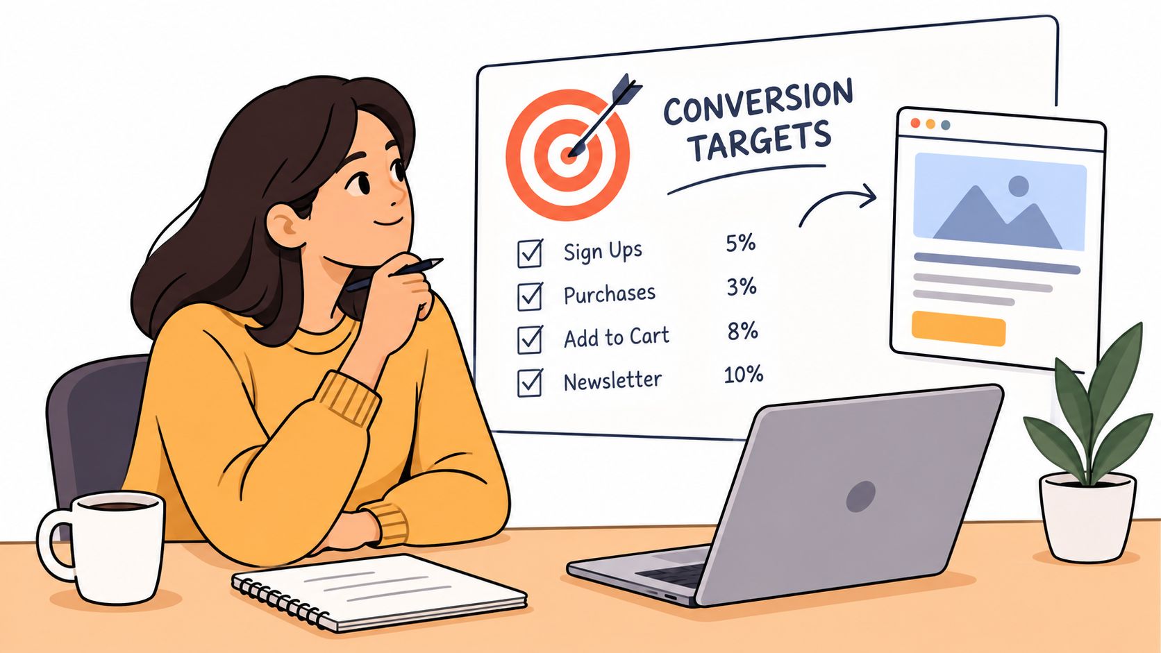
Define the primary conversion first. For an e-commerce landing page, that may be a completed purchase. Then map the supporting events, such as a qualified session, product interaction, add-to-cart, checkout initiation, and purchase. For a lead page, distinguish a form completion from a qualified opportunity or eventual sale.
This prevents a common mistake, optimizing a micro-conversion without checking its commercial value. A form that produces more submissions isn't necessarily better if sales rejects more of those leads. A discount CTA that produces more orders can still weaken contribution margin if visitors would have purchased without the incentive.
Benchmarks can provide context, but they can't provide a universal target. Analysis across tens of thousands of landing pages shows a wide gap between median conversion rates around 6.6% and top-performing pages reaching over 11%, as summarized by this landing-page conversion benchmark analysis. The gap doesn't prove that every store should aim for the top figure. It shows why traffic source, offer, audience, device, geography, price, and conversion definition must accompany any benchmark.
Write each hypothesis in a complete form:
If we align the hero message with the paid-search query and clarify delivery expectations before the CTA, then qualified add-to-cart activity and completed purchases should improve without lowering revenue quality.
Record the audience, baseline, primary metric, guardrail metrics, expected direction, and decision rule before design work begins. That document will stop a visually attractive redesign from becoming an unmeasured opinion exercise.
Measuring Landing Pages Through the Full Checkout Journey
A landing page can win the click and lose the customer. Shopify reporting often celebrates a higher add-to-cart rate while completed purchases, revenue quality, or lead quality remain unchanged. Measure the page as part of the full checkout journey, from first exposure through the commercial outcome.
Track a consistent event sequence:
- Landing-page exposure, including the page version, campaign, and traffic source.
- Qualified engagement, such as meaningful product interaction or progression to the intended next step.
- Add to cart, with product, variant, price, and promotion context.
- Checkout initiation, including device and payment-path information where available.
- Completed purchase, with revenue, cancellation, refund, and order-quality signals.
Event tracking alone is insufficient. Preserve the link between experiment assignment and every downstream event. If a visitor sees variant B, leaves, returns through another channel, and purchases later, define how that conversion is attributed. Otherwise, the team can credit the wrong session, misread an assisted purchase, or scale a treatment that produces activity without profitable orders.
Segment before interpreting
Aggregate performance can conceal a failing experience. Build a diagnostic view segmented by device, traffic source, geography, operating system, new versus returning status, and customer intent, then compare outcomes across the funnel. A page may improve on fast desktop traffic while underperforming on mobile. It may produce more paid-social form fills while reducing branded-search purchases. Those results indicate that the treatment interacts with audience context.
Use benchmarks as directional context, not as a universal target. Compare each segment with its own baseline and evaluate the business outcome that matters, such as qualified leads, completed purchases, revenue per visitor, or contribution after refunds. A useful benchmark framework therefore combines traffic source, device, and outcome instead of reporting one blended conversion rate.
The most common CRO measurement error is optimizing an upstream proxy while ignoring the transaction outcome. A credible experiment needs a pre-registered primary metric, a fixed decision rule, sufficient sample size based on baseline conversion and minimum detectable effect, and a complete test period covering normal weekday and weekend behavior, as outlined in Baymard's checkout research and benchmarking guidance.
Set guardrails before launch. Depending on the store, monitor revenue per visitor, average order value, purchase rate, cancellation, refund, or lead qualification. Do not repeatedly inspect results and stop when the variant first appears positive. That practice increases the chance of treating random fluctuation as a durable improvement.
The following video can complement the measurement setup with a visual explanation of the checkout journey:
A landing-page winner earns rollout when it improves the metric that pays the bills, or when a leading signal has been validated against that outcome. Clicks diagnose friction. Revenue quality decides the winner.
Choosing Design and Copy Levers That Actually Move Revenue
Design changes work when they remove a specific obstacle. They fail when they decorate an unclear offer.
Start with the promise. The headline, supporting copy, product imagery, and CTA should answer the visitor's immediate questions: What is this, who is it for, why should I trust it, and what happens after I click? A bold claim without evidence can increase curiosity while decreasing confidence. A long explanation can answer every question while burying the action. The right balance depends on traffic intent and product complexity.
Form design illustrates the trade-off well. Fewer fields usually reduce effort, but removing a field can weaken qualification, personalization, or fraud controls. Baymard's research found that 17% of U.S. online shoppers had abandoned an order because checkout was too long or complicated. Its benchmarking found an average of 23.48 form elements by default, while an ideal flow could be reduced to approximately 12 to 14 elements, according to its UX statistics research. The landing-page implication is direct: every field needs a clear business reason, and the value exchange should be obvious before the visitor starts typing.
Compare experience against performance
Mobile deserves its own decision framework rather than a generic “make it responsive” instruction. Available 2025 figures report that 83% of landing-page visits occurred on mobile, while desktop converted 8% better. The same source reports that 53% of mobile users abandon pages taking more than three seconds to display, and that approximately 53% of origins met all three Core Web Vitals benchmarks as of September 2025. It also reports that dynamic landing pages converted about 25.2% more mobile users than static versions, while cautioning that the methodology needs validation before treating the result as causal. These figures and their limitations are discussed in Sender's landing-page statistics research.
That tension should shape the test. A quiz, personalization layer, video, or AI-generated content may improve relevance for fast devices while adding JavaScript, latency, accessibility barriers, or layout instability for other visitors. Test the richer experience against performance budgets for LCP, INP, JavaScript weight, keyboard access, and low-end devices. Measure revenue quality by network, operating system, geography, and visitor status, not only the blended conversion rate.
For product and campaign pages, evaluate these levers together:
- Message match: Does the page continue the exact promise made in the ad, email, search result, or referring page?
- Trust placement: Are reviews, guarantees, delivery details, payment options, and returns close to the point of hesitation?
- Price clarity: Can visitors understand the total commercial commitment before checkout?
- Interaction cost: Does the page make the next step easy without removing information shoppers need?
- Visual hierarchy: Can a mobile visitor identify the product, benefit, proof, and CTA without hunting?
For a broader foundation, review landing page design best practices, then treat every recommendation as a hypothesis. A button belongs where users can find it, not where a template says it belongs. Rich media belongs where it improves understanding enough to justify its performance cost.
Running A/B Tests That Protect Downstream Performance
A/B testing doesn't remove judgment. It gives judgment a controlled way to learn.
Before launching, write down the single primary metric, the audience, the baseline conversion rate, the minimum detectable effect, the test duration, and the rollout rule. Sample-size planning should reflect the baseline and the smallest improvement worth acting on. A test that can't reliably detect a commercially meaningful change shouldn't produce a confident business conclusion.
Keep the treatment interpretable. If the hypothesis concerns message match, change the headline and supporting promise rather than rewriting the entire page, replacing the offer, and adding a new checkout flow at the same time. Multiple changes can be tested through a deliberately designed factorial experiment, but simultaneous unplanned changes make the result difficult to learn from.
Protect the result after launch
Run the test across normal weekday and weekend behavior. Don't repeatedly check the dashboard and stop at the first favorable reading. Don't generalize a blended result across materially different devices, geographies, or acquisition intents when the experience or audience differs.
The primary metric might be completed purchase, while add-to-cart and checkout initiation act as diagnostic measures. Keep revenue per visitor and order-quality signals as guardrails. A treatment that wins the click but loses the purchase should not ship just because the first-stage chart is impressive.
Document what happened, including failed tests. A failed test can show that the proposed friction wasn't the actual bottleneck, that the message was already clear, or that the treatment helped one segment and harmed another. Use that learning to form the next hypothesis instead of adding the result to a list of abandoned ideas.
Teams that need a practical testing reference can use A/B testing best practices to structure the workflow. Before full rollout, replicate a promising result in a second period or audience where practical. Repeated evidence is more valuable than a single favorable dashboard view.
Putting It All Together with a Landing Page Optimization Checklist
A durable CRO program is a loop, not a redesign sprint. The landing page is the visible part, but the operating system includes segmentation, analytics, checkout continuity, performance control, and disciplined experimentation.
Use this checklist before approving a new page or experiment:
- Define the commercial outcome. Decide whether the page exists to drive a purchase, qualified lead, add-to-cart action, or another business result. Name the downstream event that confirms value.
- Separate the audience. Build reporting views for paid search, paid social, branded search, retention, device, geography, and new versus returning visitors.
- Set a baseline. Record the current performance for the primary outcome and supporting steps. Don't compare a new page with an undefined blended average.
- Write the hypothesis. Identify the friction, proposed change, expected behavior, primary metric, guardrails, and decision rule.
- Audit the promise. Check message match, price, shipping, availability, product fit, returns, trust, and the information passed into cart and checkout.
- Reduce unnecessary effort. Remove fields, clicks, account requirements, and distractions that don't serve the customer or the business.
- Protect mobile performance. Test on realistic devices and networks. Keep richer interactions only when their incremental value survives speed and accessibility checks.
- Connect the funnel. Track landing-page exposure through qualified engagement, add-to-cart, checkout initiation, purchase, revenue per visitor, and order-quality outcomes.
- Run the experiment cleanly. Use an adequate sample, a complete test period, one clear primary metric, and no repeated early stopping.
- Validate and document. Replicate important findings, record segment behavior, and turn both wins and losses into the next hypothesis.
For Shopify teams, practical Shopify landing page testing advice can help translate this workflow into page-level experiments. The right cadence depends on traffic, business complexity, and the size of the decision, but the principle stays stable: optimize the path to profitable completion, not the most flattering step in the funnel.
ECORN helps Shopify brands improve landing pages through conversion research, CRO audits, A/B testing, Shopify development, and the implementation of validated optimization hypotheses. Visit ECORN to discuss a landing-page program tied to downstream revenue, device-level performance, and the checkout journey.


Shopify Plus Automation: A Guide for 2026
10 Social Selling Platforms for Shopify Merchants

Shopify Website Design Examples: 7 Stores Worth Studying
7 Ecommerce Newsletter Examples for Shopify Brands
One Product Shopify Store: Build and Scale
Mobile Pop Up Strategy for Shopify Stores That Converts
Sitemap for Shopify: How to Find, Optimize, and Submit It
7 Single Product Websites Worth Emulating
Product Variants Shopify: The Complete 2026 Guide
Ecommerce Analytics Consulting for Growth
What Is AI Integration for eCommerce
How to Choose the Right eCommerce Website Development Firm
E Business Strategy Implementation
Conversion Tracking Setup for Shopify Stores
BigCommerce vs Shopify Plus Which Enterprise Wins in 2026
Shopify Theme Kit: Setup, Commands, and Migration Guide
Shopify Extension Development: A Practical 2026 Guide
Shopify Speed Score Explained and How to Improve It
Shopify Mobile Optimization: The 2026 Playbook
How to Add Subcategory in Shopify for Better UX
How to Implement Structured Data for Ecommerce in 2026

SEO App Mobile: Shopify Store Optimization Guide
Shopify Plus Support: What It Includes and How to Choose
Google Ads for Shopify: The Complete 2026 Playbook
Shopify New York: How to Find and Hire the Right Agency
Google Search Console for Shopify: The Complete Setup
First Party Data Collection for eCommerce Growth
FAQ Online Store Guide: Build and Measure It Right
Do FB Ads Work for eCommerce in 2026?
One Page Checkout for Shopify: Design and Implementation
Shopify GraphQL vs REST: The 2026 Developer Decision
Shopify Ecommerce Consulting: Strategy, Pricing &

Are Reddit Ads Worth It for eCommerce Brands
Shopify Title and Meta Description: A Practical 2026 Guide

Product Video Best Practices for Shopify Brands
Real-Time Inventory Management: A 2026 Guide

AI Chatbot Integration for Shopify Stores
Affiliate Program Management: A Shopify Guide
10 Best Performance Monitoring Tools for Shopify in 2026
Digital Asset Management for eCommerce Brands in 2026
Every Type of Facebook Ads Explained for eCommerce Growth
Product Information Management Explained for Shopify Brands
Support Ticket System: A Guide for Shopify Stores

10 Best Customer Service Tools for Shopify in 2026

Can I Start a Business with No Money? a 2026 Blueprint

What Sells Good on Etsy: Best Niches for 2026

Shopify Add to Cart Button: A Practical 2026 Guide

Customer Feedback Automation: A Practical eCommerce Guide
Critical Rendering Path: A Guide for Shopify Stores

How to Promote on TikTok for eCommerce in 2026

B2B eCommerce Consulting That Drives Real Revenue
10 Best Practices for Site Navigation in 2026
Return vs Refund for Shopify Stores: A Practical Guide
What Is Customer Lifetime Value and Why It Matters
What Is Voice of Customer Research for eCommerce

SMS Marketing for Ecommerce That Actually Converts

Master How to Improve Email Deliverability in 2026

Top 7 eCommerce Partners NYC for Shopify Brands in 2026
Machine Learning for Ecommerce: Boost Your Shopify Store

Beauty Market Research: Your 2026 Growth Guide

Shopify International Expansion: A 2026 Roadmap
What Does CRO Stand for in Business: Understanding CRO

Shopify Visual Merchandising: A Playbook for Higher Sales

Shopify Landing Page Design: Master Conversion in 2026
10 Best AI SEO Optimization Tools for Shopify in 2026

Agentic AI for Ecommerce: Boost Your Sales in 2026
Mastering Email Marketing Data for eCommerce Growth

Conversion Rate Optimisation Australia: Boost Your Sales
Conversion Rate Optimization AI: Your Shopify Store Guide

10 Product Bundling Strategies for Shopify in 2026
How to Increase Customer Lifetime Value: A Shopify Playbook
AI Customer Service Automation: Shopify Guide 2026

Clean Website Design: A Shopify Conversion Playbook

Omnichannel Retail Strategy: A Shopify Playbook
Product Data Enrichment: A Guide for Shopify Brands

Instagram Shopping Features a Guide for Shopify Stores
What Is Revenue Optimization: A Holistic RevOps Guide

Benefits of Conversion Rate Optimization: Boost Your
WordPress to Shopify Migration: Your 2026 Seamless Switch
Boost Sales: Ecommerce Payment Processing Guide 2026
Unified Commerce Platform: Benefits, KPIs & Shopify Guide
How to Reduce Bounce Rate eCommerce: Your 2026 Guide
Shopify API Integration: A Practical End-to-End Guide

How to Implement Data Governance: A 2026 Guide
Shopify Store Development Cost: A 2026 Breakdown
What Is Server Side Tracking: The Shopify Guide 2026
Marketing Automation Workflows: A Shopify Guide for 2026
Shopify: How to Reduce Technical Debt

Shopify UX Design Change: A Playbook for Growth
User Generated Content Strategy: Shopify Playbook
Shopify Pause and Build Plan Cost: A Complete 2026 Guide
Compare at Price on Shopify: A Complete Guide for 2026
Where Can I Sell My Prints? 10 Best Platforms for 2026
Shopify Order Management System: The Ultimate Guide 2026
What Is Marketing Attribution? an eCommerce Guide for 2026

10 Best Black Friday Sales Sheets for 2026

Discover the Top Social Media Marketing Agencies For
Consumer Confidence Definition for eCommerce in 2026
What Is Social Commerce? Your 2026 Guide to Boosting Sales
A Social Ad Campaign Playbook for eCommerce Growth


newsletter in your inbox